What is Pac-Man (Namco 1980)?什么是 Pac-Man (Namco 1980)?
A yellow disc, a cobalt maze, and four ghost hues on pure black — Pac-Man's 1980 arcade palette turned four colors into a universal visual language.纯黑底色上:一个黄色圆盘、一条钴蓝迷宫、四只彩色幽灵——《吃豆人》1980年的街机色彩,用四种颜色构建出一套全球通行的视觉语言。
Pac-Man (Namco 1980) in briefPac-Man (Namco 1980) 速览
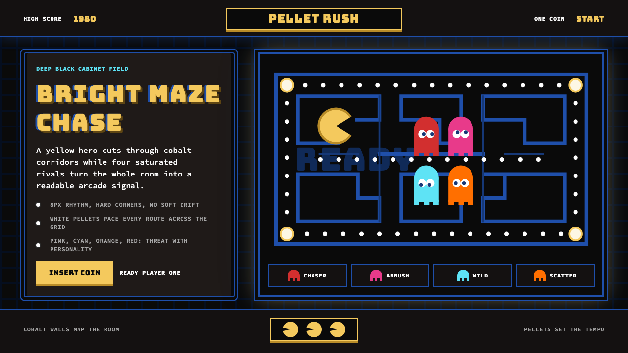
Pac-Man (Namco 1980) is a design system derived directly from the visual grammar of Toru Iwatani's 1980 arcade game — one of the most recognized artifacts of twentieth-century popular culture. Its defining elements are instantly legible: a deep-black field, a saturated golden-yellow disc protagonist, a cobalt-blue maze of corridors and walls, and four ghost characters each carrying a distinct saturated hue — pink, cyan, orange, and red. Every element is drawn with pixel-sharp edges and zero anti-aliasing, giving the entire system a quality of hard geometric precision that no hand-drawn style can replicate.《吃豆人》(Namco 1980)是一套直接从岩谷彻1980年街机游戏视觉语言中提炼出的设计系统——这款游戏是二十世纪流行文化中最具辨识度的产物之一。其核心元素一目了然:纯黑底场、饱和明金的圆盘主角、钴蓝色走廊与墙壁构成的迷宫、四只各携独特饱和色彩的幽灵——粉红色的Pinky、青蓝色的Inky、橘色的Clyde、赤红色的Blinky。每一个元素都以像素精度的锐边绘制,没有任何抗锯齿处理,赋予整个系统一种手绘风格无法复制的硬朗几何精度。
The palette is not subtle. It belongs to the world of arcade-cabinet phosphor screens, where colors needed to sing through ambient fluorescent light from three meters away. This is design that performs at distance, built for maximum pop against a void. The black background is not a neutral ground — it is an active participant, creating the illusion of depth and making each saturated color appear to float and glow. The result is simultaneously joyful, populist, and graphically bold in a way that more refined design traditions rarely achieve.这套色板毫无含蓄之处。它属于街机柜磷光屏幕的世界——那个世界里,色彩必须能在三米之外穿透荧光灯的环境光,在人潮中发光鸣响。这是为距离而生的设计,以在虚空中制造最大视觉冲击为目标。黑色背景不是中性底面,而是主动参与者:它制造深度错觉,让每一种饱和色彩看起来仿佛漂浮发光。最终呈现的效果同时具备欢愉感、大众感与图形上的大胆感——这是更精致的设计传统鲜少能够企及的。
What distinguishes the Pac-Man aesthetic from simple retro nostalgia is its structural coherence. The visual system has clear rules: the black field always dominates; color appears in bold, contained shapes rather than gradients or washes; type is chunky, display-weight, and treated with the same pixel logic as the game sprites; spacing is generous, giving each element room to read at a glance. Applied deliberately, this system carries genuine graphic authority — not because it quotes an era, but because its underlying logic is sound.将《吃豆人》美学与简单的复古怀旧区别开来的,是它的结构一致性。这套视觉系统有清晰的规则:黑色底场始终主导全局;色彩以粗壮、轮廓分明的形状出现,而非渐变或色晕;字体是粗壮的展示体,与游戏精灵遵循同一套像素逻辑;间距宽裕,让每个元素都能在一瞥之间被读取。有意识地运用这套系统,能够传递真实的图形权威——不是因为它在引用某个时代,而是因为它的底层逻辑本身是扎实的。
See the Pac-Man (Namco 1980) design system查看 Pac-Man (Namco 1980) 完整设计系统
Where does Pac-Man (Namco 1980) come from?Pac-Man (Namco 1980) 从何而来?
Pac-Man was designed by Toru Iwatani at Namco, the Japanese amusement company founded in 1955 in Tokyo. The game was released in Japan in May 1980 under the title Puck Man — a name derived from the Japanese onomatopoeia 'paku paku', describing the sound of a mouth opening and closing. Midway Games licensed the title for North American distribution, renaming it Pac-Man to prevent vandalism of the cabinet lettering. Within a year, the game had become the highest-grossing arcade title ever released, a record it held for years.《吃豆人》由岩谷彻在南梦宫(Namco)设计。南梦宫是1955年创立于东京的日本游艺公司。游戏于1980年5月在日本以《Puck Man》为名发行——这个名字来源于日语拟声词「パクパク」(paku paku),模拟嘴巴张合的声音。Midway Games取得北美发行授权后将其改名为Pac-Man,以防止玩家破坏柜体字母。不到一年,该游戏便成为有史以来营收最高的街机作品,这一纪录保持多年。
Iwatani's design decisions were both practical and visionary. The maze was drawn to fill a vertical monitor — the same aspect ratio used by most arcade cabinets of the period — and the palette was constrained to what the Namco hardware could drive at full brightness: a small set of pure, fully saturated hues against a black phosphor background. There was no option for gradients, soft shadows, or intermediate tones. These hardware limitations became the style's most enduring characteristics. The chunky, pixel-grid letterforms used for the score and labels were similarly products of constraint: the display chip handled characters as fixed-width bitmap grids, and designers worked within those grids to produce type that was instantly readable under arcade conditions.岩谷彻的设计决策既务实又富远见。迷宫被设计为填满竖版显示器——这与当时大多数街机柜使用的长宽比一致——而色板则受限于南梦宫硬件在全亮度下能够驱动的范围:在黑色磷光背景上,只有少量纯色、全饱和色调可用。渐变、柔和阴影或中间色调根本不在选项之内。这些硬件限制反而成为这套风格最持久的特征。用于显示得分与标签的粗壮像素点阵字形,同样是限制的产物:显示芯片以固定宽度位图网格处理字符,设计师在这些网格内工作,创造出在街机环境下即时可读的字体。
The game's four ghost antagonists — Blinky (red), Pinky (pink), Inky (cyan), and Clyde (orange) — each received a distinct hue for a purely functional reason: players needed to track all four simultaneously from across a loud, visually busy arcade floor. Color-coding was the only reliable differentiator at that scale and distance. The decision to give each ghost a unique behavioral personality — Blinky chases directly, Pinky attempts to get ahead of the player, Inky behaves unpredictably, Clyde wanders — added a layer of strategic depth that made the game far more replayable than its contemporaries. The color-personality pairing is one of the earliest examples of what contemporary UX designers would call 'semantic color assignment'.游戏的四只幽灵对手——赤红色的Blinky、粉红色的Pinky、青蓝色的Inky、橘色的Clyde——各自获得独特色彩,原因纯粹出于功能性:玩家需要在嘈杂、视觉繁忙的街机厅地板上同时追踪全部四只幽灵。在那种尺度与距离下,色彩编码是唯一可靠的区分手段。赋予每只幽灵独特行为个性的决定——Blinky直接追击、Pinky尝试截断玩家路径、Inky行为难以预测、Clyde漫无目的游荡——增添了一层策略深度,使这款游戏的可重复游玩性远超同时代作品。这套色彩与个性的配对,是当代UX设计师所称「语义化色彩分配」的最早案例之一。
The cultural impact of Pac-Man extended well beyond the arcade. By 1982, the character had appeared on television, in licensed merchandise, on breakfast cereals, and in animated form. The visual identity — the yellow disc, the maze, the four ghost colors — became among the most globally recognized graphic symbols of the decade. Namco, which merged with Bandai in 2006 to form Bandai Namco, has maintained the visual system with remarkable consistency across four decades of sequels, remakes, and brand collaborations. The 1980 arcade palette remains the canonical reference for all subsequent iterations.《吃豆人》的文化影响远超街机的边界。到1982年,这个角色已出现在电视节目、授权周边商品、早餐麦片包装与动画作品中。那套视觉身份——黄色圆盘、迷宫、四种幽灵色彩——成为那个十年全球最具辨识度的图形符号之列。2006年与万代合并成立万代南梦宫(Bandai Namco)后,南梦宫在四十年的续作、重制版与品牌合作中以惊人的一致性维护着这套视觉系统。1980年的街机色板始终是所有后续版本的规范参照。
What defines the Pac-Man (Namco 1980) look?Pac-Man (Namco 1980) 的视觉特征是什么?
Color Field色彩底场
The black background is the system's first and most important design decision. Unlike a neutral or tinted ground, pure black makes every adjacent color appear to radiate light rather than simply reflect it. Yellows become incandescent, blues become electric, pinks and reds glow. All color work in this system should be evaluated against a black field — colors that read well on white or grey will often appear washed out or inadequate here, and the palette must be recalibrated accordingly.黑色背景是这套系统第一个、也是最重要的设计决定。与中性或有色调的底面不同,纯黑让每一种相邻色彩看起来像是在发光,而非单纯反射光线。黄色变得白炽,蓝色变得通电,粉红与红色隐隐发光。这套系统中的所有色彩处理都应在黑色底场上加以评估——在白色或灰色底面上表现良好的色彩,在这里往往会显得暗淡或不足,必须相应重新校准。
Saturated Primary Palette饱和主色板
The system operates on a set of fully saturated, unmodified hues: a warm golden yellow, cobalt blue, hot pink, bright cyan, vivid orange, and pure red. These are arcade-CMYK colors — not the desaturated, dusty, or muted variants common in contemporary branding. No tinting with white, no shading with black, no opacity reductions. Each color appears at its maximum chromatic intensity. This approach demands discipline: the palette works because each hue occupies its own lane in the spectrum, and mixing or blending destroys the visual separation that makes the system legible.这套系统运行在一组全饱和、未经修改的色相上:温暖的金黄、钴蓝、亮粉红、明亮的青色、鲜橘与纯红。这些是街机CMYK色彩——不是当代品牌设计中常见的去饱和、尘埃感或哑光变体。不用白色调浅,不用黑色加深,不降低不透明度。每种色彩都以其最大色度强度呈现。这种方式需要自律:这套色板之所以有效,是因为每种色相在色谱中各占其位,混合或融合会破坏使系统可读的视觉分离感。
Pixel-Grid Geometry像素网格几何
All shapes in the system are drawn on an implied pixel grid. Curves are not smooth arcs but stepped approximations of arcs — a quality that is immediately visible in the Pac-Man character himself, whose circular outline is a precise digital approximation rather than a mathematically perfect circle. Corners are sharp or stepped, never rounded. Lines have visible weight determined by grid units rather than continuous stroke values. This pixel-grid discipline is the quality that most distinguishes authentic applications of this style from casual imitations.系统中的所有形状都绘制在隐含的像素网格上。曲线不是平滑弧线,而是弧线的阶梯式近似——这种特质在吃豆人角色本身上一目了然:他的圆形轮廓是精确的数字近似,而非数学意义上的完美圆形。角是锐利的或阶梯式的,绝不圆润。线条的可见粗细由网格单元决定,而非连续的笔触数值。这种像素网格自律,是将这种风格的真实应用与随意模仿区别开来的最重要特质。
Display Typography展示体字排印
Type in this system is chunky, display-weight, and treated as a graphic object on the same visual plane as the colored shapes. Letterforms carry deliberate weight — thin strokes are not welcome. Type sizing follows a binary logic: there is a large display size for headlines and scores, and a small but still highly legible size for labels and secondary information. Mid-range type sizes that would create typographic hierarchy in a conventional layout are largely absent. The letter-spacing is tight, and type tends to sit in horizontal runs that align to the grid.这套系统中的字体是粗壮的展示体,与有色形状处于同一视觉平面,被当作图形对象处理。字形带有刻意的重量感——细笔画不受欢迎。字体大小遵循二元逻辑:大号展示尺寸用于标题和分数显示,小号但仍高度清晰的尺寸用于标签和次要信息。在常规版面中用于建立排版层级的中等字号基本缺席。字距紧凑,字体倾向于沿水平方向排列,与网格对齐。
Contained Color Blocks封闭色块
Color never bleeds, gradients, or transitions. Each colored zone is a hard-edged, fully contained shape with a definite boundary — a wall, a character, a score digit, a UI element. There is no color bleeding into adjacent areas, no soft glow, no halo effect. Even where two colors are adjacent, the boundary between them is a single pixel line. This containment principle is what gives the system its graphic cleanliness and makes it readable at small sizes or across visual noise.色彩从不渗出、渐变或过渡。每个彩色区域都是硬边、完全封闭的形状,有明确的边界——一堵墙、一个角色、一个得分数字、一个界面元素。没有色彩渗入相邻区域,没有柔光,没有光晕效果。即使两种色彩相邻,它们之间的边界也是单一像素线。这种封闭原则赋予系统图形上的整洁感,使其在小尺寸或充满视觉噪音的环境中都能保持可读性。
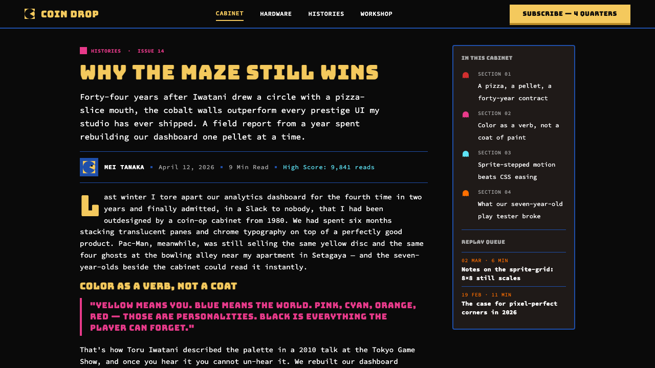
Semantic Ghost Colors语义幽灵色彩
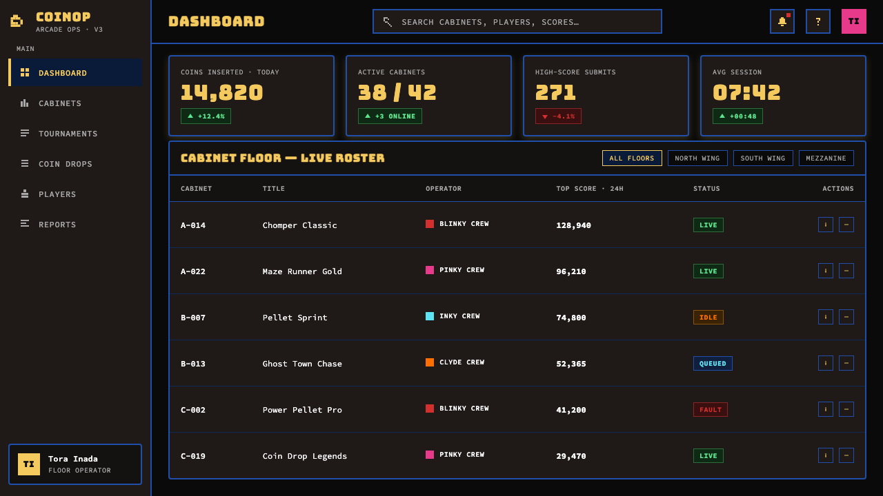
The four ghost hues — pink, cyan, orange, and red — are not decorative variety. Each was assigned to communicate a specific identity and behavioral role, and audiences learned to associate each color with a distinct personality within minutes of play. This is semantic color at its most efficient: no legend required, no explanation needed, instant recognition through pattern repetition. When applied outside the game context, these hues should carry differentiated meaning — category labels, status indicators, or entity types — rather than being used as a generic variety palette.四种幽灵色——粉红、青色、橘色与红色——并非装饰性的色彩多样化。每种色彩被分配来传达特定的身份与行为角色,玩家在几分钟的游玩后便学会将每种颜色与独特的个性关联起来。这是语义化色彩在其最高效状态下的体现:无需图例,无需说明,通过模式重复即可实现即时识别。在游戏语境之外应用时,这些色调应携带差异化的含义——类别标签、状态指示或实体类型——而不是被当作通用的多样化调色板。
High-Contrast Legibility高对比度可读性
Every element in the Pac-Man system is designed for instantaneous recognition under adverse viewing conditions — bright ambient light, peripheral vision, competitive visual noise from adjacent cabinets. The result is a system where legibility is almost aggressive: nothing is subtle, nothing is soft, nothing requires sustained attention to decode. This high-contrast, high-visibility approach is both a historical necessity and a genuine design virtue. It makes the system particularly effective in contexts where the viewer's attention is divided or where the display surface is imperfect.《吃豆人》系统中的每个元素都为在不利观看条件下的即时识别而设计——明亮的环境光、周边视觉、来自相邻街机柜的竞争性视觉噪音。结果是一套可读性近乎具有攻击性的系统:没有任何东西是含蓄的,没有任何东西是柔和的,没有任何东西需要持续专注才能解读。这种高对比度、高可见性的方法既是历史必然,也是真实的设计美德。它使这套系统在观看者注意力分散或显示表面不完美的场景中尤为有效。
See the Pac-Man (Namco 1980) design system查看 Pac-Man (Namco 1980) 完整设计系统
Who shaped Pac-Man (Namco 1980)?谁塑造了 Pac-Man (Namco 1980)?
Iwatani joined Namco in 1977 and designed Pac-Man as a deliberate attempt to attract female players and couples to arcades, which in 1980 were perceived as exclusively male spaces. His visual and conceptual choices — the rounded protagonist, the eating mechanic, the colorful antagonists with distinct personalities — were all oriented toward accessibility and broad appeal. Iwatani has stated that the character's shape was inspired by a pizza with a slice removed. He later designed Libble Rabble (1983) and worked on various Namco titles, but Pac-Man remains his singular contribution to design history.岩谷彻于1977年加入南梦宫,设计《吃豆人》的初衷是吸引女性玩家和情侣进入街机厅——1980年的街机厅被认为是纯粹的男性空间。他的视觉与概念选择——圆润的主角、进食机制、有着独特个性的彩色对手——都指向易上手性与广泛吸引力。岩谷彻曾表示,角色的形状灵感来自一块缺了一片的比萨饼。他后来设计了《Libble Rabble》(1983年)并参与了多款南梦宫作品,但《吃豆人》仍是他对设计史的唯一奇点贡献。
Namco was founded in 1955 on the rooftop of a Tokyo department store as a two-horse merry-go-round operator. Through the 1970s it became a leading arcade game developer and manufacturer in Japan, distributing Atari products in the region before developing its own hardware. The company's technical teams developed the display and color hardware that defined Pac-Man's visual palette. Namco's design culture — pragmatic, player-centered, commercially focused — produced one of the most visually coherent arcade canons of the 1980s, including Galaga (1981), Dig Dug (1982), and Pole Position (1982).南梦宫于1955年成立于东京一家百货公司的屋顶,起初经营两匹旋转木马。整个1970年代,它成长为日本领先的街机游戏开发商和制造商,在代理Atari产品的同时开发自有硬件。公司的技术团队开发了定义《吃豆人》视觉色板的显示与色彩硬件。南梦宫务实、以玩家为中心、注重商业的设计文化,在1980年代催生了最具视觉一致性的街机经典系列之一,包括《大蜜蜂》(Galaga,1981年)、《掘金者》(Dig Dug,1982年)与《极地竞速》(Pole Position,1982年)。
Midway was the Chicago-based distributor that licensed Pac-Man for North American release and was responsible for the renaming from Puck Man. Midway's manufacturing and distribution infrastructure was essential to the title's North American dominance — the company produced over 100,000 cabinets for the US market alone. Midway's team also made minor visual adjustments to the North American cabinet artwork and attract screen, decisions that have since become part of the canonical Pac-Man visual identity as much as the original Japanese materials.Midway是位于芝加哥的发行商,取得了《吃豆人》的北美发行授权,也是将游戏从《Puck Man》改名的推手。Midway的制造与发行基础设施对这款游戏在北美的主导地位至关重要——公司仅为美国市场就生产了超过十万台街机柜。Midway团队还对北美版柜体艺术与吸引屏幕做了细微视觉调整,这些决定此后与原版日本素材一同成为《吃豆人》规范视觉身份的一部分。
The 2006 merger of Namco and Bandai created Bandai Namco Entertainment, which has stewarded the Pac-Man intellectual property and visual system through more than four decades of sequels, HD remakes, mobile ports, and brand licensing. The company has maintained the canonical 1980 palette with notable consistency — a rare achievement in a media landscape that frequently updates classic IPs beyond recognition. Bandai Namco's brand management of Pac-Man offers a case study in how a purely functional, hardware-constrained aesthetic can sustain cultural relevance when its core visual logic is preserved rather than modernized.2006年南梦宫与万代合并成立万代南梦宫娱乐,负责管理《吃豆人》知识产权与视觉系统,跨越四十余年的续作、高清重制版、手机移植版与品牌授权。公司以显著的一致性维护着规范的1980年色板——在频繁将经典IP改得面目全非的媒体环境中,这是罕见的成就。万代南梦宫对《吃豆人》品牌的管理,提供了一个案例:一套纯粹出于功能、受硬件约束的美学,如何在其核心视觉逻辑被保存而非现代化时,能够维持文化相关性。
How do you use Pac-Man (Namco 1980) today?今天怎么用 Pac-Man (Namco 1980)?
The Pac-Man visual system is among the most high-impact historical styles available for contemporary design work, but it demands a particular kind of discipline: commitment to the black field, resistance to the temptation to soften or desaturate, and willingness to work with a palette that was designed for maximum contrast rather than refined taste. Applied with integrity, it produces work that is genuinely striking and immediately legible. Applied superficially — as a thin layer of retro signaling over a conventional layout — it produces work that reads as costume rather than system.《吃豆人》视觉系统是当代设计实践中冲击力最强的历史风格之一,但它要求一种特殊的自律:对黑色底场的坚守、对柔化或去饱和诱惑的抵制,以及愿意与一套为最大对比度而非精致品味而设计的色板共事。以诚意应用,它能产出真正引人注目且即时可读的作品。表面化地应用——作为常规版面之上的一层薄薄复古外衣——产出的作品读起来像是戏服而非系统。
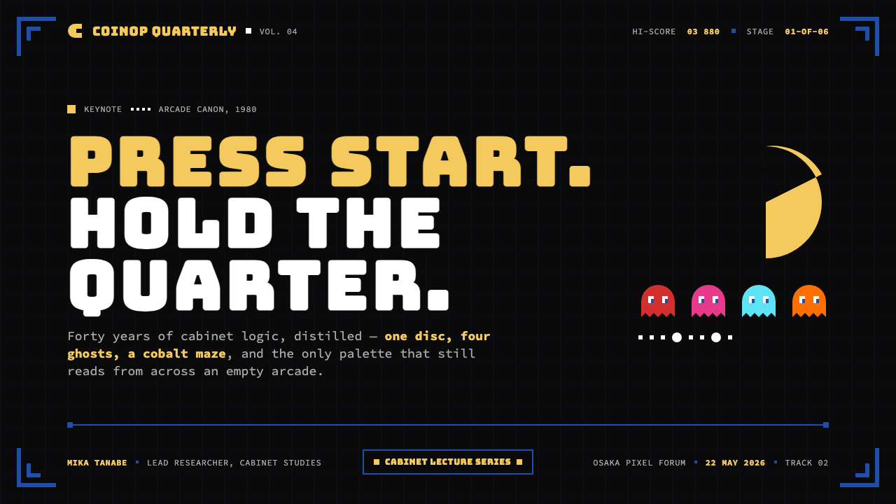
For presentation slides, this style excels at covers and section dividers. A cover built on a pure-black field with the title in large, bold, warm-yellow type and a simple geometric accent in cobalt blue achieves the arcade poster quality that is the system's hallmark. Content slides should commit to the same black field: white or near-white body text against black reads cleanly and maintains the system's visual coherence. Data slides are where the ghost-color palette earns its keep — series in bar charts, line charts, and pie charts can be assigned the four ghost hues directly, providing instant differentiation without any legend ambiguity. The pixel-grid logic should govern chart borders and grid lines: thick, visible, hard-edged.在演示文稿中,这种风格在封面和章节分割页上表现最为出色。以纯黑底场为基础、标题采用大号粗重暖黄字体、配合简单钴蓝几何点缀的封面,能够实现这套系统标志性的街机海报品质。内容页应坚守同样的黑色底场:黑底上的白色或接近白色的正文清晰易读,维持系统的视觉一致性。数据页是四幽灵色板大显身手之处——柱状图、折线图和饼图的系列可以直接分配四种幽灵色,无需任何图例歧义即可实现即时区分。像素网格逻辑应支配图表边框与网格线:粗壮、可见、硬边。
For web UI, dashboards and pricing pages are the strongest natural fit. The approach: a pure-black or very dark background as the base; primary navigation and structural elements in cobalt blue; call-to-action elements and primary metrics in warm yellow; status indicators distributed across the ghost palette. Typography should be heavy and display-weight for headlines, with generous size contrast between hierarchy levels. Interactive states — hover, active, selected — are expressed through color shift rather than opacity or blur effects. Ghost-button variants and soft shadows are incompatible with this system; bordered, solid-background components are the correct choice.对于网页界面,仪表板和定价页面是最天然的应用场景。方法如下:以纯黑或极深色背景为基础;主导航与结构性元素使用钴蓝;行动召唤元素与核心指标使用暖黄;状态指示器分配四幽灵色。标题字体应粗重,层级之间保持充裕的尺寸对比。交互状态——悬停、激活、选中——通过色彩切换而非不透明度或模糊效果来表达。幽灵按钮变体与柔和阴影与这套系统不相容;有边框、实色背景的组件才是正确选择。
For editorial and marketing work, the style is best deployed at full commitment rather than as a subtle accent. A marketing page or social card in this system uses full black bleeds, avoids any white or cream panel breaks that would undercut the palette's intensity, and treats type as a graphic element in its own right. Section headers and callouts in the yellow or ghost colors provide rhythm without requiring decorative ornaments. The style is particularly effective for gaming-adjacent brands, entertainment products, youth-oriented campaigns, and any context where high energy and immediate visual impact are primary values rather than secondary ones.对于编辑与营销内容,这种风格最好以全面投入的方式部署,而非作为微妙的点缀。这套系统中的营销页面或社交卡片使用全出血黑色,避免任何会削弱色板强度的白色或奶油色面板分隔,将字体本身当作图形元素对待。黄色或幽灵色的章节标题与引用语提供节奏感,无需装饰性点缀。这种风格对游戏相关品牌、娱乐产品、年轻向营销活动,以及任何将高能量与即时视觉冲击视为首要而非次要价值的场景尤为有效。
The most common mistake when applying Pac-Man aesthetics is using the palette without committing to the black field. When the system's hues are placed on a white, grey, or neutral background, they lose the incandescent quality that makes them work — they become merely bright rather than luminous. A second frequent error is softening the pixel-grid sharpness through border-radius, gradient fills, or box-shadow blur, which converts the system's defining precision into generic retro decoration. The palette is not the style; the black field and the hard edges are equally load-bearing. A third mistake is treating the four ghost colors as interchangeable decoration rather than as a semantic set — if they are used, each should carry a consistent and distinct meaning throughout the composition.应用《吃豆人》美学时最常见的错误,是使用这套色板却不坚守黑色底场。当这套系统的色相被置于白色、灰色或中性背景上时,它们失去了使其有效的白炽感——变得只是明亮,而非发光。第二个常见错误是通过圆角、渐变填充或盒子阴影模糊来软化像素网格的锐利感,这将系统的决定性精度转化为通用的复古装饰。色板不是风格的全部;黑色底场与硬边同样承重。第三个错误是将四种幽灵色当作可互换的装饰而非语义集合——如果使用,每种色彩在整个构图中都应携带一致且独特的含义。
See the Pac-Man (Namco 1980) design system查看 Pac-Man (Namco 1980) 完整设计系统
Pac-Man (Namco 1980) — FAQPac-Man (Namco 1980) · 常见问题
Can this style work for a professional or enterprise product, or is it too playful?这种风格适合专业或企业产品吗,还是太过玩趣?
It depends entirely on whether the product's values align with the style's values. Pac-Man aesthetics signal energy, immediacy, and populist boldness — qualities that are genuine assets for gaming platforms, entertainment dashboards, youth-oriented SaaS tools, and any brand that wants to position itself as approachable and high-energy rather than conservative and refined. For enterprise products where trust, sobriety, and institutional authority are the primary emotional goals, the style is a poor match — not because it is technically wrong but because it communicates the opposite of what those products need to say. The question is not whether the style is too playful but whether 'playful' is part of your brand's honest promise.完全取决于产品的价值观是否与风格的价值观对齐。《吃豆人》美学传递能量、即时性与大众化的大胆感——这些品质对游戏平台、娱乐仪表板、年轻向SaaS工具,以及任何希望将自身定位为平易近人、高能量而非保守精致的品牌,都是真实的资产。对于以信任感、稳重感与机构权威感为首要情感目标的企业产品,这种风格则契合度差——不是因为技术上错误,而是因为它传达的恰恰与那些产品需要表达的相反。问题不是这种风格是否太过玩趣,而是「玩趣」是否是你品牌真实承诺的一部分。
How do I use the ghost colors without making everything feel like a game?如何使用幽灵色而不让一切看起来都像游戏?
The ghost colors lose their arcade connotation when they are deployed with semantic clarity and visual restraint. Use each hue consistently for a single type of meaning — one color for warnings, one for positive states, one for a particular data category — and never use all four simultaneously in a single layout section. When the colors are doing clear information work, they read as a deliberate design system rather than a game reference. Also consider that the game context fades quickly when the surrounding typography, spacing, and layout structure are treated with discipline; the palette alone does not make a design feel like Pac-Man.当幽灵色以语义清晰度和视觉克制的方式部署时,它们会失去街机联想。将每种色相一致性地用于单一类型的含义——一种色彩用于警告,一种用于正向状态,一种用于特定数据类别——并且绝不在单一版面区域中同时使用全部四种。当这些色彩在做清晰的信息传递工作时,它们被读作刻意的设计系统,而非游戏引用。还需考虑:当周围的排版、间距与版面结构以自律方式处理时,游戏语境会很快消退;仅凭色板本身不足以让一个设计看起来像《吃豆人》。
Does the style work at small sizes — icons, mobile UI, dense data tables?这种风格在小尺寸下有效吗——图标、移动端界面、密集数据表格?
Remarkably well, precisely because the system was designed for hostile viewing conditions. The hard edges, high contrast, and contained color blocks all scale down without loss of legibility — there are no soft gradients to disappear or subtle tonal distinctions to collapse. At small sizes, the pixel-grid discipline becomes even more important: shapes must be drawn on clean grid increments to avoid the visual fuzz that occurs when continuous-coordinate shapes are rendered at low resolution. For dense data tables, the approach of reserving the ghost palette for status or category differentiation works at any density level, since the colors retain their distinctiveness even when they appear as small chips or dots.效果出奇地好,恰恰因为这套系统是为恶劣观看条件而设计的。硬边、高对比度与封闭色块在缩小时不会失去可读性——没有柔和渐变会消失,也没有微妙的色调区别会崩溃。在小尺寸下,像素网格自律变得更加重要:形状必须绘制在干净的网格增量上,以避免连续坐标形状在低分辨率下渲染时产生的视觉模糊感。对于密集数据表格,将幽灵色板保留用于状态或类别区分的方法在任何密度级别下都有效,因为即使色彩以小色块或小圆点的形式出现,也能保持其独特性。
Is there a light-background version of this style, or does it only work on black?这种风格有浅色背景版本吗,还是只在黑色上有效?
A light-background version is possible but represents a significant departure from the system's logic, not merely a cosmetic inversion. On a white or near-white ground, the fully saturated arcade hues become harsh and garish rather than luminous — they lack the dark context that makes them glow. A workable light variant requires desaturating the palette moderately and reducing it to two or three hues rather than the full set, which effectively produces a different style that shares some DNA with the original. If your use case requires a light background, it is more honest to treat this as a Pac-Man-inspired palette applied to a different layout system, rather than claiming it as the canonical arcade style.浅色背景版本是可能的,但这代表着对系统逻辑的重大背离,而非单纯的外观反转。在白色或接近白色的底面上,全饱和街机色调变得刺眼和俗气,而非发光——它们缺乏使其发光所需的深色背景语境。可行的浅色变体需要适度去饱和色板,并将其缩减为两到三种色相而非完整集合,这实际上产生了一种与原版有基因联系但本质不同的风格。如果你的应用场景需要浅色背景,更诚实的做法是将其视为受《吃豆人》启发的色板应用于不同版面系统,而非声称它是规范的街机风格。
How is Pac-Man style different from general pixel art or retro gaming aesthetics?《吃豆人》风格与一般像素艺术或复古游戏美学有何不同?
Pixel art is a broad category that includes many visual languages — the earthy palettes of early RPGs, the dithered gradients of 16-bit era graphics, the high-fantasy illustration styles of adventure games. Pac-Man style is a specific subset defined by its particular combination: the black field, the pure arcade-CMYK palette without earth tones or pastels, the simple character-based shapes rather than complex pixel illustrations, and the display-game context of scores, mazes, and status indicators. Applying 'pixel art' generically imports a jumble of era-associations; applying the Pac-Man system specifically draws on a coherent, iconic, globally recognized visual language with clear semantic rules. The specificity is the point.像素艺术是一个宽泛的类别,涵盖许多视觉语言——早期RPG的土色系色板、16位元时代图形的抖动渐变、冒险游戏的高幻想插图风格。《吃豆人》风格是一个由其特定组合定义的具体子集:黑色底场、无大地色调或粉彩的纯街机CMYK色板、简单的角色形状而非复杂的像素插图,以及分数、迷宫与状态指示器的展示游戏语境。泛泛地应用「像素艺术」引入了一堆混杂的时代联想;具体地应用《吃豆人》系统则汲取自一套连贯、标志性、全球公认的视觉语言,有清晰的语义规则。这种具体性正是重点所在。
Related design styles相关设计风格
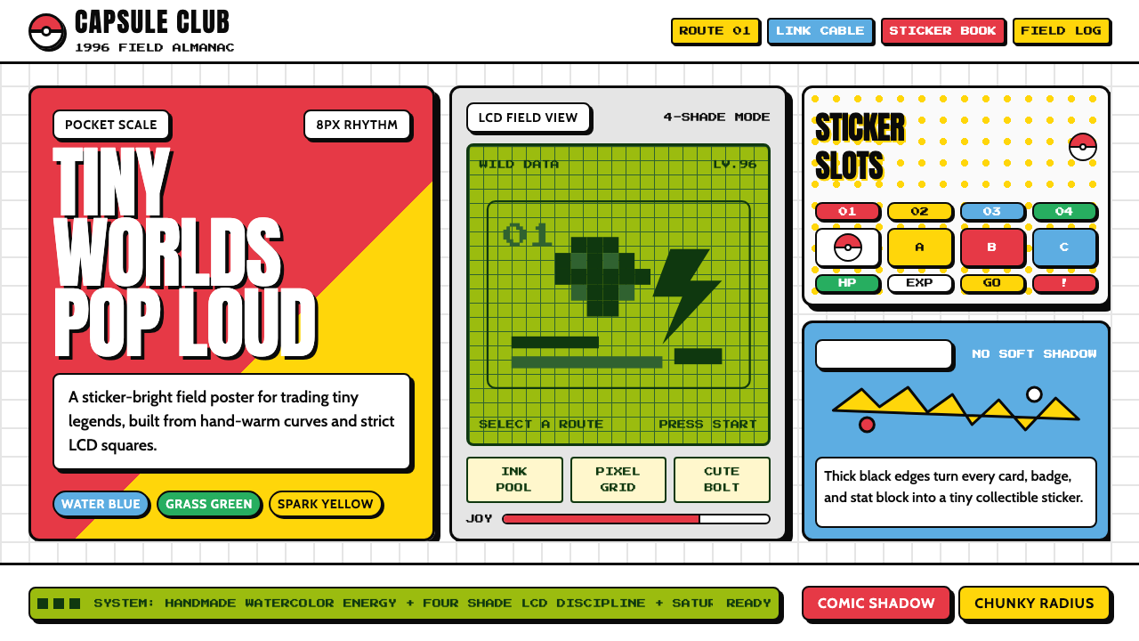 Pokémon Game BoyKawaii meets cartridge logic. Capsule red, LCD green, Anton heft, and 8px gri…卡哇伊撞上卡带逻辑:胶囊红、LCD绿、Anton粗字与8px网格同屏。
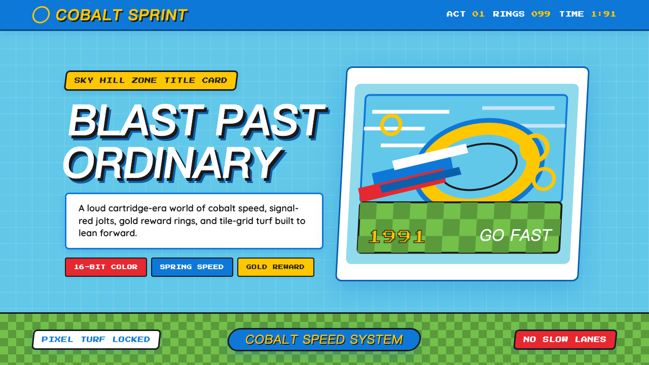 Sonic the Hedgehog (1991)Velocity has teeth. Sky-cyan, cobalt slant type, gold rings, checkerboard tur…速度带刺:天青底、钴蓝倾斜字、金环与棋盘草地。
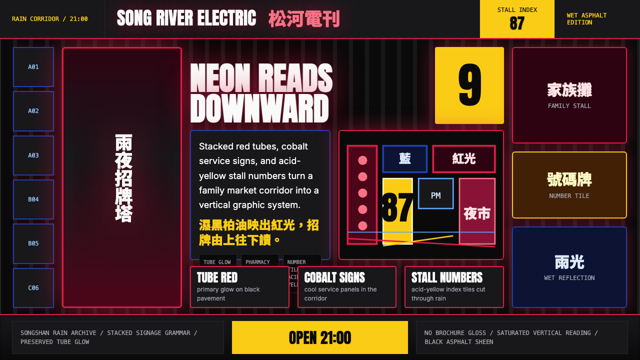 Taiwanese Raohe Night Market NeonTaipei night reads vertically. Neon red, cobalt panels, and acid-yellow numbe…台北夜色垂直閱讀:霓虹紅、鈷藍看板與酸黃號碼疊在濕黑地面。
 Cartoon Network 90s BlocksKids-cable noise, squared. Black-white checkerboards crash into hot-yellow Bu…方块化的儿童有线电视噪音:黑白棋盘撞上热黄 Bungee 字块。
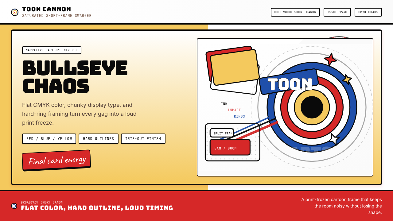 Looney Tunes (Warner Bros.)Pure cartoon chaos. Bull's-eye rings, Bungee type, and red-blue-yellow blocks.纯卡通混乱。牛眼环、粗壮标题字与红蓝黄块面。
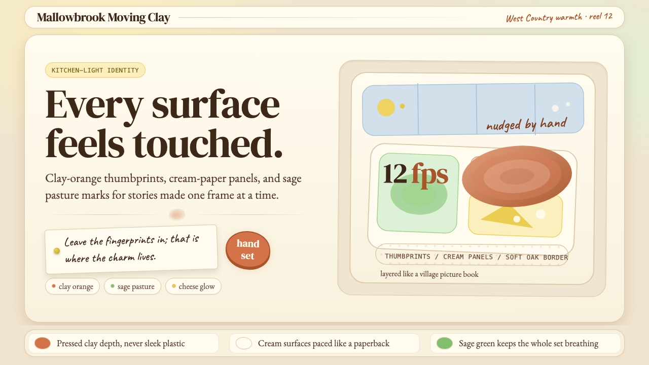 Aardman ClaymationHandmade warmth, visibly touched. Clay-orange panels, Caveat notes, thumbprin…手作温度可见:陶土橙面板、手写便签与指纹几何。