What is MTV Launch Identity (1981)?什么是 MTV Launch Identity (1981)?
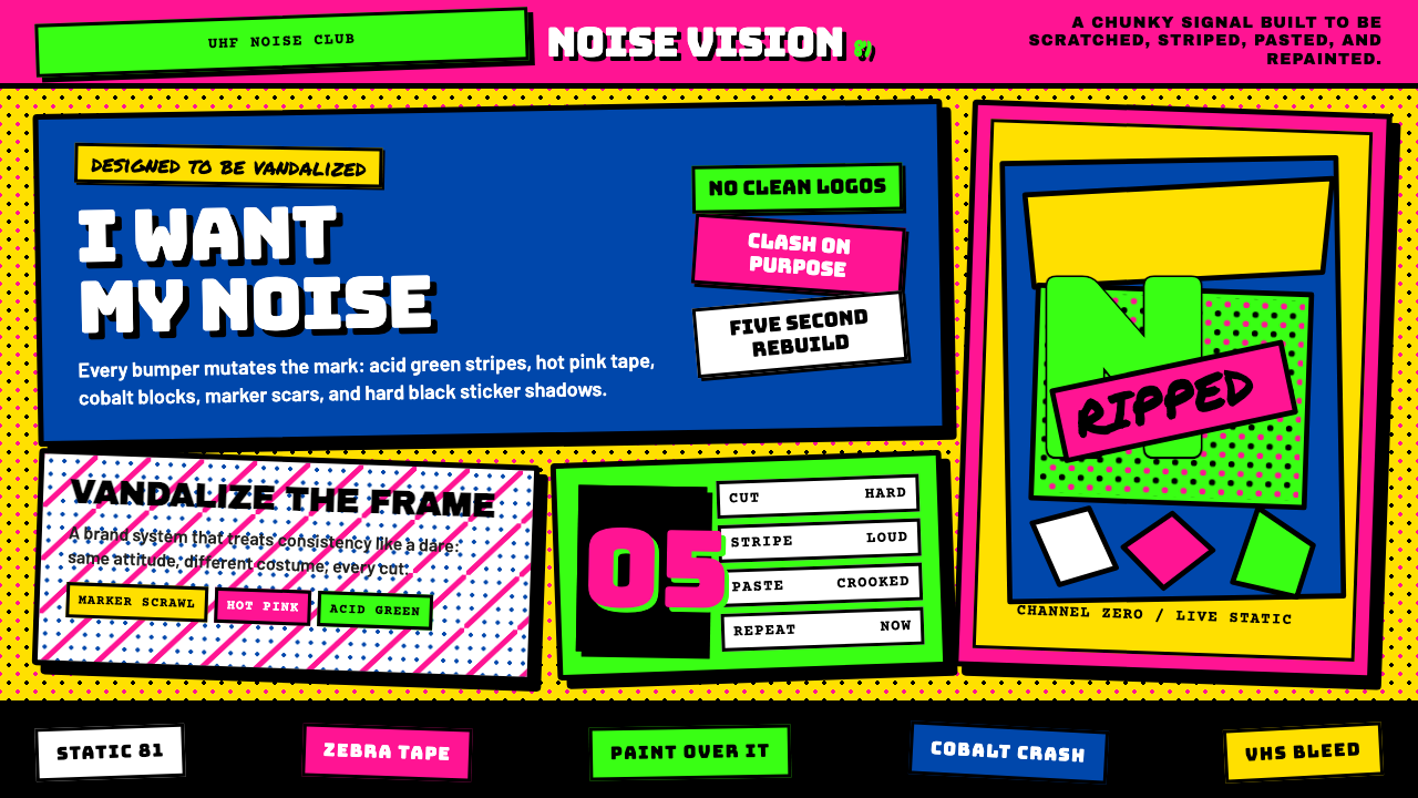
MTV's 1981 launch identity was the first major brand deliberately designed to be vandalized — a chunky block logo that invited spray paint, halftone dots, and zebra stripes every five seconds.MTV 1981 年的品牌是第一个被刻意设计来被涂鸦的主流视觉系统——那个厚重方块 logo 天生等着喷漆、网点与斑马纹每隔几秒轮番袭击它。
MTV Launch Identity (1981) in briefMTV Launch Identity (1981) 速览
MTV Launch Identity (1981) is the visual language introduced when Music Television went on air on August 1, 1981. Created by the Manhattan Design studio — Pat Gorman, Frank Olinsky, and Patti Rogoff — under creative director Fred Seibert, it replaced the idea of a fixed corporate logo with an infinitely mutable container. The blocky, hand-drawn letterforms of the 'M' became a host surface for whatever mood the channel was broadcasting: painted, scratched, on fire, polka-dotted, or slathered in graffiti. Consistency was not the point. Attitude was.MTV 1981 年品牌识别是 Music Television 于 1981 年 8 月 1 日开播时所采用的视觉语言。由曼哈顿设计工作室(Pat Gorman、Frank Olinsky 与 Patti Rogoff)在创意总监 Fred Seibert 带领下创作,它用一个无限可变的容器取代了固定的企业标志。那个厚实、手绘感十足的「M」字母成为承载频道每一种情绪的底座——被涂抹、被刮花、被点燃、被波点覆盖,或被涂鸦淹没。一致性不是目的,态度才是。
The visual system drew deliberately from post-punk street culture, the anarchic energy of fanzines, and the rough immediacy of spray-painted subway cars. Color clashed on purpose — hot pink against acid green, cobalt against electric yellow, orange punching through black — all reproduced on the soft, low-resolution glow of VHS-era cathode-ray tubes. Hand-scrawled marker lines, halftone dot screens, drip effects, and sticker-style cropped borders gave the identity a physical, made-by-hand quality that felt alien to the polished corporate graphic design of the era.这套视觉系统刻意汲取后朋克街头文化、地下自印刊物的无政府活力,以及喷漆地铁车厢的粗粝即时感。色彩故意撞色——热粉对酸性绿,钴蓝对电光黄,橙色穿透黑色——全部在 VHS 时代阴极射线管柔软、低分辨率的光晕中呈现。手写马克笔线条、网点印刷效果、颜料滴落与贴纸风格的裁切边框,赋予这套识别系统一种手工制作的物质感,与那个年代精致的企业平面设计格格不入。
Where most brand identities of the early 1980s sought authoritative stability, the MTV mark operated as a system of controlled instability. The logo's shape stayed constant; everything applied to it changed. This made the identity both immediately recognizable and perpetually surprising — a balance that would influence motion graphics, channel branding, and music packaging for the next two decades.1980 年代初大多数品牌识别追求权威性的稳定,MTV 标志却以受控的不稳定性为运作原则。Logo 的外形保持不变,附着其上的一切不停更换。这让这套识别系统既能被立即辨认,又永远出人意料——这种平衡在此后二十年持续影响了动态图形、频道品牌与音乐包装设计。
See the MTV Launch Identity (1981) design system查看 MTV Launch Identity (1981) 完整设计系统
Where does MTV Launch Identity (1981) come from?MTV Launch Identity (1981) 从何而来?
By the late 1970s, American broadcast television was dominated by three networks whose visual identities were exercises in corporate caution. The emerging cable landscape offered a different opportunity. When Warner-Amex Satellite Entertainment began planning a channel devoted entirely to music videos, the question of identity was not merely cosmetic — it was definitional. What should a channel look like when its entire reason for existence was youth culture, rebellion, and the electric novelty of music video?1970 年代末,美国广播电视被三大网络主导,它们的视觉识别是企业谨慎主义的练习题。新兴的有线电视版图提供了一种截然不同的可能。当 Warner-Amex 卫星娱乐公司开始规划一个专门播放音乐录像带的频道时,视觉识别问题不只是外观问题,而是定义性问题:当一个频道存在的全部理由是青年文化、反叛精神与音乐录像带的电光新鲜感时,它应该长什么样?
Fred Seibert, who joined the project in its early stages, brought in the Manhattan Design studio, a small New York collective working at the intersection of graphic design, punk aesthetics, and art. Pat Gorman, Frank Olinsky, and Patti Rogoff had backgrounds in underground publishing and fine art, and their approach to the brief was to reject the brief entirely. Rather than designing a logo that demanded protection and consistency, they designed one that invited violation. The chunky block 'M' with 'TV' scratched across its face in rough, tilted lettering was conceived from the outset as a form to be acted upon, not preserved.Fred Seibert 在项目早期加入,引入了曼哈顿设计工作室——一个活跃在平面设计、朋克美学与艺术交叉地带的纽约小型团体。Pat Gorman、Frank Olinsky 与 Patti Rogoff 拥有地下出版与纯艺术背景,他们对待设计任务的方式是彻底拒绝任务本身。他们没有设计一个需要被保护和保持一致的标志,而是设计了一个邀请被侵犯的标志。那个厚重的方块「M」,面上歪斜地划着「TV」字样,从一开始就被构想为一个等待被作用于其上的形态,而非一个需要被保存的对象。
The launch aired at 12:01 a.m. on August 1, 1981, with the first image on American cable television being the Apollo 11 moon landing footage recut with the MTV flag planted on the lunar surface — itself an act of graphic appropriation entirely in the spirit of the identity that followed. The interstitials and bumpers produced for the channel's first months drew on halftone printing textures, spray-paint stencil aesthetics, hand-lettered titles, and the visual grammar of concert posters and punk zines. Each treatment of the logo felt like a different person had gotten hold of it in a different mood.1981 年 8 月 1 日凌晨 12 时 01 分,频道开播。美国有线电视上出现的第一个画面是阿波罗 11 号登月录像,重新剪辑后在月球表面插上了 MTV 旗帜——这本身就是一次完全符合随后品牌精神的图像挪用行为。频道开播头几个月制作的间隔片与转场片,汲取了网点印刷质感、喷漆模板美学、手写标题,以及演唱会海报与朋克地下刊物的视觉语法。每一版 logo 的处理方式都像是被不同的人在不同情绪下拿到了手中。
The broader cultural context was decisive. Post-punk visual culture — the energy that had coursed through the Buzzcocks' sleeve designs, the Sex Pistols' Jamie Reid ransom-note graphics, and the photocopied fanzines of the late 1970s — had established a vocabulary of deliberate roughness, unexpected color, and confrontational composition. The Memphis Group, founded in Milan in 1981 the same year as MTV's launch, was simultaneously rejecting good taste through clashing pattern and aggressive ornament. MTV's identity drew from both currents, adding the specifically American vernacular of street-level commercial graphics: painted store signs, fluorescent sale banners, and the billboard culture of Times Square.更宽泛的文化背景具有决定性意义。后朋克视觉文化——流淌在 Buzzcocks 唱片封套、性手枪乐队 Jamie Reid 剪报式拼贴图形以及 1970 年代末影印地下刊物中的那种能量——已经建立起一套刻意粗粝、意外撞色与对抗性构图的词汇表。1981 年,孟菲斯设计集团在米兰成立,正是 MTV 开播的同一年,它也在以撞色图案与激进装饰拒绝所谓「好品味」。MTV 的识别系统同时汲取了这两股潮流,并叠加了特定的美国街头商业图形语言:手绘店铺招牌、荧光促销横幅,以及时代广场的广告牌文化。
What defines the MTV Launch Identity (1981) look?MTV Launch Identity (1981) 的视觉特征是什么?
Mutating Logo可变异的标志
The defining formal innovation of the MTV identity is the logo-as-canvas principle. The outer silhouette of the stacked 'M' and 'TV' letterforms remains fixed, but the interior surface is treated as blank material awaiting decoration, defacement, or transformation. Each iteration — zebra-striped, drip-painted, fire-scorched, covered in polka dots or graffiti tags — reads instantly as MTV while sharing almost nothing visually with the previous version. The container is consistent; the content is anarchic.MTV 品牌最核心的形式创新是「logo 即画布」原则。上下叠放的「M」与「TV」字形的外廓轮廓保持固定,但内部表面被视为等待装饰、破坏或变形的空白材料。每一个版本——斑马纹、颜料滴落、火烧痕迹、波点覆盖或涂鸦标签——都能被立即识别为 MTV,同时在视觉上与前一个版本几乎毫无共同之处。容器一致,内容无政府。
Deliberate Color Clash刻意撞色
The palette operates on collision rather than harmony. Hot pink, acid green, cobalt blue, electric yellow, orange, and black are used in combinations that would be considered errors in conventional color theory — adjacent hues of similar intensity, complementary pairs pushed to maximum saturation, warm and cool tones fighting for visual dominance. This is intentional: the discomfort created by the color relationships mirrors the disruptive energy of the music the channel was built to promote.这套调色盘以碰撞而非和谐为运作原则。热粉、酸性绿、钴蓝、电光黄、橙与黑以传统色彩理论会视为错误的方式组合——相似强度的邻近色并置、互补色对被推至最高饱和度、暖色调与冷色调争夺视觉主导权。这是刻意为之:色彩关系所制造的不适感,镜像了这个频道所要推广的音乐的破坏性能量。
Hand-Made Texture手工质感
The identity explicitly rejects the clean mechanical finish of professional print production. Elements throughout the system — borders, fills, type treatments — carry the evidence of physical making: ink drips, uneven spray coverage, crooked sticker edges, halftone dot screens that break apart at close range, marker lines that vary in pressure. On the low-resolution television screens of the early 1980s, this analog roughness became a form of visual warmth that polished computer graphics could not replicate.这套识别系统明确拒绝专业印刷生产的干净机械质感。系统中的各类元素——边框、填充、字体处理——都保留着物理制作的痕迹:墨水滴落、喷漆覆盖不均、贴纸边缘歪斜、近看会散开的网点、因力道变化而粗细不均的马克笔线条。在 1980 年代初低分辨率电视屏幕上,这种模拟粗粝感成为一种精致电脑图形无法复制的视觉温度。
Confrontational Typography对抗性排版
Type in the MTV system is set with the directness of street signage or protest placards rather than the refinement of editorial design. Letterforms are blocky and compressed, headlines are oversized and often tilted or stacked unexpectedly, and the relationship between type and image is abrupt rather than composed. The scratched, hand-drawn quality of the 'TV' component of the logo set the register for all on-air typography: rough, immediate, and unapologetically loud.MTV 系统中的字体以街头标牌或抗议标语的直接性排版,而非编辑设计的精致性。字形厚重压缩,标题超大号且常以意想不到的角度倾斜或叠放,文字与图像之间的关系是突兀的而非协调的。Logo 中「TV」部分刮划式手绘质感为所有播出字体定下了基调:粗粝、即时、毫无歉意地嘈杂。
Low-Resolution Aesthetics低分辨率美学
The visual identity was designed specifically for the cathode-ray tube televisions of 1981, not for print or high-definition display. This meant that the soft phosphor glow, color bleed at high-saturation boundaries, and gentle scan-line texture of the broadcast medium were not problems to be corrected but qualities to be exploited. Saturated color fields bled into each other pleasantly on-screen. Halftone patterns shimmered. The roughness of hand-made elements resolved into energy rather than noise.这套视觉识别系统专门为 1981 年的阴极射线管电视机设计,而非为印刷品或高清显示设计。这意味着广播媒介的磷光柔晕、高饱和边界处的色彩渗溢,以及柔和的扫描线质感,不是需要纠正的问题,而是需要利用的品质。高饱和色块在屏幕上愉快地相互渗透,网点图案闪烁发光,手工元素的粗粝感化解为能量而非噪声。
Anti-Corporate Attitude反企业态度
The identity is as much a philosophical position as a visual system. At a moment when corporate identity manuals enforced pixel-perfect logo reproduction across every application, Manhattan Design and Fred Seibert built a brand that explicitly prohibited such control. The manual, in effect, said: violate this. This stance was legible to the youth audience as a mark of authenticity — a signal that the channel was not just packaging music for a corporate audience but was itself part of the culture it was broadcasting.这套识别系统既是哲学立场,也是视觉系统。在企业视觉识别手册强制要求每一个应用场合都完美复制 logo 的时代,曼哈顿设计工作室与 Fred Seibert 建立了一个明确禁止这种控制的品牌。手册实际上说的是:破坏它。这种姿态在年轻受众那里被解读为真实性的标志——一个信号,表明这个频道不只是在为企业受众包装音乐,而是本身就是它所播出的那种文化的一部分。
Motion as Medium运动即媒介
Because the identity lived on television rather than in print, temporal change was a built-in property rather than an afterthought. The logo's mutations happened in real time, cutting from one treatment to another between videos. This made the brand one of the first designed specifically for duration rather than fixity — an identity that existed fully only across time, in the accumulated impression of dozens of different versions seen in sequence.由于这套识别系统生活在电视上而非印刷品中,时间性变化是其内在属性而非事后添加的考虑。Logo 的变异在实时发生,在音乐录像带之间从一种处理方式切换到另一种。这使该品牌成为最早专门为持续时间而非固定状态而设计的品牌之一——一套完整意义上只存在于时间维度中的识别系统,在按顺序看到的数十个不同版本的积累印象中才得以完整。
See the MTV Launch Identity (1981) design system查看 MTV Launch Identity (1981) 完整设计系统
Who shaped MTV Launch Identity (1981)?谁塑造了 MTV Launch Identity (1981)?
A founding partner of Manhattan Design, Gorman brought a background in fine art and underground publishing to the MTV project. Her hand was central in developing the physical, made-by-hand quality of the identity's surface treatments — the drips, the sticker borders, the layered spray-paint effects. Her understanding of how rough material aesthetics could carry emotional weight directly shaped the identity's success in communicating authenticity to a skeptical young audience.曼哈顿设计工作室的联合创始人之一,戈尔曼将纯艺术与地下出版的背景带入了 MTV 项目。她在发展这套识别系统表面处理的手工物质质感方面居功至伟——颜料滴落、贴纸边框、层叠的喷漆效果。她对粗粝材料美学如何承载情感重量的理解,直接塑造了这套识别系统向持怀疑态度的年轻受众传递真实性的成功。
Olinsky, another Manhattan Design partner, brought particular depth in music packaging and graphic identity to the project. His experience with album artwork had trained him to think about how visual identity functions under conditions of rapid scanning and low attention — exactly the environment of early cable television. He was instrumental in developing the structural logic of the mutating logo: keeping the silhouette inviolate while allowing the surface to be anything.奥林斯基是曼哈顿设计工作室的另一位合伙人,为项目带来了音乐包装与平面识别领域的深厚功底。他在唱片封套设计上的经验训练了他在快速浏览与低注意力状态下思考视觉识别的功能——这恰恰是早期有线电视的环境。他在发展可变异标志的结构逻辑方面发挥了关键作用:保持外廓轮廓不可侵犯,同时允许表面变成任何东西。
Rogoff completed the Manhattan Design trio, contributing to the overall visual language and the breadth of surface treatments applied to the MTV mark. Her work helped ensure that the system felt genuinely expansive — that the range of moods and treatments was wide enough to sustain viewer interest across months and years of on-air use — while remaining recognizably coherent as a single brand.罗戈夫是曼哈顿设计三人组的第三位成员,她参与了整体视觉语言的建构以及施加于 MTV 标志的各类表面处理的广度开发。她的工作帮助确保这套系统感觉上真正具有扩展性——情绪与处理方式的范围足够宽广,能够在数月乃至数年的播出使用中维持观众兴趣——同时作为单一品牌保持可辨识的连贯性。
As creative director, Seibert was the client-side champion who convinced Warner-Amex executives that a brand built on instability and violation was commercially viable. His most important contribution was institutional: he wrote the brief that allowed Manhattan Design to work against conventional brand logic, and he protected the identity from the pressures toward standardization that followed the channel's rapid growth. Without Seibert's continued advocacy, the mutating-logo principle would likely have been replaced by a conventional fixed mark within the channel's first year.作为创意总监,赛伯特是客户端的捍卫者,他说服了 Warner-Amex 的高管们相信一个建立在不稳定性与被侵犯原则之上的品牌在商业上是可行的。他最重要的贡献是制度性的:他撰写了允许曼哈顿设计工作室反常规品牌逻辑工作的任务书,并在频道迅速增长后保护这套识别系统免受标准化压力的侵蚀。没有赛伯特持续的捍卫,可变异标志原则很可能在频道开播第一年内就被常规固定标志所取代。
Co-creator of the channel concept alongside Seibert, Goodman shaped the broader editorial and tonal identity that the visual design had to serve. His insistence that MTV speak to its audience as peers rather than as a broadcasting authority established the philosophical ground on which the visual identity was built. The channel's voice — irreverent, knowing, directly generational — determined that its logo would need to be equally irreverent, equally unwilling to claim polished corporate authority.古德曼与赛伯特共同创造了频道概念,塑造了视觉设计必须服务的更宏观的编辑调性。他坚持 MTV 应以同伴而非广播权威的姿态与受众对话,为视觉识别的建立奠定了哲学基础。频道的声音——不敬、通透、鲜明代际感——决定了它的标志也必须同样不敬,同样不愿主张光鲜的企业权威。
How do you use MTV Launch Identity (1981) today?今天怎么用 MTV Launch Identity (1981)?
The MTV 1981 aesthetic is one of the most energetically specific styles available to a contemporary designer, which means it transfers most effectively when the product genuinely shares its underlying values: youth-facing, culturally engaged, comfortable with noise and movement, and resistant to the language of corporate authority. Applied to a brand with those qualities, it reads as authentic. Applied to a brand without them, it reads as costume.MTV 1981 年美学是当代设计师可用的风格中能量最为特定的之一,这意味着只有当产品真正分享其底层价值观时,它才能最有效地迁移:面向年轻人、文化介入深、对噪声与运动感到自在、抵抗企业权威语言。应用于具备这些特质的品牌,它读起来是真实的;应用于不具备的品牌,它读起来是戏服。
For presentation slides, the style works on cover pages through bold compositional disruption: the title set at an unexpected scale or angle, a deliberate color clash as the background treatment, and a border or frame element that looks slightly off — sticker-cropped, hand-drawn, or asymmetrically weighted. Content slides should embrace controlled chaos: headlines that feel too large for the space, body text set against unexpected color fields, and data visualizations treated as graphic objects to be layered and jostled rather than quietly aligned. The goal is energy, not legibility-through-noise — every element should still be readable, but nothing should feel at rest.对于演示文稿,这种风格通过大胆的构图颠覆在封面页上发挥效果:标题以意料之外的比例或角度排列,刻意撞色作为背景处理,边框或框架元素看起来略微偏离——贴纸式裁切、手绘或非对称加权。内容页应拥抱受控的混乱:标题感觉太大塞不进空间,正文排在意外的色块上,数据可视化被当作图形对象来堆叠碰撞而非安静对齐。目标是能量,不是靠噪声换取可读性——每个元素仍应可读,但没有任何元素应该感觉静止。
For web interfaces and dashboards, the style demands restraint in structure paired with aggression in surface treatment. The underlying layout grid should be clear and navigable — users still need to find things — but component skins, hover states, and highlight treatments can carry the full voltage of the aesthetic: hard sticker-style borders, high-saturation color fills that clash deliberately, type that sizes up unexpectedly. Music streaming platforms, youth culture editorial sites, entertainment ticketing, and creative portfolio tools are natural fits. Analytics dashboards for corporate enterprise clients are not.对于网页界面与仪表板,这种风格要求结构上的克制与表面处理上的攻击性并行。底层布局网格应清晰可导航——用户仍然需要找到东西——但组件外观、悬停状态与高亮处理可以承载这套美学的全部电压:硬边贴纸式边框、刻意撞色的高饱和填充、意外放大的字体。音乐流媒体平台、青年文化编辑网站、娱乐票务与创意作品集工具是天然的适配场景。企业级分析仪表板不是。
For editorial and marketing materials — event posters, campaign headers, social cards, merchandise — the style is most at home and permits the most latitude. Here the logo-as-canvas principle translates directly: the brand mark or headline can be treated as a surface to be textured, layered over, or partially obscured, provided the core shape remains recognizable. Color palettes should be built around deliberate clash pairs rather than harmonious schemes: choose two colors that fight each other and let them fight. Add a third only as a controlled accent. Hand-texture overlays, visible grain, and elements that appear to have been physically pasted or painted complete the effect.对于编辑与营销材料——活动海报、campaign 头图、社交卡片、周边商品——这种风格最为自在,也允许最大的发挥余地。在这里,「logo 即画布」原则可以直接转化:品牌标志或标题可以被当作一个有待纹理化、层叠覆盖或局部遮挡的表面,只要核心形态保持可辨识。色彩方案应围绕刻意冲突的色对而非和谐配色来构建:选两种互相对打的颜色,让它们打。第三种颜色仅作受控的强调点加入。手工质感叠加、可见颗粒感,以及看上去像是被物理粘贴或涂刷的元素,完成整体效果。
The most common mistake when working in this aesthetic is mistaking loudness for the point. The MTV identity is loud, but it is loud with structural intention — the logo silhouette is always readable, the hierarchy of information is always recoverable, the color clashes are chosen rather than random. Designers who apply the aesthetic by simply maximizing saturation, multiplying typefaces, and layering without restraint produce work that reads as chaotic rather than energetic. Study the originals: the M always holds, the compositions always have a center of gravity, and the 'mistakes' are consistent enough to read as decisions.使用这套美学时最常见的错误是把嘈杂误认为目的本身。MTV 品牌是嘈杂的,但它的嘈杂有结构意图——标志外廓始终可读,信息层级始终可还原,撞色是被选择的而非随机的。那些通过简单地最大化饱和度、堆砌字体、无节制叠加来应用这套美学的设计师,产出的作品读起来是混乱的而非充满能量的。研究原作:M 字形始终成立,构图始终有重心,那些「错误」足够一致,可以被读为决定。
See the MTV Launch Identity (1981) design system查看 MTV Launch Identity (1981) 完整设计系统
MTV Launch Identity (1981) — FAQMTV Launch Identity (1981) · 常见问题
Is the MTV aesthetic the same as general 1980s retro style?MTV 美学和泛泛的 1980 年代复古风格是一回事吗?
No, and the distinction matters practically. General 1980s retro style — as it appears in contemporary design — typically means neon gradients, chrome bevels, geometric grid lines on dark backgrounds, and a soft synthwave palette. This draws primarily from the era's computing and science-fiction aesthetics. The MTV 1981 identity has almost nothing in common with that vocabulary. It is rough where synthwave is glossy, hand-made where synthwave is digitally polished, and clashes primaries where synthwave blends neons. Applying MTV-style elements to a synthwave composition, or vice versa, produces incoherence rather than period authenticity.不是,而且这种区别在实践中很重要。泛泛的 1980 年代复古风格——在当代设计中的表现——通常意味着霓虹渐变、铬合金斜面、深色背景上的几何网格线,以及柔和的合成波调色板,主要汲取那个时代的计算机与科幻美学。MTV 1981 年的识别系统与这套词汇几乎没有共同之处。它在合成波光亮之处是粗粝的,在合成波数字抛光之处是手工制作的,在合成波融合霓虹之处是撞击原色的。把 MTV 风格元素应用到合成波作品中,或反之,产生的是不连贯而非时代真实性。
Can this style work for a brand that needs to feel trustworthy and premium?这种风格能用在需要传递可信赖感与高端感的品牌上吗?
It can, but only for a specific kind of premium — the kind that derives its authority from cultural credibility rather than institutional polish. A record label, a creative agency, a streetwear brand, or an art fair might legitimately use this aesthetic to signal that their version of quality is earned through cultural engagement rather than corporate pedigree. The style will not serve a financial institution, a pharmaceutical company, a luxury goods house, or any brand whose premium positioning depends on conveying order, stability, and restraint. The visual language is fundamentally anti-authoritarian, and forcing it into an authoritarian-adjacent context produces cognitive dissonance that audiences register even if they cannot articulate it.可以,但只对一种特定的高端感有效——那种权威感来自文化可信度而非机构光泽的高端感。唱片厂牌、创意代理机构、街头服饰品牌或艺术博览会,都可以合理地使用这套美学来发出信号:他们的品质版本是通过文化介入而非企业血统来证明的。这种风格不适合金融机构、制药公司、奢侈品牌,或任何高端定位依赖于传达秩序、稳定与克制的品牌。这套视觉语言从根本上是反权威的,将它强行嵌入威权相邻的语境会产生受众即使无法言说也能感知到的认知失调。
How does the MTV identity relate to the Memphis Group, which also launched in 1981?MTV 的识别系统与同样诞生于 1981 年的孟菲斯集团有什么关系?
The two movements share a historical moment and several attitudes — both rejected the refinement and restraint of late-modernism, both used color as an aggressive tool rather than a harmonizing one, and both were influenced by popular culture rather than fine art orthodoxy. But their material vocabularies are different. Memphis came from Italian furniture and object design, used pattern and surface ornament as its primary medium, and aimed at a design-literate European audience. MTV came from American broadcast culture, used motion and duration as its medium, and aimed at a mass youth audience with no particular design literacy. Memphis is deliberate and composed in its rule-breaking; MTV is deliberately rough and immediate. A Memphis-influenced surface applied to an MTV composition will feel overly controlled; an MTV-influenced surface on a Memphis form will feel too casual.两场运动共享同一历史时刻与若干共同态度——两者都拒绝了晚期现代主义的精致与克制,都将色彩作为进攻性工具而非和谐工具使用,都受到大众文化而非纯艺术正统的影响。但它们的材料词汇不同。孟菲斯来自意大利家具与产品设计,以图案与表面装饰为主要媒介,面向具有设计素养的欧洲受众。MTV 来自美国广播文化,以运动与持续时间为媒介,面向没有特定设计素养的大众青年受众。孟菲斯在破规时是深思熟虑、有构图感的;MTV 则是刻意粗粝、即时的。将孟菲斯风格的表面应用于 MTV 式构图会显得过度受控;将 MTV 风格的表面应用于孟菲斯形态则会显得过于随意。
Why does the MTV identity continue to influence motion graphics decades later?为什么 MTV 的识别系统在数十年后仍然持续影响动态图形领域?
Because it solved a problem that became structurally permanent: how to maintain brand coherence across a continuous stream of content that changes every few minutes, in a medium where stillness reads as dead. Before MTV, broadcast identity was conceived as a fixed mark applied at fixed moments — the channel bug, the title card, the opening sequence. Manhattan Design and Seibert created something else: a brand that existed in time, across mutations, sustained by a recognizable container rather than a fixed surface. Every streaming platform, every YouTube channel, every social media content brand faces exactly this same structural problem today, and the MTV solution — consistent silhouette, variable surface, motion as native medium — remains one of the most elegant answers to it.因为它解决了一个在结构上变得永久性的问题:如何在每隔几分钟就更换内容的连续内容流中维持品牌连贯性,在一种静止即死亡的媒介里。在 MTV 之前,广播识别被构想为在固定时刻应用的固定标志——频道角标、片名卡、开场序列。曼哈顿设计工作室与赛伯特创造了别的东西:一套存在于时间维度中、跨越变异而存在、由可识别的容器而非固定表面来维系的品牌。今天每一个流媒体平台、每一个 YouTube 频道、每一个社交媒体内容品牌,都面临着完全相同的结构性问题,而 MTV 的解答——一致的外廓轮廓、可变的表面、运动作为本原媒介——至今仍是对它最优雅的回答之一。
What is the most important single principle to understand before applying this aesthetic?在应用这套美学之前,最重要的单一原则是什么?
That the system's instability is disciplined, not accidental. Every version of the MTV logo is wild at the surface and locked at the structure. The silhouette never wavers. The spatial relationship between the M and TV never changes. The proportions of the letterforms are always the same. Understanding that the license to be chaotic operates within a fixed armature is what separates designers who use this aesthetic effectively from those who produce visual noise. Before you vary anything, know what cannot vary. Establish your fixed container — your consistent silhouette, your recoverable hierarchy, your legible core — and then let the surface be as loud as the content demands.这套系统的不稳定性是有纪律的,而非偶然的。每一个版本的 MTV 标志在表面上是狂野的,在结构上是锁定的。外廓轮廓从不动摇。M 与 TV 之间的空间关系从不改变。字形的比例始终相同。理解允许混乱的许可证运作于一个固定骨架之内,这正是有效使用这套美学的设计师与制造视觉噪声者之间的分野。在你变动任何东西之前,先知道什么不能变。建立你的固定容器——你的一致外廓轮廓、可还原的层级、可读的核心——然后让表面按内容的需要尽情嘈杂。
Related design styles相关设计风格
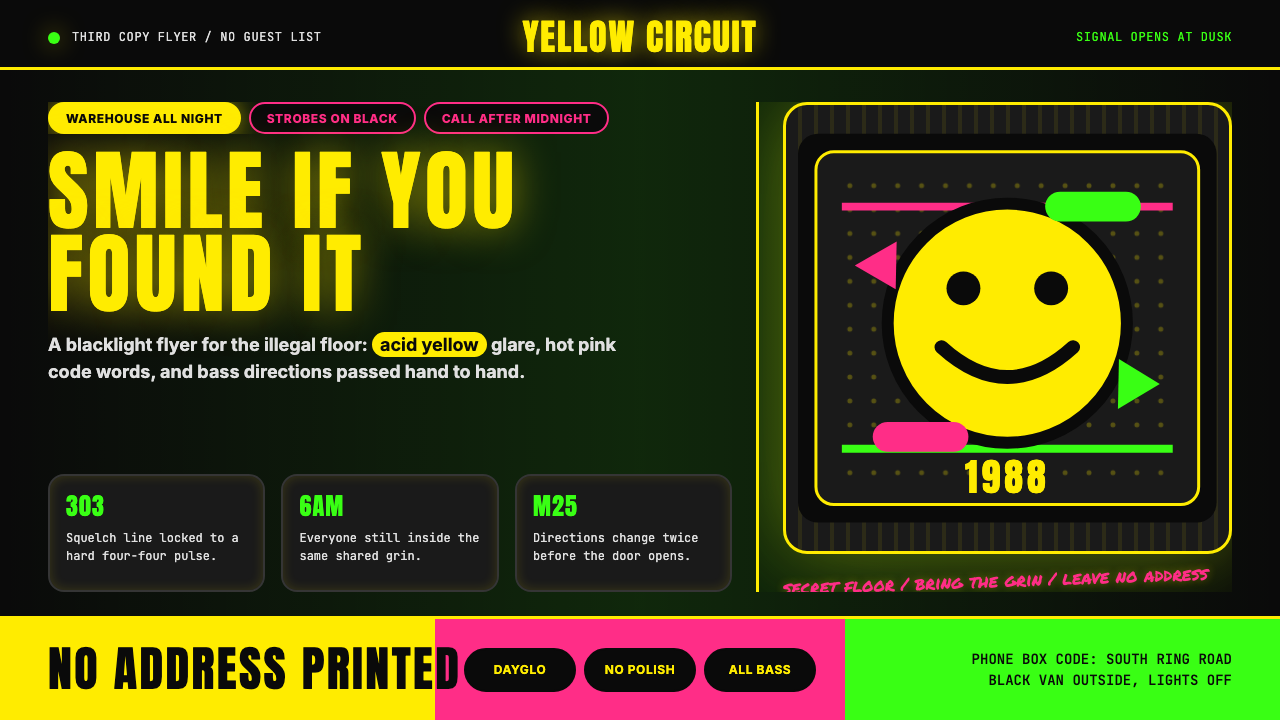 Acid House Smiley (1988)Rave energy hits first. Acid yellow on black, Anton caps, smiley glow.锐舞能量先撞上来。黑底酸黄、Anton大写与笑脸辉光。
 Cartoon Network 90s BlocksKids-cable noise, squared. Black-white checkerboards crash into hot-yellow Bu…方块化的儿童有线电视噪音:黑白棋盘撞上热黄 Bungee 字块。
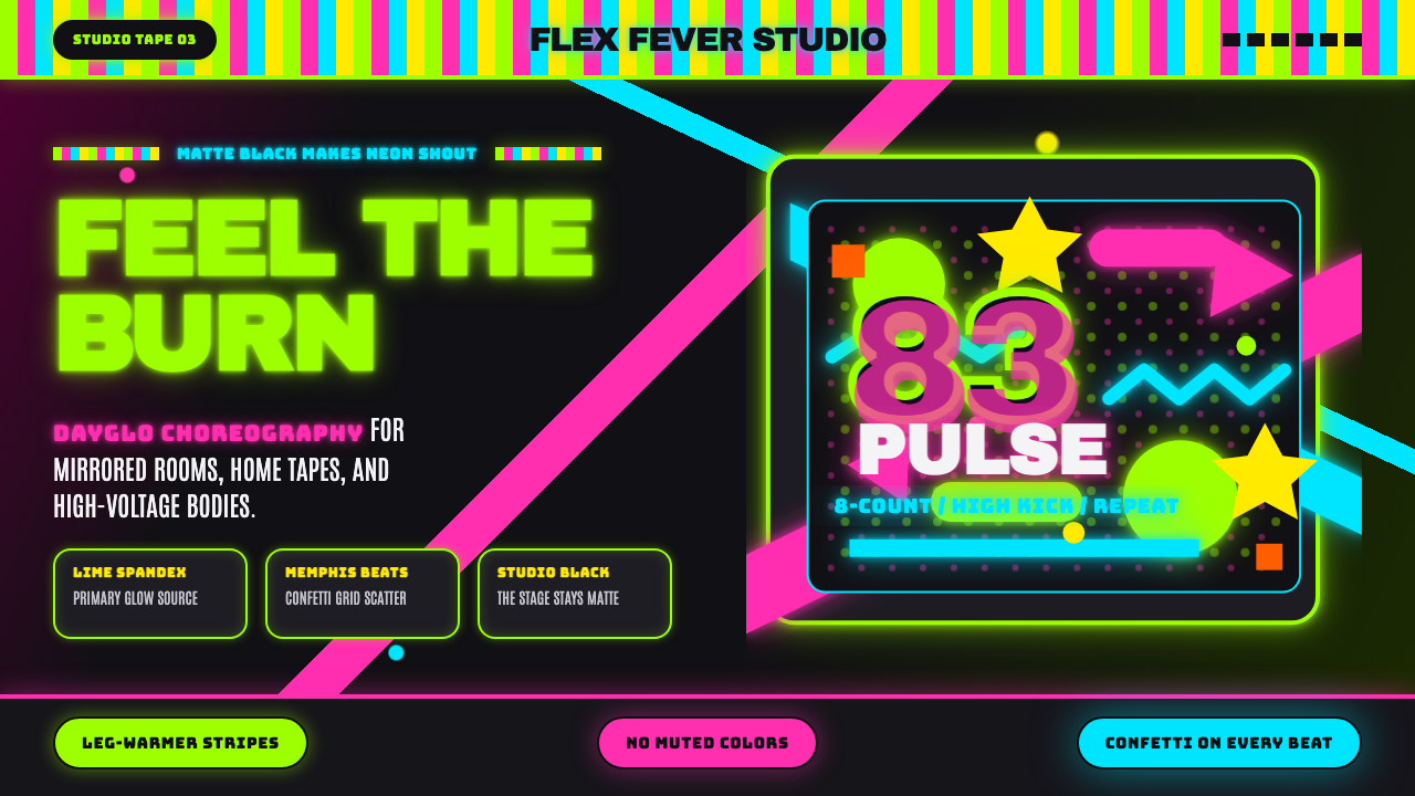 80s Aerobics Fluoro SpandexNeon refuses restraint. Lime spandex, pink-cyan confetti, and black-stage typ…霓虹拒绝克制:荧光绿氨纶、粉蓝彩屑与黑场大字一起燃烧。
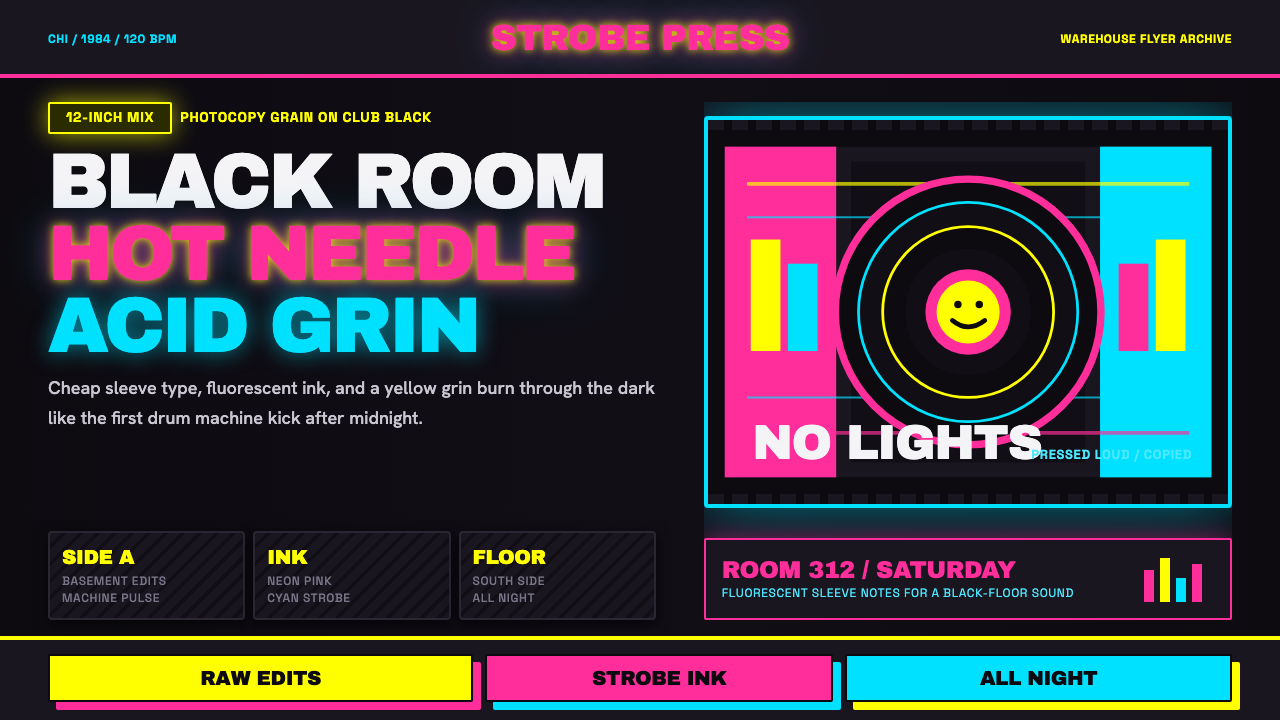 Chicago HouseDarkness starts the track. Neon pink, yellow and cyan hit black like Xerox st…黑暗先起拍。霓虹粉、黄与青打在黑底上,像复印频闪。
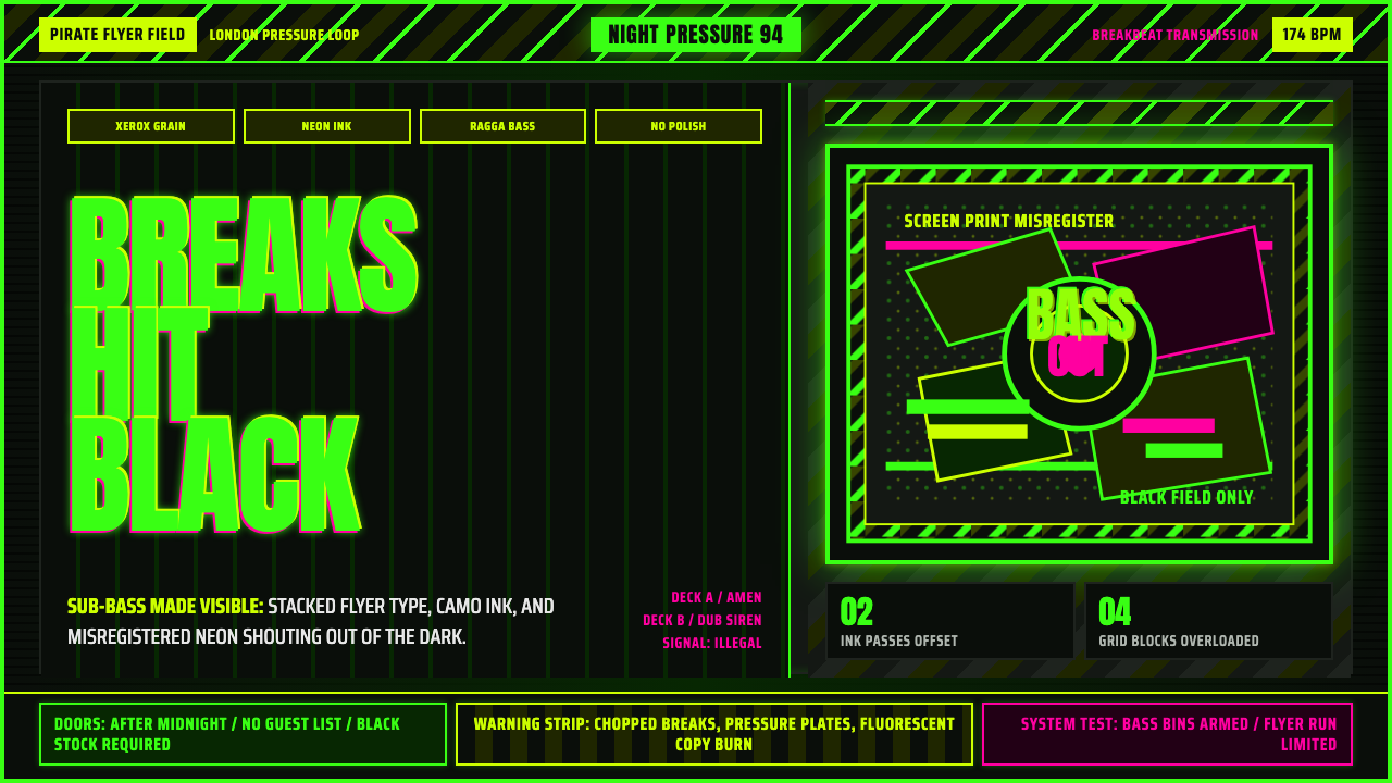 Jungle / Drum & BassRaw rave voltage. Neon green Anton, camo strips, and xerox grain hit black.粗粝锐舞电压。霓虹绿窄体字、迷彩警示条与复印颗粒压上黑底。
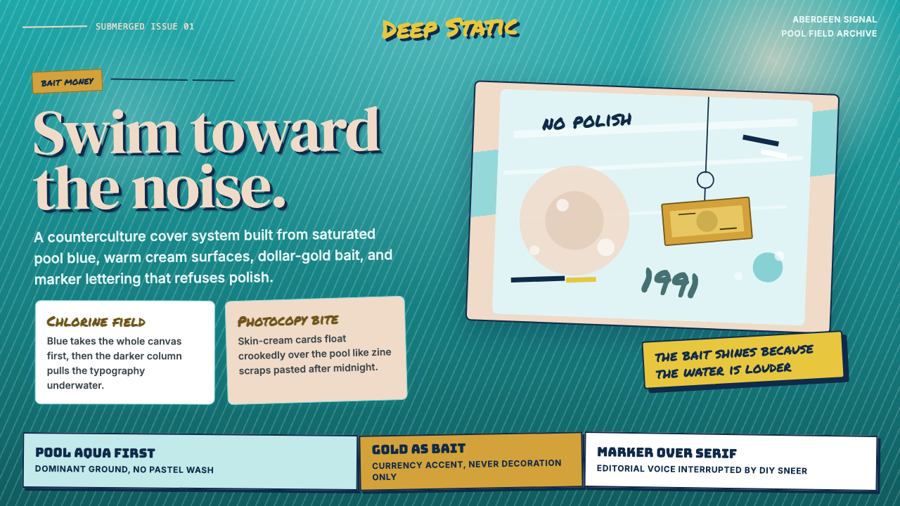 Nirvana — NevermindAnti-pop in pool blue. Cream cards, dollar-gold accents, and marker type roug…泳池蓝里的反主流:乳白卡片、美元金点缀与马克笔字打乱网格。