Design style guide设计风格指南
What is Acid House Smiley (1988)?什么是 Acid House Smiley (1988)?
In the summer of 1988, a bootlegged smiley face and a borrowed beat from Chicago turned London's derelict warehouses into the epicenter of a generation-defining cultural explosion.1988年夏天,一个盗版笑脸图案和一段借来的芝加哥节拍,把伦敦废弃仓库变成了定义一代人的文化爆炸中心。
Acid House Smiley (1988) in briefAcid House Smiley (1988) 速览
Acid House Smiley is a visual language born from the confluence of rave culture, DIY communication, and chemical euphoria on the streets and motorway corridors of late-1980s Britain. Its defining signature is acid yellow — an almost radioactive, dayglo brightness — blazing against absolute black, punctuated by the ubiquitous grinning smiley face that became the movement's universal emblem. The aesthetic is intentionally raw: photocopied textures, chunky all-caps lettering, glow effects that pulse like strobes, and a deliberate roughness that celebrates the artifact of reproduction rather than hiding it.酸屋笑脸是一套诞生于视觉语言,根植于1980年代末英国街头与高速公路走廊的锐舞文化、DIY传播和化学迷幻体验。它最鲜明的标志是酸性黄——一种近乎放射性的荧光明亮感——在绝对的黑色中燃烧,配上那张无处不在的咧嘴笑脸,那个成为整个运动通用符号的图案。这套美学是刻意粗粝的:影印机纹理、粗重的全大写字母、像频闪灯一样跳动的辉光效果,以及一种主动拥抱复制痕迹、而非掩盖它的粗糙感。
Unlike design systems built on refinement and polish, Acid House Smiley wears its lo-fi origins proudly. Every element evokes the third-generation photocopy flyer pinned to a lamppost at midnight — the bleed between ink and paper, the slight misalignment of letterforms, the glow halo that appears when black toner saturates at the edges. The result is a visual register that feels simultaneously urgent and joyful, confrontational and communal. It is the aesthetic of a subculture that had no graphic design budget and needed to be seen anyway.与建立在精致与抛光之上的设计系统不同,酸屋笑脸毫不掩饰地展示自己的低保真起源。每一个元素都让人想起午夜被钉在路灯柱上的第三代影印传单——油墨渗入纸张的晕染,字形略微错位的感觉,黑色碳粉在边缘饱和时产生的辉光光晕。结果是一种视觉语调,同时感觉紧迫又快乐,对抗又有凝聚力。这是一种亚文化的美学——没有平面设计预算,却必须被看见。
The style's emotional core is euphoric immediacy. Where other bold aesthetics achieve impact through precision and control, Acid House Smiley achieves it through release and abandon. The palette — dominated by that electric yellow, deepened by pitch black, and occasionally punctuated by hot pink or laser orange — is chosen not for refinement but for maximum sensory impact at distance and in darkness. The smiley face, stripped of any nuance or irony, becomes a pure vessel for collective joy.这种风格的情感核心是欣喜若狂的即时感。其他粗犷美学通过精确与控制来制造冲击力,酸屋笑脸则通过释放与放纵来实现它。这套色板——以那种电气黄为主导,由深邃的纯黑加深,偶尔以荧光粉或激光橙点缀——不是为了精致而选择,而是为了在远处和黑暗中产生最大的感官冲击。那张笑脸,被剥去一切细微差别和讽刺意味,成为集体欢愉的纯粹容器。
See the Acid House Smiley (1988) design system →查看 Acid House Smiley (1988) 完整设计系统 →
Where does Acid House Smiley (1988) come from?Acid House Smiley (1988) 从何而来?
The story begins not in London but in Ibiza, where in the summer of 1987 a group of British DJs — Danny Rampling, Paul Oakenfold, Nicky Holloway, and others — encountered the hedonistic club culture of the Balearic islands. They returned to Britain carrying records, rhythms, and an altered idea of what a night out could be. Within months, Rampling had opened Shoom in a Southwark fitness center, Oakenfold had launched Future at the Heaven nightclub, and a new sonic and visual world was assembling itself out of borrowed parts. The musical catalyst was Chicago house — specifically the acid bass lines produced by the Roland TB-303, a bass synthesizer originally designed to replace session musicians that instead became the defining instrument of a generation when musicians discovered its capacity for writhing, psychedelic sound.故事的起点不在伦敦,而在伊维萨岛。1987年夏天,一群英国DJ——丹尼·拉姆普林、保罗·奥肯福尔德、尼基·霍洛韦等人——在巴利阿里群岛遭遇了那里的享乐主义俱乐部文化。他们带着唱片、节拍和对于夜生活的全新理解回到英国。数月之内,拉姆普林在萨瑟克区的一家健身中心开了Shoom,奥肯福尔德在Heaven夜店发起了Future,一个由借来的零件拼装而成的新声音与视觉世界正在成形。音乐催化剂是芝加哥浩室——尤其是由罗兰TB-303合成器产生的酸性贝斯线。这台原本设计用来替代会话音乐家的低音合成器,当音乐人发现它能产生蜿蜒扭曲的迷幻音效时,意外成为一代人的标志性乐器。
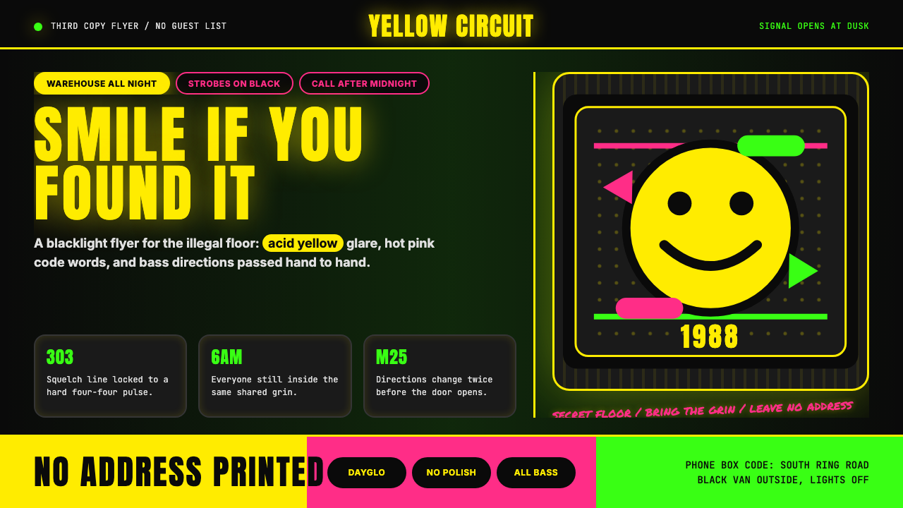
The visual language emerged from necessity. These events were largely illegal — organized in warehouses, disused factories, and fields along the M25 orbital motorway that encircles London — and their promotion relied entirely on word-of-mouth and hand-distributed flyers. There were no budgets for designers or printers. The flyers were produced on photocopiers: a face drawn on paper, some chunky lettering cut from a magazine or hand-stenciled, a phone number that would only be answered hours before the event to give the actual location. The aesthetic of the third-generation photocopy — where blacks bloom and edges lose their sharpness — became inseparable from the culture itself.视觉语言从必要性中浮现。这些活动大多是非法的——在仓库、废弃工厂,以及环绕伦敦的M25高速公路沿线的田野中举办——宣传完全依靠口耳相传和手工分发的传单。没有预算请设计师或印刷商。传单在影印机上制作:一张画在纸上的脸,一些从杂志上裁下或手工模板印出的粗重字母,一个只在活动前几小时才会有人接听的电话号码,用来告知实际地点。第三代影印的美学——黑色晕开、边缘失锐的那种——与这种文化本身变得不可分割。
The smiley face entered the picture through a combination of accident and appropriation. The yellow button badge with its simple grinning face had existed since the 1960s — designed in 1963 by American commercial artist Harvey Ball for an insurance company's morale campaign, then mass-produced and stripped of its original context. By 1988 it had become generic kitsch. DJ Danny Rampling and his collaborators began using it on Shoom flyers and stamps not as a knowing postmodern gesture but as a direct, unambiguous symbol of the euphoric communal feeling the nights were producing. When the tabloid press in Britain caught wind of the scene in late 1988 and began their predictably panicked coverage, they seized on the smiley face as their visual shorthand, inadvertently amplifying it into a national symbol.笑脸图案通过一种偶然与挪用的结合进入了这幅画面。黄色圆形徽章上那张简单咧嘴的笑脸自1960年代便已存在——1963年由美国商业艺术家哈维·鲍尔为一家保险公司的士气活动设计,随后被大量生产并剥离了原始语境。到1988年,它已成为通俗的装饰品。DJ丹尼·拉姆普林和他的合作者开始在Shoom的传单和印章上使用它,不是作为一种后现代姿态,而是对那些夜晚所产生的迷幻集体感受最直接、最明确的符号。1988年底英国小报开始对这个场景进行可预见的恐慌式报道时,他们将笑脸作为视觉速记符号,无意中将其放大为全国性的象征。
The cultural moment peaked during what participants called the Second Summer of Love — a phrase that deliberately echoed 1967 San Francisco and the first counterculture summer — and then ran hard against institutional resistance. The Entertainments (Increased Penalties) Act of 1990 and then the Criminal Justice and Public Order Act of 1994 specifically targeted rave culture, criminalizing gatherings involving music with repetitive beats. Promoters like Mark Pakenham, who organized massive M25 raves reaching tens of thousands of participants, became the focus of police operations. The movement was criminalized rather than contained; it simply mutated, moving indoors to licensed clubs, fragmenting into drum and bass, jungle, garage, and the dozens of micro-genres that constitute British dance music today. The yellow smiley, briefly an emblem of controlled substances and moral panic, is now a staple of emoji keyboards worldwide.这一文化时刻在参与者所称的“第二个爱之夏”达到顶峰——这个短语刻意呼应1967年旧金山的第一个反主流文化之夏——然后猛烈撞上了制度性阻力。1990年的《娱乐(加重处罚)法》和1994年的《刑事司法与公共秩序法》专门针对锐舞文化,将涉及重复节拍音乐的聚会定为刑事犯罪。像马克·帕肯汉姆这样组织了数万人参与的M25锐舞活动的主办者,成为警方行动的焦点。这场运动被定罪而非被遏制;它只是变异了,迁移进有执照的室内俱乐部,分裂成鼓打贝斯、丛林、车库以及构成今日英国舞曲文化的数十个微型流派。那个黄色笑脸,曾短暂地成为管制物质和道德恐慌的符号,如今已是全球表情符号键盘上的标准配置。
What defines the Acid House Smiley (1988) look?Acid House Smiley (1988) 的视觉特征是什么?
Color色彩
The palette is built on maximum contrast: a searing acid yellow — the specific shade associated with dayglo and UV-reactive pigments — set against absolute black. Where secondary colors appear, they lean toward hot pink, laser orange, or electric green, all selected for their visual impact under strobe and blacklight conditions rather than for any ambient coherence. The colors are never muted or graded; they arrive at full saturation, as if overexposed. White rarely appears as a background; when it does, it reads as a negative — a cutout in the black rather than a field in its own right.色板建立在最大对比度之上:一种炽烈的酸性黄——与荧光和紫外线活性颜料相关的特定色调——置于绝对的黑色之中。当辅助色出现时,它们倾向于荧光粉、激光橙或电气绿,这些颜色的选择都是为了在频闪灯和黑光灯条件下产生视觉冲击力,而非为了任何环境和谐。这些颜色从不被柔化或渐变;它们以全饱和度出现,仿佛曝光过度。白色几乎不作为背景出现;一旦出现,它呈现为一种负像——黑色中的一个镂空,而非独立的色域。
Typography字体排印
Text is set entirely in capital letters — the all-caps convention reflects both the urgency of flyer communication and the visual compatibility of upper-case forms with photocopier reproduction, where fine details of lower-case letterforms would be lost. The typefaces favored by the original movement were heavy, expanded sans-serifs — particularly the Anton-style condensed grotesques that fill maximum horizontal space with minimum vertical footprint. Letterspacing is tight, sometimes tracking letters so closely they risk merging, creating a visual density that mirrors the packed warehouse floor. Hierarchy is expressed through size alone; there are no decorative dividers or sub-headers in a different typeface.文字全部以大写字母排列——全大写的惯例既反映了传单传播的紧迫性,也反映了大写字形与影印机复制的视觉兼容性(小写字形的精细细节在复制过程中会丢失)。原始运动偏爱的字体是粗重的展宽无衬线体——尤其是那种Anton式的压缩粗黑体,用最小的垂直占位填满最大的水平空间。字距紧凑,有时字母贴得如此之近以至于面临融合的风险,创造出一种视觉密度,映射着拥挤的仓库舞池。层级仅通过尺寸来表达;没有装饰性分隔线,也没有使用不同字体的副标题。
Glow and Radiation辉光与辐射感
Shadows — in the conventional sense of depth cues — are absent. In their place is the opposite: glow. Elements appear to emit light rather than cast shade. The yellow smiley face blooms outward against black, its edges softened not by a blur applied in post but by the physical overexposure of a fluorescent object under ultraviolet light. This glow effect is the style's primary depth mechanism — it creates the impression that elements float in darkness rather than sit on a surface. Rendered digitally, it is achieved through layered soft-edged halos rather than any single technique, and it must preserve the feeling of organic saturation rather than clean graphic precision.阴影——在传统的深度提示意义上——是缺席的。取而代之的是其对立面:辉光。元素看起来是在发光,而不是投下阴影。黄色笑脸向外扩散绽放在黑色中,其边缘不是被后期处理的模糊软化,而是荧光物体在紫外线照射下物理性过曝的效果。这种辉光效果是这种风格的主要深度机制——它创造出元素漂浮在黑暗中而不是坐落在某个表面上的印象。在数字渲染中,它通过多层柔边光晕而非任何单一技术来实现,必须保留有机饱和感而非清晰的图形精确度。
Photocopy Grain and Roughness影印颗粒感与粗糙质感
The aesthetic does not conceal its origins in reproductive technology — it celebrates them. Grain, bleed, the slight smearing of a photocopied edge, ink saturation at corners: these are not flaws to be removed but qualities to be amplified. The roughness signals authenticity within the subculture's own value system, distinguishing handmade communication from commercial polish. In digital applications, this quality is introduced through noise layers, halftone dots, or subtle misalignment of elements — the deliberate imperfection that makes a designed object feel found rather than constructed.这套美学不掩盖其在复制技术中的起源——它颂扬这些起源。颗粒感、晕染、影印边缘轻微的拖尾、角落处的油墨饱和:这些不是要去除的缺陷,而是要放大的品质。粗糙感在亚文化自身的价值体系中传递真实性,将手工制作的传播与商业抛光区分开来。在数字应用中,这种质感通过噪点层、半调网点或元素的微妙错位来引入——那种刻意的不完美,让设计对象感觉像是被发现的,而不是被构建的。
The Smiley Face as Structural Motif笑脸作为结构性母题
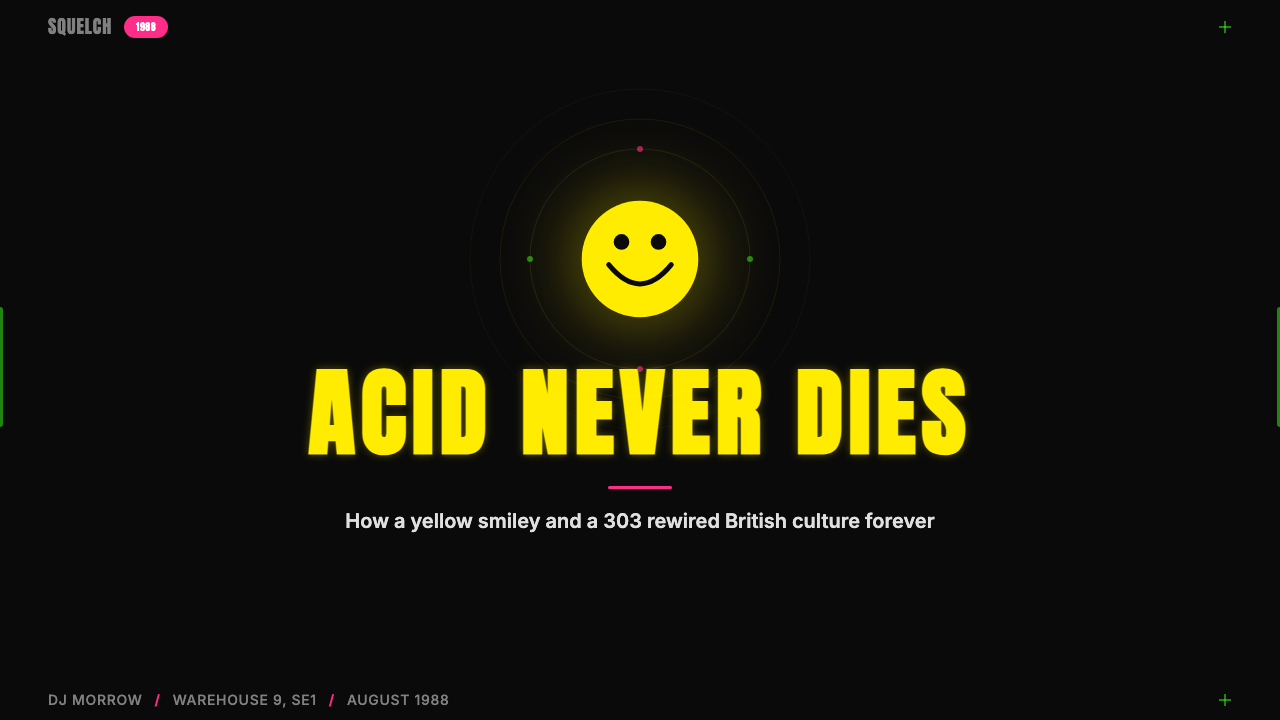
The smiley face in this system is not an illustration or a decorative element — it is a structural anchor. Visually, it functions as a circle with high internal contrast: dark dots for eyes, a curved line for the mouth, against a saturated yellow field, all surrounded by black. Its simplicity makes it infinitely scalable and reproducible without quality loss — equally legible on a small flyer or a warehouse-sized banner. When used at scale, the smiley anchors compositions in the same way a geometric primary form does in other systems: it centers the visual mass and radiates outward through the glow effect.这套系统中的笑脸不是插图或装饰元素——它是结构性的锚点。从视觉上看,它作为一个高内部对比度的圆形运作:饱和黄色底面上的深色眼睛圆点和弧形嘴线,整体被黑色包围。其简洁性使其可以无损地无限缩放和复制——在小传单或仓库大小的横幅上都同样清晰易读。当以大尺寸使用时,笑脸以其他系统中几何基础形的方式锚定构图:它居中支撑视觉重心,并通过辉光效果向外辐射。
Composition: Urgency Over Hierarchy构图:紧迫感优先于层级
Acid House flyers were not designed — they were assembled under pressure, in the hours before an event, for immediate consumption. The compositional logic reflects this: elements are placed for maximum impact at a glance, not for careful sequential reading. The smiley or primary image occupies the center or fills the frame; text wraps around it or runs beneath in a dense block. There are no margins in the conventional sense — content presses to the edges. Secondary information (phone numbers, dates, location codes) is treated as a text block of uniform weight, different from the headline only in size. The overall impression is of a surface saturated with information and energy, with every element competing equally for attention.酸屋传单不是被设计出来的——它们是在压力下拼凑的,在活动前的几个小时内,为了立即消费而制作。构图逻辑反映了这一点:元素的放置是为了一眼之间的最大冲击,而非经过细致的顺序阅读。笑脸或主图像占据中心或充满画面;文字围绕它环绕或在下方密集排列。传统意义上没有页边距——内容压向边缘。次要信息(电话号码、日期、地点代码)被当作统一字重的文字块处理,与标题的区别仅在于尺寸。整体印象是一个被信息和能量所饱和的表面,每个元素都在平等地争夺注意力。
Scale and Repetition尺度与重复
Elements in this system are not drawn from a diverse library — they repeat. The smiley face at multiple sizes, the same typeface in different scales, the same yellow repeated against black in consecutive panels: repetition with variation rather than variety. This reflects both the musical logic of the culture it emerged from (the house track as an extended repetitive loop with small variations) and the practical logic of photocopier flyer production, where a single template could be resized and overprinted efficiently. In contemporary use, this characteristic is an asset: a composition built from repeated identical elements at varying scales achieves rhythm and intensity simultaneously.这套系统中的元素不是从多样化的库中提取的——它们是重复的。以多种尺寸出现的笑脸,以不同大小出现的同一字体,在连续画面中重复在黑色上的相同黄色:带有变奏的重复,而非多样性。这既反映了它所诞生的文化的音乐逻辑(浩室音乐曲目作为带有微小变奏的延伸重复循环),也反映了影印传单制作的实践逻辑(单一模板可以高效地调整大小和叠印)。在当代应用中,这个特征是一种资产:由重复的相同元素以不同尺寸构建的构图,同时实现了节奏感和强度。
See the Acid House Smiley (1988) design system →查看 Acid House Smiley (1988) 完整设计系统 →
Who shaped Acid House Smiley (1988)?谁塑造了 Acid House Smiley (1988)?
Rampling is the DJ most directly responsible for translating the Ibiza experience into London's acid house scene. His club night Shoom, which opened in January 1988 at a Southwark fitness center, was the crucible in which the aesthetic and social conventions of the movement were first established. Shoom's visual identity — hand-stamped smiley faces on the wrist at the door, photocopied flyers with grinning yellow faces — set the template that the broader scene adopted. Rampling's curation was as important as his DJing: he shaped the specific emotional register of the nights, the sense that the space was a temporary autonomous zone where normal social rules were suspended.拉姆普林是最直接将伊维萨岛体验转化为伦敦酸屋场景的DJ。他于1988年1月在萨瑟克区一家健身中心开设的俱乐部之夜Shoom,是这场运动的美学与社会惯例首次确立的熔炉。Shoom的视觉识别——门口在手腕上手工盖章的笑脸印章,印着咧嘴黄色脸孔的影印传单——设定了整个场景随后采用的模板。拉姆普林的策展与他的DJ技艺同等重要:他塑造了这些夜晚特定的情感基调,那种空间是一个正常社会规则被暂停的临时自治区的感觉。
Oakenfold was among the original group of DJs who traveled to Ibiza in 1987 and returned to Britain with a transformed vision of dance culture. His residency at the Heaven nightclub and later at Manchester's Haçienda helped spread the acid house sound and visual language beyond London. Oakenfold's importance is partly strategic: he moved between the underground and the mainstream more fluidly than many of his contemporaries, eventually becoming one of the most commercially successful DJs of the 1990s while maintaining credibility with his original audience. His trajectory mirrors the movement itself — from illegal warehouse to legal venue to global cultural phenomenon.奥肯福尔德是1987年前往伊维萨岛并带着对舞蹈文化的全新愿景回到英国的原始DJ群体之一。他在Heaven夜店和后来在曼彻斯特Haçienda的驻场演出帮助将酸屋音效和视觉语言传播到伦敦以外。奥肯福尔德的重要性部分是战略性的:他在地下与主流之间的游走比许多同代人更为流畅,最终成为1990年代商业上最成功的DJ之一,同时在原始受众中保持了信誉。他的轨迹映照了整个运动本身——从非法仓库到合法场馆再到全球文化现象。
Holloway was the third key figure in the original Ibiza group and the organizer of Special Branch, one of the foundational acid house party series. His contribution was organizational rather than sonic: he understood how to scale the experience, moving from small club nights to events holding thousands of people while maintaining the intimacy and intensity that had characterized the early Shoom nights. The logistical innovation required to organize an illegal event for ten thousand people in a field off the M25 — with generators, sound systems, and information security tight enough to stay ahead of the police — was as significant a cultural contribution as the music.霍洛韦是原始伊维萨岛群体中的第三个关键人物,也是基础性酸屋派对系列Special Branch的组织者。他的贡献是组织性的,而非音乐性的:他理解如何扩大体验规模,从小型俱乐部之夜扩展到容纳数千人的活动,同时保持早期Shoom之夜的亲密感和强度。在M25附近的田野里为一万人组织非法活动所需的后勤创新——发电机、音响系统,以及足够严密以领先警察的信息安全——是与音乐同等重要的文化贡献。
Pakenham was one of the key organizers of the massive M25 motorway raves that defined the peak of the movement in 1988 and 1989, with some events drawing crowds estimated between ten and thirty thousand people. These were not clubs or venues — they were temporary cities assembled in fields, complete with multiple sound systems, market stalls, and their own internal social geography. The scale of these events required an entirely new logistical and visual vocabulary: enormous banners, spray-painted directional signage, and flyers distributed through networks that resembled nothing so much as samizdat publishing. Pakenham became a focus of legal action and the 1994 Criminal Justice Act was partly shaped by the challenge his events presented to conventional policing.帕肯汉姆是定义1988至1989年运动巅峰时期大规模M25高速公路锐舞活动的关键组织者之一,部分活动吸引的人群估计在一万到三万人之间。这些不是俱乐部或场馆——它们是在田野中临时搭建的城市,配有多套音响系统、市集摊位和自己内部的社会地理结构。这些活动的规模需要全新的后勤与视觉词汇:巨大的横幅、喷漆指路标识,以及通过类似地下出版网络分发的传单。帕肯汉姆成为法律行动的焦点,1994年的《刑事司法法》在一定程度上是被他的活动对传统警务构成的挑战所塑造的。
Ball designed the original smiley face in 1963 for the State Mutual Life Assurance Company in Worcester, Massachusetts — a simple circular badge intended to boost employee morale following a corporate merger. He was paid a reported forty-five dollars for the design and never trademarked it. By the 1970s the design had been mass-produced by the billions and had entered the global visual commons. His presence in this story is significant precisely because of his absence from it: the smiley that became the symbol of acid house was divorced entirely from its origin. Ball's cheerful corporate morale emblem was transformed by context, chemistry, and collective experience into something he could never have intended — a symbol of collective abandon and subcultural defiance.鲍尔于1963年为马萨诸塞州伍斯特的州互助人寿保险公司设计了原始笑脸——一个意在企业并购后提振员工士气的简单圆形徽章。据报道他获得了四十五美元的报酬,且从未为该设计申请商标。到1970年代,这个设计已被大量生产出数十亿个,进入了全球视觉公共领域。他在这段历史中的存在,恰恰因为他的缺席而显得意味深长:成为酸屋象征的笑脸与其起源完全割裂。鲍尔那个欢快的企业士气徽章,被语境、化学物质和集体体验转化成了他永远无法预料的东西——集体放纵与亚文化反抗的象征。
How do you use Acid House Smiley (1988) today?今天怎么用 Acid House Smiley (1988)?
Acid House Smiley is one of the most directionally specific styles in the library — its tonal range is narrow but intense. It works with extraordinary force in contexts where the goal is immediacy, energy, and a kind of joyful confrontation: event promotion, night-time brand experiences, music-adjacent products, and anything that wants to signal authenticity within youth and underground culture. It works less well — and should be used with caution — in contexts that require trust-building over time, professional authority, or visual warmth. The acid yellow on black carries inherent associations with nightlife, altered states, and subcultural resistance. These are powerful associations; they are also limiting ones.酸屋笑脸是本库中方向性最明确的风格之一——其调性范围窄但强烈。在目标是即时感、能量和某种欢愉对抗的场景中,它表现出非凡的力量:活动推广、夜间品牌体验、音乐周边产品,以及任何想要在青年和地下文化中传递真实性信号的事物。在需要随时间建立信任、专业权威或视觉温暖的场景中,它表现较差——应谨慎使用。黑色上的酸性黄携带着与夜生活、改变意识状态和亚文化抵抗相关的内在联想。这些是强有力的联想;但也是具有局限性的联想。
For presentation slides, this style is most effective when used for covers and section breaks rather than extended content. A cover built on acid yellow and black with the smiley face large and centered creates an immediate and memorable first impression. The challenge is the content slides: extended body text in this aesthetic becomes fatiguing quickly, and the all-caps convention that the style demands reads as aggressive over long passages. The practical solution is to use the aesthetic selectively — establish it on the cover and major dividers, then transition to a stripped-down version on content pages that retains the color palette but reduces the density and glow effects. Data slides work well with this approach: dark backgrounds with electric yellow accent bars or lines create genuine visual drama without overwhelming the data itself.对于演示文稿幻灯片,这种风格在封面和章节分隔处比在延伸内容中更为有效。以酸性黄和黑色为基础、笑脸大而居中的封面会创造立即且令人难忘的第一印象。挑战在于内容页:这种美学中的延伸正文很快会让人疲惫,这种风格要求的全大写惯例在长段落中读起来会显得咄咄逼人。实际的解决方案是有选择地使用这种美学——在封面和主要分隔处建立它,然后在内容页过渡到保留色板但减少密度和辉光效果的精简版本。数据幻灯片在这种方法中表现良好:带有电气黄强调条或线条的深色背景能创造真实的视觉戏剧感,而不会淹没数据本身。
For web interfaces and digital products, this style is best suited to landing pages, event microsites, and marketing one-pagers rather than functional application interfaces. A dashboard built entirely on this aesthetic would be exhausting to use for extended periods — the high contrast and glow effects that make it compelling at a glance create visual fatigue over hours of use. Used selectively, however — as the palette for a dark mode that users can toggle, or as the visual language for empty states, celebrations, and high-impact notifications — it can energize an otherwise neutral interface without dominating it.对于网页界面和数字产品,这种风格最适合落地页、活动微型网站和营销单页,而非功能性应用界面。一个完全建立在这种美学上的仪表板在长时间使用后会令人疲惫——使其一瞥之间引人入胜的高对比度和辉光效果在数小时的使用中会造成视觉疲劳。然而,有选择地使用——作为用户可以切换的深色模式的色板,或作为空状态、庆祝时刻和高冲击力通知的视觉语言——它可以在不主导界面的情况下为原本中性的界面注入活力。
For editorial and marketing work, the style excels in contexts where the reader relationship is participatory rather than authoritative. Music journalism, cultural event programs, festival branding, and nightlife-adjacent hospitality are natural homes. The key restraint is hierarchy: because the style pushes every element toward maximum saturation and impact, maintaining readable information hierarchy requires deliberate counterforce — significant size differentials between heading and body text, clear spatial separation between information blocks, and a willingness to let the background black do the work that white space normally does.对于编辑与营销工作,这种风格在读者关系是参与性而非权威性的场景中表现出色。音乐新闻、文化活动节目册、节日品牌和夜生活相邻的酒店款待业是其天然家园。关键的克制在于层级:由于这种风格将每个元素推向最大饱和度和冲击力,维持可读的信息层级需要刻意的反向力量——标题与正文之间显著的尺寸差异,信息块之间清晰的空间分隔,以及愿意让背景黑色承担白色空间通常承担的工作。
The most common mistake when applying this style is softening it into acceptability — using pastel yellows instead of acid yellows, introducing soft shadows to reduce the harshness, smoothing the grain. These adjustments are understandable as attempts to broaden the audience, but they reliably destroy what makes the style interesting. Acid House Smiley's power comes precisely from its refusal to be comfortable. A second common error is deploying the smiley face as decoration rather than as structural anchor: scattered small smileys across a layout read as clip art rather than as the central organizing motif the style demands. Use it large, use it centrally, or do not use it at all.应用这种风格时最常见的错误是将其柔化成可接受性——使用粉彩黄代替酸性黄,引入柔和阴影以减少刺目感,平滑颗粒质感。这些调整是可以理解的扩大受众的尝试,但它们可靠地摧毁了使这种风格有趣的东西。酸屋笑脸的力量恰恰来自它拒绝让人舒适。第二个常见错误是将笑脸作为装饰而非结构性锚点部署:在版面上散布小笑脸读起来像剪贴画,而非这种风格要求的核心组织母题。要么大用、要么居中用,要么根本不用。
See the Acid House Smiley (1988) design system →查看 Acid House Smiley (1988) 完整设计系统 →
Acid House Smiley (1988) — FAQAcid House Smiley (1988) · 常见问题
Is Acid House Smiley appropriate for commercial brands, or is it too subcultural?酸屋笑脸适合商业品牌使用吗,还是说它太过亚文化?
It depends entirely on what the brand wants to signal. The style has been successfully adopted by mainstream fashion, streetwear, music streaming platforms, and festival brands — contexts where the association with youth culture, energy, and underground authenticity is a commercial asset. It works less well for brands that need to convey stability, expertise, or institutional trust. The key question is not whether the brand is commercial but whether its target relationship with its audience is participatory and peer-level. A bank should not use this style. A festival ticket platform, a music label, or a streetwear brand might find it precisely right.这完全取决于品牌想要传递什么信号。这种风格已被主流时尚、街头服饰、音乐流媒体平台和节日品牌成功采用——在这些场景中,与青年文化、能量和地下真实性的关联是商业资产。对于需要传递稳定性、专业知识或机构信任的品牌,它表现较差。关键问题不是品牌是否商业化,而是它与受众的目标关系是否是参与性和平等性的。银行不应该使用这种风格。音乐节票务平台、音乐厂牌或街头服饰品牌可能会发现它恰到好处。
How does this style differ from other high-contrast dark aesthetics like cyberpunk or vaporwave?这种风格与赛博朋克或蒸汽波等其他高对比度深色美学有何不同?
All three are dark-background, high-contrast aesthetics rooted in specific subcultural moments, but their emotional registers are distinct. Cyberpunk tends toward cool blues, greens, and purples — the palette of surveillance, technology, and dystopian alienation. Vaporwave is pastel, nostalgic, and ironic — the aesthetic of late-capitalist melancholy softened by retromania. Acid House Smiley is warm, communal, and ecstatic — its yellow is not the yellow of caution or technology but of daytime euphoria transported into darkness. The smiley face is the key differentiator: it is the most purely joyful symbol in the visual vocabulary, stripped of irony, and that unironic joy is what makes this style unique among dark aesthetics.三者都是深色背景、高对比度的美学,根植于特定的亚文化时刻,但它们的情感调性截然不同。赛博朋克倾向于冷酷的蓝色、绿色和紫色——监控、技术和反乌托邦异化的色板。蒸汽波是柔和色调的、怀旧的和讽刺的——被复古狂热柔化的晚期资本主义忧郁的美学。酸屋笑脸是温暖的、共同体性的和狂喜的——其黄色不是警示或技术的黄色,而是被带入黑暗中的白昼欣喜。笑脸是关键的差异化因素:它是视觉词汇中最纯粹的欢乐符号,被剥去了讽刺意味,正是这种不带讽刺的欢愉使这种风格在深色美学中独一无二。
Can this style work on light backgrounds, or is the dark background essential?这种风格能在浅色背景上使用吗,还是说深色背景是必不可少的?
The dark background is not merely a preference — it is structural to how the style works. The glow effect that gives the style its signature quality requires darkness to read: a glowing smiley on black looks like it is emitting light; the same treatment on white looks like a blurred print. The acid yellow, which is the style's defining color, reads as electric and intense against black and as simply yellow against white — the psychological impact is substantially diminished. A light-background variant is possible but it becomes a different aesthetic entirely: more pop art than rave, more graphic design reference than subcultural artifact. If a light background is genuinely required by the context, consider whether a different style better serves the project.深色背景不仅仅是一种偏好——它对这种风格的运作方式来说是结构性的。使这种风格具有标志性品质的辉光效果需要黑暗才能发挥作用:黑色上发光的笑脸看起来像是在发光;同样的处理在白色上看起来像是模糊的印刷。酸性黄——这种风格的决定性颜色——在黑色上读起来是电气性的、强烈的,而在白色上只是简单的黄色——心理冲击力大大削弱。浅色背景变体是可能的,但它会成为一种完全不同的美学:更像波普艺术而非锐舞,更像平面设计参考而非亚文化产物。如果场景确实需要浅色背景,请考虑是否有其他风格更好地服务于该项目。
How do I use the repetition characteristic without making the design feel monotonous?如何使用重复这一特征而不让设计感觉单调?
The key is variation in scale rather than variation in element. Acid House Smiley uses the same small vocabulary — yellow, black, the smiley, heavy caps — repeated across the composition, but the repetition generates rhythm rather than monotony because the elements appear at radically different sizes. A composition might feature one enormous smiley face filling most of the frame, a medium smiley at the corner, and several small ones scattered in the negative space. The size differential creates hierarchy and movement even when every element is identical in color and form. What to avoid is elements repeated at the same size, which does produce the monotony the style otherwise avoids. Think of it as the visual equivalent of a house music loop: the same elements cycling, but each appearance at a different level of intensity.关键在于尺度的变化,而非元素的变化。酸屋笑脸在构图中重复使用同一套小型词汇——黄色、黑色、笑脸、粗重大写——但这种重复产生的是节奏而非单调,因为这些元素以截然不同的尺寸出现。一个构图可能包含一个充满大部分画面的巨大笑脸、一个角落处的中等笑脸,以及几个散落在负空间中的小笑脸。即使每个元素在色彩和形式上都完全相同,尺寸差异也会创造层级感和动态感。要避免的是以相同尺寸重复的元素,那确实会产生这种风格本应避免的单调感。把它想象成浩室音乐循环的视觉等价物:相同的元素循环,但每次出现的强度级别不同。
What happened to the original acid house scene, and does using this style carry any cultural baggage?原始酸屋场景发生了什么,使用这种风格会带来任何文化包袱吗?
The original scene was criminalized by British legislation in the early 1990s, which scattered rather than destroyed it — the culture simply moved indoors and fragmented into the dozen-plus micro-genres that define British electronic music today. The cultural baggage is real but manageable. The style is historically associated with MDMA use, which gave rise to the tabloid moral panic that defined the movement's public image. In contemporary use, the direct drug connotation has faded: the yellow smiley face is now a global emoji, the music has been absorbed into mainstream pop culture, and the aesthetic reads primarily as energetic, nostalgic, and joyful rather than specifically pharmaceutical. There are contexts — healthcare, education for young children, corporate communications — where the historical associations remain live enough to make the style an inadvisable choice. For most cultural and commercial contexts, however, the aesthetic has passed into the general vocabulary of expressive design, and its origins are now part of its richness rather than a liability.原始场景被1990年代初的英国立法定罪,这分散而非摧毁了它——这种文化只是迁移进室内,分裂成定义今日英国电子音乐的十余个微型流派。文化包袱是真实存在的,但可以管理。这种风格在历史上与摇头丸使用相关,这引发了定义该运动公众形象的小报道德恐慌。在当代应用中,直接的毒品联想已经消退:黄色笑脸现在是全球表情符号,这种音乐已被主流流行文化吸收,这种美学读起来主要是充满能量的、怀旧的和欢快的,而非特定地与药物相关。在某些场景中——医疗保健、儿童早期教育、企业传播——历史联想仍然足够鲜活,使这种风格成为不明智的选择。然而对于大多数文化和商业场景,这种美学已进入表达性设计的一般词汇,其起源现在是其丰富性的一部分,而非负担。
Related design styles相关设计风格
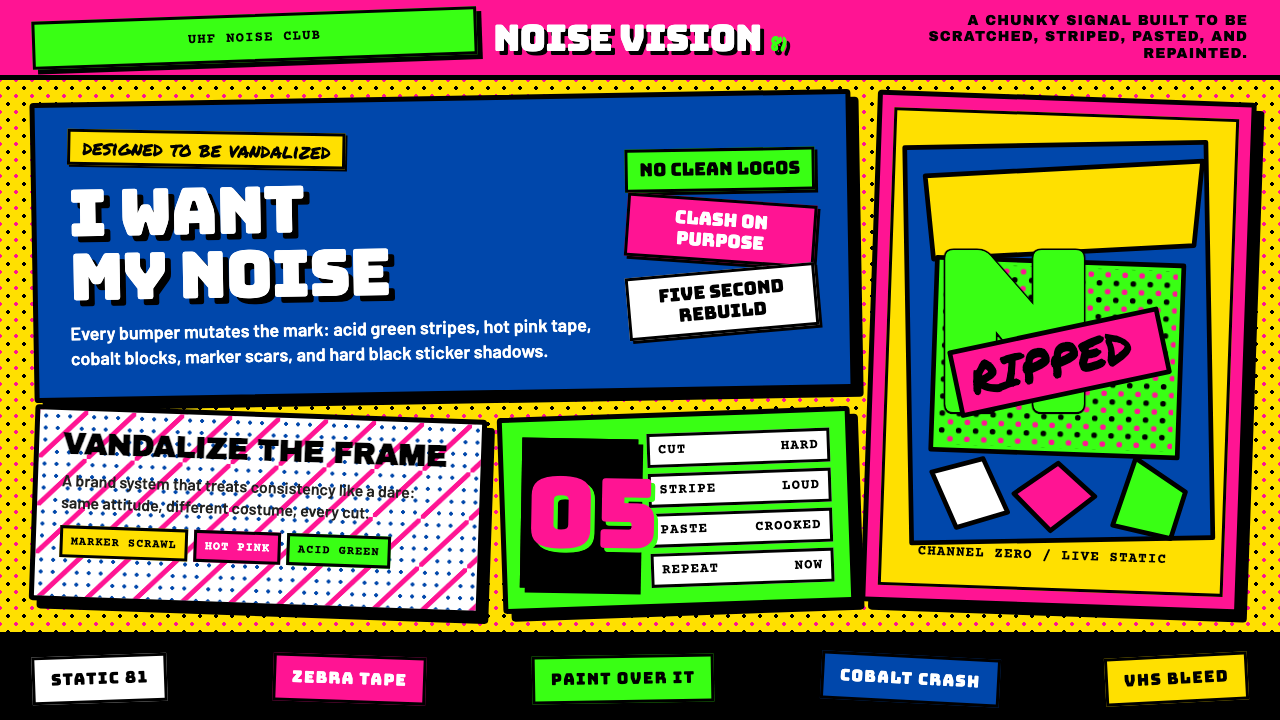 MTV Launch Identity (1981)Built to be vandalized. Hot pink, acid green, Bungee blocks, and crooked stic…天生被涂鸦:热粉酸绿、Bungee方块字与歪贴纸黑框。
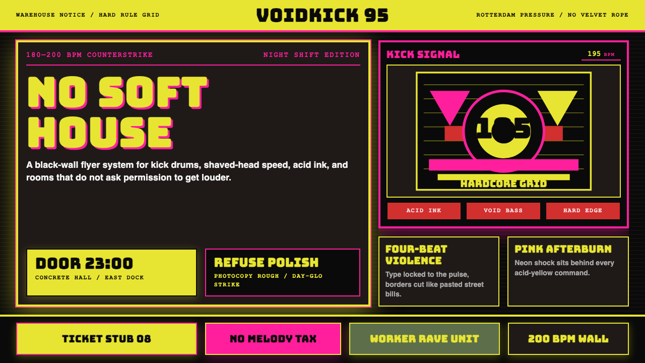 Rotterdam Gabber HardcoreHardcore refuses polish. Acid yellow, neon pink, black grid, and brutal Bunge…硬核拒绝精致:酸黄、霓虹粉与黑色网格,让粗暴 Bungee 字体像传单砸来。
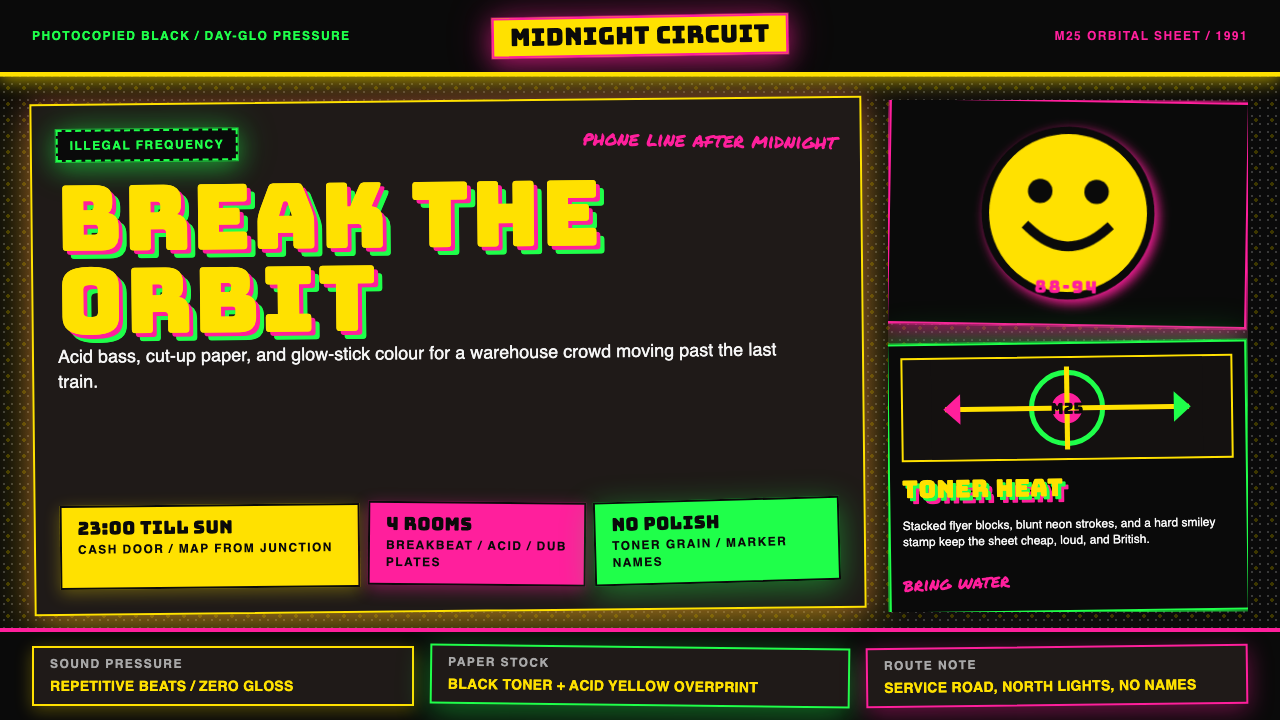 UK Rave Glow-Stick FlyerIllicit euphoria. Acid yellow, rave pink, and laser green slam into photocopi…非法狂喜。荧光黄、粉、绿撞上复印黑。
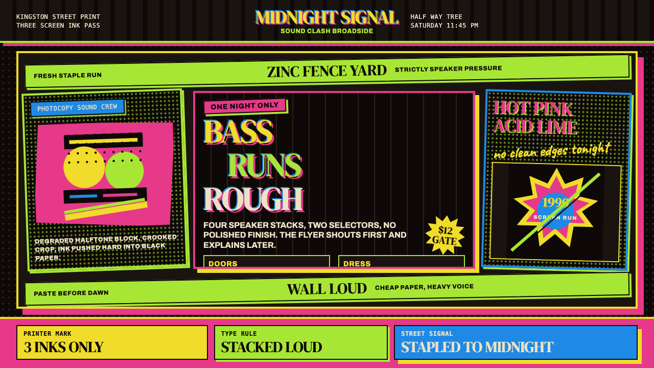 Jamaican Dancehall 1990 PosterMidnight volume. Acid lime and hot pink type stack like screenprint ink on bl…午夜音量:酸绿与热粉粗字叠在黑新闻纸上,如丝印错位。
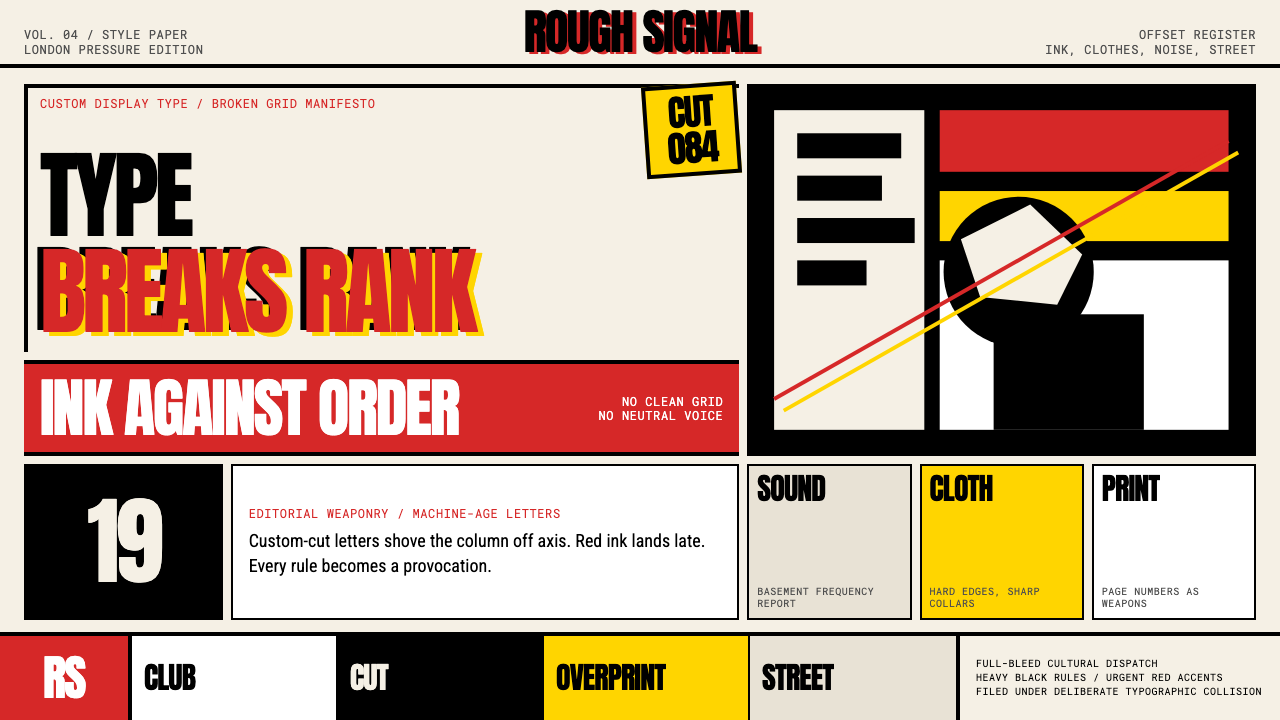 Neville Brody The FaceType mutinies on paper. Cream stock, black rules, urgent red overprint, broke…文字在纸上叛变:奶油纸、黑粗线、急促红色套印和破碎网格。
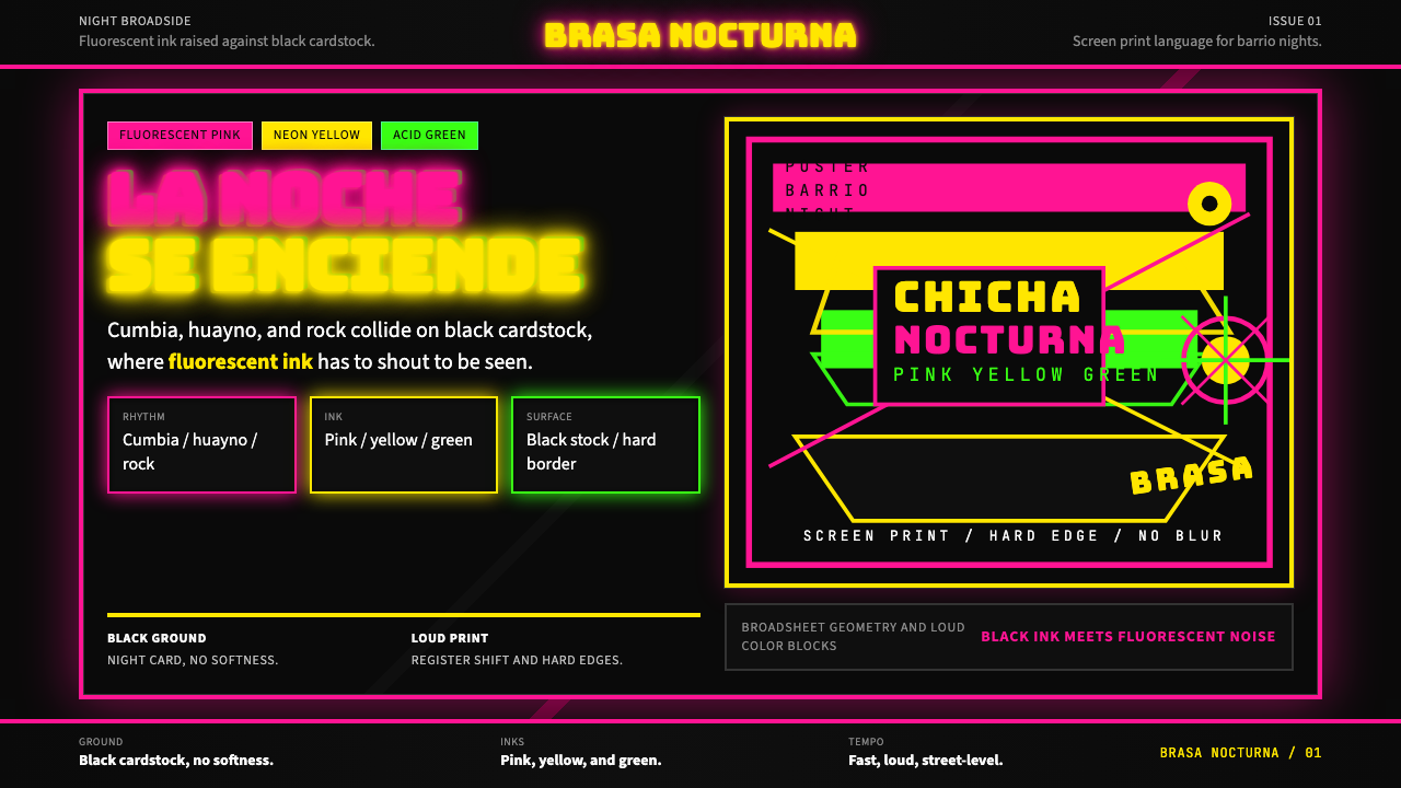 Peruvian Chicha Fluorescent PosterStreet-night fury. Pink, yellow, and green stack on black cardstock in hard b…夜街怒吼。粉黄绿硬边叠在黑卡纸上。