What is Rotterdam Gabber Hardcore?什么是 Rotterdam Gabber Hardcore?
Rotterdam gabber turned 180 BPM rage and photocopier grime into a visual language so loud it practically bleeds through the page.鹿特丹 gabber 将 180 BPM 的愤怒与复印机的粗砺,熔铸成一套响亮到近乎渗血的视觉语言。
Rotterdam Gabber Hardcore in briefRotterdam Gabber Hardcore 速览
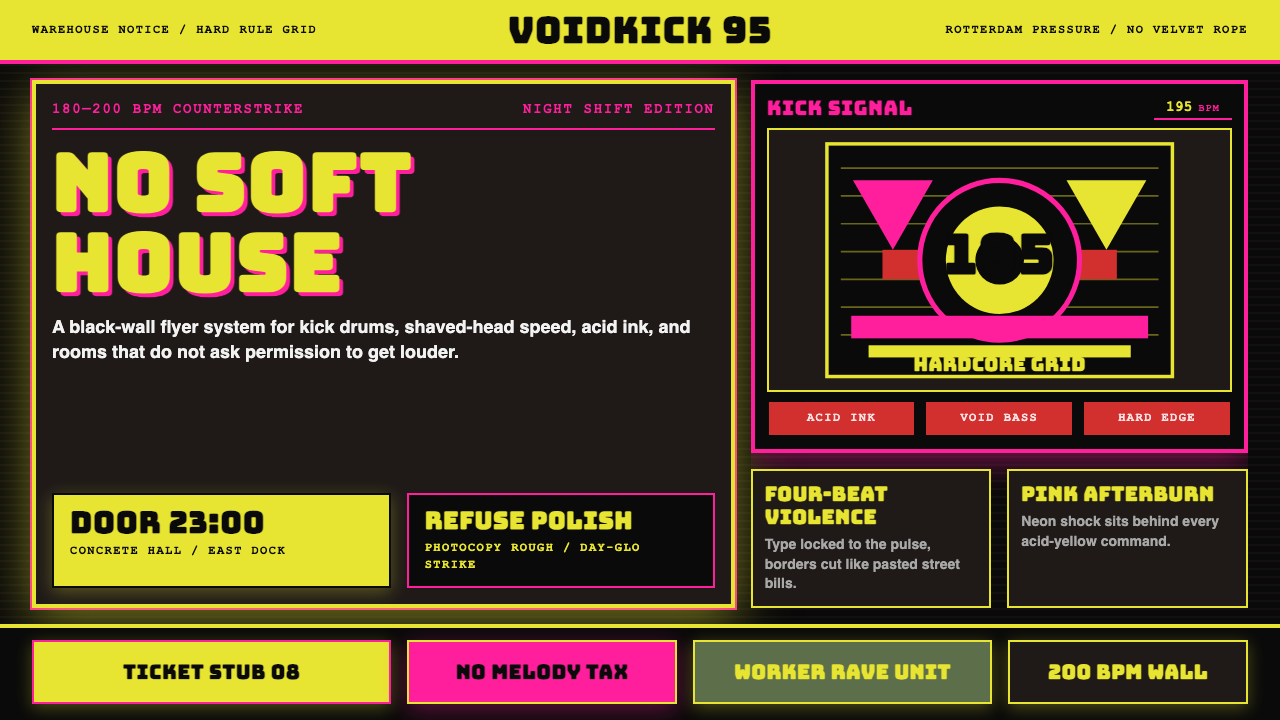
Rotterdam Gabber Hardcore is the visual identity of Dutch hardcore-techno — a subcultural graphic language born in the early 1990s from festival flyers, record sleeves, and the brutalist rave-graphic production of labels like Mokum Records and event giants ID&T and Thunderdome. It is a design system built for impact at the expense of elegance: deep black voids, acid-yellow shock, neon-pink Day-Glo collision, and monumental display type that hits the eye like a fist.鹿特丹 Gabber Hardcore 是荷兰硬核电子乐的视觉身份——一套诞生于1990年代初期的亚文化平面语言,来自 Mokum Records、ID&T 和 Thunderdome 的音乐节传单、唱片封面与野蛮派 rave 平面设计。它是一套以冲击力换取优雅的设计系统:深邃的黑色虚空、酸黄色的电击、霓虹粉的荧光碰撞,以及如拳头砸入眼球般的巨型展示字体。
Where mainstream electronic music design in the same era gravitated toward smooth gradients, glossy finishes, and polished futurism, gabber went the other direction entirely. It absorbed the visual DNA of street punk photocopied zines, football-club ultras graphics, and industrial-era warning signage — loud, repetitive, aggressive, and proud to be working-class. The aesthetic is unapologetically crude: distressed textures, halftone blowouts, type that screams rather than speaks.同期主流电子音乐视觉设计倾向于光滑的渐变、光亮的表面与精致的未来主义,而 gabber 走向了完全相反的方向。它吸收了街头朋克复印传单、足球流氓团体图形以及工业时代警示标牌的视觉 DNA——响亮、重复、攻击性强,并以工人阶级身份为傲。这套美学毫无道歉地粗粝:受损质感、半调爆破、嘶吼而非言语的字体排版。
Today the style occupies a curious double life. In its original context — vinyl sleeves, flyer stacks, raver patches — it remains a living subcultural artifact. In contemporary design practice, it has been rediscovered as a source of raw visual energy, applied to streetwear, editorial spreads, festival branding, and digital campaigns that want to project authenticity, speed, and confrontational confidence.今天,这种风格过着奇特的双重生活。在其原生语境中——黑胶唱片封套、传单堆、狂欢者臂章——它仍然是活态的亚文化遗产。在当代设计实践中,它已被重新发现,作为原始视觉能量的来源,被应用于街头服饰、编辑版面、音乐节品牌设计与数字营销活动,用以传递真实感、速度感和对抗性的自信。
See the Rotterdam Gabber Hardcore design system查看 Rotterdam Gabber Hardcore 完整设计系统
Where does Rotterdam Gabber Hardcore come from?Rotterdam Gabber Hardcore 从何而来?
The story of gabber design begins not with a studio but with a divide. In the late 1980s and early 1990s, Amsterdam's dance scene had settled into a relatively polished house-music identity — cosmopolitan, glossy, internationally connected. Rotterdam, the port city to the south, wanted nothing to do with it. Rotterdam had a working-class industrial identity, a massive immigrant population concentrated in neighborhoods like Spangen and Crooswijk, and a youth culture that found Amsterdam's scene too soft, too expensive, and too remote from everyday life.Gabber 视觉设计的故事,开始于一场地域性的分裂,而非某个设计工作室。1980年代末至1990年代初,阿姆斯特丹的舞曲现场已形成相对精致的 house 音乐身份——国际化、光鲜亮丽、与全球紧密连接。南部港口城市鹿特丹与此毫无共鸣。鹿特丹有工人阶级的工业身份、大量聚居于 Spangen 和 Crooswijk 等街区的移民群体,以及一种认为阿姆斯特丹场景过于软弱、过于昂贵、与日常生活过于疏远的青年文化。
Out of this friction came hardcore-techno — music pushed to 180, 190, even 200 beats per minute, with kick drums so distorted they resembled industrial machinery more than musical instruments. The promoters and labels who organized this scene — Mokum Records, founded in Amsterdam but quickly adopted by Rotterdam's crowd; ID&T, producers of the Thunderdome compilation series beginning in 1992 — needed visual identities that matched the music's ferocity. The result was a graphic language developed largely by unknown designers working under extreme deadline pressure, printing thousands of flyers on cheap photocopiers or on offset presses at low cost.由这一摩擦诞生了硬核电子乐——音乐被推到 180、190 甚至 200 BPM,底鼓声如此失真,更像工业机械而非乐器。组织这个场景的厂牌与主办方——Mokum Records(创立于阿姆斯特丹,很快被鹿特丹群体收编)、从1992年开始出品 Thunderdome 系列专辑的 ID&T——需要匹配音乐凶猛度的视觉身份。最终的结果是一套平面语言,主要由在极端截止日期压力下工作的无名设计师们发展而来,他们在廉价复印机上或以低成本胶印机印制数千张传单。
The visual grammar that emerged was shaped by material constraints as much as artistic intention. Cheap printing meant limited color runs — often two colors, sometimes three — which forced designers to maximize contrast. Black was always the dominant field; acid yellow and neon pink were chosen because they reproduced cleanly even on poor-quality paper stocks and held their punch even in small format. Type had to be legible at a glance in a club or on a street pole, which pushed designers toward the heaviest, widest condensed display faces available, many of them originally designed for sports-equipment branding or construction signage.这套视觉语法的形成,受制于材料条件与艺术意图的双重塑造。廉价印刷意味着有限的色数——往往只有两色,有时三色——这迫使设计师最大化对比。黑色始终是主导底色;酸黄与霓虹粉之所以被选用,是因为即便在劣质纸张上也能清晰复制,即便在小格式上也能保持视觉冲击力。字体必须在俱乐部里或街边灯柱上一眼可读,这将设计师推向当时最粗重、最宽扁的压缩展示字体,其中许多最初是为运动装备品牌或建筑工地标识而设计的。
Thunderdome, which began as a compilation series in 1992 and grew into the Netherlands' largest hardcore festival, became the style's most visible public showcase. Each Thunderdome release carried sleeve artwork that codified the aesthetic: a black ground, a central image rendered in extreme contrast (often a skull, a warrior figure, or an abstract explosion of shape), acid-yellow titling in a condensed display face, and a dense information block for track listings squeezed into a fraction of the available space. Paul Elstak, DJ Promo, The Prophet, and Sandra Welk were among the artists and producers whose names became inseparable from this visual era, their releases acting as recurring proof-of-concept for how brutal the palette could be pushed while retaining immediate legibility.Thunderdome 始于1992年的系列专辑,后成长为荷兰最大的硬核音乐节,成为这种风格最具公众能见度的展示台。每张 Thunderdome 专辑封面都将这套美学法典化:黑色底面、以极端对比度处理的中心图像(常为骷髅头、战士形象或抽象形状爆炸)、压缩展示字体排布的酸黄色标题,以及将曲目列表塞进有限空间的密集信息块。Paul Elstak、DJ Promo、The Prophet、Sandra Welk 等艺术家与制作人的名字,与这个视觉时代密不可分,他们的作品反复证明了这套色板在保持即时可读性的同时还能推进到多么野蛮的极限。
What defines the Rotterdam Gabber Hardcore look?Rotterdam Gabber Hardcore 的视觉特征是什么?
Color色彩
The palette is built on a foundation of absolute black, against which acid yellow and neon pink are deployed as maximum-contrast shock accents. These are not colors chosen for harmony or refinement — they are chosen for visibility, for the ability to burn through bad printing and register on the eye at ten meters. White appears only as a secondary structural element, used to separate dense information blocks from the surrounding darkness. The overall chromatic effect is less a designed palette than an alarm signal.这套色板以纯粹的黑色为地基,在其上以酸黄与霓虹粉作为最大对比度的冲击强调色。这些颜色的选择依据不是和谐或精致,而是可见性——能够穿透劣质印刷、在十米开外仍能击中眼球的能力。白色仅作为次要结构元素出现,用于从周围黑暗中分离出密集的信息块。整体色彩效果与其说是精心设计的色板,不如说是一枚警报信号。
Typography字体排印
Display type in the gabber idiom is monumental and merciless. The characteristic letterforms are ultra-heavy condensed or expanded faces — wide stroke, compressed width, minimal counter space — that read as blocks of visual force before they resolve into individual letters. Type is set at scales that dominate the entire composition; a headline might occupy more than half the total vertical space. Body information, where it exists at all, is set in a contrasting utilitarian face at the smallest readable size, creating a sharp two-register system with nothing in between.Gabber 语境下的展示字体宏大而毫不留情。其标志性字形是超粗压缩或扩展字体——粗笔画、压缩字宽、极小的内部空间——在让人辨认出单个字母之前,它们首先作为视觉力量的块面被感知。字体以主导整个构图的尺度排布,标题可能占据版面超过一半的纵向空间。正文信息(若有的话)以最小可读尺寸排设在对比性的实用字体中,制造出一套两极分化的层级系统,中间毫无过渡。
Texture and Distress质感与损伤
Clean printing was never the goal. Gabber graphics embrace the artifacts of cheap reproduction: halftone dot-blow, photocopier grain, ink spread on absorbent stock, registration misalignment. These are not simulated imperfections added for nostalgic effect — in the original material they were simply what happened when the budget ran out before the press check. In contemporary applications of the style, this texture must be deliberately reintroduced, used sparingly enough to signal authenticity without tipping into decoration.清晰的印刷从来不是目标。Gabber 图形拥抱廉价复制的一切痕迹:半调网点爆裂、复印机噪点、油墨在吸水纸上的渗散、套印偏差。这些不是为了怀旧效果而添加的模拟瑕疵——在原始材料中,它们只是当预算在印前检查结束前用完时发生的事情。在当代的风格应用中,这种质感必须被刻意重新引入,克制到足以传递真实感,又不至于滑入装饰的程度。
Composition and Layout构图与版式
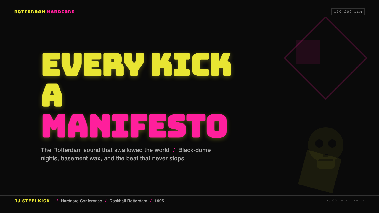
Gabber layouts are flyer-loud and centripetal — everything pushes toward the center or toward the viewer. Compositions use bilateral symmetry more often than Bauhaus-influenced Western modernism would permit, because symmetry reinforces the confrontational frontality that the style demands. A central skull or figure is flanked by symmetrical bursts of type or shape; radiating lines extend to the edges. The result is a layout that feels less like a designed page and more like a face: direct, inescapable, impossible to glance past.Gabber 版式如传单般响亮、向心——一切都向中心或向观看者推进。构图比受包豪斯影响的西方现代主义更频繁地使用双轴对称,因为对称强化了这种风格所要求的对抗性正面性。中心的骷髅或人物形象两侧对称地布置字体或形状的爆发;辐射线延伸至版面边缘。最终呈现的版式感觉与其说是一个设计过的页面,不如说是一张脸:直接、无可逃脱、无法一瞥而过。
Iconography图像志
The recurring image vocabulary of gabber is narrow and intentional: skulls, fire, lightning, masked or armored figures, abstract fragmentation suggesting an explosion or impact, and occasionally religious or martial iconography stripped of its original context and redeployed as raw intensity. These images are always rendered in extreme contrast — dense black against the background, or acid yellow against dense black — with no mid-tones and no narrative subtlety. The imagery communicates affect before it communicates content.Gabber 反复出现的图像词汇狭窄而有意为之:骷髅、火焰、闪电、蒙面或甲胄形象、暗示爆炸或冲击的抽象碎裂,以及偶尔出现的宗教或军事图像——剥离其原始语境,被重新部署为纯粹的强烈感。这些图像始终以极端对比度渲染——深黑对背景,或酸黄对深黑——没有中间调,没有叙事的微妙性。图像在传递内容之前先传递情感。
Information Density信息密度
Gabber flyers were commercial objects first — they had to carry artist names, times, venues, ticket prices, and label information all in one bounded space. Rather than resolving this tension through hierarchy and negative space, the style embraces density: blocks of text are compressed, stacked, and set in the smallest type that remains legible, occupying every available corner of the composition. The result is a visual field that rewards extended looking — there is always more information than the first glance captures.Gabber 传单首先是商业物品——它们必须在有限空间内同时承载艺术家名单、时间、场地、票价与厂牌信息。这种风格不是通过层级和留白来化解这一张力,而是拥抱密度:文字块被压缩、叠置、以最小可读字号排版,占据构图每一处可用的角落。最终呈现的视觉场域回报延伸的目光——总有比第一眼捕捉到的更多的信息。
Dark Ground as Default黑色底面作为默认状态
Unlike most Western graphic design traditions — which reserve dark grounds for special occasions or luxury registers — gabber treats absolute black as the neutral, unmarked background condition. Light elements emerge from the dark rather than sitting on a light field. This inversion has both practical roots (black is the cheapest printing ground) and tonal ones: darkness implies weight, menace, and the night-time context of the rave itself. A gabber piece on a white background feels wrong in a way that, say, a dark Bauhaus variant does not, because the dark ground is not a choice but a foundation.不同于大多数西方平面设计传统——那些传统将深色底面保留给特殊场合或奢侈品调性——gabber 将纯粹的黑色视为中性的、默认的背景状态。浅色元素从黑暗中浮现,而非落在浅色底面上。这种反转既有实际根源(黑色是最廉价的印刷底色),也有调性根源:黑暗意味着重量、威胁,以及 rave 活动本身的夜晚语境。一件 gabber 作品放在白色背景上会感觉不对,其方式与包豪斯深色变体截然不同——因为深色底面不是一个选择,而是一个地基。
See the Rotterdam Gabber Hardcore design system查看 Rotterdam Gabber Hardcore 完整设计系统
Who shaped Rotterdam Gabber Hardcore?谁塑造了 Rotterdam Gabber Hardcore?
Paul Elstak is among the most internationally recognized names to emerge from the Rotterdam hardcore scene, active as both producer and DJ from the early 1990s onward. His releases on Mokum Records — particularly those that pushed the style toward melodic happy-hardcore — carried the label's visual identity to audiences across Europe and beyond. His persona and release artwork embodied the confrontational directness that gabber graphic language was built to express: faces front, color maximum, text relentless.Paul Elstak 是从鹿特丹硬核场景走出的最具国际知名度的名字之一,自1990年代初起同时以制作人和 DJ 身份活跃。他在 Mokum Records 发行的唱片——尤其是那些将风格推向旋律性快乐硬核的作品——将这个厂牌的视觉身份带给了欧洲及更广泛的受众。他的形象与唱片封面图像具象化了 gabber 平面语言所要表达的对抗性直接性:正面迎人、色彩最大化、文字毫不留情。
DJ Promo, operating from Rotterdam through the 1990s and 2000s, became one of the style's most consistent producers in the industrial-hardcore direction — a harder, darker variant that pushed the aesthetic toward maximum austerity. His output influenced not just the music but the visual register of releases associated with that end of the spectrum: heavier graphics, deeper blacks, iconography oriented toward industrial machinery rather than carnival energy. His career arc illustrates how gabber's visual language could absorb subvariant developments without losing its core logic.DJ Promo 在整个1990年代至2000年代从鹿特丹发力,成为工业硬核方向上这种风格最具一致性的制作人之一——这是一种将美学推向极致简洁的更硬、更暗的变体。他的作品不仅影响了音乐,也影响了该端谱系发行物的视觉调性:更重的图形、更深的黑色、朝向工业机械而非狂欢能量的图像志。他的职业轨迹说明了 gabber 视觉语言在不失去其核心逻辑的前提下如何吸收亚变体的发展。
The Prophet — Rotterdam-born, active across the full arc of the scene's commercial peak — bridged the gap between pure gabber brutalism and the more accessible end of the hardcore spectrum. His releases were among the most widely distributed, and the sleeve artwork associated with his name traveled into contexts — retail record shops, mail-order catalogues, early internet — where the gabber aesthetic encountered audiences who had no prior exposure to the subculture. This crossover role made his output formative for understanding how the style translates beyond its immediate community.The Prophet——出生于鹿特丹,在场景商业巅峰期的整个弧线上持续活跃——搭建了纯粹 gabber 野蛮主义与硬核谱系更易接触一端之间的桥梁。他的唱片发行量属于流通最广的之列,与其名字相关联的封面艺术流传到唱片零售店、邮购目录、早期互联网等语境中,使 gabber 美学与此前毫无亚文化接触的受众相遇。这种跨越者角色使他的作品对理解这种风格如何超越其直接社群进行翻译具有奠基性意义。
Sandra Welk represents the dimension of gabber culture that is most frequently erased in retrospective accounts: the significant participation of women as artists, DJs, and figures whose names and faces appeared prominently on the visual material of the era. Her presence on flyers and sleeves at full graphical weight — not as ambient decoration but as headlining act — is part of the visual history of the style. The subculture's graphic language did not reserve its full visual force exclusively for male presentation.Sandra Welk 代表了 gabber 文化中一个在回顾性叙述中最常被抹去的维度:女性作为艺术家、DJ 以及名字和面孔在那个时代的视觉材料上显著出现的人物,有着相当大量的参与。她以完整平面分量出现在传单和封面上——不是作为背景装饰,而是作为压轴演出者——这是这种风格视觉史的组成部分。这个亚文化的平面语言并未将其完整的视觉力量专门保留给男性呈现。
Thunderdome as a brand — managed by ID&T — functions less as a single figure and more as an institutional voice that codified gabber's visual grammar into a commercially reproducible format. Beginning in 1992 with compilation releases and expanding to festival events that drew tens of thousands of attendees, Thunderdome sleeve artwork became the most widely circulated single body of gabber-style visual material in existence. Each release refined the formula: black ground, central high-contrast figure, acid-yellow headline type, dense track-listing block. The Thunderdome aesthetic is the closest thing the style has to a canonical reference.作为品牌的 Thunderdome——由 ID&T 经营——与其说是单个人物,不如说是一个将 gabber 视觉语法编纂为可商业复制格式的机构声音。从1992年的合辑发行开始,扩展到吸引数万名观众的音乐节活动,Thunderdome 的封面艺术成为迄今为止流通最广泛的单一 gabber 风格视觉材料体。每张专辑都提炼了这套公式:黑色底面、中心高对比度形象、酸黄色标题字体、密集的曲目列表块。Thunderdome 美学是这种风格最接近权威参考的存在。
How do you use Rotterdam Gabber Hardcore today?今天怎么用 Rotterdam Gabber Hardcore?
Applying Rotterdam Gabber Hardcore to contemporary design work requires understanding what the visual system is actually doing beneath its aggressive surface. The style is not chaos — it is a tightly constrained set of rules applied at maximum intensity. Contrast is the organizing principle: every element is either dominant or subordinate, with nothing occupying a comfortable middle register. Before touching a specific layout, establish the hierarchy of dominance — what one element must hit first — and then push everything else into relative silence.将鹿特丹 Gabber Hardcore 应用于当代设计实践,需要理解这套视觉系统在其攻击性表面之下实际运作的逻辑。这种风格不是混沌——它是一套以最大强度执行的严格约束规则。对比度是组织原则:每个元素要么主导,要么从属,没有任何元素占据一个舒适的中间位置。在接触具体版式之前,先确立主导的层级——哪一个元素必须首先击中目光——然后将其余一切推入相对的沉默。
For presentation slides, the gabber aesthetic works best on covers and section dividers where confrontational impact is the goal. A cover built in this style commits to a full-bleed dark ground, a single central image treated at extreme contrast, and a headline in the heaviest condensed display face available at a scale that crowds the top or bottom third of the slide. Body-copy slides should treat the dark ground as a fixed condition and resist the temptation to lighten it for readability — instead, increase type size. Data slides benefit from the style's high-contrast logic: charts become high-contrast objects, bars rendered as solid blocks in acid yellow or neon pink against black fields, with axis labels in a utilitarian condensed face at the minimum legible size.对于演示文稿,gabber 美学最适用于以对抗性冲击力为目标的封面和章节分隔页。以这种风格构建的封面使用满版深色底面、一个以极端对比度处理的单一中心图像,以及以当前可用的最粗压缩展示字体排布的标题,尺度大到挤满幻灯片的上三分之一或下三分之一。正文幻灯片应将深色底面视为固定条件,抵制为了可读性而将其调亮的诱惑——转而增大字号。数据幻灯片受益于这种风格的高对比度逻辑:图表成为高对比度对象,柱条以纯色块的形式在黑色底面上渲染为酸黄或霓虹粉,坐标轴标签使用实用性压缩字体以最小可读尺寸排设。
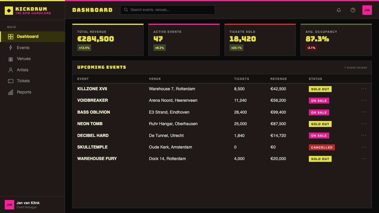
For web interfaces and dashboards, the style translates well to contexts where urgency and immediacy are values — monitoring tools, real-time data displays, event-ticketing platforms, and gaming or esports contexts. The approach demands a dark interface ground as baseline, with interactive elements distinguished by the acid accent colors rather than conventional button shapes. Type scales should be extreme: navigation labels bold and large, supporting information compressed and dense. Pricing pages in this mode use full contrast to differentiate tiers — a featured tier might occupy a neon-pink block while standard options sit in muted dark panels.对于网页界面和仪表板,这种风格能良好地迁移到紧迫感和即时性是重要价值的语境中——监控工具、实时数据展示、活动售票平台,以及游戏或电子竞技语境。这种方法要求将深色界面底面作为基线,用酸性强调色而非常规按钮形状来区分交互元素。字体层级比例应当极端:导航标签粗重且大,辅助信息压缩且密集。定价页面在这种模式下使用强烈对比来区分等级——特色套餐可能占据一个霓虹粉色块,而标准选项则位于低调的深色面板中。
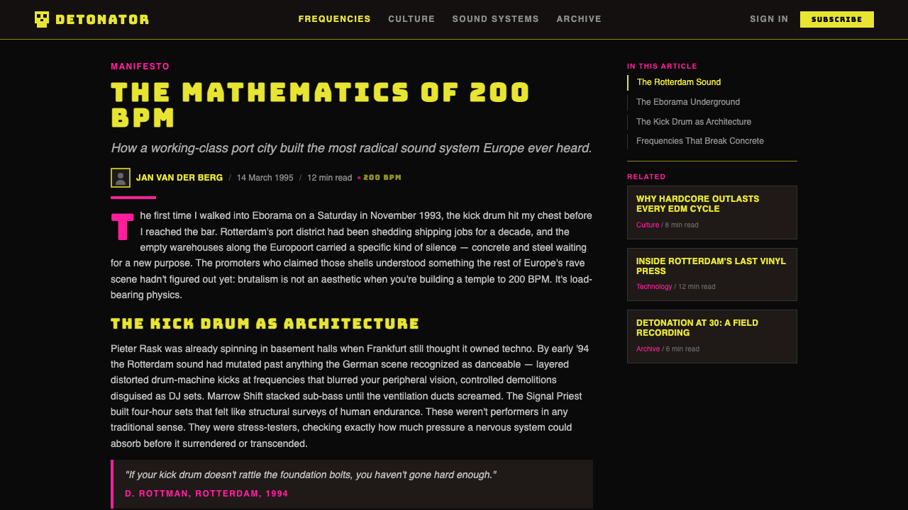
For editorial and marketing applications, the style supports high-energy campaigns, streetwear and culture-brand lookbooks, festival communications, and music-adjacent product launches. A gabber-influenced editorial spread uses the dark ground across full bleeds, reserves a single acid-yellow or neon-pink accent for the most critical call-to-action or headline, and treats photography as a high-contrast element — grainy, blown-out, or treated with extreme filters rather than naturalistic and color-corrected. Marketing emails and social cards translate well by using the color shock on a small surface: a deep black panel with a single oversized acid-yellow word and a dense white information block below.对于编辑与营销应用,这种风格支持高能量活动、街头服饰与文化品牌的 lookbook、音乐节传播以及音乐相关产品发布。受 gabber 影响的编辑版面在满版出血中使用深色底面,将单一的酸黄或霓虹粉强调色保留给最关键的行动号召或标题,将摄影作为高对比度元素处理——颗粒感强、曝光过度,或使用极端滤镜,而非自然主义的色彩校正。营销邮件和社交媒体卡片在小幅面上应用颜色冲击效果效果良好:深黑底面上一个超大尺寸的酸黄色单词,下方是密集的白色信息块。
The most common mistake when applying this style is reaching for it as a vibe rather than a system. Designers often add grain, dark backgrounds, and heavy type to an otherwise conventional layout and expect the result to read as gabber — but the style's actual power comes from its refusal of comfort at every decision point. If the background is dark but the type is set at polite proportions, the result is a failed imitation. If the contrast is extreme but the palette expands beyond the core three or four tones, legibility collapses. The second common mistake is over-texturing: distress should reinforce the low-fi authenticity of the reference, not drown it. A single halftone grain layer at low opacity is a reference; five stacked texture effects are decoration.应用这种风格时最常见的错误,是将其作为一种氛围而非一套系统来使用。设计师经常在其他方面仍是传统的版式上叠加噪点、深色背景和粗重字体,并期望结果能被解读为 gabber——但这种风格真正的力量来自于在每一个决策点上对舒适感的拒绝。如果背景是深色的,但字体排布仍维持礼貌的比例,结果只是失败的模仿。如果对比度是极端的,但色板扩展到核心三四个色调之外,可读性就会崩溃。第二个常见错误是过度质感化:损伤肌理应当强化参照的低保真真实感,而非将其淹没。一个低不透明度的单层半调噪点是参照;五个叠置的纹理效果是装饰。
See the Rotterdam Gabber Hardcore design system查看 Rotterdam Gabber Hardcore 完整设计系统
Rotterdam Gabber Hardcore — FAQRotterdam Gabber Hardcore · 常见问题
Is Rotterdam Gabber Hardcore the same as general rave aesthetics?鹿特丹 Gabber Hardcore 和泛化的 rave 美学是同一回事吗?
No. Rave aesthetics is a broad category that encompasses psychedelic fluorescents and cosmic imagery (early British rave), smooth airbrushed futurism (American EDM), and the pastel softness of ambient or chill scenes. Rotterdam gabber is a specific regional and subcultural variant defined by its working-class Rotterdam identity, its association with the 180-plus BPM end of the hardcore-techno spectrum, and its rejection of anything that reads as polished or aspirational. It is harder, darker, and denser than most of what gets called rave design, and it has strong roots in specific labels and festival contexts rather than being a diffuse aesthetic mood.不是。Rave 美学是一个宽泛的类别,涵盖迷幻荧光与宇宙图像(早期英国 rave)、光滑喷笔未来主义(美国 EDM)以及氛围或冷淡场景的粉彩柔和感。鹿特丹 gabber 是一个具体的地域性和亚文化性变体,由其工人阶级的鹿特丹身份、与硬核电子乐 180 BPM 以上端谱系的关联,以及对一切被解读为精致或充满抱负感之物的拒绝所定义。它比大多数被称为 rave 设计的东西更硬、更暗、更密集,并在具体的厂牌和音乐节语境中有强烈的根基,而非是一种弥漫性的美学情绪。
Can this style work for a brand that has nothing to do with music?这种风格能用于与音乐毫无关联的品牌吗?
Yes, but the transfer requires honesty about what is being borrowed and why. The gabber aesthetic carries strong subcultural associations — working-class pride, confrontational identity, the specific energy of Dutch hardcore rave — and using it for an unrelated product category can read as either inspired genre-bending or cynical appropriation depending on the execution. It works well for brands that genuinely want to project toughness, speed, anti-luxury positioning, or underground credibility. It is a poor fit for brands whose values are warmth, trust, approachability, or premium refinement, not because the style cannot be technically applied but because the tonal mismatch will undermine the communication at every level.可以,但这种迁移需要对借用的内容和原因保持诚实。gabber 美学携带着强烈的亚文化联想——工人阶级的自豪感、对抗性的身份认同、荷兰硬核 rave 的特定能量——将其应用于无关的产品类别,可能根据执行方式被解读为有启发性的跨类型探索,也可能是愤世嫉俗的挪用。它适用于那些真正希望传递强硬、速度、反奢侈定位或地下公信力的品牌。它不适合那些核心价值是温暖、信任、亲切或高端精致的品牌——不是因为这种风格在技术上不能被应用,而是因为调性上的错位会在每个层面上破坏传播效果。
How do you apply gabber style without it reading as ironic or retro?如何应用 gabber 风格而不使其显得讽刺或复古?
Commitment is the answer. Irony enters when elements of the style are deployed at reduced intensity — a dark background but polite typography, a heavy headline but soft supporting visuals — which signals that the designer knows the style but does not fully inhabit it. Retro enters when the reference is explicitly dated: using visual clichés that are culturally recognizable as period markers rather than applying the underlying visual logic. Applying gabber without irony or retro affect means taking its rules seriously at full strength — extreme contrast, maximum type weight, compressed information density, the correct palette — and choosing a context where that intensity is genuinely warranted rather than applied as a knowing wink.承诺是答案。当风格的元素被以降低强度的方式部署时,讽刺感就会进入——深色背景但礼貌的排版,粗重的标题但柔和的辅助视觉——这表明设计师了解这种风格,但并未完全居住其中。当参照被明确地标注为年代时,复古感就会进入:使用在文化上被识别为时代标志的视觉陈词滥调,而非应用其背后的视觉逻辑。以无讽刺、无复古情调的方式应用 gabber,意味着全力认真地对待其规则——极端对比度、最大字重、压缩的信息密度、正确的色板——并选择一个强度真正有其必要性的语境,而非将其作为一个会心一笑的文化引用。
What is the relationship between gabber design and brutalism in web design?Gabber 设计与网页设计中的野蛮主义有什么关系?
They share an impulse — the rejection of conventional polish, the embrace of raw structure, the willingness to make the viewer uncomfortable — but they come from different directions. Web brutalism is primarily an architectural metaphor, drawing on the raw-concrete aesthetic of Brutalist architecture and applying it to digital layouts through exposed grids, visible system defaults, and undecorated HTML aesthetics. Gabber design is subcultural in origin and print-born, with its rawness derived from production constraints rather than conceptual statements about digital materiality. The overlap is real and useful to understand, but conflating the two will produce work that reads as neither — too aestheticized to be brutalist, too tidy to be gabber.它们共享一种冲动——拒绝传统的精致、拥抱原始结构、愿意让观看者不舒服——但来自不同的方向。网页野蛮主义主要是一种建筑隐喻,借鉴粗野主义建筑的原始混凝土美学,通过裸露的网格、可见的系统默认值和未经装饰的 HTML 美学将其应用于数字版面。Gabber 设计在起源上是亚文化性的且诞生于印刷物,其粗粝感来自生产条件约束,而非关于数字物质性的概念声明。两者的重叠是真实的,值得理解,但将两者混为一谈会产生两者皆非的作品——对于野蛮主义来说过于美化,对于 gabber 来说过于整洁。
Does the style have to be dark, or can it work on light grounds?这种风格必须是深色的吗?能用在浅色底面上吗?
The dark ground is structural, not merely conventional. In the original material, absolute black was the default printing condition — everything else emerged from it. Inverting to a light ground changes the fundamental logic of the style: acid yellow loses most of its shock value on white, neon pink becomes a decoration rather than an alarm, and the sense of elements emerging from darkness is replaced by elements sitting on a surface. A light-ground gabber variant can exist as an adaptation — for contexts where dark grounds are technically or contextually inappropriate — but it should be understood as a deliberate departure from the source, not an equivalent option. If the dark ground is removed, the remaining elements must work considerably harder to maintain the intensity the style depends on.深色底面是结构性的,而非仅仅是惯例。在原始材料中,绝对黑色是默认的印刷条件——其他一切从中浮现。反转为浅色底面改变了这种风格的基本逻辑:酸黄在白色上失去了大部分冲击力,霓虹粉从警报变成了装饰,元素从黑暗中浮现的感觉被元素落在表面上的感觉所取代。浅色底面的 gabber 变体可以作为一种改编而存在——用于深色底面在技术上或语境上不适合的场合——但它应该被理解为对来源的刻意偏离,而非一个等价的选项。如果深色底面被去除,剩余的元素就必须付出更大得多的努力来维持这种风格所依赖的强度。
Related design styles相关设计风格
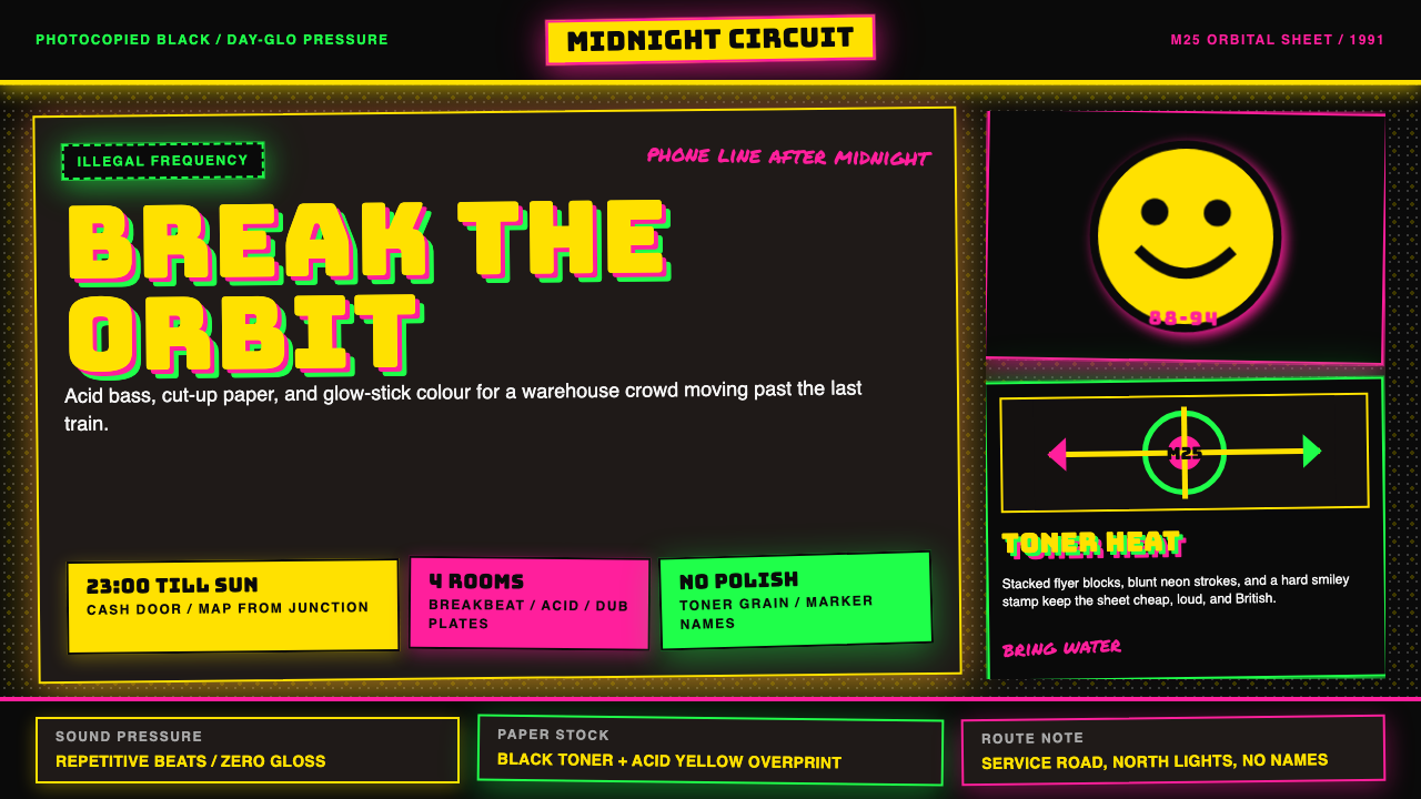 UK Rave Glow-Stick FlyerIllicit euphoria. Acid yellow, rave pink, and laser green slam into photocopi…非法狂喜。荧光黄、粉、绿撞上复印黑。
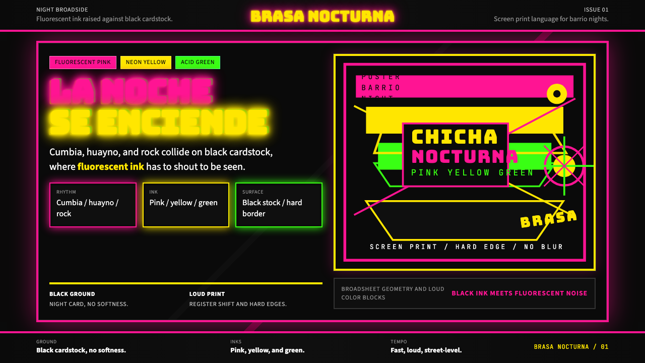 Peruvian Chicha Fluorescent PosterStreet-night fury. Pink, yellow, and green stack on black cardstock in hard b…夜街怒吼。粉黄绿硬边叠在黑卡纸上。
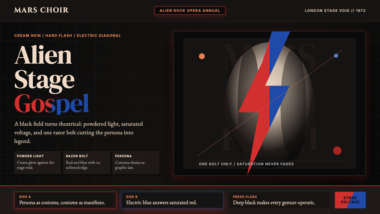 Bowie — Ziggy StardustTheater at full voltage. Cream-on-black portrait cut by one red and electric-…满电压的剧场感:黑底奶油肖像,被红与电蓝闪电劈开。
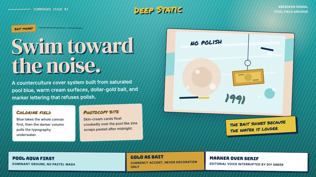 Nirvana — NevermindAnti-pop in pool blue. Cream cards, dollar-gold accents, and marker type roug…泳池蓝里的反主流:乳白卡片、美元金点缀与马克笔字打乱网格。
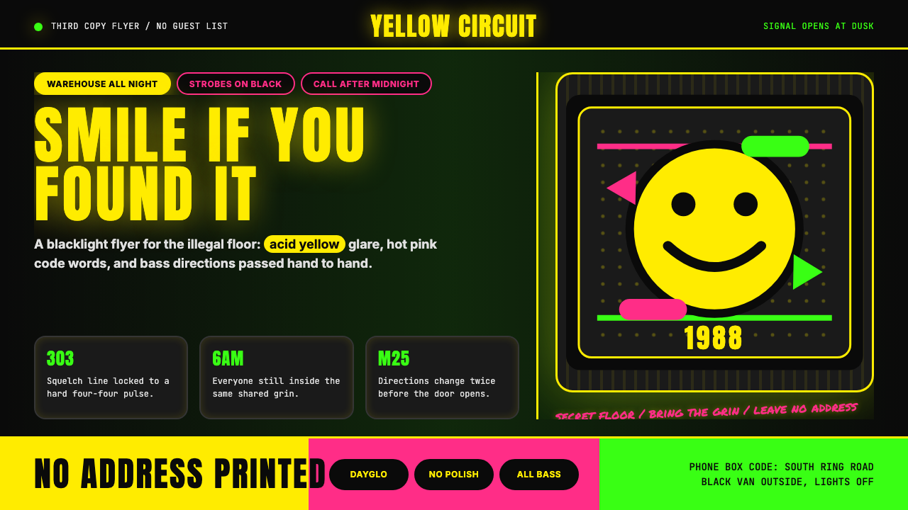 Acid House Smiley (1988)Rave energy hits first. Acid yellow on black, Anton caps, smiley glow.锐舞能量先撞上来。黑底酸黄、Anton大写与笑脸辉光。
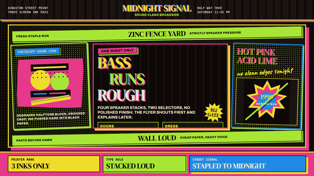 Jamaican Dancehall 1990 PosterMidnight volume. Acid lime and hot pink type stack like screenprint ink on bl…午夜音量:酸绿与热粉粗字叠在黑新闻纸上,如丝印错位。