What is Neville Brody / The Face?什么是 Neville Brody / The Face?
Neville Brody turned a London style magazine into a typographic riot — and in doing so, rewrote the rules of what printed letters were allowed to do.内维尔·布罗迪将一本伦敦风格杂志变成了排版的暴动——并由此改写了印刷文字被允许做什么的规则。
Neville Brody / The Face in briefNeville Brody / The Face 速览
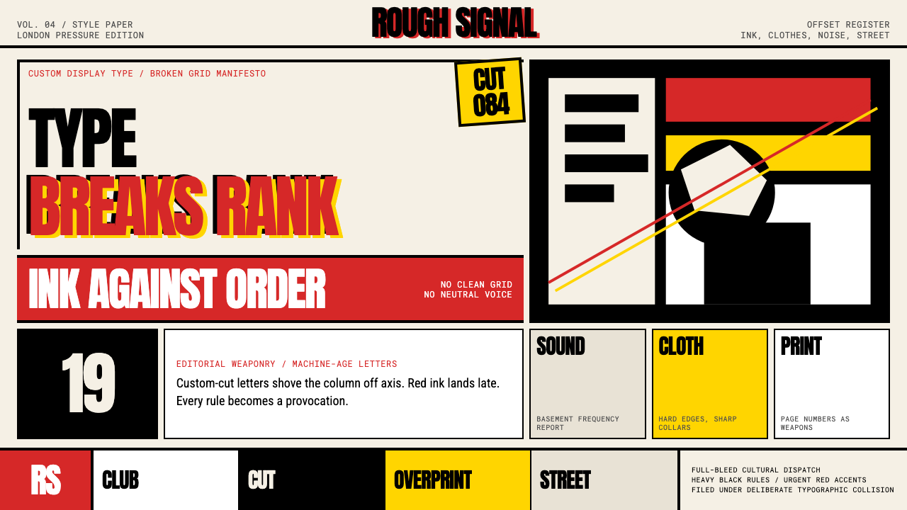
Neville Brody / The Face is a post-punk graphic design system rooted in the art direction Brody produced for the British style magazine The Face between 1981 and 1986. It is a language of maximum typographic tension: heavy black ink pressed against cream or off-white stock, urgent red accents that recall letterpress overprinting, and page layouts where the grid is not a frame to work within but a set of orthodoxies to be conspicuously broken.奈维尔·布罗迪/《The Face》是一套后朋克平面设计体系,根植于布罗迪在1981至1986年间为英国风格杂志《The Face》所创作的艺术指导实践。这是一种排版张力最大化的视觉语言:浓重的黑色油墨压在奶油色或米白色纸底上,如凸版套印般急迫的红色强调,以及将网格不视为工作框架、而视为一套需被明显打破的正统规则的版面结构。
Where Swiss International Style sought universal neutrality, Brody's system is emphatically local, urgent, and confrontational. Type is not merely a vehicle for reading — it is a visual object in its own right, placed at angles, scaled to monumental proportions, layered over photography, or reduced to a textural field of compressed marks. Headlines and page numbers receive the same graphic attention as illustrations. The boundary between typography and image-making dissolves.瑞士国际主义风格追求普遍中性,布罗迪的体系则是强烈的地域性、紧迫性与对抗性的。文字不仅是阅读的载体——它本身就是视觉对象,可以斜置、可以放大至纪念碑般的尺度、可以叠压在摄影之上,也可以压缩为密集标记构成的肌理场域。标题与页码所获得的图形关注度与插图无异。排版与图像制作之间的边界就此消融。
The system draws on sources that Swiss rationalism had deliberately excluded: Dada and Constructivist experiments in destabilizing the reading act, Art Deco's taste for heavy geometric letterforms, and the raw energy of punk fanzine culture. What makes it coherent despite its apparent disorder is Brody's insistence on strong formal rhythm — every disruption is composed, every collision is deliberate, and the underlying tension is always controlled.这套体系援引了瑞士理性主义刻意排除的源头:达达主义与构成主义在动摇阅读行为上的实验、装饰艺术对粗重几何字形的偏好,以及朋克同人志文化的原始能量。尽管表面混乱,使其保持连贯的是布罗迪对强劲形式节奏的坚持——每一次打破都经过构图,每一次碰撞都是刻意为之,底层张力始终处于可控之中。
See the Neville Brody / The Face design system查看 Neville Brody / The Face 完整设计系统
Where does Neville Brody / The Face come from?Neville Brody / The Face 从何而来?
Neville Brody was born in London in 1957 and studied at the London College of Printing, graduating in 1979. His student work already showed a restlessness with the prevailing conventions of British commercial typography — clean, inoffensive, largely derived from Swiss practice. After graduation he designed record sleeves for independent labels including Fetish Records, where the urgency and anti-establishment attitude of post-punk music demanded visual equivalents. These early projects gave him a laboratory for typographic experimentation outside the oversight of mainstream advertising culture.内维尔·布罗迪于1957年生于伦敦,就读于伦敦印刷学院,1979年毕业。他的学生作品已显露出对英国商业排版主流惯例的不安——那是一种干净、无冒犯性、大体上源自瑞士实践的风格。毕业后,他为多家独立厂牌设计唱片封套,包括Fetish Records。后朋克音乐的紧迫感与反建制态度要求与之匹配的视觉表达。这些早期项目在主流广告文化的监管之外,为他提供了排版实验的实验室。
In 1981, Nick Logan — founder of The Face, a London magazine covering music, fashion, and youth culture — appointed Brody as art director. The appointment was consequential. The Face had no large advertising accounts to placate and a readership that actively rejected mainstream aesthetics. Logan gave Brody near-total creative latitude, and Brody used it to treat every issue as a typographic manifesto. He designed custom display typefaces — Industria, Arcadia, and Insignia among them — rather than working from existing commercial fonts, ensuring that the magazine's visual identity was genuinely irreproducible by competitors. Headlines were set at sizes that consumed the visual space normally reserved for photographs; page numbers were designed as graphic symbols that accrued meaning across issues.1981年,《The Face》的创始人尼克·洛根——这是一本报道音乐、时尚与青年文化的伦敦杂志——任命布罗迪为艺术总监。这次任命意义深远。《The Face》没有需要讨好的大广告客户,它的读者群主动拒绝主流美学。洛根给了布罗迪近乎完全的创作自由,布罗迪用它把每一期杂志都做成了一份排版宣言。他专门设计了定制展示字体——Industria、Arcadia、Insignia等——而非使用现有商业字库,确保杂志的视觉识别对竞争对手而言真正无法复制。标题被设置到消耗掉通常留给照片的视觉空间的尺寸;页码被设计成图形符号,在各期之间积累起意义。
The cultural moment was important. London in the early 1980s was charged with the aftermath of punk, the emergence of new wave music and club culture, and a sharp generational rejection of the conservative design establishment. Brody's work at The Face was both a product of that environment and an influence on it — the magazine's aesthetic circulated widely, was photographed and photocopied, and defined what 'contemporary' looked like for an entire generation of British designers and art directors. The Face ran at a time before desktop publishing, meaning Brody's layouts were produced by hand, with physical type and paste-up — a constraint that forced inventiveness and made every formal decision feel earned.这一文化时刻至关重要。1980年代初的伦敦,充满着朋克浪潮退去后的余震、新浪潮音乐与俱乐部文化的兴起,以及年轻一代对保守设计建制的强烈拒绝。布罗迪在《The Face》的工作既是那个环境的产物,也对它产生了影响——杂志的美学广泛流传,被拍照和复印,为整整一代英国设计师和艺术总监定义了「当代」的样貌。《The Face》的辉煌时期发生在桌面出版之前,意味着布罗迪的版面完全由手工完成,使用实体铅字与粘贴拼版——这一约束逼出了创造力,也让每一个形式决定都感觉来之不易。
In 1987, the graphic designer Jon Wozencroft organized an exhibition of Brody's work at the Victoria and Albert Museum, accompanied by a monograph — 'The Graphic Language of Neville Brody' — that became one of the best-selling design books of its decade and was translated into multiple languages. The book formalized Brody's influence, bringing his methods to designers who had not encountered The Face directly. In 1990, Brody co-founded FontFont with Erik Spiekermann, a type foundry whose distribution model democratized access to experimental typefaces and whose catalogue extended the spirit of Brody's The Face work into the digital era. His studio, Research Studios, has continued to produce identities, typefaces, and editorial design that extend and revisit the core principles of the system.1987年,平面设计师乔恩·沃岑克罗夫特在维多利亚与艾尔伯特博物馆策划了一场布罗迪作品展,并出版了专著《内维尔·布罗迪的图形语言》,该书成为当时十年间最畅销的设计书籍之一,并被译成多种语言。这本书将布罗迪的影响力正式化,让那些未曾直接接触过《The Face》的设计师也得以了解他的方法。1990年,布罗迪与埃里克·斯皮克曼共同创立了字体厂牌FontFont,其发行模式使人们能以更民主的方式获取实验性字体,其字库目录将布罗迪《The Face》工作的精神延伸进了数字时代。他的工作室Research Studios持续出品品牌识别、字体与编辑设计,不断延伸和重访这套体系的核心原则。
What defines the Neville Brody / The Face look?Neville Brody / The Face 的视觉特征是什么?
Typographic Hierarchy as Image排版层级即图像
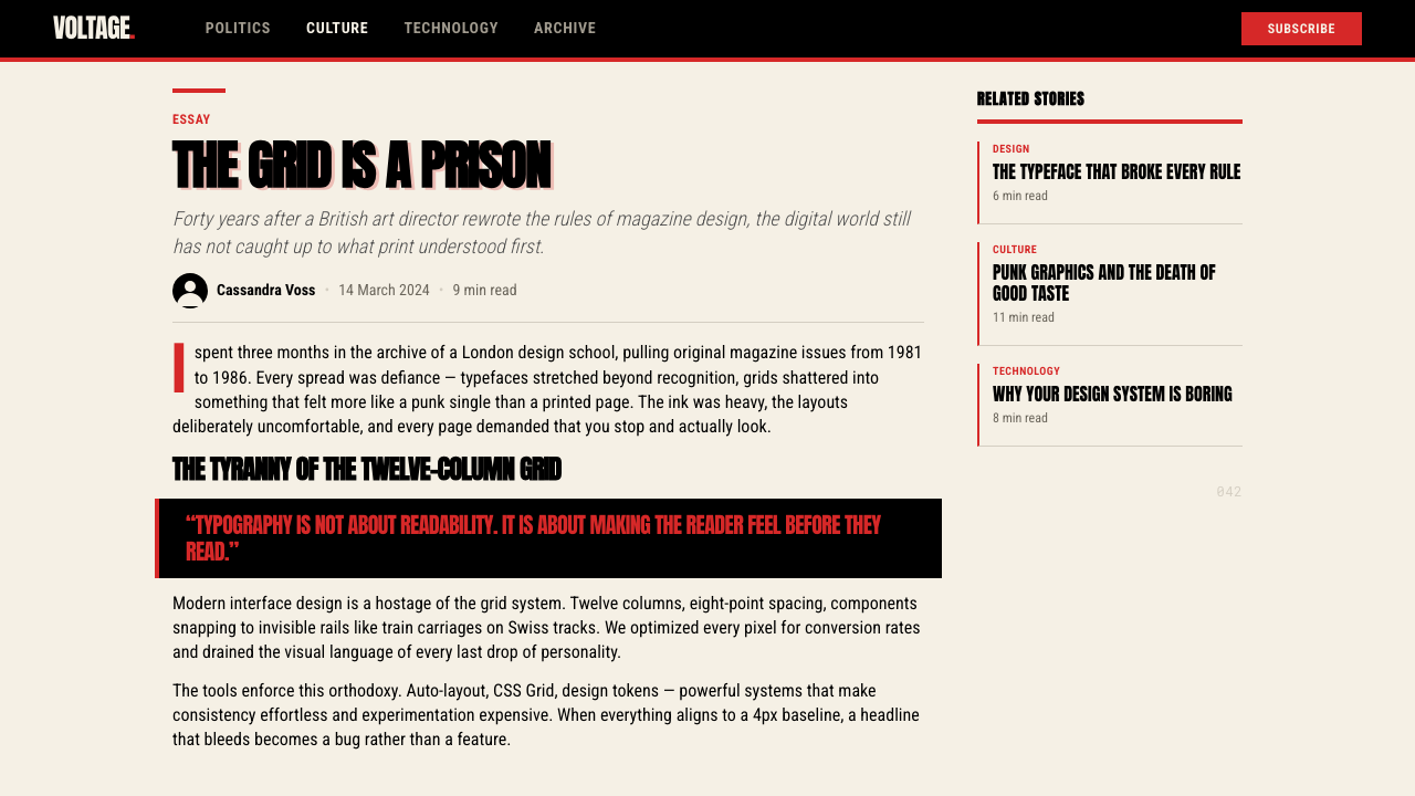
The defining move of the Brody system is treating letterforms as visual objects rather than transparent carriers of language. Headlines are scaled to dominate the spread — larger than any single photograph, sometimes larger than the entire text block. The scale differential between headline and body copy is extreme and deliberate, creating a visual percussion rather than a conventional reading flow. Type can be cropped by the page edge, rotated, or overlaid directly onto photography without a white knock-out.布罗迪体系的决定性手法是将字形视为视觉对象,而非语言的透明载体。标题被放大至主导整个跨页——比任何单张照片都大,有时比整个正文块还大。标题与正文之间的尺度差异是极端且刻意的,制造出视觉打击感而非常规阅读流。文字可以被页面边缘裁切、旋转,或在没有白色镂空底板的情况下直接叠压在摄影图像上。
Broken and Colliding Grid打破与碰撞的网格
Brody did not abandon the grid — he used it as a structure to visibly violate. Elements bleed across column boundaries, overlap one another, or sit in deliberate tension with the underlying structure. The grid's ghost is always present; what makes the layouts feel charged is the evidence of rules being broken rather than ignored. A headline might occupy three columns while a caption sits in the fourth at a contradictory angle, creating spatial energy that a conventionally aligned layout cannot produce.布罗迪并没有放弃网格——他将网格用作一种可见地加以违反的结构。元素出血跨越栏边界,彼此叠压,或与底层结构形成刻意的张力。网格的幽灵始终存在;使版面感觉充满张力的,正是规则被打破而非被忽视的痕迹。一个标题可能占据三栏,而说明文字以相悖的角度置于第四栏,产生出常规对齐版面无法制造的空间能量。
Restricted and Punchy Palette克制而有力的色彩
The palette is built around three elements: a near-black ink (deployed heavily, as though pressure-printed), a warm cream or slightly toned off-white for the ground, and a single urgent accent — most characteristically a dense red — used sparingly but at full intensity when it appears. The red reads like a letterpress overprint: something added forcefully on top of what is already there. Secondary hues are essentially absent. The restraint makes each colored element feel decisive rather than decorative.色板围绕三个要素构建:一种近黑的油墨(大量使用,仿佛是压力印刷的效果);作为底色的温暖奶油色或略带色调的米白色;以及单一的急迫强调色——最典型的是浓烈的红色——出现时克制但强度全开。红色读起来像凸版套印:一种强行叠加在既有内容之上的东西。次级色调基本缺席。这种克制使每一个有色元素感觉是决定性的,而非装饰性的。
Custom and Invented Letterforms定制与自创字形
A critical feature of the system is that its display typefaces were designed specifically for the context rather than selected from commercial catalogues. Brody's custom faces — geometric, modular, with visible construction logic — carry a distinct authority that licensed fonts cannot replicate. The letterforms are simultaneously historical (drawing on Art Deco and Constructivist precedents) and invented, giving the work a sense of internal consistency that purely borrowed typography cannot achieve.这套体系的一个关键特征是:其展示字体是专门为该语境设计的,而非从商业字库中选用。布罗迪的定制字体——几何的、模块化的、具有可见构建逻辑的——拥有授权字体无法复制的独特权威性。这些字形同时是历史性的(援引装饰艺术与构成主义的先例)和被发明的,赋予了作品一种单纯借用排版所无法实现的内在一致性。
Heavy Rule and Structural Ink粗线与结构性墨迹
Black rules — thick horizontal bars, heavy underlines, bold borders — serve as structural and compositional anchors throughout the system. These rules are not decorative dividers in the conventional sense; they are graphic objects with weight and presence. A rule might separate a headline from its subhead at several times the thickness of the type's own stroke, or frame a photograph as though branding it. The heaviness of the ink is part of the message: this is print that means to be noticed.黑色线条——粗重水平条、厚重下划线、bold边框——在整套体系中充当结构性与构图性锚点。这些线条不是常规意义上的装饰性分隔符;它们是具有重量和存在感的图形对象。一条线可能以字体笔画数倍的粗度将标题与副标题分开,或像烙印一样框住一张照片。油墨的厚重感本身就是信息的一部分:这是一种刻意要被注意到的印刷。
Photography as Graphic Raw Material摄影作为图形原材料
Photography in this system is not treated as an autonomous image to be presented and protected. It is graphic raw material — cropped aggressively, printed at high contrast, bled off the page, or used as a field over which type is directly placed without separation. The relationship between photograph and typography is collision, not coexistence. This treatment demands that photography be strong enough to survive the intrusion of large type, which in practice means it favors high-contrast, compositionally bold images over naturalistic or softly lit ones.在这套体系中,摄影不被视为需要展示和保护的自主图像,而是图形原材料——激进裁切、高对比度印刷、出血至页面边缘,或作为一个场域让文字直接置于其上而没有任何分隔。照片与排版之间的关系是碰撞,而非共存。这种处理要求摄影足够强悍,能够承受大字体的侵入——实践中这意味着它偏爱高对比度、构图大胆的图像,而非自然主义或柔和打光的图像。
Graphic Elements as Meaning Carriers图形元素作为意义载体
Brody extended the notion of what counts as a significant visual element. Page numbers, section markers, issue dates, and running headers were treated with the same graphic intensity as main headlines. Over successive issues, certain marks and symbols accumulated a kind of visual vocabulary specific to the magazine. This approach transforms the marginal and the functional — items most designers treat as invisible infrastructure — into active contributors to the page's visual argument.布罗迪扩展了什么算作重要视觉元素的概念。页码、栏目标记、期号日期与通栏页眉都被赋予与主标题同等的图形强度。在连续的几期杂志中,某些标记与符号积累起一种杂志特有的视觉词汇。这种处理方式将边缘性的、功能性的元素——大多数设计师视之为隐形基础设施的东西——转化为页面视觉论证的主动参与者。
See the Neville Brody / The Face design system查看 Neville Brody / The Face 完整设计系统
Who shaped Neville Brody / The Face?谁塑造了 Neville Brody / The Face?
The central figure of the system. Brody's five years at The Face produced a body of work that fundamentally altered what editorial design was understood to be capable of. His custom typefaces — Industria, Arcadia, Insignia — were designed within the context of specific layouts rather than as general-purpose releases, which gave them an organic relationship to the pages they appeared on. After The Face, he brought similar thinking to the music magazine Arena and to cultural institutions including the 1990 World Design Conference in Nagoya. The 1987 V&A monograph ensured his influence extended well beyond the magazine's original readership. His ongoing work at Research Studios and his role at FontFont have kept him a central voice in typography and identity design.这套体系的核心人物。布罗迪在《The Face》的五年工作产出了一批从根本上改变了人们对编辑设计能力理解的作品。他的定制字体——Industria、Arcadia、Insignia——是在具体版面语境中设计的,而非作为通用字体发布,这赋予了它们与所在页面之间有机的关系。离开《The Face》后,他将类似思维带入音乐杂志Arena,以及包括1990年名古屋世界设计大会在内的文化机构。1987年维多利亚与艾尔伯特博物馆专著确保了他的影响力远超杂志原有读者群。他在Research Studios的持续工作以及在FontFont的角色,使他始终是字体设计与识别设计领域的核心声音。
Logan founded The Face in 1980 after his success with the music press, particularly with New Musical Express. His editorial vision — that a youth culture magazine could aspire to be a serious cultural document rather than a fan-service publication — created the conditions for Brody's formal radicalism. Without Logan's willingness to prioritize visual ambition over commercial conservatism, and his trust in Brody's editorial judgment, the magazine's significance as a design object would not have materialized. Logan's role demonstrates how much great design depends on enlightened editorial leadership.洛根在音乐媒体(尤其是《新音乐快递》)取得成功后,于1980年创办了《The Face》。他的编辑愿景——一本青年文化杂志可以立志成为严肃的文化文献而非粉丝服务刊物——为布罗迪的形式激进主义创造了条件。若非洛根愿意将视觉抱负置于商业保守主义之上,以及他对布罗迪编辑判断的信任,这本杂志作为设计对象的重要性便不会实现。洛根的角色表明,伟大的设计在多大程度上依赖于开明的编辑领导力。
Spiekermann co-founded FontFont with Brody in 1990, providing the structural and business counterpart to Brody's formal radicalism. Where Brody's contribution to FontFont was the spirit of typographic invention and the network of experimental designers he brought in as contributors, Spiekermann provided the rigorous typographic standards and the technical infrastructure that made the foundry viable. FontFont's catalogue — which included faces by designers from across Europe — helped institutionalize the idea that a typeface could be a work of graphic authorship rather than merely a commercial tool.斯皮克曼于1990年与布罗迪共同创立FontFont,为布罗迪的形式激进主义提供了结构性与商业性的对应支撑。布罗迪对FontFont的贡献是排版发明的精神以及他引入的实验性设计师网络;斯皮克曼则提供了使字体厂牌得以可行运营的严格排版标准与技术基础设施。FontFont的字库目录——收录了来自欧洲各地设计师的字体——帮助将字体可以是图形创作作品而非仅仅是商业工具的理念制度化。
Elms was a journalist and writer whose work appeared regularly in The Face during Brody's tenure. His contributions to the magazine's textual content were an important complement to Brody's visual innovations — the writing shared the magazine's sharp intelligence and cultural confidence. The Face's significance as an artifact depended on the alignment between Elms's generation of writers and Brody's visual practice: neither could have achieved the same effect alone. Elms later became a broadcaster and cultural commentator, continuing to document the London scene that The Face had helped define.埃尔姆斯是一位记者与作家,在布罗迪任职期间定期在《The Face》发表文章。他对杂志文字内容的贡献是对布罗迪视觉创新的重要补充——文字与杂志锐利的智识和文化自信共享同一频道。《The Face》作为文化制品的重要性,依赖于埃尔姆斯这一代作者与布罗迪视觉实践之间的一致性:任何一方单独都无法实现同样的效果。埃尔姆斯后来成为广播人与文化评论员,持续记录着《The Face》曾帮助定义的伦敦场景。
Wozencroft organized the 1987 V&A exhibition of Brody's work and wrote the accompanying monograph 'The Graphic Language of Neville Brody,' which became one of the decade's most influential design publications. By producing a rigorous critical account of Brody's methods — including typographic experiments, rejected layouts, and the developmental logic behind specific design decisions — Wozencroft transformed work that might have remained a subcultural artifact into a formally analyzed body of practice. The book's success gave Brody's methods a pedagogical life that persisted long after The Face's peak years.沃岑克罗夫特策划了1987年维多利亚与艾尔伯特博物馆的布罗迪作品展,并撰写了配套专著《内维尔·布罗迪的图形语言》,该书成为当时十年最具影响力的设计出版物之一。通过对布罗迪方法论的严格批评性记录——包括排版实验、被拒版面以及特定设计决定背后的发展逻辑——沃岑克罗夫特将一批可能停留在亚文化制品层面的工作,转化为经过形式分析的实践体系。这本书的成功赋予了布罗迪方法论一种教学生命,在《The Face》辉煌岁月之后长久延续。
How do you use Neville Brody / The Face today?今天怎么用 Neville Brody / The Face?
The Brody / The Face system is usable across contemporary digital formats, but it rewards designers who understand its underlying logic — typographic confrontation, controlled disorder, heavy ink as structural weight — rather than those who simply borrow its surface texture. The aesthetic is high-contrast and demanding; it works where visual authority is the desired register and struggles where warmth or accessibility is paramount.布罗迪/《The Face》体系可以应用于当代数字格式,但它回报那些理解其底层逻辑的设计师——排版对抗、受控混乱、浓重油墨作为结构重量——而非那些仅仅借用其表面质感的人。这种美学高对比、强要求;它在视觉权威感是期望语调的场合有效,在温暖或可及性是首要考量的场合则力不从心。
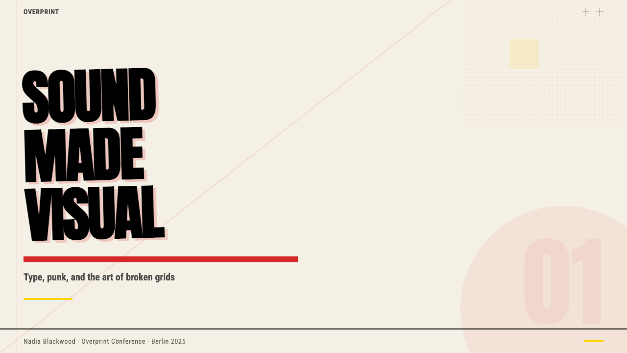
For presentation slides, the system is strongest on cover pages and section dividers. A cover built in this language sets a large, custom-feeling display word in heavy black against a cream field, with a bold horizontal rule cutting beneath it and a single red element — a rule fragment, a geometric mark, a date — introduced at full intensity. Content slides should be treated as composed grids: one dominant type size for the key message, supporting text at a significantly smaller scale, and ruled lines as the only structural decoration. Data slides take on an editorial quality: charts are treated as graphic objects rather than business visuals, with axes and labels composed as carefully as any headline.对于演示文稿,这套体系在封面页与章节分隔页上最为强势。用这种语言构建的封面,在奶油色底面上设置一个大型、具有定制感的粗黑展示字,以粗水平线切割于其下,并以满强度引入单一红色元素——一截线段、一个几何标记、一个日期。内容页应当被当作构图网格处理:关键信息的一个主导字号,支撑文字以显著更小的尺寸呈现,直线是唯一的结构性装饰。数据页呈现出编辑品质:图表被视为图形对象而非商业视觉,坐标轴与标签以与标题同等的用心来构图。
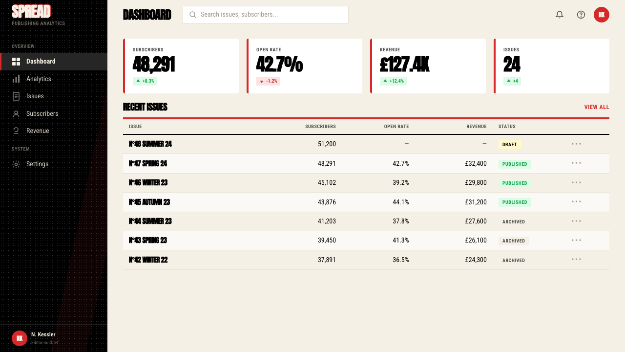
For web interfaces, the system translates well to dashboards, editorial landing pages, and any product that needs to project confidence and cultural intelligence. The approach requires committing to a near-cream or slightly warm white background, black as the primary text and structural color, and a single accent deployed at full saturation for interactive states or critical calls to action. Navigation should be typographic and assertive — wordmarks set large, labels in high contrast — rather than icon-dependent. Card components work with hard or offset borders rather than soft shadows; the heaviness of the containment is part of the visual message.对于网页界面,这套体系在仪表板、编辑型落地页,以及任何需要投射自信与文化智识的产品上均有良好转化。这种方式要求以接近奶油色或略带暖意的白色作为背景,黑色作为主要文字与结构色,以及单一强调色以满饱和度用于交互状态或关键行动号召。导航应当是字体性且强势的——文字标识设置得大,标签高对比度——而非依赖图标。卡片组件使用硬边或偏移边框,而非柔和阴影;包裹的厚重感本身就是视觉信息的一部分。
For editorial and marketing work, the system excels at any context where hierarchy needs to be felt as well as read. An article layout in this idiom uses extreme scale contrast between headline and body text, bold rules to mark transitions rather than whitespace alone, and photography placed without protective white space — let the type touch the image. Marketing pages work well with the style's poster-like directness: section headers that are visual events, not just labels; foreground and background alternating between cream-on-near-black and black-on-cream; a single red element used with full commitment wherever attention is most urgently required.对于编辑与营销内容,这套体系在任何层级需要被感知而非仅被阅读的场合均表现出色。这种惯用语中的文章版面,在标题与正文之间使用极端尺度对比,以粗线而非单纯留白标记段落过渡,照片不留保护性白边——让文字触碰图像。营销页面适合这种风格的海报式直接感:章节标题是视觉事件而非仅是标签;前景与背景在奶油底近黑字与黑底奶油字之间交替;在最急需吸引注意力的地方,以充分的决心使用单一红色元素。
The most common mistake when applying this system is mistaking surface chaos for the actual method. Randomly sized type, multiple accent colors, and arbitrary angles produce noise, not energy. Authentic application of the Brody language requires that every formal departure — every oversized headline, every rule that breaks the column, every collision of type and image — be a deliberate compositional decision. Restraint in the palette (near-black, cream, one red) is non-negotiable; it is what gives the formal disruptions their visual force. Using more than one accent color, or introducing soft gradients or drop shadows, immediately deflates the system's tension.应用这套体系时最常见的错误是将表面混乱误认为实际方法。随意大小的文字、多种强调色和任意角度产生的是噪音,而非能量。真正应用布罗迪语言要求每一次形式偏离——每一个超大标题、每一条跨越栏位的线、每一次文字与图像的碰撞——都是刻意的构图决定。色彩上的克制(近黑、奶油、一种红色)是不可妥协的;正是它赋予了形式打破以视觉力量。使用超过一种强调色、或引入柔和渐变与投影阴影,会立即泄去这套体系的张力。
See the Neville Brody / The Face design system查看 Neville Brody / The Face 完整设计系统
Neville Brody / The Face — FAQNeville Brody / The Face · 常见问题
Is this style the same as general post-punk design, or is it specific to Brody?这种风格和一般的后朋克设计相同,还是特指布罗迪的风格?
Post-punk graphic design is a broad category that includes many artists and publications from the late 1970s and 1980s who rejected Swiss rationalism in favor of raw, confrontational visuals. Brody's work at The Face is a distinct subset of that impulse: where many post-punk publications embraced the look of urgency through low-production values and deliberate roughness, Brody's approach was highly crafted and formally rigorous. The apparent disorder in his layouts is composed disorder — every element has been placed precisely, even when the effect is collisional. This makes the Brody / The Face system more transferable to high-quality contemporary applications than the broader post-punk vernacular, which tends to read as deliberately lo-fi.后朋克平面设计是一个宽泛的类别,涵盖1970至80年代许多拒绝瑞士理性主义、转而拥抱原始对抗性视觉的艺术家与出版物。布罗迪在《The Face》的工作是那种冲动的一个独特子集:许多后朋克出版物通过低制作水准和刻意粗糙来拥抱紧迫感的外观,而布罗迪的方式是高度精工且形式上严格的。他版面中的表面混乱是构图过的混乱——每个元素都被精确放置,即使效果是碰撞性的。这使得布罗迪/《The Face》体系比更宽泛的后朋克白话更易转化为高质量的当代应用,后者往往读起来是刻意的低保真。
Can this style work for digital products aimed at mainstream consumers, or is it inherently niche?这种风格能用于面向大众消费者的数字产品吗,还是它本质上是小众的?
The system can reach mainstream audiences when it is used to signal cultural authority, forward-thinking positioning, or creative industry credibility — fashion brands, music platforms, editorial publications, and design-forward technology companies all have consumer audiences for whom this register reads as sophisticated rather than alienating. It becomes genuinely niche when applied without modification to categories that expect warmth, accessibility, or familiarity: banking, healthcare, children's products, or anything where the user's emotional need is reassurance rather than stimulation. The honest test is whether the product's values include the qualities the style embodies — edge, authority, and formal intelligence — or whether those qualities are being applied as a superficial upgrade to something that actually needs a different voice entirely.当这套体系被用来传递文化权威感、前瞻性定位或创意行业公信力时,它可以触达主流受众——时尚品牌、音乐平台、编辑类出版物,以及面向设计敏感消费者的科技公司,对这些受众而言,这种语调读起来是精致而非疏离的。当它被不加修改地应用于期待温暖、可及性或亲切感的品类时,它才真正变得小众:银行、医疗、儿童产品,或任何用户情感需求是安抚而非刺激的场合。诚实的检验标准是:产品的价值观是否包含这种风格所体现的品质——锋芒、权威和形式智识——还是这些品质只是被作为表面升级,应用于实际上需要完全不同声音的东西上。
How do you maintain the style's energy without it looking cluttered or chaotic?如何在不让版面显得凌乱混乱的情况下保持这种风格的能量?
The key is understanding that controlled tension requires an underlying structure even when that structure is being deliberately violated. Start by establishing a clear grid — column structure, baseline rhythm, margin logic — then make formal decisions about which grid relationships to honor and which to break. Break the grid in one or two specific ways per composition rather than in every direction simultaneously. Maintain strict palette discipline: near-black, cream, one accent at full intensity. Keep the number of typographic scales limited — two or three levels of hierarchy, not five or six. The visual energy comes from the contrast between the underlying order and the deliberate disruptions, not from maximizing the number of disruptions.关键在于理解:受控的张力即便是在刻意违反结构的情况下,也需要一个底层结构的存在。首先建立清晰的网格——栏结构、基线节奏、页边逻辑——然后对哪些网格关系要遵守、哪些要打破做出形式性决定。每个构图中以一种或两种特定方式打破网格,而非同时向所有方向打破。保持严格的色彩纪律:近黑、奶油、一种强调色满强度使用。保持排版尺度的数量有限——两到三个层级,而非五六个。视觉能量来自底层秩序与刻意打破之间的对比,而非来自最大化打破的数量。
The Face existed before digital design. How much can its print logic actually translate to screens?《The Face》存在于数字设计之前。它的印刷逻辑究竟有多少能真正转化到屏幕上?
More than one might expect, because the system's core moves are not dependent on the physical properties of print. The high-contrast palette — heavy near-black against cream — is highly legible on screen and actually benefits from backlighting. The typographic scale contrasts read clearly at any resolution. The use of rules and borders as structural elements translates cleanly to CSS. Where print logic genuinely does not translate is in the tactile dimension: the weight of the paper, the physical impression of letterpress-style inking, the hand-produced quality of the original paste-up. Digital applications of the system should lean into what the screen does well — motion, responsive scaling, interactive state changes — rather than trying to simulate paper texture or printing artifacts, which almost always looks forced.转化程度超乎预期,因为这套体系的核心手法并不依赖印刷的物理特性。高对比色板——浓重近黑对奶油色——在屏幕上具有极高可读性,实际上还受益于背光。排版尺度对比在任何分辨率下都清晰可读。将直线与边框用作结构性元素,可以干净地转化为CSS实现。印刷逻辑真正无法转化的是触觉维度:纸张的重量、凸版式墨迹的物理压印感、原始粘贴拼版的手工制作品质。这套体系的数字应用应当充分利用屏幕擅长的东西——动效、响应式缩放、交互状态变化——而非试图模拟纸张质感或印刷痕迹,后者几乎总是显得刻意生硬。
How does Brody's approach differ from other designers who also broke typographic rules in the same era?布罗迪的方式与同时代其他同样打破排版规则的设计师有何不同?
Several contemporaries — David Carson at Ray Gun, Tibor Kalman at Colors, the early work coming out of Cranbrook Academy — also pursued anti-conventional typography in the 1980s and 1990s. The key distinction is that Brody's work at The Face was compositionally rigorous even when formally disruptive. Carson's approach was often more genuinely illegibility-seeking — type set in ways that resisted reading entirely. Kalman's work was more conceptually driven, using visual surprise in service of editorial argument. Brody's disruptions are always in tension with legibility rather than in opposition to it; the reader is challenged but not excluded. This formal rigor is what makes the system teachable and transferable, whereas the more instinctive approaches of some contemporaries are difficult to apply without the original author's specific sensibility.同时代的几位设计师——《Ray Gun》的大卫·卡森、《Colors》的提博尔·卡尔曼、克兰布鲁克学院早期涌现的作品——也在1980至90年代追求反常规排版。关键区别在于布罗迪在《The Face》的工作即便在形式上具有颠覆性,在构图上也是严格的。卡森的方式往往更真正地追求难以辨读性——以完全抵抗阅读的方式排布文字。卡尔曼的工作更以概念为驱动,将视觉惊奇用于服务编辑论点。布罗迪的打破始终与可读性处于张力之中,而非与之对立;读者受到挑战,但并未被排除在外。这种形式上的严格性使这套体系可教授、可转化,而一些同时代人更本能的方式,若缺乏原作者特定的感性,便难以应用。
Related design styles相关设计风格
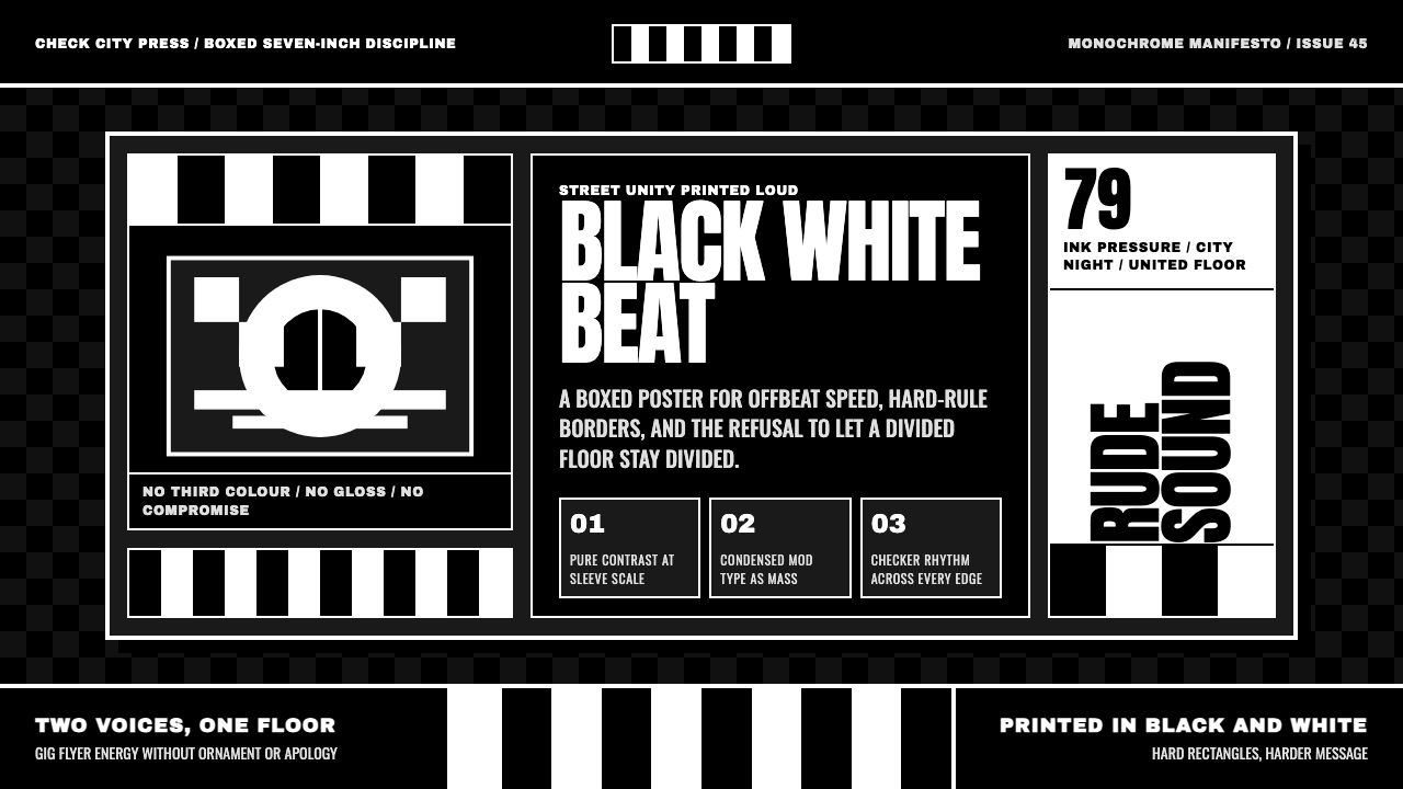 2 Tone SkaContrast as manifesto. White Anton type locks into a near-black checkerboard…对比即宣言:白色 Anton 字体压进近黑棋盘唱片框。
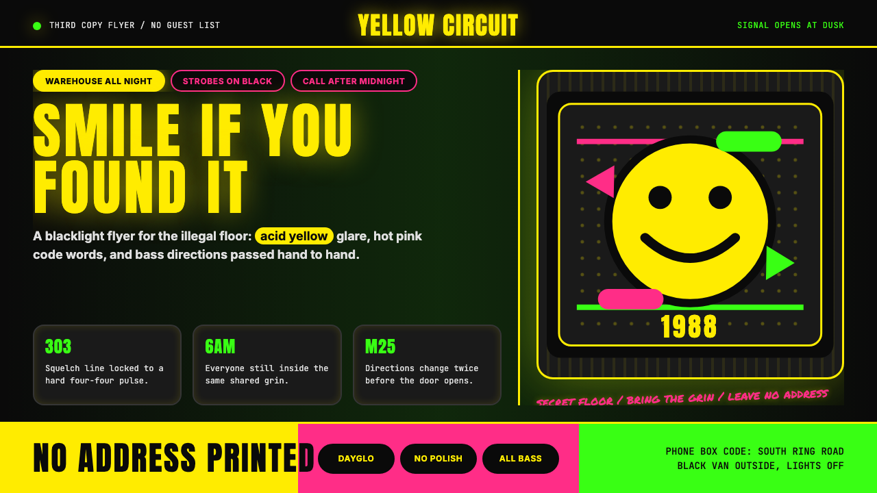 Acid House Smiley (1988)Rave energy hits first. Acid yellow on black, Anton caps, smiley glow.锐舞能量先撞上来。黑底酸黄、Anton大写与笑脸辉光。
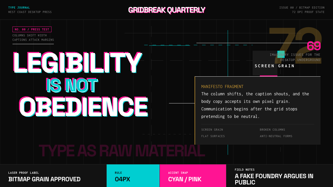 Emigre Magazine (1984–2005)Defies the tidy grid. Cyan, ochre, and hot-pink bitmap type collides on black.拒绝整齐网格:黑底上的青色、赭色与热粉像素字相撞。
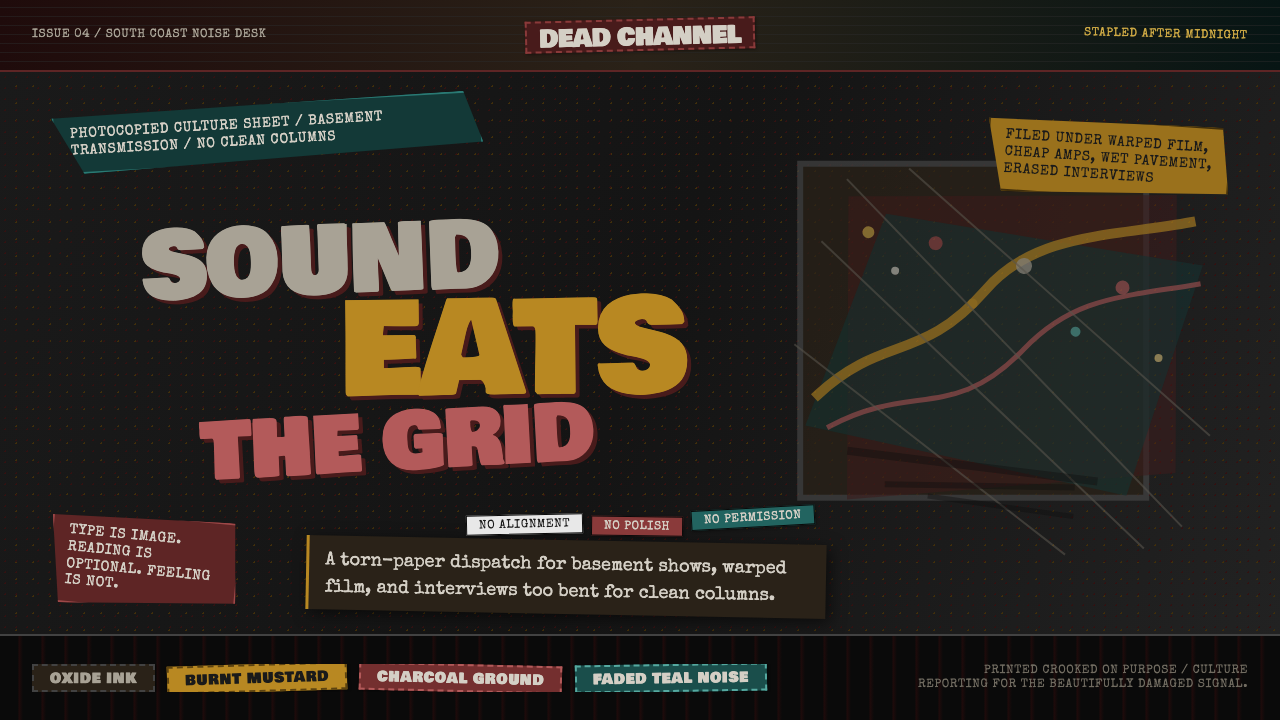 Grunge (Carson 1993)Carson's anti-rules, photocopied. Oxblood on charcoal, distressed type, delib…大卫·卡森颠覆现代主义排版的粗粝美学:暗红与焦黄、炭灰底、刻意打破的网格、油墨…
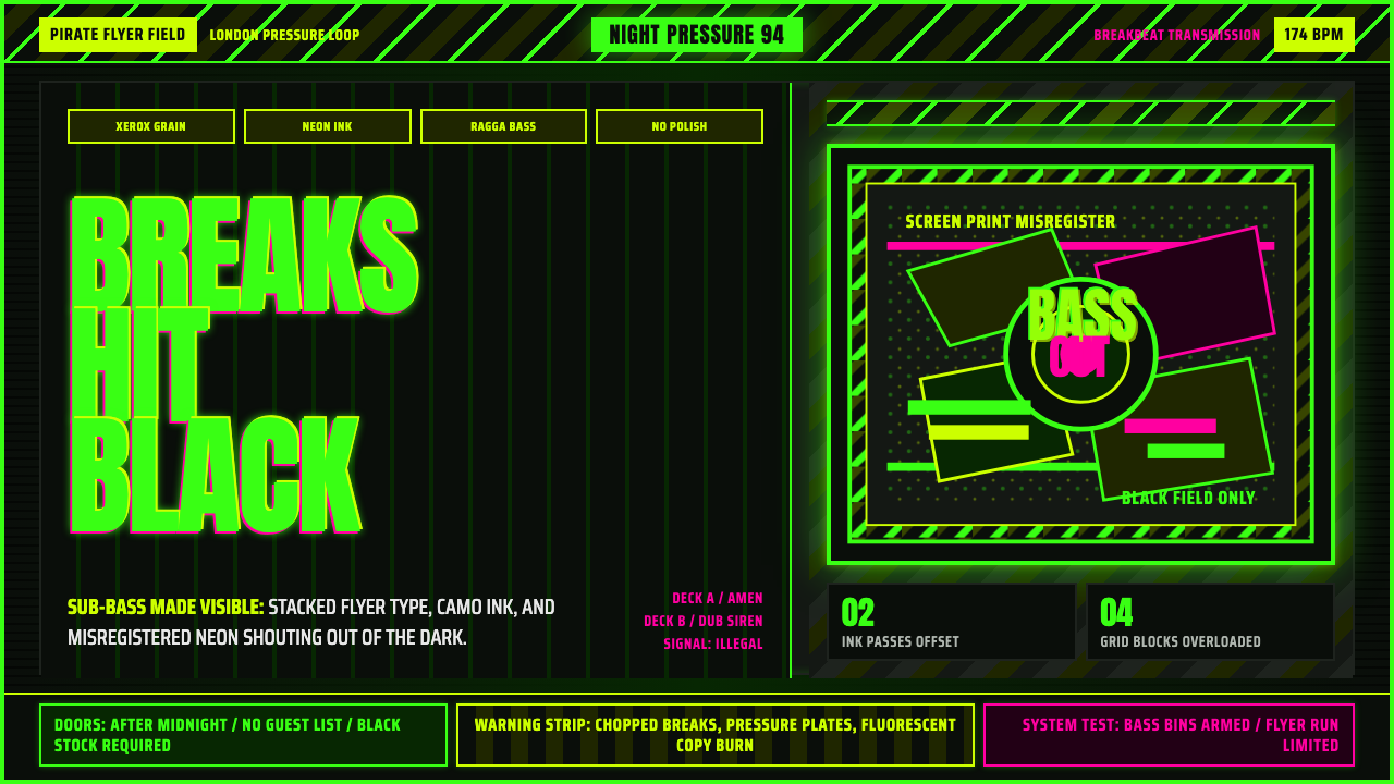 Jungle / Drum & BassRaw rave voltage. Neon green Anton, camo strips, and xerox grain hit black.粗粝锐舞电压。霓虹绿窄体字、迷彩警示条与复印颗粒压上黑底。
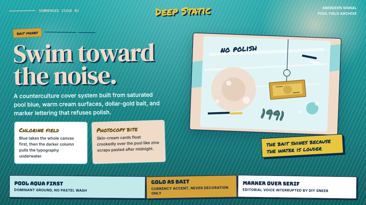 Nirvana — NevermindAnti-pop in pool blue. Cream cards, dollar-gold accents, and marker type roug…泳池蓝里的反主流:乳白卡片、美元金点缀与马克笔字打乱网格。