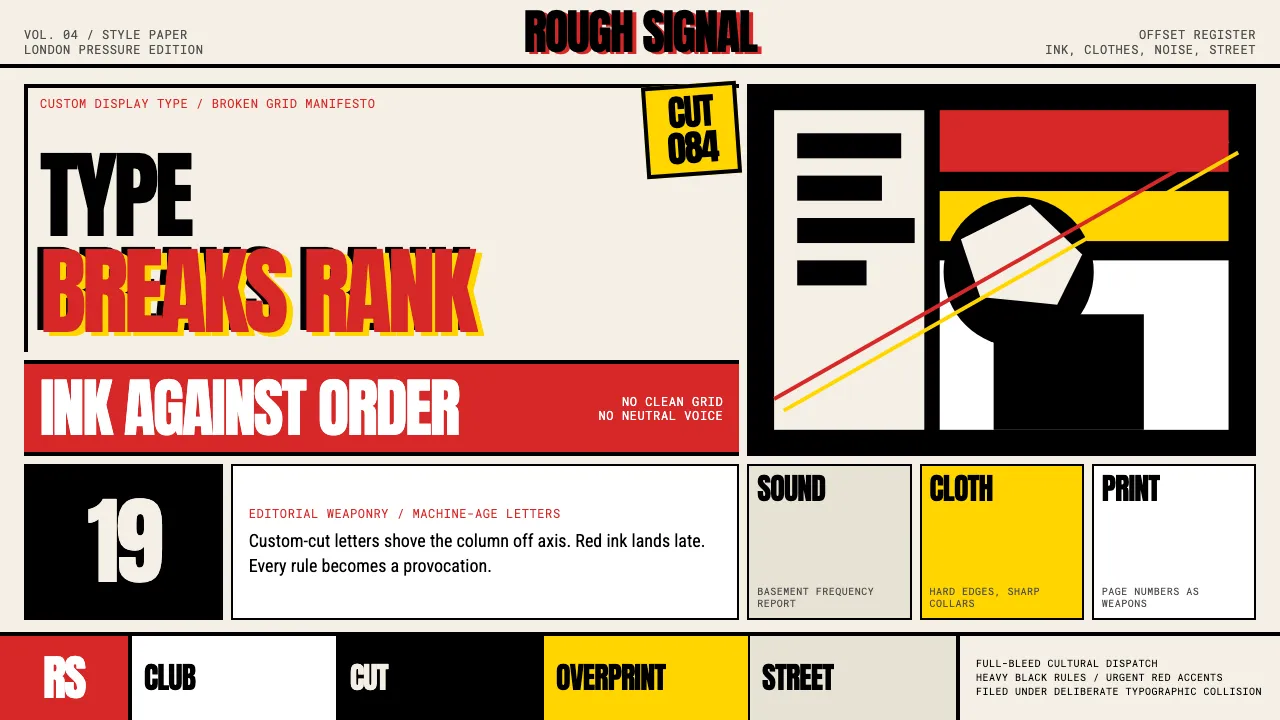
About Neville Brody / The Face
Neville Brody art-directed The Face from 1981 to 1986, turning a London style magazine into a typographic manifesto. He invented custom display faces — Industria, Arcadia, Insignia — and used them to obliterate grid orthodoxy, overlapping headlines onto photography and treating page numbers as graphic elements.
This system distills Brody's print-maximalist language into digital tokens: heavy black ink on cream stock, red accents that punch like a letterpress overprint, and deliberately broken layouts where type is image and image is type.
- Origin
- London, United Kingdom
- Era
- active 1979–present; The Face peak 1981–1986; FontFont co-founded 1990
- Key figures
- Neville Brody · Nick Logan · Erik Spiekermann · Robert Elms
- Movements
- Post-punk graphic design · British style-magazine art direction · Anti-International-Typographic-Style
Neville Brody / The Face design spec
Colors
Typography
The other 11 sections — buttons, cards, spacing, motion, techniques and more — open once you unlock. Download the DESIGN.md or send it to your AI in one click. Unlock once, yours forever.
Sign up nowStyles similar to Neville Brody / The Face
Also inspired by print & type, with a close feel.
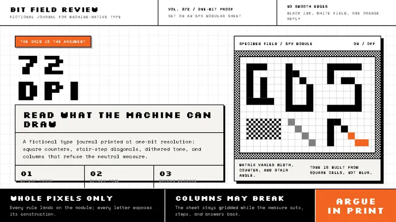 Emigre / Zuzana LickoThe pixel grid argues back. Black bitmap type, dithered grey, and one orange interruption.
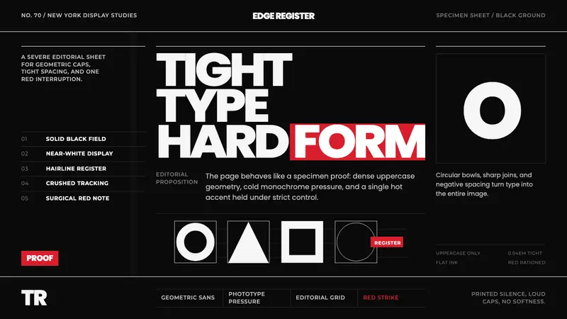 Avant Garde GothicType is the image. Tight white caps on black, ruled grids, one hot red strike.
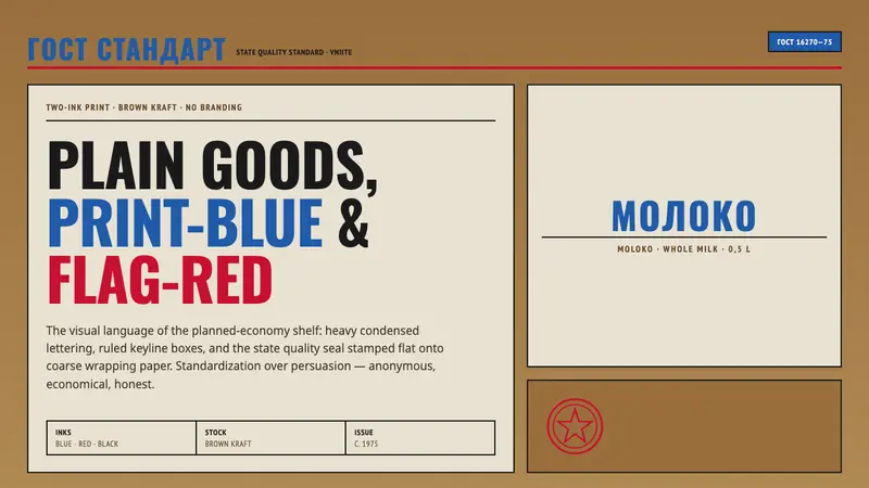 Soviet GOST PackagingAnonymous and strict. Kraft ground, red-blue ink, ruled boxes, condensed type.
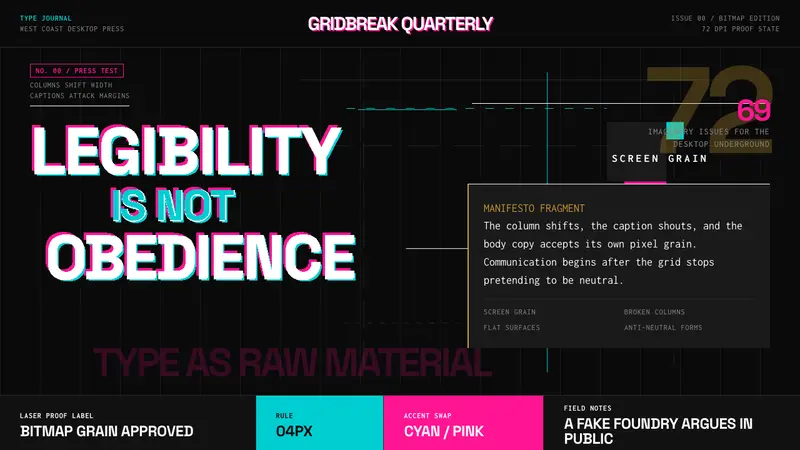 Emigre Magazine (1984–2005)Defies the tidy grid. Cyan, ochre, and hot-pink bitmap type collides on black.