Design style guide设计风格指南
What is Bun JS Runtime Pink 2023?什么是 Bun JS Runtime Pink 2023?
Bun brought bakery warmth to developer tooling — blazing hot-pink energy, benchmark obsession, and a cinnamon-bun mascot that dares the performance era to have a sense of humor.Bun 把面包店的温暖带进了开发工具——滚烫的热粉色能量、对基准测试的执念,以及一只敢于用幽默感对抗性能时代的肉桂面包吉祥物。
Bun JS Runtime Pink 2023 in briefBun JS Runtime Pink 2023 速览
Bun JS Runtime Pink 2023 is the visual identity of Bun, an all-in-one JavaScript runtime that combined a package manager, bundler, and test runner into a single binary built for raw execution speed. The design language arrived fully formed with the 1.0 release in September 2023: saturated hot pink as the dominant hue, expansive white surfaces for content, monospaced elements that echo the terminal environment, and a warm bakery undertone that kept the relentless performance focus from feeling austere.Bun JS Runtime Pink 2023 是 Bun 的视觉标识——一个将包管理器、打包工具和测试运行器合为一个二进制文件的全能 JavaScript 运行时,一切为原始执行速度而生。这套设计语言随 2023 年 9 月的 1.0 发布一同完整降临:以饱和热粉色为主色,宽阔的白色表面承载内容,等宽元素呼应终端环境,温暖的烘焙底色让毫不妥协的性能执念多了一份亲切感。
The aesthetic belongs to a specific moment in developer-tools history — when a new generation of runtimes competed aggressively against the established Node.js ecosystem and chose bold, personality-driven branding to stand out. Where many developer tools defaulted to dark terminals and muted palettes, Bun inverted the convention entirely, betting that maximum visual confidence would signal maximum engineering confidence.这套美学属于开发工具历史上的一个特定时刻——新一代运行时在与成熟的 Node.js 生态的激烈竞争中,纷纷选择大胆的、充满个性的品牌形象来脱颖而出。当大多数开发工具默认使用深色终端和低饱和度色板时,Bun 完全颠倒了这一惯例,以极致的视觉自信来宣示极致的工程自信。
At its core the style is a study in deliberate contrasts: the warmth of a bakery against the precision of benchmark charts, the playfulness of a mascot against the seriousness of systems programming, hot pink against cool white. These tensions are not accidental — they are the brand's argument that high performance and approachability can coexist in the same tool.从本质上看,这种风格是一组精心设计的对比:面包店的温暖对照基准测试图表的精密,吉祥物的俏皮对照系统编程的严肃,热粉色对照冷白色。这些张力绝非偶然——它们是品牌的论点:高性能与亲和力完全可以在同一款工具中共存。
See the Bun JS Runtime Pink 2023 design system →查看 Bun JS Runtime Pink 2023 完整设计系统 →
Where does Bun JS Runtime Pink 2023 come from?Bun JS Runtime Pink 2023 从何而来?
Bun was created by Jarred Sumner and first made public in 2022, developed under the company Oven, Inc., headquartered in San Francisco. Sumner wrote the runtime in Zig, a systems programming language that gave him low-level memory control without the complexity of C++. The choice of Zig was itself a statement — it positioned Bun outside the JavaScript-in-JavaScript tradition of many tooling projects and aligned it instead with a wave of performance-first infrastructure thinking that characterized the early 2020s.Bun 由 Jarred Sumner 创建,于 2022 年首次公开,由总部位于旧金山的 Oven 公司支撑开发。Sumner 用 Zig 编写了这个运行时——一种让他在没有 C++ 复杂性的情况下获得低级内存控制的系统编程语言。选择 Zig 本身就是一种声明,它将 Bun 置于许多工具项目的“用 JavaScript 写 JavaScript 工具”传统之外,将其与 2020 年代初盛行的性能优先基础设施思潮对齐。
Oven raised its Series A from investors who had backed Stripe, bringing professional fintech-grade capital into what had been largely a solo engineering project. The funding enabled Sumner to build a small, focused team — Ashcon Partovi, Dylan Conway, Colin McDonnell, and others — and to invest in the kind of marketing and design that turned a technical achievement into a cultural moment. The hot-pink visual identity emerged from this investment: a deliberate decision to make Bun impossible to ignore at a conference, in a tweet, or on a documentation page.Oven 的 A 轮融资来自曾支持 Stripe 的投资者,将专业金融科技级别的资本注入一个此前基本上是单人工程项目的产品。这笔资金让 Sumner 得以组建一支规模小而专注的团队——Ashcon Partovi、Dylan Conway、Colin McDonnell 等人——并投入能将技术成就变成文化事件的营销与设计工作。热粉色视觉标识正是这一投入的产物:一个刻意的决定,让 Bun 在会议展位、一条推文或一页文档上都无法被忽视。
The cinnamon-bun mascot was central to the brand from the beginning, riffing on the product name in the most literal way possible and giving the project a cheerful, self-aware personality that contrasted with the project's genuinely demanding technical ambitions. The mascot softened the benchmark-chart aggression — instead of reading as a threat to competing runtimes, Bun read as an enthusiastic contender who happened to be very, very fast.肉桂面包吉祥物从一开始就是品牌的核心,用最字面的方式拆解了产品名称,赋予项目一种欢快、自知的个性,与项目真实的、严苛的技术野心形成对照。吉祥物柔化了基准测试图表的进攻性——Bun 读起来不像是对竞争运行时的威胁,而像是一个碰巧跑得非常非常快的热情竞争者。
Bun 1.0 landed in September 2023 to significant industry attention. The announcement benchmarks showed the runtime dramatically outperforming established alternatives on common workloads, and the visual identity amplified every claim: the benchmark bars were rendered in the brand's signature pink against white, the typography was oversized and confident, and every page felt like a team that had been working quietly and was now ready to make noise. The overall effect captured a moment in the post-Node ecosystem where raw speed had become a genuine competitive differentiator and where the marketing language of developer tools had, almost for the first time, become genuinely fun.Bun 1.0 于 2023 年 9 月发布,引发业界广泛关注。发布时的基准测试显示该运行时在常见工作负载上大幅超越既有替代品,而视觉标识放大了每一项声明:基准测试对比条形图以品牌标志性的粉色渲染在白底上,字体超大且自信,每一页都传递出一支安静埋头工作、现在终于准备好大声说话的团队气质。这种整体效果捕捉到了后 Node 时代的一个时刻——原始速度已成为真正的竞争差异,而开发工具的营销语言,几乎是历史上第一次,变得真正有趣。
What defines the Bun JS Runtime Pink 2023 look?Bun JS Runtime Pink 2023 的视觉特征是什么?
Hot Pink Dominance热粉主导
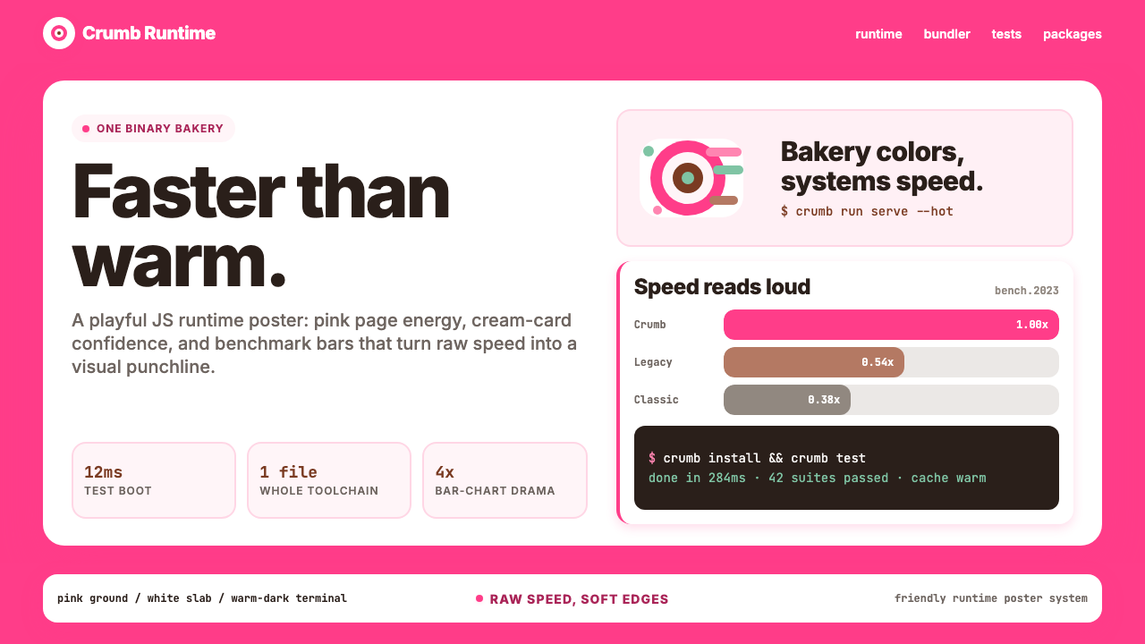
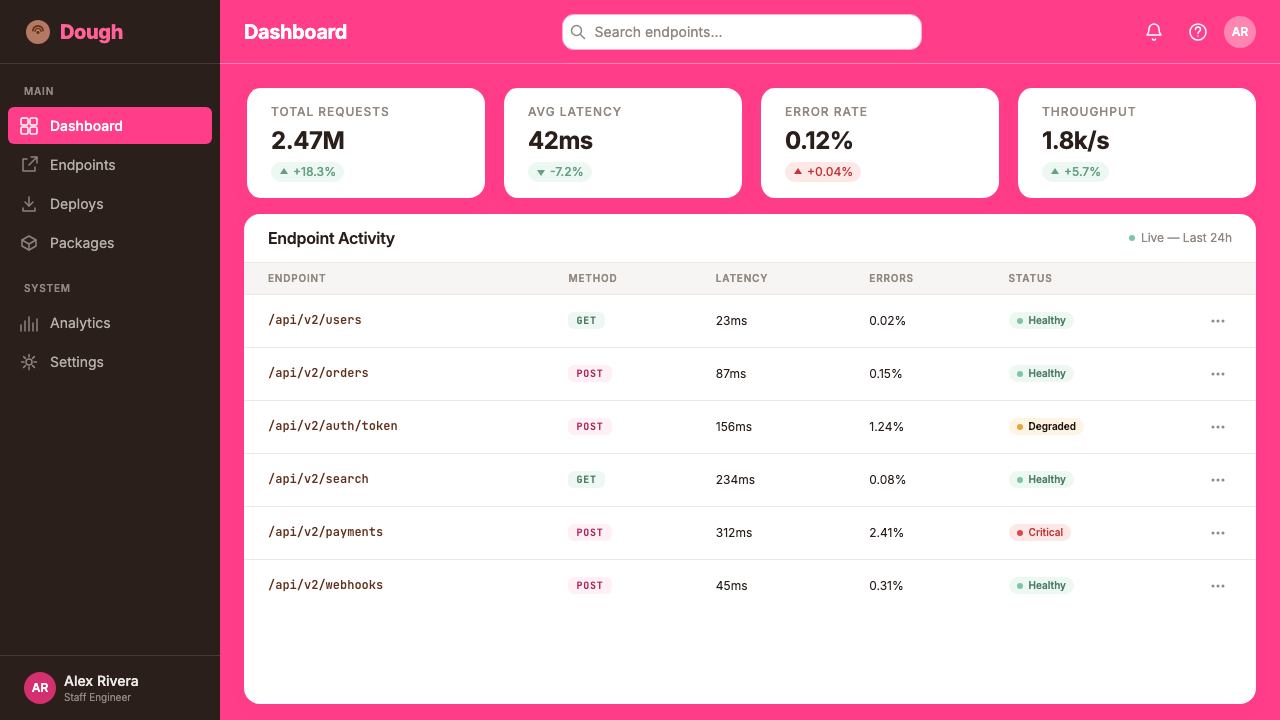
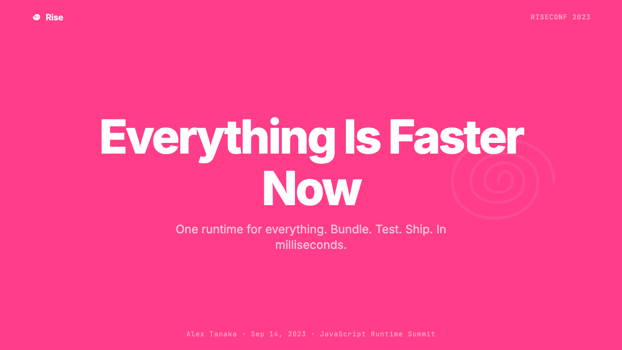
The defining color of the Bun identity is a saturated, assertive hot pink that operates at full vibrancy — not softened into blush, not darkened into mauve, but confrontationally bright. It fills page backgrounds, saturates headline type, and energizes benchmark-bar fills. The effect is immediately recognizable and deliberately polarizing: pink in a developer-tool context signals that the project refuses to follow convention, and the specific intensity of this pink communicates confidence rather than whimsy.Bun 标识的定义色是一种饱和、强硬的热粉色,以全强度运作——不软化成粉白,不加深成灰玫瑰,而是对抗性地明亮。它填满页面背景,浸透标题字体,激活基准测试图表的对比条形。效果立竿见影且刻意制造分歧:在开发工具语境中,粉色意味着这个项目拒绝跟随惯例,而这种特定强度的粉色传达的是自信,而非俏皮。
White Slab Contrast白板对比
Against the hot-pink ground, content areas are rendered as clean white slabs — card-like containers with generous internal padding that create a visual breathing room within an otherwise intense palette. These white zones host documentation, code samples, and explanatory text, letting the eye rest before returning to the pink energy of surrounding elements. The contrast between saturated pink and pure white is high enough to create strong hierarchy without requiring additional color differentiation.在热粉底色的映衬下,内容区域呈现为干净的白色板块——类卡片的容器,内有充足的内间距,在高强度色板中制造视觉呼吸空间。这些白色区域承载文档、代码示例和说明文字,让眼睛在回归周围粉色能量之前得以休息。饱和粉与纯白之间的对比足够强烈,无需额外颜色差异化即可建立清晰的信息层级。
Monospaced Infrastructure等宽基础结构
Monospaced type threads through the visual system as a persistent signal of technical authenticity. Terminal commands, benchmark numbers, package names, and code snippets are all set in monospace, honoring the environment where Bun actually lives and works. The monospaced elements create a visual rhythm distinct from the display and body type, and they ground the more exuberant pink-and-white environment in the reality of command-line tools and shell scripts.等宽字体作为技术真实性的持续信号贯穿整个视觉系统。终端命令、基准测试数字、包名和代码片段全部以等宽字体排列,致敬 Bun 实际运行和工作的环境。等宽元素创造了区别于展示型和正文字体的视觉节奏,将更为张扬的粉白环境扎根于命令行工具和 Shell 脚本的现实。
Benchmark Bar Iconography基准测试条形图标语
The horizontal performance-comparison bar chart became Bun's most recognizable visual motif beyond its color palette. These charts appear throughout the marketing and documentation with Bun's bar consistently the longest — a visual argument rendered as data. The bars themselves are rendered flat and clean with no gradients or dimensional effects, and their arrangement prioritizes immediate legibility: the fastest runtime is always the most visually prominent. The chart pattern became so associated with the brand that it functions almost as a logo alongside the cinnamon-bun mascot.水平性能对比条形图成为 Bun 在色板之外最具辨识度的视觉母题。这些图表贯穿整个营销和文档页面,Bun 的条形始终是最长的——一个以数据呈现的视觉论点。条形本身以平面干净的方式渲染,无渐变无立体效果,其排列优先考虑即时可读性:最快的运行时始终是视觉上最突出的。这种图表模式与品牌的关联度如此之高,以至于它几乎与肉桂面包吉祥物并列成为品牌标识。
Warm Bakery Undertone温暖烘焙底色
Beneath the performance intensity runs a warmth that the cinnamon-bun mascot embodies and the brand copy reinforces. Terminal backgrounds and dark-mode surfaces lean warm rather than cool-gray or pure black, giving the night-mode experience a comfortable depth rather than a stark contrast. This warmth is subtle enough to avoid contradicting the technical seriousness of the product, but consistent enough to make the overall identity feel approachable — a developer tool that wants to be used by real humans, not just admired by engineers.在性能强度之下流淌着一股温暖感,肉桂面包吉祥物将其具象化,品牌文案则将其强化。终端背景和深色模式表面偏暖而非冷灰或纯黑,赋予夜间模式体验一种舒适的纵深感,而非刺眼的对比。这种温暖感足够微妙,不至于与产品的技术严肃性相矛盾,但又足够一贯,让整体标识显得亲切可近——一款想要被真实人类使用的开发工具,而不仅仅是被工程师欣赏的工具。
Oversized Confident Typography超大号自信排版
Display type in the Bun identity runs large and heavy, used to state performance claims with the visual conviction of a headline rather than the hedged language of a technical specification. Headlines occupy significant vertical real estate and are set at weights that feel definitive. Body text contrast is high, maintaining readability against both the white slabs and the occasional pink-ground sections. The typographic system is not decorative — it is argumentative, using scale and weight as the primary tools for building the case that Bun is fast.Bun 标识中的展示型字体大而重,用于以标题的视觉信念而非技术规格书的保守措辞来陈述性能主张。标题占据可观的垂直空间,字重设置得斩钉截铁。正文对比度高,在白色板块和偶尔出现的粉色底面上都保持良好可读性。这套字体系统不具装饰性——它具有论证性,以字号和字重为主要工具,构建 Bun 速度之快的案例。
Mascot-Integrated Brand Voice吉祥物融合的品牌语态
The cinnamon-bun mascot is not decorative clip art — it is a structural element of the brand voice that softens the intensity of the performance-first messaging. Placed alongside benchmark charts and technical documentation, the mascot signals that the creators of this tool have a sense of humor about what they have built. This self-awareness is itself a design choice: it positions Bun's authors as confident enough to joke, which implies they are confident enough in the product to let the benchmarks speak. The mascot prevents the aggressive performance narrative from tipping into parody by never taking itself too seriously.肉桂面包吉祥物不是装饰性的剪贴画——它是品牌语态的结构性元素,柔化了性能优先信息的强度。与基准测试图表和技术文档并置,吉祥物传递出一个信号:这款工具的创作者对自己的成果有幽默感。这种自我意识本身就是一个设计选择:它将 Bun 的作者定位为自信到可以开玩笑的人,这意味着他们对产品自信到足以让基准测试数据自己说话。吉祥物通过从不把自己太当回事,阻止了激进的性能叙事跌入自我讽刺的境地。
See the Bun JS Runtime Pink 2023 design system →查看 Bun JS Runtime Pink 2023 完整设计系统 →
Who shaped Bun JS Runtime Pink 2023?谁塑造了 Bun JS Runtime Pink 2023?
The creator of Bun, Sumner architected the runtime in Zig before most of the industry had considered the language viable for production infrastructure. His decision to build a fully integrated toolchain — runtime, package manager, bundler, and test runner in one binary — came from direct frustration with the fragmentation of the Node.js ecosystem. Sumner's public presence on social media and at conferences was itself part of the Bun brand: technically authoritative, occasionally combative, and consistently willing to let benchmark numbers do the arguing.Bun 的创造者,Sumner 在大多数业界人士认为 Zig 在生产基础设施上尚不可行之前,就用这门语言构建了这个运行时。他决定构建一个完全集成的工具链——运行时、包管理器、打包工具和测试运行器合为一个二进制文件——源于对 Node.js 生态碎片化的切身挫败感。Sumner 在社交媒体和会议上的公开形象本身就是 Bun 品牌的一部分:技术上权威,偶尔带有对抗性,并且始终愿意让基准测试数字代替自己说话。
An early core contributor to Bun, Partovi worked on the foundational systems that made the runtime's performance claims achievable in production. The presence of a small team of focused contributors around Sumner gave Bun's architecture a coherence that single-author projects often lack — each contributor brought deep systems experience, and the shared commitment to Zig as the implementation language unified the codebase at a fundamental level.Bun 早期的核心贡献者之一,Partovi 参与了使运行时性能声明在生产环境中得以实现的基础系统工作。Sumner 周围这支规模小而专注的贡献者团队赋予了 Bun 架构以单人项目通常缺乏的连贯性——每位贡献者都带来了深厚的系统编程经验,而以 Zig 作为实现语言的共同承诺在最基础的层面统一了代码库。
A core member of the Oven team, Conway contributed to the development of Bun's bundler and other core tooling features. The all-in-one toolchain vision required engineers capable of working across multiple distinct problem domains simultaneously — parsing, linking, module resolution, and runtime internals — and Conway was among those who helped make that breadth coherent under a single binary.Oven 团队的核心成员,Conway 参与了 Bun 打包工具和其他核心工具功能的开发。全能工具链的愿景要求工程师能够同时跨越多个截然不同的问题领域——解析、链接、模块解析和运行时内部——而 Conway 是帮助将这种广度在单一二进制文件下变得连贯的人之一。
Another member of the early Oven team, McDonnell contributed to the development of Bun's APIs and documentation. Good documentation was essential to Bun's adoption strategy: the runtime was technically sophisticated enough to be intimidating, and clear, opinionated documentation helped developers understand not just how to use Bun but why its architectural choices were deliberate rather than incidental.Oven 早期团队的另一名成员,McDonnell 参与了 Bun API 和文档的开发工作。优质文档对 Bun 的采用策略至关重要:这个运行时在技术上足够复杂,可能令人望而却步,而清晰、有观点的文档帮助开发者理解的不仅是如何使用 Bun,更是为什么它的架构选择是深思熟虑的而非偶然的。
How do you use Bun JS Runtime Pink 2023 today?今天怎么用 Bun JS Runtime Pink 2023?
The Bun identity is built around a specific tension — performance-first technical authority delivered with warmth and humor — and working with this style means committing to both halves of that tension. Applied correctly, it communicates engineering confidence without condescension and technical complexity without intimidation. The dominant hot pink should anchor a composition rather than saturate every surface: one bold pink field or zone per layout establishes the brand statement, while white and near-neutral surfaces do the actual content work.Bun 标识建立在一种特定的张力之上——以温暖和幽默传递性能优先的技术权威——应用这种风格意味着对这种张力的两面都作出承诺。正确应用时,它传递的是工程自信而非居高临下,以及技术复杂性而非令人望而生畏。主导性的热粉色应当锚定一个构图,而非浸透每一个表面:每个版面中一个大胆的粉色字段或区域就足以建立品牌声明,而白色和接近中性的表面则承担实际的内容工作。
For presentation slides, the style works exceptionally well when the content involves comparison or argument. Cover slides benefit from the full pink-and-white contrast — a large, high-weight headline against a pink or white ground with generous negative space. Content slides that present performance data, architectural decisions, or technical trade-offs should use the benchmark-bar format as a model: horizontal comparison elements rendered flat and clean, with the key value always the most visually prominent. Avoid cluttering data slides with decoration; let the numbers do the arguing, and let the pink accent mark the winner.对于演示文稿,当内容涉及比较或论证时,这种风格表现尤为出色。封面页受益于充分的粉白对比——一个大字号高字重的标题,置于粉色或白色底面,留有充足的负空间。呈现性能数据、架构决策或技术权衡的内容页应以基准测试条形图格式为模型:水平对比元素以平面干净的方式渲染,关键数值始终是视觉上最突出的。避免用装饰元素堆砌数据页;让数字代替自己说话,让粉色强调色标记胜者。
For web UI and dashboards, the style suits any context where clarity and confidence are more important than softness. Navigation and headers can carry the pink energy; content areas should default to white or a warm near-white. Interactive states — hover, active, selected — are natural recipients of the pink accent, creating a system where color carries meaning without being arbitrary. Monospaced type should appear wherever technical values, commands, or identifiers are displayed, reinforcing the connection between the visual system and the technical environment it references.对于网页界面和仪表板,这种风格适合任何清晰度和自信感比柔和感更重要的场景。导航和标题可以承载粉色能量;内容区域应默认使用白色或温暖的接近白色。交互状态——悬停、激活、选中——是粉色强调色的天然受体,创造出一套颜色承载意义而非任意使用的系统。等宽字体应在任何技术值、命令或标识符出现的地方使用,强化视觉系统与其所参照的技术环境之间的联系。
For editorial and marketing work, the Bun aesthetic has particular strength in launch announcements, performance reports, and technical comparisons. A marketing page using this style alternates between pink-ground feature statements and white-ground explanatory content, with benchmark visuals occupying prominent positions. The mascot or brand personality elements should appear at moments of transition or celebration rather than as persistent decoration — they earn their place by breaking the intensity at the right moment.对于编辑和营销内容,Bun 美学在发布公告、性能报告和技术对比类内容中具有特别的力量。使用这种风格的营销页面在粉底功能声明和白底解释内容之间交替,基准测试可视化内容占据突出位置。吉祥物或品牌个性元素应出现在过渡或庆祝时刻,而非作为持续性装饰——它们通过在正确时刻打破强度来赢得自己的位置。
The most common mistake when applying this style is using the hot pink as wallpaper — saturating every surface and element until the color loses its ability to signal emphasis. The pink works because it contrasts; when everything is pink, nothing is pink. A related mistake is adopting the playful brand voice without the underlying technical confidence: the humor in the Bun identity works because it is backed by genuine benchmark data. Without that foundation, the warmth and mascot energy read as decoration rather than self-assurance.应用这种风格最常见的错误是将热粉色用作壁纸——将每一个表面和元素都染上粉色,直到颜色失去传达强调的能力。粉色之所以有效,是因为它形成对比;当一切都是粉色,就没有什么是粉色。另一个相关的错误是采用了俏皮的品牌语态,却没有底层的技术自信:Bun 标识中的幽默之所以有效,是因为它有真实的基准测试数据作为支撑。没有这一基础,温暖感和吉祥物的能量读起来就只是装饰,而非自我确信。
See the Bun JS Runtime Pink 2023 design system →查看 Bun JS Runtime Pink 2023 完整设计系统 →
Bun JS Runtime Pink 2023 — FAQBun JS Runtime Pink 2023 · 常见问题
Is this style appropriate for products outside the developer-tools category?这种风格适合开发工具类别以外的产品吗?
With adaptation, yes. The hot-pink and white combination is bold enough to work across consumer product launches, performance marketing, and startup brand moments where the goal is to be impossible to ignore. What translates is the contrast logic and the confidence of the typographic scale. What requires reconsideration is the benchmark-bar motif and the monospaced-type infrastructure, which carry strong developer-tool connotations. A consumer brand using this palette would substitute its own data visualization conventions and drop the terminal-referencing elements while keeping the color energy and mascot-driven warmth.经过适配后可以。热粉加白色的组合足够大胆,可以跨越消费品发布、效果营销和创业品牌时刻——在任何目标是无法被忽视的场景中都适用。可以迁移的是对比逻辑和排版尺度的自信感。需要重新考量的是基准测试条形图母题和等宽字体基础结构,它们携带着强烈的开发工具含义。使用这套色板的消费品品牌可以替换为自己的数据可视化惯例,去掉参照终端的元素,同时保留色彩能量和吉祥物驱动的温暖感。
How does this style handle dark mode?这种风格如何处理深色模式?
The Bun identity's dark mode is one of its most thoughtful aspects. Rather than simply inverting to black, the dark surfaces lean warm — closer to a very deep cinnamon brown than to a neutral charcoal. This preserves the bakery undertone that runs through the light-mode experience and prevents the dark version from reading as a generic dark UI. The hot pink maintains its presence in dark mode, used for interactive elements, accent marks, and the logo itself, which glows at full saturation against the warm dark ground.Bun 标识的深色模式是其最用心的方面之一。深色表面不是简单反转为黑色,而是偏暖——更接近非常深的肉桂棕,而非中性的炭灰色。这保留了贯穿浅色模式体验的烘焙底色,防止深色版本被读作普通的深色界面。热粉色在深色模式中依然保持存在感,用于交互元素、强调标记和 logo 本身——在温暖的深色底面上以全饱和度发光。
Can this style coexist with code syntax highlighting?这种风格能与代码语法高亮共存吗?
Yes, and Bun's own documentation demonstrates this well. Code blocks are rendered on near-neutral or warm-dark backgrounds that step back from the hot-pink energy of the surrounding page, creating a visual separation between brand expression and technical content. Syntax highlighting within those blocks can use a standard warm-toned scheme without conflict — the pink accent color is reserved for the brand layer and does not compete with the code's internal color logic. The monospaced type in code blocks harmonizes with the monospaced infrastructure elsewhere in the identity.可以,Bun 自己的文档很好地示范了这一点。代码块渲染在接近中性或偏暖的深色背景上,从周围页面的热粉能量中退后一步,在品牌表达和技术内容之间制造视觉分隔。代码块内的语法高亮可以使用标准的暖色调配色方案而不产生冲突——粉色强调色保留给品牌层,不与代码内部的颜色逻辑竞争。代码块中的等宽字体与标识中其他位置的等宽基础结构和谐共存。
What distinguishes authentic use of this style from simple pink-and-white branding?真正运用这种风格与普通的粉白品牌有何区别?
Three things: the warmth undertone, the data-first composition logic, and the self-aware personality. Generic pink-and-white branding uses pink as a softening or feminizing device, often at lower saturation. Bun's pink is hot — it asserts rather than softens. Generic pink-and-white branding centers lifestyle imagery; Bun's centers performance data and technical claims. And generic branding either takes itself seriously or deploys humor as a marketing layer; Bun's mascot and voice integrate humor into the technical argument itself, making playfulness a form of confidence. When all three elements align, the result has the specific Bun register. When only the color is borrowed, it reads as pink branding rather than Bun-derived design.三件事:温暖底色、数据优先的构图逻辑,以及自知的个性。通用的粉白品牌将粉色用作柔化或女性化的手段,通常饱和度较低。Bun 的粉色是热烈的——它强调而非柔化。通用粉白品牌以生活方式图像为中心;Bun 的核心是性能数据和技术主张。通用品牌要么认真对待自己,要么将幽默作为营销层部署;Bun 的吉祥物和语态将幽默融入技术论点本身,使俏皮成为自信的一种形式。当三种元素对齐时,结果具有 Bun 特有的调性。当只有颜色被借用时,读起来只是粉色品牌,而非 Bun 衍生设计。
How does this style age as the runtime landscape continues to evolve?随着运行时格局的持续演变,这种风格会如何老化?
The hot-pink identity is tied to a specific cultural moment — the 2023 JavaScript runtime wars — which means it carries both the energy of that moment and its time-stamp. In the short to medium term, the style benefits from its strong differentiation: as developer tools continue to proliferate, a bold pink identity with a mascot is more memorable than another dark-background monospace-only interface. Over a longer arc, the style's durability will depend on whether Bun's performance claims continue to hold and improve — the design and the technology are deeply integrated. If the benchmarks remain authoritative, the pink identity will read as confident; if the runtime loses its performance edge, the same visual language could start to feel like overstatement.热粉色标识与一个特定的文化时刻相关联——2023 年 JavaScript 运行时之战——这意味着它同时携带那个时刻的能量和时间戳。在短中期内,这种风格受益于其强烈的差异化:随着开发工具持续增多,一个带吉祥物的大胆粉色标识比另一个深色背景等宽字体界面更令人难忘。从更长的时间弧度看,这种风格的持久性将取决于 Bun 的性能声明是否继续成立并持续改进——设计与技术之间深度整合。如果基准测试保持权威性,粉色标识将被读作自信;如果运行时失去性能优势,同样的视觉语言可能开始感觉像是言过其实。
Related design styles相关设计风格
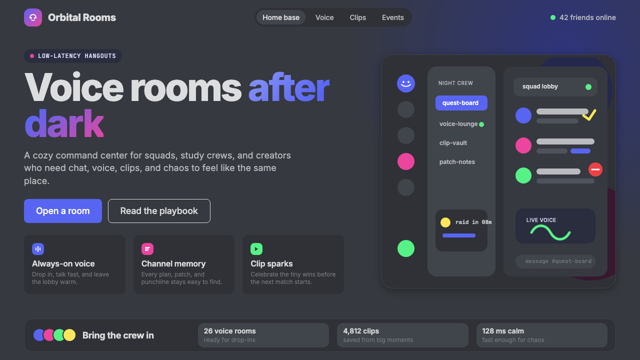 Discord 2024Blurple cozy. Charcoal grounds, illustrated characters — every surface says '…刻意去企业化的语音聊天:blurple 蓝紫、深炭灰底、俏皮插画角色——每个界…
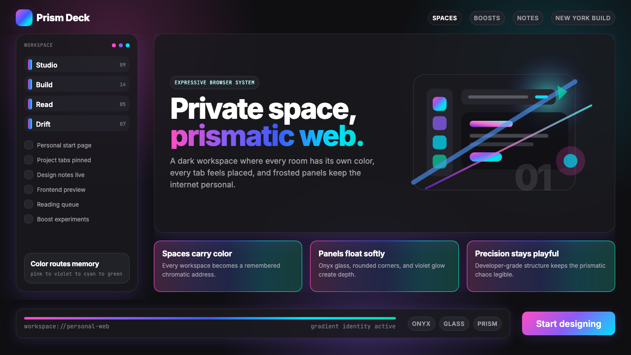 Arc Browser Prismatic (2023)Color is architecture. Pink-violet-cyan ribbons glow over onyx glass and roun…颜色即架构:粉紫青光带浮在黑曜石玻璃面板上。
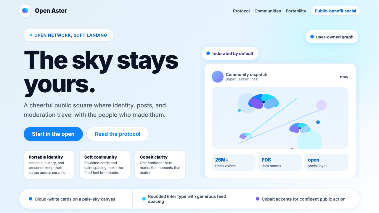 Bluesky AT Protocol 2024Open tech feels warm. Pale sky, cloud cards, Inter, and one cobalt accent car…开放科技也温暖:浅天蓝、云白卡片、Inter 与钴蓝强调。
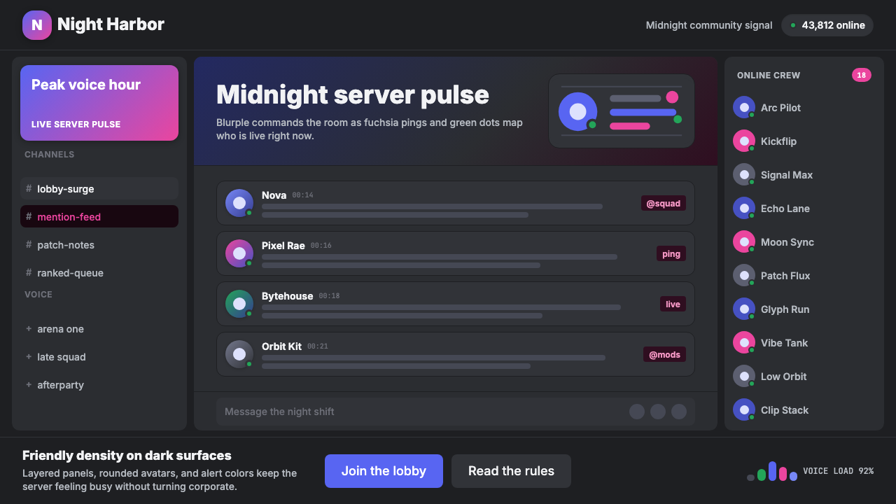 Discord Blurple Server (2020)Midnight server energy. Blurple panels, fuchsia pings, and green status dots…午夜服务器能量:蓝紫面板、品红提醒、在线绿点保持密集。
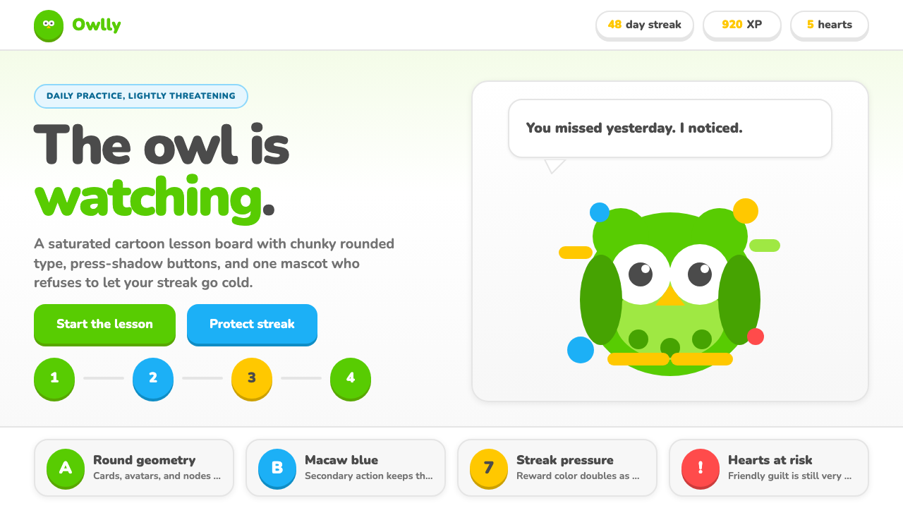 Duolingo Green Owl MascotFriendly guilt goes loud. Saturated green, Nunito heft, and press-shadow butt…友好内疚很响亮:高饱和绿、厚重 Nunito 与按压阴影盯住连胜。
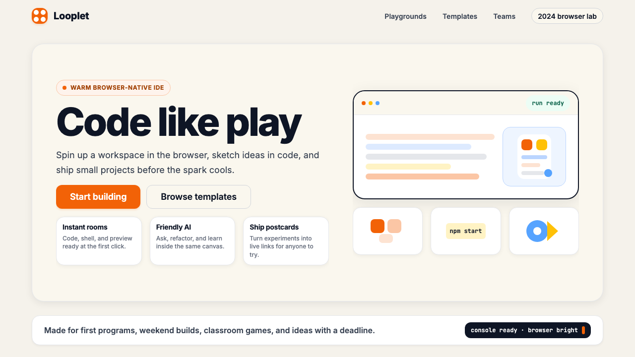 Replit 2024Coding feels warm. Coral buttons, cream panels, rounded code tiles make build…编程变得温暖:珊瑚按钮、奶油面板与圆角代码块让构建更好玩。