Design style guide设计风格指南
What is Duolingo Green Owl Mascot?什么是 Duolingo Green Owl Mascot?
Duolingo's green owl turned friendly guilt into a design language — proving that a single saturated color and a cartoon mascot can build one of the most recognizable visual identities in consumer software.Duolingo 的绿色猫头鹰把友好的内疚感变成了一套设计语言——证明一种高饱和色彩加一个卡通吉祥物,足以在消费软件中建立最具辨识度的视觉身份之一。
Duolingo Green Owl Mascot in briefDuolingo Green Owl Mascot 速览
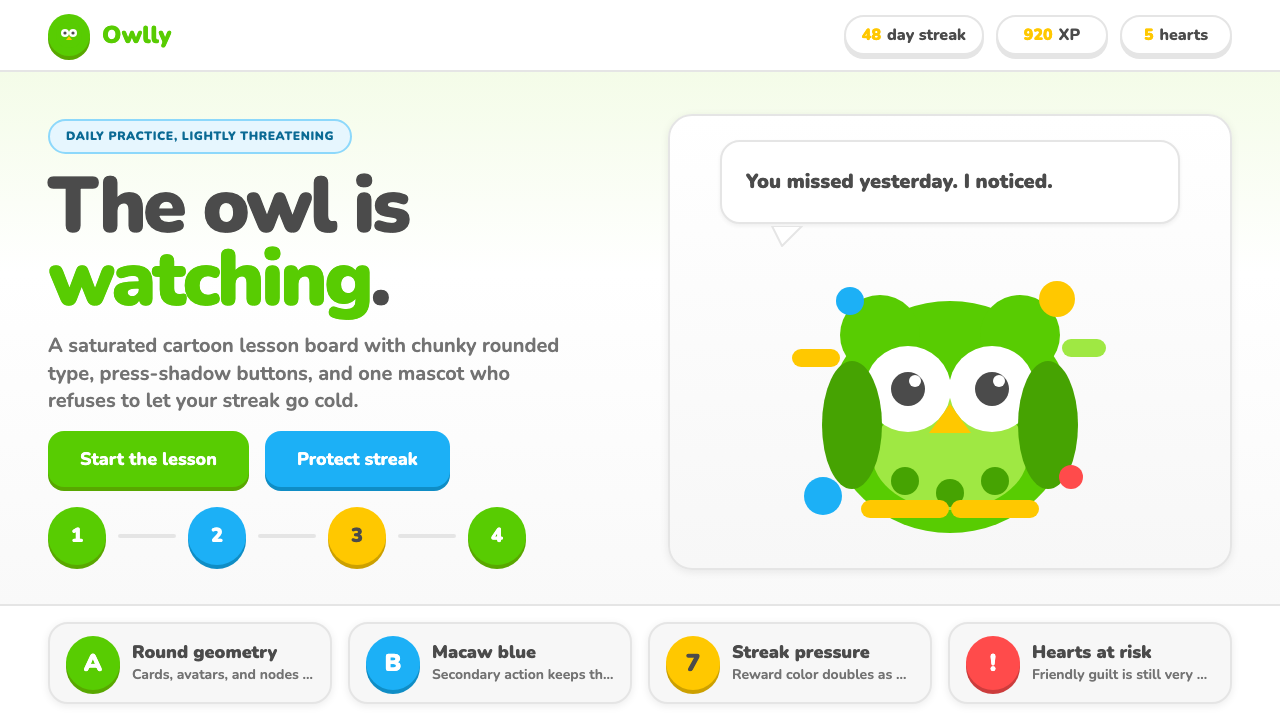
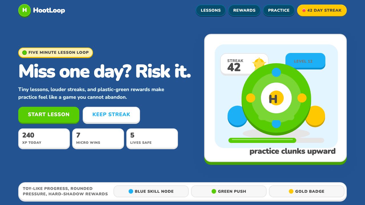
Duolingo Green Owl Mascot is the visual design language that powers the Duolingo language-learning app — a system built around a single dominant saturated green, chunky rounded geometry, expressive character illustration, and a gamified interface vocabulary that borrows equally from children's-book aesthetics and mobile game UI conventions. The style is deliberately loud, warm, and almost aggressively cheerful, designed to reduce the psychological friction of daily practice by making the product feel more like play than study.Duolingo 绿色猫头鹰吉祥物是驱动 Duolingo 语言学习应用的视觉设计语言——这套体系建立在单一主导高饱和绿、圆润粗壮的几何形状、极具表现力的角色插画,以及一套游戏化界面词汇之上,后者同时借鉴了儿童绘本美学与移动游戏 UI 惯例。这种风格刻意地响亮、温暖,几乎是咄咄逼人地欢快,其设计目标是通过让产品感觉更像玩耍而非学习,来降低日常练习的心理阻力。
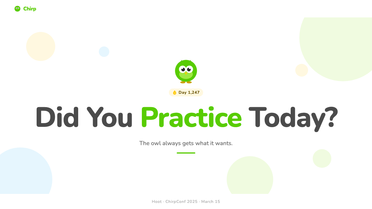
At the heart of the system is Duo, the green owl mascot, who appears in dozens of distinct emotional states: celebratory, encouraging, passive-aggressive, mournful, threatening. Each expression is rendered with the same rounded, cartoonish character art — thick outlines, simple fills, exaggerated proportions — and each state communicates a specific behavioral nudge. The owl is not decoration; it is the primary emotional carrier of the interface, doing work that text notifications and progress bars alone cannot.这套系统的核心是绿色猫头鹰 Duo。它以数十种截然不同的情绪状态出现:欢庆、鼓励、阴阳怪气、悲伤、威胁。每一种表情都以同样的圆润卡通角色风格呈现——粗描边、简单填色、夸张比例——每一种状态都传递一个特定的行为提示。猫头鹰不是装饰;它是界面的主要情感载体,承担着文字通知和进度条单独无法完成的工作。
The surrounding visual system codifies this energy into repeatable components. Buttons cast a solid pressed shadow downward, giving them a physical, stamp-like quality. Avatars are circular with thick colored borders. Speech and feedback bubbles use rounded tails. The color palette reads like a children's book printed at higher-than-recommended saturation — the greens are vivid, the yellows are warm, the reds signal danger with genuine alarm. Nothing is muted, nothing is subtle, and the cumulative effect is an interface that feels alive and opinionated at every moment.周围的视觉系统将这种能量编码成可复用的组件。按钮向下投射一个实底阴影,赋予它们一种物理性的印章质感。头像是圆形的,带有粗彩色边框。对话和反馈气泡使用圆尾巴。配色方案读起来像一本饱和度超标的儿童绘本——绿色鲜艳,黄色温暖,红色以真实的警示感标示危险。没有什么是低调的,没有什么是微妙的,累积效果是一个在每个时刻都感觉充满活力、有主见的界面。
See the Duolingo Green Owl Mascot design system →查看 Duolingo Green Owl Mascot 完整设计系统 →
Where does Duolingo Green Owl Mascot come from?Duolingo Green Owl Mascot 从何而来?
Duolingo was founded in Pittsburgh in 2011 by Luis von Ahn and Severin Hacker. Von Ahn, a Guatemalan-born computer scientist and the inventor of reCAPTCHA, had already built a reputation for designing systems that harvested collective human effort at scale. Duolingo applied the same logic to language education: if millions of people could be persuaded to practice daily, the aggregate learning data could improve the product for everyone. The challenge was persuasion — turning a daily obligation into a daily habit. That challenge shaped the entire visual philosophy.Duolingo 由路易斯·冯·安和塞韦林·哈克尔于2011年在匹兹堡创立。出生于危地马拉的计算机科学家冯·安,也是 reCAPTCHA 的发明者,此前已以设计能够大规模汇聚集体人力的系统而著称。Duolingo 将同样的逻辑应用于语言教育:如果能说服数以百万计的人每天练习,积累的学习数据就能为所有人改善产品。挑战在于说服力——将一项日常义务转化为日常习惯。这一挑战塑造了整个视觉哲学。
The original interface was comparatively restrained. Duo the owl existed from early on as a brand symbol, but the full emotional range of the mascot — the dozens of expressive states — developed gradually as the product team learned which behavioral signals worked. The 2018 mascot refresh, led in part by design director Mandy Hu, pushed the character into a bolder, more expressive register and committed the brand to character-driven design as a strategic differentiator. The owl's passive-aggressive persona, in particular — the guilt-tripping streak notifications, the mournful expressions when users lapsed — became a cultural phenomenon, producing memes that functioned as free marketing.最初的界面相对克制。Duo 猫头鹰从早期就作为品牌符号存在,但吉祥物的完整情感范围——数十种表情状态——随着产品团队了解哪些行为信号有效而逐步发展出来。2018年由设计总监胡曼迪(Mandy Hu)部分主导的吉祥物刷新,将角色推向了更大胆、更具表现力的境地,并将品牌定位于角色驱动设计作为战略差异点。猫头鹰的阴阳怪气人格——那些令人内疚的连胜通知、用户中断时的悲伤表情——尤其成为一种文化现象,产生了发挥免费营销作用的表情包。
The typography underwent a significant evolution in 2022 with the introduction of the custom typeface Feather Bold, designed specifically for Duolingo's display contexts. Before this, the brand had relied on the commercially available Nunito, a rounded sans-serif whose soft geometry aligned well with the mascot's character art. Feather Bold extended that philosophy with letterforms purpose-built for the brand's rounded, high-energy aesthetic — ensuring that type and illustration spoke the same visual language rather than coexisting as separate decisions.2022年,随着专为 Duolingo 展示场景设计的定制字体 Feather Bold 的引入,字体排印经历了重要演变。在此之前,品牌依赖商业字体 Nunito——一种圆润无衬线字体,其柔和几何形状与吉祥物角色风格契合良好。Feather Bold 以专门为品牌圆润、高能量美学打造的字形延伸了这一理念,确保字体与插画说同一种视觉语言,而非作为两个独立决定并存。
The broader movements that shaped the style include gamified learning, which treats engagement mechanics — streaks, experience points, leagues, and social competition — as first-class product features rather than add-ons. This approach demanded an interface that could credibly celebrate small victories and dramatize small failures, hence the emotional range of the mascot and the reward animations. Mascot brand identity as a movement — the practice of building a brand's emotional character around a single illustrated figure — is less common in software than in consumer goods, and Duolingo's success with Duo influenced a generation of app brands to invest in character design as a retention strategy. Character-driven product design, the third movement, extends this further: the mascot is not just a logo but an actor in the product's narrative, with a consistent personality that users develop a relationship with over time.塑造这种风格的更广泛运动包括:游戏化学习——将参与机制(连胜、经验值、联赛和社交竞争)视为一等产品特性而非附加功能。这种方式要求界面能够可信地庆祝小胜利、戏剧化小失败,因此才有吉祥物的情感范围和奖励动画。吉祥物品牌身份作为一种运动——围绕单一插画形象构建品牌情感性格的实践——在软件领域不如在消费品领域常见,而 Duolingo 与 Duo 的成功影响了新一代应用品牌,促使它们将角色设计投入为留存策略。角色驱动产品设计这第三种运动进一步延伸了这一点:吉祥物不仅仅是标志,而是产品叙事中的演员,拥有用户随时间建立关系的一致人格。
What defines the Duolingo Green Owl Mascot look?Duolingo Green Owl Mascot 的视觉特征是什么?
The Dominant Green主导绿色
The Duolingo green is not one shade among many — it is the foundation that everything else is measured against. It sits at a saturation level high enough to read as unmistakably intentional on any screen brightness, and it carries the brand signal so completely that the owl silhouette alone in that color is sufficient for recognition. The green is warm enough to feel friendly rather than clinical, but vivid enough to feel energetic rather than passive. Secondary and tertiary colors — the warm yellows, the alert reds, the softer supporting tones — all operate in relation to this anchor, either reinforcing or punctuating it.Duolingo 的绿色不是众多色调中的一种——它是衡量其他一切的基础。它的饱和度足够高,在任何屏幕亮度下都显得无可置疑地有意为之,它所承载的品牌信号是如此完整,以至于那种颜色的猫头鹰剪影单独就足以让人识别。这种绿色足够温暖,感觉友好而非临床,但又足够鲜艳,感觉充满活力而非被动。次要和三级色彩——温暖的黄色、警示的红色、更柔和的辅助色调——都在与这个锚点的关系中运作,要么强化它,要么为它添加标点。
Rounded Geometry圆润几何
Every structural element in the system — buttons, avatars, cards, badges, progress bars, input fields — is rounded to the point where sharp corners are effectively absent. This is not a casual aesthetic choice: rounded forms read as approachable, non-threatening, and friendly across cultural contexts, and they echo the character art of the mascot himself. The roundedness is applied consistently enough that any element with a sharp corner would feel like a foreign object — an error rather than a decision. This geometric consistency binds the mascot illustration and the UI components into a single coherent system.系统中的每一个结构性元素——按钮、头像、卡片、徽章、进度条、输入框——都被圆润化到锐角实际上缺席的程度。这不是一个随意的美学选择:圆润的形状在不同文化语境中都被理解为易于接近、无威胁感和友好,而且它们与吉祥物本身的角色风格相呼应。这种圆润感被足够一致地应用,以至于任何带有锐角的元素都会感觉像异物——像错误而非决定。这种几何一致性将吉祥物插画和 UI 组件绑定成单一连贯的系统。
Press-Shadow Buttons按压阴影按钮
The signature interactive component of the Duolingo system is a button with a solid, flat shadow anchored to its bottom and side edges, creating the visual impression of a raised physical object. When pressed, the button appears to depress, the shadow collapses, and the element feels genuinely physical — as though the user is pressing a real surface. This press-shadow mechanism is more than a skeuomorphic detail: it makes every interaction feel consequential and satisfying, reinforcing the gamified logic of the product. The shadow is rendered as a solid darker band rather than a diffuse gradient, keeping the overall aesthetic flat and graphic even while simulating depth.Duolingo 系统标志性的交互组件是一种按钮,带有锚定在其底部和侧边缘的实心平面阴影,制造出一个凸起物理对象的视觉印象。按下时,按钮显得下压,阴影收缩,元素感觉真实地具有物理性——好像用户在按压一个真实表面。这种按压阴影机制不仅仅是拟物化细节:它让每次交互感觉有分量、令人满足,强化了产品的游戏化逻辑。阴影被渲染为实心的深色带而非漫散的渐变,即便在模拟深度的同时,也保持了整体美学的平面和图形感。
Expressive Character Art极具表现力的角色艺术
Duo the owl is not a static logo but a performance. The character exists in a wide range of emotional states — joy, disappointment, passive aggression, threat, pride, sadness — each rendered with clear, readable body language and facial expression. The illustration style uses thick outlines, bold fills with minimal internal shading, and exaggerated proportions that prioritize emotional legibility over anatomical accuracy. This expressiveness is systematized: specific emotional states are deployed at specific product moments, so the mascot functions as an emotional feedback system integrated into the interface rather than a decorative layer applied on top of it.Duo 猫头鹰不是一个静态标志,而是一场表演。这个角色以广泛的情绪状态存在——喜悦、失望、阴阳怪气、威胁、骄傲、悲伤——每一种都以清晰可读的肢体语言和面部表情呈现。插画风格使用粗描边、内部阴影极少的大胆填色,以及优先考虑情感可读性而非解剖准确性的夸张比例。这种表现力被系统化:特定情绪状态在特定产品时刻部署,因此吉祥物作为集成在界面中的情感反馈系统运作,而非作为叠加在其上的装饰层。
Gamified Color Signals游戏化色彩信号
Color in the Duolingo system carries explicit behavioral meaning. The dominant green signals correct answers, active streaks, and successful completion. Warm yellow marks the streak flame and reward moments — borrowed from the universal signal of warmth and fire. Red appears for mistakes, lost streaks, and urgent nudges, deployed with enough contrast to create genuine alarm without becoming hostile. Purple and other secondary accent colors mark premium states and special achievement tiers. This color-as-signal logic is borrowed from game UI conventions, where color teaches the player the rules of the system through repetition and consistent consequence.Duolingo 系统中的色彩承载着明确的行为意义。主导绿色标示正确答案、活跃连胜和成功完成。温暖的黄色标记连胜火焰和奖励时刻——借用了温暖与火焰的普世信号。红色出现在错误、失去连胜和紧急提示中,以足够的对比度部署,制造真实的警示感而不至于令人敌意。紫色和其他次要强调色标记高级状态和特殊成就等级。这种色彩即信号的逻辑借鉴自游戏 UI 惯例,在那里色彩通过重复和一致的后果向玩家教授系统规则。
Reward and Celebration Animation奖励与庆祝动画
The system treats animation as an essential layer of the emotional design, not as polish applied after the fact. Correct answers trigger confetti, particle bursts, and character celebrations. Streak milestones produce elaborate animated sequences. Even small interactions — tapping a choice, completing a lesson — carry micro-animations that provide immediate tactile feedback. The animation vocabulary is energetic and exaggerated, calibrated to feel like a genuine reward rather than a token gesture. This commitment to celebration is structurally important: in a product whose core value proposition is consistency over time, each daily interaction needs to feel worthwhile on its own terms.该系统将动画视为情感设计的重要层,而非事后添加的抛光。正确答案触发彩纸、粒子爆发和角色庆祝。连胜里程碑产生精心制作的动画序列。即使是小交互——点击一个选项、完成一节课——也带有提供即时触觉反馈的微动画。动画词汇充满活力且夸张,校准为感觉像真正的奖励而非象征性姿态。这种对庆祝的承诺在结构上很重要:在一个核心价值主张是长期坚持的产品中,每次日常交互都需要在其自身层面上感觉值得。
Typographic Personality字体个性
The typography of the Duolingo system is rounded, hefty, and designed to feel sturdy and friendly rather than refined or elegant. The brand's custom display typeface carries letterforms with soft terminals and generous proportions that echo the rounded geometry of the UI components and the character art. Body text is set at weights and sizes that prioritize readability on mobile screens. The type is never delicate, never thin, never precious — it occupies its space with the same confident presence as the owl. Decorative or novelty typefaces are absent; the personality comes from weight, proportion, and roundness rather than from ornamental detail.Duolingo 系统的字体排印是圆润的、厚重的,设计为感觉坚实和友好,而非精致或优雅。品牌的定制展示字体带有软终点和慷慨比例的字形,与 UI 组件和角色艺术的圆润几何相呼应。正文以优先考虑移动屏幕可读性的字重和字号排版。字体从不纤细,从不轻薄,从不矫情——它以与猫头鹰相同的自信存在感占据其空间。装饰性或新奇字体缺席;个性来自字重、比例和圆润感,而非装饰细节。

See the Duolingo Green Owl Mascot design system →查看 Duolingo Green Owl Mascot 完整设计系统 →
Who shaped Duolingo Green Owl Mascot?谁塑造了 Duolingo Green Owl Mascot?
Von Ahn co-founded Duolingo and established its foundational product philosophy: that language learning could be made genuinely engaging if the interface made every practice session feel like a game rather than a lesson. His background in designing systems that harness human attention at scale — he had previously created reCAPTCHA and the ESP Game — directly informed the behavioral mechanics of streaks, experience points, and social competition that the visual design system was built to support. The gamified logic is inseparable from the visual language, and Von Ahn's conviction that engagement is a design problem gave the visual team the mandate to build a loud, expressive, emotionally committed system.冯·安共同创立了 Duolingo,并确立了其基础产品哲学:如果界面让每次练习都感觉像游戏而非课程,语言学习就能变得真正吸引人。他在设计大规模汇聚人类注意力的系统方面的背景——此前他创造了 reCAPTCHA 和 ESP Game——直接影响了连胜、经验值和社交竞争这些行为机制,而视觉设计系统正是为支持这些机制而构建的。游戏化逻辑与视觉语言不可分割,冯·安关于参与度是设计问题的信念给了视觉团队构建一套响亮、富有表现力、情感投入的系统的授权。
As design director, Hu led the 2018 mascot refresh that transformed Duo from a relatively simple brand mark into a rich emotional actor with a systematic range of expressions and personality states. This work was decisive: it committed the brand to character-driven design as a core strategy and established the emotional vocabulary — the passive aggression, the guilt, the celebration — that made the mascot culturally resonant far beyond the app itself. The refresh required developing a systematic approach to character expression, ensuring that Duo's personality was consistent and recognizable across dozens of distinct states.作为设计总监,胡曼迪主导了2018年的吉祥物刷新,将 Duo 从一个相对简单的品牌标志转变为一个具有系统性表情范围和人格状态的丰富情感演员。这项工作是决定性的:它将品牌定位于角色驱动设计作为核心策略,并建立了情感词汇——阴阳怪气、内疚、庆祝——这使吉祥物在应用之外产生了远超其范围的文化共鸣。这次刷新需要开发一种系统性的角色表情方法,确保 Duo 的人格在数十种截然不同的状态中保持一致和可识别。
Parvez served as Duolingo's social media manager and is credited with developing the brand voice that transformed the passive-aggressive owl into a social media phenomenon. Her work on TikTok and other platforms extended the mascot's personality far beyond the app itself, establishing a tone — sardonic, self-aware, alternating between guilt-tripping and absurdist humor — that became widely imitated by other consumer brands. This social presence was not separate from the visual design system; it amplified and extended it, demonstrating that the mascot's character could operate coherently across formats far removed from the original interface context.帕尔维兹担任 Duolingo 的社交媒体经理,被认为是发展了品牌声音的功臣,这种声音将阴阳怪气的猫头鹰变成了社交媒体现象。她在 TikTok 和其他平台上的工作将吉祥物的个性延伸到应用之外,建立了一种语调——讽刺的、自知的、在内疚施压与荒诞幽默之间交替——这种语调被其他消费品牌广泛模仿。这种社交存在并不独立于视觉设计系统;它放大并延伸了它,证明吉祥物的角色能够在远离原始界面语境的格式中连贯地运作。
Hacker co-founded Duolingo alongside Von Ahn and served as its chief technology officer. While his contributions were primarily technical, his role in establishing the product's core infrastructure — the systems that tracked streaks, experience points, and lesson completion — created the behavioral framework that the visual design was built to celebrate and reinforce. The press-shadow buttons, the celebration animations, the emotional mascot states are all in service of the underlying gamification mechanics that Hacker's engineering made possible. In this sense, the visual language is a direct expression of the technical architecture.哈克尔与冯·安共同创立了 Duolingo,并担任首席技术官。虽然他的贡献主要是技术性的,但他在建立产品核心基础设施——跟踪连胜、经验值和课程完成的系统——方面的角色,创造了视觉设计旨在庆祝和强化的行为框架。按压阴影按钮、庆祝动画、吉祥物情绪状态,都在服务于哈克尔的工程使之成为可能的底层游戏化机制。从这个意义上说,视觉语言是技术架构的直接表达。
How do you use Duolingo Green Owl Mascot today?今天怎么用 Duolingo Green Owl Mascot?
The Duolingo style works best in contexts where the primary design challenge is motivation and retention rather than authority or refinement. It is a system built around emotional momentum — the feeling that progress is happening, that effort is being recognized, and that the next step is immediately rewarding. Applying it correctly means understanding which moments in a user journey call for celebration and which call for gentle pressure, then deploying the mascot's emotional range accordingly.Duolingo 风格最适用于主要设计挑战是激励和留存而非权威或精致的场景。它是一套围绕情感动力构建的系统——进步正在发生的感觉,努力被认可,下一步是立即有奖励的。正确应用它意味着理解用户旅程中的哪些时刻需要庆祝,哪些时刻需要温和的压力,然后相应地部署吉祥物的情感范围。
For presentation slides, this style is highly effective for product pitches, educational content, and consumer-facing decks where warmth and approachability matter more than corporate polish. Cover slides can use the dominant green at full saturation against a white ground, with rounded display type scaled large enough to command the frame. Content slides work well when treated as single-idea layouts: one mascot expression in the corner, one headline, one supporting element. The press-shadow button treatment can be adapted as a bold callout component — a rounded rectangle with a downward solid shadow used to frame a key statistic or action point.对于演示文稿,这种风格对于产品推介、教育内容,以及温暖和易于接近比企业精致感更重要的面向消费者的幻灯片非常有效。封面幻灯片可以在白色背景上以全饱和度使用主导绿色,圆润的展示字体放大到足以主导画面的尺寸。内容幻灯片在被当作单一理念版面时效果很好:一角一个吉祥物表情,一个标题,一个支持性元素。按压阴影按钮处理可以作为大胆的引用组件改编——一个带有向下实底阴影的圆角矩形,用于框住关键统计数据或行动要点。
For web interfaces, the style is most at home in consumer-facing products with an educational or self-improvement dimension: language apps, fitness trackers, habit builders, onboarding flows, and any dashboard where progress visualization is central. The approach should establish the green as the primary action color and reserve the warm yellow for streak or milestone indicators. Navigation should be clean and rounded, with typographic labels at confident weights. Cards and panels benefit from the press-shadow treatment adapted as a subtle downward offset rather than a dramatic game-button depth.对于网页界面,这种风格最适合具有教育或自我提升维度的面向消费者的产品:语言应用、健身追踪器、习惯培养工具、入职流程,以及任何进度可视化是核心的仪表板。方法应将绿色确立为主要动作色,将温暖的黄色保留给连胜或里程碑指示符。导航应该是干净的、圆润的,字体标签采用有自信感的字重。卡片和面板受益于按压阴影处理,改编为微妙的向下偏移而非戏剧性的游戏按钮深度。
For editorial and marketing work, the style supports energetic brand communications and social content where stopping power and emotional directness matter. A campaign layout in this style uses the mascot expression as the emotional anchor — choosing the right expression for the message's tone — then builds the surrounding composition from rounded type and strong color fields. The style is particularly effective for before-and-after narratives, progress stories, and anything that benefits from making the user feel seen and celebrated. Marketing emails, social posts, and onboarding screens all respond well to the system's high-contrast, round-everything logic.对于编辑和营销工作,这种风格支持充满活力的品牌传播和社交内容,在那里吸引力和情感直接性很重要。这种风格的活动版面使用吉祥物表情作为情感锚点——为信息的语调选择正确的表情——然后从圆润字体和强烈色彩域构建周围的构图。这种风格对于前后对比叙事、进度故事,以及任何让用户感到被看见和被庆祝的内容特别有效。营销邮件、社交帖子和入职屏幕对系统的高对比度、一切皆圆润逻辑都有良好回应。
A common mistake when applying this style is mistaking loudness for the goal. The Duolingo system is loud in service of warmth — every element of high saturation and expressive character is calibrated to make the user feel encouraged rather than overwhelmed. Applying the visual vocabulary without that emotional calibration produces interfaces that feel aggressive rather than friendly. Similarly, using the mascot expression without matching the appropriate emotional state — deploying the celebratory owl at a moment of failure, or the guilt-tripping owl at a moment of success — breaks the system's logic entirely. The expressiveness only works when it is contextually honest.应用这种风格时一个常见的错误是将响亮误认为目标。Duolingo 系统的响亮服务于温暖——每一个高饱和度和富有表现力的角色元素都被校准为让用户感到受到鼓励而非不知所措。在没有这种情感校准的情况下应用视觉词汇,会产生感觉咄咄逼人而非友好的界面。同样,在不匹配适当情绪状态的情况下使用吉祥物表情——在失败时刻部署庆祝猫头鹰,或在成功时刻部署内疚施压猫头鹰——完全打破了系统的逻辑。这种表现力只有在上下文诚实的情况下才有效。
See the Duolingo Green Owl Mascot design system →查看 Duolingo Green Owl Mascot 完整设计系统 →
Duolingo Green Owl Mascot — FAQDuolingo Green Owl Mascot · 常见问题
Is the Duolingo style appropriate for serious or professional products?Duolingo 风格适合严肃或专业的产品吗?
The Duolingo style is calibrated for contexts where approachability and emotional engagement are primary values. In professional or enterprise contexts — analytics dashboards, financial tools, legal platforms, medical applications — the style's loudness and character-driven expressiveness can undermine the credibility signals that users in those contexts require. The rounded geometry and saturated palette can be borrowed selectively: softer roundness, lower saturation, the gamified progress indicators without the mascot. But the full system, mascot and all, is hard to transplant into contexts that require authority or formality without creating tonal dissonance. The honest assessment is that this is a consumer entertainment aesthetic that works best when the product's emotional register matches its own.Duolingo 风格为易于接近和情感参与是主要价值观的场景而校准。在专业或企业场景中——分析仪表板、金融工具、法律平台、医疗应用——这种风格的响亮感和角色驱动的表现力可能会破坏那些场景中用户所需的可信度信号。圆润几何和饱和色板可以选择性地借用:更柔和的圆润感、更低的饱和度、没有吉祥物的游戏化进度指示符。但完整的系统,吉祥物和一切,很难移植到需要权威或正式感的场景中而不产生语调不协调。诚实的评估是:这是一种消费娱乐美学,当产品的情感基调与其自身匹配时效果最好。
How does the Duolingo style differ from general gamification design?Duolingo 风格与一般游戏化设计有何不同?
General gamification design borrows game mechanics — points, badges, leaderboards — and drops them onto otherwise conventional interfaces. The Duolingo style is more integrated than this: the visual vocabulary (the rounded forms, the press-shadow buttons, the expressive mascot, the celebration animations) and the game mechanics (streaks, experience points, leagues) were designed together as a single system. The aesthetics reinforce the mechanics and the mechanics justify the aesthetics — neither layer feels grafted on. This integration is what distinguishes the Duolingo style from interfaces that add a progress bar to a standard design and call it gamified. The commitment is total, not selective.一般游戏化设计借用游戏机制——积分、徽章、排行榜——并将它们放置在其他方面常规的界面上。Duolingo 风格比这更具整合性:视觉词汇(圆润形式、按压阴影按钮、富有表现力的吉祥物、庆祝动画)和游戏机制(连胜、经验值、联赛)被一起设计为单一系统。美学强化机制,机制证明美学的合理性——没有任何一层感觉是嫁接的。这种整合将 Duolingo 风格与那些在标准设计中添加进度条就称之为游戏化的界面区分开来。承诺是彻底的,而非选择性的。
Can this style work in dark mode?这种风格在深色模式下有效吗?
The Duolingo style is fundamentally a light-mode system. Its dominant green is designed to read against light grounds, and the character art is optimized for the contrast ratios that white and near-white backgrounds provide. A dark-mode inversion is technically possible but requires care: the green will appear more intense and possibly neon-like against dark grounds, which can shift the emotional register from friendly to aggressive. The press-shadow buttons and the character illustrations both depend on their relationship to a light surrounding field. A dark variant works best when it is treated as a deliberate nighttime or focus mode — reducing animation intensity, softening the saturation slightly — rather than a simple palette flip.Duolingo 风格从根本上是一个浅色模式系统。其主导绿色被设计为在浅色背景上阅读,角色艺术被优化为利用白色和接近白色背景提供的对比度比率。深色模式反转在技术上是可能的,但需要谨慎:绿色在深色背景上会显得更强烈,可能有霓虹感,这可能会将情感基调从友好转向咄咄逼人。按压阴影按钮和角色插画都依赖于与浅色周围域的关系。深色变体在被视为刻意的夜间或专注模式时效果最好——降低动画强度,稍微软化饱和度——而不是简单的色板翻转。
What makes the mascot emotionally effective rather than just decorative?是什么让吉祥物情感上有效而不仅仅是装饰性的?
The mascot's emotional effectiveness comes from its systematic deployment at behaviorally significant moments — it is a feedback system, not a logo. Each expression is paired with a specific product state: the celebratory owl at a lesson completion, the guilty owl at a missed day, the threatening owl before a streak expires. Users learn to read these expressions as signals, the same way they learn to read color or sound. The mascot becomes emotionally effective because it is contextually honest: it expresses what the situation warrants, not what the brand wishes the user felt. When the owl looks genuinely disappointed, users respond because the emotion matches the reality of having broken a streak. Decoration does not earn that response; earned behavior does.吉祥物的情感有效性来自于它在行为显著时刻的系统性部署——它是一个反馈系统,而非标志。每种表情都与特定的产品状态配对:课程完成时的庆祝猫头鹰,错过一天时的内疚猫头鹰,连胜即将到期前的威胁猫头鹰。用户学会将这些表情解读为信号,就像他们学会解读色彩或声音一样。吉祥物变得情感有效是因为它在上下文中是诚实的:它表达情况所需要的,而非品牌希望用户感受到的。当猫头鹰看起来真的很失望时,用户会回应,因为情绪与打破连胜的现实相匹配。装饰赢不到这种回应;赢得的行为才能。
How should the style handle failure states and error messages?这种风格应该如何处理失败状态和错误消息?
Failure states are one of the Duolingo system's most carefully designed moments. The style treats failure not as a neutral information event but as an emotional beat — an opportunity to acknowledge what happened and immediately redirect toward recovery. The mascot's mournful or gentle-reproach expressions are deployed here, paired with warm, non-punishing language and an immediate path forward. Error messages use the alert colors — particularly red — but the surrounding composition softens the blow: rounded components, the mascot in a sympathetic pose, a prominent recovery action. The principle is that failure should feel like a temporary setback in a game rather than a judgment. This requires using the full visual system, not just the error color, to communicate tone.失败状态是 Duolingo 系统中设计最细心的时刻之一。这种风格不将失败视为中性的信息事件,而是视为情感节拍——一个承认发生了什么并立即引导向恢复的机会。吉祥物悲伤或温和责备的表情在这里部署,配以温暖的、非惩罚性的语言和立即的前进路径。错误消息使用警示色彩——特别是红色——但周围的构图软化了打击:圆润的组件,吉祥物以同情姿势出现,一个显著的恢复动作。原则是失败应该感觉像游戏中的暂时挫折而非判断。这需要使用完整的视觉系统,而非仅仅是错误色彩,来传达语调。
Related design styles相关设计风格
 Duolingo 2024Adorable pressure wins. Feather Green, Nunito heft, rounded push-shadows gami…可爱压力取胜:羽毛绿、Nunito粗字与圆角硬阴影,把愧疚游戏化。
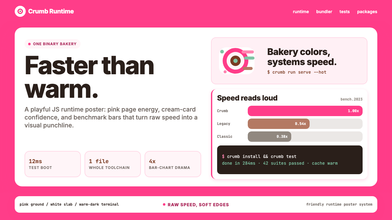 Bun JS Runtime Pink 2023Dev speed gets bakery-bright. Hot pink grounds white slabs, mono bars, and wa…开发速度像烘焙店一样明亮:热粉底、白卡片、等宽基准条与暖黑终端。
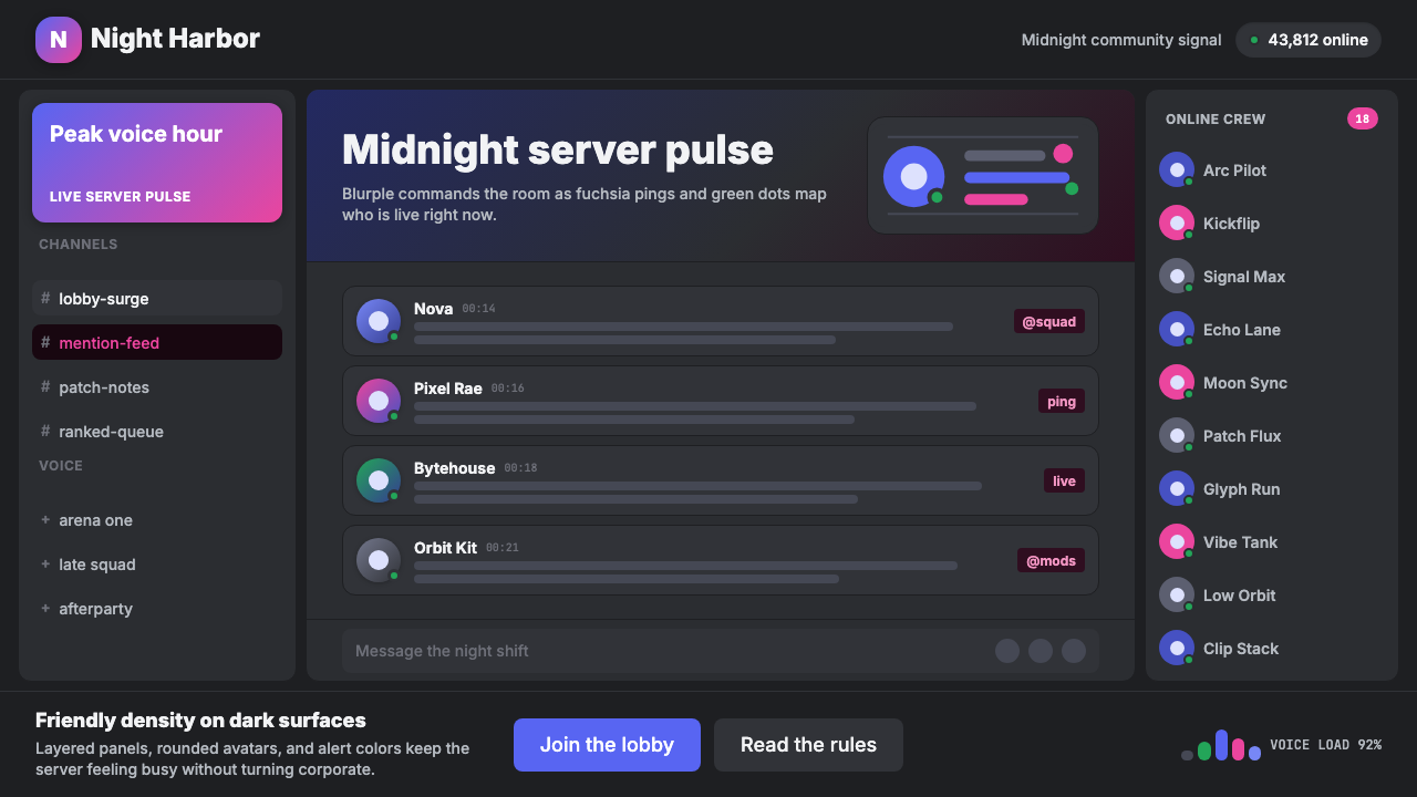 Discord Blurple Server (2020)Midnight server energy. Blurple panels, fuchsia pings, and green status dots…午夜服务器能量:蓝紫面板、品红提醒、在线绿点保持密集。
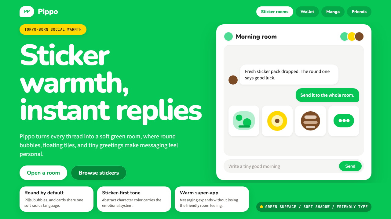 LINE Messenger GreenChat feels like a sticker. Bright green, pill bubbles, and rounded Nunito kee…聊天像贴图般亲近:亮绿、药丸气泡与圆润 Nunito 保持温度。
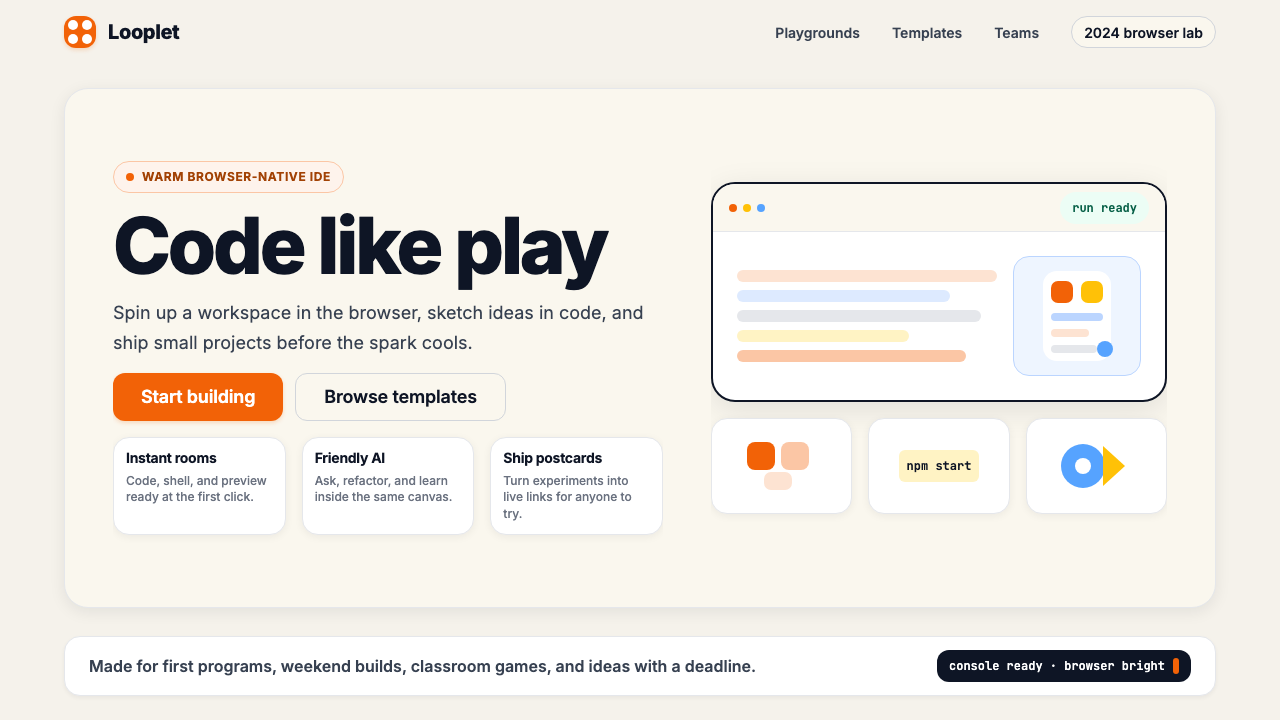 Replit 2024Coding feels warm. Coral buttons, cream panels, rounded code tiles make build…编程变得温暖:珊瑚按钮、奶油面板与圆角代码块让构建更好玩。
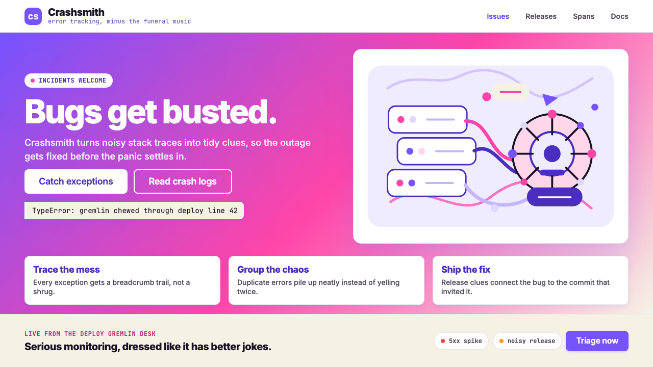 Sentry 2023Debugging gets weird on purpose. Purple-pink gradients, Inter heft, and doodl…故障被玩笑化:紫粉渐变、粗 Inter 与手绘虫子。