Design style guide设计风格指南
What is Discord Blurple Server (2020)?什么是 Discord Blurple Server (2020)?
Discord's 2020 redesign turned a scrappy gaming voice-chat tool into one of the most recognizable visual identities on the internet — built around a single invented color that is neither blue nor purple.Discord 2020年的品牌重塑,将一款游戏语音工具变成了互联网上最具辨识度的视觉身份之一——核心是一种既非蓝色也非紫色的自创颜色。
Discord Blurple Server (2020) in briefDiscord Blurple Server (2020) 速览
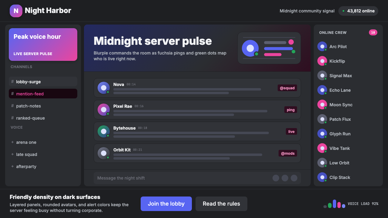
Discord Blurple Server (2020) is the design language that emerged from Discord's brand overhaul — organized around deep near-black surfaces, a signature blue-violet hue called Blurple, fuchsia mention highlights, online-green status indicators, rounded corners, circular avatars, pill-shaped buttons, and gradient Nitro banners. Together these elements define the 'active server at midnight' aesthetic that hundreds of millions of users associate with real-time community.Discord Blurple Server(2020)是 Discord 在当年品牌重塑中确立的设计语言——一套以深近黑底色为基础的完整视觉体系,以被称为 Blurple 的蓝紫色调为签名色,辅以品红色 @提及高亮、在线绿状态指示,以及圆角卡片、圆形头像、胶囊状按钮和渐变 Nitro 横幅的视觉词汇。这些元素共同定义了「午夜活跃服务器」的美学气质,让数亿用户一眼认出它属于 Discord。
The system is unmistakably dark-mode first. Where most productivity software treated darkness as an accessibility toggle, Discord built its personality around the deep-panel experience. A sidebar of server icons, a dense channel list, a message thread layered with reactions and embeds — not a simplified interface but an intentionally dense one, made navigable through a hierarchy of surface tones from near-black background to lighter panel fill to card-level highlight.这套系统是彻底的深色优先设计。彼时大多数生产力软件将黑暗模式视为无障碍切换选项,而 Discord 却将整个产品个性建立在深色面板体验之上。充满服务器图标的侧边栏、密集的频道列表、叠满表情回应和嵌入内容的消息流——这不是被简化过的界面,而是刻意信息密集的界面,依靠一套精密的表面色调层级来维持可导航性:从近黑背景,到稍浅的面板填充,再到卡片级高亮。
What makes the system coherent across its density is the discipline with which each accent color carries a single semantic role. Blurple means 'brand and interactive.' Fuchsia means 'you were mentioned.' Online-green means 'this person is present.' These are status signals that users learn to read at a glance — the aesthetic emerges from that functional assignment, not the reverse.让整套系统在如此密度下保持连贯的,是每种强调色被严格分配单一语义角色的自律。Blurple 代表品牌与可交互。品红代表你被提及。在线绿代表这个人正在线。这些不是可互换的装饰色,而是用户在视觉层面习得阅读的状态信号——就像空管人员阅读仪表盘那样。美学从功能分配中浮现,而非反过来。
See the Discord Blurple Server (2020) design system →查看 Discord Blurple Server (2020) 完整设计系统 →
Where does Discord Blurple Server (2020) come from?Discord Blurple Server (2020) 从何而来?
Discord launched in May 2015 as a free voice and text chat application for video gamers — faster and lower-latency than the dominant tools of the time. Its initial visual identity was scrappy: a cartoonish mascot named Clyde, a name referencing dissonance and chord, and a palette already leaning toward blue-violet without yet committing to it as a brand asset. The product grew to 250 million registered users by 2019, but its design language had accumulated inconsistencies at the same pace.Discord 于2015年5月作为一款面向游戏玩家的免费语音与文字聊天应用上线——相比当时主流工具,它速度更快、延迟更低。早期视觉形象粗糙而缺乏个性:一个叫 Clyde 的卡通吉祥物,一个隐喻「不谐和音」的名字,以及一套已经隐约偏向蓝紫色调却尚未将其作为有意为之的品牌资产来经营的色板。产品增长迅猛,到2019年注册用户突破2.5亿,但设计语言积累的混乱与用户规模同步膨胀。
The 2020 rebrand, led in part by Brent Anderson and the internal design team, resolved those inconsistencies and signaled that Discord had outgrown its gamer-tool origins without abandoning them. The central move was codifying Blurple — a blue-violet hue loosely present since the product's early days — into a precise, named, intentional brand color. Naming it rather than merely specifying it was the key decision: it tells users and designers the color is non-interchangeable, carries brand equity, and belongs to a product confident enough to give its signature hue an invented word.2020年的品牌重塑由 Brent Anderson 参与主导,内部设计团队共同完成,旨在消解这些不一致,并向外界表明 Discord 已超越了其游戏工具的起点,同时并未与之割裂。核心动作是将 Blurple——一种从早期起就松散存在于产品中的蓝紫色调——精确化、命名化,正式确立为有意为之的品牌色。「命名」这一行为本身意味深长:将一种颜色叫做 Blurple,既告诉用户也告诉设计师,这种颜色不可替换,承载品牌资产,而这款产品对自身身份足够自信,愿意给自己的签名色一个凭空造出的词。
The choice of deep near-black as the dominant surface came directly from the gaming context in which Discord was born. PC gaming interfaces had long favored dark backgrounds to reduce eye strain during extended sessions in dim rooms. Discord's initial users — streamers, competitive gamers, modders — had grown accustomed to spending hours in dark UI environments. The design team recognized darkness was not merely a preference but an identity marker, and formalized it as the canonical experience.深近黑色作为主导表面色的选择,直接来源于 Discord 诞生的游戏语境。PC 游戏界面长久以来偏爱深色背景,部分出于审美,部分因为深色面板能在长时间的昏暗室内使用中缓解眼睛疲劳。Discord 最初的用户——直播主、竞技玩家、游戏 Mod 制作者——已习惯在深色 UI 环境中连续使用数小时。设计团队意识到,黑暗不仅是一种偏好,更是一种身份标识,于是将其正式确立为标准体验,而非备选主题。
The 2021 rollout of gg sans completed the typographic dimension of the 2020 system. Designed for legibility at small sizes in dense threads, gg sans is a geometric-influenced rounded sans-serif that carries the Blurple brand's friendliness into the typographic register. Its slightly rounded terminals echo the pill and circular forms throughout the interface — a coherence that earlier reliance on generic system fonts had not provided. The 2020 color codification and the 2021 typeface together established the system in the form hundreds of millions of users now recognize.2021年推出的自定义字体 gg sans 完成了这套2020年体系的字体维度。gg sans 是一款几何感圆润的无衬线体,专为在密集消息流中小字号可读性而设计,将 Blurple 品牌语气中的亲切感延伸至排印领域。字体略带圆润的末端笔画——在小写字母「a」「r」「t」中清晰可见——呼应了界面中随处可见的胶囊形与圆形,形成了此前依赖通用系统字体时未曾有过的字体一致性。2020年的色彩成文与2021年的字体推出,共同将这套系统确立为数亿用户今日所认知的形态。
What defines the Discord Blurple Server (2020) look?Discord Blurple Server (2020) 的视觉特征是什么?
The Blurple SignatureBlurple 签名色
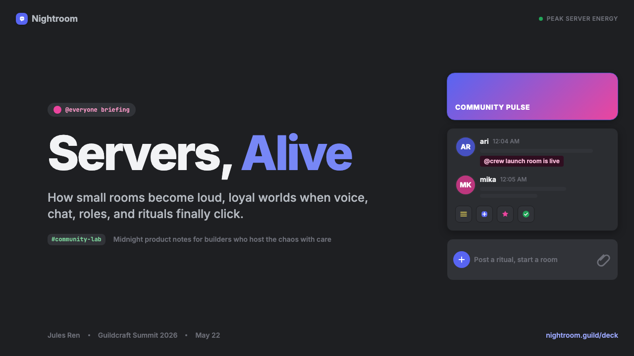
Blurple — Discord's invented name for its blue-violet brand color — sits in a perceptual middle ground between blue and purple, leaning toward blue enough to read as trustworthy and toward violet enough to carry warmth. In the interface it appears on primary action buttons, active navigation states, selected channel indicators, and verification badges — everywhere the system wants to say 'this is official Discord.' Its distinctiveness comes not just from its hue but from its consistent semantic assignment: it never appears decoratively.Blurple——Discord 为其蓝紫品牌色自创的名字——是整套系统中辨识度最高的单一元素。它在蓝色与紫色之间占据一个感知上的中间地带:偏蓝到足以传递科技感与可信赖感,又偏紫到足以携带温暖与个性。在界面中,Blurple 出现在主要操作按钮、激活的导航状态、选中的频道指示器和认证徽章上——凡是系统想说「这是官方 Discord」的地方。它的辨识度不仅来自其特定色调,更来自其一贯的语义分配:它从不作为装饰出现。
Dark Layered Surfaces深色分层表面
The Discord surface system works through layered near-blacks rather than a single flat dark tone. The server list sidebar is the deepest; the channel list panel is a step lighter; the message area lighter still, with card elements on a subtly elevated surface. This layering creates spatial depth without gradients or drop shadows — depth achieved purely through tone graduation. Users navigate by reading surface brightness as a spatial cue: darker means further back, lighter means closer to the interaction surface.Discord 的表面系统通过多层近黑色调而非单一平面深色来运作。最深的一层用于服务器列表侧边栏。向内推进,频道列表面板使用稍浅的深色调,消息区域再浅一些,每个消息气泡和卡片元素则置于微妙高出的表面之上。这种层级在不借助任何渐变或投影阴影的前提下创造了空间纵深——深度完全通过色调渐进来实现。用户在这片深色空间中靠阅读表面亮度作为空间线索来导航:越深代表越靠后,越浅代表越靠近交互表面。
Semantic Accent Colors语义强调色
Beyond Blurple, the system maintains a small set of accent colors each assigned a strict semantic meaning. The fuchsia-pink for mention notifications is calibrated to be high-salience against dark backgrounds — drawing the eye without generating alarm. Online-green communicates availability with a single visible mark, distinguishing 'present' from 'away,' 'do not disturb,' and 'offline.' These colors are not interchangeable with Blurple or with each other. The system works because users learn the semantic map quickly: Blurple is action, fuchsia is personal attention, green is presence.在 Blurple 之外,整套系统维护着一小组强调色,每种都被严格分配语义意义。用于提及通知的品红色——当有人输入你的用户名时触发——被校准为在深色背景上高度显眼,吸引视线却不引发整体警觉。在线绿状态点用一个可见的标记传达在场状态,通过少量色调与视觉模式区分「在线」「离开」「请勿打扰」与「离线」。这些颜色彼此之间,以及与 Blurple 之间,都不可互换。整套系统之所以有效,是因为用户能快速习得语义图谱——Blurple 是操作,品红是个人关注,绿色是在场。
Rounded Geometry圆润几何
Discord's interface is built on soft geometric forms throughout: circular avatars, pill-shaped action buttons, rounded-corner cards, and rounded-corner inputs. This roundness signals approachability in contrast to the sharp interfaces of professional productivity tools. The degree is calibrated — server icons shift from square to circle when hovered, signaling selection without a label. The roundness operates as a tonal signal — community software, not enterprise infrastructure — without sacrificing the spatial density the system requires.Discord 的界面建立在一套一贯的柔和几何形式哲学之上:圆形头像、胶囊状操作按钮、圆角卡片、圆角输入框。这种圆润并非偶然——它与专业生产力工具的方正尖锐界面形成对比,传递出亲近感与友好性。圆角程度经过精心校准:服务器图标在悬停时从方形过渡为圆形,在不增加额外标签的前提下传递选中状态。表情回应容器轻柔圆润。圆润作为一种语气信号运作——这是社区软件,不是企业基础设施——同时不牺牲系统所要求的空间密度。
Gradient as Reward渐变作为奖励
Gradients appear in the Discord system only in privileged contexts: Nitro subscription banners, profile decorations, and other premium cosmetic elements. Elsewhere the system is resolutely flat. This restriction is a semantic decision — gradient signals 'paid and special' when flatness is the default. The gradients tend to move through Blurple-adjacent hues, reinforcing the brand signature in their most expressive application. Encountering a gradient in a Discord interface is not visual noise but a marker of premium status.Discord 系统中存在渐变,但只出现在单一的特权语境中:Nitro 订阅横幅、个人资料装饰及其他高级装饰元素。在其他地方,系统是彻底平面的。渐变的限制性使用是精准的语义决策——在一个以平面为默认状态的系统里,渐变传递「付费且特殊」的含义。渐变本身倾向于在接近 Blurple 的色调间过渡,即使在最具表现力的应用中也强化了品牌签名。效果是:在 Discord 界面中遭遇渐变不是一次视觉噪声事件,而是状态或高级会员资格的有意义标记。
Status as Interface状态即界面
Discord treats online status as a first-class visual element rather than secondary tooltip or metadata. The small colored dot on each avatar — visible in sidebar lists, message headers, and direct message panels — communicates availability at a glance. In a busy server, the aggregate of these dots creates an ambient indicator of community activity. The design constraint is legibility at icon scale: the dot must communicate clearly at very small sizes, which limits both its form and the hue choices used for each state.Discord 最具特色的设计贡献之一,是将在线状态视为第一级视觉元素,而非次级工具提示或元数据。附着于每个头像的小彩点——在侧边栏用户列表、消息头、私信面板中清晰可见——一目了然地传递在场状态,使社区的社交在场在空间上可见。在繁忙的服务器中,这些状态点的集合构成了一种社区活动的环境指示器。这里的设计承诺是小尺寸下的可读性:状态点必须在图标尺寸上清晰传达信息,这同时约束了其形态与用于表示不同状态的色调选择。
Typography for Density为密度服务的排版
The gg sans typeface, introduced in 2021, solves a challenge every dense dark-mode interface faces: legibility across many sizes — usernames, message bodies, timestamps, channel names — in a single view. Its geometric-influenced rounded forms avoid reading as cold or corporate; its metrics suit the tight line-spacing dense threads require. Richness comes from repetition and density, not decorative typographic display.2021年作为系统成熟标志推出的 gg sans 字体,应对了大多数深色模式消费类界面都面临的挑战:如何在单一版面中——用户名、消息正文、时间戳、频道名、系统通知——跨多个字号保持可读性。其几何感圆润字形防止文字读起来冷漠或公司化,而其字体度量专为密集消息流所需的紧行间距而设计。界面文案使用克制的排版层级:频道名以较小的阅读字号呈现,用户名以略微强调的字重处理,消息正文以一贯的中性字重出现,时间戳则以一种低调的变体显示。整套系统通过重复与密度实现丰富感,而非依靠装饰性的排版展示。
See the Discord Blurple Server (2020) design system →查看 Discord Blurple Server (2020) 完整设计系统 →
Who shaped Discord Blurple Server (2020)?谁塑造了 Discord Blurple Server (2020)?
Citron co-founded Discord in 2015 after building OpenFeint, a mobile gaming social network acquired by GREE. His gaming-community background shaped Discord's original focus on voice communication and its default dark interface. As CEO through the 2020 rebrand, he championed the transition from gamer-specific tool to general community platform while insisting the visual language remain authentic to its gaming origins — preserving the dark-mode identity rather than lightening it for mainstream appeal.Citron 于2015年联合创立 Discord,此前曾创立移动游戏社交网络 OpenFeint,后被 GREE 收购。他在游戏社区的经历塑造了 Discord 最初对玩家语音通信的聚焦,以及其默认深色界面。在2020年品牌重塑期间担任 CEO,他主导了从游戏专属工具向通用社区平台的转型,同时坚持让视觉语言对其游戏起源保持真实——这一决策保留了深色模式身份,而非为迎合主流审美而将其调亮。
Vishnevskiy co-founded Discord as CTO and built the voice and video infrastructure that made the product technically distinctive. His architecture — a real-time communication system first, with the visual layer exposing that live data — directly shaped the dense, status-rich design language. Presence indicators, typing indicators, and reaction counters are all consequences of building a UI on top of genuine real-time event streams.Vishnevskiy 以 CTO 身份联合创立 Discord,负责使产品在技术上独具特色的语音和视频基础设施。他的工程背景将 Discord 的架构塑造为首先是一个实时通信系统,视觉层建立在暴露和导航这些实时数据之上——这一约束深刻影响了密集、富含状态信息的设计语言。可见的在线状态指示器、输入指示器与表情回应系统,都是在真正实时事件数据之上构建 UI 的结果。
Anderson worked within Discord's design team during the 2020 brand codification. His contribution included formalizing Blurple as a named brand color and establishing the systematic approach to accent color semantics that distinguishes Discord's system from competitors' more casual use of color. Naming the hue 'Blurple' — an invented portmanteau — reflects a design culture that treated color as product vocabulary, not visual decoration.Anderson 在产出2020年品牌成文的时期任职于 Discord 设计团队。他在视觉身份方面的工作推动了将 Blurple 正式确立为具名品牌色,并建立了对强调色语义的系统化处理方式——这使 Discord 系统区别于竞争对手对色彩更随意的运用。赋予 Discord 签名色一个自创混合词——Blurple——的决策,体现了一种将品牌色视为产品词汇而非视觉装饰的设计文化。
Marcoullier was an early Discord advisor with consumer community product experience, having co-founded MyBlogLog. His background informed decisions about balancing simplicity for new users with density for power users — a tension the design system resolves through progressive disclosure. He represented the consumer-product sensibility that gave the system its rounded, approachable face.Marcoullier 是 Discord 的早期顾问,在消费互联网产品领域根基深厚,曾联合创立 MyBlogLog 并在雅虎任职。他在社区产品建设方面的经验影响了 Discord 早期关于如何平衡新用户简洁性与高级用户密度的决策——这一张力由视觉设计系统通过渐进式披露来解决:服务器管理、角色分配和频道权限的全部复杂性被隐藏,直到用户主动寻找。他带来的消费产品感性,影响了这套系统圆润、亲切的外貌——否则它很可能会更重地倒向功能性的游戏 UI 惯例。
How do you use Discord Blurple Server (2020) today?今天怎么用 Discord Blurple Server (2020)?
The Discord Blurple system transfers well to any interface that needs to communicate real-time presence, dense information, and community activity. Applying it well means internalizing its core logic: every color carries a specific semantic role, and surfaces communicate depth through tonal layering rather than decorative shadow. Importing the look without the logic produces an interface that feels dark and purple without being useful.Discord Blurple 体系高度适用于任何需要传达实时在场、密集信息和社区活动的界面——但要用好它,需要内化其核心逻辑:每种颜色承载特定语义角色,表面通过色调分层而非装饰性阴影传达深度。只引入外观而不引入逻辑,会产生一个感觉黑暗且偏紫却不实用的界面。
For presentation slides, the dark-background approach demands different composition habits than light-mode work. Cover slides benefit from a bold asymmetric layout: a Blurple-toned geometric element on a near-black ground, title in large rounded sans-serif at high contrast. Content slides treat the dark canvas as a scannability asset — strict typographic hierarchy with accent color reserved for active items only. Data slides have a spatial drama against dark grounds that flat light equivalents lack, provided data series colors stay within the semantic palette rather than introducing new hues.使用这种风格制作演示文稿时,深色背景要求与浅色模式截然不同的构图习惯。封面页适合大胆的居中或非对称布局:近黑底色上一个 Blurple 色调的几何元素,标题以大号、圆润友好的无衬线体高对比度呈现。内容页应将深色背景视为可扫描性的画布——使用严格的排版层级(章节标题、条目要点、说明文字),强调色仅保留给激活或高亮项目。此系统下的数据页具有突出特质:深色背景上的图表和数据图呈现出空间戏剧感,前提是数据系列颜色从同一语义色板中取用,而非引入新的色调。
For web interface and dashboard design, the key structural move is establishing the layered dark surface hierarchy before any color is applied: background plane, panel plane, elevated card plane — each at a distinct tonal step. Navigation uses Blurple for selection states, unselected items in muted type against the panel background. Status and notification accents, used sparingly, communicate system events without noise. Pill-button shapes and circular avatar patterns transfer directly to web components.在网页界面与仪表板设计中,这套系统可以很好地迁移到任何实时或面向社区的产品中。关键的结构性动作是在应用任何颜色之前先建立分层深色表面层级:背景平面、面板平面和高出的卡片平面,每层之间保持清晰的色调步差。导航应使用 Blurple 驱动的选中状态,未选中项以静默的文字色调呈现于面板背景上。状态与通知强调色——克制使用——在不制造视觉噪声的前提下传达系统事件。胶囊按钮形态与圆形头像模式都可以直接迁移至网页组件。
For marketing work, the style suits technology, gaming, and community subjects. Use alternating dark-panel sections at different tonal depths, Blurple for primary calls to action, other accent hues only for contextual highlights. The rounded geometric vocabulary — circular framing, pill badges — gives layouts a product-interface quality that signals authenticity to audiences familiar with the source.在编辑和营销语境中,当主题是科技、游戏、社区或年轻文化时,这种风格表现出色。以这种语域构建的营销页面应使用不同色调深度交替的深色面板板块,Blurple 保留给主要的行动号召,品红或其他强调色只用于上下文高亮——绝不作为装饰。圆润几何视觉词汇——包括摄影的圆形取景框和功能胶囊徽章——赋予营销版面一种产品界面质感,向熟悉源素材的受众传递真实感。
A common error is using darkness as atmosphere rather than structural information. The Discord system's dark layers are not a mood — they are a spatial map. If background, panel, and card surfaces share the same dark tone, the layering logic collapses and the interface reads as gloomy rather than immersive. Similarly, treating Blurple as a general-purpose accent — on borders, tints, decorative elements — dilutes its semantic weight. In the source system, Blurple is reserved and therefore powerful; spread everywhere, it becomes wallpaper.应用这种风格时常见的错误,是将黑暗当作纯粹的氛围使用,而非结构性信息。Discord 系统的深色层级不是情绪——它是空间地图。如果背景、面板和卡片表面都是同一深色调,分层逻辑就会崩塌,界面读起来不是结构化而沉浸,而是平淡且压抑。同样,将 Blurple 当作通用强调色在整个版面中随处出现——边框、背景色块、装饰元素——会稀释其语义分量。在源系统中,Blurple 是被保留的,因此有力量;在一个它无处不在的仿制品中,它沦为壁纸。
See the Discord Blurple Server (2020) design system →查看 Discord Blurple Server (2020) 完整设计系统 →
Discord Blurple Server (2020) — FAQDiscord Blurple Server (2020) · 常见问题
Why is Discord's signature color called Blurple rather than just 'blue-violet'?为什么 Discord 的签名色被称为 Blurple,而不仅仅叫「蓝紫色」?
Naming is a brand decision, not a color theory one. Calling it 'blue-violet' describes a point on a spectrum, implying it could shift without consequence. Calling it 'Blurple' turns it into a proper noun — a named entity not interchangeable with adjacent hues. The invented portmanteau signals the color is product vocabulary, as specific as the company name. When a color acquires a proper name, it has crossed from visual choice into brand asset.命名是品牌决策,不是色彩理论问题。将其称为「蓝紫色」会把它描述为光谱上的一个点,暗示稍加调整也无妨。将其称为 Blurple 则将它变成一个专有名词——一个拥有独立身份、不可与相邻色调互换的具名实体。这个自创混合词表明,这种颜色是产品词汇的一部分,与公司名称本身一样具体且不容商榷。这是强大品牌体系中的常见模式:当一种颜色获得专有名称时,它已从视觉选择跨越成为品牌资产。
Is the Discord aesthetic only suitable for dark interfaces, or can it inform light-mode designs?Discord 美学只适合深色界面,还是也能应用于浅色模式设计?
Discord ships a light mode, but the design language is native to dark surfaces. Its strongest qualities — tonal depth from layered near-blacks, accent drama against dark grounds, the immersive midnight-server feeling — do not translate directly to light backgrounds. A light-mode application can work for community contexts wanting the rounded forms and semantic color discipline without the darkness, but some specificity is inevitably lost.Discord 提供浅色模式,系统本身也搭载了它——但这套设计语言原生于深色表面,浅色版本是一种翻译而非同等规范的形态。系统最强的许多特质——多层近黑创造的色调深度、强调色在深色底上的戏剧感、午夜服务器的沉浸感——并不能直接迁移到浅色背景上。词汇的浅色模式应用是可行的,尤其适合希望保留圆润友好形态和语义色彩纪律、但不想要黑暗感的社区或游戏语境。但 Blurple 品牌色和圆润几何语言即使没有深色表面也能承载这个参照,只是不可避免地会失去一些特定性。
How does the Discord system differ from other dark-mode design systems like GitHub's or Linear's?Discord 的系统与 GitHub 或 Linear 等其他深色模式设计系统有何不同?
GitHub's and Linear's dark interfaces are utility-first: darkness reduces eye strain and establishes hierarchy for developer and productivity tools. Their accent colors are functional (success, error, link) and typography is optimized for code or task lists. Discord's system is community-first and presence-first: accent colors communicate social states rather than system states, rounded forms signal friendliness rather than precision, and density reflects continuous habitation rather than task completion. Linear leans toward utility, Discord toward personality, GitHub between them.GitHub 的深色模式和 Linear 的深色界面是功能优先的:它们用黑暗来减少眼疲劳,并为信息密集的开发者与生产力工具建立视觉层级。它们的强调色是功能性的(绿色代表成功、红色代表错误、蓝色代表链接),排版方式针对代码阅读或任务列表优化。Discord 的系统是社区优先、在场优先的:它的强调色传递社交状态而非系统状态,圆润的形态传递友好而非精确,密集感反映的是对持续居留的预期而非任务完成。这三套系统在功能到个性的光谱上占据不同位置——Linear 偏向功能,Discord 偏向个性,GitHub 介于其间。
Can the Discord visual vocabulary be applied to products unrelated to gaming or chat?Discord 的视觉词汇能应用于与游戏或聊天无关的产品吗?
Yes, with selectivity. Most transferable outside gaming and chat are the rounded geometric forms, the tonal layering system, and the semantic approach to accent color assignment — principles applicable wherever you need to communicate real-time state or community membership. Least transferable is the strong Blurple brand reference (it reads as 'Discord' to anyone familiar with the platform) and the density expectations, which reflect a habituated user base. A product borrowing the vocabulary while substituting its own brand color and calibrating its density can carry the aesthetic register without being read as imitation.可以,但需要选择性地应用。在游戏和聊天语境之外迁移性最强的元素,是圆润几何形态、深色表面的色调分层系统,以及对强调色进行语义分配的方式。这些原则并非游戏专属——它们适用于任何需要传达实时状态、密集社交活动或社区归属感的场景。迁移性最弱的元素是强烈的 Blurple 品牌指涉(对熟悉该平台的人而言,它立刻被读取为「Discord」)以及整体的密度预期(这反映的是一个已被训练的用户群体,而非通用设计理想)。一款产品只要在借用这套词汇的同时替换成自有品牌色、并针对自身受众校准密度,就能产出一套承载 Discord 美学语域却不被解读为模仿的系统。
Why do gradients appear in Discord's Nitro branding but not in the general interface?为什么渐变出现在 Discord 的 Nitro 品牌中,却不出现在普通界面里?
The restriction is semantic. In a system where the default is flat and every element carries a specific meaning, gradients function as a reserved signal — they mean 'elevated, premium, beyond the default.' If gradients appeared everywhere, they would lose that meaning. By keeping the standard interface rigorously flat and deploying gradients only in subscription contexts, Discord ensures that encountering one is an event: it marks premium status or a paid customization. Visual restraint in the default state makes expressive elements more powerful when they appear.这种限制是语义性的,而非美学性的。在一个以平面为默认状态、每个视觉元素都承载特定含义的系统中,渐变成为一种被保留的信号可用——它意味着「升级的、高级的、超越默认的」。如果渐变无处不在,它就会失去这种含义,沦为背景噪声。通过让标准界面保持严格的平面性、只在订阅相关的语境中部署渐变,Discord 确保了遭遇渐变本身就是一个事件:它标记用户的高级状态、付费定制,或特殊场合。这是一个更宏观原则的例证:在默认状态下的视觉克制,让表现性元素在出现时更具力量。
Related design styles相关设计风格
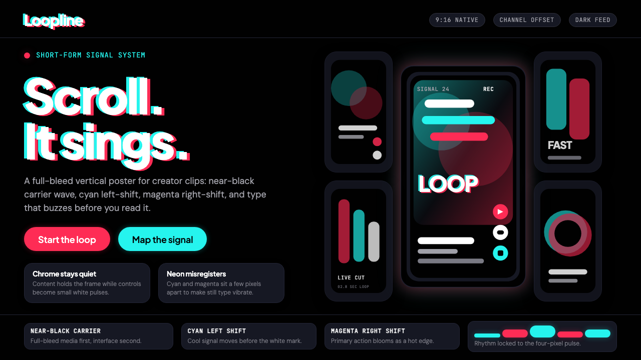 TikTok 2024Attention vibrates. Near-black feed, cyan-magenta offsets, and vertical frame…注意力在震动。近黑底、青粉错位与竖屏框架发出嗡鸣。
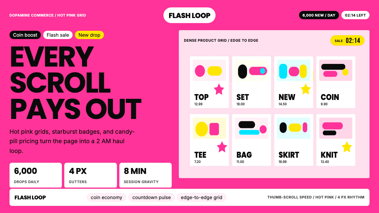 Shein Fast FashionDopamine density wins. Hot pink grids, starbursts, and candy pills pack every…高密度多巴胺取胜。热粉网格、星爆和糖果药丸挤满每个像素。
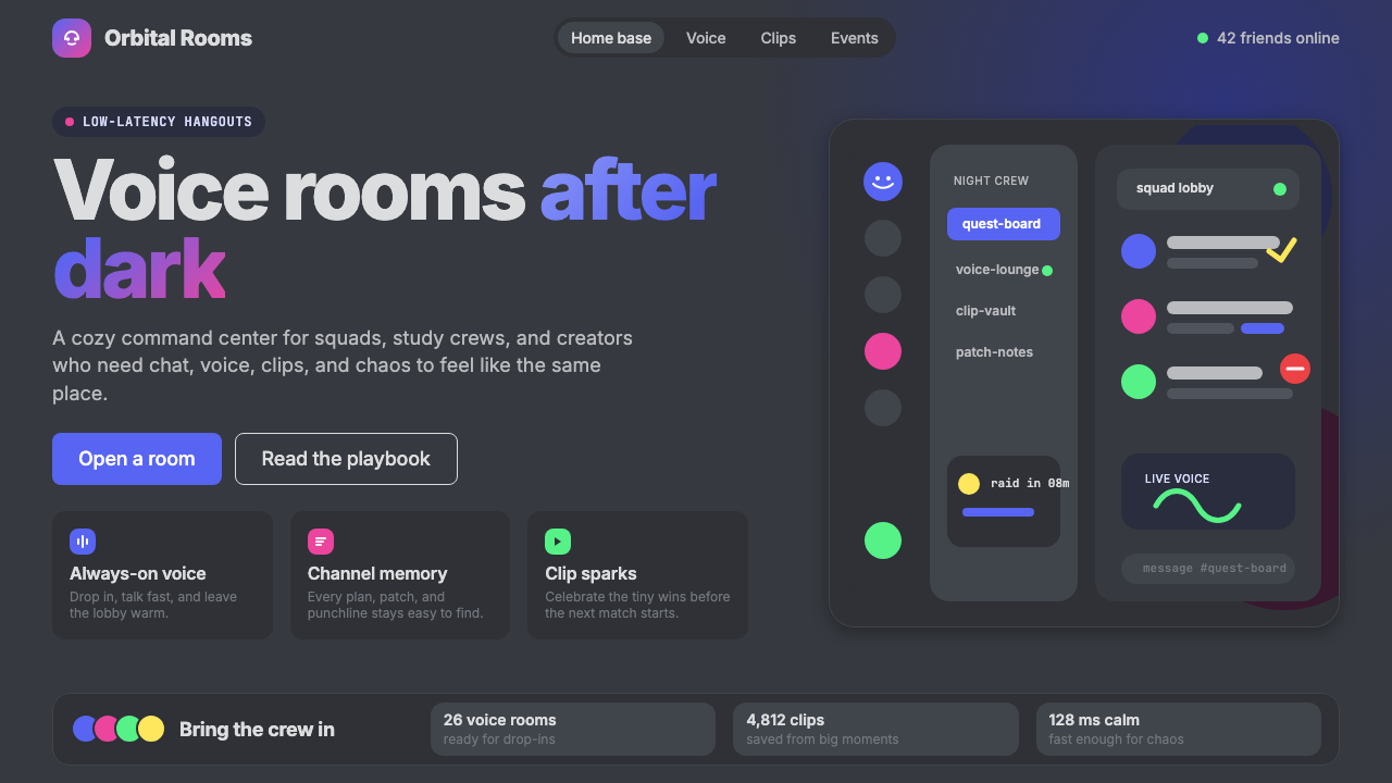 Discord 2024Blurple cozy. Charcoal grounds, illustrated characters — every surface says '…刻意去企业化的语音聊天:blurple 蓝紫、深炭灰底、俏皮插画角色——每个界…
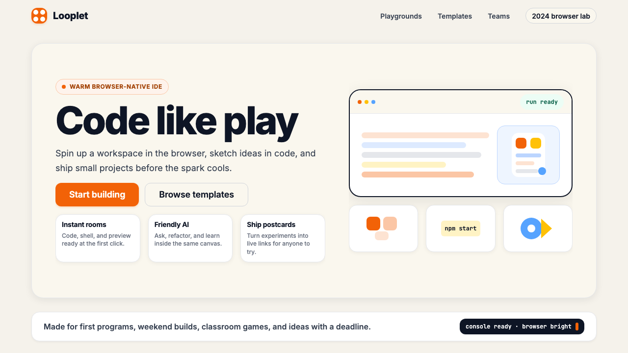 Replit 2024Coding feels warm. Coral buttons, cream panels, rounded code tiles make build…编程变得温暖:珊瑚按钮、奶油面板与圆角代码块让构建更好玩。
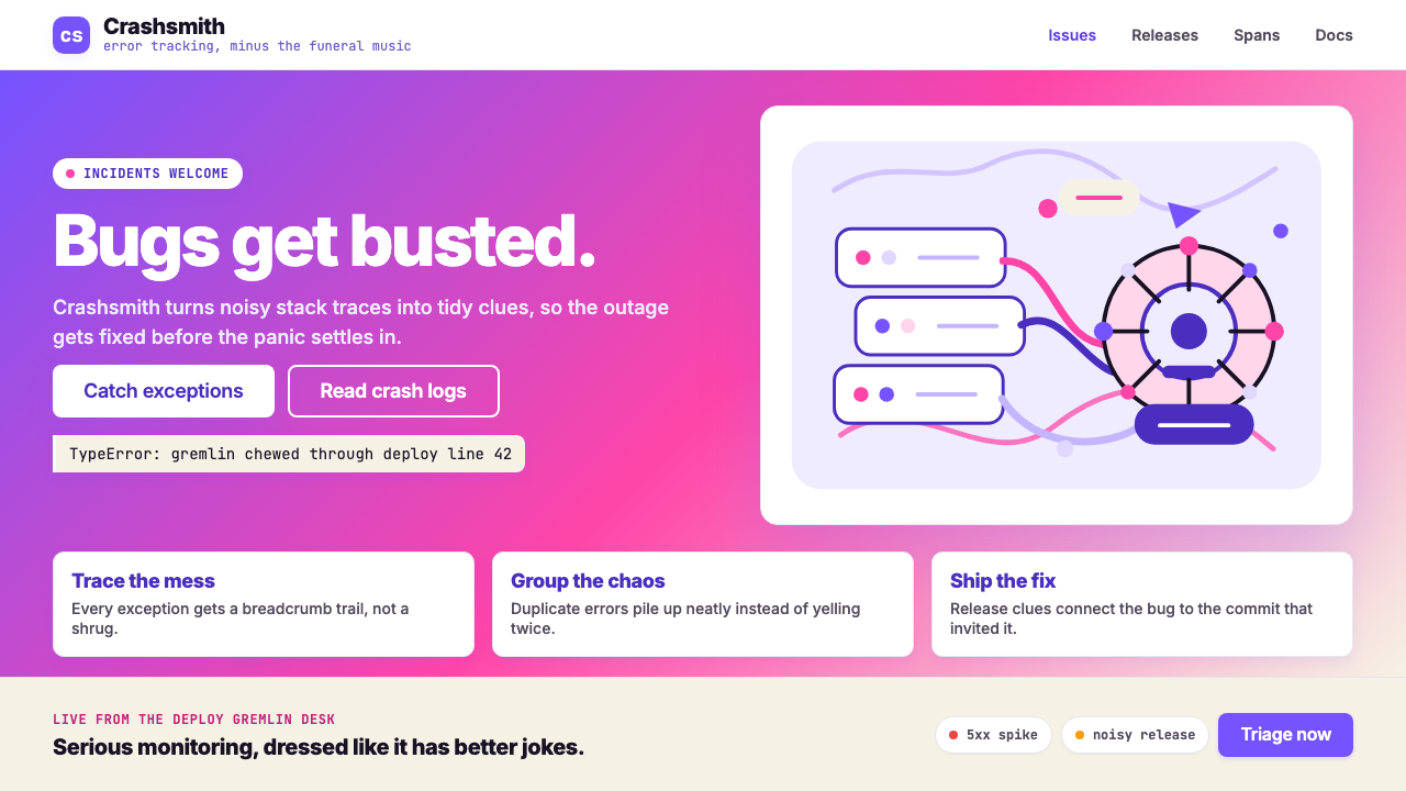 Sentry 2023Debugging gets weird on purpose. Purple-pink gradients, Inter heft, and doodl…故障被玩笑化:紫粉渐变、粗 Inter 与手绘虫子。
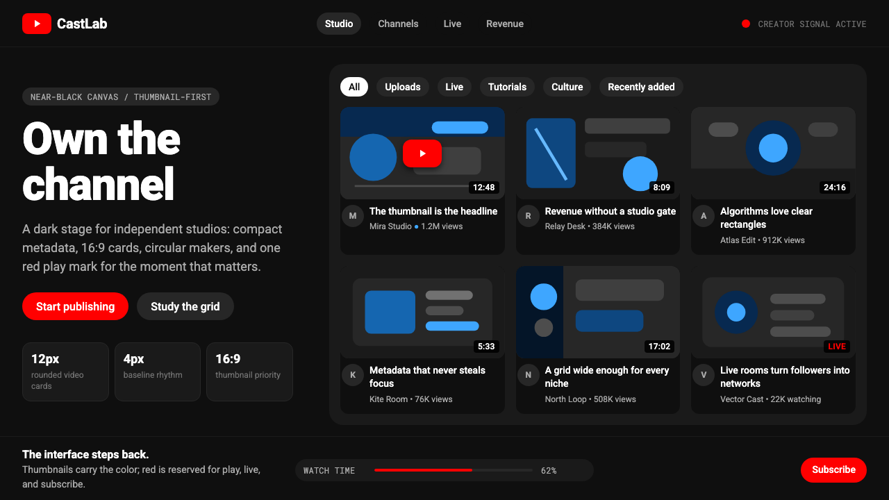 YouTube Creator EconomyThe UI disappears. Near-black Roboto grids let thumbnails shout; red only mea…界面退后:近黑Roboto网格让缩略图发声,红色只为播放。