Design style guide设计风格指南
What is Shein Fast Fashion?什么是 Shein Fast Fashion?
Shein's visual language is a dopamine slot machine engineered in hot pink — every pixel monetized, every scroll rewarded, and restraint treated as a revenue leak.Shein 的视觉语言是一台用热粉色精密工程化的多巴胺老虎机——每个像素都在变现,每次滑动都有即时奖励,而留白被视为营收漏洞。
Shein Fast Fashion in briefShein Fast Fashion 速览
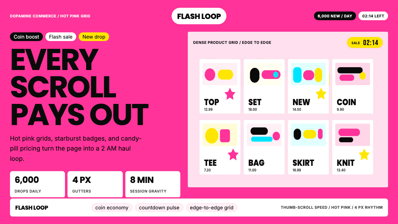
Shein Fast Fashion is the visual identity system of the world's largest ultra-fast-fashion retailer, crystallized most sharply in its mobile app and global website experience between roughly 2021 and 2024. The aesthetic is instantly recognizable: a saturated hot pink that borders on fluorescent, relentless product density, starburst discount badges, countdown timers, and candy-pill interactive elements that feel engineered for impulsive late-night tapping. Unlike fashion brands that use restraint to signal luxury, Shein treats density itself as the brand value.Shein 快时尚是全球最大超快时尚零售商的视觉识别体系,在其移动应用与全球网站体验中呈现得最为鲜明,尤其集中于2021至2024年间。这套美学体系极易辨认:接近荧光的饱和热粉色、毫不松懈的产品密度、星爆形折扣徽章、倒计时器,以及专为冲动性深夜点击而设计的糖果药丸式交互元素。与用克制传递奢侈感的时尚品牌不同,Shein 将密度本身视为品牌价值。
The system belongs to a category sometimes called dopamine design — an approach that borrows heavily from casino UX, mobile gaming reward loops, and social feed psychology to maximize engagement and purchase velocity. Every visual choice accelerates the transaction: grids are tight and edge-to-edge, contrast is high, sale signals are impossible to ignore, and the color pink operates less as a corporate identity choice than as a Pavlovian trigger wired directly to Gen-Z haul culture.这套体系属于一种有时被称为「多巴胺设计」的类别——大量借鉴赌场 UX、手机游戏奖励循环和社交信息流心理学,以最大化参与度和购买速度。每一个视觉选择都在加速交易:网格紧凑且贴边,对比度高,促销信号无处不在,而粉色的运作方式与其说是企业识别选择,不如说是直接接入Z世代开箱文化的巴甫洛夫信号。
Understanding Shein's visual system means understanding it on its own terms rather than measuring it against editorial or luxury standards. This is a purpose-built machine aesthetic for a commerce context where conversion rate is the primary design criterion. The identity succeeds — often brilliantly — at what it is designed to do, and that specificity is what makes it worth studying.理解 Shein 的视觉体系,意味着在它自身的框架内理解它,而非以编辑类或奢侈品标准来衡量。这是为商业语境精心打造的机器美学,其中转化率是首要设计标准。这套视觉识别在它所设计完成的目标上获得了成功——往往是出色的成功——而这种特殊性正是它值得研究的原因。
See the Shein Fast Fashion design system →查看 Shein Fast Fashion 完整设计系统 →
Where does Shein Fast Fashion come from?Shein Fast Fashion 从何而来?
Shein was founded in Nanjing in 2008 by Chris Xu, originally under the name SheInside. The company began as a wedding dress and women's clothing dropshipper, then pivoted aggressively into general women's fashion around 2012. The early visual identity was unremarkable — a functional e-commerce skin indistinguishable from hundreds of Chinese cross-border commerce sites of the era. The distinctive hot-pink-and-density visual system that the world now associates with Shein is a product of the brand's explosive growth phase, which began in earnest around 2019 and fully crystallized by 2021.Shein 由许仰天(Chris Xu)于2008年在南京创立,最初名为 SheInside。公司起步于婚纱与女装代发货,2012年前后果断转型为综合女装平台。早期视觉识别平淡无奇——与那个时代数百家中国跨境电商网站无从区分的功能性电商外壳。如今全球认知的热粉高密度视觉体系,是品牌从2019年前后开始的爆炸式增长阶段的产物,并于2021年前后完全成型。
The visual identity's evolution tracks almost perfectly with TikTok haul culture. As short-form video made 'haul' content a mainstream genre, Shein's interface needed to feel at home inside that aesthetic. The hot pink became thumbnail color, packaging color, and brand signal simultaneously. The identity was not designed top-down by a brand studio; it emerged from performance optimization, A/B testing, and alignment with the visual grammar of the social platforms where its target audience lived.这套视觉识别的演进轨迹,与 TikTok 开箱文化的崛起几乎完美重合。随着 TikTok 和 Instagram Reels 上的短视频将「开箱」内容——创作者解箱数十件廉价商品并逐一点评——变成主流体裁,Shein 的界面需要在那种美学内自如生存。热粉色同时成为缩略图颜色、包装颜色和品牌信号。这套识别并非由传统品牌工作室自上而下设计,而是从效果优化、A/B 测试以及与目标受众所在社交平台视觉语法的对齐中生长出来的。
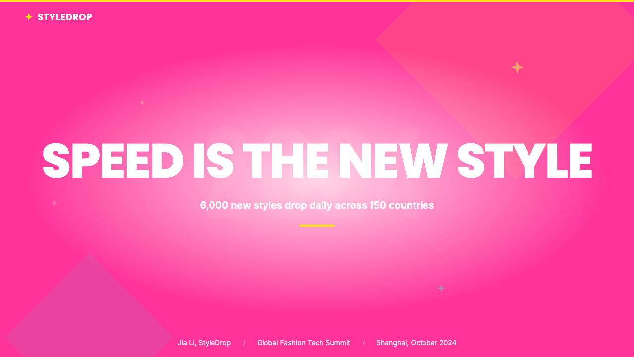
The company's cross-border logistics model — shipping directly from Chinese factories to consumers in 150 countries, releasing up to six thousand new SKUs daily, and pricing aggressively below Western fast-fashion incumbents like Zara or H&M — demanded a visual system that could make radical abundance feel like curated discovery. The solution was the tight grid: an infinite scroll of small product images, each stamped with a discount percentage, that creates the illusion of treasure-hunting through endless inventory. The starburst badge became the typographic shorthand for this economy of scale.公司的跨境物流模式——从中国工厂直接向150个国家的消费者发货、每日发布多达六千个新SKU、定价大幅低于 Zara 或 H&M 等西方快时尚品牌——要求一套能将激进的丰盛感包装成精选发现体验的视觉体系。解决方案是紧密网格:小产品图无限滚动,每张都打上折扣百分比标签,制造出在无尽库存中淘宝的幻觉。星爆形徽章成为这种规模经济的排印速记符号。
In 2021, Shein's headquarters moved to Singapore as the company prepared for an international public offering, and the brand began investing in visual consistency across markets. The current identity — hot-pink primary, coin-economy gamification, push-notification-style urgency markers — represents the mature form of an aesthetic that grew from conversion data rather than from a brand brief. Its roots lie in product and engineering rather than in marketing or design in the traditional sense.2021年,Shein 总部迁往新加坡,公司开始着手准备国际上市,并更有意识地在各市场强化视觉一致性。现行识别——明确的热粉主色、金币经济化的游戏元素以及推送通知式的紧迫感标记——代表了一套从转化数据而非品牌简报中生长出来的美学的成熟形态。执行董事长唐伟(Donald Tang)与首席营销官缪因因(Molly Miao)共同塑造了品牌的对外扩张形象,而这套视觉体系的根源在于产品与工程,而非传统意义上的市场营销或设计。
What defines the Shein Fast Fashion look?Shein Fast Fashion 的视觉特征是什么?
Color: Saturated Hot Pink as Primary Signal色彩:饱和热粉色作为主要信号
The defining color is a hot pink so saturated it reads almost as fluorescent. It is deployed as primary interactive color, branding anchor, and emotional trigger simultaneously — pink buttons, pink banners, pink badges, pink countdown timers. Most brands reserve a signature color for hero moments; Shein floods the interface with it. The effect is cumulative: the color becomes indissociable from urgency and desire. Secondary colors — orange-red for flash-sale warnings, white for product backgrounds — serve the hot pink rather than competing with it.这套体系的定义色是饱和度极高的热粉色,其强度接近荧光强调而非背景色。它同时被用作主要交互色、品牌锚点和情感触发器。大多数品牌将标志性色彩保留给英雄时刻,Shein 则将其淹没整个界面——粉色按钮、粉色横幅、粉色徽章、粉色倒计时器。累积效应是刻意的:这种颜色与紧迫感和欲望变得密不可分。次要色——通常是限时特卖警示用的橙红色和产品背景用的白色——服务于热粉色,而非与之竞争。
Density: Maximum Products Per Scroll密度:每次滚动最大化产品数量
The grid is the system's most telling structural choice. Rather than the generous white space of editorial fashion, the interface packs product thumbnails as tightly as the screen allows. This density is both business logic and aesthetic statement: more products visible means more discovery moments per session. The grid does not breathe — it accumulates. This relentlessness is the opposite of curation; Shein offers abundance rather than selection.网格是 Shein 视觉体系中最能说明问题的结构性选择。与编辑类或奢侈时尚的慷慨留白相反,界面以屏幕允许的最紧密方式堆砌产品缩略图,间距极小。这种密度既是商业逻辑,也是美学声明:单次可见的产品越多,每次使用中潜在的发现时刻就越多。网格不提供呼吸空间——它持续积累。这种毫不停歇恰恰是策展的反面,并如实被解读为这种含义:Shein 提供的是丰盛而非精选。
Discount Signage: The Starburst Economy折扣标识:星爆经济
Discount badges are not incidental — they are the primary typographic element. The starburst shape communicates rupture and urgency: this price has been broken, the deal is exceptional and time-limited. Badges dominate the product thumbnail, often covering a corner of the garment image entirely, with large, bold, high-contrast numbers inside. On any given screen, the eye is drawn first to the badge cluster rather than to the clothing itself. This inversion — deal first, product second — is the system's most radical departure from conventional fashion visual hierarchy.折扣徽章在 Shein 的视觉体系中并非附带元素——它们是主要的排印元素。星爆形状传达断裂与紧迫:这个价格已被打破,优惠是超常的且有时限的。徽章的尺寸足以主导产品缩略图,往往完全覆盖服装图片的一角。徽章内的数字大、粗、与徽章背景形成高对比度。在任何一块屏幕上,眼睛首先被徽章群落吸引,而非被服装本身。这种倒置——优惠在先,产品在后——是该体系对传统时尚视觉层级最激进的背离。
Gamification Elements: Coins, Countdowns, and Streaks游戏化元素:金币、倒计时与连击
Beyond static discount badges, Shein layers in dynamic elements from mobile gaming: coin systems that reward daily check-ins, countdown timers that convert browsing into time-pressured decisions, and streak mechanics that encourage consecutive-day engagement. These share a visual register borrowed from casual games — bright, rounded, reward-saturated — and exist not to inform the user but to maintain a heightened affective state throughout the session. The boundary between shopping and playing is deliberately blurred.在静态折扣徽章之外,Shein 还叠加了直接借鉴手机游戏设计的动态元素:奖励每日签到和购买的金币系统、将浏览转变为时间压力决策的倒计时器、有自身紧迫视觉语言的限时特卖活动,以及鼓励连续每日参与的连击机制。这些元素共享一种借自休闲游戏的视觉语域——明亮、圆润、充满奖励感——它们存在的目的不是告知用户,而是在整个使用过程中维持高度激活的情感状态。购物与游戏之间的边界被刻意模糊。
Button and UI Shape Language: Candy Pill and Rounded Rectangle按钮与界面形状语言:糖果药丸与圆角矩形
Interactive elements favor heavily rounded corners — pill-shaped buttons, rounded tag chips, circular badge containers. These shapes carry associations with softness and approachability, standing in deliberate contrast to the countdown's urgency and the discount badge's aggression. Together, rounded friendliness and urgent signage create a push-pull tension that defines the system's affective strategy. Nothing feels sharp or authoritative; everything feels tappable and warm.Shein 体系中的交互元素偏好大圆角——药丸形按钮、圆角标签碎片和圆形徽章容器。这些形状带有柔和、亲和、非威胁性邀请的联想。它们与倒计时的紧迫感和折扣徽章的攻击性形成刻意对比;药丸形说「点我」,徽章说「快点」。圆润的友好感与紧迫的标识共同制造了推拉张力,这是该体系情感设计策略的特征。没有任何东西感觉锋利或权威;一切都感觉可点击且温暖。
Photography Style: Speed Over Craft摄影风格:速度优先于工艺
Shein's product photography is produced at industrial scale — tens of thousands of new SKUs each month, each needing at least one hero image. The production constraint produces a consistent aesthetic: clean white backgrounds, flat-lay or model-worn garments shot from standardized angles, even lighting, color reproduction over artistic composition. The photography does not aspire to editorial beauty; it aspires to accurate and reproducible product representation. At gallery density, this standardization becomes a visual system in itself — a field of consistently lit product chips the eye can scan rapidly.Shein 的产品摄影以工业规模生产——每月数万个新SKU,每个至少需要一张主图。这种生产约束带来的视觉结果是一致的美学:干净的白色或接近白色的背景,平铺或模特穿着的服装以标准化角度拍摄,均匀照明无强烈阴影,色彩还原优先于艺术构图。摄影并不追求编辑类美感,而是追求准确、快速和可复制的产品呈现。在画廊密度下,这种标准化本身成为一套视觉体系——一片可供眼睛快速扫描的小型、均匀打光的产品碎片组成的视野。
Notification and Urgency Architecture通知与紧迫感架构
The visual system extends beyond the interface into push notifications, email banners, and social thumbnails, each carrying the same hot-pink urgency signal and discount-first message hierarchy. The notification design borrows from alerts and warnings rather than invitation: urgency accents on pink grounds, exclamation-forward typography, and countdown mechanics that begin the moment a campaign is seen rather than when a user decides to engage. The Shein aesthetic is not confined to a product page — it is a pervasive environmental signal.这套视觉体系延伸至界面之外,进入推送通知、电子邮件横幅和社交缩略图,每一处都承载着相同的热粉紧迫信号和相同的优惠优先消息层级。这种跨触点的一致性意味着 Shein 美学不局限于产品页面——它是一种无处不在的环境信号。通知设计尤其借鉴了警报与警告的视觉词汇,而非邀请语言:粉色底面上的红色紧迫强调、以感叹为先的字体排印,以及从看见活动即开始、而非等用户决定参与才启动的倒计时机制。
See the Shein Fast Fashion design system →查看 Shein Fast Fashion 完整设计系统 →
Who shaped Shein Fast Fashion?谁塑造了 Shein Fast Fashion?
Chris Xu founded Shein in Nanjing in 2008 and built it into a global ultra-fast-fashion phenomenon. His background in search engine optimization shaped the brand's data-driven approach to product discovery, translating directly into the visual system's conversion-first logic. Xu is notably private — the company operated for years without publicly confirming his identity — and his influence on the visual identity is systemic rather than personal, living in product and engineering culture rather than in any design brief.许仰天于2008年在南京创立 Shein,并在品牌爆炸式增长为全球超快时尚现象的过程中担任首席执行官。他在搜索引擎优化方面的背景塑造了 Shein 早期以数据驱动的产品发现和客户获取方式——这些策略直接转化为视觉体系的转化优先逻辑。许仰天极为低调;公司多年来甚至未公开确认其身份,这本身就是西方创始人即品牌模式的一种倒置。他对视觉识别的影响是系统性而非个人性的——它存在于产品与工程文化中,而非任何个人设计简报之中。
Molly Miao served as Shein's chief marketing officer and became the brand's most visible external face during its international expansion. Her significance to the visual system is that under her tenure the hot-pink brand color was consistently applied across social media, packaging, events, and influencer partnerships — giving the system coherence beyond the app itself and anchoring the aesthetic in cultural identity rather than interface alone.缪因因担任 Shein 首席营销官,在公司国际扩张阶段成为品牌最具知名度的对外面孔。随着公司从一个几乎无名的中国跨境零售商转变为拥有网红合作、名人联名和快闪活动的全球知名品牌,缪因因负责将界面美学转化为更广泛的文化身份。她的角色对视觉体系意义重大,因为正是在她任职期间,热粉品牌色被一致地应用于社交媒体、包装、活动和合作伙伴关系中,赋予这套体系超越应用程序本身的连贯性。
Donald Tang joined Shein as executive chairman as the company prepared for a potential public listing. Under his stewardship, the brand invested in legitimization efforts — design collaborations, sustainability reporting, and the 'SHEIN X' designer incubator — that represent an attempt to layer conventional fashion brand values onto the existing commerce-first aesthetic. Whether that layering succeeds or contradicts the base identity remains an open question.唐伟在 Shein 筹备潜在上市并开始应对作为中国创立的全球品牌所面临的监管、声誉和地缘政治复杂性之际,加入公司担任执行董事长。他在视觉体系中的角色是间接但重要的:在他的管理下,Shein 投资于品牌正当化努力——设计合作、可持续发展报告,以及全球「SHEIN X」设计师孵化项目——代表了将更常规的时尚品牌价值叠加在现有商业优先美学上的尝试。这种叠加是否成功,抑或与基础识别相矛盾,是品牌仍在探索的开放问题。
The distributed network of haul content creators on TikTok and Instagram functioned as a de facto creative direction team for the Shein visual identity. Creators unboxing dozens of items while displaying pink packages on camera established conventions the brand then codified: the hot-pink bag as set dressing, the stacked discount items as abundance signal, and the informal try-on format as the dominant product display mode. The identity was shaped as much by user-generated content norms as by any internal design decision.尽管并非单一个人,TikTok 和 Instagram 上分散的开箱内容创作者网络,在 Shein 增长阶段实际上充当了品牌视觉识别的创意指导团队。创作者拍摄 Shein 开箱视频——解箱并评价数十件商品,镜头前往往展示多个粉色包装袋——确立了品牌随后将其编码化的美学惯例:热粉色购物袋作为布景道具、堆叠折扣商品作为丰盛感信号、随意却系统化的试穿格式作为主要产品展示模式。这套识别由用户生成内容规范塑造的程度,不亚于任何内部设计决策。
How do you use Shein Fast Fashion today?今天怎么用 Shein Fast Fashion?
The Shein visual system is a high-context tool: applying it outside of its native e-commerce environment requires understanding which of its mechanisms are transferable and which are inseparable from the specific commercial logic that generated them. The system works through accumulation, urgency, and reward — three levers that are relevant in contexts beyond fashion retail, but which need deliberate recalibration when moved to new domains.Shein 视觉体系是高语境工具:在其原生电商环境之外应用它,需要理解其中哪些机制可以迁移,哪些与产生它们的特定商业逻辑不可分割。这套体系通过积累、紧迫感和奖励发挥作用——三个在时尚零售之外同样相关的杠杆,但在移植到新领域时需要刻意重新校准。
For presentation slides, the most transferable element is the grid logic: tight, density-first layouts that prioritize showing many options simultaneously. A product roadmap slide displaying six to eight feature tiles — each with a bold label, short phrase, and status badge — borrows the system's energy without its sales anxiety. Cover slides can use a hot-pink accent against near-white for high legibility. Data slides benefit from badge-style callouts — a large bold number in a bright rounded container reads instantly in a way a footnote never does.对于演示文稿,最可迁移的元素是 Shein 的网格逻辑:紧凑、一致、以密度为先的版面,优先同时展示多个选项,而非使任何单一选项令人惊叹。一张同时显示六到八个功能磁贴的产品路线图幻灯片——每个都有粗体标签、简短支撑短语和状态徽章——借鉴了这套体系的能量,而不引入其销售焦虑感。封面幻灯片可以在近白色底面上使用热粉色强调,配以镜像糖果药丸形状语言的粗体圆角字体,兼具高度易读性。数据幻灯片受益于关键指标的徽章式标注——一个被明亮圆角容器包围的大粗体数字,能够即时被识读,而脚注永远做不到这一点。
For web interfaces, the system's density and badge vocabulary translate best into notification systems, alert hierarchies, and promotional modules rather than into full-page layout philosophy. A flash-sale banner can borrow the countdown mechanic and high-contrast color blocking without requiring the rest of the interface to match that intensity. Gamification elements — progress bars, coin or credit systems, streak counters — adapt well to onboarding flows and loyalty programs.对于网页界面,这套体系的密度与折扣徽章词汇最适合迁移到通知系统、警报层级和促销模块,而非全页面版面哲学。电商或 SaaS 定价页面上的限时特卖横幅,可以借鉴倒计时机制和粗体高对比度色块,而无需要求界面其余部分采用同样的强度。游戏化元素——进度条、金币或积分系统、连击计数器——可以适配到应用程序的引导流程、忠诚度计划和参与机制中,适用于以建立习惯性回访为目标的场景。
For editorial and marketing work, the aesthetic is most effective when used selectively to signal urgency: a promotional email using hot-pink color blocks, rounded badge containers, and countdown copy reads as sale-coded in a way a plain typographic layout never does. Social media thumbnails benefit from the system's readability principles — high contrast, bold text overlay, a single dominant color, a visual hook within the first fraction of a second.对于编辑与营销内容,Shein 美学在用于选择性地传递价值紧迫感时最为有效:使用热粉色色块、折扣数字周围的圆角徽章容器和倒计时文案的促销电子邮件,会被读解为促销语境,而纯排印版面做不到这一点。社交媒体内容——尤其是短视频缩略图——受益于这套体系的缩略图可读性原则:高对比度、粗体文字叠加、单一主导色,以及在观看的第一刹那就起到钩子作用的视觉元素。
A common mistake when applying this aesthetic is importing the density without importing the accompanying information architecture that makes density legible. Shein's grid works because every cell is the same size, every badge occupies the same position, and every label follows the same truncation logic. Applying the visual style while ignoring the underlying consistency produces chaos rather than energy. The system is also optimized for small-screen consumption and shows its seams when naively scaled to wide desktop layouts — the tight grid becomes oppressive at large sizes, and the starburst badge loses its thumbnail legibility when rendered large. The correct register is energetic and transactional, not editorial or meditative.应用这套美学时最常见的错误,是引入密度却不引入使密度得以被读解的配套信息架构。Shein 的网格之所以有效,是因为每个格子尺寸相同,每个徽章占据相同位置,每个标签遵循相同的截断逻辑。应用视觉风格却忽视底层一致性,产生的是混乱而非能量。同样,将热粉色强调色以全饱和度用作长篇阅读体验——长文章、文档或数据密集型仪表板——的背景色,会让眼睛疲惫而非获得奖励。这套体系正确的语境是充满活力的交易型,而非编辑型或冥想型。
See the Shein Fast Fashion design system →查看 Shein Fast Fashion 完整设计系统 →
Shein Fast Fashion — FAQShein Fast Fashion · 常见问题
Is Shein's design intentionally bad, or is it achieving something?Shein 的设计是刻意做差的,还是在实现某种目标?
It is achieving something, deliberately. The visual system optimizes for conversion, dwell time, and return visits rather than editorial beauty or brand prestige. By those metrics, it ranks among the most successful design systems in e-commerce history. Calling it 'bad' misreads the goal: this is a brand that has deliberately rejected aspirational restraint in favor of something designed for a different behavioral outcome. Design quality is always relative to the design's actual goals.它在实现某种目标,是刻意的,且规模精密。这套视觉体系针对转化率、停留时长和复访进行优化,而非追求编辑类美感或品牌声望。以这些指标衡量,它是电子商务史上最成功的设计体系之一。称其为「差劲」是对目标的误读:这不是一个努力成为 Zara 却失败的品牌,而是一个刻意拒绝 Zara 的上进式克制、转而服务于不同行为目标的品牌。设计质量始终与设计的实际目标相对。
What design movements does Shein's aesthetic draw from?Shein 的美学从哪些设计流派汲取灵感?
The most direct influences are casino and mobile gaming UX — where reward mechanics and urgency signaling are studied science — and the visual grammar of Chinese mobile e-commerce platforms like Taobao, which Shein's system resembles more than any Western fashion brand. TikTok's visual language — bold overlaid text, high contrast, thumbnail-first design — is another shaping force. Physical retail coupon and flyer traditions also echo in the starburst badge and the red-on-pink color coding for sale versus full price.最直接的影响来自赌场与手机游戏 UX——奖励机制与紧迫感信号是经过研究的科学——以及淘宝、京东等中国移动电商平台的视觉语法,Shein 的设计体系与这些平台的相似程度远超任何西方时尚品牌。TikTok 的视觉语言——粗体叠加文字、高对比度、缩略图优先设计——是另一塑造力量。也有来自实体零售优惠券和传单传统的痕迹:星爆徽章、手写风格数字配原价删除线,以及特价与原价的红色与粉色编码。
Can this style work for a brand that wants to seem trustworthy rather than exciting?这种风格能用于希望显得可信而非刺激的品牌吗?
Not in its full form — attempts tend to produce something that reads as untrustworthy. The Shein visual system is built on urgency and scarcity signals — elements that have been studied to reduce deliberation and accelerate decisions. Brands that depend on trust — financial services, healthcare, legal platforms, B2B software — rely on the opposite: signals of permanence, stability, and considered judgment. The rounded pill shapes and gamification elements can be selectively adapted for younger-skewing products where engagement is primary, but the urgency core would need to be entirely removed.以其完整形态不行,而试图这样使用的尝试往往产生被解读为不可信的结果。Shein 视觉体系建立在紧迫感和稀缺性信号之上——这些元素经研究证明能减少深思熟虑并加速决策。依赖信任的品牌——金融服务、医疗健康、法律平台、B2B 软件——依赖的恰恰相反:永久性、稳定性和深思熟虑判断的信号。这套体系的圆角药丸形状和游戏化元素可以选择性地适配到以年轻用户为目标、参与度和亲和力为优先的产品中,但美学的紧迫感核心需要被完全移除。
How does the Shein aesthetic differ from other Chinese e-commerce platforms like Taobao?Shein 的美学与淘宝等其他中国电商平台有何不同?
Both share the dense, badge-heavy visual grammar of Chinese mobile commerce, but they have diverged significantly. Taobao is heterogeneous — individual merchant storefronts vary enormously, and the platform allows considerable design latitude within listings. Shein is centralized and brand-controlled, with consistent pink application, standardized product photography, and a unified badge vocabulary across all listings. Shein also operates with a global audience in mind, producing some visual simplification relative to the domestic Chinese mobile commerce norm.Shein 与淘宝共享中国移动电商密集、徽章密布视觉语法的共同源头,初次接触两者的西方用户可能难以清晰说明区别。但两者已显著分化。淘宝的视觉体系更加异质——各商家店面差异极大,平台在商品详情中允许相当程度的设计自由。Shein 的体系更集中且由品牌控制,具有一致的粉色应用、标准化产品摄影和适用于所有商品的统一徽章词汇。Shein 也以全球受众为目标运营,这相对于国内中国移动电商规范推动了一定程度的视觉简化。
Is the Shein visual system sustainable as a long-term identity, or is it a moment?Shein 的视觉体系是可持续的长期识别,还是一个时代的产物?
Both. The specific intensity — hot pink, starburst badge, coin iconography — is tied to a particular phase of short-form video culture that will evolve. What is durable is the underlying commerce-first philosophy: that every visual element should serve transaction acceleration, and that density and urgency are legitimate design values rather than failures of restraint. That philosophy predates Shein and will outlast any particular execution of it. The surface aesthetic will update; the structural logic probably will not.它既是一个时代的产物,也是持久的模式。具体的强度——确切的热粉色调、星爆徽章、金币图标——与短视频文化和Z世代开箱美学的特定阶段相关联,而这些将会演变。持久的是底层的商业优先设计哲学:每个视觉元素都应服务于交易加速的原则,以及密度与紧迫感是合理的设计价值而非克制失败。这种哲学早于 Shein 存在,也将在任何具体执行之后延续。表面美学将会更新;结构逻辑可能不会。
Related design styles相关设计风格
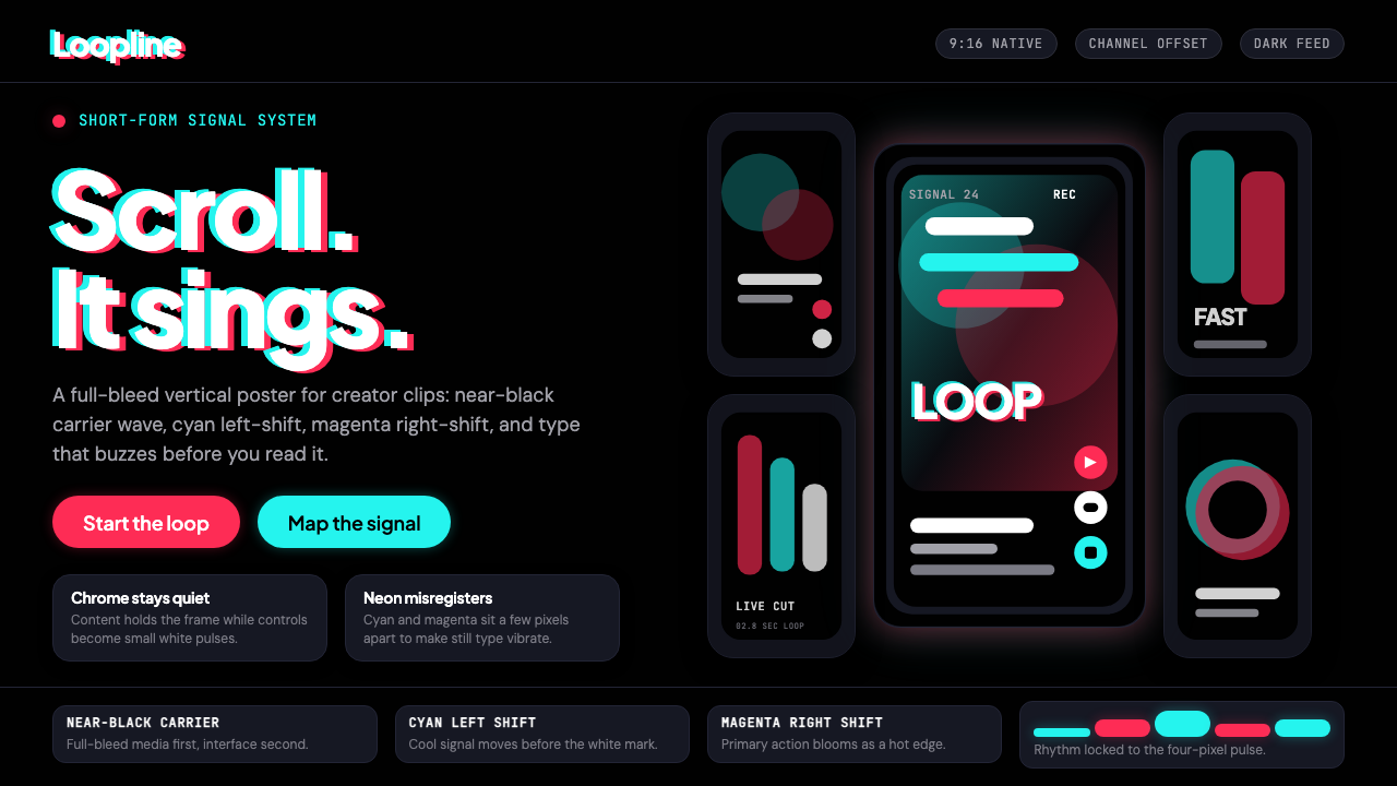 TikTok 2024Attention vibrates. Near-black feed, cyan-magenta offsets, and vertical frame…注意力在震动。近黑底、青粉错位与竖屏框架发出嗡鸣。
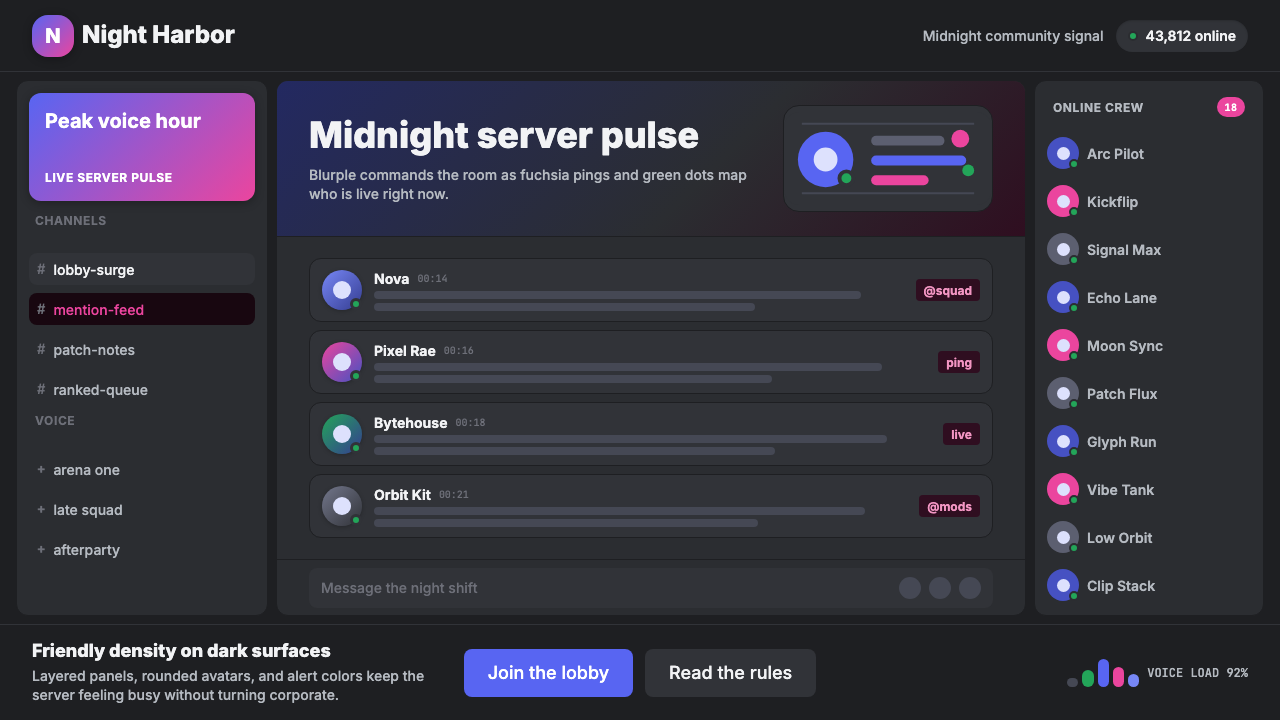 Discord Blurple Server (2020)Midnight server energy. Blurple panels, fuchsia pings, and green status dots…午夜服务器能量:蓝紫面板、品红提醒、在线绿点保持密集。
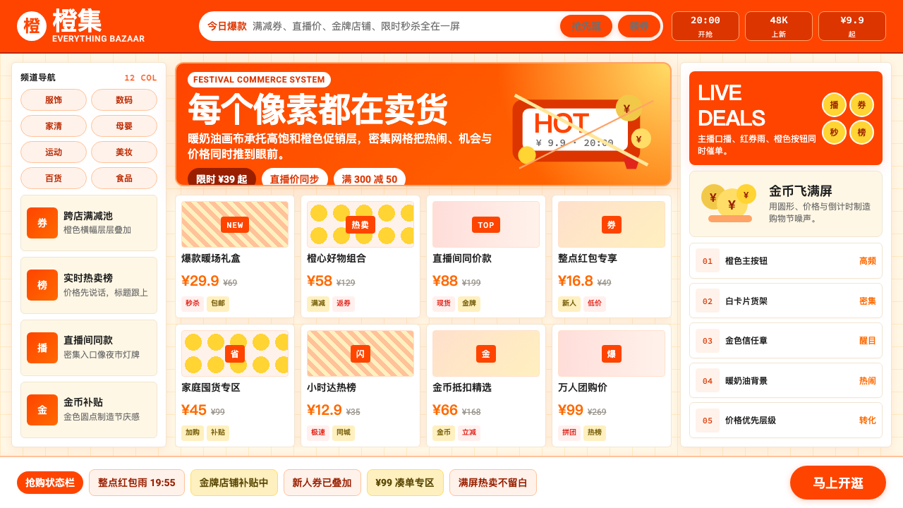 Taobao (淘宝)Every pixel sells. Orange on cream, dense price grids and gold coins shout ab…每个像素都在卖货。橙色压在奶油底上,密集价格网格与金币喊出丰盛。
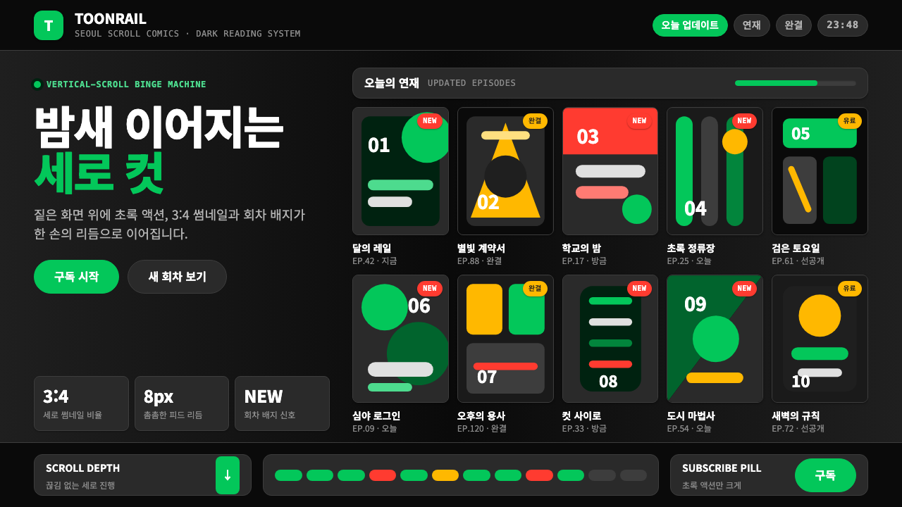 Naver Webtoon (2024)Built for late-night scroll. Charcoal grids, Noto Sans KR, and green episode…为深夜滚动而生:炭灰网格、思源黑体与绿色话数信号。
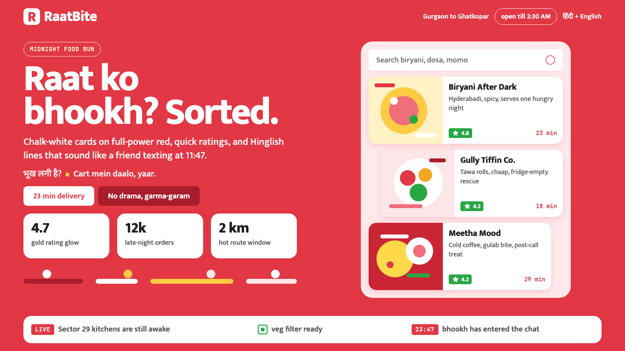 Zomato India DeliveryOwns the midnight scroll. Saturated red, Mukta Hinglish, white cards and gold…午夜外卖很会说话:饱和红、Mukta双语字和白卡金星撑起深夜滚动。
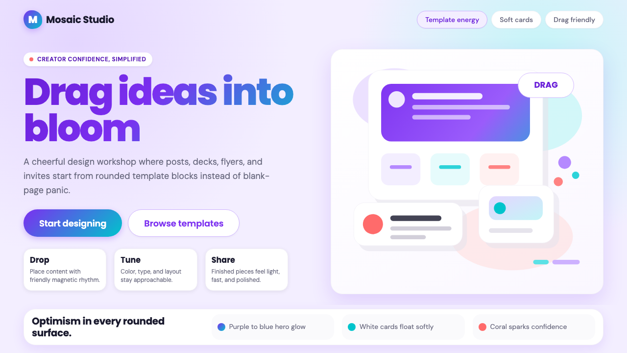 Canva 2024Confidence feels draggable. Purple-blue gradients and floating white template…信心可拖拽:紫蓝渐变与漂浮白卡,让创作变柔和。