What is Naver Webtoon (2024)?什么是 Naver Webtoon (2024)?
Naver Webtoon turned the smartphone screen into an infinite comic canvas — charcoal darkness, electric green signals, and a vertical grammar invented for the thumb-scrolling generation.Naver Webtoon 将智能手机屏幕化为无尽漫画画布——炭黑底色、电光绿信号,以及一套为拇指滚动世代发明的竖向视觉语法。
Naver Webtoon (2024) in briefNaver Webtoon (2024) 速览
Naver Webtoon is the visual and interaction design system of Korea's dominant vertical-scroll comics platform, refined over two decades and crystallized into its most mature form in the 2024 era. The system is not a general-purpose aesthetic — it is a purpose-built reading environment engineered for one very specific behavior: a reader, alone, late at night, phone in hand, scrolling through episodic illustrated stories in near-total darkness.Naver Webtoon 是韩国占主导地位的垂直滚动漫画平台的视觉与交互设计体系,历经二十年打磨,在 2024 年前后凝练为最成熟的形态。这套体系并非通用美学——它是一套专为特定行为工程化的阅读环境:一个读者,独自一人,深夜,手握手机,在几乎全黑的屏幕上滚动翻阅分话式图像故事。
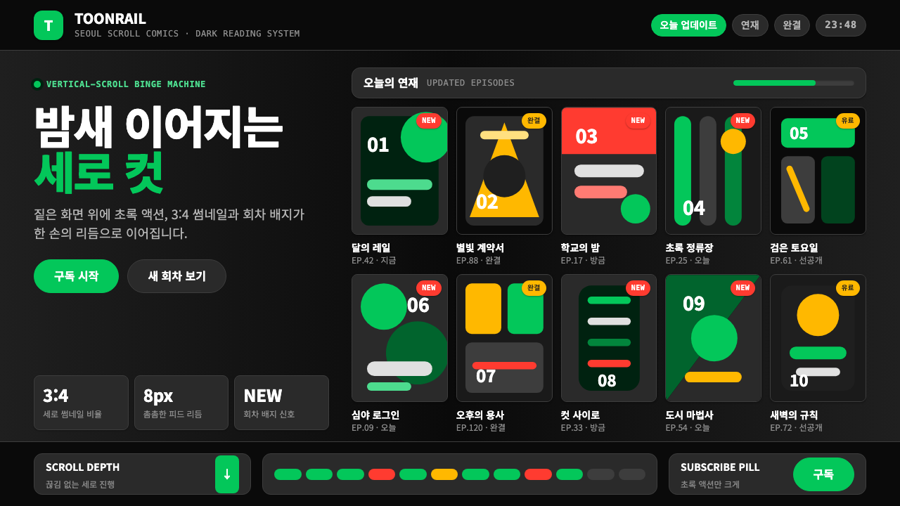
The defining visual signature is the pairing of a deep charcoal ground with Naver's signature green — a vivid, slightly cool accent that appears on subscription buttons, episode-count badges, and interactive calls to action. Against the dark field, thumbnail grids of comic cover art create rhythmic vertical sequences, each cell a miniature poster. The overall impression is immersive and cinematic, closer to a streaming video interface than to a traditional print comics page.最具辨识度的视觉标志,是深炭灰底色与 Naver 标志性绿色的配对——那抹鲜活而略带冷调的绿出现在订阅按钮、话数徽章和交互性行动号召上。在深色背景衬托下,漫画封面缩略图网格构成节奏感强烈的竖向序列,每一格都是一张微型海报。整体观感沉浸而富有电影质感,更接近流媒体视频界面,而非传统印刷漫画页面。
What makes Naver Webtoon a coherent design language rather than a collection of conventions is its discipline around a handful of structural elements: the pill-shaped button, the badge system for episode counts and update states, the tight vertical thumbnail grid, and the typographic hierarchy built around a humanist Korean typeface. These components repeat at every scale — from the home feed to the reader chrome to the creator dashboard — producing a platform that feels instantly legible no matter which surface the reader lands on.让 Naver Webtoon 成为连贯设计语言而非惯例集合的,是它对少数结构性元素的高度自律:药丸形按钮、话数与更新状态的徽章系统、紧凑的竖版缩略图网格,以及以人文主义韩文字体构建的排版层级。这些组件在每个尺度上重复出现——从首页信息流到阅读器界面再到创作者后台——使平台在读者落到任何界面时都能即时读懂。
See the Naver Webtoon (2024) design system查看 Naver Webtoon (2024) 完整设计系统
Where does Naver Webtoon (2024) come from?Naver Webtoon (2024) 从何而来?
Naver Webtoon's visual lineage begins in Seoul in 2004, when Naver — at that point Korea's leading internet portal — launched a free comics service to differentiate itself from competitors. The founding context matters: Korean internet penetration was already extremely high, mobile phones were becoming a primary access device, and a generation of independent cartoonists had no viable print publishing channel. The platform offered them free hosting in exchange for building the content library that would define the medium.Naver Webtoon 的视觉渊源始于 2004 年的首尔。当时,韩国领先互联网门户 Naver 为与竞争对手差异化,推出了一项免费漫画服务。创立背景至关重要:韩国互联网普及率已极高,手机正成为主要接入设备,而一代独立漫画家苦无可行的纸质出版渠道。平台以免费托管换取内容库的构建,最终定义了这一媒介形态。
The term 'webtoon' itself was coined by this period — a portmanteau of 'web' and 'cartoon' that the Korean industry adopted as a formal genre designation. The critical design innovation was not the content but the format: instead of the page-turn model inherited from print manga and American comics, Naver's engineers and early designers adopted an infinite vertical scroll in which panels flowed continuously down the screen. This was not a recreation of an existing format but a native response to the smartphone's physical affordances — the thumb scrolls naturally downward, and a long vertical canvas maps perfectly to that gesture.「Webtoon」一词本身也诞生于这一时期——由「web」与「cartoon」合成,被韩国产业界采纳为正式体裁名称。关键的设计创新不在于内容,而在于格式:Naver 的工程师与早期设计师没有沿用从印刷漫画和美式漫画书继承的翻页模式,而是采用了无限竖向滚动——让分格画面连续向下流动。这不是对既有格式的再造,而是对智能手机物理可供性的原生回应:拇指自然向下滑动,而长竖幅画布与这一手势完美契合。
The visual identity went through several iterations over its first decade and a half, tracking the evolution of mobile screen technology. Early versions relied on lighter backgrounds and simpler color systems suited to the lower-contrast OLED panels of the mid-2000s. As AMOLED screens became the standard for Korean smartphone manufacturers — particularly Samsung — and as their black rendering improved dramatically, the platform shifted decisively toward the deep charcoal dark-mode aesthetic that would become its signature. By the early 2020s, the dark ground was not merely a visual choice but an engineering one: on AMOLED displays, true blacks consume almost no power, and a platform used for long nightly reading sessions benefits directly from reduced battery draw.视觉识别系统在最初十余年间经历了数次迭代,跟随移动屏幕技术的演进而变化。早期版本依赖更浅的背景和更简单的配色体系,适配 2000 年代中期对比度较低的 OLED 屏幕。随着 AMOLED 屏幕成为韩国智能手机厂商(尤其是三星)的标准配置,其纯黑渲染能力大幅提升,平台果断转向深炭灰暗模式美学,并将其发展为标志性视觉语言。到 2020 年代初,深色底面已不仅是视觉选择,更是工程决策:在 AMOLED 屏幕上,纯黑几乎不耗电,而一个被用于长时间夜间阅读的平台,在降低电池消耗方面能获得直接收益。
The 2020–2024 period saw Naver Webtoon formalize its design system at scale, driven by the platform's international expansion — it launched in English-speaking markets as Webtoon, and later in Southeast Asia, France, and other territories. This expansion required the design language to work across languages and scripts, which strengthened the system's emphasis on visual hierarchy over purely typographic organization. The green accent that had long been associated with the Naver brand became more precisely calibrated, the badge system was regularized, and the pill button became the platform's signature interactive shape — a form that reads clearly across cultures and scripts without relying on text alone.2020 至 2024 年间,伴随平台国际化扩张,Naver Webtoon 开始大规模正式化其设计体系——先以 Webtoon 品牌进入英语市场,继而拓展至东南亚、法国等地区。这一扩张要求设计语言能跨越语言与文字体系运作,从而强化了系统对视觉层级而非纯排版组织的倚重。长期与 Naver 品牌关联的绿色被更精准地调校,徽章系统得到规范,药丸形按钮则成为平台标志性的交互形态——这一形式无需单纯依赖文字,便能在不同文化与文字体系中清晰传达。
What defines the Naver Webtoon (2024) look?Naver Webtoon (2024) 的视觉特征是什么?
Dark Ground深色底面
The base environment is a deep, neutral charcoal — not pure black but a softer dark that reduces eye strain during extended reading sessions. This ground is consistent across the home feed, episode lists, and the in-strip reading interface, creating a seamless visual environment that does not break the immersive reading experience as users move between surfaces. The darkness is functional: on the dominant screen technology used by the platform's core audience, it directly extends reading session duration by reducing display power consumption.基础环境是一种深沉、中性的炭灰——并非纯黑,而是更柔和的暗色,用以降低长时间阅读时的眼部疲劳。这一底面贯穿首页信息流、话数列表与漫画阅读界面,营造出连贯的视觉环境,让用户在不同界面切换时不会打断沉浸式阅读体验。深色有其功能性:在平台核心受众使用的主流屏幕技术上,它通过降低显示功耗直接延长了阅读时长。
Naver Green AccentNaver 绿强调色
A vivid, slightly cool green — immediately recognizable as the Naver brand hue — serves as the system's single interactive accent. It appears on subscribe and follow buttons, on episode-count indicators, on 'new episode' badges, and on the active state of bottom navigation items. Against the charcoal ground, the green carries high luminance contrast, making every actionable element immediately legible without requiring additional visual complexity. The restraint is important: the accent never bleeds into backgrounds or decorative uses, so its appearance always signals interactivity or status.一抹鲜活而略带冷调的绿——即刻可辨为 Naver 品牌色调——作为系统唯一的交互强调色。它出现在订阅与关注按钮、话数指示符、「新话」徽章,以及底部导航的激活状态上。在炭灰底面的映衬下,这抹绿拥有高亮度对比度,使每个可操作元素无需额外视觉复杂度便能即时识别。克制至关重要:这个强调色从不渗入背景或装饰性用途,因此它的出现始终意味着交互或状态信号。
Vertical Thumbnail Grid竖版缩略图网格
The core browse surface is organized as a tight vertical grid of comic-cover thumbnails, each formatted to a consistent portrait aspect ratio. The grid gives equal visual weight to each title, functioning less like a curated editorial layout and more like a densely packed catalog — appropriate for a platform where users often browse by genre and update schedule rather than by editorial recommendation. Each thumbnail cell carries a small overlay layer for title text and status badges, maintaining readability against the varied color fields of the cover artwork.核心浏览界面由紧凑的竖版漫画封面缩略图网格构成,每格均采用统一的竖向长宽比。网格给予每个作品同等的视觉权重,更接近密集排列的目录,而非经过编辑策划的版面——这与平台读者常按题材和更新时间表浏览而非依赖编辑推荐的习惯高度契合。每格缩略图叠加一层薄覆层,用于显示标题文字和状态徽章,在各异的封面色彩底面上保持可读性。
Pill-Shaped Button药丸形按钮
The platform's signature interactive component is the fully rounded rectangular button — what the interface world often calls a pill shape. Subscribe buttons, episode-start prompts, and genre filter tags all share this form. The pill reads clearly as a tap target on small screens regardless of surrounding text script, and its rounded softness contrasts deliberately with the geometric severity of the grid and badge system, providing a visual cue that these elements are invitational rather than informational.平台标志性的交互组件是全圆角矩形按钮——即界面设计中常称的「药丸形」。订阅按钮、开始阅读提示和题材筛选标签均采用这一形态。药丸形在小屏幕上无论周围文字是何种文字体系都能清晰识别为点击目标,其柔和的圆角与网格和徽章系统的几何硬朗形成刻意对比,传达出这些元素是邀请性而非信息性的视觉暗示。
Badge and Status System徽章与状态系统
A compact badge vocabulary communicates the real-time state of a comic's publication cycle without requiring the reader to interpret text. Episode-count figures, 'UP' indicators for freshly updated titles, 'AD' markers for titles with promotional episodes, and completion status labels all appear as small, high-contrast chips attached to thumbnail corners or list rows. The system is especially important for mobile contexts where the reader scans at speed — a glance at the badge layer conveys all scheduling information before any text is read.一套简练的徽章词汇在不依赖文字解读的情况下,传达一部漫画出版周期的实时状态。话数数字、刚更新作品的「UP」标示、含推广话的「AD」标记,以及完结状态标签,均以小型高对比度标签片的形式附着于缩略图角落或列表行上。这套系统在移动端快速扫视的场景中尤为重要——读者一眼扫过徽章层,便能在读任何文字之前获取全部更新信息。
Humanist Korean Typography人文主义韩文排版
The typographic backbone of the platform is a humanist sans-serif Korean typeface — specifically the Noto Sans KR family — chosen for its wide script coverage, warm stroke proportions, and strong legibility at small sizes on backlit screens. The type hierarchy is tight: a moderate size differential between title labels, episode information, and metadata communicates structure without the aggressive scale contrasts found in Western editorial design. The Latin and numeric characters in the same typeface maintain visual consistency across the platform's multilingual content.平台的排版骨干是一套人文主义无衬线韩文字体——即思源黑体(Noto Sans KR)系列——因其广泛的文字覆盖、温润的笔画比例,以及在背光屏幕小尺寸下的强劲可读性而被选用。排版层级紧凑:标题标签、话数信息与元数据之间适度的尺寸差异传达结构感,而不采用西方编辑设计中常见的激进大小对比。同一字体的拉丁字母与数字字符在平台多语种内容中维持视觉一致性。
Immersive Reader Chrome沉浸式阅读器界面
When a reader enters a strip, the surrounding interface chrome recedes to near-invisibility. Navigation controls appear as minimal dark overlays that fade after a moment of inactivity, leaving the comic artwork as the only significant visual element. This stripping-back of chrome is a deliberate design decision: the reader has committed to a specific strip, and the platform's task shifts from discovery to immersion. The transition from the badge-rich browse grid to the minimal reader environment is one of the most effective contextual mode-shifts in mobile interface design.读者进入一部漫画后,周围的界面控件退缩至几近隐形。导航控制以极简深色覆层呈现,静止片刻后自动淡出,只留漫画作品本身作为唯一显著的视觉元素。这种界面剥除是刻意的设计决策:读者已经选定一部作品,平台的任务随之从发现转向沉浸。从徽章密集的浏览网格到极简阅读器环境的切换,是移动界面设计中最有效的语境模式转换之一。
See the Naver Webtoon (2024) design system查看 Naver Webtoon (2024) 完整设计系统
Who shaped Naver Webtoon (2024)?谁塑造了 Naver Webtoon (2024)?
Kim Junkoo co-founded the webtoon format as a platform strategy during Naver's early portal era and is widely credited with establishing the vertical-scroll reading convention that now defines the global webtoon industry. His decision to provide free hosting for independent cartoonists — compensating them through ad revenue and later through paid episode models — created the economic structure that made the platform viable and attracted the density of creators whose visual diversity became the platform's distinctive character.金俊九在 Naver 早期门户时代共同创建了 Webtoon 格式作为平台战略,被普遍认为是确立竖向滚动阅读惯例的关键人物,而这一惯例如今已定义了全球 Webtoon 产业。他为独立漫画家提供免费托管、以广告收入和后来的付费话模式作为补偿的决策,构建了令平台得以维系的经济结构,并吸引了海量创作者——他们视觉风格的多样性,成为平台独特气质的来源。
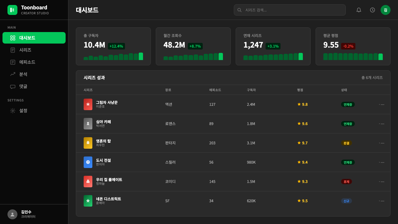
An early platform architect whose work on Naver Webtoon's content infrastructure established the technical and editorial conventions — episode segmentation, the comment layer beneath each strip, the reader-engagement metrics — that would shape how the design system prioritized information. The decision to surface episode counts and completion status prominently in the browse interface reflects an editorial philosophy that treats the reader's time investment as a central design variable.早期平台架构师,其在 Naver Webtoon 内容基础设施上的工作确立了技术与编辑惯例——话数分割、每部漫画下方的评论层、读者参与度指标——这些惯例影响了设计体系如何排列信息的优先级。在浏览界面突出显示话数与完结状态的决策,体现了一种将读者时间投入视为核心设计变量的编辑哲学。
As a key figure in Naver Webtoon's design and product evolution during its internationalization phase, Lee Jong-bum's work on the platform's visual system helped reconcile the Korean-first design DNA with the requirements of a multilingual, multicultural product. The calibration of the badge and button system to function legibly across Korean, English, Japanese, and Thai interfaces — while preserving the dark-mode reading environment — represents one of the more difficult localization challenges in contemporary consumer app design.作为 Naver Webtoon 国际化阶段设计与产品演进的关键人物,李种范在平台视觉体系上的工作帮助将韩国本土设计基因与多语言、多文化产品的需求加以调和。在保留暗模式阅读环境的同时,使徽章与按钮系统能跨越韩语、英语、日语和泰语界面清晰运作,代表了当代消费类应用设计中最具挑战性的本地化课题之一。
The visual richness of the Naver Webtoon design system is inseparable from the enormous range of artists and studios who created content for the platform. Many creators developed distinct panel layouts, color worlds, and visual rhythms that the platform's thumbnail grid had to accommodate — driving the design system's neutrality in the browse environment so that the creator's artwork, not the platform chrome, commands attention. Several Naver Webtoon originals — including titles later adapted into K-drama and film — helped define the visual vocabulary of contemporary Korean popular culture.Naver Webtoon 设计体系的视觉丰富性,与在平台上创作内容的庞大艺术家和工作室群体密不可分。许多创作者发展出各具特色的分格布局、色彩世界和视觉节奏,平台的缩略图网格必须容纳这些差异——这驱动了浏览环境在设计上的中立性:是创作者的画作而非平台界面在吸引注意力。多部 Naver Webtoon 原创作品——包括后来被改编为韩剧和电影的作品——帮助定义了当代韩国流行文化的视觉词汇。
The internal design organization at Naver has maintained the visual system across two decades of platform evolution, navigating the transition from a desktop web portal aesthetic to a mobile-native dark-mode product. The team's most consequential decision was committing to the AMOLED-optimized dark ground as the primary environment rather than offering it as an option — a choice that positioned the platform as a native mobile experience at a time when most Western platforms were still defaulting to light backgrounds.Naver 内部设计团队在平台二十年演进过程中持续维护视觉体系,历经从桌面门户网站美学到移动原生暗模式产品的转型。团队最具影响力的决策,是将 AMOLED 优化的深色底面作为主要环境而非选项提供——这一选择在大多数西方平台仍默认浅色背景之时,就将平台定位为原生移动体验。
How do you use Naver Webtoon (2024) today?今天怎么用 Naver Webtoon (2024)?
Naver Webtoon's design language translates most naturally to digital products that share its core use case: long-session consumption of visual content in low-light environments. The system's principles — dark ground, single vivid accent, restrained badge vocabulary, immersive content-first chrome — are directly applicable to any streaming, reading, or content-browsing interface where the user's attention should be directed entirely at the content rather than the surrounding UI.Naver Webtoon 的设计语言最自然地迁移至与其核心使用场景相似的数字产品:在低光环境下长时间消费视觉内容的应用。这套体系的核心原则——深色底面、单一鲜明强调色、克制的徽章词汇、以内容为先的沉浸式界面——可直接应用于任何希望将用户注意力完全导向内容而非周边界面的流媒体、阅读或内容浏览产品。
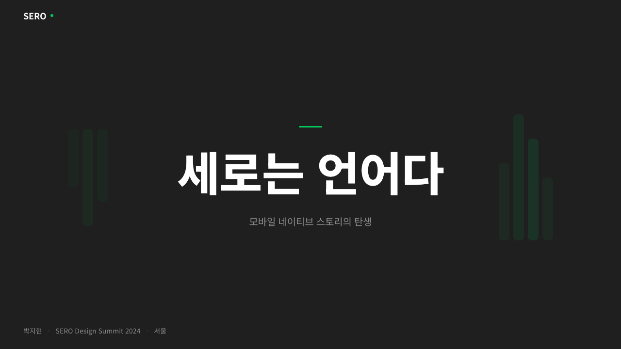
For presentation slides, the style works best for cover and section-break pages rather than dense content slides. A cover built on this system uses the deep charcoal as the full-bleed background, positions the title in a large, clean sans-serif at high contrast, and deploys the green accent sparingly — as a single underline, a geometric block, or a highlighted word. Content slides should keep backgrounds dark and use the accent color exclusively for data highlights or key terms, never as a decorative fill. Data visualizations benefit from the system's discipline: charts rendered as clean geometric forms against the dark field with the accent color marking the primary data series read with exceptional clarity at a distance.在演示文稿中,这种风格最适合封面页和章节过渡页,而非信息密集的内容页。基于这套体系构建的封面,以深炭灰作为全出血背景,在高对比度下以大号简洁无衬线字体排布标题,绿色强调色则极度克制地使用——作为单条下划线、几何色块,或高亮关键词。内容页应保持深色背景,强调色仅用于数据高亮或关键词,绝不作为装饰性填充。数据可视化受益于这套体系的自律:以简洁几何形态在深色底面上渲染的图表,配合标记主要数据系列的强调色,在远距离也具有出色的清晰度。
For web interfaces, the aesthetic translates directly to dark-mode dashboards, media streaming pages, and any catalog-style browse experience. The approach is to establish the charcoal ground across the full viewport, define a thumbnail or card grid using consistent proportions, and build the interactive layer entirely from pill buttons in the accent color and flat badge chips for status communication. Pricing pages and subscription interfaces are particularly well-served: the pill button form and the color-coded badge system communicate tier and action without requiring elaborate visual metaphors.对于网页界面,这种美学可直接迁移至暗模式仪表板、媒体流媒体页面,以及任何目录式浏览体验。方法是:以炭灰底面覆盖整个视口,以统一比例定义缩略图或卡片网格,并将交互层完全构建于强调色药丸形按钮和扁平徽章标签片之上,以传达状态信息。定价页面和订阅界面尤为受益:药丸形按钮和色彩编码的徽章系统在无需复杂视觉隐喻的情况下便能清晰传达等级和行动。
For editorial and marketing materials, the system's cinematic quality makes it effective for entertainment brands, gaming companies, cultural organizations, and any product in the creative or media sector. A Naver Webtoon-inflected marketing page uses the dark ground as a stage, presents content in a bold thumbnail-grid rhythm, and uses the accent color for calls to action and headline emphasis. The style's Korean visual heritage gives it a distinct cultural signal that can itself be a deliberate brand positioning choice for products targeting audiences who follow Korean entertainment.对于编辑与营销素材,这套体系的电影质感使其对娱乐品牌、游戏公司、文化机构,以及任何创意或媒体领域的产品都颇为有效。一个融入 Naver Webtoon 风格的营销页面,以深色底面为舞台,以大胆的缩略图网格节奏呈现内容,并以强调色用于行动号召与标题强调。这种风格的韩国视觉基因赋予其独特的文化信号,对于定位于关注韩国娱乐的受众的产品来说,这本身就可以是一种刻意的品牌定位选择。
A common mistake when applying this style is overusing the accent green or substituting it with other saturated hues to create visual variety. The system's power comes from the restraint: one vivid color against a near-neutral dark field. Adding secondary accent colors, softening the dark ground to grey, or applying decorative gradients to the badge and button components immediately collapses the system's clarity. Similarly, the dark ground must be genuinely dark — a mid-grey is not a substitute and reads as an unfinished attempt rather than a deliberate environment. Commit to the darkness and the single accent, and the system rewards that commitment with exceptional legibility and atmosphere.应用这种风格时最常见的错误,是过度使用强调绿色,或用其他高饱和色彩替代以制造视觉变化。这套体系的力量来自克制:一种鲜亮色彩对抗近中性的深色底面。加入次级强调色、将深色底面软化为中灰,或对徽章和按钮组件应用装饰性渐变,都会立即瓦解体系的清晰度。同样,深色底面必须是真正的深色——中灰并非替代品,看起来像未完成的尝试而非刻意的环境设计。坚守深色与单一强调色,这套体系将以卓越的可读性和氛围感给予回报。
See the Naver Webtoon (2024) design system查看 Naver Webtoon (2024) 完整设计系统
Naver Webtoon (2024) — FAQNaver Webtoon (2024) · 常见问题
Is this style only appropriate for entertainment or comics products?这种风格只适合娱乐或漫画产品吗?
Not exclusively, though it originated there. The core system — dark ground, single vivid accent, restrained badge and button vocabulary — translates cleanly to any product where immersive consumption or long-session focus is a design goal: music streaming interfaces, reading applications, developer tools and code editors, financial dashboards used in trading contexts, and any professional product that needs to work well in low-ambient-light environments. The style becomes inappropriate when the product requires warmth, accessibility for broad age ranges, or association with outdoor or daytime use.并非仅限于此,尽管它起源于娱乐领域。核心体系——深色底面、单一鲜明强调色、克制的徽章与按钮词汇——可以清晰迁移至任何以沉浸式消费或长时间专注为设计目标的产品:音乐流媒体界面、阅读应用、开发者工具与代码编辑器、交易场景下使用的金融仪表板,以及任何需要在低环境光下良好运作的专业产品。当产品需要温暖感、适应宽泛年龄段的可及性,或与户外和日间使用场景关联时,这种风格便不再适合。
How does Naver Webtoon's dark mode differ from a generic dark mode?Naver Webtoon 的暗模式与通用暗模式有何不同?
Generic dark modes are typically a light-mode design inverted — the same hierarchy, the same component shapes, the same accent logic, just with backgrounds darkened and text lightened. Naver Webtoon's dark environment was designed dark from the beginning, which means every compositional decision — the proportion of the thumbnail grid, the role of the accent color, the weight of the badge type — was made with the dark ground as the primary assumption rather than an alternative. The result is a system that feels coherent rather than adapted: nothing looks like it was designed for white and then flipped.通用暗模式通常是将浅色模式设计反转——相同的层级、相同的组件形态、相同的强调色逻辑,只是背景变暗、文字变浅。Naver Webtoon 的深色环境从一开始就是按深色设计的,这意味着每一个构图决策——缩略图网格的比例、强调色的作用、徽章文字的字重——都是以深色底面为首要前提而非备选方案做出的。结果是一个感觉连贯而非适配的体系:没有任何元素看起来像是为白色背景设计后翻转而来的。
Can the green accent be swapped for a brand's own color?绿色强调色可以替换为品牌自己的颜色吗?
Yes, the green in Naver Webtoon is a brand-specific choice, not a structural necessity. The structural requirement is that the accent color be a single, high-luminance hue that creates strong contrast against the charcoal ground. Vivid blues, saturated oranges, bright magentas, and electric yellows all work within the system logic — provided they are used with the same restraint as the original green: one accent, deployed only on interactive states and status indicators, never as a decorative fill or background tone. Colors with low luminance against dark grounds — deep purples, forest greens, navy blues — do not substitute effectively because they lose the contrast that makes the system readable.可以,Naver Webtoon 中的绿色是品牌特定选择,而非结构性必然。结构性要求是:强调色必须是单一的、高亮度色相,能与炭灰底面形成强烈对比。鲜亮的蓝色、高饱和橙色、明亮品红和电光黄,都能在这套体系逻辑中运作——前提是以与原版绿相同的克制度使用:单一强调色,仅部署于交互状态和状态指示符,绝不用作装饰性填充或背景色调。在深色底面上亮度低的颜色——深紫、暗绿、藏青——无法有效替代,因为它们在深色背景上失去了令体系可读的对比度。
How should the vertical thumbnail grid be adapted for wider screens?竖版缩略图网格应如何适配更宽的屏幕?
On mobile, the Naver Webtoon grid typically shows two or three columns of portrait-oriented thumbnails at comfortable tap-target proportions. On tablet and desktop breakpoints, the grid expands in column count while preserving the portrait thumbnail aspect ratio — the form is not changed, only multiplied. The dark ground and badge overlay system work at any width. The mistake to avoid is switching to a landscape-oriented card layout at larger sizes; the vertical thumbnail is a deliberate aspect-ratio choice tied to the comic-cover format and should remain consistent across breakpoints to maintain the catalog-browsing feel.在手机端,Naver Webtoon 网格通常以两到三列竖向缩略图呈现,保持舒适的点击目标比例。在平板和桌面断点,网格在保持竖向缩略图长宽比的同时扩展列数——形态不变,只是复数增加。深色底面和徽章覆层系统在任何宽度下都能运作。应避免的错误是在更大尺寸下切换为横向卡片布局;竖向缩略图是与漫画封面格式绑定的刻意长宽比选择,应在各断点保持一致,以维持目录浏览的体验感。
Does this style work for print or physical media?这种风格适用于印刷或实体媒体吗?
With significant adaptation. The deep charcoal ground that forms the system's visual foundation is optimized for backlit screens — on paper, dark backgrounds are expensive to print, difficult to achieve in matte finishes without muddying, and can reduce type legibility in low-contrast environments. A print adaptation of the Naver Webtoon aesthetic typically inverts the ground to a pale tone while retaining the accent color and badge-style information system. Event posters, merchandise packaging, and promotional print materials for entertainment brands can carry the system's visual vocabulary — the pill shape, the badge chips, the single accent on dark — if the dark ground is treated as a spot-color or foil application rather than a full-coverage ink flood.需要大幅适配。构成体系视觉基础的深炭灰底面是为背光屏幕优化的——在纸张上,深色背景印刷成本高昂,哑光质感难以实现而不显浑浊,且可能在低对比度环境下降低字体可读性。Naver Webtoon 美学的印刷版本通常将底面反转为浅色调,同时保留强调色和徽章式信息系统。活动海报、周边商品包装和娱乐品牌的促销印刷品可以承载这套体系的视觉词汇——药丸形态、徽章标签、深色底面上的单一强调色——前提是将深色底面视为专色或烫印处理,而非满版印墨覆盖。
Related design styles相关设计风格
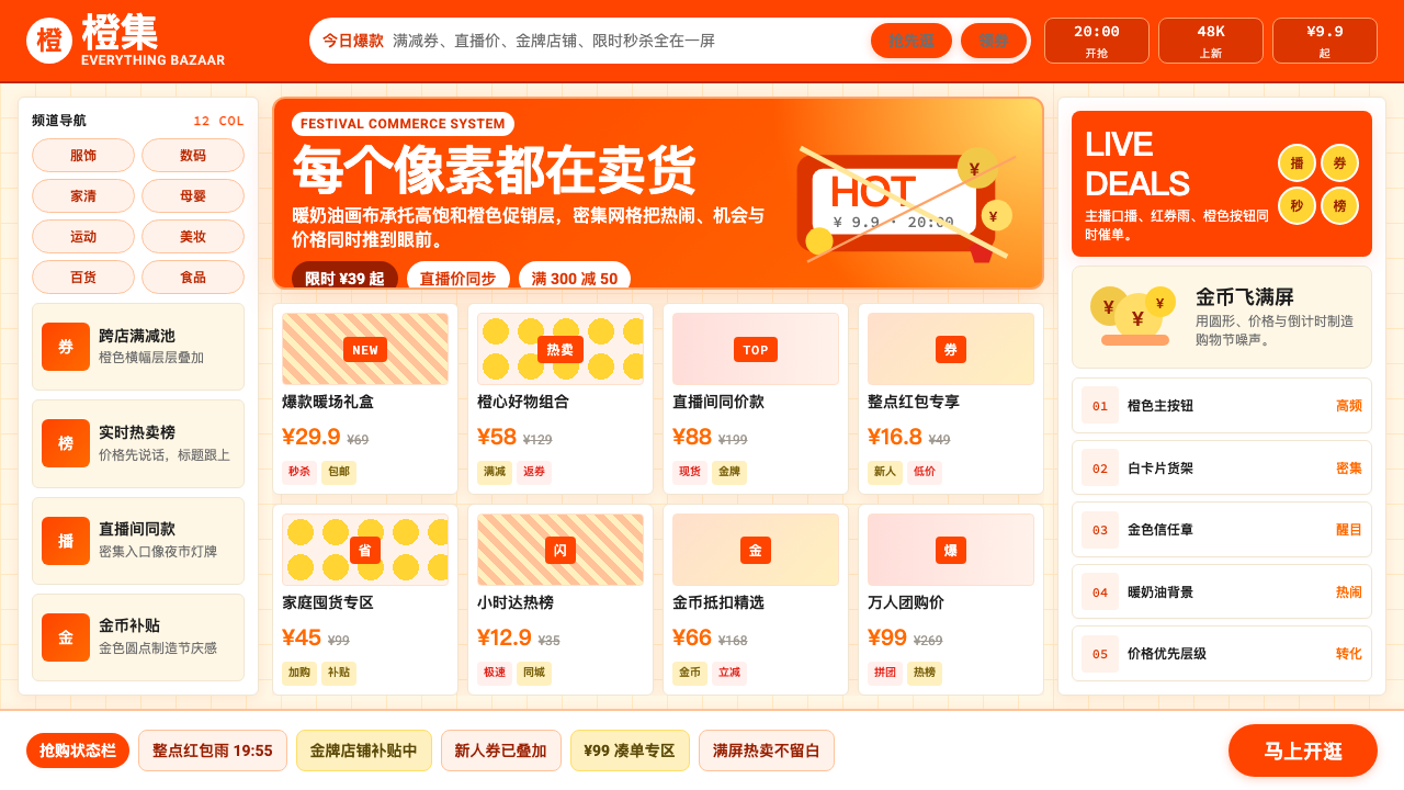 Taobao (淘宝)Every pixel sells. Orange on cream, dense price grids and gold coins shout ab…每个像素都在卖货。橙色压在奶油底上,密集价格网格与金币喊出丰盛。
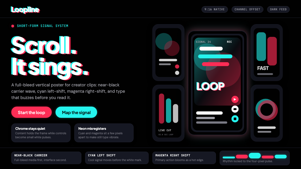 TikTok 2024Attention vibrates. Near-black feed, cyan-magenta offsets, and vertical frame…注意力在震动。近黑底、青粉错位与竖屏框架发出嗡鸣。
 Discord 2024Blurple cozy. Charcoal grounds, illustrated characters — every surface says '…刻意去企业化的语音聊天:blurple 蓝紫、深炭灰底、俏皮插画角色——每个界…
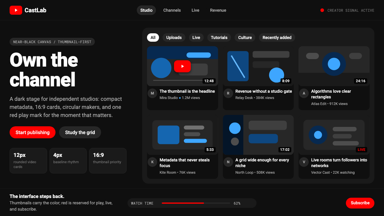 YouTube Creator EconomyThe UI disappears. Near-black Roboto grids let thumbnails shout; red only mea…界面退后:近黑Roboto网格让缩略图发声,红色只为播放。
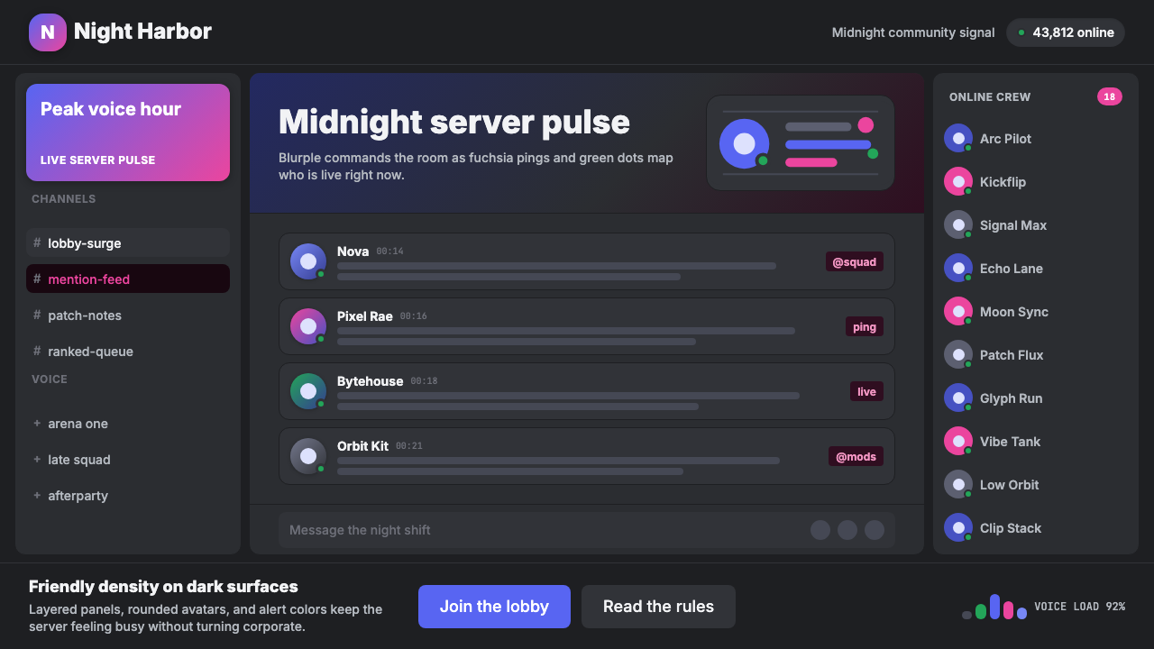 Discord Blurple Server (2020)Midnight server energy. Blurple panels, fuchsia pings, and green status dots…午夜服务器能量:蓝紫面板、品红提醒、在线绿点保持密集。
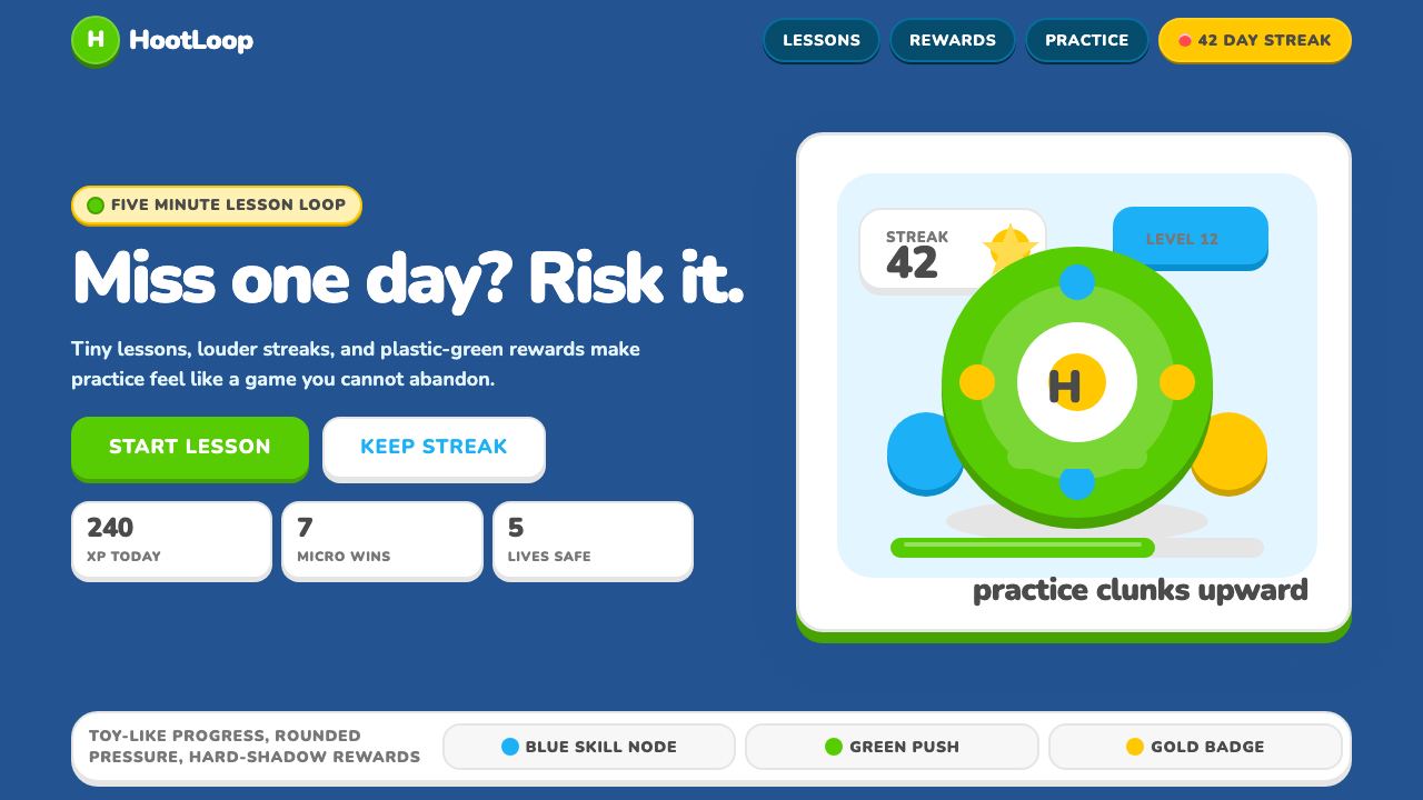 Duolingo 2024Adorable pressure wins. Feather Green, Nunito heft, rounded push-shadows gami…可爱压力取胜:羽毛绿、Nunito粗字与圆角硬阴影,把愧疚游戏化。