What is Zomato India Delivery?什么是 Zomato India Delivery?
One saturated red and a voice that texts like your funniest friend at midnight — Zomato's post-2020 visual system turned Indian food delivery into a design landmark.一种饱和红,加上一个像你最有趣的朋友在午夜发短信的品牌声调——Zomato 的 2020 年后视觉系统让印度外卖成为了设计史上的一个坐标。
Zomato India Delivery in briefZomato India Delivery 速览
Zomato India Delivery is the visual and verbal identity system that the Gurgaon-based food-technology company refined and locked in around 2020, a year before its landmark IPO on the National Stock Exchange. It is not a static logo-and-color guideline — it is a living interface language built for mobile-first card-scroll behavior, shaped by bilingual typography, saturated hero color, and a copywriting voice that is at once informal, urgent, and distinctly Indian.Zomato 印度外卖视觉系统是这家总部位于古尔冈的食品科技公司在 2020 年前后——也就是其在印度国家证券交易所上市前一年——完善并定型的视觉与文字识别体系。它并非一套静态的标志与色彩规范,而是一套为移动优先的卡片滚动行为量身打造的活体界面语言,由双语排版、饱和主色与极具个性的文案声调共同塑造。
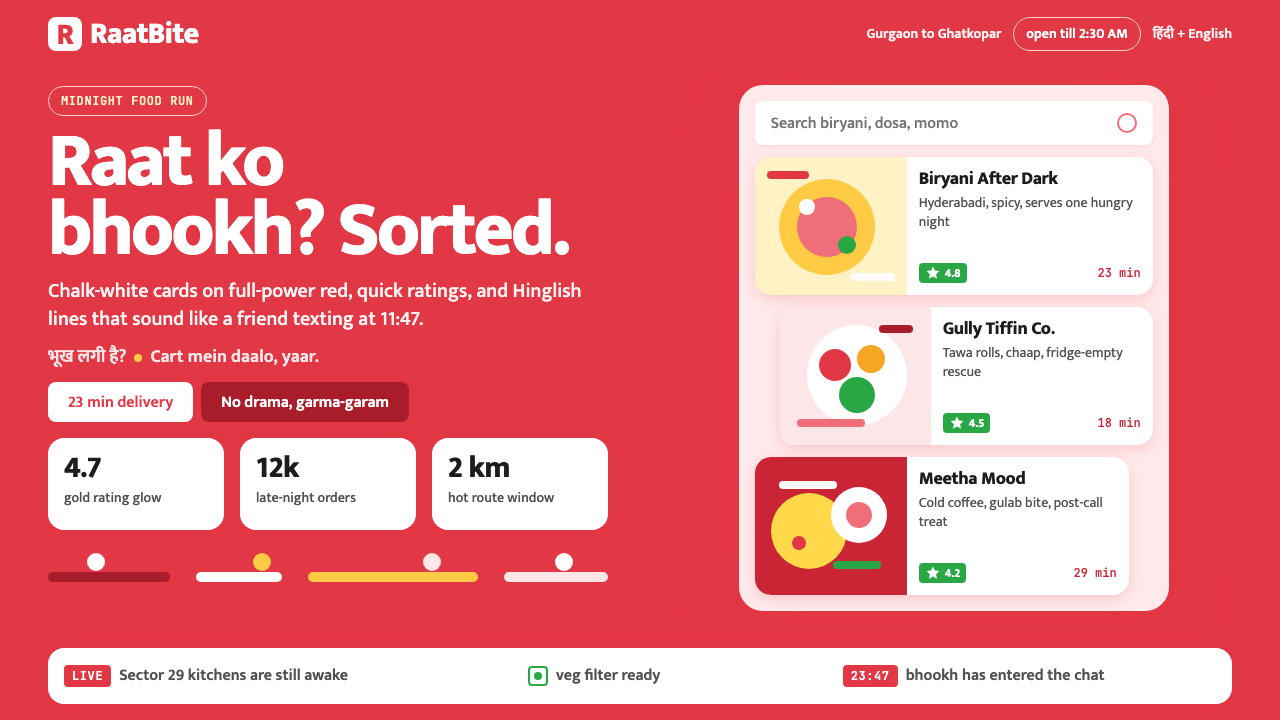
The system is organized around a single dominant color — a fierce, warm red that floods the page background — against which chalk-white card surfaces float. Each card carries bold food photography, star ratings rendered in gold, and delivery countdown timers. The visual hierarchy is almost brutally simple: background color signals the brand, white cards surface the content, gold marks quality, and every word is written in a Hinglish register that mixes Hindi idiom with English syntax to create something neither purely one nor the other.这套系统以单一主导色为核心组织——一种热烈的暖红铺满页面背景,粉白色卡片面板浮于其上。每张卡片承载着大幅美食摄影、金色星级评分和配送倒计时。视觉层级简洁到近乎直白:背景色传递品牌信号,白色卡片呈现内容,金色标注品质,而每一个字都以 Hinglish 语调写就——这种将印地语习语与英语句式混合的语言,创造出一种既非纯粹印地语、也非纯粹英语的独特表达。
What distinguishes this system from generic delivery-app design is its coherence across all touchpoints: the same warmth in the notification copy as in the empty-state illustration, the same typographic weight in a restaurant name as in a promotional banner. The system was designed to work for a young, mobile-native Indian urban audience who are simultaneously fluent in multiple languages, accustomed to dense visual information, and deeply responsive to humor and personality in brand communication.将这套系统与普通外卖应用设计区别开来的,是它在所有触点上的高度一致性:推送通知文案与空状态插图拥有同样的温度,餐厅名称与促销横幅拥有同样的字体分量。这套系统专为年轻的、移动原生的印度城市用户设计——他们同时流利使用多种语言,习惯于高密度视觉信息,并对品牌传播中的幽默感与个性极为敏感。
See the Zomato India Delivery design system查看 Zomato India Delivery 完整设计系统
Where does Zomato India Delivery come from?Zomato India Delivery 从何而来?
Zomato began in 2008 as Foodiebay, a restaurant discovery website built by Deepinder Goyal and Pankaj Chaddah, two engineers at Bain and Company in New Delhi. The original product was a simple digitization of paper menus — functional, informational, almost entirely without visual personality. The company renamed itself Zomato in 2010 and expanded aggressively through the following decade, entering markets across South and Southeast Asia, the Middle East, and briefly operating in several European and American cities before refocusing on India.Zomato 的历史始于 2008 年,彼时它还叫 Foodiebay,是由贝恩咨询公司新德里分公司的两位工程师 Deepinder Goyal 和 Pankaj Chaddah 共同搭建的一个餐厅发现网站。最初的产品是对纸质菜单的简单数字化——功能性的,信息性的,几乎完全没有视觉个性。公司在 2010 年更名为 Zomato,并在随后的十年里大举扩张,进入南亚、东南亚、中东市场,一度在欧美多个城市运营,最终战略聚焦回印度本土。
The visual identity that most people associate with Zomato today is the product of the 2020 refresh, shaped significantly by the demands of the Indian food-delivery market during and after the COVID-19 pandemic. As restaurant dining collapsed and delivery surged, Zomato's app became the primary interface millions of Indians used to access food. The design team — led internally with contributions from brand strategist Gulshan Bajwa and finance executive Akshant Goyal overseeing the broader brand health in the IPO run-up — recognized that the product needed to feel as warm, trustworthy, and immediate as the best neighborhood restaurant. The saturated red was not chosen arbitrarily: red carries deep cultural resonance in India, associated with celebration, auspiciousness, and energy, from festival textiles to the tikka worn at religious occasions.今天大多数人所熟知的 Zomato 视觉识别,是 2020 年改版的产物,这一改版在很大程度上受到新冠疫情期间及之后印度外卖市场需求的驱动。随着堂食骤降、外卖激增,Zomato 的应用成为数百万印度人获取食物的主要界面。设计团队——由内部主导,品牌策略师 Gulshan Bajwa 与财务高管 Akshant Goyal 在 IPO 筹备期共同把控整体品牌健康——意识到产品需要像最好的街边餐馆一样,传递出温暖、可信赖与即时性。饱和红的选择并非随意:红色在印度文化中承载着深厚的共鸣,与喜庆、吉祥和活力相关联,从节日织物到宗教场合所佩戴的吉祥痣,红色无处不在。
The bilingual typography was a direct response to the linguistic reality of Zomato's market. India has no single written vernacular that reaches every user; the app serves users in Delhi, Mumbai, Chennai, Kolkata, Bengaluru, and hundreds of smaller cities, each with distinct language preferences. Rather than defaulting to English only — which would have felt alienating to large segments of the user base — or fragmenting the design into dozens of localized versions, the team adopted Mukta, a typeface engineered to render Devanagari script and the Latin alphabet at harmonious visual weight. This allowed a single layout system to carry Hindi, English, and Hinglish text without breaking visual rhythm.双语排版是对 Zomato 市场语言现实的直接回应。印度没有能够触达所有用户的单一书面白话;这款应用服务于德里、孟买、金奈、加尔各答、班加罗尔和数百座中小城市的用户,每个地区都有截然不同的语言偏好。设计团队没有退守纯英语——那会让大量用户群体感到疏离——也没有将设计碎片化为数十个本地化版本,而是采用了 Mukta 字体。这款字体专为以和谐视觉重量同时渲染天城文字母与拉丁字母而设计,使得单一版式系统得以无缝承载印地语、英语与 Hinglish 文本,而不打破视觉节奏。
The Hinglish copywriting voice emerged from a deliberate brand decision to sound like a friend rather than a service. Earlier app copy in the Indian consumer-tech space tended toward formal English, which created a social distance between brand and user. Zomato's writers pushed in the opposite direction: micro-interactions were written with the cadence and humor of an informal chat — delivery confirmation messages that crack jokes about hunger, empty search states that commiserate with the user, promotional notifications that adopt the exaggerated enthusiasm of a friend recommending a restaurant. This voice became so strongly associated with the brand that it influenced an entire generation of Indian consumer app copywriting. The 2021 IPO — which valued the company at approximately twenty billion dollars — cemented the system as not just a design outcome but a commercial proof point: warmth, speed, and cultural specificity at scale.Hinglish 文案声调源于一个深思熟虑的品牌决策:听起来像朋友,而非服务商。印度消费科技领域早期的应用文案往往倾向于正式英语,在品牌与用户之间制造了一种社交距离。Zomato 的文案团队朝着相反方向推进:微交互文字以非正式聊天的节奏和幽默写成——配送确认信息调侃饥饿感,空搜索状态与用户共情,促销通知采用朋友推荐餐厅时那种夸张的热情。这种声调与品牌之间的关联如此之强,以至于影响了整整一代印度消费应用的文案写作风格。2021 年的 IPO——公司估值约合两百亿美元——将这套系统定格为不仅是一个设计成果,更是一个商业验证:温度、速度与文化特殊性可以在规模上并存。
What defines the Zomato India Delivery look?Zomato India Delivery 的视觉特征是什么?
Dominant Brand Color强势品牌主色
A single saturated warm red functions as the total background environment — it floods the screen rather than appearing as an accent or a logo element. This approach is unusual in app design, where muted or neutral backgrounds are typical; Zomato's choice makes the brand color inescapable and immediately recognizable even in peripheral vision. The red is warm rather than cool, suggesting energy, appetite, and cultural celebration rather than urgency or danger.一种饱和的暖红作为整体背景环境覆盖整个屏幕——它不是作为强调色或标志元素出现,而是铺满全屏。这种做法在应用设计中颇为罕见,通常应用会选择中性或柔和的背景色;Zomato 的选择使品牌色在视觉边缘地带也能被即时识别,无处可以回避。这种红色偏暖而非偏冷,传递的是能量、食欲与文化喜庆感,而非紧迫感或危险信号。
White Card Architecture白色卡片架构
Against the saturated background, chalk-white card components create a layered spatial system. Cards carry all functional content — restaurant identity, food photography, ratings, pricing, and delivery metadata — while the colored ground acts as connective tissue between cards. The white is clean and slightly cool, creating strong contrast with the warm background and making food photography appear vivid and appetizing. Subtle elevation through shadow gives cards a sense of physical presence without simulating complex depth.在饱和背景的衬托下,粉白色卡片组件构建出一套分层空间系统。卡片承载所有功能性内容——餐厅标识、美食摄影、评分、定价与配送元数据——而色彩背景在卡片之间起到连接组织的作用。白色干净且略带冷调,与暖色背景形成强烈对比,使美食摄影显得鲜艳诱人。通过投影产生的微妙层次感赋予卡片物理存在感,而无需模拟复杂的空间深度。
Gold as Quality Signal金色作为品质信号
Star ratings are rendered in gold — not as decoration but as a precise semantic choice. In the context of the red-and-white system, gold stands out as the only warm metallic note, carrying cultural associations with value, reward, and prestige that are broadly recognized across Indian visual culture. The use of gold for ratings creates an immediate and universally understood hierarchy between restaurants: a five-star gold cluster reads as premium at a glance without requiring any text explanation.星级评分以金色呈现——这不是装饰,而是精准的语义选择。在红白系统的语境下,金色是唯一的暖金属色调,承载着价值、奖励与尊贵的文化联想,这些联想在印度视觉文化中被广泛认知。将金色用于评分在餐厅之间建立了一种即时且普遍可理解的层级:五颗金色星星一眼就能传达高端品质,无需任何文字说明。
Bilingual Typography at Equal Weight等权重双语排版
The typeface selected for the system handles both Devanagari script and the Latin alphabet, with both scripts rendered at visually equivalent stroke weight. This means a restaurant name in Hindi and its English transliteration sit at the same apparent size and boldness on a card, neither subordinating the other. The resulting layout feels native to India's multilingual reality rather than like a foreign-language overlay on an English-first design. The type scale moves through clear large-to-small hierarchy, with restaurant names large, cuisine tags smaller, and metadata at a compact but legible size.这套系统所选用的字体能够同时处理天城文与拉丁字母,且两种文字以视觉上等重的笔画粗细呈现。这意味着一张卡片上,餐厅的印地语名称与其英语音译在视觉上拥有同等大小和粗细,互不从属。由此呈现的版面感觉上与印度的多语言现实天然契合,而不像是将外语覆盖在英语优先设计之上。字体大小从大到小层级分明:餐厅名最大,菜系标签次之,元数据以紧凑但清晰易读的尺寸呈现。
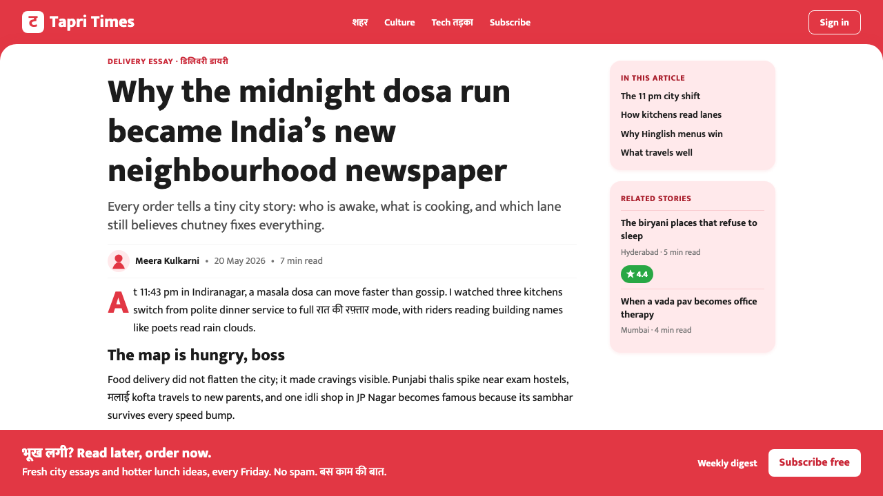
Hinglish Copywriting VoiceHinglish 文案声调
Every piece of interface copy — from button labels to push notifications to empty-state messages — is written in a conversational register that blends Hindi cultural reference with English syntactic structure. The tone is late-night, informal, and comedic: it assumes the user is a young urban Indian who appreciates irony, understands food culture as social ritual, and responds better to humor than to transactional language. This voice is carried consistently across the entire system, including states that other apps treat as purely utilitarian, such as loading screens and error messages.每一处界面文字——从按钮标签到推送通知,再到空状态提示——都以一种对话性语调写就,将印地语的文化典故与英语的句法结构融为一体。语气是深夜的、非正式的、带着喜剧感的:它假设用户是一个欣赏反讽、将饮食文化视为社交仪式的年轻印度城市居民,他对幽默的回应远胜于交易性语言。这种声调贯穿整个系统,包括其他应用视为纯功能性的状态,如加载界面和报错信息。
Hero Food Photography大图美食摄影
Food photographs occupy the dominant visual real estate within each card, shot and processed to appear warm, immediate, and slightly larger than life. The photography style favors overhead and close-up angles that emphasize texture, color, and portion — the visual language of appetite rather than of culinary aspiration. Images are treated with enough warmth and saturation to remain vivid against the already-saturated brand background, a deliberate calibration that distinguishes Zomato's visual system from more neutrally styled competitors.美食摄影在每张卡片内占据主导视觉面积,拍摄与后期处理使图像显得温暖、直接、略大于实物。摄影风格偏爱俯拍与特写角度,强调质感、色彩与份量感——这是食欲的视觉语言,而非烹饪理想的视觉语言。图像经过足够的暖调与饱和度处理,以便在已然饱和的品牌背景下依然鲜活,这是一种有意为之的校准,使 Zomato 的视觉系统区别于风格更为中性的竞争对手。
Delivery Countdown as Design Element配送倒计时作为设计元素
Estimated delivery time is given prominent typographic placement within cards, treated not as metadata but as a primary selling point. The countdown — typically expressed as a range in minutes — sits in large, bold numerals that create a sense of immediacy and service confidence. This design choice reflects a key insight of the Indian food-delivery market: speed is both a practical requirement and an emotional promise. Making the number prominent and readable at a glance turns a functional data point into a brand statement about reliability.预计配送时间在卡片中获得显著的排版位置,被处理为主要卖点而非元数据。倒计时——通常以分钟区间表达——以粗大的数字字体呈现,营造出即时感与服务信心。这一设计选择反映了印度外卖市场的一个关键洞察:速度既是实际需求,也是情感承诺。将数字放大至一眼即读,将功能性数据点转化为关于可靠性的品牌陈述。
See the Zomato India Delivery design system查看 Zomato India Delivery 完整设计系统
Who shaped Zomato India Delivery?谁塑造了 Zomato India Delivery?
Goyal co-founded the company in 2008 as Foodiebay and led it through its transformation from a restaurant discovery platform to a full-stack food-delivery operation. His product philosophy — that technology should feel warm and personal rather than efficient and transactional — shaped the design direction that became explicit in the 2020 refresh. Under his leadership, Zomato resisted the impulse to homogenize its visual language for international markets and instead doubled down on Indian cultural specificity, a decision that proved commercially decisive in the IPO period.Goyal 于 2008 年联合创办 Foodiebay,并主导了公司从餐厅发现平台向全链路外卖运营商的转型。他的产品哲学——科技应该感觉温暖而个人化,而非高效而交易性——塑造了 2020 年改版中明确呈现的设计方向。在他的领导下,Zomato 抵制了将视觉语言国际化同质化的冲动,转而加倍强化印度文化特殊性,这一决策在 IPO 阶段被证明具有决定性的商业价值。
Chaddah co-founded Zomato alongside Goyal and was instrumental in the company's early expansion across Indian cities. His understanding of how Indian consumers discover and choose restaurants — through social trust networks, peer recommendation, and local culinary knowledge — informed the rating and review architecture that became central to the card design language. The gold star rating system reflects his founding insight that social proof, made visually prominent, is the strongest purchase signal in the Indian food market.Chaddah 与 Goyal 共同创办 Zomato,并在公司早期跨城市扩张中发挥了关键作用。他对印度消费者如何发现和选择餐厅的深刻理解——通过社交信任网络、同伴推荐与本地饮食知识——奠定了评分与评论架构的基础,而这一架构后来成为卡片设计语言的核心。金色星级评分系统折射出他的创业洞察:在印度食品市场,被显著呈现的社交证明是最强大的购买信号。
Bajwa contributed to Zomato's brand strategy during the period when the visual system was being consolidated. The Hinglish voice that the brand became famous for — informal, witty, and culturally embedded — required deliberate brand governance to ensure consistency across a large team producing copy at high volume and velocity. Bajwa's work on brand standards helped codify what was initially an instinctive cultural tone into a repeatable system that could be applied by writers, designers, and product managers across the entire app surface.Bajwa 在视觉系统整合时期参与了 Zomato 的品牌策略工作。品牌所以成名的 Hinglish 声调——非正式的、机智的、深植于文化的——需要深思熟虑的品牌治理,以确保在高产量、高节奏的大型文案团队中保持一致性。Bajwa 在品牌规范方面的工作,帮助将最初凭直觉形成的文化语调转化为可被文案、设计师和产品经理在整个应用界面加以应用的可复制系统。
As a key executive overseeing financial and strategic functions during the IPO preparation, Akshant Goyal's role involved ensuring that the visual and brand investments being made translated into measurable business outcomes. The 2020 identity refresh was not purely a creative exercise — it was timed to build brand equity ahead of the public listing. His involvement underscores the degree to which the Zomato visual system was understood internally as a commercial asset: the design language, the photography style, and the Hinglish voice were all treated as compounding investments in brand recognition that would support the valuation narrative.作为 IPO 筹备期间分管财务与战略职能的核心高管,Akshant Goyal 的角色在于确保视觉与品牌投资能够转化为可量化的商业成果。2020 年的视觉识别改版并非单纯的创意工程——它在时间节点上经过精心设计,旨在公开上市前积累品牌资产。他的参与深刻揭示了 Zomato 内部对这套视觉系统的定性:设计语言、摄影风格与 Hinglish 声调都被视为品牌认知度的复利投资,将为估值叙事提供支撑。
How do you use Zomato India Delivery today?今天怎么用 Zomato India Delivery?
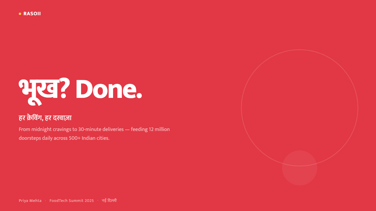
The Zomato India Delivery visual system is highly transferable to presentation and slide design whenever the goal is to communicate energy, warmth, and approachability at speed. For a cover slide, the approach works best with a full-bleed brand color background — a rich, saturated warm red — and a single white or cream card element centered or offset to carry the title. The contrast between the intense background and the bright card creates instant visual impact without requiring any additional decoration. Headline type should be bold, generous in size, and set with enough negative space within the card that the text breathes rather than crowds. A secondary detail — a subtitle, a tagline, a date — can be set smaller in the same card, creating clear hierarchy through scale alone.Zomato 印度外卖视觉系统在演示与幻灯片设计中具有高度可移植性,尤其当目标是以快节奏传递能量、温度与亲切感时。对于封面页,这套方法最适合以全出血品牌色——丰富饱和的暖红——作为背景,以单一白色或奶油色卡片元素居中或偏移承载标题。强烈背景与明亮卡片之间的对比制造出即时视觉冲击,无需任何附加装饰。标题字体应粗重、足够大,并在卡片内留有充分负空间,使文字呼吸而非拥挤。副标题、标语或日期可在同一卡片内以更小字号呈现,仅通过大小差异建立清晰层级。
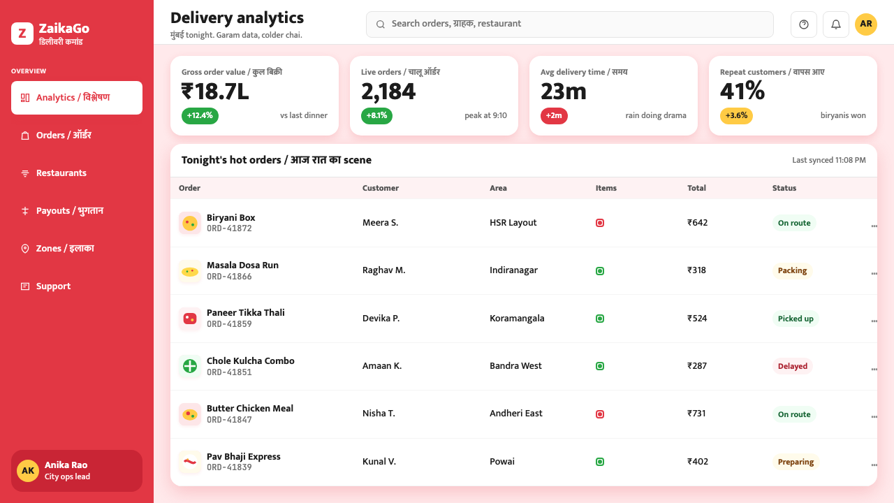
For content slides, the card-on-color system translates directly into a modular grid of information panels. Each card carries one concept: a data point, a quote, a metric, an image with caption. The saturated background unifies the slide even when multiple cards are present, and the white surfaces direct the eye to the content. Data visualization on this system works best when charts are treated as bold graphic objects — bars and circles at full color saturation against the card's white ground — rather than as fine-line analytical diagrams. Labels should be large and direct, written in the friendly, confident voice the system is built on, avoiding the formal passive constructions typical of corporate reporting.对于内容页,卡片叠色系统可以直接转化为模块化信息面板网格。每张卡片承载一个概念:一个数据点、一句引语、一项指标、一张带说明的图像。饱和背景将幻灯片统一为整体,即便多张卡片同时在场,白色面板也能将视线引导至内容。在这套系统中,数据可视化最适合将图表作为大胆的图形对象处理——在卡片白底上以全饱和色呈现柱条与圆形——而非精细的分析线图。标签应大且直接,以系统所建立的友好、自信语调书写,避免企业报告中常见的正式被动式表达。
For web interfaces, dashboards, and pricing pages, the system offers a strong model for hierarchy through color environment. A pricing page built on this visual logic uses the brand color as a dominant section background for the most important tier, with white or neutral backgrounds for secondary tiers — the color itself signals primacy without requiring extra visual devices like badges or callout boxes. Dashboard panels function as cards: white surfaces on a lightly colored ground, each panel carrying one metric or widget. The key discipline is restraint in color: the warm red works as a full environment or as a strong accent, but never as a light tint or a mid-saturation wash — the system depends on the color being committed to, not hedged.对于网页界面、仪表板与定价页面,这套系统提供了一个通过色彩环境建立层级的有力范本。基于这套视觉逻辑的定价页面,以品牌色作为最重要定价层级的主体背景,以白色或中性背景呈现次级层级——色彩本身传递首要性,无需额外视觉装置如徽章或标注框。仪表板面板以卡片形式运作:在轻色底面上的白色面板,每个面板承载一项指标或组件。关键的自律是色彩上的克制:暖红可以作为完整环境或强烈强调色使用,但绝不应作为淡色调或中饱和度渲染——这套系统依赖于对色彩的全情投入,而非谨慎试探。
For editorial and marketing applications, the Zomato system's most powerful tool is its combination of large photography and strong typographic voice. A marketing page or social card built on this language leads with a full-bleed food or product photograph that is warm, close, and tactile. Type is placed on a white card overlaid on the photograph or on a separate colored band below it. The copy should carry the brand's characteristic informal energy — contractions, direct address, humor — which creates the sense that the content is being spoken by a person rather than published by an institution. This voice makes even promotional content feel like a recommendation from a trusted source.对于编辑与营销应用,Zomato 系统最强大的工具是大幅摄影与强烈文字声调的组合。基于这套语言构建的营销页面或社交卡片,以全出血的美食或产品摄影作为引领,图像应温暖、贴近、富有质感。文字或置于叠加在摄影之上的白色卡片,或置于其下方的独立色带。文案应承载品牌标志性的非正式活力——缩略语、直接称谓、幽默感——使内容感觉是由一个人说出,而非由机构发布。这种声调使即便是促销内容也感觉像是来自可信赖来源的推荐。
A common mistake when applying this system is diluting the brand color. The Zomato visual logic depends on the red being used at full, uncompromised saturation — as a background environment, not as a tint over white or a mid-tone accent. Designers who are uncertain about so much color often reduce it to a pastel or a partial overlay, which destroys the system's primary mechanism: the contrast between the intense ground and the bright card. Similarly, the Hinglish copywriting voice should not be translated into formal language when applying the system to non-Indian contexts — instead, find the locally equivalent register of friendly informality, because the system's emotional effect depends on the copy and the visual language reinforcing each other. A bold visual paired with stiff copy produces dissonance, not warmth.应用这套系统时最常见的错误是稀释品牌色。Zomato 视觉逻辑依赖于红色以完整、不妥协的饱和度使用——作为背景环境,而非白底上的淡色调或中调强调色。对大面积用色感到不确定的设计师往往将其降低为粉色调或半透明叠层,这会摧毁系统的核心机制:强烈底面与明亮卡片之间的对比。同样,在将这套系统应用于非印度语境时,Hinglish 文案声调不应被翻译为正式语言——而应找到当地等效的友好非正式语域,因为这套系统的情感效果依赖于文案与视觉语言的相互强化。大胆的视觉搭配僵硬的文案产生的是不协调,而非温度。
See the Zomato India Delivery design system查看 Zomato India Delivery 完整设计系统
Zomato India Delivery — FAQZomato India Delivery · 常见问题
Is the Zomato visual system appropriate for products outside food and delivery?Zomato 视觉系统适合用于餐饮外卖以外的产品吗?
The system's core mechanisms — saturated color environment, white card architecture, prominent photography, and informal copywriting voice — are transferable to any consumer product that values warmth, speed, and cultural relatability. It works especially well for marketplace products, event ticketing, travel booking, and lifestyle apps where the goal is to make browsing feel enjoyable rather than utilitarian. It is less suitable for professional services, financial products, or B2B tools where the dominant values are precision, authority, and formal trust — contexts where an intense brand-color background can feel overwhelming or unprofessional.这套系统的核心机制——饱和色彩环境、白色卡片架构、大幅摄影与非正式文案声调——可以迁移至任何重视温度、速度与文化亲切感的消费产品。它在市集类产品、活动购票、旅行预订和生活方式应用中表现尤为出色,因为在这些场景中,目标是使浏览感觉愉悦而非功利。对于专业服务、金融产品或 B2B 工具则不太适合,这些场景的主导价值是精准、权威与正式信任——在这些语境中,强烈的品牌色背景可能显得压迫甚至不够专业。
How does the Hinglish voice translate when designing for audiences outside India?为印度以外的受众设计时,Hinglish 声调如何转化?
The Hinglish voice is not a linguistic formula but a tonal stance: friendly, direct, informal, and culturally embedded. When applying the visual system to other markets, the key is to find the equivalent register in the local language — the way a trusted friend speaks about food, a place, or an experience — rather than to translate Hinglish literally. In practice, this means contractions over formal grammar, second-person direct address, humor that references shared cultural knowledge, and a willingness to be playful in states that traditional interface copy treats as purely functional. The voice works because it signals social equality between brand and user; that signal can be reproduced in any language that has an informal register.Hinglish 声调并非语言学公式,而是一种语调立场:友好、直接、非正式、深植于文化。将这套视觉系统应用于其他市场时,关键在于找到当地语言中的等效语域——可信赖的朋友谈论食物、地方或体验的方式——而非逐字翻译 Hinglish。实际操作中,这意味着用缩略语代替正式语法,用第二人称直接称谓,用引用共同文化知识的幽默,以及愿意在传统界面文案视为纯功能性的状态中展现轻松感。这种声调之所以有效,是因为它传达了品牌与用户之间的社交平等信号;这种信号可以在任何拥有非正式语域的语言中复现。
Can this system work in a light or dark mode, or is it tied to its specific background color?这套系统能以浅色或深色模式运行吗,还是与其特定背景色不可分离?
The system's saturated background is structural rather than decorative — it is the primary mechanism that makes the white card surfaces pop and gives the interface its characteristic energy. A fully light mode version (white or cream background with colored accents) loses the system's most distinctive quality and begins to resemble generic app design. A dark mode version is possible, but it requires replacing the warm red with a deep, rich dark tone — not pure black — and using warm cream or white for card surfaces. The gold ratings, prominent photography, and bold typography translate well to dark mode; the informal copywriting voice remains unchanged. However, the emotional temperature of dark mode is lower — it reads as more premium and less immediately warm, which shifts the brand perception meaningfully.这套系统的饱和背景是结构性的而非装饰性的——它是使白色卡片面板跳脱出来、赋予界面标志性活力的核心机制。完全浅色模式版本(白色或奶油背景加色彩强调)会丧失系统最显著的特质,开始趋近于通用应用设计。深色模式版本是可能的,但需要用深邃丰富的暗色调——而非纯黑——替代暖红,并以暖奶油或白色作为卡片面板色。金色评分、大幅摄影与粗重排版均能适配深色模式;非正式文案声调不需改变。然而,深色模式的情感温度更低——读来更具高端感,即时温度感减弱,这会显著改变品牌感知。
What makes this system specifically Indian rather than just a bold consumer app design?是什么使这套系统具体地是印度的,而不仅仅是大胆的消费应用设计?
Three elements are specifically culturally rooted. First, the red is warm and celebratory rather than urgent or cautionary — it references the chromatic range of Indian textiles, festivals, and ritual markers, a palette that carries different connotations in Indian visual culture than in Western design contexts where red often signals warning or energy alone. Second, the bilingual typography — rendering Devanagari and Latin at equal visual weight — is not a localization afterthought but an architectural decision that treats India's linguistic plurality as a design strength rather than a problem to be managed. Third, the Hinglish copywriting voice is impossible to produce authentically without cultural fluency in both Hindi and English as they are actually spoken and mixed by urban Indians — it is not translatable, only natively writable. Remove these three elements and you have a competent bold consumer app; keep them and you have something that could only have come from a specific place.三个元素具有明确的文化根基。第一,这种红色是温暖而喜庆的,而非紧迫或警示性的——它参照的是印度织物、节日与仪式标记的色彩范围,这一色板在印度视觉文化中承载的联想与西方设计语境中红色通常仅代表警示或能量的含义截然不同。第二,双语排版——以等视觉重量呈现天城文与拉丁字母——不是本地化的事后补救,而是一个架构决策,将印度的语言多元性视为设计优势而非待管理的问题。第三,Hinglish 文案声调在没有对印地语与英语在印度城市居民中实际使用与混合方式具备文化流利度的情况下,无法被真实地产出——它不可翻译,只能原生书写。去掉这三个元素,你得到的是一款称职的大胆消费应用;保留它们,你得到的是只能来自某个特定地方的东西。
How should the card hierarchy be structured when there are many items competing for attention?当有许多内容项竞争注意力时,卡片层级应如何构建?
The Zomato system handles information density through physical card size rather than through additional color or badge layering. Primary items — featured restaurants, top-rated options, sponsored placements — receive larger cards with dominant photography. Secondary items receive smaller cards with more compact typography and less image prominence. The hierarchy reads spatially: the eye travels by card size first, then by image appeal, then by rating, then by delivery time. The key discipline is to resist adding color variation within the card system to signal priority — the background color is already doing that work by creating a unified ground that the cards emerge from. Adding tinted cards, colored borders, or priority badges introduces noise that competes with the photography, which is the system's most powerful attention mechanism.Zomato 系统通过物理卡片大小而非附加色彩或徽章分层来处理信息密度。主要内容项——精选餐厅、高评分选项、赞助位——获得带主导摄影的大卡片。次级内容项获得更小的卡片,排版更紧凑,图像比重更低。层级以空间方式被阅读:视线首先被卡片大小引导,其次是图像吸引力,再次是评分,最后是配送时间。关键的自律是抵制在卡片系统内部添加色彩变化来传递优先级——背景色已经通过创造统一底面(卡片从中浮现)完成了这项工作。添加彩色卡片、有色边框或优先徽章,会引入噪声并与摄影竞争——而摄影才是这套系统最强大的注意力捕获机制。
Related design styles相关设计风格
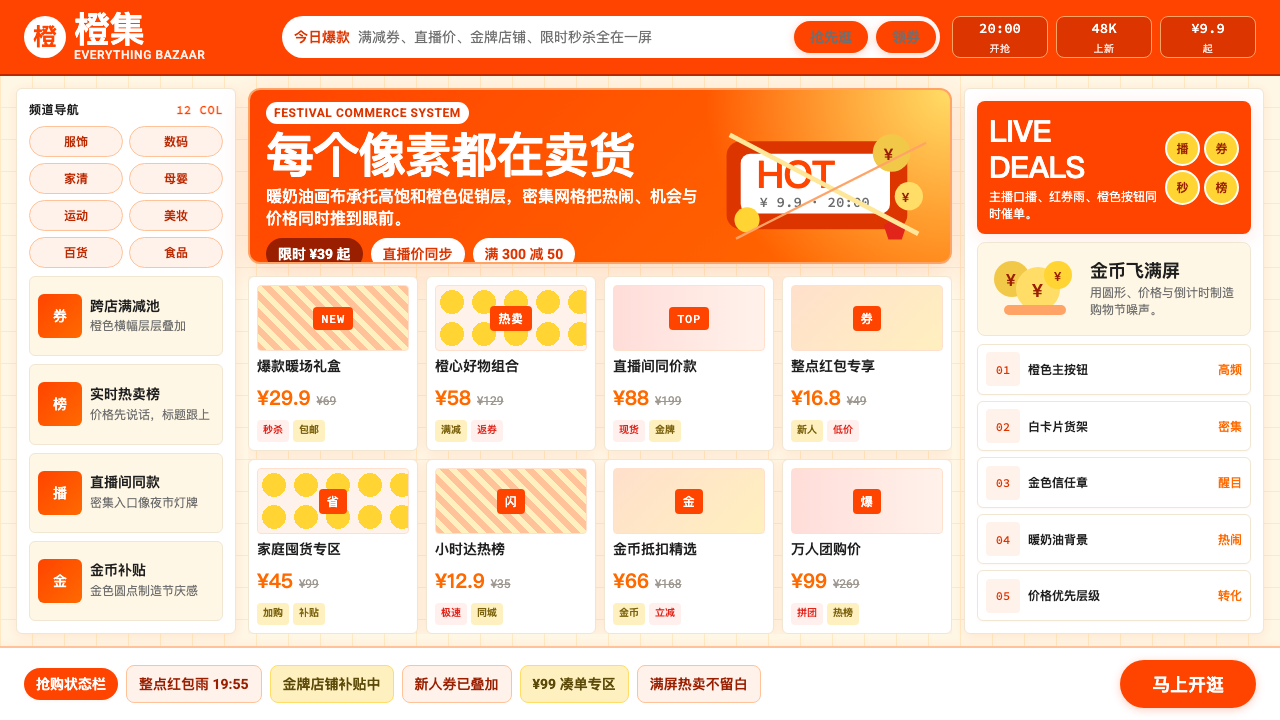 Taobao (淘宝)Every pixel sells. Orange on cream, dense price grids and gold coins shout ab…每个像素都在卖货。橙色压在奶油底上,密集价格网格与金币喊出丰盛。
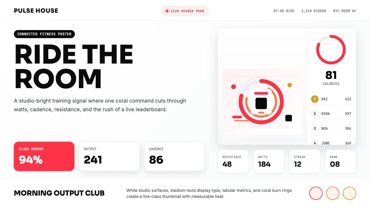 Peloton Fitness Coral (2020)Studio-bright urgency. Coral rings, Sora caps, and leaderboard grids drive th…明亮而紧迫:珊瑚红圆环、Sora 大写与排行榜网格点燃热量。
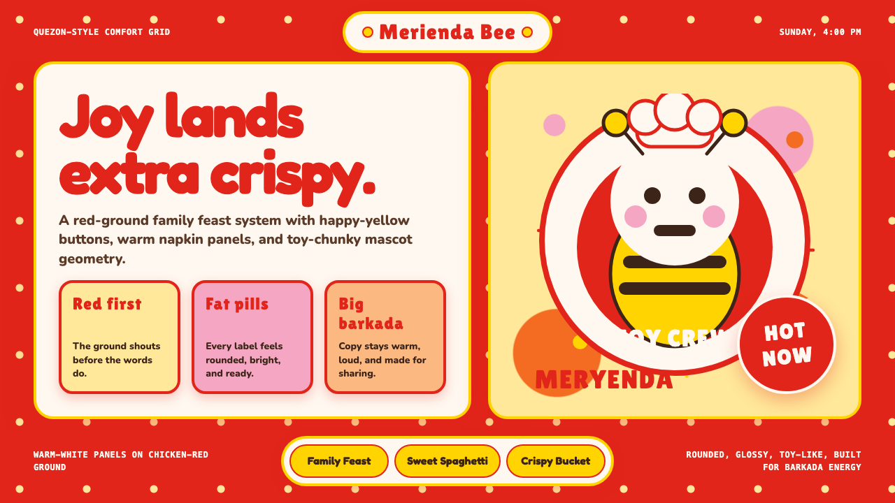 Philippines Jollibee Bee MascotJoy shouts first. Red ground, Fredoka curves, yellow pills, chunky grid.欢乐先喊出来:红底、Fredoka圆字、黄色胶囊与厚实网格。
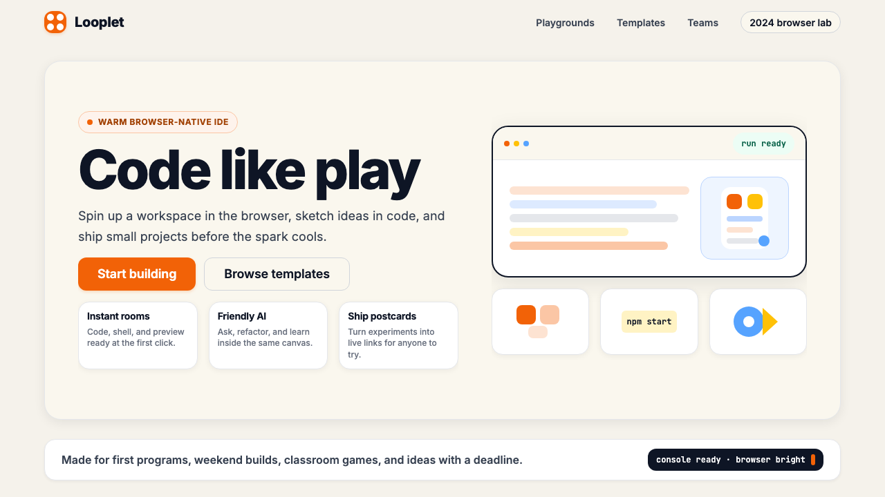 Replit 2024Coding feels warm. Coral buttons, cream panels, rounded code tiles make build…编程变得温暖:珊瑚按钮、奶油面板与圆角代码块让构建更好玩。
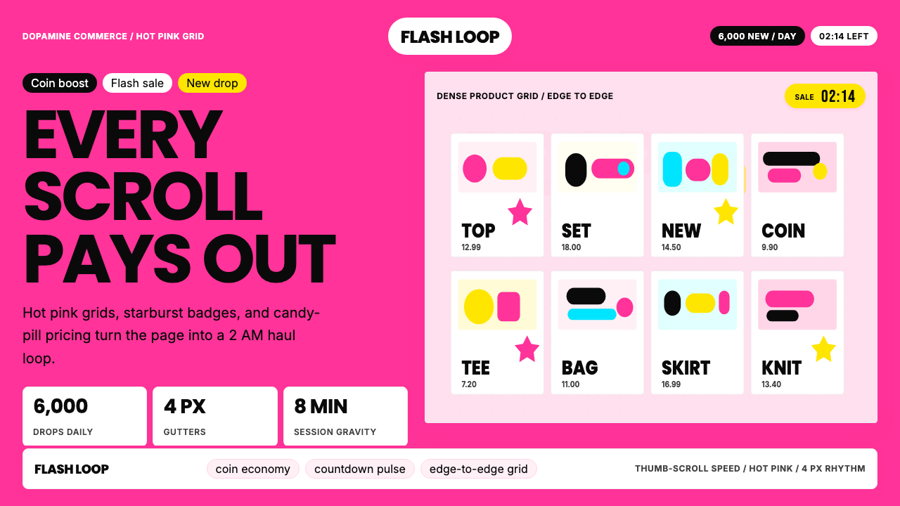 Shein Fast FashionDopamine density wins. Hot pink grids, starbursts, and candy pills pack every…高密度多巴胺取胜。热粉网格、星爆和糖果药丸挤满每个像素。
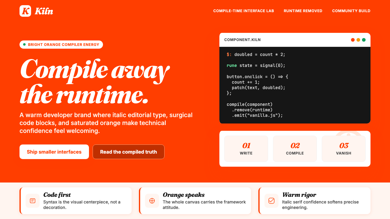 Svelte Compiler OrangeCompiler warmth goes loud. Orange flood, Fraunces italics, and code cards do…编译器温度很响亮。橙色满版、Fraunces 斜体和代码卡片发声。