Design style guide设计风格指南
What is Philippines Jollibee Bee Mascot?什么是 Philippines Jollibee Bee Mascot?
Jollibee turned a smiling red bee into a symbol of Filipino pride — and built a design language loud enough to outlast every global competitor that ever tried to muscle into its home market.快乐蜂将一只微笑的红色蜜蜂变成了菲律宾骄傲的象征——并由此建立起一套响亮的设计语言,响亮到足以让每一个试图进入其本土市场的全球竞争者知难而退。
Philippines Jollibee Bee Mascot in briefPhilippines Jollibee Bee Mascot 速览
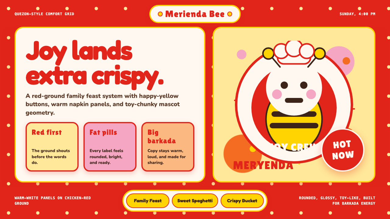
Philippines Jollibee Bee Mascot is a design system rooted in one of Southeast Asia's most beloved fast-food brands. Its visual identity is defined by a charged emotional warmth rather than coolness or restraint: deep red surfaces, sunshine-yellow accents, chunky rounded forms, and a mascot-forward visual culture that places the smiling bee at the center of nearly every communication. The system radiates joy loudly and without apology.菲律宾快乐蜂吉祥物是一套根植于东南亚最受喜爱快餐品牌之一的设计系统。它的视觉识别由充沛的情感温度定义,而非凉感或克制:深红色的基底、阳光黄的点缀、厚实圆润的造型,以及一种以吉祥物为核心的视觉文化——那只微笑的蜜蜂几乎出现在每一个品牌传播场合。这套系统以不加掩饰的方式,大声地传递快乐。
Where many global fast-food brands rely on efficiency and appetite cues alone, Jollibee's design system layers in a distinctly Filipino sense of togetherness — the bayanihan spirit of communal celebration — expressed through generous proportions, glossy food photography that glorifies abundance, and a typographic personality that feels friendly and approachable rather than corporate or slick.许多全球快餐品牌仅靠效率感与食欲暗示取胜,快乐蜂的设计系统则在此之上叠加了一种鲜明的菲律宾式集体感——那种以社区共庆为核心的「巴扬尼罕」精神——通过慷慨的视觉比例、颂扬丰盛的光泽食物摄影,以及一种亲切而非企业感的字体个性,将这种精神具象化。
The system is not subtle. It does not whisper. Its palette is saturated and unapologetically warm, its shapes are fat and soft rather than sharp or geometric, and its mascot persona carries an emotional register that ranges from celebratory to sentimental — matching the full arc of Filipino family life that the brand explicitly evokes in its advertising.这套系统并不含蓄,也不低声细语。它的配色方案饱和而毫不掩饰的温暖,它的造型厚实柔软而非尖锐几何,而其吉祥物人格所承载的情感跨度——从欢庆到感伤——正好覆盖了品牌在广告中明确唤起的菲律宾家庭生活的完整弧线。
See the Philippines Jollibee Bee Mascot design system →查看 Philippines Jollibee Bee Mascot 完整设计系统 →
Where does Philippines Jollibee Bee Mascot come from?Philippines Jollibee Bee Mascot 从何而来?
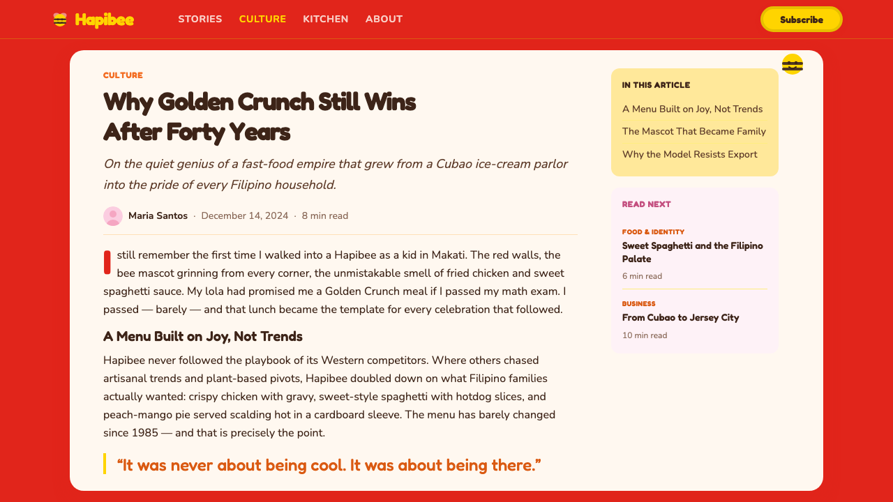
Jollibee's story begins not as a fast-food chain but as an ice cream parlor. Tony Tan Caktiong and his family opened two Magnolia Ice Cream parlors in Cubao, Quezon City, in 1975. When customers started requesting hot meals, the family pivoted, and in 1978 Jollibee Foods Corporation was officially incorporated. The timing placed the brand in an extraordinary competitive moment: McDonald's was preparing its Philippine entry, which arrived in 1981. Rather than retreat, Jollibee competed — and won. By the mid-1980s, Jollibee had more stores in the Philippines than the American giant, a feat that no local competitor in any major market had managed at that scale.快乐蜂的故事起点并非快餐连锁,而是一家冰淇淋店。陈觉中(Tony Tan Caktiong)和家人于1975年在奎松市古瓦波区开设了两家木兰冰淇淋店。当顾客开始要求热食时,家族随即转型,快乐蜂食品集团于1978年正式注册成立。这个时机恰好将品牌推入了一个非凡的竞争节点:麦当劳正准备进入菲律宾市场,并于1981年落地。面对这一压力,快乐蜂选择迎击——并且赢了。到1980年代中期,快乐蜂在菲律宾的门店数量已超过这家美国巨头,这是当时任何主要市场的本土竞争者都未曾在如此规模上实现过的壮举。
The bee mascot was introduced around 1980 and was crucial to this victory. In a country where American brands arrived carrying the prestige of the global, Jollibee responded with local warmth. The mascot — a cheerful, round-bodied red bee in a chef's toque and bow tie — drew on a visual vocabulary of abundance and hospitality rather than speed or modernity. It looked like something a Filipino grandmother might have embroidered on a kitchen towel. That domesticity was strategic: it signaled that Jollibee understood Filipino families in ways that a foreign company never could.蜜蜂吉祥物大约于1980年正式推出,是这场胜利的关键。在一个美国品牌携带着全球声望强势登陆的国度,快乐蜂以本土温度作为回应。这个吉祥物——一只圆润身形、戴着厨师帽与领结的欢乐红色蜜蜂——调用的是丰盛与款待的视觉词汇,而非速度或现代感。它看起来像是菲律宾祖母会绣在厨房毛巾上的图案。这种家常气质是有战略意图的:它传递出快乐蜂以外来公司永远无法企及的方式,真正理解菲律宾家庭。
The brand's design language consolidated around the values the mascot embodied. Red, already associated in Filipino culture with good fortune and festivity, became the dominant ground. Yellow, the color of sunshine and ripe tropical fruit, functioned as the celebratory accent. The forms that surrounded the bee — signage, packaging, uniforms, interiors — leaned toward roundness and generosity of proportion, avoiding the aggressive linearity of competitors. Chunky lettering, pill-shaped buttons, and playful graphic borders all contributed to a visual identity that felt genuinely approachable and culturally legible.品牌的设计语言围绕吉祥物所体现的价值观得到巩固。红色——在菲律宾文化中早已与好运和节庆相联——成为主导基调。黄色,阳光与热带成熟果实的颜色,充当欢庆性的强调色。围绕蜜蜂的所有形态——招牌、包装、制服、店内装潢——都倾向于圆润与比例上的慷慨,刻意回避竞争对手的攻击性直线感。厚实的字体、胶囊形按钮和俏皮的图形边框,共同构筑了一套真正亲切且具有文化可读性的视觉识别系统。
The global expansion that began in 1998, bringing Jollibee stores to the United States, the Middle East, and eventually the United Kingdom and Vietnam, imposed a new challenge on the design system: to carry Filipino cultural identity into diaspora markets without feeling parochial. The mascot's emotional legibility — its uncomplicated happiness — proved to be the system's most portable asset. Overseas Filipinos (OFWs) recognized the bee as a piece of home, and non-Filipino customers in diverse communities encountered it as an emblem of genuine joy rather than a corporate construction. The system's warmth traveled because it had never been manufactured; it had been grown from real cultural roots.始于1998年的全球扩张——将快乐蜂带到美国、中东,最终延伸至英国和越南——对设计系统提出了新的挑战:如何在离散市场中承载菲律宾文化身份,而不显得狭隘。吉祥物的情感可读性——那种简单直接的快乐——证明是整套系统中最具可移植性的资产。海外菲律宾人(OFW)将那只蜜蜂认作一块故土的碎片,而不同社区的非菲律宾顾客则将它视为真实欢乐的象征,而非企业的刻意建构。这套系统的温度之所以能够旅行,正是因为它从未是人工制造的——它生长自真实的文化根系。
Throughout subsequent decades, the visual system has been refreshed but never fundamentally broken. Art direction on packaging grew more polished, food photography became more aspirational, and digital touchpoints introduced the system's vocabulary into interfaces and social media. Yet the foundational decisions — the red ground, the yellow accent, the round forms, the central mascot — have remained stable, giving the brand an unusual degree of visual continuity across nearly five decades and dozens of markets.在随后数十年间,这套视觉系统经过多次刷新,却从未被从根本上颠覆。包装上的平面美术指导日趋精致,食物摄影变得更具渴望感,数字触点将这套系统的词汇引入界面与社交媒体。然而那些奠基性的决定——红色基底、黄色强调、圆润造型、居中吉祥物——始终保持稳定,赋予了这个品牌跨越近五十年和数十个市场的罕见视觉连贯性。
What defines the Philippines Jollibee Bee Mascot look?Philippines Jollibee Bee Mascot 的视觉特征是什么?
Color: Warm and Saturated Ground色彩:温暖饱和的基底
The system's dominant color is a deep, festive red that functions less as a warning signal and more as a ground of celebration — the red of Chinese New Year lanterns, of birthday tablecloths, of a family gathering in full swing. Against this, a bright sunshine yellow operates as the primary accent, producing a chromatic relationship that feels energetic and abundant rather than aggressive. White appears generously in typography and secondary surfaces, creating moments of breathing space that prevent the composition from overwhelming the viewer. The palette as a whole reads as a feast prepared for guests.这套系统的主导色是深沉而节日感浓郁的红色——它的作用与其说是警示信号,不如说是欢庆的基调:像农历新年的灯笼,像生日派对的桌布,像一场进行中的家庭聚会。在这个基底上,明亮的阳光黄作为主要强调色运作,产生一种充满活力与丰盛感而非攻击性的色彩关系。白色大量出现在字体与次要表面上,营造出喘息空间,防止构图让观者感到压迫。整体配色读起来像一席为宾客精心准备的盛宴。
Mascot Centrality吉祥物的核心地位
Unlike design systems that treat mascots as optional decorative additions, Jollibee's system positions its bee as a structural element — almost an anchor that every other visual decision orbits. The mascot's round body, toque, and exuberant expression set the emotional register for the entire system. When the mascot appears at scale, it establishes a warmth that the typography and color alone could not sustain. When it is absent, its personality still shapes the choices made in its place. The system is, in a meaningful sense, a mascot-first visual culture.与许多将吉祥物视为可选装饰添加物的设计系统不同,快乐蜂系统将蜜蜂定位为一个结构性元素——几乎是所有其他视觉决策都围绕其运转的锚点。吉祥物圆润的身形、厨师帽与满溢的表情,为整套系统设定了情感基调。当吉祥物以大尺度出现时,它建立起一种字体与色彩单独无法维持的温度。当它缺席时,它的人格依然形塑着替代它的种种选择。从有意义的角度说,这套系统是一套以吉祥物为优先的视觉文化。
Form: Rounded and Generous造型:圆润而慷慨
Across every touchpoint — buttons, packaging shapes, signage outlines, icon styles — the Jollibee design language favors softly rounded corners and full, pillowy silhouettes over hard edges or geometric precision. This roundness is not accidental: it mirrors the mascot's form and carries the same emotional coding, signaling approachability, comfort, and a sense that there is always a little more room at the table. Pill shapes and oval containers recur throughout, giving the system a tactile warmth that feels more handcrafted than engineered.在每一个触点上——按钮、包装形状、招牌轮廓、图标风格——快乐蜂的设计语言偏爱柔和圆角与饱满枕状的轮廓,而非硬边或几何精准。这种圆润并非偶然:它呼应了吉祥物的形态,承载着相同的情感编码,传递出亲切感、舒适感,以及餐桌上永远再挤得下一个人的那种感觉。胶囊形状与椭圆容器在整个系统中反复出现,赋予这套系统一种手工感多于工程感的触觉温度。
Food Photography: Glossy and Abundant食物摄影:光泽而丰盛
Food photography in the Jollibee visual system is not understated or artisan-styled — it is unabashedly indulgent. The hero product shots prioritize glossy surfaces, steam, and overflowing portions in ways that signal celebration rather than restraint. Chickenjoy pieces glisten. Rice is domed and plentiful. Spaghetti sauce is deep and richly colored. The photography functions as a visual feast that amplifies the brand's message of abundance and joy. This approach requires restraint in composition — the food itself is always the primary actor, with backgrounds kept simple enough not to compete.快乐蜂视觉系统中的食物摄影既不内敛也不走手工艺风格——它毫不掩饰地放纵。主角产品拍摄优先呈现光泽表面、腾腾热气与溢出边框的份量,以一种传递欢庆而非克制的方式。炸鸡块闪着光泽,米饭堆成圆顶而分量充足,意大利面酱汁深沉而色泽丰富。摄影作为视觉盛宴运作,放大了品牌关于丰盛与快乐的核心信息。这种手法要求在构图上保持克制——食物本身永远是主角,背景简洁到不会与之竞争。
Typography: Friendly and Bold字体排印:亲切而粗壮
The typographic personality of the system leans toward rounded, thick letterforms that feel approachable and confident at the same time — never delicate or refined, but also never aggressive or mechanical. Headlines are set at generous weights that read clearly at distance, matching the bold visual environment they inhabit. The overall typographic register is one of cheerful directness: it announces rather than whispers, but it announces warmth rather than authority.这套系统的字体个性倾向于圆润、粗壮的字形——同时感觉亲切与自信,从不纤细或精致,但也绝不攻击性或机械感。标题以充裕的字重设定,在远处也能清晰辨读,与它们所处的大胆视觉环境相匹配。整体字体基调是一种欢快的直接性:它宣告而非低语,宣告的是温度而非权威。
Cultural Specificity: Filipino Warmth文化特殊性:菲律宾式温度
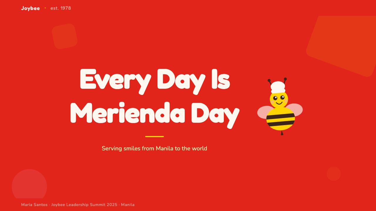
Perhaps the most important characteristic of the system is that it encodes a specific cultural emotional register — the Filipino concept of kapwa (shared identity), the warmth of extended family meals, the communal joy of merienda. These values are not illustrated literally but are expressed structurally through the system's generosity of form, its saturated warmth of color, and its mascot's unconditional happiness. The system works because it is not universal-by-design; it is Filipino-first, and the universality it achieves is a byproduct of that specificity being genuinely felt.这套系统最重要的特征,或许是它编码了一种特定的文化情感基调——菲律宾的「卡普瓦」(kapwa,共同身份认同)概念、大家庭聚餐的温度、共享「米连达」点心时刻的集体快乐。这些价值观并非被字面图解,而是通过系统在造型上的慷慨、色彩上的饱和温度,以及吉祥物无条件的快乐,以结构性的方式得到表达。这套系统之所以奏效,正是因为它不是以普世性为目标设计的;它以菲律宾为先,而它所实现的普世性,是那份真实情感的副产品。
Emotional Range: Celebration to Sentiment情感跨度:从欢庆到感伤
Jollibee's visual identity is unusually capable of spanning a wide emotional register — from birthday party exuberance to quiet, sentimental longing — without losing coherence. This range is achieved primarily through the mascot's expression and scale, and secondarily through photography direction that can shift from brightly lit group celebrations to more intimate, warmly lit single-figure moments. The system has the structural flexibility to be festive in one campaign and tender in the next, which is rare among fast-food brand identities and explains much of the brand's unusual emotional hold on its audience.快乐蜂视觉识别系统具有不寻常的能力,能够在不失连贯性的前提下跨越宽广的情感跨度——从生日派对的狂欢到安静的感伤思念。这种跨度主要通过吉祥物的表情与尺度来实现,其次通过摄影导演方向来配合——可以是明亮热闹的群体欢庆,也可以是更亲密、暖光氛围下的个体静思。这套系统具备结构性的灵活度,能够在一个营销活动中欢腾,在下一个中温情,这在快餐品牌识别系统中实属罕见,也在很大程度上解释了这个品牌对受众异乎寻常的情感牵引力。
See the Philippines Jollibee Bee Mascot design system →查看 Philippines Jollibee Bee Mascot 完整设计系统 →
Who shaped Philippines Jollibee Bee Mascot?谁塑造了 Philippines Jollibee Bee Mascot?
The founder of Jollibee, Tan Caktiong made the foundational brand decisions that shaped the visual system's values: the choice to compete against McDonald's on warmth rather than efficiency, the embrace of local cultural identity over imported prestige, and the early investment in the mascot as a brand cornerstone. His instinct that Filipino families would respond to a visual language of celebration and belonging rather than speed and convenience guided every subsequent design decision. He later expanded the company through strategic acquisitions — including Chowking, Greenwich, and Mang Inasal in the Philippines, and Smashburger and The Coffee Bean internationally — making Jollibee Foods Corporation one of Asia's largest restaurant groups while keeping the flagship brand's emotional core intact.快乐蜂的创始人陈觉中做出了塑造这套视觉系统价值观的奠基性品牌决策:选择以温度而非效率对抗麦当劳,拥抱本土文化身份而非进口声望,以及在早期就将吉祥物作为品牌基石进行投资。他的直觉——菲律宾家庭会对欢庆与归属感的视觉语言而非速度与便利性作出回应——引导了此后每一个设计决策。他后来通过战略收购扩展公司版图——在菲律宾收购了真功夫、格林威治和芒伊纳萨,在国际上收购了Smashburger和The Coffee Bean——将快乐蜂食品集团发展为亚洲最大的餐饮集团之一,同时保持了旗舰品牌的情感内核完好无损。
As CEO and long-serving executive of Jollibee Foods Corporation, Tanmantiong has been the principal architect of the brand's global expansion strategy and its visual identity consistency across markets. His leadership during the international growth phase — navigating the challenge of bringing a deeply Filipino visual language to diaspora communities in the United States, the Middle East, and Southeast Asia — required maintaining the system's emotional authenticity while adapting it to diverse retail environments. Under his watch, the brand refined its ability to communicate Filipino warmth to non-Filipino audiences without sanitizing the cultural specificity that makes it distinctive.作为快乐蜂食品集团的首席执行官和长期高管,谭曼忠是品牌全球扩张战略和跨市场视觉识别一致性的主要设计者。他在国际增长阶段的领导——驾驭将深度菲律宾化的视觉语言带入美国、中东和东南亚离散社区这一挑战——既要保持系统的情感真实性,又要使之适应多样的零售环境。在他的主导下,品牌磨砺出向非菲律宾受众传递菲律宾温度的能力,同时不至于将使其独特的文化特殊性消毒漂白。
The design team credited as 'Creative Heads' that developed and refined the bee mascot in the early 1980s made a pivotal visual decision: making the mascot round, chef-hatted, and unconditionally cheerful at a time when most fast-food brand characters were either abstract shapes or human analogues. By choosing a bee — an insect associated with industriousness and community — and rendering it in an almost cartoonishly warm register, the team created a visual personality that was legible across age groups and culturally specific without being exclusionary. The mascot's design choices established the soft, rounded, saturated visual grammar that the entire Jollibee system now expresses.在1980年代初开发并精炼蜜蜂吉祥物的「创意领袖」设计团队做出了一个关键性的视觉决策:在大多数快餐品牌角色还是抽象形状或人类替代品的时代,将吉祥物设计为圆润、戴厨师帽且无条件欢乐的形象。通过选择蜜蜂——一种与勤勉和社区相联系的昆虫——并以近乎卡通的温暖基调呈现它,团队创造了一个跨年龄层可读、文化特殊而非排他的视觉人格。吉祥物的设计选择奠定了整套快乐蜂系统如今所表达的柔软、圆润、饱和的视觉语法。
While not designers, the millions of Overseas Filipino Workers who became Jollibee's most emotionally invested ambassadors worldwide function as a key design figure in this system's story. Their relationship with the brand shaped its global design decisions: the visual system had to carry not just appetite cues but homeland cues, functioning as a proxy for Philippine culture itself in cities from Dubai to Daly City to London. This community's emotional response to the brand forced the design system to maintain its cultural authenticity through international expansion, rather than diluting it into a generic fast-food register.尽管并非设计师,数以百万计在全球各地成为快乐蜂最具情感投入的品牌大使的海外菲律宾劳工(OFW),在这套系统的故事中扮演着关键的「设计人物」角色。他们与品牌的关系塑造了其全球设计决策:这套视觉系统必须承载的不只是食欲暗示,还有故乡暗示——在迪拜、戴利城到伦敦的城市中,充当菲律宾文化本身的替代物。这个群体对品牌的情感回应迫使设计系统在国际扩张过程中坚守文化真实性,而非将其稀释进通用快餐语言。
The founding family's background as entrepreneurs from the Fujian Chinese-Filipino community brought a specific cultural lens to the brand's earliest design decisions. The emphasis on red as a ground color, on abundance as a visual value, and on communal celebration as the primary emotional register all reflect the intersection of Filipino and Chinese-Filipino cultural sensibilities. The family business model — in which extended family involvement was normalized — also shaped the brand's commitment to depicting food as a vehicle for family togetherness rather than individual consumption, a commitment that remains visible in Jollibee advertising and in-store visual communication today.创始家族作为来自福建的菲律宾华人社群企业家的背景,为品牌最早的设计决策带来了特定的文化视角。以红色作为基底色的强调、以丰盛作为视觉价值观,以及以集体欢庆作为主要情感基调——这些选择都折射出菲律宾与菲律宾华人文化感知的交汇。家族式商业模式——其中大家庭参与被视为常态——也塑造了品牌将食物描绘为家庭团聚载体而非个人消费品的承诺,这一承诺在今天的快乐蜂广告和店内视觉传播中依然清晰可见。
How do you use Philippines Jollibee Bee Mascot today?今天怎么用 Philippines Jollibee Bee Mascot?
The Jollibee design system is one of the richest references available for anyone building a brand that needs to communicate warmth, cultural specificity, and communal joy at scale. Applying it correctly requires understanding that its energy comes from emotional sincerity — it works because Jollibee really does embody the values it depicts — and that surface imitation without underlying cultural coherence produces work that reads as hollow rather than joyful.快乐蜂设计系统是现有的最丰富的设计参考之一,适用于任何需要在大规模传播中传递温度、文化特殊性与集体欢乐的品牌建设。正确应用它,需要理解其能量来源于情感的真诚——它之所以奏效,是因为快乐蜂真正体现了它所描绘的价值观——没有深层文化连贯性的表面模仿,只会产生看起来空洞而非欢乐的作品。
For presentation slides, the system's most transferable lessons are in cover design and section dividers. A cover built in this register should lead with a warm, saturated dominant color field — red or deep orange — overlaid with bold, rounded type at generous scale, with a focal element (a logo, a mascot-like illustration, or a central hero image) positioned off-center but weighted toward balance. Section divider slides benefit from the system's palette logic: alternating between the dominant warm ground and a bright accent ground breaks the visual monotony of long decks while maintaining tonal coherence. Data slides should use the accent color sparingly to highlight the single most important data point — not to color every bar in a chart.在演示文稿中,这套系统最可移植的经验在于封面设计与章节分割页。以这种基调构建的封面,应以温暖而饱和的主导色块——红色或深橙色——打底,叠加慷慨尺度的粗圆字体,将焦点元素(标志、吉祥物风格插图或中心主图)放置于偏心但向平衡倾斜的位置。章节分割页可从系统的配色逻辑中受益:在主导暖色底与明亮强调色底之间交替,能在保持色调连贯性的同时打破长演示文稿的视觉单调。数据页应将强调色用于点亮最重要的单一数据点,而非对图表中的每条数据进行着色。
For web interfaces, the system offers strong guidance for consumer-facing products where warmth and approachability are primary values: food delivery apps, family-oriented services, community platforms, and festive e-commerce experiences. The key principle to carry over is that white space should feel generous rather than sparse — the Jollibee visual environment is never cramped — and interactive elements like buttons should be rounded and substantial rather than thin or hairline. Navigation should be typographically bold enough to read at a glance, with hover states that feel genuinely responsive rather than minimal.对于网页界面,这套系统为温度与亲切感是核心价值的消费者产品提供了强有力的指导:餐饮配送应用、家庭导向服务、社区平台和节日感电商体验。最值得移植的核心原则是:留白应感觉慷慨而非稀疏——快乐蜂的视觉环境从不拥挤——按钮等交互元素应圆润而有分量,而非纤细或发丝线。导航字体应粗重到一眼即识,悬停状态应感觉真实有力而非敷衍极简。
For editorial and marketing work, the system's most useful lesson is the power of mascot-forward communication. Any brand that has a character — human, animal, or illustrated — can learn from how completely Jollibee commits to centering that character in every piece of communication. Marketing layouts benefit from the system's generosity: hero images should be large and food-forward, copy should be direct and warm rather than clever or ironic, and calls to action should feel like an invitation rather than a demand. The system's emotional range — from celebration to quiet sentiment — is also worth studying: the same visual grammar can support a joyful launch campaign and a tender brand story if the photography direction and copy register are shifted carefully.对于编辑与营销内容,这套系统最有价值的经验是以吉祥物为核心进行传播的力量。任何拥有形象人物——人、动物或插画角色——的品牌,都可以从快乐蜂如何彻底将这个角色置于每件传播物中心这一点上汲取灵感。营销版面受益于系统的慷慨气质:英雄图像应大而食物聚焦,文案应直接而温暖而非聪明或反讽,行动号召应感觉像邀请而非要求。这套系统的情感跨度——从欢庆到安静的感伤——同样值得研究:只要摄影导演方向和文案基调得到细心调整,同一套视觉语法可以支撑欢腾的上市活动,也可以支撑温情的品牌故事。
The most common mistake when applying the Jollibee visual reference is treating its energy as license to simply pile on color, character, and warmth without structural discipline. The system's apparent exuberance actually rests on consistent restraint in composition: the red ground is usually uninterrupted by competing textures, the food photography maintains a clear subject-to-background hierarchy, and the mascot appears at considered scale rather than everywhere at once. Borrowing the emotional temperature without the compositional discipline produces work that reads as chaotic rather than celebratory. The second common mistake is desaturating the palette in an attempt to make it feel more 'sophisticated' — the warmth of the system lives in its full saturation, and pulling it back undermines the fundamental emotional register.应用快乐蜂视觉参考时最常见的错误,是将其能量理解为一种许可,简单地堆砌色彩、角色与温度而不加结构约束。这套系统表面上的活力实际上建立在构图上的一贯克制之上:红色基底通常不被竞争性纹理所打断,食物摄影维持着清晰的主体对背景层级,吉祥物以经过考量的尺度出现,而非无处不在。借用情感温度而不要构图约束,产生的作品读起来混乱而非欢庆。第二个常见错误是为了追求更「精致」的感觉而降低色彩饱和度——这套系统的温度正存在于它的充分饱和之中,拉低饱和度会从根本上损害其情感基调。
See the Philippines Jollibee Bee Mascot design system →查看 Philippines Jollibee Bee Mascot 完整设计系统 →
Philippines Jollibee Bee Mascot — FAQPhilippines Jollibee Bee Mascot · 常见问题
Why did Jollibee beat McDonald's in the Philippines when no other local chain managed to?为什么快乐蜂能在菲律宾击败麦当劳,而其他本土连锁在任何其他主要市场都未能做到?
The design system answer is that Jollibee's visual language was doing cultural work that McDonald's global standardization could not replicate. McDonald's arrived in the Philippines in 1981 with a visual identity optimized for global legibility — clean, efficient, and deliberately culture-neutral. Jollibee responded not by competing on the same terms but by doubling down on everything that made it Filipino: the mascot's warmth, the red-and-yellow palette coded to local festivity rather than international branding, the menu items tuned to Filipino palates (the signature sweet-style spaghetti, the garlic rice). The visual system and the product were consistent expressions of the same cultural value proposition, and together they were more legible to Filipino consumers than a foreign brand optimized for everywhere at once.从设计系统的角度来看,快乐蜂的视觉语言在做一种文化工作,而这种工作是麦当劳的全球标准化无法复制的。麦当劳于1981年携着为全球可读性优化的视觉识别进入菲律宾——简洁、高效、刻意去文化特殊性。快乐蜂的回应不是在同样的维度上竞争,而是加倍强化一切使自己成为菲律宾品牌的元素:吉祥物的温度、编码于本土节庆而非国际品牌逻辑的红黄配色、为菲律宾口味调制的菜单(标志性的甜味意大利面、蒜香米饭)。视觉系统与产品是同一文化价值主张的一贯表达,合在一起,它们对菲律宾消费者的可读性远胜于一个为四海皆准而优化的外来品牌。
Can the Jollibee visual style work for non-food brands?快乐蜂的视觉风格能用于非食品品牌吗?
The system's specific elements — the mascot, the glossy food photography, the branded red — are inseparable from its food-brand context. But the underlying design principles it demonstrates — mascot-first visual culture, warm saturated palettes for community-oriented brands, rounded generous forms for approachability, emotional range that spans celebration to sentiment — are fully transferable. A children's education platform, a community-focused fintech product, or a family-services brand could legitimately borrow from these principles without adopting the bee or the red. What cannot be transferred is the emotional authenticity: the Jollibee system works because it genuinely expresses Filipino cultural values, not because it deployed particular colors and shapes. Any application that borrows the form without the underlying cultural coherence will feel hollow.这套系统的具体元素——吉祥物、光泽食物摄影、品牌红——与其食品品牌语境密不可分。但它所展示的底层设计原则——以吉祥物为先的视觉文化、面向社区导向品牌的温暖饱和配色、以圆润慷慨造型传递亲切感、跨越欢庆与感伤的情感跨度——是完全可移植的。一个面向儿童的教育平台、一个社区导向的金融科技产品,或一个家庭服务品牌,完全可以合理地借鉴这些原则,而无需采用蜜蜂或红色。不可移植的是情感真实性:快乐蜂系统之所以奏效,是因为它真诚地表达了菲律宾的文化价值观,而不是因为它使用了特定的颜色和形状。任何借用其形式而缺乏底层文化连贯性的应用,都将显得空洞。
How does the Jollibee visual system handle the difference between celebratory and sentimental campaigns?快乐蜂的视觉系统如何处理欢庆性和感伤性营销活动之间的差异?
The system's flexibility is primarily achieved through photography direction and mascot expression rather than changes to the core palette or forms. In celebratory campaigns — birthdays, graduations, holiday gatherings — the photography is brightly lit, shot from above or at table level, filled with multiple figures, and accompanied by the mascot at full exuberance. In sentimental campaigns — the brand's long-running OFW homesickness advertisements are the clearest example — the photography shifts to warmer, lower-key lighting, tighter framing around individuals or small groups, and the mascot either recedes or appears in a quieter register. The red and yellow remain, but they breathe differently in the lower-key environment. The structural consistency of the visual system is what makes this range work: because the palette and forms are stable, the emotional shift can be achieved through relatively small adjustments to lighting and composition without the brand becoming unrecognizable.这套系统的灵活性主要通过摄影方向和吉祥物表情来实现,而非改变核心配色或造型。在欢庆性营销活动中——生日、毕业、节日聚会——摄影光线明亮,从上方或桌面高度拍摄,画面充满多个人物,伴随着全力欢腾状态的吉祥物。在感伤性营销活动中——品牌长期延续的海外菲律宾劳工思乡广告是最清晰的例证——摄影转向更温暖、更低调的光线,更紧密地聚焦于个体或小群体,吉祥物或退居后景,或以更安静的基调出现。红色与黄色依然在场,但在低调的氛围中呼吸方式不同。正是视觉系统在结构上的一致性使这种跨度得以奏效:由于配色和造型保持稳定,情感转变可以通过相对细微的光线与构图调整来实现,而品牌本身不会变得面目全非。
What makes the Jollibee mascot design particularly effective compared to other fast-food mascots?与其他快餐吉祥物相比,快乐蜂吉祥物的设计为什么特别有效?
Several design decisions distinguish the bee from competitors. First, the choice of species: a bee carries connotations of industriousness, community, and sweetness that a clown (McDonald's Ronald), a king figure (Burger King), or an abstract shape cannot. It arrives with positive cultural coding already attached. Second, the form is unconditionally warm — the round body, the toque, the broad smile signal hospitality and abundance without any hint of the unsettling uncanny valley quality that some mascot designs produce. Third, the mascot is scaled generously in applications — it appears large, at eye level, as the primary visual actor rather than as a small supporting element. Fourth, and perhaps most importantly, the mascot's emotional register matches the brand's actual cultural claim: Jollibee does not just use happiness as a marketing tool; the brand genuinely sells communal joy, and the bee's design embodies that promise at a visual level that customers recognize as authentic.几个设计决策使这只蜜蜂区别于竞争对手。第一,物种的选择:蜜蜂携带着勤勉、社区与甜蜜的文化内涵,这是小丑(麦当劳的罗纳德)、国王形象(汉堡王)或抽象形状所不具备的。它带着已经附着其上的正面文化编码到来。第二,它的造型是无条件温暖的——圆润的身形、厨师帽、宽阔的微笑传递出款待与丰盛,没有任何一些吉祥物设计产生的令人不安的恐怖谷效应。第三,吉祥物在应用中以慷慨的尺度呈现——它以大尺寸、在视线高度、作为主要视觉主角而非小型辅助元素出现。第四,也是最重要的一点:吉祥物的情感基调与品牌真实的文化主张相匹配。快乐蜂不只是将快乐作为营销工具;这个品牌真正销售的是集体欢乐,而那只蜜蜂的设计在视觉层面体现了这个承诺,顾客感知到这份真实性。
How should designers adapt the Jollibee visual register for digital-first contexts without losing its warmth?设计师如何在数字优先的场景中调用快乐蜂的视觉基调,而不失去其温度?
The system's warmth in digital contexts lives primarily in three places: the color temperature of backgrounds and surfaces (warm whites and soft creams retain warmth where pure cold whites do not), the roundness of interactive elements (pill-shaped buttons and rounded card corners communicate approachability at the micro level), and the generosity of imagery (large, high-resolution food or community photography maintains the system's abundancelogic even when the mascot is not present). The traps to avoid are the cooling effects of flat gray backgrounds, hairline borders on interactive elements, and compressed image sizes that strip the photography of its glossy warmth. Animation in digital contexts should feel playful and slightly bouncy rather than precise and mechanical — motion that matches the mascot's personality carries the system's warmth into interactive states in ways that static design alone cannot.在数字场景中,这套系统的温度主要存在于三个地方:背景与表面的色温(暖白与柔和奶白保留温度,纯冷白则不然)、交互元素的圆润度(胶囊形按钮与圆角卡片在微观层面传递亲切感),以及图像的慷慨度(大尺寸、高分辨率的食物或社区摄影,即使在吉祥物不在场时,也能维持系统的丰盛逻辑)。需要避免的陷阱是:扁平灰色背景的降温效果、交互元素上的发丝线边框,以及压缩图像尺寸带来的光泽温度流失。数字场景中的动效应感觉俏皮而略带弹性,而非精准与机械——与吉祥物个性相匹配的动态,能将这套系统的温度带入交互状态,而这是单靠静态设计无法实现的。
Related design styles相关设计风格
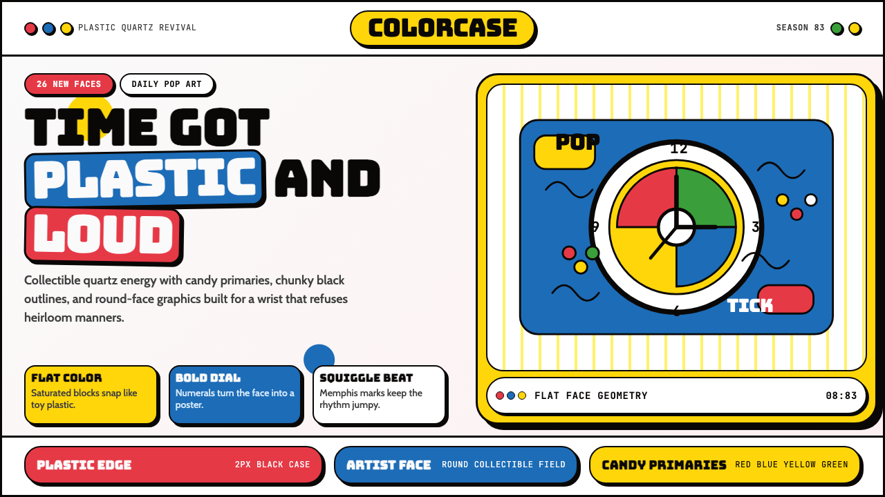 Swatch Watch (1983)Pop plastic optimism. Bungee type, candy primaries, round dials and squiggles…塑料乐观主义:Bungee 字体、糖果三原色、圆表盘与波浪线一起跳响。
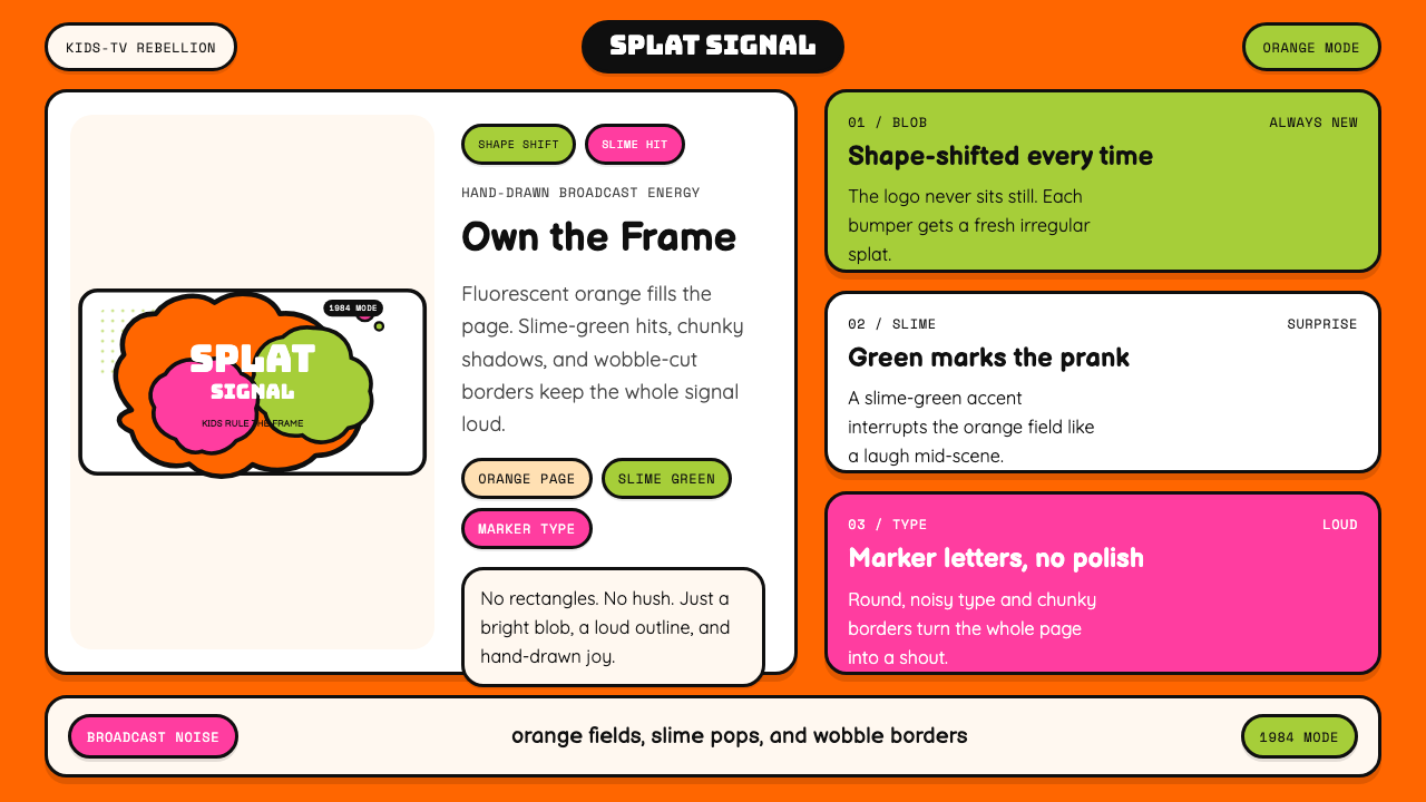 Nickelodeon Orange Splat (1984)Kids own the screen. Orange fields, slime-green pops, and wobble borders do t…孩子掌控屏幕。橙底、史莱姆绿点缀和歪斜边框一起喊话。
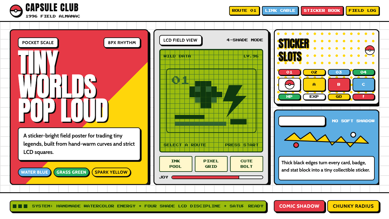 Pokémon Game BoyKawaii meets cartridge logic. Capsule red, LCD green, Anton heft, and 8px gri…卡哇伊撞上卡带逻辑:胶囊红、LCD绿、Anton粗字与8px网格同屏。
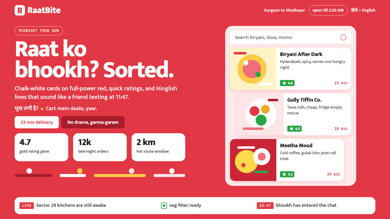 Zomato India DeliveryOwns the midnight scroll. Saturated red, Mukta Hinglish, white cards and gold…午夜外卖很会说话:饱和红、Mukta双语字和白卡金星撑起深夜滚动。
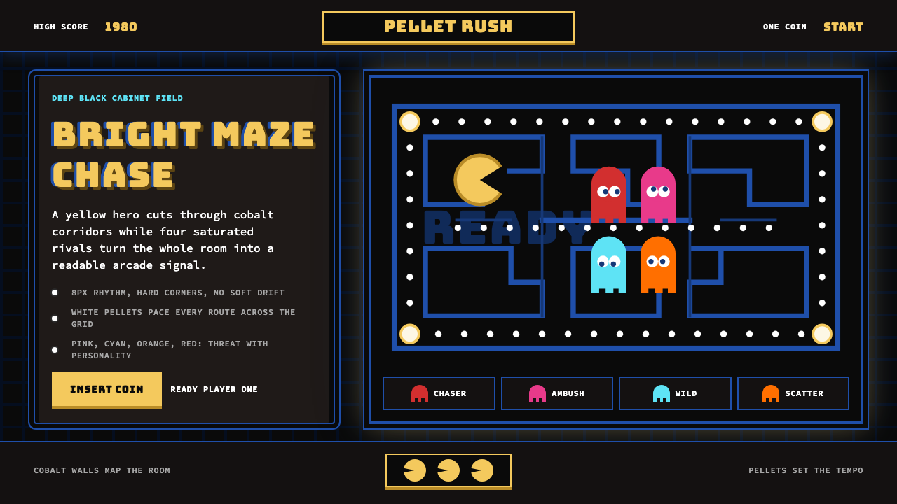 Pac-Man (Namco 1980)Arcade joy burns bright. Yellow disc, cobalt maze, and four ghost hues snap o…街机欢愉高亮燃烧:黄圆、钴蓝迷宫与四色幽灵在黑底上跳动。
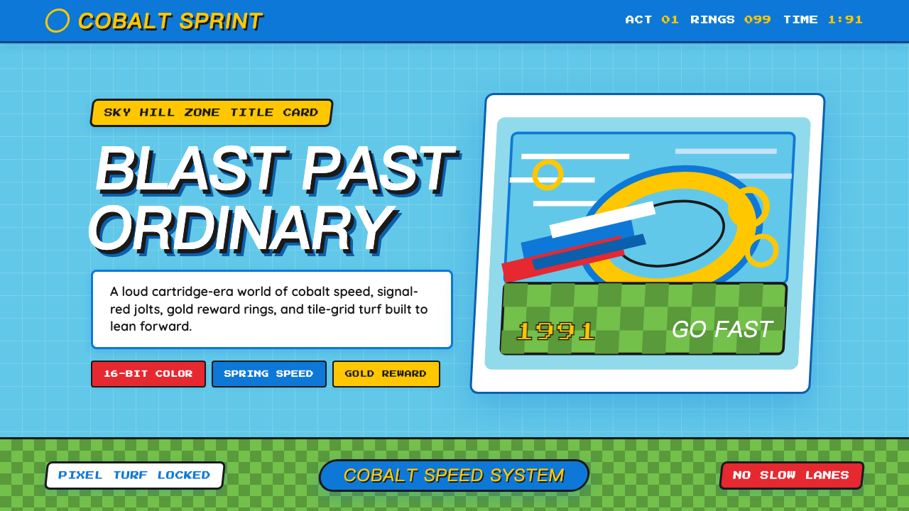 Sonic the Hedgehog (1991)Velocity has teeth. Sky-cyan, cobalt slant type, gold rings, checkerboard tur…速度带刺:天青底、钴蓝倾斜字、金环与棋盘草地。