What is Nickelodeon Orange Splat (1984)?什么是 Nickelodeon Orange Splat (1984)?
In 1984, a hand-drawn orange blob rewrote the rules of broadcast identity — proving that kids' television could be as visually anarchic as the audience it served.1984年,一个手绘橙色色块改写了广播标识的规则——证明儿童电视节目可以和它服务的观众一样视觉无法无天。
Nickelodeon Orange Splat (1984) in briefNickelodeon Orange Splat (1984) 速览
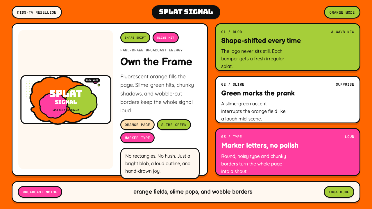
Nickelodeon Orange Splat is the visual identity system built around the irregular, hand-drawn orange blob that Nickelodeon adopted in 1984. Unlike conventional broadcast logos — which relied on clean geometric shapes and neutral typefaces to project institutional authority — the splat was deliberately imperfect: its outline wobbled, its interior filled with an almost luminescent orange, and its form changed from bumper to bumper without ever settling into a fixed silhouette. This shapeshifting quality was not a bug; it was the entire point.尼克儿童频道橙色泼溅是一套围绕不规则手绘橙色色块构建的视觉识别系统。这个色块由尼克儿童频道于1984年正式采用。与依赖干净几何形状和中性字体来投射机构权威感的传统广播标志截然不同,这个「泼溅」是刻意不完美的:轮廓摇摇晃晃,内部填充着近乎荧光的橙色,从一段节目间隔片到下一段,形态不断变化,从不固定成单一的剪影。这种变形的品质不是缺陷,而恰恰是全部要义所在。
The system that grew around the splat extended its anti-corporate logic into every element of Nickelodeon's on-air and print presence. Fluorescent orange dominated as the primary field color, supported by a slime-green that appeared in accents, pops, and surprise moments. Type was chunky, hand-inflected, and sometimes deliberately off-axis — the visual equivalent of a kid writing their own name in Sharpie on their lunchbox. Borders wobbled. Shadows were thick, cartoon-style, and offset at exaggerated angles. The whole system read like a declaration: this channel belongs to children, not to adults.围绕泼溅图形生长出来的整套系统,将其反企业逻辑延伸到尼克儿童频道播出和印刷出现的每一个元素中。荧光橙作为主要底色主宰全场,辅以史莱姆绿在点缀、弹出效果和惊喜时刻中出现。字体厚重、带有手绘意味,有时刻意倾斜偏轴——就像孩子用马克笔在饭盒上写自己名字的视觉版本。边框歪歪扭扭。阴影粗厚,带着卡通式的夸张偏移角度。整套系统读起来像一份宣言:这个频道属于孩子,不属于大人。
What made the identity culturally significant was its refusal to condescend. Most children's media of the era used saccharine pastels and overly rounded letterforms that signaled 'safe for kids' by draining out anything edgy or expressive. Nickelodeon Orange Splat went the opposite direction — it trusted that children had taste, energy, and a genuine appetite for visual noise. The result was a design system that felt genuinely irreverent, and that irreverence became a core brand promise sustained for over a decade.使这套视觉识别在文化上具有重要意义的,是它拒绝居高临下的态度。那个年代大多数儿童媒体使用甜腻的粉彩色和过度圆润的字母形态,通过抽干一切有锋芒或有表达力的东西来传递「适合儿童」的信号。尼克儿童频道橙色泼溅走了相反的方向——它相信孩子有品位、有能量、对视觉噪音有真实的渴望。结果是一套真正显得无所顾忌的设计系统,而这种无所顾忌变成了一个持续超过十年的核心品牌承诺。
See the Nickelodeon Orange Splat (1984) design system查看 Nickelodeon Orange Splat (1984) 完整设计系统
Where does Nickelodeon Orange Splat (1984) come from?Nickelodeon Orange Splat (1984) 从何而来?
Nickelodeon launched in 1979 as a channel created by and for children, a mandate that came with an uncomfortable institutional problem: how do you build a brand identity that children actually trust and claim as their own, rather than one designed by adults who imagine what children want? For the first few years, the channel's visual language was tentative — it used conventional broadcast graphics that looked indistinguishable from any other cable network. By 1983, Nickelodeon's parent company, Viacom's Group W Cable, was losing confidence in the channel's direction.尼克儿童频道于1979年作为一个由儿童创作、为儿童服务的频道正式开播,这一使命带来了一个令人不安的机构性问题:如何建立一套孩子们真正信任并视为己有的品牌视觉识别,而不是由大人想象孩子需要什么而设计出来的东西?最初几年,频道的视觉语言犹豫不决——它使用的常规广播图形看起来与任何其他有线电视网毫无差别。到1983年,尼克儿童频道的母公司维亚康姆旗下的W有线集团已经对频道的发展方向失去了信心。
In 1984, Fred Seibert and Alan Goodman — creative directors who had already reimagined MTV's identity with its famous logo mutations — were brought in to overhaul Nickelodeon's on-air look. Working with designer Tom Pomposello, they produced the identity that would define the channel for a generation. The central insight was borrowed from MTV's own logic: a logo that changes shape signals that the channel itself is alive, responsive, and unpredictable. For Nickelodeon, that insight was pushed further — where MTV's logo mutations were cool and slightly menacing, Nick's splat was deliberately messy, warm, and joyful. Geraldine Laybourne, who was shaping the channel's programming philosophy at the same time, ensured that the visual identity matched the editorial commitment: programming that respected children's intelligence rather than talking down to them.1984年,弗雷德·赛伯特和艾伦·古德曼——两位曾以著名的标志变形改造MTV视觉识别的创意总监——被请来全面翻新尼克儿童频道的播出形象。他们与设计师汤姆·庞波塞洛合作,创造出了定义这个频道整整一代人的视觉识别。核心洞察借鉴自MTV自身的逻辑:不断变形的标志传递出频道本身是有生命力的、能够回应的、不可预测的信号。对于尼克儿童频道,这一洞察被推进得更远——MTV的标志变形是酷的、略带威胁感的,而尼克的泼溅图形则是刻意凌乱的、温暖的、充满喜悦的。正在同时塑造频道编程哲学的杰拉尔丁·莱伯恩确保视觉识别与编辑承诺相匹配:尊重儿童智识而不是俯视他们的节目内容。
The orange color itself carried deliberate cultural weight. Orange was not a color that corporate America used in the 1980s for serious institutional communication — it was too loud, too warm, too associated with Halloween and construction cones rather than trustworthy brands. That was precisely the point. By claiming fluorescent orange as its primary brand color, Nickelodeon was visually announcing that it did not want to be taken seriously in the way that adult institutions wanted to be taken seriously. The color read as a provocation, and children understood it intuitively as a signal that the channel was theirs.橙色本身承载着刻意为之的文化分量。橙色不是1980年代美国企业用于严肃机构传播的颜色——它太响亮、太温热,让人联想到万圣节和施工锥而非可信赖的品牌。这恰恰就是重点所在。通过将荧光橙确立为主要品牌色,尼克儿童频道在视觉上宣告:它不想以成人机构希望被认真对待的那种方式被认真对待。这种颜色读起来像一种挑衅,孩子们凭直觉将其理解为一个信号:这个频道是他们的。
The slime-green accent color arrived not purely from the design system but from the programming itself. Nickelodeon had introduced green slime as a recurring physical comedy element — it appeared on Double Dare, You Can't Do That on Television, and other flagship shows as a symbol of gleeful chaos. The design system absorbed slime-green from the programming, creating a feedback loop in which the color of the identity and the color of the content reinforced each other. By the peak years of 1986 to 1998, the orange-and-green combination was so deeply embedded in children's cultural consciousness that it functioned almost as a sensory shortcut: those two colors together meant Nickelodeon, and Nickelodeon meant freedom from adult seriousness. The 2018–2024 revival of the classic splat identity drew on exactly this cultural memory, deploying the original palette and wobbly geometry to trigger nostalgia in audiences who had grown up under that orange glow.史莱姆绿的点缀色并非纯粹来自设计系统,而是来自节目内容本身。尼克儿童频道在节目中引入了绿色粘液作为反复出现的肢体喜剧元素——它出现在《双重挑战》、《你不能在电视上这样做》和其他旗舰节目中,象征着令人愉快的混乱。设计系统从节目中吸收了史莱姆绿,形成了一个视觉识别颜色与内容颜色相互强化的反馈回路。在1986年到1998年的鼎盛时期,橙绿组合在儿童的文化意识中嵌入得如此之深,以至于它几乎成为一种感官捷径:这两种颜色放在一起意味着尼克儿童频道,而尼克儿童频道意味着从大人的严肃中获得自由。2018年至2024年对经典泼溅标志的复兴,正是从这段文化记忆中汲取力量,以原始色板和摇摆几何形唤起那些在橙色光芒下成长起来的观众的怀旧情感。
What defines the Nickelodeon Orange Splat (1984) look?Nickelodeon Orange Splat (1984) 的视觉特征是什么?
Fluorescent Orange Field荧光橙底色
The dominant color is an intense, warm orange that pushes toward the fluorescent end of the spectrum without quite crossing into neon. It is used as a full-bleed field rather than as an accent, which means it never recedes into the background — it is always the loudest thing in the room. This is the opposite of how most corporate design systems use color: as a supporting tint rather than the primary voice. In the Nickelodeon system, orange is the voice.主导色是一种强烈、温暖的橙色,向荧光端靠拢而不完全跨入霓虹领域。它被用作满铺底色而非点缀色,这意味着它从不退入背景——它永远是房间里最响亮的东西。这与大多数企业设计系统使用颜色的方式截然相反:后者将其作为辅助底色而非主要声音。在尼克儿童频道系统中,橙色本身就是那个声音。
Slime-Green Accent史莱姆绿点缀
The secondary color is a yellow-leaning green — the exact shade associated with the physical slime that appeared throughout Nickelodeon's programming — used to signal surprise, emphasis, or delight. It appears as text highlights, border pops, and background panels in a supporting role, but it is never subtle. When slime-green appears, it is meant to be noticed. The color combination of fluorescent orange and slime-green was essentially unprecedented in broadcast design before Nickelodeon made it canonical.第二色调是一种偏黄的绿色——与尼克儿童频道节目中出现的实体粘液颜色一致——用于传递惊喜、强调或喜悦感。它以文字高亮、边框弹出和背景色块的形式出现,担任辅助角色,但从不低调。史莱姆绿一旦出现,就是要被注意到的。荧光橙与史莱姆绿的色彩组合,在尼克儿童频道将其确立为标准之前,在广播设计领域几乎前所未见。
Wobbly, Hand-Drawn Geometry摇摆手绘几何
Where most identity systems prize perfect geometric precision, the splat and the broader Nickelodeon visual system prize deliberate imprecision. Borders are not ruled straight lines; they tremble. The splat itself has no fixed outline — its silhouette varied across every application. Shapes that might be ovals or rectangles have slightly uneven sides. This wobble is not accidental or a mark of low production quality; it requires careful craft to look consistently inconsistent. The effect communicates spontaneity and child-made authenticity.大多数视觉识别系统珍视完美的几何精确度,而泼溅图形和整个尼克儿童频道视觉系统珍视的是刻意的不精确。边框不是用直尺画出的直线,它们在抖动。泼溅本身没有固定的轮廓——它的剪影在每一个应用场合都不同。那些可能是椭圆或矩形的形状,边缘略显不均匀。这种摇摆感不是偶然发生的,也不是低劣制作品质的标志;要让它看起来持续地不一致,反而需要精心的工艺。这种效果传递出自发性和孩子手作般的真实感。
Cartoon Shadows and Outlines卡通阴影与轮廓
Shadows in the Nickelodeon system are thick, hard-edged, and offset at exaggerated angles — closer to cartoon cel-animation conventions than to any realistic lighting simulation. They give lettering and graphic elements a chunky, three-dimensional quality without any actual depth or gradation. Black outlines often trace the edges of colored elements, reinforcing the cartoon-panel quality. The combination of flat fill, thick outline, and hard shadow produces an effect that reads as playful and confident rather than refined.尼克儿童频道系统中的阴影厚重、硬边,以夸张的角度偏移——更接近卡通赛璐璐动画的惯例,而非任何写实的光照模拟。它们赋予文字和图形元素一种厚实的、三维的质感,却没有任何实际的深度或渐变。黑色轮廓线通常描绘彩色元素的边缘,强化了卡通分格漫画的质感。平面填充、粗轮廓线和硬边阴影的组合产生出一种读起来充满活力和自信而非精致的效果。
Sharpie-Style Typography马克笔式字体排印
The typographic voice of the system favors thick, chunky letterforms with an informal, hand-drawn quality — the visual equivalent of a child writing with a broad-tipped marker. Letters may be slightly uneven in weight, compressed, or stretched. All-caps settings are common, and characters are sometimes tilted or playfully misaligned. The typographic goal is legibility with personality rather than legibility with neutrality — the type should feel like it is being shouted in a good-natured way.这套系统的字体声音偏爱粗厚、敦实的字母形态,带有一种非正式的手绘质感——就像孩子用宽头马克笔书写的视觉等价物。字母的笔重可能略显不均匀、被压缩或被拉伸。全大写的设置很常见,字符有时倾斜或带着玩笑性质的错位。字体排印的目标是带有个性的清晰易读,而非带有中性感的清晰易读——字体应该让人感觉像是以善意的方式被大声喊出来的。
Density and Visual Noise密度与视觉噪声
While restrained design traditions use negative space as a primary compositional tool, the Nickelodeon system treats density as a virtue. Compositions tend toward full, layered, and busy — backgrounds are filled with color, foregrounds carry type and graphic elements simultaneously, and decorative details like starbursts, dots, and wavy lines occupy spaces that a more austere system would leave empty. This density is calibrated to the attention economy of children's programming, where visual richness signals excitement and rewards sustained looking.克制的设计传统将留白作为主要构图工具,而尼克儿童频道系统则将密度视为一种美德。构图倾向于饱满、分层、繁忙——背景充满颜色,前景同时承载文字和图形元素,星形爆炸、圆点和波浪线等装饰细节占据着更严谨的系统会留空的空间。这种密度是为儿童节目的注意力经济校准的,在那里,视觉丰富性传递着兴奋感,并奖励持续的注目。
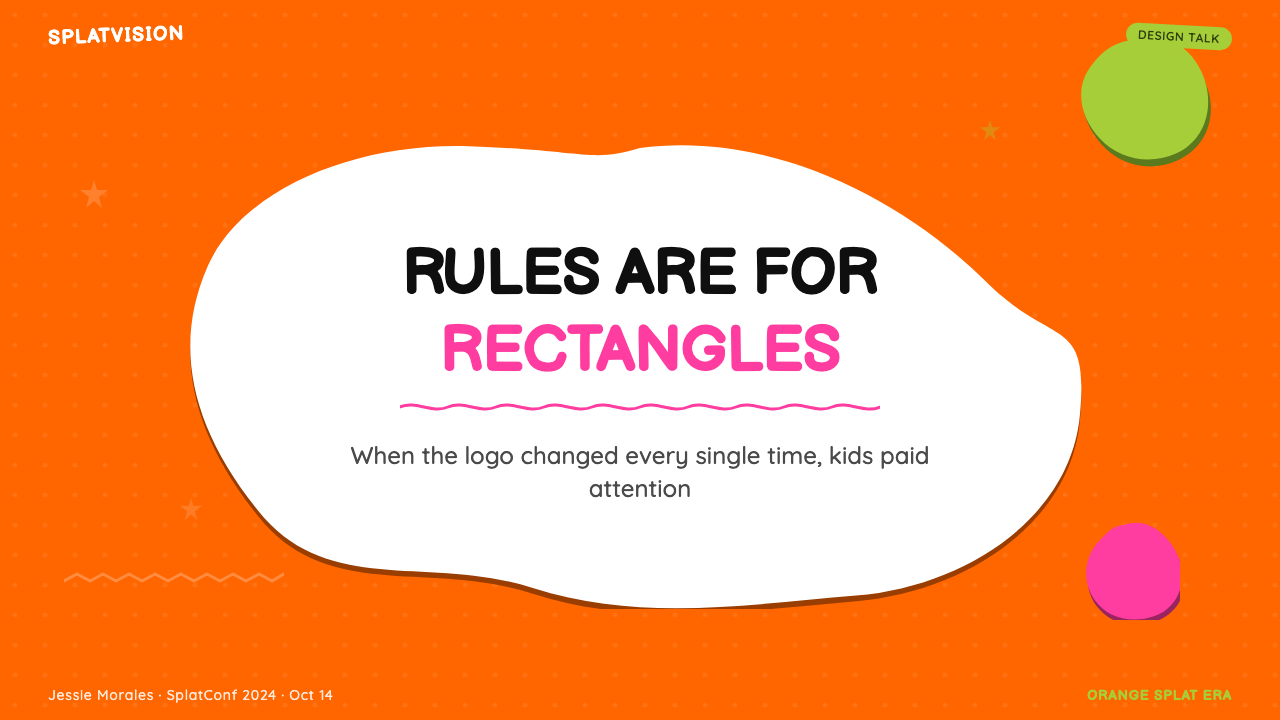
Shapeshifting Brand Form变形品牌形态
Perhaps the most unusual characteristic of the Nickelodeon identity system is that its central mark — the splat — has no fixed form. Where most brand standards manuals define a logo as an exact, invariant shape, the splat was intentionally variable. Different applications, different bumpers, different printed materials all showed a slightly different blob. The brand was unified by color, energy, and attitude rather than by geometric consistency. This approach was radical in 1984 and remains unusual even by contemporary standards.尼克儿童频道视觉识别系统最不寻常的特征,或许是它的核心标志——泼溅图形——没有固定的形态。大多数品牌标准手册将标志定义为精确不变的形状,而泼溅图形则是刻意可变的。不同的应用场合、不同的节目间隔片、不同的印刷材料呈现的都是略有不同的色块。品牌通过颜色、能量和态度而非几何的一致性来保持统一。这种做法在1984年是激进的,即便以当代标准衡量依然不同寻常。
See the Nickelodeon Orange Splat (1984) design system查看 Nickelodeon Orange Splat (1984) 完整设计系统
Who shaped Nickelodeon Orange Splat (1984)?谁塑造了 Nickelodeon Orange Splat (1984)?
Seibert was the creative force behind both the MTV and Nickelodeon identity overhauls of the early 1980s. His key insight — that a logo could be a mutable, living thing rather than a fixed mark — was first applied at MTV and then pushed further at Nickelodeon, where the splat changed shape with every use. Seibert later co-founded Frederator Studios, continuing to work at the intersection of animation and broadcast design, and his work on the Nickelodeon identity remains one of the most influential acts of brand thinking in American television history.赛伯特是1980年代初MTV和尼克儿童频道视觉识别改造背后的创意力量。他的核心洞察——标志可以是可变的、有生命的东西,而非固定的标记——首先在MTV得到应用,然后在尼克儿童频道被推进得更远,泼溅图形在每次使用时都会变形。赛伯特后来联合创立了弗雷德雷特工作室,继续在动画与广播设计的交叉点上工作,他对尼克儿童频道视觉识别的贡献至今仍是美国电视史上最具影响力的品牌思维行为之一。
Pomposello was the designer who gave the splat its physical form, working with Seibert and Goodman to translate the strategic brief — a logo that belongs to kids, not adults — into a specific visual language. The technical challenge of the splat was producing something that looked casually hand-drawn while still functioning as a legible, reproducible brand mark across television, print, and merchandise. Pomposello's ability to calibrate the wobble — irregular enough to feel spontaneous, consistent enough to be recognizable — was central to the identity's success.庞波塞洛是赋予泼溅图形具体形态的设计师,他与赛伯特和古德曼合作,将策略简报——一个属于孩子而非大人的标志——转化为具体的视觉语言。泼溅图形的技术挑战在于创造出一个看起来随手画成、同时又能作为清晰可复制的品牌标志在电视、印刷和商品中运作的东西。庞波塞洛校准那种摇摆感的能力——不规则到让人感觉自发,又一致到足以被辨认——是这套视觉识别成功的核心。
Goodman partnered with Seibert at what would become Fred/Alan Inc., the creative consultancy that handled both the MTV and Nickelodeon identity projects. His contribution was primarily strategic: defining what kind of channel Nickelodeon should be communicating that it was, and what visual signals would most effectively reach a child audience that had been underestimated by broadcast television. The insistence that the identity should feel genuinely anarchic — not adult-designed fake-anarchy — was central to Goodman's framing of the brief.古德曼与赛伯特共同创立了后来的弗雷德/艾伦公司,这家创意咨询公司同时承接了MTV和尼克儿童频道两个视觉识别项目。他的贡献主要是战略性的:界定尼克儿童频道应该传达自己是什么样的频道,以及哪些视觉信号能最有效地触达被广播电视低估的儿童受众。坚持视觉识别应该感觉真正无法无天——而不是大人设计的假装无政府——是古德曼定义工作简报的核心立场。
Laybourne was the programming executive who defined Nickelodeon's editorial philosophy during its most formative years. While not a designer, her insistence that Nickelodeon's content should treat children as intelligent, capable people rather than passive consumers directly shaped the brief that Seibert and Goodman received. The visual identity and the programming philosophy were developed in parallel, and Laybourne's influence ensured they reflected the same value system: irreverence, trust, and the conviction that children's culture deserved to be taken seriously on its own terms.莱伯恩是在尼克儿童频道最具成型意义的年份中定义其编辑哲学的节目主管。尽管她不是设计师,但她坚持尼克儿童频道的内容应该将儿童视为有智识、有能力的人而非被动消费者,这直接塑造了赛伯特和古德曼收到的工作简报。视觉识别和节目制作哲学是并行发展的,莱伯恩的影响确保它们反映同样的价值体系:无所顾忌、信任,以及相信儿童文化值得按照自己的标准被认真对待的信念。
How do you use Nickelodeon Orange Splat (1984) today?今天怎么用 Nickelodeon Orange Splat (1984)?
Nickelodeon Orange Splat is a deliberately loud, high-energy design system, and applying it well requires understanding that its loudness is structural, not decorative. The system is built for contexts where enthusiasm, playfulness, and visual confidence are genuine values — children's educational platforms, youth-oriented events, gaming and entertainment brands, and any product that needs to communicate that it is on the user's side rather than performing seriousness at them. Reaching for this system in a context that actually calls for calm authority — a financial dashboard, a medical tool, a legal platform — will produce a mismatch between visual promise and user expectation that no amount of execution quality can fix.尼克儿童频道橙色泼溅是一套刻意响亮、高能量的设计系统,善用它需要理解:它的响亮是结构性的,而非装饰性的。这套系统是为热情、玩乐感和视觉自信是真实价值的场景而构建的——儿童教育平台、面向青少年的活动、游戏和娱乐品牌,以及任何需要传达「站在用户这边」而非「表演严肃感」的产品。在一个实际上需要平静权威感的场景中套用这套系统——金融仪表板、医疗工具、法律平台——会在视觉承诺与用户期望之间制造出无论多高的执行质量都无法弥补的错位。
For presentation slides, the system works best when it commits fully to its energy. A cover slide built in this style should use fluorescent orange as the primary field, with the title treated in thick, informal lettering at large scale. Wobbly border elements and a splash of slime-green as a secondary accent — used sparingly, as a pop rather than a second dominant field — will read as purposeful rather than cluttered. Content slides should carry the typographic boldness of the system without trying to fit as many elements as possible; the style's density reads well in motion or on screen but can feel overwhelming in static multi-column layouts. Data slides benefit from treating charts and graphs as cartoon objects — bold outlines, flat fills in the brand palette, exaggerated label sizes — rather than defaulting to the thin-line, muted-color conventions of business charting software.对于演示文稿幻灯片,这套系统在完全投入其能量时效果最佳。用这种风格构建的封面幻灯片应以荧光橙作为主要底色,标题采用大尺寸的粗厚非正式字体处理。摇摆的边框元素和作为第二点缀色的史莱姆绿飞溅——少量使用,作为弹出感而非第二主色——读起来会是有目的性的而非杂乱。内容幻灯片应携带这套系统的字体排印大胆感,而不是试图塞进尽可能多的元素;这种风格的密度在动态或屏幕上效果好,但在静态多列版面中可能感觉令人窒息。数据幻灯片可以从把图表当作卡通对象来处理中获益——粗轮廓线、品牌色板的平面填充、夸张的标签尺寸——而不是默认商业制图软件的细线、哑色惯例。
For web interfaces and dashboards, the system is best deployed in contexts aimed at younger audiences or where the product personality is explicitly playful. A youth-facing gaming dashboard or a children's learning platform could use the style's full vocabulary: orange hero sections, slime-green interactive states, chunky card components with hard offset shadows and visible borders. For a general consumer product that wants energy without the full commitment, selective use of the orange-and-green palette with more neutral typography and tighter geometry can borrow the system's vitality without its maximum intensity. Pricing pages and feature showcases can use alternating orange and white sections to create rhythm, with slime-green reserved for the highlighted tier or the primary call-to-action.对于网页界面和仪表板,这套系统最适合部署在面向年轻受众或产品个性明确偏向玩乐感的场景中。面向青少年的游戏仪表板或儿童学习平台可以使用这套系统的完整词汇:橙色英雄区块、史莱姆绿互动状态、带有硬边偏移阴影和可见边框的厚重卡片组件。对于想要活力感但不完全投入的一般消费产品,选择性地使用橙绿色板搭配更中性的字体排印和更紧凑的几何形,可以借用这套系统的活力而不达到最大强度。定价页面和功能展示可以使用交替的橙色和白色区块来创造节奏,史莱姆绿保留给高亮等级或主要行动号召。
In editorial and marketing contexts, the system's poster-like boldness supports strong visual hierarchy. A campaign using this style might lead with a large-scale type treatment on a full-bleed orange background, with supporting imagery that has been given thick outlines and cartoon-flat color treatment. Marketing emails and social cards built in this system perform well when the composition is kept simple — one big graphic idea per unit, with type large enough to be the dominant visual element. The style does not support nuance or subtext well; it is built for direct, legible, enthusiastic communication.在编辑和营销场景中,这套系统的海报式大胆感支持强劲的视觉层级。采用这种风格的营销活动可能以全铺橙色背景上的大尺寸字体处理为主角,辅以经过粗轮廓线和卡通平面色彩处理的支撑图像。用这套系统构建的营销邮件和社交卡片,在构图保持简洁时效果最佳——每个单元一个大的图形创意,字体足够大以成为主导的视觉元素。这种风格不擅长处理细微差异或潜台词;它是为直接、清晰、热情的传播而构建的。
A common mistake when applying this system is treating orange as one color among several in an otherwise neutral layout, rather than as the dominant field. The system only works when orange takes over; a button or heading in orange on a white background with conventional grey text around it will look like a broken palette, not a deliberate design system. A second frequent mistake is using the wobbly, irregular elements as purely decorative detail while keeping the rest of the layout conventional — the wobble needs to propagate through borders, type treatment, and graphic elements consistently to read as a system rather than ornamentation. The third mistake is visual overload: the system can tolerate density, but only when every element at every density level has clear purpose. Adding multiple competing focal points, several competing accent colors, and busy background patterns simultaneously will collapse into chaos rather than productive noise.应用这套系统时最常见的错误,是在其他部分保持中性的版面中把橙色当作多种颜色之一,而非主导底色来使用。这套系统只有当橙色全面接管时才能奏效;在白色背景上用橙色做按钮或标题,周围环绕着常规的灰色文字,看起来会像一个破损的色板,而非刻意的设计系统。第二个常见错误是把摇摆、不规则的元素纯粹作为装饰细节使用,同时保持版面其他部分的惯常感——摇摆感需要一致地传播到边框、字体处理和图形元素中,才能读起来是一套系统而非装饰品。第三个错误是视觉过载:这套系统可以承受密度,但前提是每个密度层级的每个元素都有清晰的目的。同时添加多个相互竞争的视觉焦点、多个竞争的点缀色和繁忙的背景图案,会崩溃为混乱而非富有成效的噪声。
See the Nickelodeon Orange Splat (1984) design system查看 Nickelodeon Orange Splat (1984) 完整设计系统
Nickelodeon Orange Splat (1984) — FAQNickelodeon Orange Splat (1984) · 常见问题
Is this system appropriate for adult audiences, or is it strictly for children's products?这套系统适合成人受众吗,还是严格限于儿童产品?
The Nickelodeon system was designed for children, but its vocabulary has migrated into adult contexts where youthful energy and anti-corporate irreverence are desired values — streetwear branding, music festival identity, gaming platforms, and certain kinds of consumer technology. The key question is whether the product's value proposition aligns with what the style communicates: enthusiasm, playfulness, and the rejection of institutional gravity. If those are genuine product values, adult audiences will read the style as confident and deliberate. If they are not, the style will read as infantilizing or unserious.尼克儿童频道系统是为儿童设计的,但它的视觉词汇已经迁移到成人场景中,在那里,青春活力和反企业无所顾忌是期望的价值——街头服饰品牌、音乐节视觉识别、游戏平台,以及某些类型的消费科技。关键问题是产品的价值主张是否与这套风格所传递的内容一致:热情、玩乐感,以及对机构庄重感的拒绝。如果这些是真实的产品价值,成人受众会将这种风格解读为自信而蓄意的。如果不是,这种风格会被解读为幼稚或不严肃。
How do you use slime-green without the composition looking accidental?如何使用史莱姆绿而不让构图看起来像是意外?
Slime-green functions as a signal color in the Nickelodeon system — it marks the moments of surprise, emphasis, or delight. Treat it as a pop rather than a field: it should appear in a limited number of locations per composition, used to highlight specific elements rather than to fill background areas. A useful rule is to decide in advance what slime-green means in your layout — it might mark the most important number in a data display, or the primary call-to-action, or a key illustrative element — and use it consistently for that purpose throughout the design. When slime-green appears everywhere, it stops being a signal and starts being wallpaper.史莱姆绿在尼克儿童频道系统中作为信号色发挥作用——它标记惊喜、强调或喜悦的时刻。把它当作弹出感而非底色来使用:它应该在每个构图中出现在有限的位置,用于高亮特定元素而非填充背景区域。一个有用的规则是事先决定史莱姆绿在你的版面中意味着什么——它可能标记数据展示中最重要的数字、主要行动号召,或关键的图示元素——并在整个设计中为该目的一致地使用它。当史莱姆绿无处不在时,它就不再是信号,而成了墙纸。
Can the wobbly border style work in a digital product, or does it only suit print and broadcast?摇摆边框风格能在数字产品中奏效吗,还是只适合印刷和广播?
The wobbly border style works in digital products, but it requires different implementation thinking than print. In broadcast, the wobble was often achieved through animation — the border actually trembled on screen, reinforcing the hand-drawn quality. In static digital UI, a border that looks hand-drawn needs to be executed carefully to avoid looking like a rendering artifact or an error. The approach that works best is treating the irregular shapes as intentional graphic elements — defined, consistent within a session of the design, and clearly belonging to a system — rather than as truly random imperfection. Illustrated border assets used consistently across components will read as a design choice rather than a mistake.摇摆边框风格可以在数字产品中奏效,但它需要与印刷不同的实现思维。在广播中,摇摆感通常通过动画实现——边框在屏幕上真实地颤抖,强化手绘质感。在静态数字界面中,看起来是手绘的边框需要谨慎执行,以避免看起来像渲染缺陷或错误。效果最佳的方法是将不规则形状视为刻意的图形元素——有明确定义的、在一个设计版本中保持一致、清晰地归属于一套系统——而非真正随机的不完美。在各组件中一致使用的手绘边框素材,读起来会是一种设计选择而非错误。
What is the difference between Nickelodeon Orange Splat and other retro-kids styles like Lisa Frank or Garfield?尼克儿童频道橙色泼溅与丽莎·弗兰克或加菲猫等其他复古儿童风格有何不同?
The key distinction is structural versus illustrative. Nickelodeon Orange Splat is primarily an identity system built around color, form, and typography — it works without any characters or illustrations, because its visual energy comes from the palette, the irregular shapes, and the typographic treatment. Lisa Frank's aesthetic is almost entirely illustration-driven: the palette and the sparkle effects are inseparable from specific character imagery. Garfield's visual language is tied to a single licensed character. The Nickelodeon system is more versatile because it is abstract enough to be adapted to new content without requiring its iconic characters. Its wobble and orange are the characters.关键区别在于结构性与插图性之间。尼克儿童频道橙色泼溅首先是一套围绕颜色、形态和字体排印构建的视觉识别系统——它在没有任何角色或插图的情况下也能运作,因为它的视觉能量来自色板、不规则形状和字体处理。丽莎·弗兰克的美学几乎完全由插图驱动:色板和闪光效果与特定的角色图像不可分割。加菲猫的视觉语言与单一授权角色绑定。尼克儿童频道系统更为多功能,因为它足够抽象,可以适应新内容而不需要其标志性角色。它的摇摆感和橙色本身就是那些「角色」。
Why did the 2018–2024 revival resonate so strongly, and what does that say about how to use nostalgia in design?为什么2018至2024年的复兴会引发如此强烈的共鸣?这对如何在设计中使用怀旧感有何启示?
The revival worked because it was referential rather than reproductive. Rather than simply reissuing the 1984 identity unchanged, the revival used the original palette, the splat form, and the wobbly geometry as a set of signals that activated cultural memory without trying to pretend that thirty years had not passed. Adults who had grown up with Nickelodeon recognized the system immediately and felt the emotional resonance of childhood ownership — this was our channel. The lesson for using nostalgia in design more broadly is that the most effective approach is to identify the specific visual elements that carry emotional memory — often a color combination, a typographic voice, or a characteristic shape — and use those precisely and consistently, rather than trying to recreate an entire era. Nostalgia works through triggers, not through total reconstruction.这次复兴之所以奏效,是因为它是引用性的而非复制性的。与其简单地原样重新发行1984年的视觉识别,复兴版本使用原始色板、泼溅形态和摇摆几何形作为一组激活文化记忆的信号,而不是试图假装三十年没有过去。在尼克儿童频道中长大的成年人立即认出了这套系统,感受到儿时所有权的情感共鸣——这是我们的频道。关于更广泛地在设计中使用怀旧感,这里的启示是:最有效的方法是识别承载情感记忆的特定视觉元素——通常是一种颜色组合、一种字体排印声音或一种特征性形状——并精确而一致地使用它们,而不是试图重现整个时代。怀旧感通过触发器发挥作用,而非通过全面重建。
Related design styles相关设计风格
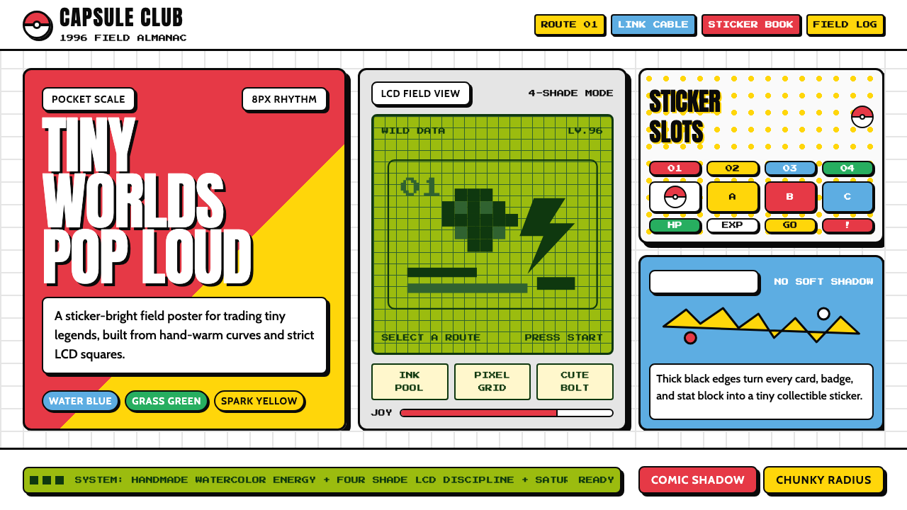 Pokémon Game BoyKawaii meets cartridge logic. Capsule red, LCD green, Anton heft, and 8px gri…卡哇伊撞上卡带逻辑:胶囊红、LCD绿、Anton粗字与8px网格同屏。
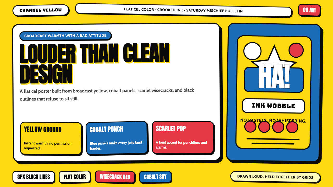 The Simpsons YellowCartoon warmth misbehaves. Yellow ground, cobalt panels, thick wobbly black l…卡通暖意在捣乱:黄色底、钴蓝面板和粗黑抖线。
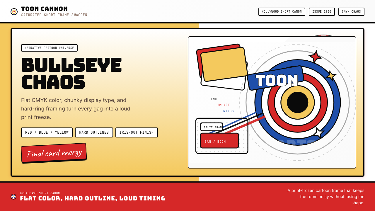 Looney Tunes (Warner Bros.)Pure cartoon chaos. Bull's-eye rings, Bungee type, and red-blue-yellow blocks.纯卡通混乱。牛眼环、粗壮标题字与红蓝黄块面。
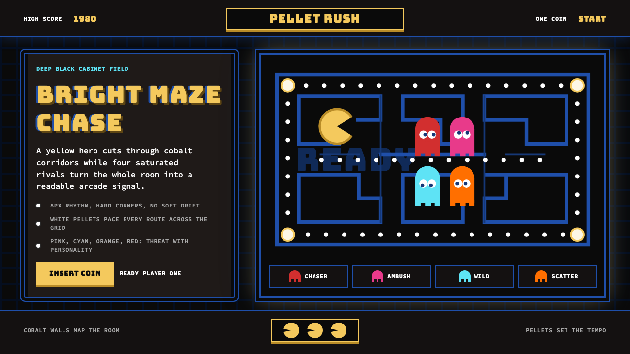 Pac-Man (Namco 1980)Arcade joy burns bright. Yellow disc, cobalt maze, and four ghost hues snap o…街机欢愉高亮燃烧:黄圆、钴蓝迷宫与四色幽灵在黑底上跳动。
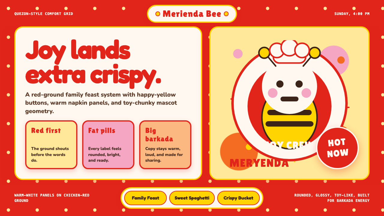 Philippines Jollibee Bee MascotJoy shouts first. Red ground, Fredoka curves, yellow pills, chunky grid.欢乐先喊出来:红底、Fredoka圆字、黄色胶囊与厚实网格。
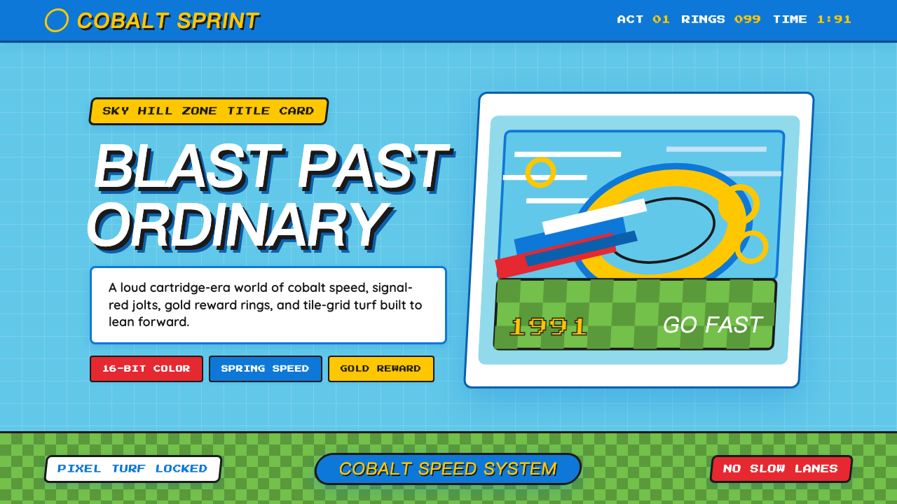 Sonic the Hedgehog (1991)Velocity has teeth. Sky-cyan, cobalt slant type, gold rings, checkerboard tur…速度带刺:天青底、钴蓝倾斜字、金环与棋盘草地。