About Nickelodeon Orange Splat (1984)
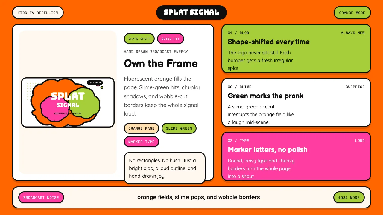
The Nickelodeon orange splat — introduced in 1984 by Tom Pomposello and Fred Seibert — rejected every rule of corporate identity design. Where adult networks used Helvetica in rectangles, Nick used an irregular hand-drawn blob that changed shape with every bumper, promo, and print ad.
This system captures that anarchic kid-energy: fluorescent orange pages, slime-green accents, chunky cartoon shadows, wobbly borders, and typography that looks like a fourth-grader's Sharpie masterpiece. It's loud, decorated, and unapologetically dense.
- Origin
- USA — New York City (Viacom MTV Networks)
- Era
- 1984 orange-splat identity; peak 1986–1998; revival 2018–2024
- Key figures
- Geraldine Laybourne · Fred Seibert · Tom Pomposello · Alan Goodman
- Movements
- 1980s–90s children's broadcast identity · MTV-influenced expressive logo design · post-rigorous-Helvetica kids-TV vocabulary
Nickelodeon Orange Splat (1984) design spec
Colors
Typography
The other 11 sections — buttons, cards, spacing, motion, techniques and more — open once you unlock. Download the DESIGN.md or send it to your AI in one click. Unlock once, yours forever.
Sign up nowStyles similar to Nickelodeon Orange Splat (1984)
Also inspired by brands & products, with a close feel.
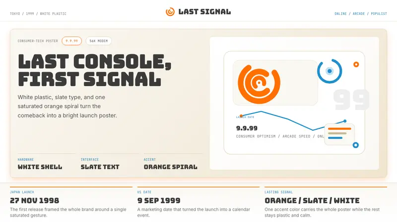 Sega Dreamcast (1999)Last-console cool. White plastic, slate type, and one orange spiral.
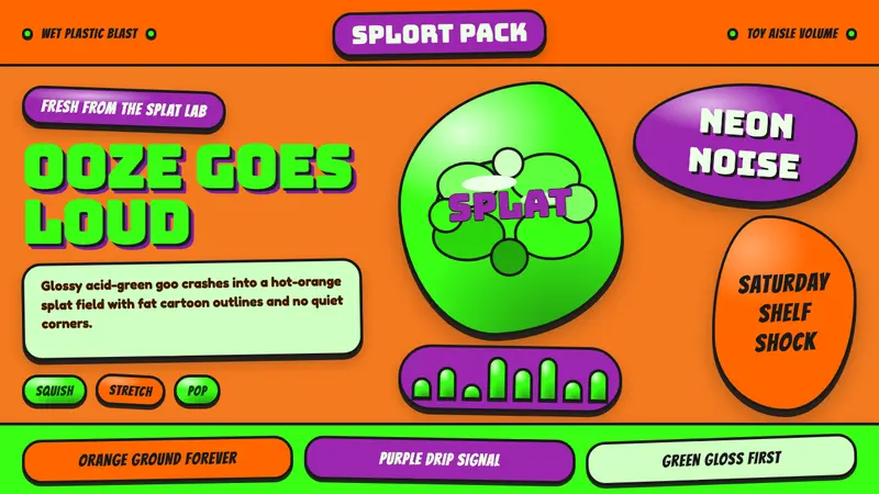 Mattel Gak Slime (Nickelodeon 1992)Wet, neon, loud. Acid green gloss smashes through hot orange splats and purple drips.
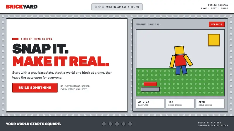 Roblox (2006)Play begins with a click. Fire-engine red cuts through a hard-edged gray stud grid.
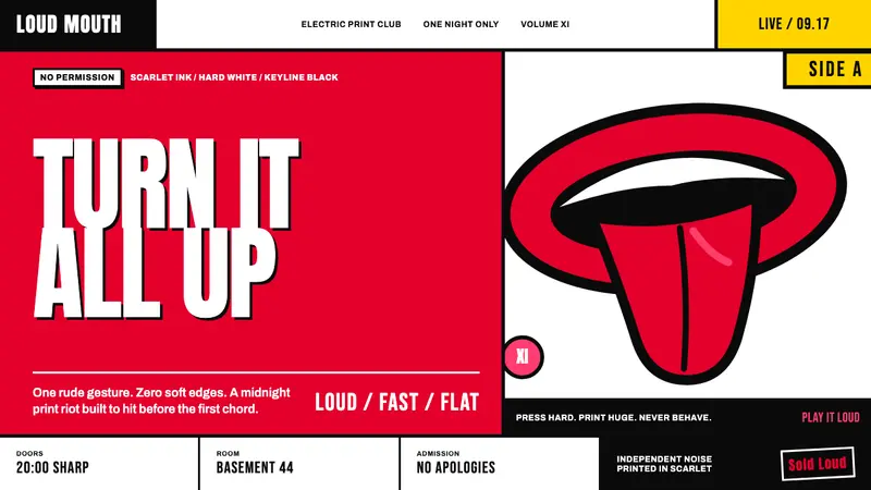 Rolling Stones Tongue (1971)Flat ink shouts loud. Scarlet curves, black keylines, and cropped poster scale refuse restraint.