What is The Simpsons Yellow?什么是 The Simpsons Yellow?
The Simpsons turned a single shade of cartoon skin into the most recognizable color on broadcast television — saturated, irreverent, and impossible to ignore.《辛普森一家》将一种卡通皮肤色调变成了电视广播史上最具辨识度的颜色——饱和、不羁,令人无法忽视。
The Simpsons Yellow in briefThe Simpsons Yellow 速览
The Simpsons Yellow is the visual language of adult animation at its most self-aware: a flat, hand-cel palette built around the warm, slightly acidic yellow that covers every member of the Simpson family. It is not a neutral background color or a decorative accent — it is the dominant presence, the ground on which cobalt blue skies, chalk-white eyeballs, and thick wobbling black outlines all perform. The system captures what the show itself embodies: irreverence, warmth, and the refusal to take any convention at face value.《辛普森一家》的黄色是成人动画视觉语言最具自我意识的表达:一套以温暖、略带酸感的黄色为核心的平涂手绘赛璐珞风格,这种黄色覆盖着辛普森家族的每一个成员。它不是中性的背景色,也不是点缀性的强调色——它是主导性的存在,是钴蓝天空、粉白眼白和粗黑摇摆轮廓线共同表演的舞台。这套系统捕捉了剧集本身所体现的精髓:不敬、温暖,以及拒绝以常规眼光看待任何事物。
Where most design systems use yellow as a secondary signal — a highlight, a warning, an energetic accent — The Simpsons Yellow reverses the hierarchy entirely. Yellow is the skin of every character, the wallpaper of the world, the thing that is always already there. Against this saturated ground, the cobalt blues read as sky and depth, the reds carry emotional heat, and the blacks define every edge with the confidence of a felt-tip pen drawn without hesitation. The result is a palette that feels simultaneously handmade and hyper-legible — unmistakably animated, instantly warm.大多数设计系统将黄色用作次要信号——高亮、警示、充满活力的强调——而《辛普森一家》黄色则彻底颠覆了这一层级。黄色是每个角色的皮肤,是世界的壁纸,是那个始终存在的东西。在这片饱和的底色上,钴蓝色呈现天空与深度,红色承载情感热度,黑色以毡头笔毫不犹豫落笔般的自信勾勒每一条边缘。结果是一套既像手工制作又极度易读的色板——毫无疑问是动画的,瞬间温暖人心。
As a design aesthetic, this system draws on the full lineage of American popular cartooning: the bold flat colors of mid-century cel animation, the exaggerated proportions of comic strips, the slightly unsteady line quality that signals human touch rather than mechanical precision. Applied beyond the show itself, it carries instant pop-culture recognition and a specific emotional register — humor, nostalgia, accessibility — that few other visual systems can claim.作为设计美学,这套系统传承自美国大众卡通的完整谱系:世纪中叶赛璐珞动画的粗犷平涂色彩、漫画条的夸张比例,以及那种略显颤抖的线条质感——它传递的是人的手触而非机械精度的信号。在剧集之外应用这套系统,它携带着即时的流行文化辨识度和特定的情感语调——幽默、怀旧、亲切感——这是其他视觉系统中鲜有可比的。
See the The Simpsons Yellow design system查看 The Simpsons Yellow 完整设计系统
Where does The Simpsons Yellow come from?The Simpsons Yellow 从何而来?
The Simpsons premiered on Fox on December 17, 1989, as a spin-off of the short animated segments Matt Groening had created for The Tracey Ullman Show beginning in 1987. Groening, who had built his reputation on the underground comic strip Life in Hell, drew the family in a hurry on the way to a meeting — which is partly why the character designs retain a quality of deliberate crudeness. The yellow skin tone was a creative decision made during early production discussions with director David Silverman and producer James L. Brooks: a talking head on television is typically skin-toned, and the animators wanted viewers channel-surfing to stop and wonder what they were seeing. A color that did not exist in nature for human skin, broadcast at full saturation, would be impossible to mistake for live-action footage.《辛普森一家》于1989年12月17日在福克斯电视台首播,是马特·格罗宁从1987年起为《特蕾西·厄尔曼秀》创作的简短动画片段的衍生剧。格罗宁凭借地下漫画《地狱人生》建立起自己的声誉;他在赶去一个会议的路上匆匆画出了这家人——这在一定程度上解释了为何角色设计保留了一种刻意的粗粝感。黄色皮肤色调是在早期制作讨论中,格罗宁与导演大卫·西尔弗曼和制片人詹姆斯·L·布鲁克斯共同做出的创意决定:电视上的真人谈话节目通常呈现肉色,而动画师们希望在频道间切换的观众能够停下来,好奇自己看到的是什么。一种在自然界中不存在于人类皮肤的颜色,以全饱和度广播,是不可能被误认为真人影像的。
The technical constraints of late-1980s broadcast television shaped the palette as much as any artistic intention. NTSC broadcast standards of the era had a tendency to bleed saturated colors — particularly reds and oranges — causing halation and edge artifacts on cathode-ray tube screens. The animators, working with Klasky-Csupo during the first several seasons, learned which hues stayed stable and which bled, and built the palette accordingly. The warm yellow-gold that became the characters' skin sat in a sweet spot: saturated enough to read as bold on a television screen, stable enough not to bleed, and distinct enough from any realistic flesh tone that the artifice was always legible. Cobalt blue, used for skies and backgrounds, was similarly chosen for broadcast stability.1980年代末广播电视的技术限制,与任何艺术意图同等程度地塑造了这套色板。那个时代的NTSC广播标准有使饱和色——尤其是红色和橙色——溢出的倾向,在阴极射线管屏幕上造成光晕和边缘伪影。动画师们在最初几季与Klasky-Csupo合作期间,学会了哪些色相保持稳定、哪些会溢色,并据此构建色板。最终成为角色皮肤色的暖黄金色恰好处于一个甜蜜点:在电视屏幕上饱和到足够醒目,稳定到不会溢色,又与任何写实肤色截然不同,使人工造物的属性始终清晰可辨。用于天空和背景的钴蓝色,同样因其广播稳定性而被选用。
The graphic lineage of the show runs through several distinct American traditions. MAD Magazine, which had been satirizing American consumer culture since 1952 with grotesque caricature and deliberately garish color, is an acknowledged influence — Groening has cited it repeatedly. Underground comix of the 1960s and 1970s, with their hand-drawn lettering and exaggerated physical comedy, contributed to the wobbly line quality and the willingness to make characters physically repulsive in the service of a joke. Early Hanna-Barbera television animation, produced on tight budgets with simplified character designs and a limited cel-painting palette, established the visual grammar of flat broadcast color that The Simpsons inherited and then elevated.这部剧的图形谱系贯穿了数种截然不同的美国传统。《MAD》杂志自1952年起以怪诞漫画和刻意俗丽的色彩嘲讽美国消费文化,是公认的影响来源——格罗宁多次提及它。1960至70年代的地下漫画,凭借手绘字体和夸张的肢体喜剧,为这种摇摆线条质感和为了笑点不惜让角色形象丑陋的意愿做出了贡献。汉纳-巴伯拉早期的电视动画在紧张预算下以简化角色设计和有限赛璐珞色板制作,确立了《辛普森一家》所继承并升华的平涂广播色彩的视觉语法。
During what many critics consider the show's golden era, roughly 1993 to 2002, the visual style reached its mature form under the oversight of supervising directors including David Silverman and a rotating team of writers and animators who maintained remarkable consistency across hundreds of episodes. Art director Bill Oakley and others established the specific spatial logic of Springfield — the fictional Midwestern town whose geography is famously inconsistent but whose color palette is absolutely fixed. By the mid-1990s, the yellow had become so culturally embedded that it functioned not just as a character color but as a brand signal: any yellow-skinned figure with overbite and four fingers was immediately legible as a Simpsons reference, regardless of context.在许多批评家认为的剧集黄金时代——大约1993年至2002年间——视觉风格在监制导演大卫·西尔弗曼以及一个在数百集中保持惊人一致性的轮换编剧与动画师团队的监督下,达到了成熟形态。美术指导比尔·奥克利等人确立了斯普林菲尔德这座虚构中西部小镇的具体空间逻辑——其地理位置出了名地前后矛盾,但色板却绝对固定。到1990年代中期,这种黄色已在文化上根深蒂固,不仅是角色色彩,更是品牌信号:任何有着黄色皮肤、龅牙和四根手指的形象,无论出现在何种语境中,都能立即被解读为对《辛普森一家》的引用。
What defines the The Simpsons Yellow look?The Simpsons Yellow 的视觉特征是什么?
Dominant Yellow Ground主导性黄色底色
The defining characteristic of the palette is that yellow is not an accent — it is the ground itself. Character skin occupies the largest surface area of any scene, which means the warm, slightly acid yellow is always the visual baseline against which everything else is measured. This reversal of conventional color hierarchy is what makes the system so immediately identifiable: you are not looking at a design with yellow in it, you are looking at a yellow world with other colors visiting.这套色板最核心的特征是:黄色不是强调色——它是底色本身。角色皮肤占据任何场景中最大的表面积,这意味着那种温暖而略带酸感的黄色始终是衡量其他一切的视觉基准。这种对传统色彩层级的颠覆,正是这套系统如此立刻可辨的原因:你看到的不是一个含有黄色的设计,而是一个其他颜色前来作客的黄色世界。
Cobalt Sky and Structural Blue钴蓝天空与结构性蓝色
Against the warm yellow ground, cobalt blue performs two roles simultaneously: it reads as sky and outdoor space in narrative context, and it provides the coolest, deepest contrast available in the palette. Backgrounds, shadow areas, and framing panels that use this blue create an immediate sense of depth and structural separation without requiring any actual rendering of three-dimensional form. The blue and yellow together produce a vibration that is characteristic of broadcast animation — energetic and slightly electric.在温暖的黄色底面上,钴蓝色同时扮演两个角色:在叙事语境中,它呈现天空与户外空间;在色彩层面,它提供了整套色板中最冷、最深的对比。使用这种蓝色的背景、阴影区域和框架面板,能在无需任何三维形体渲染的情况下,即时营造出深度感与结构性分隔感。蓝色与黄色并置所产生的色彩震动,是广播动画的典型特征——充满活力,略带电光质感。
Thick Wobbly Black Outlines粗黑摇摆轮廓线
Every form in the Simpsons visual system is bounded by a thick black outline that is not entirely straight. The wobble is not an accident or a production artifact — it is the index of the human hand in the drawing process. These outlines perform multiple functions: they separate adjacent shapes of similar color, they give characters weight and physical presence, and they carry the graphic energy of underground comix and newspaper strips. In contemporary applications, the equivalent is any element whose border carries visible drawing character rather than perfect geometric precision.《辛普森一家》视觉系统中的每个形体都由一条并不完全笔直的粗黑轮廓线界定。这种摇摆感不是偶然,也不是生产伪影——它是绘制过程中人手的指纹。这些轮廓线执行多重功能:分隔相邻的相似色形状,赋予角色重量感与实体存在感,同时携带地下漫画和报纸条漫的图形能量。在当代应用中,对应的是任何带有可见手绘笔触而非完美几何精度的边框元素。
Comic-Book Drop Shadows漫画书式偏移投影
Shadows in this system are not soft, diffuse, or gradient — they are hard-edged, offset at a consistent diagonal, and rendered as flat shapes in a deeper version of the primary color or in solid black. This is the same shadow logic used in mid-century comic books and newspaper cartoons: shadow as a geometric declaration rather than a lighting simulation. The effect gives dimensionality to flat forms without abandoning the system's fundamental flatness — objects read as having sides and presence while remaining unambiguously drawn.这套系统中的阴影不是柔和、漫射或渐变的——它们是硬边的,以固定的对角线方向偏移,以主色调的更深版本或纯黑渲染为平面形状。这与世纪中叶漫画书和报纸卡通使用的阴影逻辑相同:阴影是一种几何宣告,而非光照模拟。这种效果在不放弃系统根本平面性的前提下,赋予平面形体以立体感——物体呈现出侧面与实体存在感,同时毫无疑问地保持着绘制的属性。
Saturated Broadcast Color饱和广播色彩
The entire palette operates at a saturation level calibrated for cathode-ray tube broadcast — higher than print, higher than most contemporary digital interfaces, and higher than what most designers would consider safe for extended screen use. This saturation is structural: it ensures legibility at low resolution and across a wide range of display conditions, and it produces the visual heat that makes the style feel alive. Desaturating the palette in an attempt to make it feel 'sophisticated' removes precisely the quality that makes it work.整套色板以为阴极射线管广播校准的饱和度运作——高于印刷,高于大多数当代数字界面,也高于大多数设计师认为在长时间屏幕使用中安全的水平。这种饱和度是结构性的:它确保在低分辨率和各种显示条件下的易读性,并产生使这种风格感觉鲜活的视觉热度。为了使色板看起来「精致」而降低饱和度,恰恰去除了使其有效运作的那种品质。
Rounded, Chunky Forms圆润厚实的形体
The geometric vocabulary of the Simpsons aesthetic favors roundness: bulbous heads, eyes that are simple ovals, mouths that curve in exaggerated arcs, buildings with rounded corners, cars with swollen proportions. This roundness is not softness — it carries the visual weight of the thick outlines and saturated color, and it reads as comedic and approachable rather than elegant. In applications, this translates to a preference for rounded rectangles, pill shapes, and thick-bordered containers over sharp-cornered geometric precision.《辛普森一家》美学的几何词汇偏爱圆润:球状的头部、简单椭圆形的眼睛、夸张弧度的嘴巴、圆角建筑、比例浮夸的汽车。这种圆润并非柔软——它携带着粗黑轮廓线和饱和色彩的视觉重量,读来滑稽而亲切,而非优雅。在实际应用中,这转化为对圆角矩形、胶囊形状和厚边框容器的偏好,而非锐角几何精度。
Flat Color with No Gradient Fill无渐变的平涂色彩
Within the outlines, every area is filled with a single, flat, unmodulated color. There are no gradients, no subtle value shifts, no textural variation within a color field. This flatness is the visual signature of cel animation, where each color was physically painted onto a separate transparent acetate sheet. The discipline of using exactly one value per bounded shape gives the system its characteristic graphic clarity — every color decision is absolute, every boundary is decisive.在轮廓线之内,每个区域都以单一、平涂、均匀的色彩填充。没有渐变,没有细微的明度变化,在色彩区域内没有纹理变化。这种平面性是赛璐珞动画的视觉签名——每种色彩被物理涂布在独立的透明醋酸片上。在每个封闭形状内恰好使用一种明度值的规律,赋予这套系统其特有的图形清晰度——每个色彩决定都是绝对的,每条边界都是决定性的。
See the The Simpsons Yellow design system查看 The Simpsons Yellow 完整设计系统
Who shaped The Simpsons Yellow?谁塑造了 The Simpsons Yellow?
The creator of The Simpsons and the originator of its visual vocabulary, Groening had already developed a highly idiosyncratic drawing style through Life in Hell, his alternative newspaper comic strip. His character designs for the Simpson family — developed rapidly and retaining an intentional crudeness — established the proportional system and the thick-outline aesthetic that the entire production then systematized. Groening's aesthetic instincts, shaped by MAD Magazine, underground comix, and a deliberately anti-slick sensibility, are the direct source of the palette's irreverence.作为《辛普森一家》的创作者和其视觉词汇的发明者,格罗宁已经通过他的另类报纸漫画《地狱人生》发展出了极具个人特色的绘画风格。他为辛普森家族设计的角色——快速创作,刻意保留粗粝感——确立了比例系统和粗黑轮廓美学,随后整个制作团队将其系统化。格罗宁受《MAD》杂志、地下漫画和刻意反精致感性塑造的审美直觉,是这套色板不敬精神的直接来源。
As supervising director and key animation director across many of the show's formative years, Silverman was responsible for translating Groening's loose sketches into a consistent animated visual system. He directed the first episode and oversaw the development of the show's specific movement vocabulary — the timing of takes, the exaggeration of emotional expressions, the spatial logic of Springfield. Silverman's work in establishing visual consistency across a large team of animators is a large part of why the style reads as a coherent system rather than a collection of individual interpretations.作为剧集最初数年的监制导演和核心动画导演,西尔弗曼负责将格罗宁的松散草图转化为一套一致的动画视觉系统。他执导了第一集,并监督了剧集特定运动词汇的发展——表情夸张的时机、情感表达的放大、斯普林菲尔德的空间逻辑。西尔弗曼在一个庞大动画师团队中确立视觉一致性的工作,在很大程度上使这种风格被解读为一套连贯的系统,而非各种个人诠释的集合。
The executive producer who shepherded The Simpsons from concept to broadcast, Brooks brought the institutional authority of a Hollywood television veteran to a project that Fox network executives were deeply uncertain about. His insistence that the show function as genuine character comedy — with emotional investment in its characters — rather than pure satire or animation novelty shaped the tonal register that the visual style had to serve. The palette's combination of warmth and absurdity reflects the show's dual commitments: the yellow had to be funny, but it also had to be home.将《辛普森一家》从概念带到播出的执行制片人,布鲁克斯将好莱坞电视资深人士的机构权威带入了一个福克斯高管们深度不确定的项目。他坚持这部剧应作为真正的角色喜剧运作——对角色有情感投入——而非纯粹的讽刺或动画噱头,这塑造了视觉风格必须服务的情感基调。这套色板中温暖与荒诞的结合,反映了剧集的双重承诺:黄色必须是滑稽的,但它同时也必须是家的感觉。
A writer and showrunner during some of the series' most celebrated seasons in the 1990s, Oakley contributed to the crystallization of Springfield's visual and narrative identity. His involvement during the period when the show's aesthetic references — the specific architecture of the town, the visual grammar of recurring locations — were being established makes him a key figure in the codification of the style beyond individual episode decisions. The Simpsons Yellow as a consistent, world-building presence rather than a character-specific color is partly the result of the editorial discipline that Oakley and his collaborators imposed.作为1990年代剧集最受赞誉的几季的编剧和主创,奥克利参与了斯普林菲尔德视觉与叙事身份的结晶过程。他在剧集美学参照——小镇的特定建筑风格、重复出现地点的视觉语法——被确立的时期介入其中,使他成为将这种风格固化为超越单集决策的关键人物。《辛普森一家》黄色作为一种一致的、构建世界的存在而非特定角色的颜色,部分源于奥克利及其合作者所施加的编辑纪律。
The animation production studio founded by Arlene Klasky and Gábor Csupó handled the first several seasons of The Simpsons and was instrumental in translating the palette from concept to consistent broadcast output. Working under significant time and budget pressure, Klasky-Csupo's teams developed the practical painting and filming conventions — the specific color mixes, the outline weights, the cel-painting discipline — that turned Groening's drawings into a reproducible visual system. The slightly rougher quality of the early seasons, which many viewers regard as the style at its most authentic, is a direct product of Klasky-Csupo's methods.由阿琳·克拉斯基和加博尔·丘波创立的动画制作公司承担了《辛普森一家》最初数季的制作,在将色板从概念转化为一致的广播输出方面发挥了关键作用。在巨大的时间和预算压力下,Klasky-Csupo的团队开发了实用的绘制和拍摄惯例——特定的色彩混合、轮廓线粗细、赛璐珞绘制规范——将格罗宁的画稿转化为可复制的视觉系统。早期几季略显粗粝的品质——许多观众认为这是这种风格最本真的状态——正是Klasky-Csupo方法的直接产物。
How do you use The Simpsons Yellow today?今天怎么用 The Simpsons Yellow?
The Simpsons Yellow is a high-personality style that works best when the project has a clear need for warmth, humor, or pop-culture legibility — and when the audience is expected to recognize the reference or respond to its emotional register. Before applying it, the fundamental question is whether the content can afford to be irreverent. A serious financial dashboard, a medical platform, or a luxury brand will fight against the style's inherent comedy. A community tool, an entertainment product, a youth-facing marketing campaign, or any project that benefits from being taken lightly is a natural fit.《辛普森一家》黄色是一种个性强烈的风格,最适合项目明确需要温暖感、幽默感或流行文化易读性的场合——以及观众被期待能识别这种引用或回应其情感语调的情境。在应用之前,根本的问题是:内容是否可以承受不敬?严肃的金融仪表板、医疗平台或奢侈品牌会与这种风格固有的喜剧感产生对抗。社区工具、娱乐产品、面向年轻人的营销活动,或任何受益于被轻松看待的项目,都是天然的适配对象。
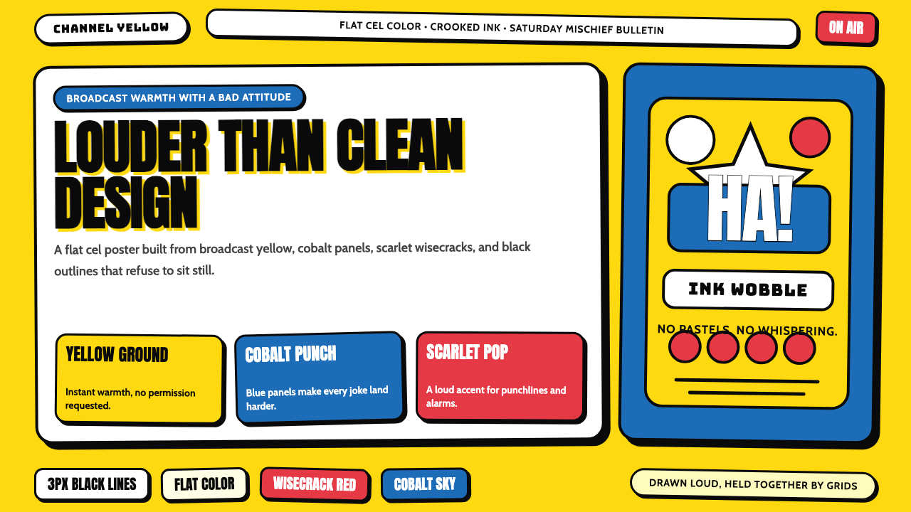
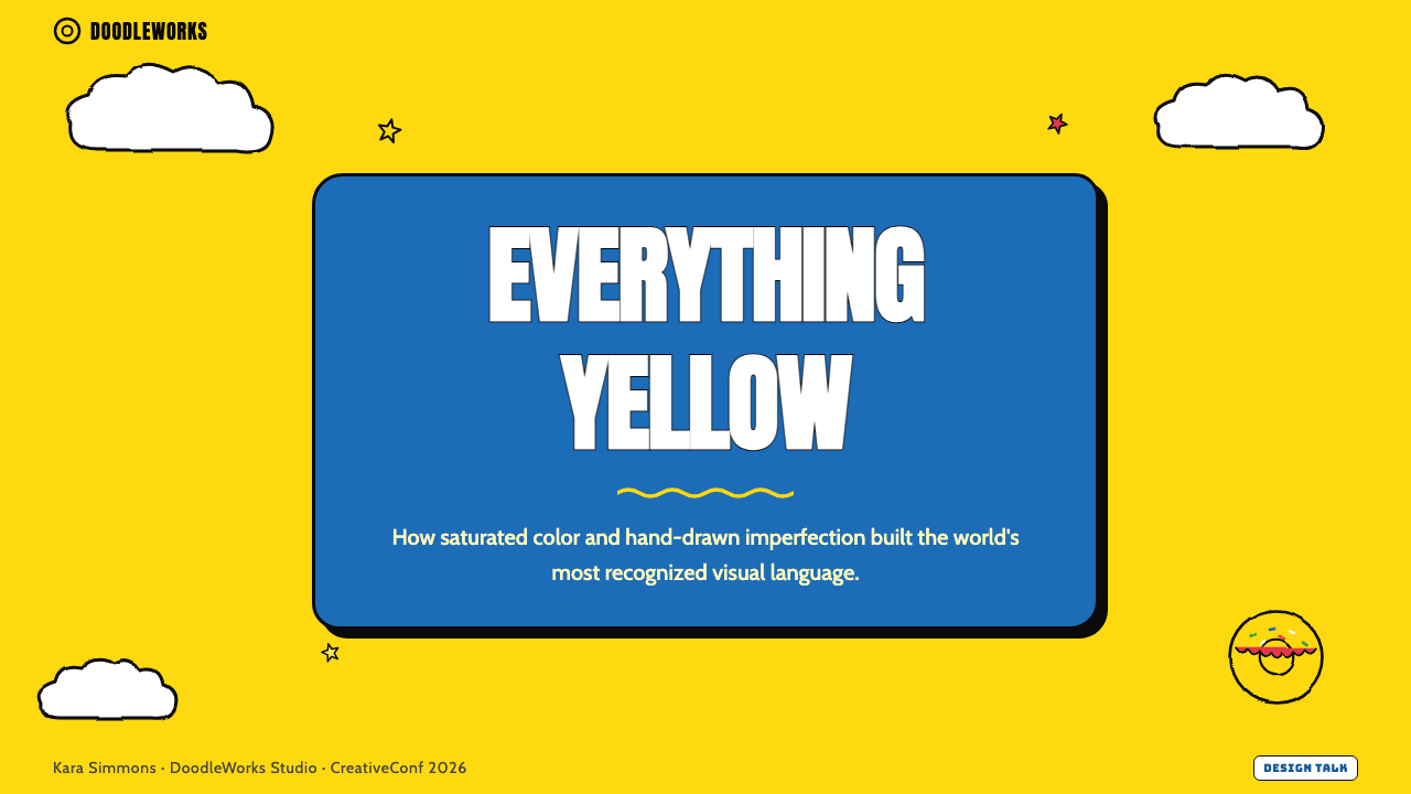
For presentation slides, the style delivers maximum impact on cover pages built around the signature yellow ground. A cover image — whether an illustration or a flat graphic — that uses the full palette against a saturated yellow field immediately signals the tone of everything that follows. Content slides work best when they adopt the system's flatness and outline logic: heavy borders around content blocks, flat icon graphics rather than photographic images, and typographic hierarchy defined by weight and size contrast rather than color variety. Data slides take on a cartoon-diagrammatic quality that can make complex information feel more approachable — bar charts become solid, flat colored shapes; labels are set in bold, rounded type; and any data-driven narrative benefits from the palette's tendency to make everything feel a bit more consequential and a bit less stressful.在演示文稿中,这种风格在以标志性黄色底面为核心构建的封面页上产生最大冲击力。在饱和黄色底面上使用完整色板的封面图像——无论是插图还是平面图形——立即传达了后续一切内容的基调。内容页在采用系统的平面性和轮廓线逻辑时效果最佳:内容块的粗边框、平面图标图形(而非摄影图像),以及由字重和尺寸对比而非色彩多样性定义的字体层级。数据页呈现出一种卡通示意图质感,使复杂信息感觉更易亲近——柱状图变成实心平涂的彩色形状,标签以粗体圆润字体排印,任何数据驱动的叙述都受益于这套色板使一切感觉更有分量、更少压迫感的倾向。
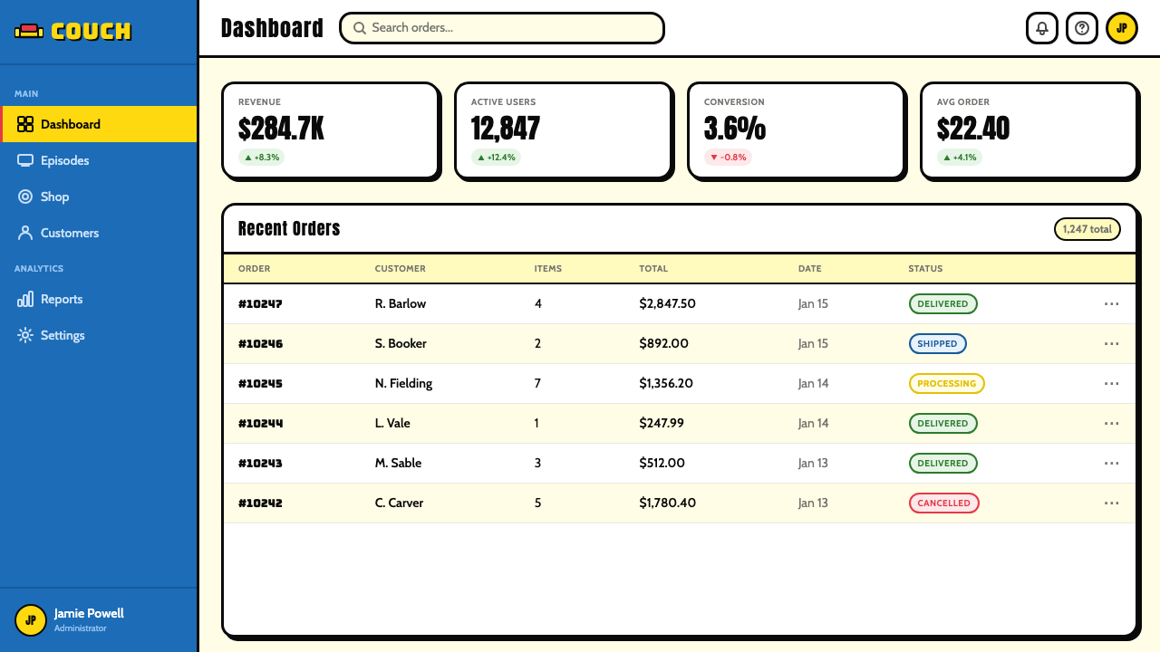
For web interfaces and dashboards, the style is well-suited to contexts where density and data volume need to be offset by a sense of personality and approachability. Pricing pages built in this system benefit from the palette's natural hierarchy: the warm yellow serves as a background or highlight tier, cobalt panels differentiate plan levels, and the thick-outline convention translates directly into bold card borders that make options visually distinct without requiring shadow or depth effects. Navigation and UI controls should feel drawn rather than rendered — rounded buttons with visible borders, flat icon treatment, no ambient glow or soft shadow. The risk with dashboards is over-applying the yellow at high saturation across large screen areas, which can create visual fatigue; the solution is to treat the yellow as a selective accent and use near-white or light ground for most content areas.对于网页界面和仪表板,这种风格适合那些需要用个性感和亲切感来平衡信息密度与数据量的场景。以这套系统构建的定价页面受益于色板天然的层级性:温暖的黄色用作背景或高亮层,钴蓝色面板区分套餐等级,而粗轮廓线惯例直接转化为加粗的卡片边框,使选项在视觉上清晰区分,无需阴影或深度效果。导航和界面控件应感觉像被绘制出来的,而非被渲染的——有可见边框的圆形按钮、平涂图标处理、无环境光晕或柔和阴影。仪表板的风险在于在大屏幕区域以高饱和度过度应用黄色,这可能造成视觉疲劳;解决方案是将黄色作为选择性强调色,并将接近白色或浅色的底面用于大多数内容区域。
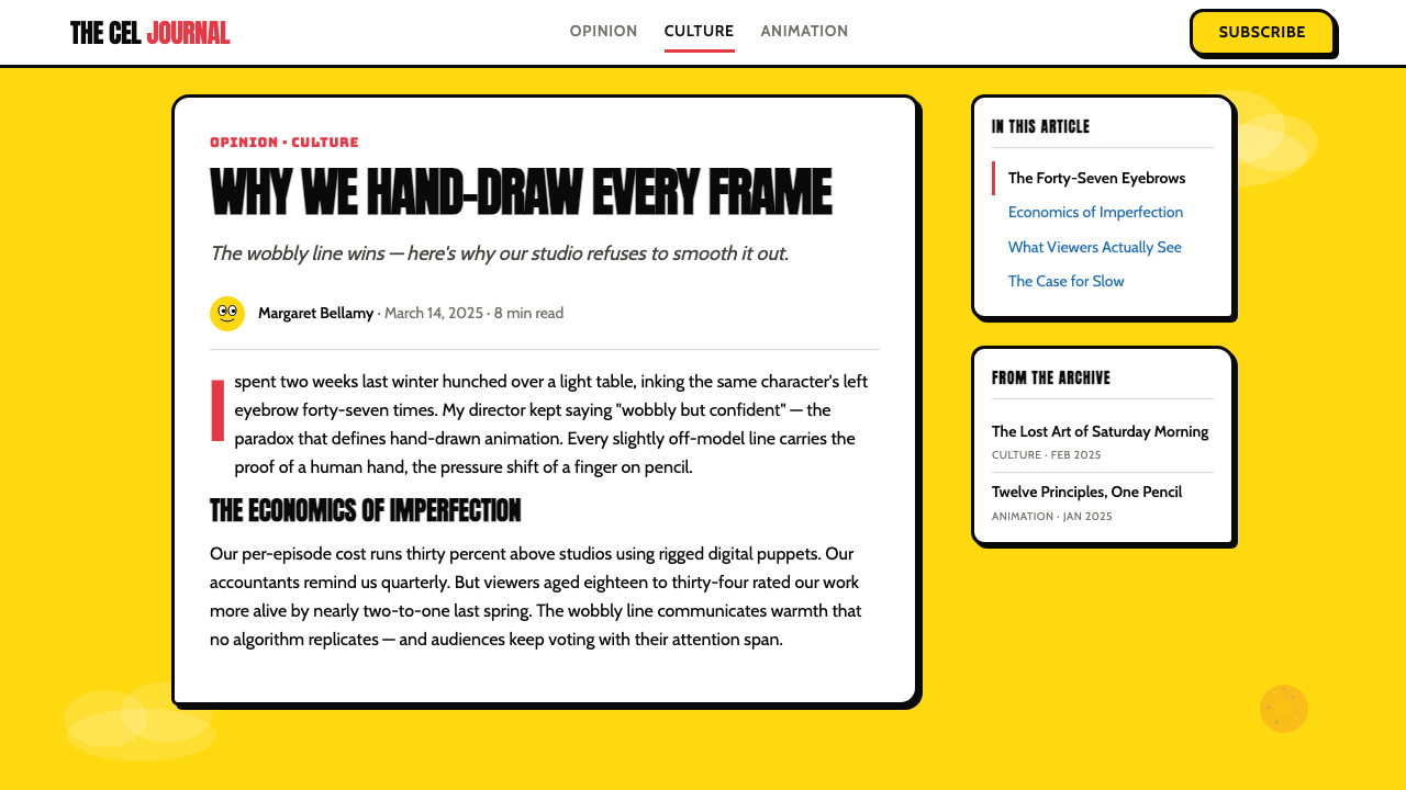
For editorial and marketing work, the palette's most powerful application is the large-format poster or hero image, where its saturated broadcast quality translates directly into visual stopping power. A marketing hero built around the yellow ground with cobalt blue panels and bold, wobbly-outlined typography will read as instantly distinctive even at small sizes or in competitive visual environments. Editorial applications work well when the style is used as a framing device rather than a total-environment approach — yellow headers, outlined pull-quote boxes, flat icon illustrations — against a more neutral content ground. Social cards and thumbnail images benefit enormously from the palette's contrast and saturation, which ensures legibility at the small sizes and compressed formats typical of social media feeds.对于编辑和营销工作,这套色板最有力的应用是大幅海报或英雄图像,其中饱和的广播色彩品质直接转化为视觉冲击力。以黄色底面、钴蓝色面板和粗体摇摆轮廓排版构建的营销主视觉,即使在小尺寸或竞争激烈的视觉环境中,也会立即呈现出鲜明的辨识度。编辑应用在将这种风格作为框架装置而非全环境方案使用时效果最佳——黄色标题、有轮廓线的引用框、平涂图标插图——衬托在更中性的内容底面上。社交卡片和缩略图图像极大地受益于这套色板的对比度和饱和度,这确保了在社交媒体信息流典型的小尺寸和压缩格式下的易读性。
A common mistake is treating the thick-outline convention as purely decorative rather than structural. In the source material, outlines exist because they separate adjacent color areas and give weight to forms — they are doing real visual work. When applied to interface elements without this structural purpose, outlines quickly read as retro pastiche rather than as a coherent system. Similarly, the wobbly quality of the original line is the result of human drawing — attempting to replicate it with geometric shapes and border-radius values produces something that looks imitative rather than genuine. The best applications of this style either commit to actual illustrated elements or use the palette's color and proportion logic without attempting to replicate the line quality through digital means.一个常见的错误是将粗轮廓线惯例视为纯粹的装饰性,而非结构性的。在源素材中,轮廓线之所以存在,是因为它们分隔相邻色彩区域并赋予形体以重量——它们在做真实的视觉工作。当应用于界面元素而没有这种结构目的时,轮廓线很快就会被解读为复古拼贴,而非连贯系统。同样地,原始线条的摇摆感是人手绘制的结果——试图用几何形状和圆角值来复制它,会产生看起来模仿而非真实的东西。这种风格最佳的应用要么承诺使用实际的插图元素,要么在不试图通过数字手段复制线条质感的情况下,运用色板的色彩和比例逻辑。
See the The Simpsons Yellow design system查看 The Simpsons Yellow 完整设计系统
The Simpsons Yellow — FAQThe Simpsons Yellow · 常见问题
Does The Simpsons Yellow work in professional or corporate contexts?《辛普森一家》黄色适合专业或企业语境吗?
It can, but the framing matters enormously. The style carries an irreverence that reads as intentional — an audience encountering it in a corporate context will assume the brand is making a deliberate, self-aware choice to be playful. That can be a strength for products in entertainment, gaming, community platforms, or any sector where approachability and personality are competitive advantages. In regulated industries, formal enterprise software, or any context where authority and seriousness are expected, the style works against the product's goals. The yellow specifically triggers cartoon associations that are difficult to suppress even with disciplined application — the question is whether those associations are assets or liabilities.可以,但框架设定至关重要。这种风格携带着一种被解读为刻意的不敬——在企业语境中遇到它的受众会认为品牌正在做出刻意的、自我意识的选择,选择展现活泼感。这对娱乐、游戏、社区平台或任何以亲切感和个性为竞争优势的行业中的产品可以成为优势。在受监管的行业、正式的企业软件,或任何期待权威性和严肃感的语境中,这种风格会与产品目标产生对抗。黄色本身会触发难以压制的卡通联想,即使进行严格的应用——问题在于这些联想是资产还是负债。
How is this style different from other cartoon or retro-animation aesthetics?这种风格与其他卡通或复古动画美学有何不同?
The Simpsons aesthetic is specifically adult animation from the broadcast television era — which distinguishes it from several adjacent styles. It is warmer and more character-driven than mid-century UPA graphic animation, which tends toward cooler, more abstract forms. It is looser and more hand-drawn than the clean vector aesthetic of 1990s motion graphics. It is grittier and more satirical in feeling than the pastel warmth of Disney feature animation from the same era. The specific combination of warm yellow dominance, cobalt blue, thick wobbly outlines, and comic-book drop shadows is sufficiently distinctive that it reads as a reference to this specific visual tradition rather than to cartooning generally.《辛普森一家》美学特指广播电视时代的成人动画——这将它与几种邻近风格区别开来。它比世纪中叶的UPA图形动画更温暖、更以角色为驱动;UPA动画倾向于更冷调、更抽象的形式。它比1990年代动态图形的清晰矢量美学更松散、更像手绘。它比同时期迪士尼故事长片的粉彩温暖感更粗粝、更具讽刺意味。温暖黄色的主导地位、钴蓝色、粗黑摇摆轮廓线和漫画书式偏移投影的特定组合,足够独特,能够被解读为对这一特定视觉传统的引用,而非对卡通动画的泛指。
Can the style work in dark mode or on dark backgrounds?这种风格能在深色模式或深色背景上使用吗?
Dark-background applications of this palette are possible but require significant rethinking of the hierarchy. The warm yellow that reads as a skin-tone ground on a light background becomes an aggressive, almost fluorescent accent when placed on a dark or black ground. This can be effective for theatrical or nighttime contexts — concert promotions, late-night event materials, horror or thriller themes with a comedic register — but it shifts the emotional tone considerably, from sunny warmth to something more electric and slightly ominous. The cobalt blue also becomes more prominent on dark backgrounds, which can push the palette toward a more electronic, neon-influenced quality. The thick outlines and flat color logic work well in both light and dark contexts; it is primarily the color balance and temperature that requires adjustment.深色背景对这套色板的应用是可能的,但需要对层级进行重大重新考量。在浅色背景上读来像皮肤色底面的温暖黄色,放置在深色或黑色底面上时,会变成攻击性的、近乎荧光的强调色。这对戏剧性或夜晚语境可以有效——音乐会宣传、深夜活动材料、带有喜剧色彩的恐怖或惊悚主题——但它会显著转变情感基调,从阳光温暖变为更加充满电感、略带不祥的氛围。钴蓝色在深色背景上也会更加突出,可能会将色板推向更具电子感、受霓虹影响的品质。粗轮廓线和平涂色彩逻辑在浅色和深色语境中都运作良好;主要需要调整的是色彩平衡和色温。
Is it possible to use this style without making everything look like a Simpsons parody?能否在不让一切看起来像《辛普森一家》仿作的情况下使用这种风格?
Yes, with careful selection of which elements to adopt. The full system — character-yellow ground, cobalt blue, wobbly outlines, comic-book shadows, rounded chunky forms — is so strongly coded that it reads as direct parody. But individual elements can be extracted and applied more selectively. The palette's saturation and warmth, without the wobbly outline convention, reads as cheerful broadcast graphic design. The flat-color-within-hard-outlines approach, applied to geometric rather than character-derived forms, references the cel animation tradition more broadly. The key is to decide in advance which associations you want to carry and which to leave behind, then apply only the elements that serve those associations. The style becomes parody when all elements are present simultaneously at full intensity; it becomes a sophisticated design reference when applied selectively and with intention.可以,只需谨慎选择采用哪些元素。完整系统——角色黄色底面、钴蓝色、摇摆轮廓线、漫画书式阴影、圆润厚实的形体——编码如此强烈,以至于被解读为直接仿作。但单个元素可以被提取并更有选择性地应用。色板的饱和度和温暖感,在没有摇摆轮廓线惯例的情况下,读来像开朗的广播图形设计。将轮廓线内平涂色彩的方法应用于几何形体而非角色衍生形体,更广泛地引用了赛璐珞动画传统。关键是提前决定你想携带哪些联想、放弃哪些,然后只应用服务于这些联想的元素。当所有元素同时以全强度呈现时,风格变成仿作;当有选择性地、有意图地应用时,它变成一种精致的设计引用。
What type of typography pairs best with this aesthetic?什么类型的字体排印最适合与这种美学搭配?
Typography that has warmth and visible personality — either through a slight geometric roundness, an explicit display quality, or a letterform that suggests it could have been hand-drawn — works best with this palette. Heavy weights read as more authentic than light or thin ones. All-caps settings can amplify the graphic, poster-like quality of the style. Comic and display typefaces designed to evoke mid-century cartoon lettering are an obvious and direct choice, though they risk tipping into parody territory quickly. A more versatile approach uses rounded display sans-serifs at headline scale and a plain, legible workhorse sans-serif at body scale — preserving the warmth and roundness associations at the level where they are most visible while maintaining readability in longer text. Script or serif typefaces generally work against the system's flat, graphic logic.具有温暖感和可见个性的字体——通过轻微的几何圆润度、明显的展示性,或暗示可以手绘的字形——与这套色板搭配效果最佳。重字重比轻字重或细字重读来更本真。全大写排版设置可以放大这种风格图形海报式的品质。专为唤起世纪中叶卡通字体而设计的漫画和展示字体是明显且直接的选择,尽管它们存在很快滑向仿作领域的风险。更通用的方法是在标题级别使用圆润展示无衬线字体,在正文级别使用简洁、易读的主力无衬线字体——在最显眼的级别保留温暖感和圆润感的联想,同时在较长文本中维持可读性。手写体或衬线字体通常与这套系统的平面图形逻辑相悖。
Related design styles相关设计风格
 Cartoon Network 90s BlocksKids-cable noise, squared. Black-white checkerboards crash into hot-yellow Bu…方块化的儿童有线电视噪音:黑白棋盘撞上热黄 Bungee 字块。
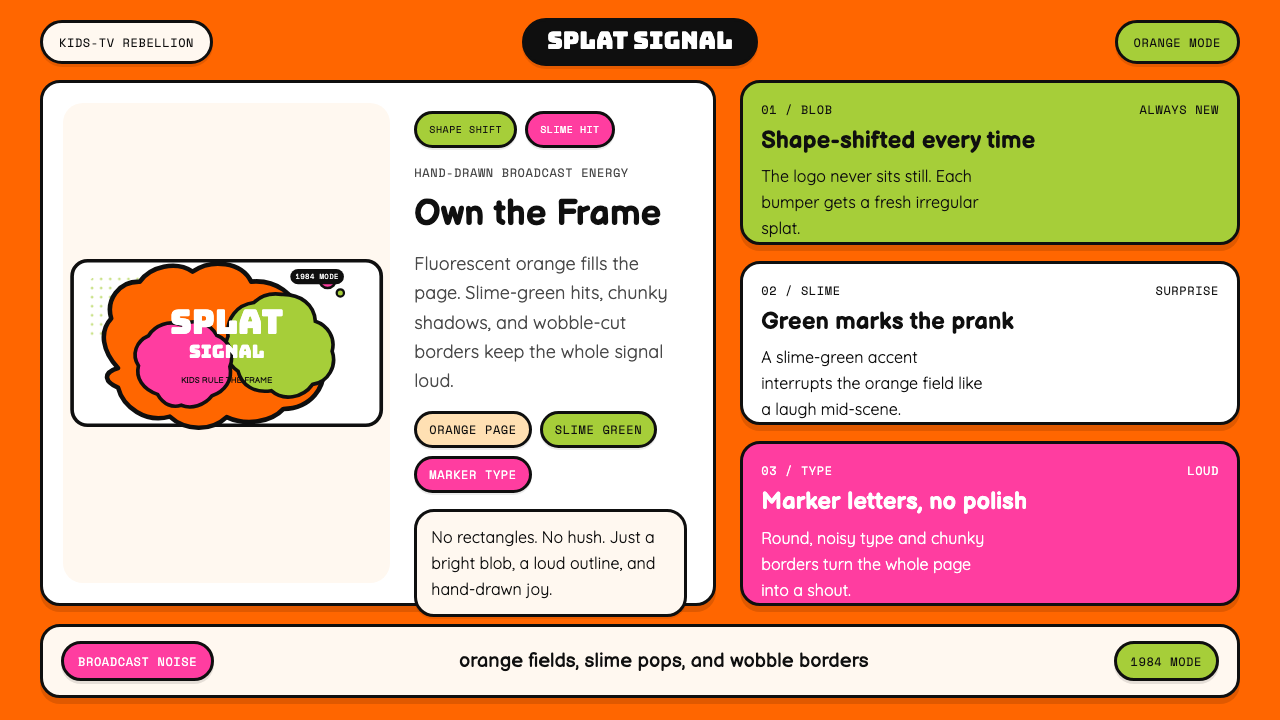 Nickelodeon Orange Splat (1984)Kids own the screen. Orange fields, slime-green pops, and wobble borders do t…孩子掌控屏幕。橙底、史莱姆绿点缀和歪斜边框一起喊话。
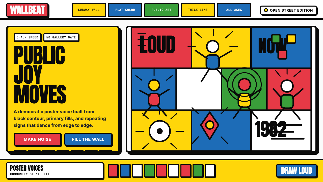 Keith Haring PopJoy refuses the gallery. Thick black contours pack primary color into a danci…快乐拒绝画廊:粗黑轮廓把原色塞进跳动墙面网格。
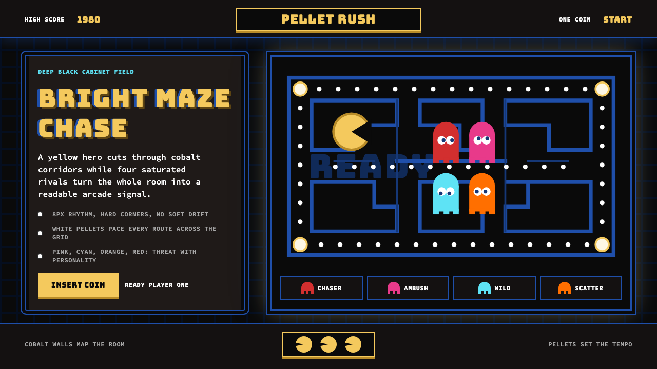 Pac-Man (Namco 1980)Arcade joy burns bright. Yellow disc, cobalt maze, and four ghost hues snap o…街机欢愉高亮燃烧:黄圆、钴蓝迷宫与四色幽灵在黑底上跳动。
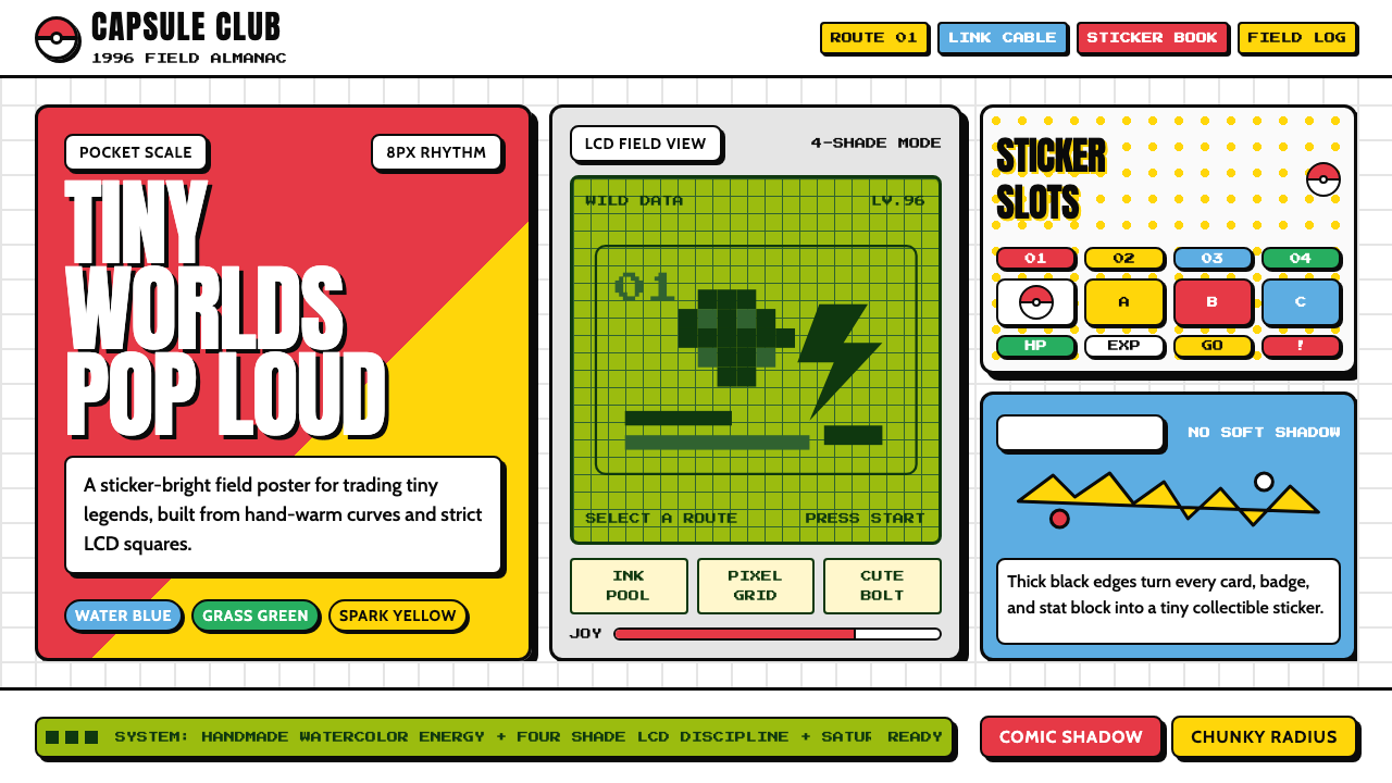 Pokémon Game BoyKawaii meets cartridge logic. Capsule red, LCD green, Anton heft, and 8px gri…卡哇伊撞上卡带逻辑:胶囊红、LCD绿、Anton粗字与8px网格同屏。
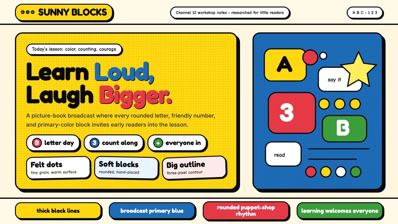 Sesame Street (1969)Learning feels handmade. Big yellow, monster blue, chunky outlines, and round…学习像手工做成:大黄与怪兽蓝、粗黑描边、圆胖字母一起发声。