What is Sesame Street (1969)?什么是 Sesame Street (1969)?
Sesame Street turned the television screen into a felt-and-puppet classroom where every color, letterform, and monster was calibrated by child-development science to say: learning is bright, friendly, and made by hand.《芝麻街》把电视屏幕变成了一间毛毡与木偶教室,每一种颜色、每一个字形、每一只怪兽都经过儿童发展科学的校准,传递同一个信息:学习是明亮的、友好的、手工制作的。
Sesame Street (1969) in briefSesame Street (1969) 速览
Sesame Street is the most rigorously researched children's visual language in the history of broadcast media. Launched in 1969 by the Children's Television Workshop, the program's every design decision — palette, letterform, character proportions, scene composition — was tested with child-development psychologists and reviewed against empirical viewing data before a single frame aired. The result is not a casual aesthetic but a deliberate visual system built to be legible, emotionally warm, and cognitively accessible to children aged two through five.《芝麻街》是广播媒体史上经过最严格研究的儿童视觉语言。1969年由儿童电视工作坊推出,节目的每一个设计决策——色板、字形、角色比例、场景构图——都经过儿童发展心理学家的测试,并根据实证收视数据审核,才允许出现在屏幕上。这不是一种随意的美学,而是专为两至五岁儿童的清晰可读性、情感温度与认知可及性而构建的蓄意视觉系统。
The visual language rests on three foundations: saturated broadcast-primary colors that read clearly on the cathode-ray televisions of the era, chunky black outline strokes that give every shape a crisp boundary at low resolution, and felt-and-foam textures that communicate handcraft and tactile warmth. Big Bird's signature yellow and Cookie Monster's deep blue anchor the palette as complementary emotional poles — one sunny and gentle, one gruff and comedic — while Elmo's vivid red introduced a third playful voice in the early 1980s. Together these colors never feel harsh because they are always accompanied by the visual softness of fabric, fur, and hand-painted surfaces.这套视觉语言建立在三个基础之上:在当年阴极射线管电视上仍能清晰呈现的饱和广播原色;给每个形状都画上清晰边界的粗黑轮廓线;以及传递手工感与触感温度的毛毡和泡沫材质。大鸟标志性的黄色与饼干怪兽深邃的蓝色,作为互补的情感两极锚定了整个色板——一个温煦柔和,一个粗声粗气又滑稽可爱——艾摩鲜亮的红色则在1980年代初期加入,构成第三个顽皮的声部。这些颜色之所以从不显得刺眼,是因为始终伴随着织物、毛皮与手绘表面带来的视觉柔和感。
What distinguishes Sesame Street visually from other children's media of its era is the studied imperfection of its forms. Letterforms are rounded, slightly uneven, almost wobbly — more like a child's own handwriting than a typeset page. Shapes are blob-like and organic rather than geometrically rigid. Nothing is slick or machined. The aesthetic deliberately rejects the polish of commercial animation in favor of the warmth of the Henson puppet workshop, signaling to every child viewer that the people who made this show did so with their hands.《芝麻街》视觉上有别于同时代其他儿童媒体之处,在于其形态经过刻意设计的不完美。字形圆润、略显不均匀、几乎带点摇摆感——更像是孩子自己的笔迹,而非印刷页面。形状是团块状和有机的,而非几何上的严格规整。没有任何东西是光滑或机械加工的。这种美学有意拒绝商业动画的精抛光,转而拥抱亨森木偶工坊的温度,向每一位儿童观众传递信号:制作这个节目的人是用双手做出来的。
See the Sesame Street (1969) design system查看 Sesame Street (1969) 完整设计系统
Where does Sesame Street (1969) come from?Sesame Street (1969) 从何而来?
Sesame Street was born from a simple but radical hypothesis: if children were already spending hours in front of the television, could television be designed to teach them? The idea was developed in 1966 by Joan Ganz Cooney, a television producer, and Lloyd Morrisett, a psychologist at the Carnegie Corporation. Cooney's landmark feasibility study, published in 1966, argued that a sustained, broadcast-quality children's show combining entertainment with curriculum goals could measurably improve school readiness, particularly for children from lower-income households who lacked access to pre-kindergarten education. The Children's Television Workshop was founded in 1968, and the first episode aired on November 10, 1969.《芝麻街》诞生于一个简单却激进的假设:既然孩子们已经在电视机前度过了大量时光,能否把电视设计成教学工具?这个想法由电视制作人琼·甘茨·库尼与卡内基基金会心理学家劳埃德·莫里塞特于1966年共同发展。库尼于同年发表的里程碑式可行性研究报告主张:一档持续的、广播级品质的儿童节目,若能将娱乐性与课程目标相结合,将能够切实提升儿童的入学准备程度——尤其是那些缺乏学前教育资源的低收入家庭儿童。儿童电视工作坊于1968年成立,第一集于1969年11月10日播出。
The visual and puppet design of the original series was the work of Jim Henson and his collaborators, most importantly Frank Oz and the broader Muppet workshop. Henson had spent the previous decade developing the Muppet form on variety shows and commercials, refining the principles of foam-and-felt puppet construction that would define Sesame Street's physical aesthetic. The choice of soft, tactile materials was not merely practical — it was communicative. Foam rubber and fleece read on camera as warmth and approachability in a way that rigid plastic or painted wood could not. The characters' exaggerated features — enormous eyes, oversized mouths, simplified body shapes — were calibrated to be readable on the small-screen televisions of 1969 and to project emotion legibly from across a living room.原版系列的视觉与木偶设计出自吉姆·亨森及其合作者之手,核心人物包括弗兰克·奥兹以及更广泛的布偶工坊团队。亨森在此前十年间已在综艺节目与广告片中持续发展布偶形式,精炼了以泡沫和毛毡为材料的木偶制作原则——而这些原则将定义《芝麻街》的物理美学。选择柔软触感材料,不仅是实用考量,更是传播考量。泡沫橡胶与羊毛绒在镜头前所呈现的温度与亲近感,是硬质塑料或彩绘木头无法传递的。角色夸张的特征——巨大的眼睛、宽大的嘴巴、简化的身体轮廓——既经过校准以适应1969年的小屏幕电视,也能从客厅对面清晰传递情感。
The street set itself — a brownstone block in an unnamed American city, clearly coded as inner-city New York — was a deliberate departure from the idealized suburban settings of most children's television. The design team, working with producers and researchers, wanted the show's environment to reflect the lived reality of the urban children it most needed to reach. Trash cans, stoops, fire escapes, and a neighborhood fix-it shop were not just set dressing but signals of cultural recognition. The warm, slightly worn quality of the set was maintained throughout the original run: surfaces were never too new, colors never too clean, communicating the lived-in warmth of a real neighborhood rather than a designed one.街道布景本身——一个无名美国城市中的褐石街区,被明确编码为内城纽约——是对大多数儿童电视节目所呈现的理想化郊区环境的刻意背离。设计团队与制作人、研究人员合作,希望节目的环境能够映照出它最需要触达的城市儿童的真实生活。垃圾桶、门廊台阶、防火梯和街角修理铺,不只是布景装饰,而是文化认同的信号。布景温暖而略显磨损的质感贯穿了原版系列的始终:表面从不崭新,颜色从不过于洁净,传递的是一个真实街区的生活温度,而非一个被设计出来的街区。
The golden era of the show's visual innovation ran from 1969 through roughly 1985, spanning the full period of Henson's direct involvement. During this period, the animated inserts — short films commissioned from independent animators to illustrate letters and numbers — introduced an extraordinary range of graphic styles, from psychedelic rotoscopy to cut-paper collage to chalk-on-blackboard hand-drawing. These inserts collectively created a visual pluralism within the show's larger identity: the linking thread was always warmth, handcraft, and primary-color clarity, even when the specific visual style varied wildly from segment to segment. This eclecticism within a unifying visual philosophy is one of the most sophisticated design achievements of the original series.节目视觉创新的黄金时代大致从1969年延伸至1985年,覆盖了亨森直接参与的完整时期。在此期间,用于展示字母与数字的动画插入片——委托独立动画师创作的短片——引入了极为丰富的平面风格,从迷幻描摹到剪纸拼贴,再到黑板粉笔手绘,不一而足。这些插入片在节目的整体身份之中共同创造了一种视觉多元主义:贯穿始终的线索永远是温暖、手工感与原色清晰度,即使各段落的具体视觉风格相差悬殊。这种在统一视觉哲学框架内的多元并存,是原版系列最具复杂性的设计成就之一。
What defines the Sesame Street (1969) look?Sesame Street (1969) 的视觉特征是什么?
Color色彩
The palette is built from saturated broadcast primaries — the golden yellow of Big Bird, the vivid blue of Cookie Monster, and the bright red of Elmo — chosen and tested for maximum legibility on the cathode-ray television sets of the late 1960s. These hues are always warm, never clinical; they carry the chromatic intensity of primary colors without the harshness, because they are consistently deployed against soft textures rather than hard surfaces. Secondary colors appear frequently in supporting roles — the green of Oscar's trash can, the orange of fruit and background props — but the primary trio retains emotional anchor status throughout.色板以饱和的广播原色构建——大鸟的金黄、饼干怪兽的鲜蓝、艾摩的亮红——专为在1960年代末的阴极射线管电视上实现最大可读性而选择并测试。这些色调永远是温暖的,从不冷峻;它们携带着原色的色彩强度,却不显刺眼,因为它们始终依托柔软的质感表面而非坚硬表面展示。间色在辅助角色中频繁出现——奥斯卡垃圾桶的绿色、水果与背景道具的橙色——但三原色组合始终保持其情感锚定地位。
Outline and Boundary轮廓与边界
Every significant form in the Sesame Street visual vocabulary — characters, props, typographic elements in animated segments — is defined by a substantial black outline. This stroke is not a stylistic flourish but a functional device: it separates figure from ground at low resolutions, gives shapes clear boundaries when adjacent colors are similar in value, and creates the comic-book legibility that allows a toddler to parse a crowded screen. The weight of the outline is always chunky, never delicate; it communicates the same handmade quality as a thick crayon stroke.《芝麻街》视觉词汇中的每一个重要形态——角色、道具、动画段落中的文字元素——都被一条粗黑轮廓线所定义。这条描边不是风格点缀,而是功能装置:它在低分辨率下将图形从背景中分离,在相邻颜色明度接近时赋予形状清晰的边界,并创造出让幼儿能够解读密集画面的连环画式清晰度。轮廓线的粗细永远是厚实的,从不纤细;它传递出与粗蜡笔笔触相同的手工质感。
Texture and Material质感与材质
The dominant surface quality of Sesame Street is textile warmth: fur, fleece, felt, foam, and fabric are the physical materials of its characters, and their visible texture communicates tactile approachability. In the live-action and animated segments, this material sensibility extends to hand-painted backgrounds, chalk-drawn lettering, cut-paper shapes, and clay-modeled forms. The aesthetic consistently signals that objects in this world were made by human hands — pinched, stitched, painted, and assembled — rather than manufactured or generated. This tactility is as much an emotional argument as a visual one.《芝麻街》主导性的表面质量是织物温度:毛皮、羊毛绒、毛毡、泡沫和布料是角色的物理材料,其可见的质感传递出触感上的亲近性。在实景与动画段落中,这种材质感性延伸至手绘背景、粉笔书写字母、剪纸形态和黏土塑形。这种美学持续发出信号:这个世界里的物件是由人手制成的——捏塑、缝制、绘画、拼装——而非机器制造或数字生成。这种触感既是视觉论点,也是情感论点。
Typography字体排印
Letters in the Sesame Street visual system are rounded, chunky, and deliberately imperfect. They derive their character from hand-drawn and hand-painted sources rather than typeset conventions, and they share the same formal vocabulary as the show's puppet characters — blob-like, organic, slightly wobbly. Uppercase letters tend to dominate, because capital forms are the ones young children first learn to recognize. In the animated inserts, letters are frequently given personalities, shown dancing, marching, or transforming — treating the alphabet not as a system to be memorized but as a cast of characters to be befriended.《芝麻街》视觉系统中的字母是圆润的、厚实的、故意不完美的。它们的性格来自手绘与手写资源,而非排版规范,并与节目的布偶角色共享相同的形式词汇——团块状、有机感、略带摇摆。大写字母往往占主导,因为大写形式是幼儿最先学会辨认的。在动画插入片中,字母频繁被赋予个性,被展示为跳舞、行进或变形——将字母表不作为需要记忆的系统,而作为可以交朋友的角色阵容来对待。
Character Design角色设计
Sesame Street characters are designed around exaggerated, simplified features that maximize emotional readability: eyes are enormous relative to the head, mouths are wide and expressive, body proportions are soft and non-threatening. The design rule is consistent across human Muppets and monster Muppets alike — clarity of emotional state takes priority over anatomical realism. Each character is given a dominant color that becomes their visual signature, so that even very young children can identify them instantly at a distance or in a cluttered frame. The combination of simplified form and distinctive color is directly analogous to the show's approach to teaching letters: make the essential feature unmistakable.《芝麻街》角色围绕夸张、简化的特征设计,以最大化情感可读性:眼睛相对于头部显得巨大,嘴巴宽阔而富于表情,身体比例柔软而不具威胁感。这一设计规则在人形布偶与怪兽布偶中保持一致——情感状态的清晰度优先于解剖学上的写实性。每个角色被赋予一种主导颜色作为其视觉签名,使极小的孩子也能在远处或拥挤的画面中立刻识别他们。简化形态与鲜明颜色的组合,与节目教字母的方式直接类比:让最本质的特征无法被误认。
Handmade Imperfection手工的不完美
Unlike the polished animation of the major studios, Sesame Street cultivates visible imperfection as a positive aesthetic value. Puppet seams are not hidden, painted backgrounds carry visible brushstrokes, animated segments often wobble and jitter with the evidence of hand-drawn frame-by-frame construction. This imperfection is not a production limitation — it is a communication strategy. It tells the child viewer that the adults who made this chose to make it with their hands, that the world of Sesame Street is crafted rather than manufactured, and by extension that the child's own hand-drawn letter or cut-paper shape belongs in the same tradition of making.与各大制片公司精抛光的动画不同,《芝麻街》将可见的不完美视为一种积极的美学价值刻意培养。布偶的缝线不被掩盖,手绘背景留有清晰的笔触,动画段落常常带着逐帧手绘的颤抖与摇摆痕迹。这种不完美不是制作局限——它是一种传播策略。它告诉儿童观众:制作这个节目的大人选择用双手来做;《芝麻街》的世界是工匠打造的,而非机器制造的;并由此延伸出:孩子自己手绘的字母或剪纸形状,也同样属于这一制作传统。
Visual Pluralism视觉多元主义
One of the most architecturally sophisticated features of the original Sesame Street design is its deliberate embrace of multiple visual styles within a single show. The live-action puppet segments, the animated letter-and-number inserts, the documentary street scenes, and the parody commercials each have distinct visual identities — psychedelic animation, cut-paper collage, chalk-on-blackboard, painted cel animation — united only by their shared commitment to warmth, legibility, and handcraft. This pluralism models visual literacy: children learn not just letters and numbers but how to read different kinds of images in different registers.原版《芝麻街》设计中最具建筑复杂性的特征之一,是其在单一节目内对多种视觉风格的刻意拥抱。实景木偶段落、动画字母与数字插入片、纪录片式街景,以及戏仿商业广告,各自拥有鲜明的视觉身份——迷幻动画、剪纸拼贴、黑板粉笔、手绘赛璐珞动画——唯一的统一线索是对温暖感、清晰度与手工感的共同承诺。这种多元主义培养了视觉素养:孩子们学到的不只是字母和数字,还有如何以不同的方式阅读不同类型的图像。
See the Sesame Street (1969) design system查看 Sesame Street (1969) 完整设计系统
Who shaped Sesame Street (1969)?谁塑造了 Sesame Street (1969)?
Cooney was the co-founder of the Children's Television Workshop and the originating intellectual force behind Sesame Street. Her 1966 feasibility study — commissioned after a dinner-party conversation with Lloyd Morrisett — established the framework of research-driven educational television that would govern the show's production for decades. Cooney's conviction that design decisions should be empirically tested, not intuitively made, was the direct reason that the show's visual language became as rigorously developed as its curriculum. She led the Children's Television Workshop from its founding through 1990, overseeing the creation of multiple educational properties that extended the Sesame Street model.库尼是儿童电视工作坊的联合创始人,也是《芝麻街》的原始智识推动力。她的1966年可行性研究报告——在与劳埃德·莫里塞特的一次晚宴谈话后受托撰写——建立了以研究为驱动的教育电视框架,这一框架将主导节目的制作长达数十年。库尼坚持设计决策应经过实证检验而非凭直觉做出,这正是节目的视觉语言能够像其课程内容一样得到严格发展的直接原因。她从工作坊成立起领导该机构直至1990年,主持创建了多个延伸《芝麻街》模式的教育项目。
Henson was the creator of the Muppets and the designer of Sesame Street's central cast of puppet characters. Working with his ensemble of builders, performers, and writers, he developed the foam-and-fleece puppet construction techniques and the performance conventions — including the direct address to camera and the eye-level framing that came to define the show's intimate register — that made Sesame Street's characters feel like real inhabitants of their world rather than theatrical props. Henson's contribution was not limited to craft: his insistence that the Muppets be performed with emotional depth and comedic intelligence elevated what could have been a didactic show into genuine storytelling.亨森是布偶(Muppets)的创造者,也是《芝麻街》核心木偶角色阵容的设计者。他与建造者、表演者和编剧团队合作,发展出泡沫与羊毛绒的木偶制作技术,以及表演惯例——包括直视镜头的对话方式和眼平线构图——使《芝麻街》的角色感觉像是其世界的真实居民,而非舞台道具。亨森的贡献不局限于工艺:他坚持以情感深度与喜剧智慧来表演布偶,将一档本可能流于说教的节目提升为真正的故事讲述。
Oz was Henson's closest creative collaborator and the primary performer of several of Sesame Street's most iconic characters, including Cookie Monster, Bert, and Grover. As a performer and co-director, Oz helped establish the performance language of the Muppets — the timing, physical expressiveness, and vocal character work — that transformed the puppet form from variety entertainment into a vehicle for nuanced emotional storytelling. His performances gave the characters the psychological depth that allowed children to form genuine emotional attachments to them, which in turn made the educational content far more effective than any purely didactic approach could have been.奥兹是亨森最亲密的创作搭档,也是《芝麻街》若干最具标志性角色的主要表演者,包括饼干怪兽、波特和格罗弗。作为表演者与联合导演,奥兹帮助建立了布偶的表演语言——节奏、肢体表现力与声音角色塑造——将木偶形式从综艺娱乐转化为细腻情感叙事的载体。他的表演赋予了角色心理深度,使孩子们能够对这些角色建立真实的情感依附,而这反过来又使教育内容的有效性远超任何纯粹说教式的方法。
Spinney was the performer of Big Bird and Oscar the Grouch for nearly fifty years, from 1969 until 2018. His dual role — the naive, curious, yellow-feathered child-surrogate who learns alongside the audience, and the gruff, irascible green recluse who models that negative emotions are acceptable — gave him responsibility for the show's two most psychologically complex characters. Big Bird in particular became the visual and emotional anchor of the entire series: the character's scale (at roughly adult height despite childlike psychology), warm golden color, and gentle curiosity defined the show's invitation to learning more than any other single element.斯宾尼担任大鸟与垃圾桶奥斯卡的表演者近五十年,从1969年直至2018年。他的双重角色——天真好奇、以黄色羽毛为标志、与观众一同学习的儿童替身,以及粗声粗气、易怒而孤僻、示范负面情绪可被接受的绿色隐居者——让他承担了整个节目两个心理上最为复杂的角色的责任。大鸟尤其成为整个系列的视觉与情感锚点:这个角色的尺度(尽管心理上如儿童,身高却接近成人)、温暖的金黄色彩与温柔的好奇心,比任何其他单一元素都更能定义这个节目对学习的邀请。
The research division of the Children's Television Workshop — led initially by developmental psychologist Edward Palmer and involving ongoing collaboration with Harvard's Graduate School of Education and other academic partners — was the organizational force that translated the show's educational goals into specific visual and narrative decisions. The team ran systematic viewing studies with child audiences, measuring attention, comprehension, and retention for individual segments before they were incorporated into finished episodes. This research-production feedback loop was unprecedented in children's television and was the structural reason that Sesame Street's visual language became more than intuition: it was an empirically validated communication system.儿童电视工作坊研究部门——最初由发展心理学家爱德华·帕尔默领导,并与哈佛教育研究生院及其他学术合作机构持续协作——是将节目教育目标转化为具体视觉与叙事决策的组织力量。团队对儿童观众进行系统性收视研究,在各段落被纳入成品集之前,测量其吸引注意力、理解与记忆的效果。这种研究与制作的反馈循环在儿童电视界是史无前例的,也是《芝麻街》视觉语言超越直觉的结构性原因:它是一套经过实证验证的传播系统。
How do you use Sesame Street (1969) today?今天怎么用 Sesame Street (1969)?
The Sesame Street visual vocabulary is far more transferable than its children's-television origin might suggest. At its core, the system is about making complex information feel approachable, warm, and immediately legible — which are useful goals in adult design contexts too. The key is understanding which specific mechanisms create those qualities: saturated but warm primary colors, chunky and rounded forms, visible texture, and the deliberate embrace of imperfection as a trust signal. Deploying these correctly in a contemporary design context means adapting the underlying logic rather than literally replicating the puppets.《芝麻街》视觉词汇的可移植性远超其儿童电视节目的起源所暗示的程度。其核心在于让复杂信息感觉易于接近、温暖亲切、即刻可读——这些同样是成人设计语境中有价值的目标。关键在于理解究竟是哪些具体机制创造了这些品质:饱和而温暖的原色,厚实而圆润的形态,可见的质感,以及将不完美刻意拥抱为信任信号。在当代设计语境中正确部署这些元素,意味着适应其底层逻辑,而非字面复制木偶形象。
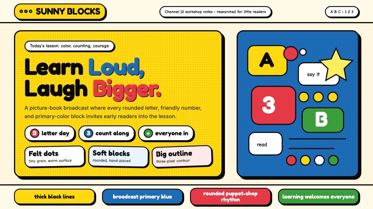
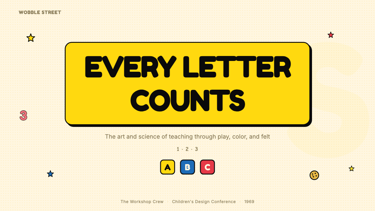
For presentation slides, the Sesame Street aesthetic works particularly well for educational, onboarding, and explainer contexts — anywhere the primary challenge is making unfamiliar material feel non-threatening. A cover slide in this mode should anchor on one dominant warm primary color — golden yellow or a warm red — set against an off-white or cream background, with a large rounded display letterform for the title. Body slides should use chunky, slightly rounded section headings to distinguish hierarchy, and any illustrative elements — icons, diagrams, character figures — should carry visible hand-drawn or imperfect qualities rather than crisp vector polish. Data slides benefit from the system's color logic: use warm, saturated fills for bars and segments rather than muted corporate palettes, and surround numerical elements with enough white space that they read as friendly rather than clinical.对于演示文稿,《芝麻街》美学在教育、引导和解说类场景中尤为适用——在任何主要挑战是让陌生内容感觉毫无威胁的地方。此类封面页应以一种主导暖色原色为锚——金黄色或暖红色——置于米白或奶油色背景上,标题使用大号圆润展示字形。正文页应使用厚实、略带圆润感的节标题来区分层级,任何插图元素——图标、图表、角色图形——都应带有可见的手绘或不完美品质,而非清晰的矢量精抛光。数据页受益于这套系统的色彩逻辑:为柱状图与饼图扇区使用温暖、饱和的填充色,而非沉闷的企业配色,并在数值元素周围保留足够的留白,使其读来友善而非冷峻。
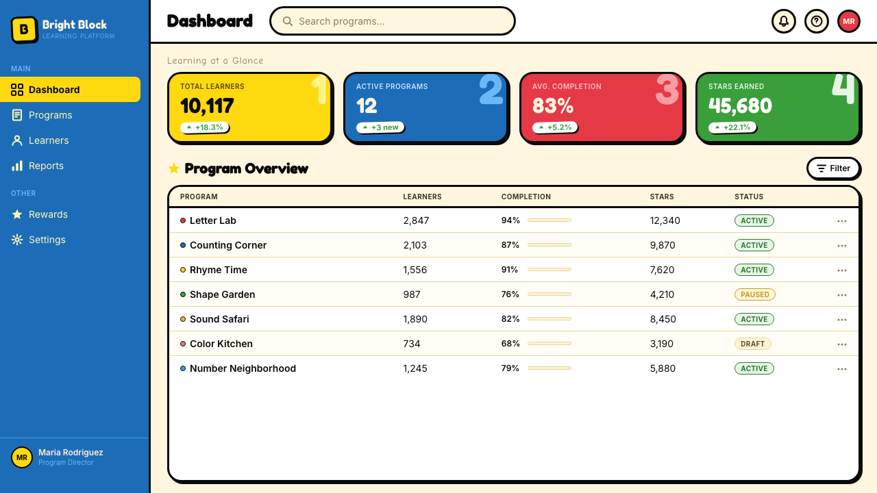
For web interfaces, this visual language is most appropriate for products aimed at learners, children, community platforms, or any context where reducing intimidation and building trust are primary UX goals. On a dashboard or product page, the approach translates to: rounded corners pushed to near-circular on interactive elements; thick, visible borders on cards and inputs rather than hairlines; icon sets that feel hand-drawn or illustrated rather than geometric and precise; and background colors in warm off-white or cream rather than cool gray. Avoid the trap of deploying the full palette simultaneously — one dominant warm primary as the brand color, supported by neutral ground tones, is more coherent than trying to work all three primaries into the interface at once.对于网页界面,这套视觉语言最适合面向学习者、儿童、社区平台,或任何降低使用门槛、建立信任是主要用户体验目标的场景。在仪表板或产品页面上,这种方式转化为:交互元素上的圆角推至接近圆形;卡片与输入框使用粗而可见的边框,而非发丝线;图标组感觉手绘或插画化,而非几何精确;背景颜色使用温暖的米白或奶油色,而非冷灰色。避免同时部署完整色板的陷阱——以一种主导暖色原色作为品牌色,以中性底调作支撑,比试图将三种原色同时融入界面更为连贯。
For editorial and marketing work, the Sesame Street aesthetic can be highly effective for campaigns around education, community, early childhood, social programs, or any initiative that needs to communicate warmth and accessibility without sacrificing visual impact. Posters and social cards in this mode work best with a single dominant saturated color as background, white or cream lettering in a rounded display face, and a hand-drawn or illustrated supporting element. The imperfection principle is especially valuable in editorial contexts: deliberately rough textures, uneven ink fills, or hand-lettered callouts communicate authenticity and community investment in a way that polished vector work cannot.对于编辑与营销内容,《芝麻街》美学对于围绕教育、社区、儿童早期发展、社会项目,或任何需要传递温暖与可及性却不牺牲视觉冲击力的倡议类活动而言,可以非常有效。此类海报与社交卡片最适合以单一主导饱和色作背景,以圆润展示字体的白色或奶油色文字呈现内容,并以手绘或插画化的辅助元素配合。不完美原则在编辑语境中尤具价值:刻意粗粝的质感、不均匀的墨水填充,或手写体标注语,能以精制矢量作品无法传递的方式传达真实感与社区投入感。
The most common mistake when applying this visual language is conflating it with generic children's design — using it in contexts where it signals immaturity or unsophistication rather than warmth and accessibility. The distinction lies in execution: Sesame Street's visual system is empirically calibrated and deeply intentional, which means that the roughness is controlled, the colors are specific, and the imperfections are deliberate. Cheap imitations use garish colors without the warm saturation, blunt letterforms without the rounded care, and scattered layouts without the underlying legibility logic. A second common mistake is over-illustrating — loading every surface with characters and imagery when the actual power of the system comes from strategic deployment of warmth within clear compositional structure.应用这套视觉语言时最常见的错误,是将其与泛泛的儿童设计混淆——在那些它传达的是不成熟或缺乏精致感而非温暖与可及性的语境中使用它。区别在于执行:《芝麻街》的视觉系统是经过实证校准、高度刻意为之的,这意味着粗糙感是受控的,颜色是特定的,不完美是故意的。廉价模仿品使用刺眼颜色却没有温暖的饱和感,使用生硬字形却没有圆润的用心,使用散乱布局却没有底层的清晰度逻辑。第二个常见错误是过度插画化——在每一个表面都堆满角色与图像,而这套系统真正的力量来自于在清晰构图结构中对温暖感的策略性部署。
See the Sesame Street (1969) design system查看 Sesame Street (1969) 完整设计系统
Sesame Street (1969) — FAQSesame Street (1969) · 常见问题
Is the Sesame Street visual style appropriate for adult audiences, or does it read as childish?《芝麻街》视觉风格适合成年受众吗,还是会显得幼稚?
It depends entirely on execution and context. The underlying principles — warm saturated color, rounded forms, tactile texture, legibility-first hierarchy — are not inherently childish; they become childish when applied without sophistication or in contexts where the audience expects a different register. Used with intention in adult educational platforms, community organizations, social campaigns, or early-stage consumer products that want to signal approachability over authority, the style communicates warmth and trust effectively. The key is calibrating the degree of imperfection and illustration density: a light touch that retains the color warmth and roundness while reducing the overt hand-drawn wobble will read as friendly to adults without tipping into juvenile.这完全取决于执行方式与语境。其底层原则——温暖饱和的色彩、圆润的形态、触感质感、以清晰度优先的层级——并非天生幼稚;它们之所以显得幼稚,是因为被应用于受众期待不同表达方式的场合,或缺乏精致的执行。在成人教育平台、社区组织、社会倡议,或那些希望传递亲近感而非权威感的早期消费产品中有意为之地使用,这种风格能有效传递温暖与信任。关键在于校准不完美的程度与插画的密度:保留色彩温度与圆润感、同时减少明显手绘摇摆感的轻盈处理,将对成年人读来友善,而不至于滑入幼稚感。
How does Sesame Street's visual approach differ from other children's animation styles of the same era?《芝麻街》的视觉方式与同时代其他儿童动画风格有何不同?
The most important distinction is intentionality. Most children's animation of the 1960s and 1970s was designed primarily for entertainment, with visual choices made by artists working within commercial production constraints. Sesame Street's visual language was designed to teach — which meant every choice had to be justified against research findings about child cognition, attention, and learning. The result is a system that is simultaneously more constrained and more varied than typical children's animation: more constrained in its palette, legibility rules, and character design principles; more varied in its embrace of different animation styles across segments. The show also uniquely combined live action, puppetry, and multiple animation approaches within a single episode — a pluralism that most children's television avoided in favor of consistent style.最重要的区别在于意图性。1960至70年代的大多数儿童动画主要是为娱乐而设计的,视觉选择由在商业制作约束下工作的艺术家做出。《芝麻街》的视觉语言是为教学而设计的——这意味着每一个选择都必须有儿童认知、注意力与学习的研究发现作为依据。结果是一套比典型儿童动画既更受约束又更多元化的系统:在色板、清晰度规则与角色设计原则上更受约束;在跨段落拥抱不同动画风格上更多元化。这个节目还独特地在单集内融合了实景、木偶和多种动画方式——一种大多数儿童电视为保持风格一致性而刻意回避的多元主义。
What happened to the visual identity of Sesame Street after the Henson era ended in 1990?1990年亨森时代结束后,《芝麻街》的视觉身份发生了什么变化?
The post-Henson era brought gradual changes. Through the 1990s and early 2000s, the show maintained most of its foundational visual principles — saturated primaries, rounded forms, puppet-centered warmth — while the animation styles in inserts became more polished and computer-influenced. The 2016 move to HBO, followed by a simultaneous PBS Kids broadcast, marked a more significant visual update: backgrounds became somewhat slicker, animation segments adopted contemporary digital aesthetics, and some of the productive roughness of the original was smoothed away. The core character designs have remained largely faithful to the Henson-era originals, which means the emotional anchor of the visual system — the characters themselves — has been preserved even as the surrounding design language has evolved.后亨森时代带来了渐进式变化。整个1990年代至2000年代初,节目维持了其大多数基础视觉原则——饱和原色、圆润形态、以木偶为中心的温度——同时插入段落的动画风格变得更为精致,并受到计算机技术的影响。2016年迁往HBO频道(同时在PBS儿童频道播出)标志着更为显著的视觉更新:背景变得略微光滑,动画段落采用了当代数字美学,原版富有成效的粗粝感有所磨平。核心角色设计大体上保持了对亨森时代原版的忠实,这意味着视觉系统的情感锚点——角色本身——即使在周围设计语言持续演进的过程中也得以保留。
Can the research-driven design methodology of Sesame Street be applied to contemporary digital product design?《芝麻街》以研究为驱动的设计方法论,能够应用于当代数字产品设计吗?
The methodology is in many ways the most durable and transferable aspect of the Sesame Street legacy. The core principle — that design decisions affecting communication and cognition should be tested against the responses of actual users before being finalized — is now standard practice in product design under different names: usability testing, A/B testing, user research, iterative prototyping. What made Sesame Street's approach distinctive was the depth of the research collaboration (ongoing partnerships with academic developmental psychologists, not one-time focus groups) and the rigor with which research findings were translated into specific design revisions. The lesson for contemporary designers is not to replicate the visual output but to take seriously the idea that no design decision about how information is presented should be made on the basis of aesthetic preference alone.这套方法论在许多方面是《芝麻街》遗产中最持久、最具可移植性的方面。核心原则——影响传播与认知的设计决策应在最终确定前针对真实用户的反应进行测试——如今已以不同名称成为产品设计的标准实践:可用性测试、A/B测试、用户研究、迭代原型。使《芝麻街》的方式与众不同的,是研究协作的深度(与学术发展心理学家的持续合作伙伴关系,而非一次性焦点小组),以及将研究发现转化为具体设计修订的严格程度。对当代设计师的启示,不是复制其视觉输出,而是认真对待一个想法:没有任何关于信息呈现方式的设计决策,应仅仅基于美学偏好做出。
Is Sesame Street's palette too culturally specific to work in international or non-American design contexts?《芝麻街》的色板是否过于文化特定,难以在国际或非美国设计语境中使用?
The palette itself — saturated warm primaries — is not culturally specific; primary colors read as warm, energetic, and approachable across most cultural contexts, and the warmth of handcraft and textile materials is broadly universal rather than specifically American. What is culturally specific is the set of associations that the Sesame Street brand carries for audiences who grew up watching it — the nostalgia, the specific character associations, the emotional memory. If you are designing for an audience with those associations, you have a strong positive asset. If you are designing for an audience without them, you are simply working with a warm, rounded, handcraft-inflected visual language that communicates accessibility and warmth, which translates well across cultural contexts. The show itself was adapted for dozens of countries — Takalani Sesame in South Africa, Alam Simsim in Egypt, Sesamstrasse in Germany — each with locally designed characters that preserved the visual system while adapting the cultural content.色板本身——饱和的暖色原色——并不具有文化特定性;原色在大多数文化语境中都被解读为温暖、充满活力且易于接近,手工感与织物材质的温度也是跨文化的普遍语言,而非特定于美国。具有文化特定性的,是《芝麻街》品牌对那些在收看中长大的受众所携带的联想体系——怀旧感、特定的角色联想、情感记忆。如果你为拥有这些联想的受众设计,你拥有一项强大的正向资产。如果你为没有这些联想的受众设计,你只是在运用一套温暖、圆润、带有手工感的视觉语言——这套语言传递可及性与温度的能力,在跨文化语境中具有良好的适应性。节目本身已在数十个国家推出本地化版本——南非的《Takalani Sesame》、埃及的《Alam Simsim》、德国的《Sesamstrasse》——每个版本都有本地设计的角色,在保留视觉系统的同时对文化内容进行了本土化适配。
Related design styles相关设计风格
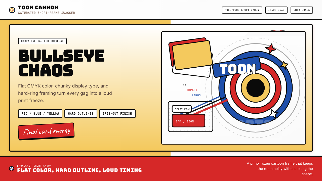 Looney Tunes (Warner Bros.)Pure cartoon chaos. Bull's-eye rings, Bungee type, and red-blue-yellow blocks.纯卡通混乱。牛眼环、粗壮标题字与红蓝黄块面。
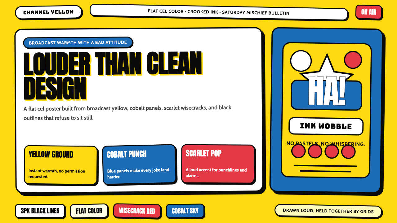 The Simpsons YellowCartoon warmth misbehaves. Yellow ground, cobalt panels, thick wobbly black l…卡通暖意在捣乱:黄色底、钴蓝面板和粗黑抖线。
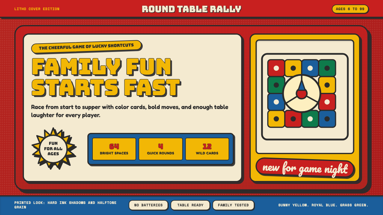 Vintage Board Game BoxShelf appeal shouts. Fire-engine red, Bungee lockups, yellow bursts, and ink…货架感在喊:消防红底、Bungee 标题、黄爆炸章与硬黑影。
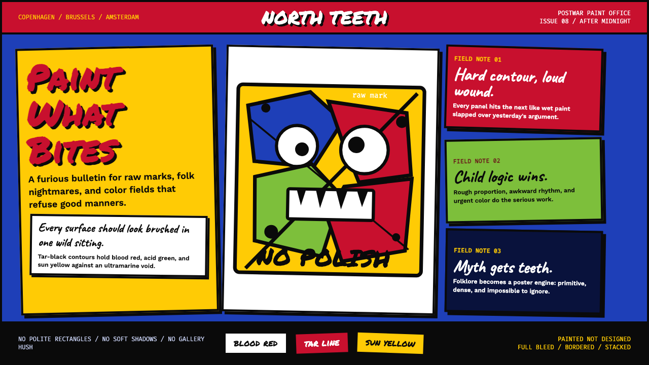 CoBrA (Asger Jorn, 1948)Paint refuses polish. Ultramarine ground, blood red slabs, and marker type th…拒绝精致。群青底、血红块与手写字在黑线中冲撞。
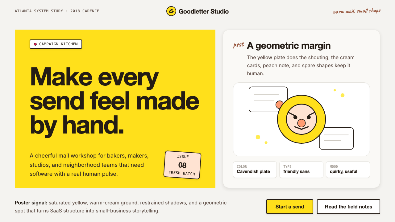 Mailchimp Freddie-YellowFriendly software, handmade. Cavendish yellow blocks and warm geometric masco…友善而手作。卡文迪许黄块与几何吉祥物撑起温暖版面。
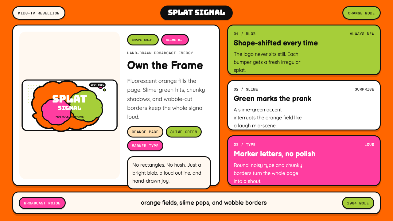 Nickelodeon Orange Splat (1984)Kids own the screen. Orange fields, slime-green pops, and wobble borders do t…孩子掌控屏幕。橙底、史莱姆绿点缀和歪斜边框一起喊话。