What is Mailchimp Freddie-Yellow?什么是 Mailchimp Freddie-Yellow?
Mailchimp turned email software into a beloved brand by pairing a winking cartoon monkey with a sun-drenched banana-yellow that made marketing feel like something a human being actually made.Mailchimp 用一只眨眼猴子和一抹阳光香蕉黄,让电子邮件软件变成了一个真实有温度的品牌。
Mailchimp Freddie-Yellow in briefMailchimp Freddie-Yellow 速览
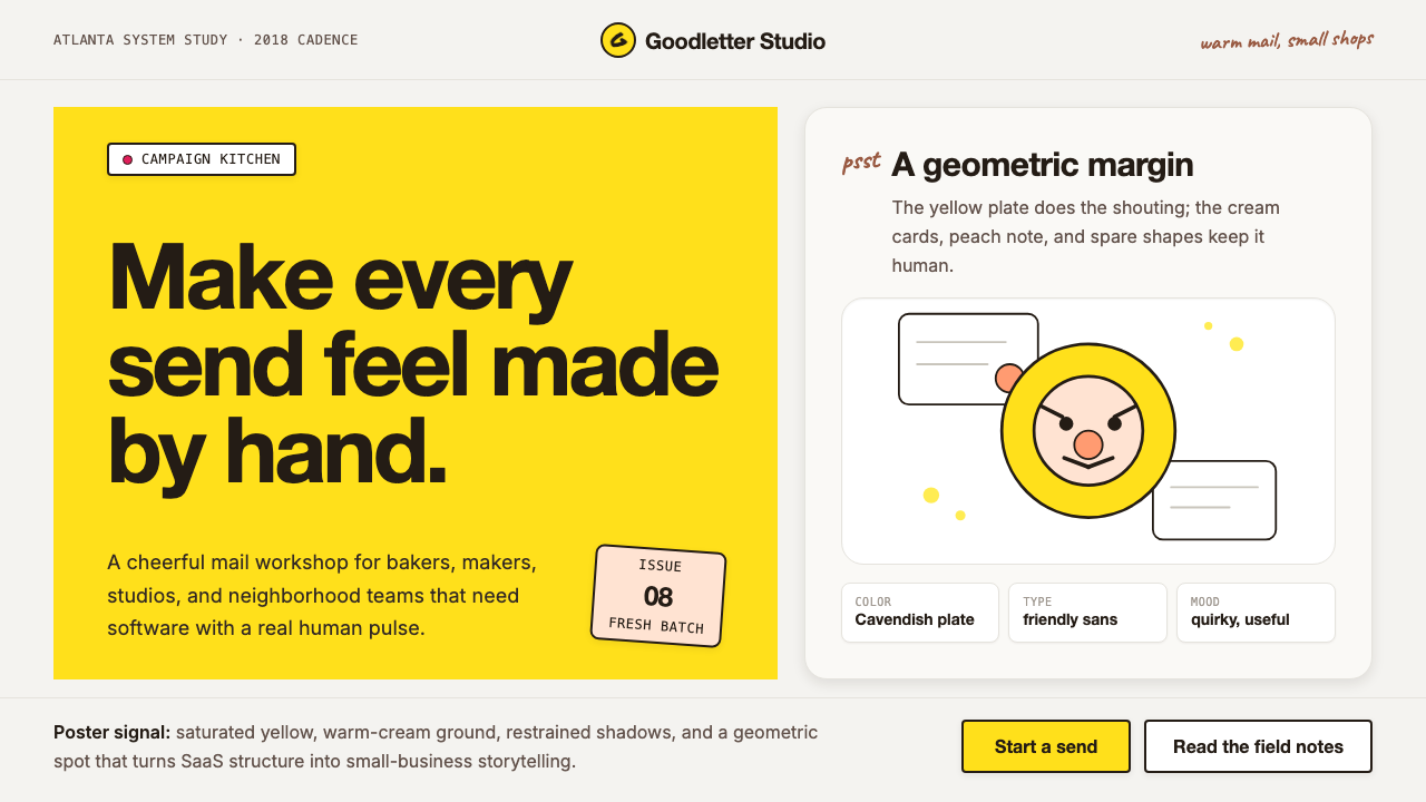
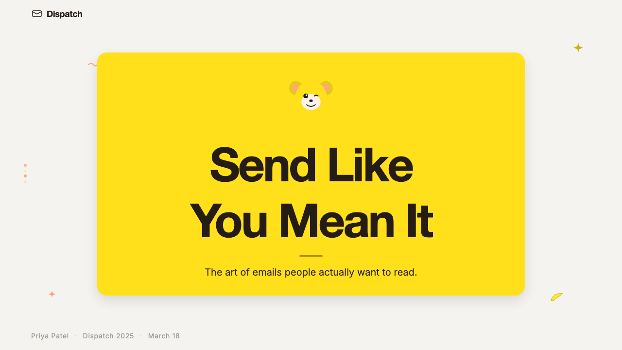
Mailchimp Freddie-Yellow is the visual identity system built around Mailchimp's email-marketing platform: a saturated Cavendish-yellow primary color, a warm cream background, hand-drawn illustration, and the cartoon-monkey mascot Freddie who appears throughout the interface and marketing material. Together these elements produce a tone that is simultaneously professional and approachable — the rare tech brand that feels as if it were designed by someone who has actually run a small business.Mailchimp Freddie-Yellow 是围绕 Mailchimp 邮件营销平台构建的视觉识别系统:饱和的 Cavendish 黄主色、温暖的奶油底色、手绘风插画,以及在界面与营销物料中无处不在的卡通猴子吉祥物 Freddie。这些元素共同营造出一种既专业又平易近人的气质——在科技品牌中极为罕见,仿佛这套界面真的是由一个亲历过小生意的人设计出来的。
The aesthetic sits at the intersection of editorial illustration, brand mascotry, and digital product design. It rejects both the cold minimalism of enterprise SaaS and the aggressive gradient-heavy look of fintech. Instead it draws on the warmth of mid-century American commercial art — bold flat shapes, friendly curves, ink-line character — and updates that sensibility for a web interface where clarity and delight must coexist on the same page.这套美学坐落于编辑插画、品牌吉祥物与数字产品设计的交叉点。它既不是企业级 SaaS 的冰冷极简,也不是金融科技产品惯用的强烈渐变风。它借鉴的是二十世纪中期美国商业插画的温度——大面积平色、友善的曲线、墨线勾勒的角色——并将这种感性更新为网页界面语言,让清晰与愉悦并存于同一页面。
What distinguishes this system from mere friendliness-as-decoration is its structural discipline. The yellow is not sprinkled; it anchors entire hero blocks. Freddie is not a logo dropped into a corner; he is an active participant — winking at form completion, offering a high-five at campaign launch. The cream background is not a safe default; it is a considered warm neutral that makes the yellow sing rather than glare. Every element has a job, and the cumulative effect is a brand that feels human without feeling amateurish.这套系统与单纯的「友好装饰」的根本区别,在于它的结构纪律。黄色不是点缀,而是整个主视觉区的锚点。Freddie 不是被贴进角落的 logo,而是一个主动参与的角色——在表单提交时向你眨眼,在活动上线时向你击掌。奶油色背景不是安全的缺省选择,而是经过计算的温暖中性,让黄色发光而不刺眼。每个元素都有明确的职责,叠加的效果是一个有人情味却不显业余的品牌。
See the Mailchimp Freddie-Yellow design system查看 Mailchimp Freddie-Yellow 完整设计系统
Where does Mailchimp Freddie-Yellow come from?Mailchimp Freddie-Yellow 从何而来?
Mailchimp was founded in 2001 in Atlanta, Georgia by Ben Chestnut and Dan Kurzius. Chestnut had been running a web-design agency when he noticed that his small-business clients spent an inordinate amount of time wrestling with email newsletters. The two built Mailchimp as a side project to solve that specific problem, and the informal, human-scale nature of that origin — a tool built by people for people like them — never fully left the brand's DNA. Atlanta, not San Francisco, shaped its sensibility: scrappier, warmer, more inclined toward wit than polish.Mailchimp 由 Ben Chestnut 和 Dan Kurzius 于 2001 年创立于美国乔治亚州亚特兰大。Chestnut 当时经营着一家网页设计代理公司,他注意到自己的小生意客户在处理电子邮件通讯时耗费了大量不必要的精力。两人将 Mailchimp 作为副项目开发出来,专门解决这个具体问题。这种起源的非正式性——由懂得小生意的人为小生意打造工具——从未真正离开品牌的基因。亚特兰大而非旧金山塑造了它的气质:更粗犷,更温暖,更倾向于机智而非光泽。
The mascot Freddie Von Chimpenheimer IV — Freddie for short — predates the canonical brand system by years. Chestnut originally sketched the character in the early days of the company as an internal joke, and the winking monkey gradually became the face customers saw in transactional emails and loading states. What began as an improvised bit of personality became the brand's most recognizable asset. Freddie's persistence through multiple redesigns illustrates a principle the Mailchimp team articulated explicitly: a brand built around a character rather than an abstraction is harder to erase, because people form genuine affection for characters.吉祥物 Freddie Von Chimpenheimer IV(简称 Freddie)比系统化的品牌体系早出现好几年。Chestnut 最初在公司成立初期将这个角色作为内部玩笑草草画出,那只眨眼猴子逐渐成为客户在事务性邮件和加载界面上看到的面孔。起初只是一点即兴的个性表达,最终成为品牌最具辨识度的资产。Freddie 历经多次品牌重设计而长存不衰,印证了 Mailchimp 团队明确表述过的一个原则:围绕角色而非抽象符号建立的品牌更难被抹去,因为人们会对角色产生真实的情感。
The canonical brand refresh that established the visual system in its current cohesive form arrived in 2018, when Mailchimp worked with its internal creative team and external collaborators to systematize what had been an evolving, sometimes inconsistent collection of brand decisions. The 2018 system introduced the Cavendish-yellow name — chosen deliberately, a reference to the Cavendish banana variety, grounding the abstract brand color in something tangible and edible — along with a warm cream background as the default canvas, a new custom typeface built on geometric sans-serif forms, and a formalized illustration style drawing on the work of collaborators like Tom Froese, whose hand-drawn characters and vignettes of small-business life became the system's illustrative voice.确立当前完整视觉系统的品牌焕新发生在 2018 年。Mailchimp 与内部创意团队及外部合作者一起,将此前演化中偶尔不一致的品牌决策系统化。2018 年的体系引入了「Cavendish 黄」这个名称——有意为之,源自 Cavendish 香蕉品种,将抽象的品牌色彩锚定于某种具体可感的事物——同时确立了温暖奶油色作为默认画布、一套建立在几何无衬线字形上的定制字体,以及由 Tom Froese 等手绘插画家主导的正式插图风格。Froese 笔下的手绘角色与小生意生活场景成为整套体系的插画声音。
Intuit acquired Mailchimp in 2021, and the brand has since been integrated into a larger suite of small-business financial tools. The visual identity has been maintained largely intact, though the product context has broadened. For designers, the canonical reference point remains the 2018 system: the moment when every element — color, type, illustration, mascot, tone of voice — was deliberately unified into something teachable and replicable. That system became a case study in how a SaaS company could build brand equity not through sleekness or data-driven minimalism but through personality and craft.Intuit 于 2021 年收购 Mailchimp,品牌此后被整合进更广泛的小生意财务工具矩阵。视觉识别在大体上保持完整,尽管产品语境有所拓宽。对设计师而言,规范参考点仍是 2018 年的体系:那是色彩、字体、插画、吉祥物与品牌语调的每个元素被刻意统一为可教授、可复制系统的时刻。那套体系成为一个经典案例,说明一家 SaaS 公司可以不依靠流线型外观或数据驱动的极简主义,而是凭借个性与手作感来积累品牌资产。
What defines the Mailchimp Freddie-Yellow look?Mailchimp Freddie-Yellow 的视觉特征是什么?
Color: Cavendish Yellow色彩:Cavendish 黄
The defining color is a fully saturated, warm banana yellow named after the Cavendish banana — bright enough to command attention at full-page scale, warm enough to read as cheerful rather than alarming. It is used in large fields: hero backgrounds, button fills, highlight bands. The yellow is never diluted into a pastel and never darkened toward ochre; its job is to be unambiguously itself. Against the warm cream background that the system pairs it with, the yellow glows rather than vibrates, because both colors share the same warm undertone.这套体系的核心色是一种完全饱和的温暖香蕉黄,以 Cavendish 香蕉命名——饱和到足以在整页尺度上统领视线,同时又足够温暖,读来令人愉悦而非惊慌。它被用于大面积色块:主视觉背景、按钮填充、高亮色带。这抹黄从不被稀释为粉嫩色调,也不被加深为赭石色;它的职责就是毫不含糊地做它自己。与体系配套的温暖奶油色底面相遇时,黄色发光而非振动,因为两种颜色共享同一暖色调。
Background: Warm Cream Canvas底色:温暖奶油画布
The default background is not white but a warm off-white — cream with a slight yellow cast — that functions as a chromatic bridge between the dominant yellow and the body text black. This choice is rarely noticed by users but is responsible for much of the system's perceived warmth. Pure white would make the yellow feel loud; the cream absorbs it. The cream background also references the tactile warmth of uncoated paper, aligning the digital system with the handmade, printed-matter aesthetic that the illustration style reinforces.默认背景不是纯白,而是带有轻微黄调的温暖暖白色——奶油色——它在主色黄与正文黑之间充当色彩桥梁。用户很少有意识地注意到这个选择,但它正是这套体系温暖感的重要来源。纯白底面会让黄色显得喧嚣;奶油色将其吸收。奶油色背景还唤起了非涂布纸的触感温度,让数字体系与插画风格所强化的手作、印刷物美学在视觉上保持一致。
Illustration: Hand-Drawn Warmth插画:手绘温度
The illustration style is characterized by visible ink line work, imperfect edges, and subject matter drawn from the everyday life of small-business owners — storefronts, coffee cups, potted plants, shipping boxes, small crowds of recognizably human figures. The style deliberately preserves evidence of the human hand: slight irregularities in line weight, textures that suggest paper grain, color fills that stop just inside the outline. This is not the smooth vector illustration common to most SaaS platforms; it is illustration that has been touched.这套插画风格以可见的墨线笔触、不完美的边缘以及取材于小生意主日常生活的主题为特征——店面、咖啡杯、盆栽、快递箱、一群辨识度高的人物。风格刻意保留了人手的痕迹:线条粗细的细微不规则、暗示纸张纹理的质感、略收于轮廓线内的色块填充。这不是大多数 SaaS 平台惯用的光滑矢量插画;这是被触碰过的插画。
Mascot: Freddie as Active Participant吉祥物:作为主动参与者的 Freddie
Freddie is not a static logo mark but a character deployed contextually throughout the product experience. He winks at successful form submissions, offers an animated fist-bump when a campaign goes live, and peers out from corners in moments of user delight. This contextual deployment is what distinguishes a brand mascot from a logo: the character responds to events, which creates the illusion of relationship. Freddie is always Freddie — the same rounded face, the same cap — but his expression and gesture change to match what the user has just accomplished.Freddie 不是一个静态的 logo 标志,而是一个在产品体验全程随情境出现的角色。他在表单提交成功时向用户眨眼,在活动上线时献上动态击拳,在用户愉悦的时刻从角落探出头来。这种情境化部署正是品牌吉祥物与 logo 的根本区别:这个角色会对事件做出回应,创造出一种关系的幻觉。Freddie 永远是 Freddie——同样圆润的脸型,同样的帽子——但他的表情和手势会随着用户刚刚完成的事情而改变。
Typography: Geometric Sans with Personality字体排印:带有个性的几何无衬线
The type system is built on a custom geometric sans-serif with letterforms that are clean and modern but not cold — the terminals and proportions carry enough optical warmth to harmonize with the illustration style rather than clash with it. Headlines are set large and confident, with ample negative space. Body text is kept at a comfortable reading weight, never compressed or condensed in ways that would undercut readability. The type system avoids the hyper-refined, micro-contrast letterforms common to luxury or finance brands; it is built for legibility and friendliness at the same time.字体系统建立在一套定制几何无衬线字形上,字符干净现代而不冷硬——字形的末端细节与比例保持足够的视觉温度,与插画风格和谐共存而不产生冲突。标题字号大而自信,配以充足的负空间。正文保持舒适的阅读字重,从不以压缩或窄体方式损害可读性。这套字体体系避开了奢侈品或金融品牌惯用的极度精炼、微对比字形;它同时为易读性和友善感而设计。
Tone: Witty Without Trying Too Hard语调:机智而不过度用力
The visual system is inseparable from a verbal tone that is conversational, occasionally self-deprecating, and comfortable with the absurdity of marketing a marketing tool. Error messages are humanized; confirmation copy is celebratory without being sycophantic. The illustrations reinforce this — a small business owner depicted mid-coffee-sip is more relatable than a stock-photo professional in a glass office. The overall effect is a brand that feels like it has a sense of humor about itself, which is a difficult thing to sustain across a complex product without tipping into forced quirk.这套视觉系统与一种言语语调不可分割:对话式的、偶尔自嘲的,并且能够坦然面对「用营销工具来营销营销工具」这件事本身的荒诞。错误提示被人性化;确认文案庆祝而不谄媚。插画强化了这一点——一个正在喝咖啡的小生意主,比站在玻璃办公室里的商业摄影模特更有共鸣感。整体效果是一个能够自我调侃的品牌,而在一个复杂产品中长期保持这种状态而不滑向刻意的怪异,是非常困难的。
Layout: Generous Space, Clear Hierarchy版式:宽裕的空间,清晰的层级
Layouts within the Mailchimp system are characterized by generous breathing room around text and illustration elements, a strong left-aligned reading axis, and a two- or three-level typographic hierarchy that is resolved through size and weight rather than color variation. The yellow is reserved for calls to action and featured elements; it does not appear in every section. Content blocks alternate between cream-background sections and yellow-background hero panels, creating rhythm without requiring complex grid acrobatics.Mailchimp 体系中的版式以文字和插画元素周围宽裕的呼吸空间为特征,阅读轴线强烈左对齐,两到三级的字体层级通过大小和字重解决,而非依赖色彩变化。黄色被保留给行动号召和特色元素,并非出现在每个区域。内容区块在奶油背景区段与黄色背景主视觉面板之间交替,形成节奏感,无需复杂的网格技巧。
See the Mailchimp Freddie-Yellow design system查看 Mailchimp Freddie-Yellow 完整设计系统
Who shaped Mailchimp Freddie-Yellow?谁塑造了 Mailchimp Freddie-Yellow?
Co-founder and longtime CEO of Mailchimp, Chestnut was the original author of the brand's personality. His background as a web designer rather than a venture-backed founder shaped the company's preference for craftsmanship over scale optics. He drew early versions of Freddie himself, setting the precedent that brand identity at Mailchimp was something built by the people running the product, not outsourced to consultants. His insistence on maintaining Atlanta roots rather than relocating to Silicon Valley reinforced the brand's positioning as an outsider making tools for outsiders.Mailchimp 联合创始人兼长期 CEO,Chestnut 是这个品牌个性的最初塑造者。他的网页设计师背景而非风投资金背景,使公司更倾向于工艺感而非规模外观。他亲手画出了早期版本的 Freddie,确立了 Mailchimp 品牌识别由产品经营者亲自构建而非外包给顾问公司的先例。他坚持将公司根植于亚特兰大而非迁往硅谷,也强化了品牌「由局外人为局外人打造工具」的定位。
As head of brand and content at Mailchimp for many years, DiCristina was the steward of the Freddie-Yellow system through its maturation. He championed the idea that Mailchimp's marketing should itself demonstrate the quality of creative work the platform enables — publishing original editorial content, commissioning independent filmmakers, and treating the brand's creative output as worthy of the same attention as the product. Under his guidance, Mailchimp became as well known for its branded content strategy as for its visual identity.DiCristina 长期担任 Mailchimp 品牌与内容负责人,是 Freddie-Yellow 体系走向成熟过程中的守护者。他倡导 Mailchimp 的营销内容本身应当展示这一平台所赋能的创意工作质量——发布原创编辑内容、委托独立电影人制作内容,将品牌创意产出视为与产品本身同等值得认真对待的事物。在他的主导下,Mailchimp 因其品牌内容战略与视觉识别同样广为人知。
The type designer behind Mailchimp's custom typeface — a geometric sans-serif developed to give the brand a typographic voice that was distinctly its own rather than borrowed from a widely licensed library. Jenkins brought a craftsman's approach to the letterforms, building in proportions and details that harmonize with the organic warmth of the illustration system without sacrificing the legibility required for an interface that surfaces dense information. The custom type is one of the system's most quietly important elements: it prevents the brand from feeling like a theme applied on top of someone else's design.Mailchimp 定制字体背后的字体设计师——一套几何无衬线字体,目的是让品牌拥有独属于自己的排印声音,而非借用广泛授权的字体库。Jenkins 以工匠的方式处理字形细节,在比例和细节上构建出与插画体系的有机温度相协调的特质,同时不牺牲在呈现大量信息的界面上所必需的易读性。这套定制字体是整个体系中最安静却最重要的元素之一:它防止品牌感觉像是套在别人设计上的一个主题皮肤。
Among the illustrators whose work shaped the Mailchimp illustration voice, Froese contributed character work and scenes depicting small-business life with the warmth and slight imperfection that became signature to the system. His approach — figures with expressive but not cartoonish faces, environments rendered with just enough detail to feel real — helped define the tonal sweet spot between illustration and editorial art. The Mailchimp illustration style is not a house style developed by a single hand; it is a defined set of qualities that multiple collaborators were invited to work within, and Froese's output helped establish what those qualities felt like in practice.在塑造 Mailchimp 插画声音的插画家中,Froese 贡献了描绘小生意生活场景的角色作品,带有成为体系标志的温度与轻微不完美感。他的方式——表情丰富却不卡通化的人物,细节刚好足以让环境显得真实的场景——帮助定义了插画与编辑艺术之间那个调性上的甜蜜点。Mailchimp 的插画风格不是由单一手笔发展出来的内部风格;而是一套邀请多位合作者在其中创作的明确品质标准,而 Froese 的产出帮助确立了这些品质在实践中的感觉。
How do you use Mailchimp Freddie-Yellow today?今天怎么用 Mailchimp Freddie-Yellow?
Applying Mailchimp Freddie-Yellow correctly requires understanding the system's underlying logic: the yellow is an anchor, not a garnish. Presentations that use this style effectively begin with a cover where the entire background field is Cavendish yellow, the title sits in large, dark letterforms, and a single illustrative element — a winking character, a relevant object drawn in the hand-rendered style — occupies one corner or edge. The yellow cover is not a color choice; it is a statement of confidence. Cream-background content slides follow, with the yellow reappearing only on interactive-style elements: data callouts, highlighted findings, section openers.正确应用 Mailchimp Freddie-Yellow 需要理解这套体系的底层逻辑:黄色是锚点,不是点缀。有效运用这种风格的演示文稿,应以一张整个背景面都是 Cavendish 黄的封面开始,标题以大号深色字体落于其上,单个插画元素——眨眼角色或一件以手绘风格描绘的相关物品——占据某个角落或边缘。黄色封面不是一个色彩选择;它是一种自信的表态。其后跟随奶油底色的内容页,黄色只重新出现在互动感元素上:数据标注、高亮发现、章节开头。
Content slides in this system work best with clear two-level hierarchy: a large, weighted headline followed by body text at a comfortable reading size, separated by generous space. Data slides benefit from treating charts and graphs as illustrations in themselves — bar charts with soft rounded tops, muted-but-warm secondary palette for non-featured data series, feature series in Cavendish yellow to draw the eye immediately to the key metric. Avoid cold charting defaults like stark gray or pure blue; they break the warmth. Every slide should feel as if it was laid out by a person who cares about the information, not generated by a template engine.这套体系中的内容页最适合清晰的两级层级:大号有分量的标题,加上舒适阅读字号的正文,以宽裕空间分隔。数据页受益于将图表本身视为插画对象——柱状图顶部带有柔和圆角,非特色数据系列采用低饱和但温暖的辅助色,特色数据系列以 Cavendish 黄呈现,立即将视线引向关键指标。避免冰冷的图表默认设置,如纯灰或纯蓝;它们会破坏整体温度。每张幻灯片都应该像是一个关心这些信息的人手动排出来的,而不是由模板引擎生成的。
For web interfaces and dashboards, the system translates well to any surface where approachability and trust must coexist. Navigation and header areas work well with the cream background and dark type; reserve yellow for primary calls to action and key status indicators. Pricing pages benefit from using yellow as the highlight tier background — the featured plan sits in a yellow card while others remain on cream, instantly directing attention without requiring additional badge or label decoration. Form design should favor border-defined fields over ghost inputs, and confirmation states should include a Freddie-style celebratory moment — an animation, an illustrated flourish — that rewards the user for completing a task.对于网页界面和仪表板,这套体系在任何需要平易近人与信任感共存的场景中都有良好的适配性。导航区和顶部区域适合采用奶油底色配深色文字;将黄色保留给主要行动号召和关键状态指示符。定价页面受益于以黄色作为高亮套餐的背景——特色方案坐落在黄色卡片上,其他选项保持奶油色,无需额外徽章或标签即可立即引导注意力。表单设计应偏向有边框输入框而非幽灵输入框,确认状态应包含 Freddie 风格的庆祝时刻——动画、插画花絮——奖励用户完成了一项任务。
For editorial layouts and marketing materials, this system suits content that aims to be informative and enjoyable simultaneously. A long-form article in this style uses a wide opening image in the illustration style to set emotional tone, followed by a narrow measure of body text with generous margins for pull-quotes. Section breaks are marked by small illustrated vignettes rather than decorative lines, and the overall page rhythm alternates between reading density and visual breath. Marketing pages work with the system's poster sensibility: a bold yellow hero section makes an immediate impression, followed by cream sections that build the case, returning to yellow for the final call-to-action panel. The tone throughout should remain direct and human — the copy and the visual system must agree.对于编辑版式和营销材料,这套体系适合同时追求信息性与愉悦感的内容。这种风格下的长篇文章用一张插画风格的宽幅开场图设定情感基调,其后是窄行宽的正文,配合宽裕的留白容纳引用语。章节分隔用小型插画小品标记,而非装饰性线条,整体页面节奏在阅读密度与视觉呼吸之间交替。营销页面以海报感运用这套体系:大胆的黄色主视觉区域留下即时印象,其后奶油色区域逐步建立论点,最终在黄色行动号召面板上收尾。全程语调应保持直接而有人情味——文案与视觉系统必须保持一致。
The most common mistake in applying this style is treating the yellow as a general accent color and using it throughout at small scale — yellow badges, yellow borders, yellow underlines — rather than deploying it in the large fields where it works. A second common error is pairing the system with cold, clinical illustration or photography: any imagery that reads as hyper-polished, stock-photo professional, or technically rendered immediately undermines the hand-made warmth the system depends on. A third trap is adding complexity where simplicity is the point: the Mailchimp visual language is generous with space and restrained with decoration, and crowding elements together or adding visual texture behind illustration defeats the system's fundamental character.应用这套风格最常见的错误,是将黄色当作通用强调色大量用于小尺度元素——黄色徽章、黄色边框、黄色下划线——而非在它真正有效的大面积色块中部署。第二个常见错误是将这套体系与冷淡、精确的插画或摄影搭配:任何看起来过度精致、商业摄影感或技术渲染感的图像,都会立即破坏这套体系所依赖的手作温度。第三个陷阱是在简洁才是核心的地方添加复杂性:Mailchimp 视觉语言对空间慷慨,对装饰克制,将元素挤压在一起或在插画后方添加视觉纹理,都会削弱这套体系的根本性格。
See the Mailchimp Freddie-Yellow design system查看 Mailchimp Freddie-Yellow 完整设计系统
Mailchimp Freddie-Yellow — FAQMailchimp Freddie-Yellow · 常见问题
Can the Freddie-Yellow system work for brands that have no mascot?Freddie-Yellow 体系是否可以在没有吉祥物的品牌中使用?
Yes, but Freddie's absence changes the system significantly. The mascot is what provides the brand's most intimate human connection — the sense that someone is on the other side of the screen, reacting to what you do. Without a mascot, the Mailchimp system becomes a strong illustration-forward color story: Cavendish yellow plus cream background plus hand-drawn imagery. That combination is still warm and distinctive, but it loses the contextual responsiveness that makes the brand feel alive. To compensate, brands without a mascot should invest more heavily in the illustration quality and the verbal tone — those two elements carry more weight when there is no character to anchor the emotional register.可以,但 Freddie 的缺席会显著改变这套体系。吉祥物提供的是品牌最亲密的人际连接感——屏幕另一侧有人在回应你所做的事情。没有吉祥物,Mailchimp 体系变成了一个以插画为主导的强色彩叙事:Cavendish 黄加奶油底色加手绘图像。这个组合依然温暖而有辨识度,但失去了让品牌感觉「活着」的情境响应性。为了弥补,没有吉祥物的品牌应当在插画质量和言语语调上加大投入——当没有角色来锚定情感基调时,这两个元素需要承担更多重量。
Is this style appropriate for enterprise or B2B contexts?这种风格适合企业级或 B2B 场景吗?
It depends on the product positioning. Mailchimp itself is B2B — it sells to businesses — so the style is not inherently unsuited to business contexts. What it does poorly is project authority and gravitas in situations where buyers need to feel confident about large financial commitments or compliance risks. The friendly-quirky register that the system excels at communicates competence-with-approachability rather than enterprise-grade seriousness. For products sold to individual business owners, small teams, or creative professionals, the style is highly effective. For products sold to procurement committees, CFOs, or regulated industries, the warmth may undercut rather than support the sales case.这取决于产品定位。Mailchimp 本身是 B2B 产品——它向企业销售——所以这套风格本身并不天然不适合商业场景。它表现欠佳的是:在采购方需要对大额财务承诺或合规风险建立信心的情况下,传递权威感和庄重感。这套体系擅长的友善俏皮语域,传达的是「专业而平易近人」而非「企业级严肃性」。对于销售给个体生意主、小团队或创意专业人士的产品,这套风格高度有效。对于销售给采购委员会、首席财务官或受监管行业的产品,温暖感可能反而削弱而非支持销售论点。
How does Freddie-Yellow differ from other friendly-tech brand aesthetics like Slack or Duolingo?Freddie-Yellow 与 Slack、Duolingo 等其他友善科技品牌美学有何不同?
All three use color and personality to distinguish themselves from enterprise coldness, but they do so differently. Slack's visual identity is built around a multi-color palette and grid-based icon system — the friendliness is systematic and geometric rather than hand-drawn. Duolingo leans into animation and gamification cues, with Duo the owl deployed as an operationally consistent brand voice across social media as well as product. Mailchimp's distinction is specifically the hand-made illustration warmth — the ink lines, the visible human touch — combined with a single dominant color rather than a rainbow. The system feels like a small-business brand that grew up, not a tech brand that got permission to play.三者都用色彩和个性将自己与企业级冷漠区别开来,但方式各有不同。Slack 的视觉识别建立在多色调色板和基于网格的图标体系上——友善感是系统性和几何性的,而非手绘的。Duolingo 更倾向于动画和游戏化线索,猫头鹰 Duo 在社交媒体和产品中都被作为运营一致的品牌声音使用。Mailchimp 的区别在于手作插画的温度——墨线、可见的人手痕迹——结合单一主导色而非彩虹色板。这套体系感觉像是一个长大了的小生意品牌,而不是一个获准去玩耍的科技品牌。
What happens when the Cavendish yellow is used on dark backgrounds?Cavendish 黄在深色背景上使用时效果如何?
Yellow on black is a high-contrast, attention-demanding combination that works well for single-purpose contexts — a warning state, a featured highlight bar, a hero section meant to stop scrolling — but poorly as a sustained reading environment. The Mailchimp system is architected around light grounds for a reason: the yellow and cream combination creates warmth through similarity, while yellow on black creates energy through maximum contrast. A dark-mode variant of this system is possible, but it requires discipline: use the yellow sparingly as a bright accent against a very dark warm-gray or near-black background, keep body text in a warm off-white rather than pure white, and avoid deploying Freddie in yellow contexts that make him difficult to read. The character should always have sufficient contrast to be expressive.黄色配黑色是一种高对比度、强烈抓取注意力的组合,适用于单一目的场景——警告状态、特色高亮条、旨在打断滚动的主视觉区——但不适合作为持续阅读环境。Mailchimp 体系围绕浅色底面构建是有原因的:黄色与奶油色的组合通过相似性产生温度,而黄色配黑色则通过最大对比度产生能量。这套体系的深色模式变体是可能的,但需要纪律:将黄色作为明亮强调色谨慎使用,搭配非常深的暖灰色或近黑色背景;正文采用温暖的暖白色而非纯白;避免在让 Freddie 难以辨读的黄色语境中部署他。这个角色应该始终保有足够的对比度来传递表情。
How closely must an illustration style match the Mailchimp look to invoke this system?插画风格需要多贴近 Mailchimp 的样式才能调用这套体系?
The essential qualities are: visible hand-drawn line work (not smooth vector), subject matter grounded in human everyday activity, a color fill approach that stays within warm bounds, and figures with expressive but not hyperbolically cartoonish faces. The exact drawing style can vary considerably — the Mailchimp system itself employed multiple illustrators, each with a personal hand — as long as these qualities are present. What breaks the system is substituting polished vector iconography, photography, or three-dimensional rendering for flat hand-drawn illustration. The warmth the brand depends on is specifically an artifact of the illustration approach, not just the color palette, so protecting it requires consistency in how imagery is made, not merely what it depicts.核心品质是:可见的手绘线条(非光滑矢量)、以人类日常活动为主题、色块填充保持在温暖色域内,以及具有丰富表情但不夸张卡通化的人物形象。具体的绘画风格可以有相当大的差异——Mailchimp 体系本身就启用了多位各有个人手法的插画家——只要这些品质存在即可。破坏这套体系的是用精致矢量图标、摄影图片或三维渲染取代手绘插画。这个品牌所依赖的温度,特别是插画方式的产物,而不仅仅是色彩调色板,因此保护它需要在图像的制作方式上保持一致,而不仅仅是图像描绘的内容。
Related design styles相关设计风格
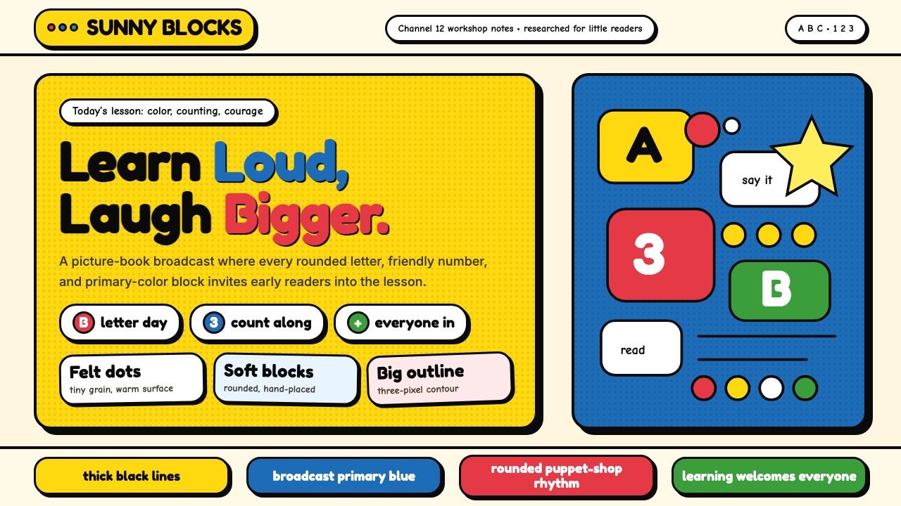 Sesame Street (1969)Learning feels handmade. Big yellow, monster blue, chunky outlines, and round…学习像手工做成:大黄与怪兽蓝、粗黑描边、圆胖字母一起发声。
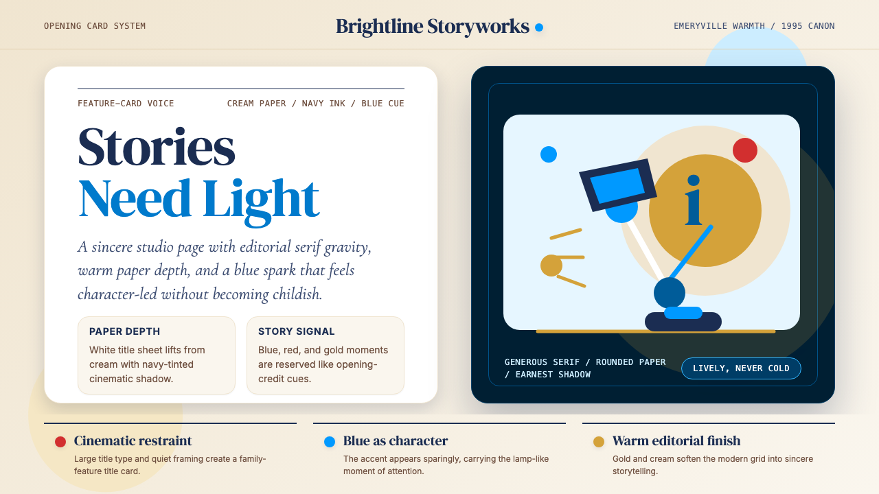 Pixar LuxoSincere story warmth. Cream paper, deep navy serif, and blue lamp geometry ho…真诚的故事温度:奶油纸、深海军蓝衬线与蓝色灯形稳住画面。
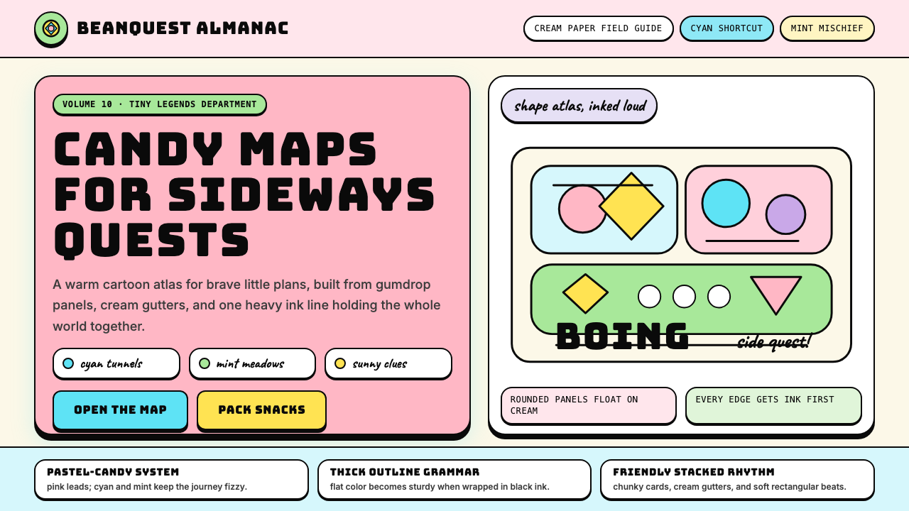 Adventure TimeCartoon warmth, inked loud. Cream gutters, candy pink, cyan and mint lock int…卡通温暖被粗线放大:奶油留白、糖粉、青色与薄荷全靠黑描边定型。
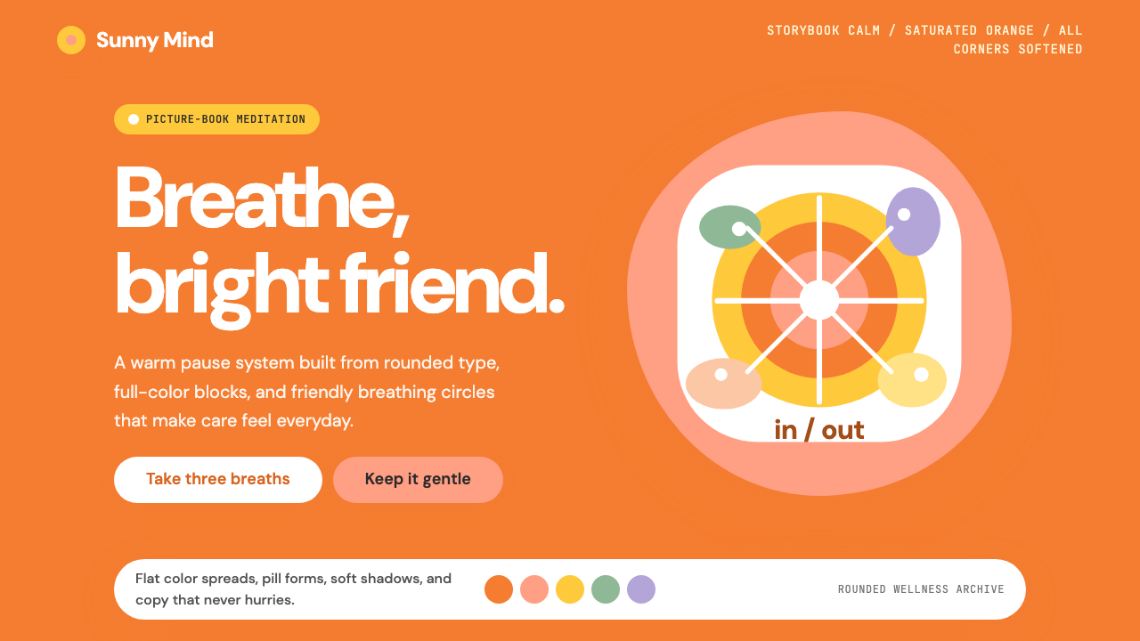 Headspace Orange MeditationMeditation becomes friendly. Orange blocks, DM Sans, and pill shapes soften e…冥想变得亲切:橙色块、DM Sans 与药丸圆角软化一切。
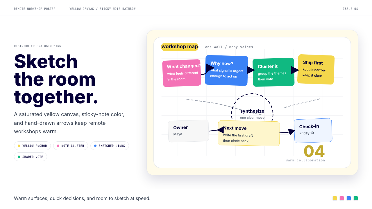 Miro Collab YellowWarm brainstorming in motion. Yellow canvas, sticky-note rainbow, hand-drawn…暖黄白板上的协作灵感。便利贴彩虹和手绘箭头带出流动感。
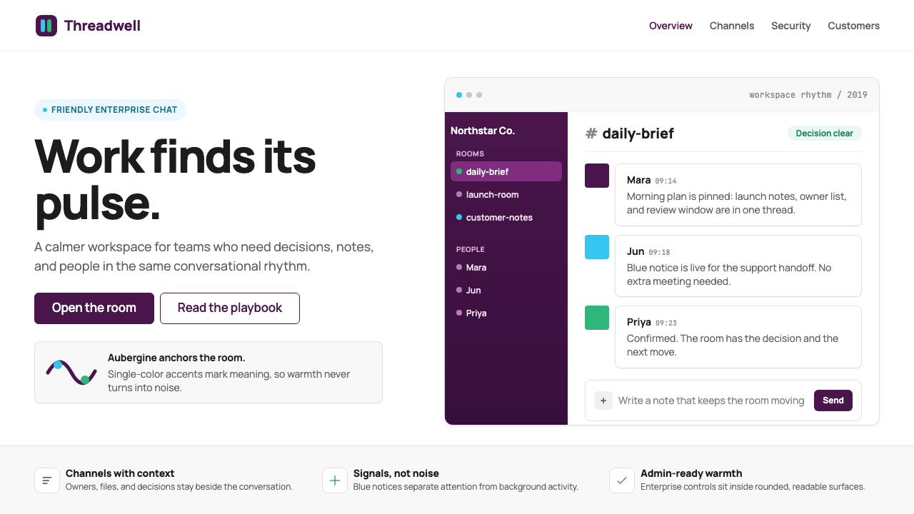 Slack 2019Warm enterprise chat. Aubergine rail, Manrope type, and single-accent badges…温暖企业对话:茄紫侧栏、Manrope 与单色徽章让它有人味。