What is Adventure Time?什么是 Adventure Time?
Adventure Time distilled a decade of indie-animation warmth into one visual grammar: candy-saturated pastels caged in thick black outlines, cream breathing room, and a whimsical looseness that somehow reads as precise.《探险活宝》把整整十年的独立动画温度浓缩进一套视觉语法:糖果般饱和的粉彩色被粗黑描边锁住,奶油色的留白充当呼吸空间,整体带着一种天真散漫却又出奇精准的气质。
Adventure Time in briefAdventure Time 速览
Adventure Time is the visual design language that crystallized around Cartoon Network's landmark animated series, which aired from 2010 to 2018 and then continued on HBO Max. Its aesthetic — saturated pastel-candy colors bounded by thick black outlines, bean-shaped and softly rounded characters, cream or near-white grounds, and an overall sense of hand-drawn warmth — became the defining look of a generation of indie and studio animation.《探险活宝》的视觉设计语言,随着卡通频道这部2010年至2018年播出、后续在HBO Max续集的标志性动画系列而逐渐成型。它的美学——饱和的糖果粉彩色被粗黑描边框定、豆子形状与柔软圆润的角色、奶油色或近白色的底面、整体弥漫的手绘温度——成为整整一代独立动画与商业动画的核心面貌。
As a graphic design system, Adventure Time is simultaneously populist and rigorous. It appears effortless, even childlike, yet its internal rules are consistent: a heavy black outline does all the structural work that shadow or depth would do in a more naturalistic style; color is deployed from a small, tightly curated candy palette — candy pink, sky cyan, soft mint, warm yellow, and gentle lavender — always against light or cream grounds; shapes default to organic curves and bean forms rather than hard geometry; and every element carries the slight irregularity of a confident hand-drawn stroke.作为平面设计系统,《探险活宝》同时具备平民化与严格性。它看起来毫不费力,甚至有些孩子气,但其内部规则高度一致:一条粗黑描边承担了自然主义风格中阴影或深度才能完成的结构工作;色彩从一套小而精心选配的糖果色板中取用——糖果粉、天蓝、柔薄荷、暖黄和淡薰衣草紫——始终搭配浅色或奶油色底面;形状默认为有机曲线与豆形,而非硬朗的几何体;每个元素都带着自信手绘线条特有的轻微不规则感。
The system's strength is its emotional legibility. Because it borrows the visual grammar of children's media, it triggers immediate warmth and approachability. But because Pendleton Ward's production design was genuinely disciplined — thick outlines create containment, the palette avoids muddy combinations, and negative space is used generously — the style remains clear at small sizes and across different media. It is playful but never chaotic, cartoon but never crude.这套系统的力量在于其情感可读性。因为它借用了儿童媒体的视觉语法,能即刻唤起温暖与亲切感。但由于 Pendleton Ward 的制作设计在规则上确实经过打磨——粗描边提供视觉围合,色板刻意回避泥浊的配色组合,留白被慷慨运用——这种风格在小尺寸和不同媒介上依然保持清晰。它顽皮却从不混乱,像卡通却从不粗糙。
See the Adventure Time design system查看 Adventure Time 完整设计系统
Where does Adventure Time come from?Adventure Time 从何而来?
The Adventure Time aesthetic traces back to a 2006 seven-minute Flash animation pilot that Pendleton Ward produced while attending the California Institute of the Arts. Frederator Studios picked it up and posted it online, where it accumulated millions of views before Cartoon Network greenlit a full series in 2010. That origin story — scrappy indie animation reaching mainstream broadcast through internet viral momentum — embedded the style's hand-crafted, non-corporate warmth at its core.《探险活宝》的美学根源可追溯至2006年——那是 Pendleton Ward 就读于加利福尼亚艺术学院时制作的一部七分钟 Flash 动画试播集。Frederator Studios 看中它并上传至网络,在卡通频道于2010年正式开播整季之前,这部短片已积累了数百万次观看。这段创作历程——一部粗犷独立的动画凭借网络病毒式传播突破主流院线——将手工制作、非商业化的温度深深嵌入了这套风格的基因。
Ward drew on a specific lineage: the rounded, expressive character design of early Hanna-Barbera cartoons, the elastic looseness of Fleischer Studios animation from the 1930s, and the psychedelic color sensibility that ran through independent underground comics of the 1970s and 1980s. He combined these influences with the color vocabulary of candy packaging and childhood illustration — a palette that reads as nostalgic and inviting rather than aggressive or sophisticated. The Land of Ooo, the show's fictional setting, was explicitly designed as a post-apocalyptic candy kingdom, which justified the density of saturated pinks, cyans, and mints in the world-building.Ward 汲取了一条特定的视觉谱系:汉纳-巴伯拉早期卡通片圆润而富表现力的角色设计、1930年代弗莱舍工作室动画的弹性松弛感,以及贯穿1970至80年代地下独立漫画的迷幻色彩敏感度。他将这些影响与糖果包装和儿童插画的色彩词汇融合在一起——那是一套令人感到怀旧与温暖而非强势或世故的色板。故事发生地「魔幻欧奥之地」在设定上明确是一个后启示录糖果王国,这为世界观中饱和粉色、青色和薄荷色的密集出现提供了正当理由。
The series also served as a launching pad for a generation of animation talent. Rebecca Sugar, who worked on Adventure Time as a writer and storyboard artist before creating Steven Universe in 2013, carried the candy palette and thick-outline aesthetic forward while adding an additional emotional depth and musical expressiveness. Jesse Moynihan, another Adventure Time writer and storyboard artist, brought a cosmic mysticism to the show's visual mythology. These collaborators seeded the post-Adventure Time animation wave — shows like Gravity Falls, Steven Universe, OK K.O.!, and She-Ra — that collectively extended the aesthetic into the mid-2020s.这部系列动画同时充当了一整代动画人才的发射台。Rebecca Sugar 在出任《探险活宝》编剧与分镜师后,于2013年创作了《宝石战士》,将糖果色板与粗描边美学传承下去,同时注入了更深的情感厚度与音乐表达力。另一位编剧与分镜师 Jesse Moynihan 则为这部剧的视觉神话带来了宇宙神秘主义色彩。这些合作者共同播撒了后探险活宝动画浪潮的种子——《怪诞小镇》《宝石战士》《OK K.O.!》和《无敌少女营》等作品将这套美学延续至2020年代中期。
As a design reference, Adventure Time arrived at precisely the right cultural moment. The mid-2010s saw a reaction against the ultra-polished flat design of early smartphone software, and designers began reaching for warmer, more expressive visual languages. The Adventure Time look offered a vocabulary that was digital-native yet hand-made-feeling, bold yet approachable, and richly colored yet legible. It was adopted — consciously or not — across branding for youth-targeted digital products, social media illustration, and a wave of illustration-forward marketing campaigns that peaked around 2015 to 2020.作为设计参考,《探险活宝》在恰当的文化时机登场。2010年代中期,设计界开始对早期智能手机软件超级精抛光的扁平设计产生反弹,设计师们开始寻求更温暖、更富表现力的视觉语言。《探险活宝》的面貌提供了一套天然数字化却又带手工质感、大胆而亲切、色彩丰富却依然清晰易读的词汇。从2015年到2020年前后,它被——有意识地或无意识地——大量借用于面向年轻人的数字产品品牌、社交媒体插画,以及一波以插图为核心的营销活动。
What defines the Adventure Time look?Adventure Time 的视觉特征是什么?
Thick Black Outlines粗黑描边
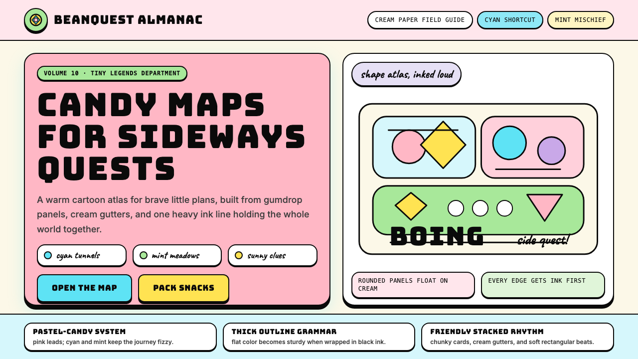
The single most recognizable feature of the Adventure Time visual system is a consistently heavy black outline that traces every character, object, and major shape. This line is not a decoration — it is the structural skeleton. It provides containment for the saturated interior colors, prevents adjacent candy hues from bleeding into each other, and creates legibility across a wide range of sizes and backgrounds. The line weight is uniform or near-uniform around each form, giving objects a printed or stamped quality rather than a hand-shaded or rendered one. This is cartoon line discipline at its most purposeful.《探险活宝》视觉系统最具辨识度的单一特征,是始终如一地勾勒每个角色、物体和主要形状的粗重黑色描边。这条线不是装饰——它是结构骨架。它为饱和的填色提供围合,防止相邻的糖果色调相互渗透,并在各种尺寸和背景下保持清晰度。每个形体周围的线条粗细均匀或近乎均匀,赋予物体一种印刷或盖章的质感,而非手工上色或渲染的质感。这是卡通线条规范最有目的性的运用。
Candy Pastel Palette糖果粉彩色板
The color palette is saturated but not harsh — it reads as candy rather than neon. The anchor colors are a warm candy pink, a bright sky cyan, a soft mint green, a gentle warm yellow, and occasional soft lavender. These are applied as flat fills with no shading, gradient, or texture inside the outlined shapes. The key tension in the palette is that the colors are individually high-chroma but are always paired against cream or near-white grounds and separated by the black outline system, which prevents them from clashing. The result is intense but never aggressive — the palette of a cartoon world that is bright because brightness is joyful, not because it is alarming.色板饱和但不刺眼——它散发出糖果的感觉,而非霓虹灯的感觉。主色为温暖的糖果粉、明亮的天蓝、柔薄荷绿、温和的暖黄,偶尔出现柔淡紫。这些色彩以平涂方式填充,轮廓线内部无阴影、无渐变、无纹理。色板的关键张力在于:单独来看每种颜色的饱和度都很高,但它们始终搭配奶油色或近白色底面,且由黑色描边系统隔开,这就防止了色彩之间的冲突。结果是强烈但从不咄咄逼人——这是一个卡通世界的色板,鲜亮是因为鲜亮即是欢乐,而非因为它在警示什么。
Bean Forms and Organic Curves豆形与有机曲线
Where Bauhaus reaches for the circle, square, and triangle, Adventure Time reaches for the bean, the blob, and the soft irregular oval. Characters and objects are designed on organic, rounded armatures — Finn's body is a rounded rectangle, the Ice King's form is a rounded diamond, even the architectural structures in the Land of Ooo favor rounded towers and soft-cornered buildings. This preference for organic form over geometric form creates a visual world that feels grown or found rather than constructed — consistent with the show's premise of a world that has overgrown, healed, and become strange after catastrophe. In design applications, this translates to rounded corners at a generous radius, pill-shaped containers, and illustrations built from overlapping soft blobs rather than hard polygons.包豪斯伸手取来圆形、方形与三角形,而《探险活宝》伸手取来的是豆形、不定形块与柔软的不规则椭圆。角色和物体建立在有机的、圆润的形体骨架上——芬恩的身体是圆角矩形,冰王的体形是圆润菱形,甚至欧奥之地的建筑结构也偏爱圆形塔楼和软转角建筑。这种对有机形的偏爱凌驾于几何形之上,构建了一个感觉像是自然生长或随机发现而非人工建造的视觉世界——与剧集的核心设定一致:一个在灾变之后重新生长、自我愈合并变得奇异的世界。在设计应用中,这转化为大圆角半径、药丸形容器,以及由相互叠压的柔软块面而非硬朗多边形构建的插图。
Cream Grounds and Generous Negative Space奶油底面与慷慨留白
The Adventure Time visual system is not dense. Despite its saturated palette, it breathes. Backgrounds in the show itself are often simple washes of a single warm sky tone or a cream ground with minimal detail. In graphic design applications derived from the aesthetic, this translates to avoiding overfilled layouts — the cream or near-white background is a primary compositional element, not a default emptiness waiting to be covered. Candy-colored elements float against the light ground; the outline system defines their edges without requiring the contrast of a dark background. This openness is what keeps the style readable and prevents its intense palette from feeling overwhelming.《探险活宝》视觉系统并不拥挤。尽管色板饱和,它依然有呼吸感。剧集本身的背景往往是单一暖调天色或奶油色底面的简单渲染,几乎没有细节。在衍生自这套美学的平面设计应用中,这转化为避免过度填充的版面——奶油色或近白色背景是主要的构图元素,而非等待被填满的默认空白。糖果色彩的元素漂浮在浅色底面上;描边系统界定它们的边缘,无需深色背景所提供的对比度。这种开放性使风格保持可读,并防止其浓烈色板带来压迫感。
Hand-Drawn Warmth and Deliberate Imperfection手绘温度与刻意不完美
Even when the Adventure Time aesthetic is executed digitally, it retains the visible signature of hand-drawn origin: lines that are confident but not mechanically perfect, shapes that are consistent in proportion but carry slight organic wobble, fills that read as painted rather than algorithmically applied. This deliberate imperfection is not sloppiness — it is an intentional warmth signal. It communicates that a human made this, that it was drawn with energy and affection. In design contexts, this quality is achieved through illustration elements, slightly textured fills, hand-lettered accents, or wobbling borders rather than perfectly straight rules. The warmth is the point.即便《探险活宝》美学以数字方式呈现,它依然保留着手绘起源的可见印记:线条自信但非机械完美,形状比例一致但带有轻微的有机抖动,填色读起来像是手工涂抹而非算法应用。这种刻意的不完美并非粗糙——它是一种有意为之的温度信号。它传达出:这是人做的,是带着能量与情感画出来的。在设计语境中,这种质感通过插画元素、略带纹理的填色、手写体点缀,或轻微摆动的边框(而非完美水平的直线)来实现。温度,才是重点。
Expressive Character as Visual Anchor富表现力的角色作为视觉锚点
In Adventure Time's native context — animation — characters carry enormous expressive range through simple, exaggerated facial features: wide circular eyes, small mouths capable of vast emotional range, eyebrows that travel far up or down the forehead. This character expressiveness translates into the wider design aesthetic as a preference for mascot-style illustration, friendly face motifs, and design elements that feel inhabited or personified rather than purely abstract. When the Adventure Time aesthetic is applied to branding or interface design, the natural extension is character-driven illustration, emotive iconography, and a general warmth of voice that the visual system supports and amplifies.在《探险活宝》的原生语境——动画中——角色通过简单而夸张的面部特征承载着巨大的表现幅度:宽大的圆形眼睛、能传达广阔情感范围的小嘴,以及可以大幅上扬或下垂的眉毛。这种角色表现力转化到更广泛的设计美学中,表现为对吉祥物风格插画、友善面孔母题,以及让设计元素感觉有生命或被拟人化而非纯粹抽象的偏好。当《探险活宝》美学应用于品牌或界面设计时,其自然延伸是角色驱动的插画、富有情感的图标语言,以及整套视觉系统所支撑和放大的温暖表达调性。
Flat Fill, No Gradient平涂填色,无渐变
Color in the Adventure Time system is applied as uniform flat fill — the interior of an outlined shape is a single solid color with no shading, no highlight, no drop in value from light to dark. Depth and volume are communicated through outline, shape overlap, and the occasional use of a separate darker flat tone for shadow areas (a second flat color, not a gradient). This flat-fill discipline is what gives the style its printed-page quality and keeps it legible as a transferable design system. Any softening of fills — blurs, glows, gradients — pulls the aesthetic out of the Adventure Time register and into a different, more generic digital style.《探险活宝》系统中的色彩以均匀平涂方式应用——轮廓线内部是单一纯色,无阴影、无高光、无从亮到暗的明度变化。深度与体积通过描边、形状叠压,以及偶尔使用单独的较深平涂色(一种第二平涂色,而非渐变)来传达阴影区域。这种平涂规范赋予了这套风格印刷页面的质感,并使其作为可移植设计系统保持清晰。任何对填色的软化处理——模糊、发光、渐变——都会将美学从《探险活宝》的语境中拉出,滑入另一种更通用的数字风格。
See the Adventure Time design system查看 Adventure Time 完整设计系统
Who shaped Adventure Time?谁塑造了 Adventure Time?
Ward created the Adventure Time universe and served as its showrunner through the first six seasons. His original 2006 pilot — made at CalArts and distributed online by Frederator Studios — established the visual DNA that would define the series: the candy palette, the thick outlines, Finn and Jake's rounded forms, and the particular flavor of absurdist warmth that distinguishes the show from other animated comedies. Ward stepped back from day-to-day showrunning after Season Six, but the visual language he established remained remarkably consistent through the series' conclusion and influenced virtually every indie animation production that followed.Ward 创造了《探险活宝》的整个宇宙,并在前六季担任主创。他2006年的原版试播集——在加州艺术学院制作、由 Frederator Studios 在线发行——确立了整部系列的视觉基因:糖果色板、粗描边、芬恩和杰克的圆润形体,以及区别于其他动画喜剧的那种荒诞温暖的特殊气质。第六季后,Ward 淡出日常主创工作,但他确立的视觉语言在整部系列结束之前始终保持着令人惊叹的一致性,并影响了几乎所有随后出现的独立动画作品。
Sugar joined Adventure Time as a writer and storyboard artist and worked on the show from 2010 to 2013. Her contributions — including the fan-favorite episode 'It Came from the Nightosphere' and the musical segment 'Simon and Marcy' — helped establish the emotional depth beneath the candy surface. After leaving to create Steven Universe, Sugar carried the thick-outline candy aesthetic into a new show that added greater cultural diversity, more complex emotional storytelling, and a musical vocabulary. Steven Universe became the primary vector through which the Adventure Time visual language reached new audiences in the mid-2010s and demonstrated the system's range.Sugar 以编剧和分镜师身份加入《探险活宝》,在2010年至2013年间参与制作。她的贡献——包括广受粉丝喜爱的剧集《来自夜域》和音乐段落《西蒙与玛西》——帮助建立了糖果表面之下的情感深度。离开后创作《宝石战士》,Sugar 将粗描边糖果美学带入了新的作品,并在其中加入了更丰富的文化多样性、更复杂的情感叙事和音乐词汇。《宝石战士》成为《探险活宝》视觉语言在2010年代中期触达新受众的主要媒介,并展示了这套系统的延展性。
Moynihan was a writer and storyboard artist on Adventure Time whose visual contributions leaned toward the more mystical and cosmic dimensions of the show's mythology. He is credited with developing some of the most visually ambitious episodes — those dealing with ancient cosmic entities, the Lich, and the origins of the Land of Ooo — that pushed the candy-colored surface into contact with genuinely dark and visually experimental territory. Moynihan's own illustration and comic work runs parallel to the show's style and gives a clearer view of the aesthetic's range when applied by a single hand. His work demonstrates that the Adventure Time visual language is not limited to cheerfulness — it can accommodate unease and strangeness within the same candy-outline system.Moynihan 是《探险活宝》的编剧与分镜师,其视觉贡献偏向剧集神话体系中更神秘、更宇宙性的维度。他被认为推动了一些视觉野心最大的剧集——那些涉及远古宇宙实体、巫妖,以及欧奥之地起源的集数——将糖果彩色的外表推入了真正黑暗和视觉实验性的领域。Moynihan 自身的插画与漫画创作与剧集风格并行,让人更清楚地看到这套美学由单一作者操刀时的延展范围。他的作品证明:《探险活宝》视觉语言并不局限于欢快——它能在同一套糖果描边系统内容纳不安与怪异。
Muto joined the show early as a storyboard artist and eventually became showrunner for the series' final seasons following Ward's departure. His tenure was responsible for maintaining visual consistency across a massive production spanning hundreds of episodes while also steering the show's narrative toward a more epic conclusion. Muto's role demonstrates a dimension of the Adventure Time aesthetic that is often overlooked: the style is not just a look but a production system — a set of constraints around character construction, background painting, and line discipline that allowed a large team to maintain coherent output across years of production. That systemic discipline is what makes it so transferable as a design language.Muto 早期以分镜师身份加入剧组,并在 Ward 离开后最终成为最后几季的主创。他的任期负责在跨越数百集的大型制作中维持视觉一致性,同时引导剧集叙事走向更史诗性的结局。Muto 的角色展示了《探险活宝》美学中常被忽视的一个维度:这种风格不仅仅是一种外观,更是一套制作系统——围绕角色构造、背景绘制和线条规范形成的一套约束条件,使得一个庞大的团队能够在多年制作中保持连贯的产出。正是这种系统性的规范,使它作为设计语言具有如此强的可移植性。
How do you use Adventure Time today?今天怎么用 Adventure Time?
Adventure Time is one of the most directly actionable cartoon-derived aesthetics in contemporary design work, because its rules are visual rather than conceptual. You do not need to understand its narrative or cultural context to apply it — you need to understand its line, color, and form logic. Apply it correctly and the result reads as warm, approachable, and joyful. Apply it carelessly and it reads as childish, chaotic, or unconsidered. The difference lies in discipline: the same commitment to consistent outline weight, restrained palette, and generous negative space that made the show visually coherent must carry through into any design application.《探险活宝》是当代设计实践中可操作性最强的卡通衍生美学之一,因为它的规则是视觉性的而非概念性的。你不需要了解其叙事或文化背景就能应用它——你需要理解它的线条、色彩和形态逻辑。正确应用,效果读来温暖、亲切、充满喜悦。粗心应用,效果则读来幼稚、混乱或漫不经心。区别在于规范:让这部动画在视觉上保持连贯的那种对一致描边粗细、克制色板和慷慨留白的承诺,必须贯穿进每一个设计应用。
For presentation slides, the Adventure Time aesthetic is most effective when it leans into illustration as a structural device rather than decoration. A cover slide benefits from a centered or asymmetrically placed character or creature illustration against a cream ground, with the title set in a bold rounded typeface that echoes the organic form language. Content slides should treat text as secondary to visual hierarchy — use large, friendly, clearly bounded content areas with candy-colored headers and cream bodies. For data slides, charts and graphs take on an illustrated quality: bars are rounded, segments are separated by white space that echoes the outline system, and each data category gets one palette color as its identifier. The system works well for educational decks, product launches aimed at younger or broader audiences, and any context where warmth and accessibility are the primary communication goals.在演示文稿中,《探险活宝》美学在将插画作为结构性装置而非纯粹装饰时最为有效。封面页适合将一个角色或生物插画居中或非对称地置于奶油色底面上,标题以粗重圆润的字体排列,呼应有机形态的视觉语言。内容页应将文字视为次于视觉层级的元素——使用大而友善、边界清晰的内容区块,糖果色标题搭配奶油色正文区域。数据页中,图表呈现插画质感:柱条圆角处理,扇形以空白间距分隔(呼应描边系统),每个数据类别以一种色板颜色作为标识。这套系统在面向年轻或更广泛受众的教育性演示、产品发布,以及任何以温暖和亲和力为核心传达目标的场景中表现出色。
For web interfaces, the Adventure Time aesthetic works naturally in products where emotional warmth and approachability are central to the experience — onboarding flows, children's educational platforms, community or social products, and creative tools. The approach: use a cream or very light warm white as the base background, round all interactive elements generously, apply the candy palette to call-to-action elements and highlights rather than large surface areas, and use clear black borders or heavy strokes around card and container components instead of soft drop shadows. Navigation should be friendly and typographic, with icon elements rounded and illustrated rather than geometric or minimal. The common failure mode for web applications is overdoing the illustration — Adventure Time's own success came from restraint: clear ground, bounded color, generous space.对于网页界面,《探险活宝》美学自然适用于情感温度和亲切感是体验核心的产品——引导流程、儿童教育平台、社群或社交产品,以及创意工具。方法如下:以奶油色或非常浅的暖白色作为基础背景,为所有交互元素添加慷慨的圆角,将糖果色板用于行动号召元素和高亮而非大面积底色,用清晰的黑色边框或粗重线条包裹卡片和容器组件,替代柔和的投影阴影。导航应友善且以文字为主,图标元素圆润且插画化而非几何化或极简化。网页应用中最常见的失败模式是过度使用插画——《探险活宝》自身的成功来自克制:清晰的底面、有边界的色彩、充裕的空间。
For editorial and marketing work, the Adventure Time aesthetic supports campaigns targeting audiences where warmth, creativity, and inclusivity are desired associations. A marketing page using this system would feature illustration-forward hero sections with a candy-colored character or scene against a cream field, section breaks marked by thick colored rules or illustrated dividers rather than hairlines, and body text set in a rounded, approachable typeface against a light ground. Social media graphics benefit enormously from the system's clarity at small sizes: a single bold character or icon in the candy palette against cream, outlined in black, reads clearly even as a thumbnail. The aesthetic is particularly well-suited to product launches, brand refreshes, and awareness campaigns where the goal is emotional resonance rather than authority signaling.对于编辑与营销内容,《探险活宝》美学支持针对那些希望与温暖、创意和包容性产生关联的受众群体的活动。使用这套系统的营销页面,会以插画为主打造英雄区块——糖果色角色或场景置于奶油色底面上,以粗彩色横线或插画化分割线而非细线标记段落分隔,正文以圆润亲切的字体排列在浅色底面上。社交媒体图形极大受益于这套系统在小尺寸下的清晰度:一个糖果色系的粗描边单一角色或图标,置于奶油色底面,即便作为缩略图也清晰可辨。这套美学特别适合产品发布、品牌焕新,以及以情感共鸣而非权威感为目标的品牌认知活动。
A common mistake when applying the Adventure Time aesthetic is importing the surface energy — the saturated colors, the rounded forms — without importing the structural discipline that makes the original work legible. The candy palette only works because it operates against a light, uncrowded ground separated by consistent line weight. Designers who fill backgrounds with candy colors, stack multiple saturated hues without the outline system to separate them, or use soft gradients in place of flat fills end up with something that feels agitated and unresolved rather than joyfully bold. A second common error is confusing the aesthetic with generic cartoon cuteness — Adventure Time's line quality is deliberate and consistent, not approximate. Committing to a uniform stroke weight and a tight, curated palette of four to five candy colors will produce more authentic results than assembling a large library of disparate cartoon elements.应用《探险活宝》美学时最常见的错误,是引进了表面能量——饱和色彩、圆润形态——却没有引进使原作保持清晰的结构规范。糖果色板之所以有效,是因为它在浅色、不拥挤的底面上运作,并由一致的线条粗细隔开。设计师若以糖果色填充背景、在没有描边系统分隔的情况下叠加多种饱和色调、或用柔和渐变替代平涂填色,最终得到的效果会显得焦虑不安而非充满欢乐的大胆。第二个常见错误是将这套美学与通用卡通可爱风格混淆——《探险活宝》的线条质感是刻意而一致的,而非大概其可。坚守统一的线条粗细和由四到五种糖果色构成的精简色板,将比拼凑一大堆来源各异的卡通元素产生更真实可信的效果。
See the Adventure Time design system查看 Adventure Time 完整设计系统
Adventure Time — FAQAdventure Time · 常见问题
Is the Adventure Time aesthetic appropriate for adult or professional audiences?《探险活宝》美学适合成年人或专业受众吗?
Yes, with important qualifications. Adventure Time itself was always a dual-audience show — it ran on a children's network but was written, in significant part, for adults who appreciated its philosophical depth, emotional complexity, and subversive humor. The design aesthetic similarly can carry adult or professional content when deployed with discipline. The key is context and intent: a productivity app, mental health platform, or creative-industry brand can successfully use the candy palette and organic forms if the content strategy and voice are calibrated for the target audience. What makes it feel juvenile is not the visual system but the absence of considered deployment — playful visuals paired with thoughtful, substantive content read as whimsical sophistication, not immaturity.可以,但有重要前提。《探险活宝》本身始终是一部面向双重受众的作品——它在儿童频道播出,但在很大程度上是为欣赏其哲学深度、情感复杂性和颠覆性幽默的成年人而写的。这套设计美学同样可以承载成年或专业内容,前提是部署得当。关键在于语境和意图:一款生产力应用、心理健康平台或创意行业品牌,若内容策略和表达调性针对目标受众进行了校准,完全可以成功运用糖果色板和有机形态。让它显得幼稚的不是视觉系统本身,而是缺乏审慎的部署——顽皮的视觉搭配深思熟虑、内容充实的信息,读起来是异想天开的成熟,而非不成熟。
How does Adventure Time differ from other cartoon-inspired design aesthetics?《探险活宝》与其他卡通风格的设计美学有何不同?
The clearest distinctions are the color palette and the outline system. Flat design and Material Design also use solid fills and bold colors, but their color systems are more corporate and their lines are absent — there is no outline, just color contrast to define shape. Classic Disney or Pixar aesthetics have outlines in their animation but rely on gradient shading and volume modeling that Adventure Time explicitly rejects. The 1990s Nickelodeon cartoon aesthetic — Rugrats, Hey Arnold — shares the thick outline and candy colors but is noisier, more textured, and uses pattern fills far more heavily. Adventure Time's distinguishing discipline is the cream ground, the restraint of the candy palette to five or six anchor colors, and the flat fill rule. These three constraints working together produce the style's particular readable warmth.最清晰的区别在于色板和描边系统。扁平设计和 Material Design 同样使用实色填充和大胆色彩,但它们的色彩系统更偏企业感,且完全没有轮廓线——靠色彩对比而非描边来定义形状。迪士尼或皮克斯经典动画风格在动画中有轮廓线,但依赖渐变阴影和体积建模,这是《探险活宝》明确拒绝的。1990年代尼克国际儿童频道的卡通美学——《淘气小兵兵》《阿诺德的烦恼》——与它共享粗描边和糖果色,但画面更嘈杂、质感更丰富,且大量使用图案填充。《探险活宝》的独特规范是:奶油色底面、将糖果色板克制在五到六种锚定色、以及平涂填色规则。这三项约束共同作用,产生了这种风格特有的清晰温暖感。
Can this aesthetic work in dark mode or on dark backgrounds?这套美学能在深色模式或深色背景下使用吗?
The Adventure Time aesthetic is fundamentally a light-ground system, and dark inversions require care. The candy palette — particularly the pale mints and lavenders — loses much of its character on dark grounds because those colors depend on their contrast with cream or white to read as delicate rather than washed-out. On black, candy pink and bright cyan survive well; soft mint and pale lavender tend to disappear or require substantial saturation boost that pushes them out of the palette's gentle register. A workable dark variant leans on the stronger anchor colors — candy pink, bright cyan, warm yellow — and uses the black outline system as the primary structural device rather than background contrast. It reads more like a night scene from the show than a full inversion of the design system.《探险活宝》美学从根本上是一套浅色底面系统,深色反转需要谨慎处理。糖果色板——尤其是浅薄荷和淡薰衣草紫——在深色底面上会失去很多特质,因为这些颜色依赖与奶油色或白色的对比才能读来精巧而非黯淡。在黑色背景上,糖果粉和亮天蓝的存活效果较好;柔薄荷和淡紫往往会消失,或需要大幅提升饱和度才能显现,这又会把它们推出色板原有的温柔音域。一个可行的深色变体应倚重较强的锚定色——糖果粉、亮天蓝、暖黄——并以黑色描边系统作为主要结构手段,而非依靠背景对比度。这种效果更像是剧集中的一个夜景,而非整套设计系统的完全反转。
What types of projects are a poor fit for the Adventure Time aesthetic?哪类项目不适合使用《探险活宝》美学?
The Adventure Time aesthetic struggles in contexts that require authority, institutional gravitas, or premium-luxury positioning. Financial services, legal products, enterprise software, luxury consumer brands, and medical or clinical applications generally cannot absorb the candy palette and rounded organic forms without undermining the trust and competence signals those categories depend on. The aesthetic is also a poor fit for contexts where cultural specificity is important — the visual language is strongly identified with American indie animation and with a particular millennial and Gen-Z internet cultural moment, and it may feel alienating or inappropriate in design contexts with strong ties to other cultural traditions. Finally, the style does not scale gracefully into extreme information density — it is designed to breathe, and forcing it into dense data-heavy interfaces produces clutter, not clarity.《探险活宝》美学在需要权威感、机构庄重感或高端奢华定位的场合往往力不从心。金融服务、法律产品、企业软件、奢侈品消费品牌,以及医疗或临床应用,通常无法容纳糖果色板和圆润有机形态,因为这样做会破坏这些类别所依赖的信任感和专业能力信号。这套美学同样不适合文化特异性至关重要的场合——这套视觉语言与美国独立动画、以及特定千禧一代和Z世代网络文化时刻有强烈关联,在与其他文化传统有深厚连结的设计语境中可能显得格格不入甚至不得体。此外,这种风格在极高信息密度下无法优雅地延伸——它生来需要呼吸空间,强行将其套入信息密集的界面只会带来混乱,而非清晰。
How closely should illustrations follow the Adventure Time character style to be authentic?插画需要多贴近《探险活宝》角色风格,才算真正呈现这套美学?
The spirit of the system matters more than literal imitation. Using Finn, Jake, or other existing Adventure Time characters in design work raises intellectual property questions and misses the point anyway — the goal is to apply the visual language, not to reproduce the show. What constitutes authentic application is adherence to the underlying principles: organic rounded forms built on bean-shape armatures, a consistent thick black outline at the same weight throughout, flat candy-palette fills, generous cream or white grounds, and a hand-drawn warmth in the line quality. Original characters and abstract shapes that follow these rules read as Adventure Time aesthetic without copying any specific design. The system is generative, not a locked library of characters.系统的精神比字面上的模仿更重要。在设计作品中使用芬恩、杰克或其他现有《探险活宝》角色,会引发知识产权问题,而且无论如何都偏离了目的——目标是应用视觉语言,而非复制这部剧。真正的应用在于坚守底层原则:建立在豆形骨架上的有机圆润形态、通体粗细一致的粗黑描边、平涂糖果色填色、充裕的奶油色或白色底面,以及线条质感中的手绘温度。遵循这些规则的原创角色和抽象形状,读来就是《探险活宝》美学,而无需复制任何具体设计。这套系统具有生成性,而非一个封闭的角色库。
Related design styles相关设计风格
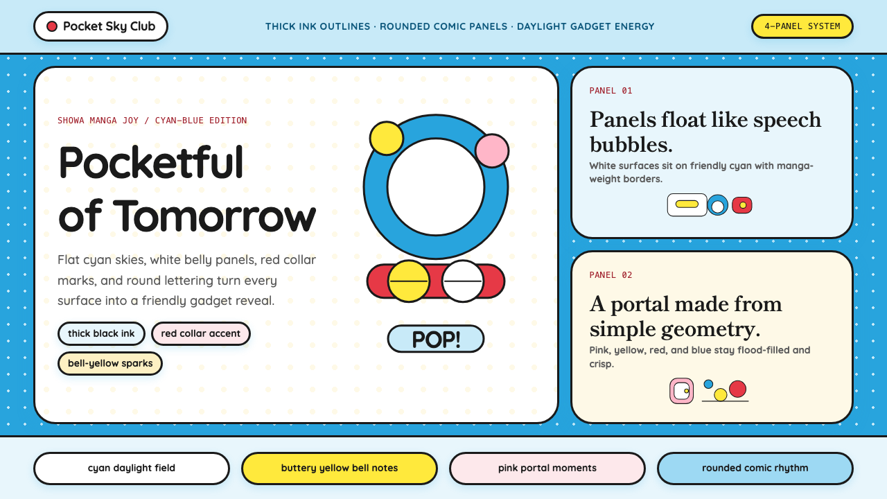 DoraemonChildhood joy, inked bold. Cyan fields, white panels, red collars, and rounde…童年快乐被粗线描出:青蓝底、白面板、红项圈与圆润漫画字。
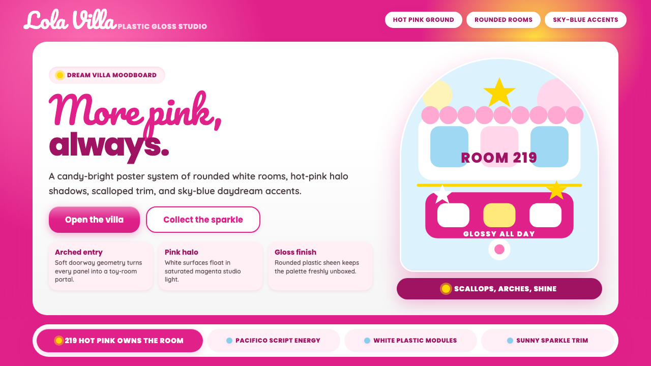 Barbie DreamhousePink is the whole world. Hot magenta ground, Pacifico script, scallops and gl…粉色就是全世界:洋红底、Pacifico手写、扇贝边与亮面拱门。
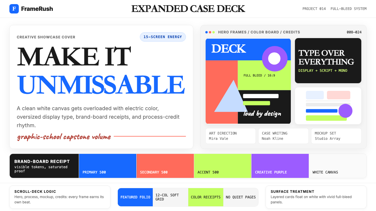 Behance Maximalist PortfolioPortfolio volume at max. Electric blue, coral and lime stack into a full-blee…作品集音量拉满:电光蓝、珊瑚橙与酸橙绿堆成全出血案例板。
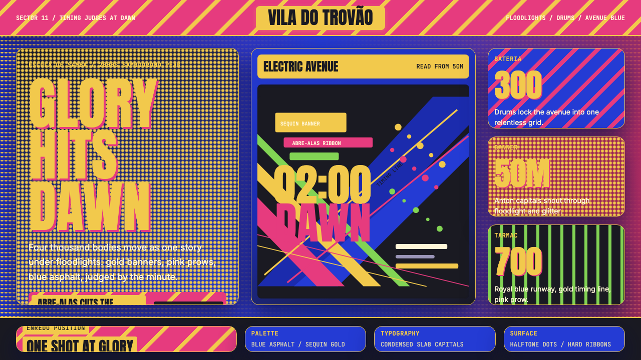 Brazilian Samba School (2000s Carnaval)Parade at floodlight volume. Royal blue asphalt, sequin gold type, pink ribbo…泛光灯音量的游行。宝蓝路面、亮片金字、玫红斜带。
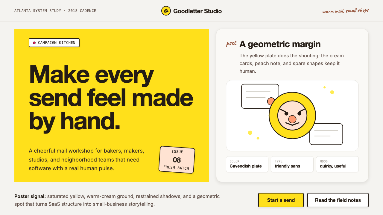 Mailchimp Freddie-YellowFriendly software, handmade. Cavendish yellow blocks and warm geometric masco…友善而手作。卡文迪许黄块与几何吉祥物撑起温暖版面。
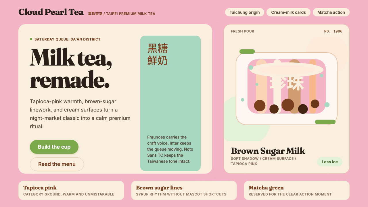 Taiwan Bubble Tea PremiumWarm craft, not kawaii. Tapioca pink, Fraunces serif, cream cards, matcha act…溫暖精品,不走可愛風:珍珠粉、Fraunces 襯線、奶白卡與抹茶綠。