What is Doraemon?什么是 Doraemon?
Half a century of manga joy distilled into bold outlines, flood-fill cyan, and the irresistible roundness of a robot cat from the future.半个世纪的漫画欢乐凝练成粗黑轮廓、平涂青蓝与一只来自未来的机器猫那无法抗拒的圆润。
Doraemon in briefDoraemon 速览
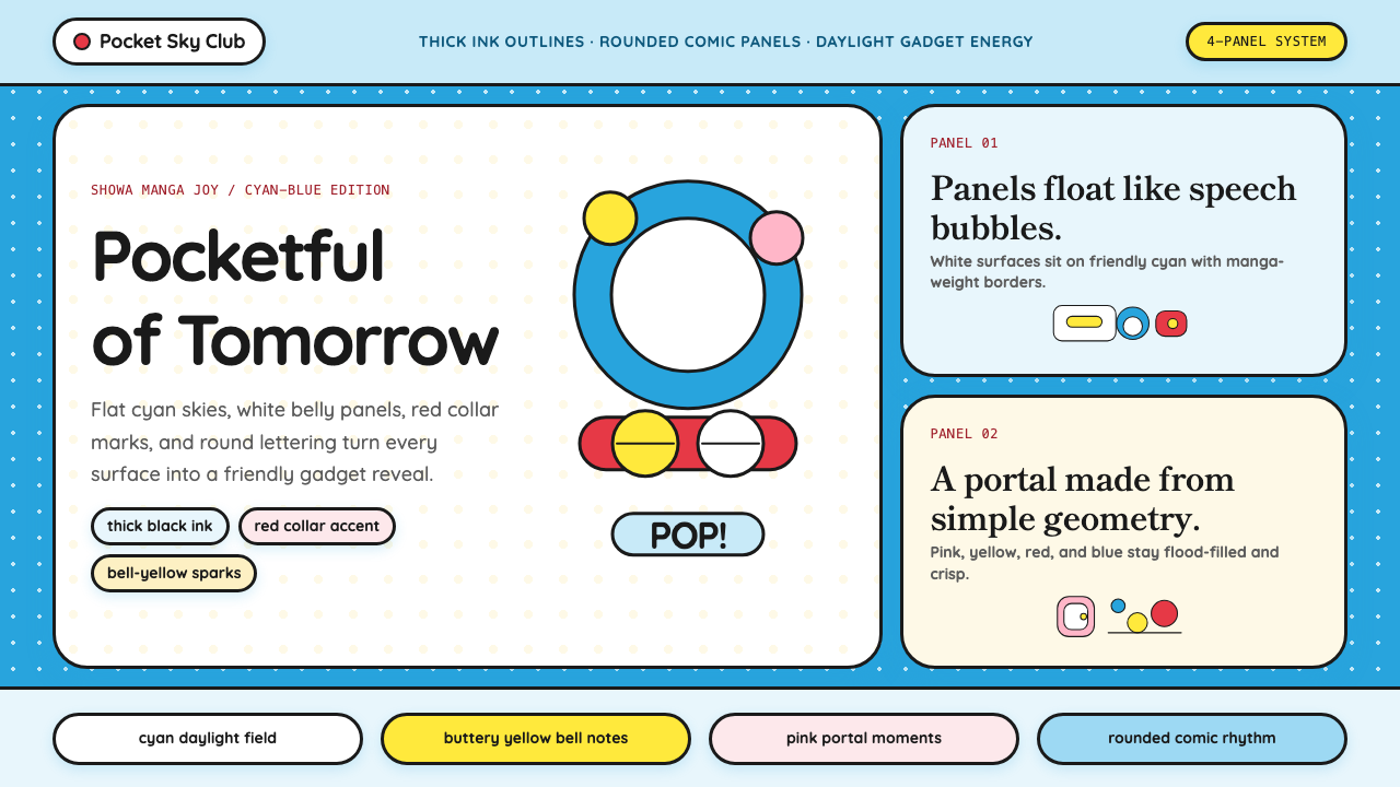
Doraemon is a visual design language drawn directly from one of the most beloved manga and anime franchises in history. Its aesthetic vocabulary is rooted in Showa-era Japanese children's comics: thick black outlines that hold every shape firmly in place, broad flat fields of primary color with no shading or gradation, and an obsessive commitment to rounded, circular geometry that mirrors the character's own circle-constructed body. The style radiates kindergarten warmth — it is the visual grammar of childhood comfort and wonder.哆啦A梦设计语言直接源自史上最受喜爱的漫画与动画系列之一。其视觉词汇植根于昭和时代的日本儿童漫画:粗黑的轮廓线牢牢框住每一个形状,宽阔平涂的原色无阴影无渐变,以及一种痴迷于圆润几何的执着——这份执着完整映照了角色那由圆形构成的身体。这种风格散发着幼儿园般的温暖,是童年安慰与惊奇的视觉语法。
The palette begins with the signature cyan-blue of Doraemon's body, a vivid mid-tone that reads as optimistic and immediately legible across all ages. It is offset by pure white for surfaces and backgrounds, warm red for collar and bell accents, soft pink for the Anywhere Door portal, and yellow for highlights. No hue in this system is dark, muted, or ambiguous — every color earns its place by being as clear and joyful as possible.配色以哆啦A梦标志性的青蓝色为起点——一种生动的中调色,跨越所有年龄都清晰可读,且充满乐观气息。与之并置的是纯白的表面与背景、温暖的红色铃铛项圈点缀、柔粉色的任意门传送门,以及黄色高光。这套系统里没有一种颜色是暗沉、低饱和或模糊的——每一种颜色都以尽可能清晰、欢快的方式占据它的位置。
Applied to interfaces and graphic design, the Doraemon style translates these manga craft conventions into a recognizable modern system: extreme corner rounding on every container, bold stroke outlines on interactive components, a bright daylight palette that never approaches darkness, and typography that carries the chubby hand-drawn quality of comic lettering. The result is a design language that communicates safety, friendliness, and playful intelligence.应用于界面与平面设计时,哆啦A梦风格将这些漫画工艺惯例转化为一套可识别的现代系统:每个容器极度圆润的圆角、交互组件上的粗描边轮廓、永远不会陷入黑暗的明亮日光配色,以及带有漫画手写字般圆润质感的排版。最终呈现的是一套传达安全感、亲切感与活泼智慧的设计语言。
Where does Doraemon come from?Doraemon 从何而来?
Doraemon was created by the duo Fujiko F. Fujio — the pen name of Hiroshi Fujimoto and Motoo Abiko — and first appeared in January 1970 in multiple children's manga magazines simultaneously, a launch strategy engineered to reach the broadest possible audience of primary-school readers in Japan. The character is a robotic cat sent back from the twenty-second century to help a hapless boy named Nobita Nobi, and his visual design was established almost immediately: a spherical blue-white body, a broad round face with a red nose and whiskers, and the iconic red bell collar that became one of the most recognized accessories in Asian popular culture.哆啦A梦由藤子·F·不二雄创作——这是藤本弘与安孫子素雄的共同笔名——于1970年1月同步在多本儿童漫画杂志上登场,这一发行策略旨在尽可能广泛地覆盖日本小学读者群。这个角色是一只从二十二世纪穿越回来帮助倒霉男孩野比伸太的机器猫,其视觉形象几乎从一开始就已定型:球形的蓝白身体、宽阔圆润的脸庞配上红鼻子与胡须,以及标志性的红色铃铛项圈——后者成为亚洲流行文化中辨识度最高的配饰之一。
The visual style of the Doraemon manga is firmly rooted in the conventions of mid-century Showa-era children's comics. Fujiko F. Fujio drew in a clear-line tradition that prioritized readability and emotional accessibility over artistic complexity — thick, consistent outlines, flat color fills, simple expressive faces that could convey the full range of childhood emotions in a single panel. The character's circular construction is no accident: circles carry universal connotations of softness, safety, and completeness across cultures, and Doraemon's design makes those associations inescapable.哆啦A梦漫画的视觉风格牢固植根于昭和时代中期儿童漫画的惯例。藤子·F·不二雄采用清晰线条的绘画传统,将易读性与情感可及性置于艺术复杂度之上——粗而一致的轮廓线、平涂的颜色填充、能在单格画面中传达童年全部情绪的简洁表情脸。角色的圆形构造并非偶然:圆形在不同文化中都普遍承载着柔软、安全与完整的联想,哆啦A梦的设计让这些联想无处可逃。
The anime adaptation launched in 1973 on Nippon Television and has continued in various forms ever since, with the long-running Shin-Ei Animation production — beginning in 1979 — establishing the definitive modern look of the franchise. Animated by Shin-Ei and voiced for decades by a rotating cast of voice actors (with Wasabi Mizuta taking over the title role in 2005 and remaining through the present day), the series brought Doraemon's visual language to television screens across Japan and, eventually, across most of Asia. By the time the franchise's visual identity was fully standardized around 2005, it had evolved into one of the most systematically consistent character design systems in entertainment history.动画版于1973年在日本电视台开播,此后以各种形式延续至今。从1979年开始的长期播出版本由新映画动画制作,确立了这个系列的现代定型形象。由新映画制作、数十年间由轮换声优配音(其中铃木梅以2005年接任主角配音并延续至今),该系列将哆啦A梦的视觉语言带入了日本乃至整个亚洲的电视屏幕。当系列形象在2005年前后完全标准化时,它已演变为娱乐史上系统一致性最强的角色设计体系之一。
Doraemon's cultural reach extends far beyond entertainment. The character has served as Japan's official anime ambassador in diplomatic contexts, appeared on government tourism campaigns, and been adopted by educational programs throughout Southeast Asia. This soft-power role has made the franchise's visual language — the cyan blue, the round forms, the bold outlines — into something approaching a regional cultural symbol. The aesthetic carries connotations of Japanese quality, childhood nostalgia, and cross-generational warmth that give it unusual emotional weight for a design language derived from commercial entertainment.哆啦A梦的文化影响力远超娱乐本身。这个角色曾在外交场合担任日本官方动漫大使,出现在政府旅游宣传活动中,并被东南亚各地的教育项目采用。这种软实力角色使系列的视觉语言——那抹青蓝色、圆润的造型、粗描轮廓线——成为一种接近地区文化符号的存在。这种美学承载着对日本品质、童年记忆与跨代温情的联想,赋予了这套衍生自商业娱乐的设计语言异乎寻常的情感分量。
What defines the Doraemon look?Doraemon 的视觉特征是什么?
Signature Blue标志性蓝色
The defining color of the system is the vivid cyan-blue of Doraemon's body — a bright, fully saturated mid-tone that sits confidently between turquoise and sky blue. It is not a corporate blue or a navy; it reads as cheerful, open, and unmistakably warm despite being a cool hue. This blue functions as the primary field color for backgrounds, large containers, and hero areas, and its emotional register — optimistic, childlike, immediately recognizable — defines the entire palette's mood.这套系统最具定义性的颜色是哆啦A梦身体的那抹生动青蓝——一种明亮、高饱和的中调色,自信地落在绿松石与天空蓝之间。它不是企业蓝,也不是深海蓝;尽管是冷色调,它读起来却欢快、开放,且带有不可否认的温暖。这种蓝色作为背景、大型容器与主视觉区域的首选底色,其情感基调——乐观、童真、辨识度极高——定义了整套配色方案的氛围。
Bold Black Outlines粗黑轮廓线
Every component in this design language is bounded by a visible, weighty outline. These strokes are consistent in thickness across the hierarchy, functioning less as borders and more as the structural skeleton that holds each shape in place — exactly as ink outlines hold panels in a manga page. The outlines create immediate legibility at any size, unify disparate elements into a coherent visual system, and give the interface a graphic, illustrated quality that distinguishes it from flat design conventions.这套设计语言中的每个组件都被醒目有分量的轮廓线所框定。这些描边在整个层级中粗细一致,与其说是边框,不如说是将每个形状固定到位的结构骨架——恰如墨线轮廓在漫画页面中固定每个格框那样。轮廓线在任何尺寸下都带来即刻的清晰可读性,将差异化的元素统一进连贯的视觉系统,并赋予界面一种图形插画的质感,使其有别于扁平化设计的惯例。
Rounded Geometry圆润几何
Rounded corners are applied at an extreme degree — not a subtle softening but a deliberate push toward circularity. Buttons, cards, badges, and containers all approach pill or oval shapes. The rounding is so pervasive and consistent that it reads not as a stylistic choice applied to individual elements but as a fundamental property of the design system itself, directly echoing Doraemon's spherical body and the rounded panel shapes common in children's manga.圆角以极致程度应用——不是轻微柔化,而是有意向圆形推进。按钮、卡片、徽章与容器都趋向药片形或椭圆形。这种圆润无处不在且高度一致,读起来不像是施加于各个元素的风格选择,而是设计系统本身的基本属性,直接呼应了哆啦A梦的球形身体以及儿童漫画中常见的圆润格框造型。
Flat Color Fields平涂色块
Colors are applied as solid, unmodulated fills — no gradients, no texture overlays, no inner shadows suggesting three-dimensionality. Each color block is uniform from edge to edge, in the tradition of manga color printing where flat fills were both an aesthetic choice and a production necessity. This flatness makes the palette feel bold and immediate rather than polished or rendered, giving the overall design an energetic print-comic quality.颜色以纯色平涂的方式施用——无渐变,无纹理叠加,无暗示三维感的内阴影。每块色面从边到边均匀一致,延续了漫画彩印传统中平涂既是美学选择也是生产需要的惯例。这种平坦性使配色显得大胆直接而非精致呈现,赋予整体设计一种充满活力的印刷漫画质感。
Accent Colors as Storytelling点缀色作为叙事
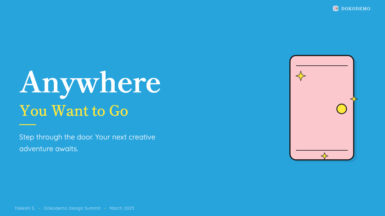
Beyond the signature blue and white, each accent color in the system carries a direct referential meaning borrowed from the franchise: warm red echoes the bell collar — used for primary calls-to-action and the most important interactive elements; soft pink recalls the Anywhere Door — used for secondary highlights and transition states; yellow references the four-dimensional pocket — used for warnings, featured items, or energy-rich states. Designers using this system are working with a pre-loaded set of cultural associations that users who grew up with the franchise will recognize intuitively.在标志性蓝白之外,系统中的每种点缀色都直接借用了系列作品的指涉意义:温暖的红色呼应铃铛项圈——用于主要行动号召与最重要的交互元素;柔粉色唤起任意门——用于次级高光与过渡状态;黄色指向四次元口袋——用于警示、精选项目或充满活力的状态。使用这套系统的设计师,手中握有一套预置的文化联想,那些伴随这个系列成长的用户将本能地识别它们。
Comic-Inflected Typography漫画感排版
Type choices in this system favor rounded, slightly condensed letterforms that echo the chubby quality of hand-lettered comic text. Headlines feel friendly and approachable rather than authoritative or sharp. The character weight skews toward the heavier end to complement the bold outline language of the surrounding components; thin or lightweight type looks out of place. Both Japanese and Latin letterforms should prioritize stroke warmth and visual roundness over geometric precision.这套系统中的字体选择偏向圆润、略微压缩的字形,呼应手写漫画文字的圆墩质感。标题感觉亲切平易而非权威尖锐。字重偏向较重的一端,以配合周围组件的粗描边语言;细字重或轻字重在这里显得格格不入。无论日文还是拉丁字形,都应将笔画温度与视觉圆润度置于几何精确之上。
Joyful Brightness明朗欢快的亮度
The entire system operates in a bright, high-key register — there are no dark themes, no shadowed moods, no color choices that read as serious or somber. Even interactive states like hover, focus, and error are handled with brighter or warmer variants of existing palette colors rather than with darkening or desaturation. This consistent brightness is not accidental; it is a structural commitment that keeps the experience feeling safe, welcoming, and emotionally accessible to the widest possible audience.整套系统在明亮、高调的色域中运作——没有深色主题,没有阴翳情绪,没有任何读起来严肃或沉重的颜色选择。就连悬停、聚焦、错误等交互状态也通过现有配色的更明亮或更温暖的变体来处理,而非通过加深或降饱和度。这种持续的明亮不是偶然的;它是一种结构性承诺,让体验对尽可能广泛的受众保持安全感、亲切感与情感可及性。
Who shaped Doraemon?谁塑造了 Doraemon?
The pen name of Hiroshi Fujimoto, who was the primary artistic and narrative driver of the Doraemon franchise. Fujimoto developed the clear-line drawing style and circular character construction that became the visual foundation of the franchise. His approach to visual storytelling — prioritizing emotional clarity and readability over rendering complexity — established the aesthetic principles that still govern the franchise's design language decades after his death in 1996. Fujimoto's commitment to round, simple, universally readable forms was not naivety but a sophisticated understanding of how visual communication reaches across age, education, and cultural difference.藤本弘的笔名,是哆啦A梦系列在创作与叙事上的核心驱动者。藤本弘发展出了清晰线条的绘画风格与圆形角色构造法,这成为整个系列的视觉基础。他的视觉叙事方式——将情感清晰度与可读性置于描绘复杂度之上——确立了在他1996年辞世数十年后仍主导系列设计语言的美学原则。藤本弘对圆润、简洁、普遍可读形式的坚持,并非天真,而是对视觉传达如何跨越年龄、教育与文化差异的深刻理解。
The other half of the Fujiko F. Fujio pen name partnership. While Abiko was less involved in Doraemon specifically after the duo split their creative partnership in 1987, his collaborative work during the franchise's formative years shaped the storytelling rhythm and episodic structure that gave the visual language its context. The combination of Abiko's narrative instincts and Fujimoto's visual sensibility produced a franchise whose design vocabulary was always in service of emotional storytelling rather than aesthetic display.藤子·F·不二雄笔名组合的另一半。尽管在1987年双人合作解散后,安孫子素雄较少直接参与哆啦A梦的创作,但他在系列成形期的合作工作塑造了赋予视觉语言其情境的叙事节奏与单元剧结构。安孫子的叙事直觉与藤本弘的视觉感性相结合,产生了一个设计词汇始终服务于情感叙事而非美学展示的系列。
The production studio that has animated the definitive modern version of Doraemon since 1979. Shin-Ei's work on the series standardized the franchise's color relationships, defined the precise visual weight of the black outlines, and established the brightness levels that have remained consistent across decades of television broadcast. The studio's meticulous maintenance of visual consistency — across thousands of episodes and multiple theatrical films — is what transformed the franchise's aesthetic from a single artist's drawing style into a reproducible, systematic design language.自1979年起负责制作哆啦A梦现代定型版本的动画制作公司。新映画对这个系列的工作标准化了系列的色彩关系,确定了黑色轮廓线的精确视觉重量,并建立了数十年电视播出中始终保持一致的亮度水准。该公司对视觉一致性的严格维护——跨越数千集剧集与多部院线电影——正是将系列美学从单一艺术家的绘画风格转化为可复制、系统化设计语言的关键。
The voice actress who has provided the voice of Doraemon in the Shin-Ei production since 2005. Mizuta's casting marked the beginning of the franchise's fully contemporary era, coinciding with a comprehensive visual refresh of the character design and merchandise standards. Her tenure spans the period during which the franchise's visual identity became globally standardized and began to influence design outside Japan — in children's media, educational contexts, and eventually in digital product design across Asia.自2005年起在新映画版本中为哆啦A梦配音的声优。铃木梅的接任标志着系列完全当代时期的开始,恰逢角色设计与周边标准的全面视觉刷新。她的任期跨越了系列视觉形象实现全球标准化、并开始影响日本以外设计领域的时期——涵盖儿童媒体、教育场景,乃至最终影响整个亚洲的数字产品设计。
How do you use Doraemon today?今天怎么用 Doraemon?
The Doraemon design language is one of the most emotionally immediate styles available in contemporary interface design. Applying it well requires understanding its core promise: this system should feel safe, joyful, and effortlessly welcoming before it communicates anything else. Every application decision — corner radius, outline weight, color assignment — should serve that promise. If a design choice makes the interface feel more formal or severe, it is working against the style.哆啦A梦设计语言是当代界面设计中情感感染力最为直接的风格之一。正确应用它需要理解其核心承诺:这套系统应当在传达任何其他信息之前,先让人感到安全、欢快、毫不费力地受到欢迎。每一个应用决策——圆角半径、描边粗细、颜色分配——都应服务于这个承诺。如果某个设计选择让界面显得更正式或更严肃,它就在对抗这种风格。
For presentation slides, this style works best when it commits fully to its visual vocabulary. A cover slide benefits from the bold contrast of the signature blue as a full-field background with white display type and a strong accent element in red or yellow. Content slides should use white or near-white backgrounds to maximize legibility, with the blue reserved for headers, callout boxes, or data-category labels. Data slides should treat charts as graphic objects — round-capped bar charts, full-color-fill segments — with every data series assigned a distinct palette color. The system is particularly effective for educational presentations and children's content platforms where warmth and legibility must coexist.在演示文稿中,这种风格在完全投入其视觉词汇时效果最佳。封面幻灯片适合用标志性蓝色作为全幅背景,搭配白色展示标题字体与强调性的红色或黄色元素,形成大胆对比。内容页应使用白色或接近白色的背景以最大化可读性,将蓝色保留给标题、引用框或数据类别标签。数据页应将图表作为图形对象处理——圆头柱形图、全色填充扇区——每个数据系列分配一种独立的配色。这套系统对教育类演示和儿童内容平台尤为有效,因为在这些场合温暖感与可读性必须共存。
For web interfaces, the Doraemon style suits products where friendliness and approachability are genuine user needs: onboarding flows, children's education platforms, family-oriented dashboards, and consumer apps targeting broad age ranges. The approach on a pricing or feature page is to use card components with heavy corner rounding and visible outlines, section backgrounds that alternate between white and the signature blue, and buttons that are rounded, boldly colored, and large enough to communicate confidence. Navigation elements should be clearly labeled in rounded type; icon systems should favor filled, outlined icons over thin-line systems.对于网页界面,哆啦A梦风格适合亲切感与平易感是真实用户需求的产品:引导流程、儿童教育平台、面向家庭的仪表板,以及针对广泛年龄段的消费类应用。在定价页或功能页上的处理方式是:使用圆角明显、描边可见的卡片组件,交替使用白色与标志性蓝色的区块背景,按钮应圆润、色彩鲜明且足够大以传达自信。导航元素应以圆润字体清晰标注;图标系统应偏向实心描边图标而非细线图标。
For editorial and marketing materials, this style's graphic boldness makes it well-suited to social media cards, event posters, and brand campaign materials targeting younger audiences or families. A marketing layout in this style should use the full-color system confidently: blue as the dominant field, white for readable text areas, and red and yellow sparingly as accent anchors. Illustration-style decorative elements — simple circle-based characters or rounded shape motifs — integrate naturally with the design language and can add narrative warmth to otherwise information-heavy layouts.对于编辑与营销材料,这种风格的图形大胆感使其非常适合面向年轻受众或家庭的社交媒体卡片、活动海报与品牌营销材料。这种风格的营销版面应自信地运用完整色彩系统:蓝色作为主导色域,白色用于可读文字区域,红色与黄色作为点缀锚点适量使用。插画风格的装饰元素——基于圆形的简单角色造型或圆润形状母题——与这套设计语言自然融合,能为原本信息密集的版面增添叙事温度。
The most common mistake when applying this style is restraint in the wrong places. Designers sometimes soften the outlines, reduce the corner rounding, or introduce intermediate neutral tones in an attempt to make the result feel more 'professional.' These adjustments undermine the system's fundamental logic. A half-committed Doraemon application looks neither playful nor polished — it looks unfinished. The style requires conviction: the outlines should be weighty, the corners should be dramatically round, and the colors should be saturated. A second common mistake is using the palette's warmth as license for visual clutter — the system is bold, not busy, and generous whitespace is as important here as in any minimal design language.应用这种风格时最常见的错误是在错误的地方保持克制。设计师有时会软化轮廓线、减少圆角幅度,或引入中性过渡色调,试图让结果显得更「专业」。这些调整破坏了系统的基本逻辑。半心半意的哆啦A梦应用既不显得活泼,也不显得精致——它只是显得未完成。这种风格需要信念:描边应有分量,圆角应戏剧性地圆润,颜色应饱和鲜明。第二个常见错误是将配色的温暖感作为视觉堆砌的许可——这套系统大胆但不杂乱,慷慨的留白在这里与任何极简设计语言中同等重要。
Doraemon — FAQDoraemon · 常见问题
Is this style only appropriate for children's products?这种风格只适合儿童产品吗?
Not exclusively, but it requires a genuine alignment between the style's emotional register and the product's purpose. The Doraemon design language communicates warmth, safety, and playful joy — values that resonate beyond children's products in contexts like family apps, educational platforms for all ages, community-driven social tools, and consumer brands that want to project friendliness without irony. Where it struggles is in contexts demanding authority, seriousness, or premium positioning: financial tools projecting stability, enterprise software requiring cognitive neutrality, or luxury products where restraint is a signal of quality. The question to ask is whether the product benefits from the associations the style carries — not whether the audience is young.不完全是,但需要风格的情感基调与产品目的之间真正的对齐。哆啦A梦设计语言传达温暖、安全与活泼的欢乐——这些价值观在家庭应用、全年龄教育平台、社区驱动的社交工具,以及想要传达真诚亲切感的消费品牌中,能在儿童产品之外产生共鸣。它力不从心的场合是需要权威性、严肃性或高端定位的语境:强调稳定性的金融工具、需要认知中立性的企业软件,或以克制作为品质信号的奢侈品。应该问的问题是:这个产品是否从这种风格携带的文化联想中受益——而不是受众是否年轻。
How does this style handle dark mode?这种风格如何处理深色模式?
The Doraemon design language is fundamentally a light-ground system and does not adapt naturally to dark backgrounds. The signature blue at full saturation on a dark background can become overpowering and loses its characteristic cheerful warmth. If a dark variant is required, the approach should shift significantly: use the blue sparingly as an accent and rely on near-black backgrounds with bold white typography and the red collar accent as the primary call-to-action signal. The black outlines that define the system in light mode may need to be replaced with white or light-colored outlines on dark fields. However, a forced dark mode Doraemon application will always feel like a compromise — the system's core values are most fully expressed in a bright, open, light-ground environment.哆啦A梦设计语言从根本上是一套浅色底面的系统,不能自然地适应深色背景。标志性蓝色以全饱和度出现在深色背景上会显得过于强势,并失去其特有的欢快温暖感。如果确实需要深色变体,处理方式应大幅调整:将蓝色用作点缀,以近黑背景搭配粗重白色排版,将红色铃铛点缀作为主要行动号召信号。在浅色模式中定义系统的黑色轮廓线,在深色底面上可能需要替换为白色或浅色轮廓线。然而,强制应用的深色哆啦A梦方案始终感觉是一种妥协——这套系统的核心价值只有在明亮、开放的浅色底面环境中才能最充分地表达。
Can this style work alongside photography?这种风格能与摄影图像共存吗?
Photography is the most difficult element to integrate with the Doraemon aesthetic. The flat, outline-defined, fully saturated character of the system sits in visual tension with the naturalistic tonal range of photographic images. When photography is necessary, the most effective approaches are aggressive cropping to isolate the subject, duotone or flat-color treatment to reduce tonal complexity, or placing photography inside outline-bordered containers that frame it as a designed element rather than a naturalistic window. Alternatively, treating photographs as texture backgrounds that are substantially covered by flat-color overlays can work. The worst approach is placing naturalistic full-color photography directly adjacent to the bold flat elements of the design system — the contrast reads as a category error.摄影图像是最难与哆啦A梦美学融合的元素。这套系统平涂、描边定义、全饱和度的特性,与摄影图像自然主义的色调范围之间存在视觉张力。当摄影图像不可避免时,最有效的处理方式是激进裁剪以隔离主体、双色调或平涂处理以降低色调复杂性,或将摄影图像放置在描边边框的容器内,使其作为被设计的元素而非自然主义窗口出现。另一种可行方式是将照片作为质感背景,大面积覆盖平涂颜色叠加层。最差的处理方式是将自然主义全彩摄影直接放置在设计系统大胆平涂元素的旁边——这种对比会产生类别错误的违和感。
How does this style differ from other Japanese character-design aesthetics like Sanrio or Pokémon?这种风格与三丽鸥或宝可梦等其他日本角色设计美学有何不同?
All three aesthetics draw from Japanese children's character design traditions, but they operate differently as design systems. Sanrio's style — most visible in Hello Kitty — is softer, pastelier, and more reliant on secondary and tertiary colors; it emphasizes cuteness (kawaii) over boldness and tends toward a more delicate visual weight. Pokémon's design language is more diverse and inventory-driven, organized around type-coding a large number of distinct characters rather than a single character's consistent palette; it uses bolder contrasts and more saturated accent colors but lacks Doraemon's outline consistency. The Doraemon system is uniquely characterized by its commitment to high saturation at full key, heavy outline weight, and a tightly constrained referential palette — it is the most systematically consistent of the three as a design language.三种美学都源自日本儿童角色设计传统,但作为设计系统的运作方式各有不同。三丽鸥的风格——在Hello Kitty中最为可见——更柔和、更偏粉彩色,更依赖间色与复色;它强调可爱(kawaii)而非大胆感,视觉重量趋向更精致纤细。宝可梦的设计语言更多样化且以图鉴为驱动力,围绕着为大量不同角色进行类型编码而组织,而非依托单一角色的一致色板;它使用更大胆的对比与更饱和的强调色,但缺乏哆啦A梦的描边一致性。哆啦A梦系统的独特之处在于对全调高饱和度、重描边以及严格约束的指涉色板的坚持——作为设计语言,它是三者中系统一致性最强的。
What types of content benefit most from this design language?哪些类型的内容最能从这套设计语言中受益?
Content where emotional accessibility and instant comprehension are more important than authoritative sophistication. Educational materials — especially those aimed at breaking down complex topics for non-specialist audiences — benefit from the style's combination of bold visual hierarchy and warm approachability. Onboarding experiences, where first impressions determine whether users continue, can use the style's welcoming energy to lower the perceived cost of engagement. Gamified interfaces and reward systems gain from the style's natural affinity with animation and expressive state changes. Community platforms and social products where the goal is to make users feel they belong to something joyful rather than something efficient are strong candidates. The style is also effective for any product that wants to signal cultural proximity to Japanese or broader Asian popular culture.情感可及性与即刻理解比权威精致感更重要的内容,最能从这套设计语言中受益。教育材料——尤其是那些旨在为非专业受众拆解复杂主题的内容——得益于这种风格大胆视觉层级与温暖平易感的结合。引导体验中,第一印象决定用户是否继续,这种风格的欢迎感可以降低用户感知到的参与成本。游戏化界面与奖励系统从这种风格与动画及富有表现力的状态变化的自然亲和力中获益。以让用户感到归属于某种欢乐而非高效之物为目标的社区平台与社交产品,是强有力的候选场景。这种风格对于任何希望向日本或更广泛的亚洲流行文化靠拢的产品同样有效。
Related design styles相关设计风格
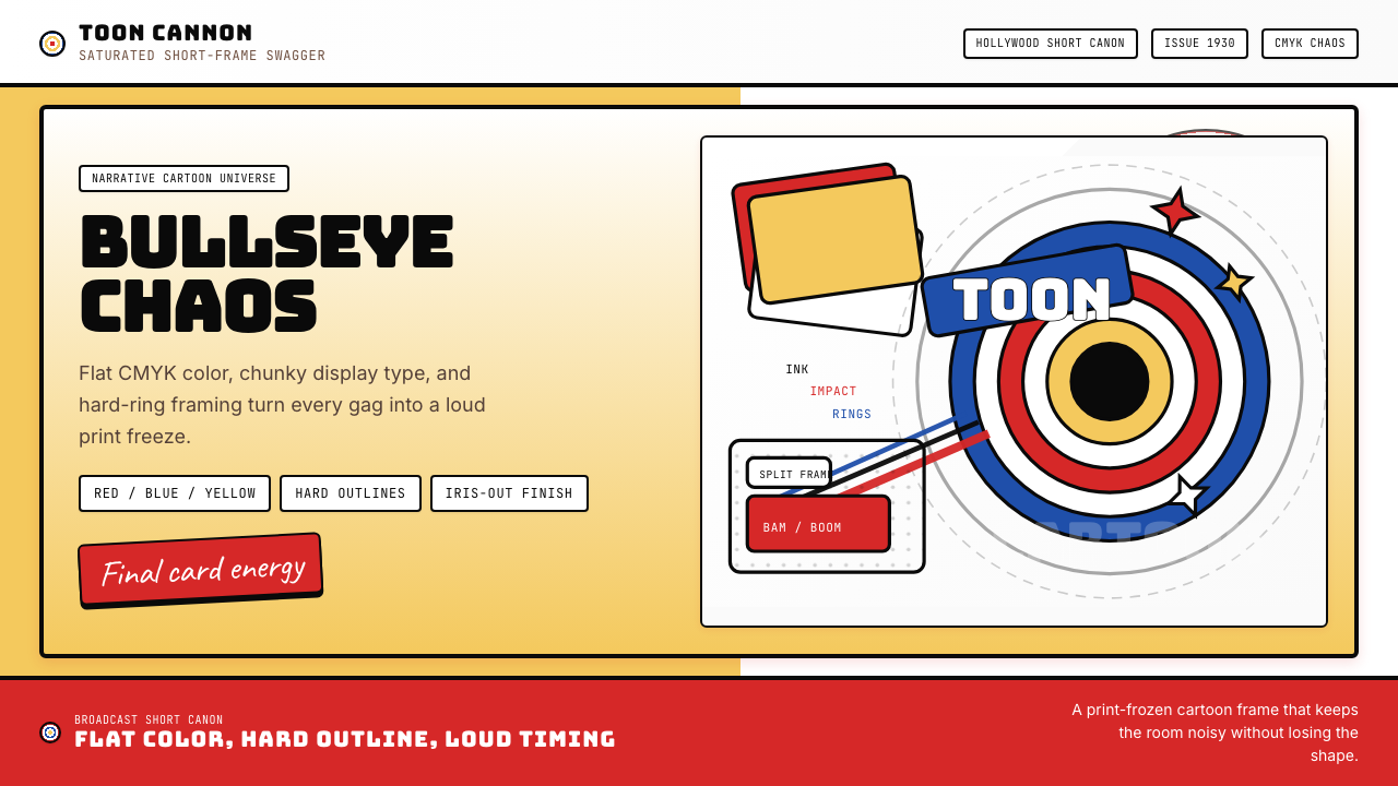 Looney Tunes (Warner Bros.)Pure cartoon chaos. Bull's-eye rings, Bungee type, and red-blue-yellow blocks.纯卡通混乱。牛眼环、粗壮标题字与红蓝黄块面。
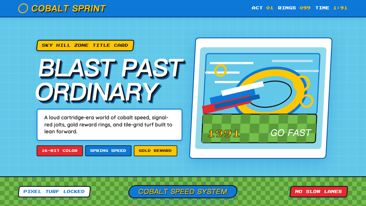 Sonic the Hedgehog (1991)Velocity has teeth. Sky-cyan, cobalt slant type, gold rings, checkerboard tur…速度带刺:天青底、钴蓝倾斜字、金环与棋盘草地。
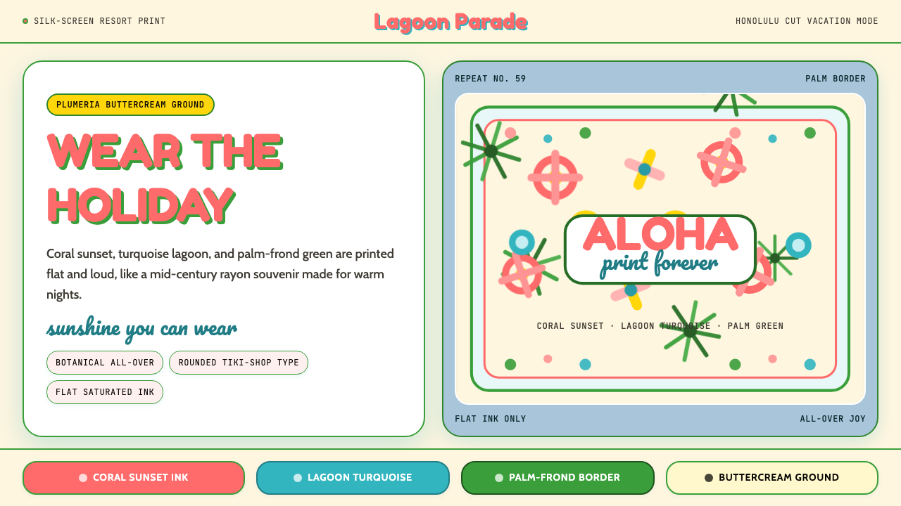 Hawaiian Aloha ShirtThe shirt is the holiday. Buttercream ground, coral Fredoka type, and flat tr…穿上就是假期。奶油底、珊瑚 Fredoka 字与热带平面印花。
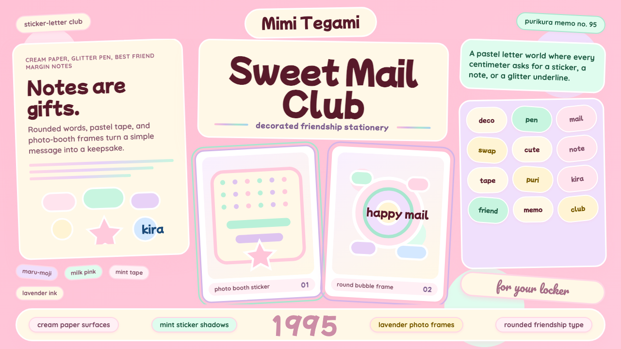 Kawaii Japanese Letter PurikuraCuteness fills every inch. Pink cream paper, mint stickers, lavender frames.可爱填满每寸:粉色奶油纸、薄荷贴纸、薰衣草相框。
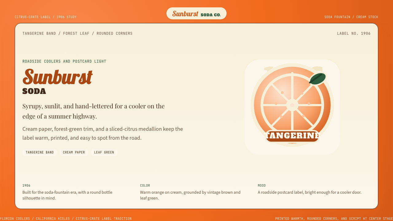 Orange Crush Soda (1906)Syrupy nostalgia. Tangerine, cream, and script make it a postcard label.糖浆般怀旧。橘红、奶油纸与手写体把标签变成明信片。
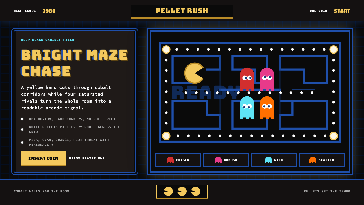 Pac-Man (Namco 1980)Arcade joy burns bright. Yellow disc, cobalt maze, and four ghost hues snap o…街机欢愉高亮燃烧:黄圆、钴蓝迷宫与四色幽灵在黑底上跳动。