What is Kawaii Japanese Letter Purikura?什么是 Kawaii Japanese Letter Purikura?
Kawaii tegami letter culture and purikura sticker-photo booths gave the world a joyfully maximalist visual language built from pastel rounds, layered stickers, and the conviction that every surface deserves a little more love.可爱手紙文化与大头贴机将一种欢快的极繁主义视觉语言带给了世界——它由柔和的圆润形态、层叠的贴纸与「每寸纸面都值得再多一点爱」的信念构成。
Kawaii Japanese Letter Purikura in briefKawaii Japanese Letter Purikura 速览
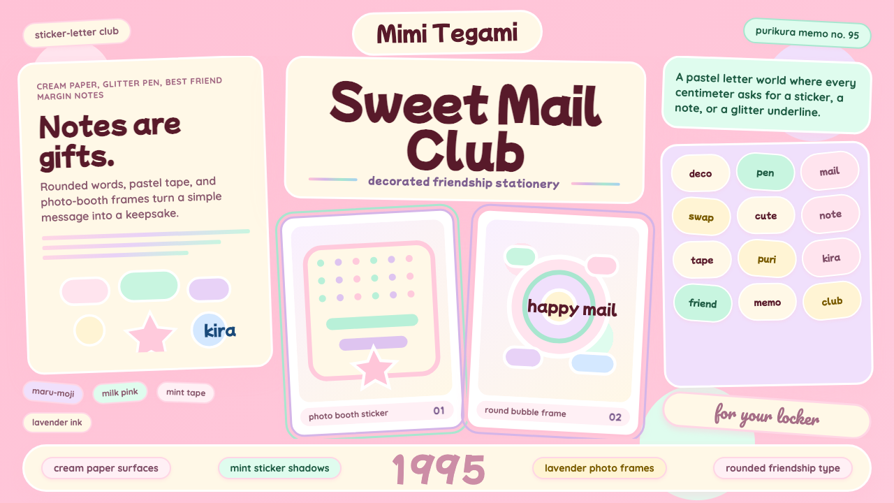
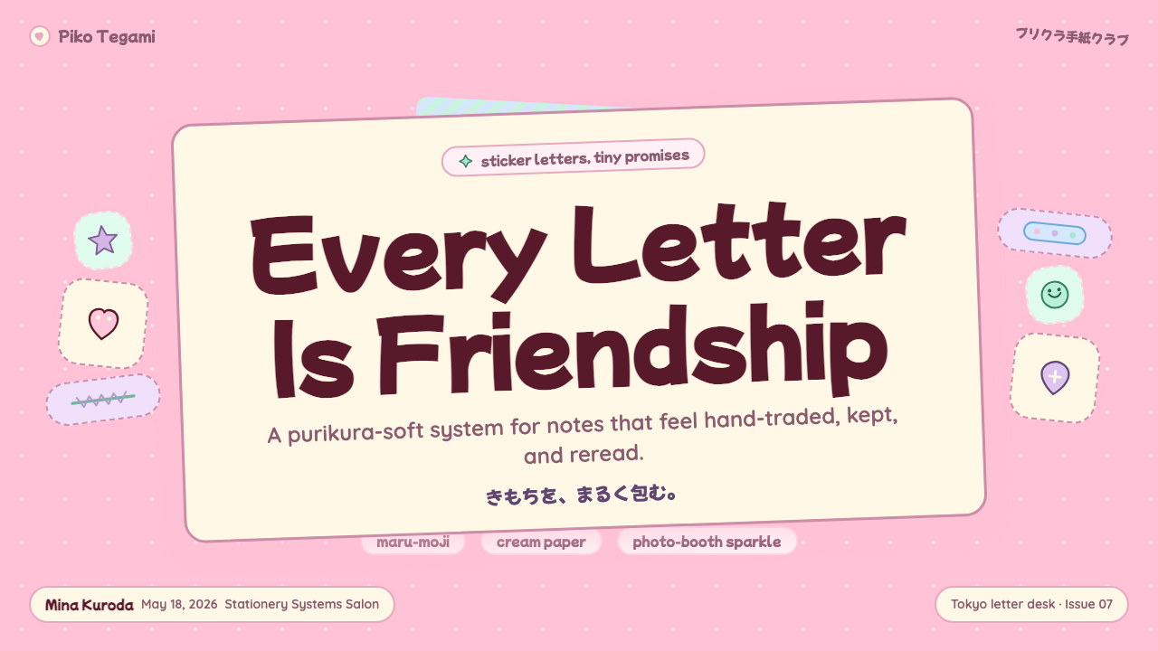
Kawaii Japanese Letter Purikura is a densely decorative visual system born from two overlapping traditions in Japanese youth culture: the bubbly maru-moji handwriting style popularized by schoolgirls in the 1970s and 1980s, and the purikura (Print Club) sticker-photo booth phenomenon that erupted across Japan from 1995 onward. Together they produced a design language in which every available surface is treated as a canvas for pastel color, rounded forms, layered stickers, glitter-pen marginalia, and character mascots — a style whose defining mood is exuberant, generous, and unapologetically cute.可爱手紙大头贴是一套浓密的装饰性视觉系统,诞生于日本青年文化中两条相互交织的传统:1970至80年代由女学生推广的圆润丸文字书写风格,以及1995年起席卷日本的大头贴(Print Club)贴纸拍照机现象。两者共同催生了一种视觉语言——每一寸可用的表面都被视为柔和色彩、圆润形态、层叠贴纸、闪光笔装饰和卡通吉祥物的画布。这种风格的核心气质是热情、慷慨、毫无保留的可爱。
The aesthetic operates by accumulation rather than restraint. Where modernist design systems subtract until nothing unnecessary remains, kawaii letter-purikura design adds until the composition feels complete — complete meaning warm, personal, and saturated with affection. Sticker clusters overlap speech-bubble captions; lace-edged frames nest inside scalloped borders; small mascot characters perch in corners or dangle from ruled lines. The palette centers on pale pink and cream as the dominant ground tones, with mint, lavender, baby blue, and soft yellow introduced as accent layers. Nothing is harsh or angular; every edge softens into a curve, and every curve is an invitation.这套美学以累积而非克制为运作方式。现代主义设计系统不断做减法直至只剩必要,而可爱手紙大头贴设计则不断做加法直至构图感觉完整——「完整」意味着温暖、个人化,并充满情感。贴纸群落与对话气泡标注相互重叠,蕾丝边框嵌套于扇贝形边界之内,小小的吉祥物角色栖息在角落或悬挂在横线旁。色板以淡粉色和奶油色为主调,辅以薄荷绿、薰衣草紫、浅蓝和柔和的黄色作为点缀层次。没有什么是刺眼或有棱角的;每一条边都柔化成曲线,每一条曲线都是一种邀请。
Although the style is rooted in analog craft — physical sticker sheets, gel pens on letter paper, photo-booth print strips — its visual logic translates cleanly into digital design. The rounded geometry, pastel layering, soft drop shadows, and character-based illustration vocabulary carry directly into interface design, social media graphics, brand identity, and presentation materials. The key quality that distinguishes the style from generic pastels is intentional density: kawaii letter-purikura work is carefully composed even when it looks spontaneous, with each decorative element placed to contribute warmth without producing chaos.尽管这种风格植根于模拟手工艺——实体贴纸页、手紙上的果冻笔、大头贴打印条——它的视觉逻辑可以清晰地转化到数字设计领域。圆润的几何形态、柔和的色彩分层、轻柔的投影和以角色为基础的插图词汇,可以直接延伸到界面设计、社交媒体图形、品牌形象和演示材料中。将这种风格与普通柔和色彩区分开来的关键品质是有意为之的密度:可爱手紙大头贴作品即便看起来自然随性,也是精心构图的——每一个装饰元素的放置都在为温暖感做贡献,同时又不制造混乱。
See the Kawaii Japanese Letter Purikura design system查看 Kawaii Japanese Letter Purikura 完整设计系统
Where does Kawaii Japanese Letter Purikura come from?Kawaii Japanese Letter Purikura 从何而来?
The roots of the kawaii letter aesthetic reach back to the late 1960s and early 1970s, when Japanese schoolgirls began writing in an idiosyncratic style they called maru-moji — literally 'round letters.' Characters were drawn with rounded strokes, letters were given faces and appendages, and pages were filled with small drawings of hearts, stars, and anthropomorphized objects alongside the written text. This handwriting was initially condemned by teachers and cultural commentators as a sign of intellectual regression; Yamane Kazuma's influential 1986 sociological study characterized it as a symptom of childlike dependency. But the girls writing it understood something their critics did not: the style was a deliberate construction of softness and playfulness in a social environment that demanded conformity and seriousness. Maru-moji was not laziness — it was a visual dialect.可爱手紙美学的根源可以追溯至1960年代末和1970年代初,那时日本女学生开始用一种她们称为「丸文字」的独特风格书写——字面意思是「圆润的文字」。字符用圆润笔触描绘,字母被赋予面孔和四肢,页面上的书写文字旁边填满了心形、星形和拟人化物体的小图画。这种书写方式最初遭到老师和文化评论者的谴责,认为它是智识退化的标志;山根和真1986年颇具影响力的社会学研究将其定性为孩童式依赖的症状。但书写丸文字的女孩们理解了批评者所不理解的东西:这种风格是在一个要求顺从和严肃的社会环境中,对柔软与嬉戏精神的刻意建构。丸文字不是懒惰——它是一种视觉方言。
The second foundational current was the rise of the kawaii goods industry in Tokyo's Shibuya, Harajuku, and Ikebukuro districts from the 1970s onward. Sanrio, founded in 1960, began producing character stationery and gift goods that made maru-moji culture tangible and purchasable: letter sets printed with Hello Kitty and My Melody, sticker sheets in pastel die-cut shapes, gel pens in confectionery colors. The Sanrio design department, under the creative direction of Yuko Yamaguchi (who became Hello Kitty's primary designer from 1980), refined a visual vocabulary in which cuteness operated through simplification — removing the mouth, rounding every form, centering the composition on emotional warmth rather than physical realism. San-X contributed its own roster of characters, including Rilakkuma and Nyan Nyan Nyanko, each embodying a slightly different register of softness and whimsy.第二条基础性脉络是从1970年代起,东京涩谷、原宿和池袋商圈的可爱商品产业的兴起。1960年成立的三丽鸥开始生产角色文具和礼品商品,使丸文字文化变得有形且可购买:印有Hello Kitty和My Melody的信纸套装、柔和色调模切形状的贴纸页、糖果色的果冻笔。三丽鸥设计部在矢口裕子(1980年起成为Hello Kitty的主要设计师)的创意主导下,精炼出一套可爱感通过简化来运作的视觉词汇——去除嘴巴,将每个形态圆润化,将构图中心置于情感温度而非物理写实上。San-X贡献了自己的角色阵容,包括轻松熊和猫猫虫咖波,每一个都体现着略有不同的柔软与奇趣格调。
The third and most catalyzing development was the 1995 launch of Print Club by Atlus, distributed in arcades and game centers across Japan by Sega. Print Club machines allowed users to photograph themselves against decorative backgrounds and print the results as sheets of small sticker photos — purikura, a phonetic contraction of 'print club.' The technology gave the letter-writing tradition a photographic dimension: purikura strips were exchanged between friends the way letters were, decorated with pens and stickers, and collected in albums. Later generations of the machines added in-booth decoration tools — digital stamps, glitter overlays, text fonts, and frame templates — that transferred the sticker-collage aesthetic directly into the photograph itself. By the late 1990s, the purikura booth had become the primary social technology of Japanese teenage girl culture.第三个也是最具催化作用的发展,是1995年Atlus推出的Print Club,由世嘉在日本全国的游戏厅和娱乐中心分销。Print Club机器允许用户在装饰性背景前拍照,并将结果打印成一张张小贴纸照片——大头贴,是「print club」的日语音译缩写。这项技术为手紙书写传统增添了摄影维度:大头贴条像信件一样在朋友之间交换,用笔和贴纸装饰,收集在相册里。后续几代机器增加了亭内装饰工具——数字印章、闪光叠加层、文字字体和边框模板——将贴纸拼贴美学直接转移到照片本身之中。到1990年代末,大头贴亭已成为日本少女文化的首要社交技术。
The peak years of kawaii letter-purikura culture as a unified aesthetic ran roughly from 1995 to 2005, coinciding with the height of the gyaru fashion subculture and the Harajuku decora movement, in which participants layered as many character accessories, plastic clips, and sticker-laden objects on their bodies as physically possible. The style never disappeared after that decade — it evolved, absorbed digital tools, and continued through social media, LINE sticker sets, and the global spread of Japanese pop culture. Today, a revived interest in Y2K aesthetics and in analog craft has brought kawaii letter-purikura sensibility back to prominent international attention, informing everything from fashion brand campaigns to mobile application interface design.可爱手紙大头贴文化作为统一美学的鼎盛年代大约从1995年延续至2005年,恰与辣妹时尚亚文化和原宿decora运动的高峰期重叠——decora运动的参与者在身上层叠尽可能多的角色配饰、塑料夹和贴满贴纸的物件。在那十年之后,这种风格从未消失——它演进发展,吸收了数字工具,并通过社交媒体、LINE贴图集和日本流行文化的全球传播延续至今。如今,对Y2K美学和模拟手工艺的复兴兴趣,将可爱手紙大头贴的感性带回了国际视野的显著位置,影响着从时尚品牌活动到移动应用界面设计的方方面面。
What defines the Kawaii Japanese Letter Purikura look?Kawaii Japanese Letter Purikura 的视觉特征是什么?
Color Palette色板
The palette is built around soft, desaturated pinks and creams as the dominant ground tones, with mint green, lavender, baby blue, and pale butter yellow layered on top as accent and sticker colors. Pure white appears as a highlight and as the ground for text bubbles. Nothing in the palette is fully saturated or harsh — even the deepest tones are pulled toward the pastel register, as though every color has been mixed with a measure of cream. Black is used sparingly, primarily for fine outlines and pen-drawn details rather than as a structural color. Iridescent and glitter tones — soft silver, light gold, pearl — appear as special-effect layers that evoke the physical shimmer of gel pens and holographic sticker sheets.色板以柔和的低饱和粉色和奶油色作为主导底调,薄荷绿、薰衣草紫、浅蓝和淡黄色作为点缀和贴纸颜色层叠其上。纯白色作为高光和文字气泡的底色出现。色板中没有任何颜色是完全饱和或刺眼的——即便是最深的色调也被拉向柔和的粉彩色域,仿佛每种颜色都混入了一份奶油。黑色使用克制,主要用于细线轮廓和钢笔描绘的细节,而非结构性色彩。彩虹光泽和闪光色调——柔和的银色、浅金色、珍珠色——作为特效层出现,唤起果冻笔和镭射贴纸的物理闪光效果。
Form and Geometry形态与几何
Rounded geometry is the structural signature of the style. Squares become rounded rectangles; circles and ovals are the primary containment shapes for portraits, speech bubbles, and decorative frames. The corner radius is never zero — sharp corners are alien to the aesthetic. Organic shapes derived from hearts, stars, clouds, and flowers appear as both background elements and sticker forms. Scalloped edges, lace patterns, and daisy chains function as border vocabulary. The overall compositional effect is one of softness and approachability: nothing in the layout could be described as severe or confrontational.圆润的几何形态是这种风格的结构性标志。正方形变为圆角矩形;圆形和椭圆形是人像、对话气泡和装饰边框的主要容纳形状。圆角半径从不为零——锐利的角对这套美学来说是异类。源自心形、星形、云朵和花朵的有机形态既作为背景元素又作为贴纸形式出现。扇贝形边缘、蕾丝图案和雏菊链条构成边框词汇。整体构图效果是柔软与亲和:版面中没有任何元素可以被描述为严厉或对抗性的。
Layering and Density层叠与密度
The compositional method is additive layering: a patterned or solid ground receives a frame, which receives sticker clusters, which receive photograph panels or illustrated elements, which receive text in bubble or stamp form, which may receive yet another layer of small character stickers or glitter accents. This creates a sense of visual depth and richness that reads as handmade and personal even in digital form. Unlike modernist design, where white space is structural, negative space in kawaii letter-purikura compositions is simply the space that hasn't been decorated yet — it is potential, not principle.构图方法是累积式层叠:图案或纯色底面承接一个边框,边框承接贴纸群落,贴纸群落承接照片面板或插图元素,这些元素承接气泡或印章形式的文字,文字上还可能再覆盖一层小角色贴纸或闪光点缀。即便在数字形式中,这也制造出一种手工制作、充满个人情感的视觉深度与丰富感。不同于现代主义设计中留白具有结构性意义,可爱手紙大头贴构图中的负空间只是尚未被装饰的空间——它是潜力,而非原则。
Typography and Lettering字体排印与手写字
Text in the style occupies three registers. First, handwritten or hand-lettered elements that echo maru-moji: rounded, bouncy, with inconsistent baseline and deliberate imperfection. Second, stamp-style type — blocky, outlined, and slightly offset — that evokes the physical rubber stamps sold in kawaii stationery stores. Third, speech-bubble captions in which the bubble shape is as expressive as the text inside it. Type is never the primary structural element of a composition; it is one decorative layer among many. Scale variation is used for expressive emphasis rather than informational hierarchy — a single word might be enlarged to fill a sticker, while surrounding text remains small and dense.这种风格中的文字占据三种表达形态。第一种是手写或手绘字体,呼应丸文字:圆润、弹跳感强,基线不一致,带有刻意的不完美感。第二种是印章风格字体——方块感强、有轮廓线、略微偏移——唤起可爱文具店出售的实体橡皮印章。第三种是对话气泡标注,气泡的形状与其中的文字同样富有表现力。文字从不是构图的主要结构性元素;它是众多装饰层次之一。尺度变化用于表达性强调而非信息层级——单个词语可能被放大以填满一张贴纸,而周围的文字则保持小巧而密集。
Character and Mascot Illustration角色与吉祥物插图
Character illustration is central rather than supplemental. Small mascot figures — whether licensed Sanrio or San-X characters, original drawn figures, or simplified emoji-style creatures — appear throughout compositions as emotional anchors. The illustration style shares the style's geometric softness: large heads relative to bodies, eyes that are simple circles or ovals, minimal facial features, and postures that communicate a specific emotional state (surprised, sleepy, happy, shy). These characters personalize compositions and function the way a handwritten signature does on a physical letter — they are a form of identity and a declaration of warmth.角色插图是核心而非附属。小型吉祥物形象——无论是授权的三丽鸥或San-X角色、原创手绘形象,还是简化的表情符号风格生物——遍布构图各处,作为情感锚点。插图风格与这种风格的几何柔软感共鸣:相对于身体来说头部较大,眼睛是简单的圆形或椭圆形,面部特征极简,姿态传达一种特定的情感状态(惊讶、困倦、快乐、害羞)。这些角色使构图个人化,功能类似于实体信件上的亲笔签名——它们是身份认同的一种形式,也是温情的宣示。
Soft Shadow and Glow柔和阴影与光晕
Where shadows appear, they are soft and diffuse rather than hard and geometric — the opposite of the Bauhaus approach. A sticker element casts a gentle rounded shadow that lifts it slightly off the layer beneath, creating a sense of physical tactility and craft. White glow effects outline characters and key sticker elements, increasing contrast against busy backgrounds while maintaining the style's softness. Gradient glows in iridescent tones appear on special frames and overlay effects. The shadow and glow system serves one purpose: to make the composition feel dimensional, like something assembled by hand and held in the light.当阴影出现时,它们是柔和弥散的,而非硬朗几何的——与包豪斯的处理方式相反。贴纸元素投下一道轻柔的圆润阴影,将其从下方的层次微微托起,制造出物理触感和手工艺的感觉。白色光晕效果勾勒出角色和关键贴纸元素的轮廓,在繁忙的背景上增加对比度的同时保持风格的柔软感。彩虹光泽色调的渐变光晕出现在特殊边框和叠加效果上。阴影和光晕系统服务于一个目的:使构图感觉是立体的,像是用双手拼贴组装、置于光线下的东西。
Pattern and Texture图案与纹理
Patterned backgrounds replace flat grounds in many compositions: polka dots, gingham checks, small repeating hearts or stars, stripe sequences, or lightly textured surfaces that suggest cream paper or washi tape. These patterns are never bold or distracting — they operate at a lower visual weight than the sticker and character layers above them, creating depth without competition. Washi tape strips, with their characteristic semi-transparent stripe patterns, appear as both compositional elements and framing devices. Texture in this system signifies handmade care: the slight roughness of sticker paper, the translucency of gel pen glitter.在许多构图中,图案背景取代了平面底色:波点、格纹、小型重复的心形或星形、条纹序列,或轻微纹理化的表面暗示着奶油色信纸或和纸胶带。这些图案从不粗犷或令人分心——它们在视觉重量上低于其上方的贴纸和角色层,在不产生竞争的情况下制造深度。和纸胶带条带,以其特有的半透明条纹图案,既作为构图元素又作为框架装置出现。这套系统中的纹理意味着手工制作的用心:贴纸纸张的轻微粗糙感,果冻笔闪光的半透明质感。
See the Kawaii Japanese Letter Purikura design system查看 Kawaii Japanese Letter Purikura 完整设计系统
Who shaped Kawaii Japanese Letter Purikura?谁塑造了 Kawaii Japanese Letter Purikura?
Yamaguchi became the primary designer of Hello Kitty in 1980 and held that role for decades, making her the single most influential individual in defining the visual vocabulary of commercial kawaii. Her approach to the character — stateless expression (no mouth), oversized head, simplified silhouette — encoded the core principles of kawaii illustration: legibility across tiny reproduction sizes, emotional openness that allows the viewer to project feeling, and a geometry stripped of everything not essential to cuteness. Through Hello Kitty's licensing across thousands of product categories, Yamaguchi's design sensibility became the template against which all subsequent kawaii character design was measured.矢口裕子于1980年成为Hello Kitty的主要设计师,并在此后数十年保持这一角色,使她成为定义商业可爱视觉词汇的最具影响力的个人。她对这个角色的处理方式——无状态的表情(没有嘴巴)、超大的头部、简化的剪影——编码了可爱插图的核心原则:在极小的再现尺寸下仍保持可读性,情感上的开放性使观者能够投射自己的感受,以及剔除了一切非可爱本质的几何形态。通过Hello Kitty在数千个产品类别中的授权,矢口裕子的设计感性成为所有后续可爱角色设计所参照的模板。
The designers and engineers at Atlus who created the original Print Club machine in 1995 — distributed by Sega — effectively invented a new social medium. Their key insight was pairing photography with immediate physical output in sticker format, creating an object that was simultaneously a photograph, a sticker, and a letter-writing accessory. Subsequent development teams expanded the in-booth decoration capabilities over the following decade, adding the digital stamp, glitter, and frame tools that brought the full kawaii letter aesthetic into the photographic space. The Print Club machine's combination of mechanical photography and sticker culture created the central artifact around which the entire purikura aesthetic organized itself.1995年在Atlus创作了原版Print Club机器(由世嘉分销)的设计师和工程师们,实际上发明了一种新的社交媒介。他们的核心洞见是将摄影与即时实体输出以贴纸形式结合,创造出一个同时是照片、贴纸和手紙写作配件的物件。此后十年间,后续开发团队不断扩展亭内装饰功能,添加了数字印章、闪光和边框工具,将完整的可爱手紙美学带入了摄影空间。Print Club机器将机械摄影与贴纸文化相结合,创造出整个大头贴美学围绕其组织的核心物件。
While Sanrio established the foundational vocabulary of Japanese character stationery, San-X — founded in 1932 and pivoting to character goods in the 1990s — extended the kawaii letter aesthetic in a more melancholy and introspective direction. Characters like Rilakkuma (a bear of uncertain origin who simply appeared one day) and Nyan Nyan Nyanko (a cat who wears a fish costume) introduced a quality of gentle ambiguity and absurdist warmth that distinguished San-X work from the more straightforwardly cheerful Sanrio register. San-X stationery, sticker sets, and character goods were central to kawaii letter culture throughout the 1990s and 2000s, and the company's design sensibility showed that kawaii could encompass quiet, sleepy, and even slightly strange alongside purely happy.尽管三丽鸥建立了日本角色文具的基础词汇,但1932年创立、1990年代转型至角色商品的San-X,将可爱手紙美学向更加忧郁和内省的方向延伸。轻松熊(一只来源不明、某天突然出现的熊)和猫猫虫咖波(一只穿着鱼造型衣服的猫)这样的角色,引入了一种温柔模糊和荒诞温情的品质,使San-X作品有别于三丽鸥更直接欢快的格调。San-X的文具、贴纸集和角色商品在整个1990至2000年代都是可爱手紙文化的核心,这家公司的设计感性表明,可爱可以包容安静、困倦甚至略带奇异,而不仅仅是纯粹的快乐。
Sanrio's in-house design team, working under successive creative directors since the company's 1960 founding, built the commercial infrastructure of kawaii letter culture. The company's genius lay not in any single character but in the system: a roster of characters each occupying a distinct emotional niche, a stationery product line that gave girls the physical materials to write in kawaii style, and a retail environment (Sanrio stores, later Sanrio Puroland) that made the aesthetic immersive and aspirational. The department's work on letter sets — envelopes with matching paper, printed with character borders and pastel grounds — directly shaped the visual conventions that kawaii letter-purikura design inherited.三丽鸥的内部设计团队,自1960年公司创立以来在历届创意总监的带领下,建立了可爱手紙文化的商业基础设施。这家公司的天才之处不在于任何单一角色,而在于整个系统:一个每个角色占据不同情感细分领域的角色阵容,一条给女孩们提供以可爱风格书写所需实体材料的文具产品线,以及一个使这套美学变得沉浸而令人向往的零售环境(三丽鸥商店,后来是三丽鸥乐园)。该团队在信纸套装——印有角色边框和柔和底色的配套信封与信纸——上的工作,直接塑造了可爱手紙大头贴设计所继承的视觉惯例。
The decora subculture that flourished in Harajuku from the mid-1990s through the 2000s represented the most fully realized physical embodiment of kawaii letter-purikura aesthetic values. Decora participants applied the layering principle to their bodies: hundreds of plastic clips, character accessories, sticker-covered objects, and pastel garments accumulated into compositions that were literal three-dimensional equivalents of a densely decorated letter page. Photographers like Shoichi Aoki, who documented Harajuku street fashion in the magazine Fruits, brought international visibility to the subculture and established the connection between kawaii accumulation aesthetics and a broader global visual conversation. The decora community demonstrated that kawaii letter-purikura principles were not limited to paper — they were a complete approach to personal visual expression.从1990年代中期到2000年代在原宿蓬勃发展的decora亚文化,代表了可爱手紙大头贴美学价值观最充分实现的物质体现。decora参与者将层叠原则应用于自己的身体:数百个塑料夹、角色配饰、贴满贴纸的物件和柔和色调的服装积累成构图,成为装饰丰富的信纸页面字面意义上的三维等价物。青木耕辅等摄影师在杂志《Fruits》中记录原宿街头时尚,使这个亚文化获得了国际能见度,并建立了可爱累积美学与更广泛全球视觉对话之间的联系。decora社区证明,可爱手紙大头贴的原则并不局限于纸张——它们是一种完整的个人视觉表达方式。
How do you use Kawaii Japanese Letter Purikura today?今天怎么用 Kawaii Japanese Letter Purikura?
Kawaii Japanese letter-purikura is one of the few historical design systems built explicitly around emotional warmth, which makes it simultaneously highly specific in application and unusually transferable across product categories where affection, personality, and playfulness are desired values. Applying it well requires understanding its underlying logic — accumulation as care, softness as welcome, density as generosity — rather than simply selecting pastel colors and adding a few hearts.可爱手紙大头贴是少数几个明确围绕情感温度建构的历史设计系统之一,这使它既在应用上高度具体,又在情感、个性和嬉戏感是期望价值的产品类别中具有异常强的可移植性。良好地应用它需要理解其底层逻辑——累积即关爱,柔软即欢迎,密度即慷慨——而非仅仅选择柔和色彩并添加几颗心形。
For presentation slides, the style excels on cover pages and section dividers where emotional tone is established before content begins. A cover built in this system layers a soft patterned background with a centered or slightly offset composition of character illustration, rounded title type, and a small sticker cluster in the lower corner. The result should feel curated, as though someone prepared it specifically for the viewer. Content slides require more restraint: use the style's patterned border vocabulary to frame content areas, keep background patterns at very low visual weight, and rely on rounded-rectangle containers rather than hard-edged boxes. Data slides can incorporate the style's character mascots as data annotation elements — a small surprised character next to an unexpected data point reads as warm and self-aware rather than clinical.对于演示文稿,这种风格在封面页和章节分隔页上表现卓越,因为情感基调在内容开始之前就已建立。用这套系统构建的封面将柔和的图案背景与居中或略微偏移的角色插图、圆润的标题字体和位于下角的小贴纸群落层叠在一起。效果应该感觉是精心策划的,仿佛有人专门为观者准备的。内容页需要更多克制:使用这种风格的图案边框词汇来框定内容区域,保持背景图案的极低视觉重量,依靠圆角矩形容器而非硬边盒子。数据页可以将这种风格的角色吉祥物作为数据注释元素——一个位于意外数据点旁边的小惊讶角色,读起来是温暖而有自我意识的,而非临床式的。
For web interfaces, the style is well-suited to consumer-facing products targeting audiences who value personality over authority: children's education platforms, personal productivity tools, pet-care applications, social and community products, gift and stationery e-commerce. Dashboard layouts benefit from soft rounded cards with subtle inner glow effects, pastel color coding for categories, and character mascots used as empty-state illustrations. Pricing pages can use the style's sticker vocabulary — a slightly rotated badge with rounded corners and an outline glow — to highlight a recommended tier without resorting to aggressive contrast. Navigation elements should have a handcrafted quality: slightly imperfect alignment, type that reads as friendly rather than corporate.对于网页界面,这种风格非常适合面向重视个性而非权威的受众的消费类产品:儿童教育平台、个人生产力工具、宠物护理应用、社交和社区产品、礼品和文具电商。仪表板布局受益于带有微妙内发光效果的柔和圆角卡片、用于分类的柔和色彩编码,以及用作空状态插图的角色吉祥物。定价页面可以使用这种风格的贴纸词汇——略微旋转的带轮廓发光的圆角徽章——来突出推荐套餐,而无需诉诸攻击性的对比度。导航元素应该具有手工制作的品质:略微不完美的对齐,字体读起来是友好的而非企业化的。
For editorial and marketing work, the style supports campaigns where authenticity, warmth, and community are central values. A brand campaign built in this system uses a consistent mascot character as a through-line, applies the pastel layering system to photography by overlaying sticker-style graphic elements, and writes copy in a register that is personal and conversational. Packaging design in this system emphasizes the gift-giving dimension of kawaii culture: the package is itself an object of delight, not merely a container. Pattern-based wrapping, sticker-sheet inserts, and character-printed tissue paper are all consistent with the aesthetic's logic of making every surface an opportunity for affection.对于编辑和营销工作,这种风格支持真实性、温度和社区是核心价值的活动。用这套系统构建的品牌活动以一致的吉祥物角色作为贯穿线索,通过叠加贴纸风格图形元素将柔和色彩分层系统应用于摄影,并以个人化和对话性的语调撰写文案。这套系统中的包装设计强调可爱文化的馈赠维度:包装本身是一件令人愉悦的物件,而不仅仅是容器。带图案的包装纸、贴纸页插页和印有角色的棉纸,都与这套美学逻辑——让每一寸表面成为情感表达的机会——相吻合。
A common mistake when applying this style is confusing visual density with visual chaos. Kawaii letter-purikura compositions are dense, but they are not random — each element is placed with intention, and the overall composition has a clear focal point (usually a character or photograph) surrounded by supporting decorative layers at decreasing visual weight. A second mistake is applying the pastel palette without the rounded geometry: pastel colors on sharp-cornered layouts produce a style that feels clinical and cold rather than warm. The softness of the color and the softness of the form must work together. A third mistake is treating the style as inherently juvenile; in contemporary practice, kawaii aesthetics operate successfully in adult consumer products, premium gift brands, and sophisticated editorial contexts — the key is maintaining compositional care and avoiding the kind of thoughtless accumulation that makes the style read as childish rather than curated.应用这种风格时最常见的错误,是将视觉密度与视觉混乱混淆。可爱手紙大头贴的构图是密集的,但并非随机的——每个元素都是有意放置的,整体构图有一个清晰的焦点(通常是角色或照片),周围是以递减视觉重量排列的支撑装饰层。第二个错误是在没有圆润几何的情况下应用柔和色板:柔和色彩配上锐角布局会产生一种感觉临床而冰冷而非温暖的风格。色彩的柔软感与形态的柔软感必须协同工作。第三个错误是将这种风格视为本质上是幼稚的;在当代实践中,可爱美学在成人消费品、高端礼品品牌和精致编辑语境中都能成功运作——关键是保持构图的用心,避免让这种风格读起来是随意堆砌而非精心策划的那种漫无目的的累积。
See the Kawaii Japanese Letter Purikura design system查看 Kawaii Japanese Letter Purikura 完整设计系统
Kawaii Japanese Letter Purikura — FAQKawaii Japanese Letter Purikura · 常见问题
How is kawaii letter-purikura different from generic pastel or 'soft girl' aesthetics?可爱手紙大头贴与普通的柔和色调或「软妹」美学有何不同?
Generic pastel design uses soft color simply for its mood value — calm, approachable, gentle — and often pairs it with clean, minimal layouts. Kawaii letter-purikura is specifically about density, layering, and character-based illustration. The pastel color is not the subject; it is the ground on which stickers, frames, mascots, handwriting-style type, and photographic elements are accumulated. A true kawaii letter-purikura composition will always have more elements than a soft pastel design, and those elements will include character figures, decorative borders derived from craft traditions (lace, stamps, washi tape), and a sense that the composition was assembled as an act of affection for its recipient.普通的柔和色调设计仅仅为了情绪价值而使用柔和色彩——平静、亲和、温柔——通常与简洁、极简的版面搭配。可爱手紙大头贴专门关注密度、层叠和以角色为基础的插图。柔和色彩不是主题;它是贴纸、边框、吉祥物、手写风格字体和摄影元素在其上积累的底面。真正的可爱手紙大头贴构图总是比柔和粉彩设计拥有更多元素,而那些元素将包括角色形象、源自手工艺传统的装饰边框(蕾丝、印章、和纸胶带),以及一种感觉——构图是作为对接收者的情感行为而组装的。
Can this style work for brands that need to appear professional or premium?这种风格能用于需要显得专业或高端的品牌吗?
Yes, but it requires calibration. The style's density and character illustration can be dialed down while retaining its core qualities: rounded forms, layered soft color, patterned grounds, and a sense of compositional care. Premium kawaii applications tend to reduce the number of decorative layers, limit the character illustration to a single refined mascot, use higher-quality typographic choices in the handwritten register, and apply the palette in a more restrained range — perhaps two pastel tones rather than five. Japanese stationery brands like Midori and Classiky demonstrate that kawaii principles can operate at a craft-premium register without becoming childish or chaotic. The key is elevating the craft quality of each individual element rather than reducing the number of elements.可以,但需要校准。在保留核心品质的同时,可以降低这种风格的密度和角色插图程度:圆润的形态、层叠的柔和色彩、图案底面,以及构图用心的感觉。高端的可爱应用往往减少装饰层次的数量,将角色插图限制为单一精炼的吉祥物,在手写字体选择上使用更高品质的方案,并以更克制的范围应用色板——也许是两种柔和色调而非五种。日本文具品牌如Midori和Classiky证明,可爱原则可以在手工艺精品档次下运作,而不显得幼稚或混乱。关键是提升每个单独元素的工艺质量,而非减少元素的数量。
How should photography be treated within this design system?在这套设计系统中应该如何处理摄影?
Photography in kawaii letter-purikura compositions is treated as one layer among many, not as the dominant visual element. Photographs are typically contained within rounded frames — circles, ovals, rounded rectangles, or decorative shaped frames — and positioned within a larger decorated composition rather than bleeding to the edge of a layout. The purikura tradition specifically involves decorating around and over photographs with digital stamps, glitter overlays, and text frames, so the photograph becomes a center point for additional decoration rather than a standalone image. In digital applications, this translates to treating product photography or portrait photography as contained objects within a sticker-like frame, surrounded by character illustration and decorative elements at a lower visual weight.可爱手紙大头贴构图中的摄影被视为众多层次之一,而非主导视觉元素。照片通常被包含在圆润的边框内——圆形、椭圆形、圆角矩形或装饰性异形边框——并定位在更大的装饰构图中,而非出血至版面边缘。大头贴传统专门涉及用数字印章、闪光叠加层和文字边框在照片周围和之上进行装饰,因此照片成为额外装饰的中心点,而非独立图像。在数字应用中,这转化为将产品摄影或人像摄影视为贴纸状边框内的容纳对象,被视觉重量更低的角色插图和装饰元素所环绕。
Is it appropriate to use licensed Sanrio or San-X characters in commercial design work?在商业设计作品中使用授权的三丽鸥或San-X角色合适吗?
Licensed character use requires formal licensing agreements with the IP holders — Sanrio and San-X both have active global licensing programs and are accustomed to commercial partnerships, but unauthorized use of their characters in commercial contexts is a copyright infringement regardless of aesthetic intent. In practice, the kawaii letter-purikura style can be fully realized using original character illustration that follows the style's established conventions: large-headed figures with simple facial features, rounded silhouettes, and clear emotional expression. Many successful kawaii brand identities use original mascot characters that clearly operate within the kawaii visual tradition without requiring licensed IP. The style's conventions are in the public domain even when specific character designs are not.使用授权角色需要与知识产权持有者签订正式授权协议——三丽鸥和San-X都有活跃的全球授权项目,也习惯于商业合作,但在商业语境中未经授权使用其角色无论出于何种美学意图都构成版权侵权。在实践中,可爱手紙大头贴风格完全可以使用遵循该风格既定惯例的原创角色插图来实现:头部较大、面部特征简单、轮廓圆润、情感表达清晰的形象。许多成功的可爱品牌形象使用原创吉祥物角色,这些角色在可爱视觉传统中清晰运作,而无需授权知识产权。这种风格的惯例属于公共领域,即便具体角色设计并非如此。
What makes a kawaii letter-purikura design feel authentic versus merely derivative?是什么让一个可爱手紙大头贴设计感觉是真实的,而非仅仅是衍生品?
Authentic work in this style is characterized by compositional intentionality — the sense that every element was chosen and placed with care, even if the overall effect is maximalist. Derivative work tends to scatter decorative elements randomly across a pastel ground without establishing a focal point or a visual hierarchy among the layers. Authentic kawaii letter-purikura compositions always have a clear center of gravity: a portrait, a character, or a text element that the surrounding decoration serves. A second marker is the quality of the character illustration: rough or generic clip-art figures read as hollow imitation, while original illustration with personality and emotional specificity anchors the style convincingly. Finally, authentic work demonstrates understanding of the physical craft traditions it references — the visual logic of sticker sheets, the semi-transparency of washi tape, the bounce of rubber-stamp type — rather than simply applying pastel color to a conventional layout.这种风格中真实的作品以构图的刻意性为特征——每个元素都经过用心选择和放置的感觉,即便整体效果是极繁主义的。衍生性作品往往将装饰元素随机散落在柔和色彩底面上,而没有建立焦点或层次之间的视觉层级。真实的可爱手紙大头贴构图始终有一个清晰的重心:一张人像、一个角色或一个文字元素,周围的装饰服务于它。第二个标志是角色插图的品质:粗糙或通用的剪贴画形象读起来是空洞的模仿,而具有个性和情感特异性的原创插图则令人信服地锚定了这种风格。最后,真实的作品展示出对它所参照的实体手工艺传统的理解——贴纸页的视觉逻辑、和纸胶带的半透明感、橡皮印章字体的弹跳感——而不仅仅是将柔和色彩应用于常规版面。
Related design styles相关设计风格
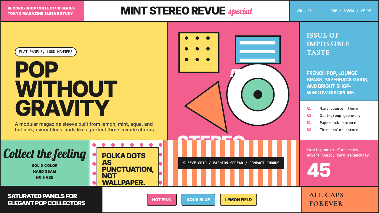 Shibuya-kei (Flipper's Guitar, 1995)Pop without gravity. Hot pink, mint, lemon, and aqua snap into album-sleeve g…流行但不沉重:粉红、薄荷、柠檬与水蓝拼成唱片封套网格。
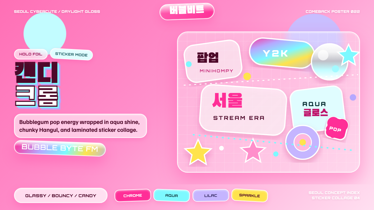 K-Pop Y2K SeoulCandy chrome goes maximal. Hot pink, aqua, Hangul type, and sticker collage s…糖果铬感极繁:热粉、水蓝、韩文字体与贴纸拼贴发光。
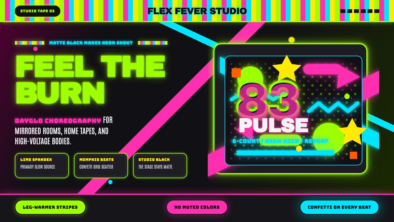 80s Aerobics Fluoro SpandexNeon refuses restraint. Lime spandex, pink-cyan confetti, and black-stage typ…霓虹拒绝克制:荧光绿氨纶、粉蓝彩屑与黑场大字一起燃烧。
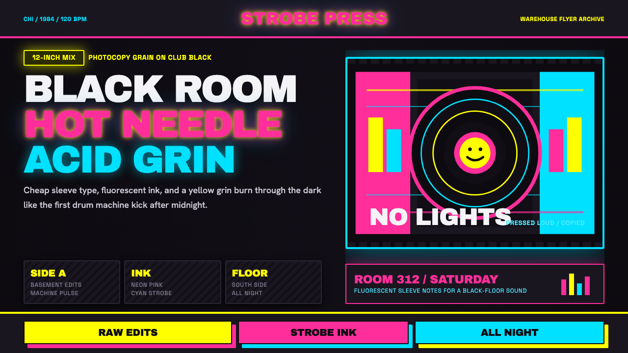 Chicago HouseDarkness starts the track. Neon pink, yellow and cyan hit black like Xerox st…黑暗先起拍。霓虹粉、黄与青打在黑底上,像复印频闪。
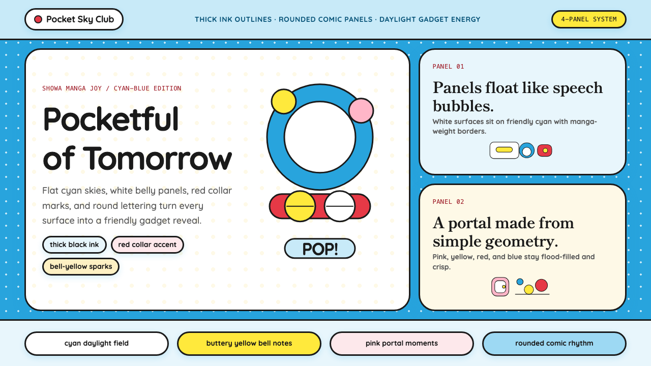 DoraemonChildhood joy, inked bold. Cyan fields, white panels, red collars, and rounde…童年快乐被粗线描出:青蓝底、白面板、红项圈与圆润漫画字。
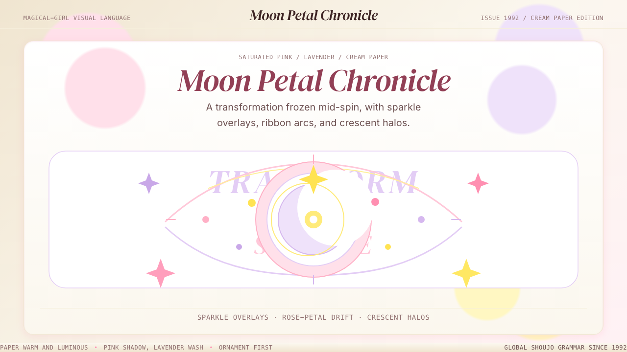 Sailor Moon ShoujoSweet and ornate. Pink, lavender, and cream with sparkle, ribbons, and cresce…甜美又繁复。粉紫奶油底色配星光、丝带与新月光环。