What is Sailor Moon Shoujo?什么是 Sailor Moon Shoujo?
Sailor Moon Shoujo freezes a magical-girl transformation mid-spin — saturated pastel swirls, crescent tiaras, cascading ribbons, and an unapologetic sweetness that defined a genre for a generation.美少女战士的视觉语言将一段变身序列定格在最华彩的瞬间——饱和的彩虹漩涡、新月发饰、倾泻的丝带,以及一种毫不掩饰的甜美,定义了整整一代人的少女漫画美学。
Sailor Moon Shoujo in briefSailor Moon Shoujo 速览
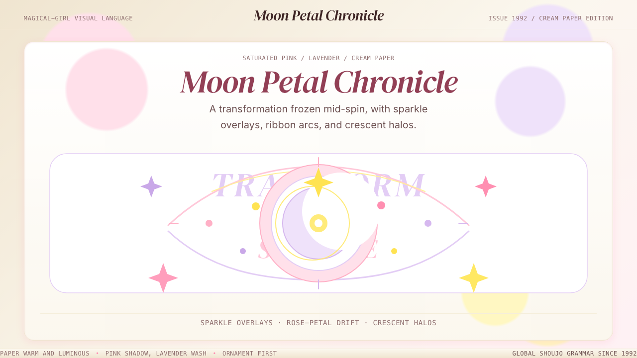
Sailor Moon Shoujo is the canonical visual language of 1990s magical-girl anime and manga: a lush, ornate aesthetic built from saturated pink and lavender, soft cream and white grounds, sparkle overlays, rose-petal motifs, crescent-moon iconography, and the elaborate flourishes of transformation sequences. It is the rare design style that is simultaneously maximalist and internally coherent — every element of excess has a recognizable emotional purpose.美少女战士少女风格是1990年代魔法少女动漫与漫画的标志性视觉语言:一套繁复华丽的美学体系,由饱和的粉红与薰衣草紫、柔和的奶油色与白色底面、星光闪烁的叠层、玫瑰花瓣母题、新月图腾,以及变身序列特有的精雕细琢装饰花纹共同构成。它是罕见的将极繁主义与内在一致性融于一体的设计风格——每一处过剩都有可辨认的情感目的。
The style operates through layering. A typical composition might place a cream or pale ground beneath a gradient sky, scatter sparkles and starbursts across the midground, add ribbons and lace borders at the edges, and culminate in a central figure surrounded by petals, light rays, and ornamental typography. None of this reads as clutter because the palette is carefully controlled: pinks, lavenders, soft yellows, and peach tones occupy the warm end of the spectrum, while pale blues and mints provide contrast without introducing visual weight. The result is richness without darkness.这种风格通过层叠来运作。一个典型的构图可能在奶油色或淡色底面之上铺设渐变天空,在中间层散布星光与光晕,在边缘添加丝带与蕾丝边框,最终以被花瓣、光线和装饰性字体围绕的中心人物收尾。这一切并不显得杂乱,因为色板受到精心控制:粉红、薰衣草、柔黄和桃色占据暖色端,淡蓝与薄荷绿提供对比而不引入视觉重量。结果是丰盛而不阴沉。
At its core, Sailor Moon Shoujo is a narrative style. Its visual vocabulary — the crescent moon, the star, the heart, the rose, the bow — carries story meaning. These symbols do not function as decoration in the way that geometric ornament does in other styles; they are a visual shorthand for the genre's thematic preoccupations: love, transformation, identity, and power. Applying the style correctly means treating its motifs as meaningful rather than merely pretty.从本质上说,美少女战士少女风格是一种叙事性风格。它的视觉词汇——新月、星星、心形、玫瑰、蝴蝶结——承载着故事意义。这些符号不像其他风格中的几何装饰那样纯粹作为点缀;它们是这一流派主题关切的视觉速记:爱、变身、身份与力量。正确应用这种风格,意味着将这些母题当作有意义的存在,而非仅仅是美丽的装饰。
See the Sailor Moon Shoujo design system查看 Sailor Moon Shoujo 完整设计系统
Where does Sailor Moon Shoujo come from?Sailor Moon Shoujo 从何而来?
The style traces directly to Naoko Takeuchi, a manga artist who began serializing Pretty Soldier Sailor Moon in the monthly shōjo anthology Nakayoshi in December 1991. Takeuchi fused two previously distinct genres — the magical-girl tradition originating with Sally the Witch in 1966, and the sentai (team superhero) action format — into a single narrative that centered romantic emotion and personal transformation alongside battle sequences. Her draftsmanship set the visual template: elongated proportions, enormous luminous eyes, elaborately designed costumes featuring sailor-collar uniforms, bows, and crescent insignia, and transformation sequences rendered with an almost baroque density of starbursts, ribbons, and radial light.这种风格的源头可以直接追溯到漫画家武内直子。她于1991年12月开始在月刊少女漫画杂志《好朋友》上连载《美少女战士》。武内将两种此前截然不同的流派合而为一——以1966年《魔法使莎莉》为开端的魔法少女传统,以及战队(团队超级英雄)动作格式——创作出一部将浪漫情感与个人变身置于战斗序列同等核心位置的叙事作品。她的绘画风格确立了视觉范本:修长的人体比例、巨大而明亮的眼睛、精心设计的服装(水手领、蝴蝶结、新月徽章),以及以近乎巴洛克式的密度呈现的变身序列——星光、丝带、放射状光线铺天盖地。
Toei Animation brought the manga to television in March 1992, and the adaptation codified the visual language for a global audience. Director Junichi Sato and later Kunihiko Ikuhara — who would go on to create Revolutionary Girl Utena — shaped the anime's signature aesthetic vocabulary: the spinning transformation henshin sequences that became the style's most imitated element, the pastel-gradient backdrops of Tokyo neighborhoods, the recurring moon and star iconography, and the editorial italic typography used in title cards and eyecatches. The anime's color styling, handled by Toei's experienced animation teams, standardized the palette that the broader genre would adopt for the rest of the decade.东映动画于1992年3月将漫画搬上电视,改编版将这套视觉语言向全球观众完整呈现。导演佐藤顺一,以及后来执导《少女革命》的幾原邦彦,塑造了动画版的标志性视觉词汇:旋转变身「变身」序列(成为这种风格被模仿最多的元素)、东京街区的粉彩渐变背景、反复出现的月亮与星星图腾,以及用于片名卡和片段分隔画面的装饰意大利体字体。东映经验丰富的动画团队所确定的色彩方案,为此后整个十年的魔法少女流派奠定了标准色板。
The cultural moment was as important as the creators. Japan's early 1990s saw a sustained boom in shōjo manga, a genre addressing adolescent girls as a primary creative and commercial audience rather than a peripheral one. Publishers like Kodansha, who produced Nakayoshi, invested heavily in visual spectacle. Meanwhile, improvements in color printing for manga supplementary materials — artbooks, merchandise inserts, and deluxe editions — gave Takeuchi's full-color illustrations wide distribution and established the palette associations that fans internalized: Sailor Moon's primary pink, Sailor Mercury's cool blue, Sailor Mars's deep red, and so on across the ensemble cast.文化时机与创作者本身同样重要。1990年代初的日本正处于少女漫画的持续繁荣期——这一流派将青少年女性作为主要的创作与商业受众,而非边缘群体。讲谈社等出版商对视觉奇观进行了大量投资。与此同时,漫画周边材料——画集、商品插页、豪华版——的彩色印刷工艺的进步,使武内的全彩插画得以广泛发行,并在粉丝之间确立了深入人心的色彩联想:月野兔的主色粉红、水野亚美的冷蓝、火野丽的深红,以及整个主角团各自对应的专属色。
International distribution through the 1990s and early 2000s — including North American broadcast adaptations, European releases, and widespread VHS circulation in Asia — carried the visual language beyond Japan. A generation of artists, designers, and illustrators who grew up watching the show absorbed its aesthetic vocabulary as a formative reference. The 2014 reboot Sailor Moon Crystal, produced to mark the franchise's twentieth anniversary, reintroduced the style to a new generation with updated production values while maintaining the core visual grammar. Today the style functions simultaneously as nostalgia artifact and living design language, actively cited in fashion, digital illustration, and graphic design globally.1990年代至2000年代初的国际发行——包括北美播出的改编版、欧洲版本,以及遍布亚洲的录像带流通——将这套视觉语言带出了日本国境。一整代在观看这部作品中成长的艺术家、设计师和插画师,将其视觉词汇作为形成期的参照内化。2014年为纪念系列二十周年而制作的重制版《美少女战士Crystal》,以更新的制作水准向新一代重新引介这种风格,同时保留了核心视觉语法。如今,这种风格同时作为怀旧符号与鲜活的设计语言而存在,在全球的时尚、数字插画和平面设计领域被广泛援引。
What defines the Sailor Moon Shoujo look?Sailor Moon Shoujo 的视觉特征是什么?
Palette色板
The foundational palette centers on saturated pinks and lavenders — warm, luminous hues that read as both sweet and intense simultaneously. These anchor colors are extended by soft creams, pale yellows, and peach tones in the warm range, and by cool mints and baby blues that provide contrast without visual weight. White appears frequently, not as a neutral ground but as a glowing, almost radiant surface. The palette avoids dark values; even shadows in this style tend to be warm violet or soft purple rather than black or grey. The overall impression is of color that is fully saturated but never heavy.基础色板以饱和的粉红与薰衣草紫为核心——这些温暖、明亮的色调同时传递甜美与强烈。这两种锚点色向暖色端延伸至柔和的奶油色、淡黄与桃色,向冷色端延伸至薄荷绿与淡蓝,后者提供对比而不引入视觉重量。白色频繁出现,不是作为中性底面,而是作为一种发光的、近乎辐射感的表面。色板回避深色调;即便是这种风格中的阴影,也倾向于使用暖紫或柔和的紫色,而非黑色或灰色。整体印象是色彩完全饱和但从不沉重。
Sparkle and Light Overlay星光与光效叠层
Sparkle elements — starbursts, lens flares, scattered diamonds, and radial glows — are not accent details in this style; they are structural components of the composition. Every major figure or focal element is surrounded by light, and the background atmosphere is typically thick with small scattered stars or shimmer. The light sources in these compositions are multiple and non-directional, producing a suffused, omnidirectional glow rather than a single-source highlight. This creates a sense of being inside a moment of transformation rather than observing it from outside.星光元素——星形光晕、镜头耀斑、散落的钻石形和放射状光晕——在这种风格中不是点缀细节,而是构图的结构性组成部分。每一个主要人物或焦点元素都被光所环绕,背景气氛通常充满细小的散点星光或微光。这些构图中的光源是多重且无方向性的,产生弥散的、全向的光晕,而非单一光源的高光。这营造出一种身处变身时刻之内、而非从外部观察的感受。
Ornamental Motifs装饰性母题
The style maintains a consistent vocabulary of symbolic motifs: crescent moons as crowns or tiaras, five-pointed stars as scattered field elements or jewelry, roses either whole or mid-fall as petals, bows and ribbons both as costume elements and as compositional framing devices, and hearts used across scales from tiny scattered accents to large graphic anchors. These motifs are not interchangeable decoration — each carries genre-specific meaning. The crescent in particular is the style's most singular identifier, and its appearance in any composition immediately invokes the aesthetic tradition.这种风格维持着一套一致的象征性母题词汇:作为冠冕或发饰的新月,作为散落点缀或珠宝的五角星,整朵或飘落花瓣状态的玫瑰,既是服装元素也是构图框架装置的蝴蝶结与丝带,以及跨越从细小散点装饰到大面积图形锚点多种尺度的心形。这些母题并非可互换的装饰——每一种都承载着特定于该流派的含义。新月尤其是这种风格最独特的标识,它出现在任何构图中,都会立即唤起这一美学传统。
Soft, Layered Depth柔和的层叠纵深
Unlike flat or diagrammatic styles, Sailor Moon Shoujo uses extensive soft gradients, glowing halos, and atmospheric perspective to create a sense of deep, dreamy space. Backgrounds recede through pastel washes into luminous white or pale sky; foreground elements are richly detailed while middle distances soften into haze. Edges are rarely hard: figures blur slightly at the halo, petals feather at their tips, light sources dissolve outward. The depth is not photorealistic — it is idealized, resembling a dream-space more than a physical environment.与平面化或示意图风格不同,美少女战士少女风格大量使用柔和渐变、发光光晕和大气透视来营造深邃而梦幻的空间感。背景通过粉彩晕染退入明亮的白色或淡蓝天空;前景元素细节丰富,而中景则柔化为朦胧。边缘很少是硬朗的:人物在光晕处微微模糊,花瓣尖端羽化,光源向外溶解。这种纵深并非写实性的——它是理想化的,更像梦境空间而非物理环境。
Editorial and Italic Typography装饰性意大利体字排
Text in this style appears with deliberate calligraphic or editorial character. Titles and headings use sweeping italic or script letterforms, often with thin stroke contrast and delicate serifs. The type frequently incorporates small ornamental elements — stars, hearts, or floral dingbats — either embedded within the letterforms or arranged around them as typographic companions. Hierarchy is established through size contrast and decorative weight rather than through grid-strict alignment. The overall typographic register is feminine and romantic in a specifically 1990s sense: expressive rather than systematic.这种风格中的文字具有刻意的书法或编辑特质。标题和大标采用大幅倾斜的意大利体或手写体字形,通常带有纤细的笔画对比和精致的衬线。字体频繁融入细小的装饰元素——星星、心形或花卉符号——或嵌入字形内部,或作为字体伴侣围绕排布。层级通过尺寸对比和装饰性笔画重量来建立,而非通过严格的网格对齐。整体字体气质是1990年代特有意义上的女性化与浪漫化:表现性的,而非系统性的。
Transformation-Sequence Drama变身序列的戏剧感
Perhaps the style's most distinctive contribution to visual design is what might be called transformation-sequence drama: the treatment of any central figure as if it is mid-transformation, surrounded by and generating light, motion, and symbolic material. In the original anime, transformation sequences were kinetic and elaborately animated. In static design applications, this quality is achieved through radial composition, multiple overlapping sparkle layers, ribbons or other linear elements that imply motion, and the placement of the figure at the center of an outward-radiating composition. The figure does not exist in a scene; it creates the scene.这种风格对视觉设计最独特的贡献,或许是可以称为「变身序列戏剧感」的东西:将任何中心人物处理为仿佛正处于变身中途——被光、动态和象征性素材所围绕并主动生成它们。在原版动画中,变身序列是动态且精心制作的。在静态设计应用中,这种品质通过放射状构图、多重叠加的星光层、暗示动态的丝带或其他线性元素,以及将人物置于向外辐射构图的中心来实现。人物不是存在于一个场景之中——它创造了这个场景。
Costume Iconography服装图腾
The Sailor Senshi uniform — sailor-collar blouse, pleated skirt, bow at chest and back, tiara with central gem, and elbow-length gloves — functions as a visual anchor and design system in itself. Each character's variant of the uniform follows the same structural grammar while differentiating through color and accessory detail. In design applications beyond illustration, this principle translates into the use of uniform structural templates differentiated by color coding: the sailor-uniform logic becomes a flexible design system that maintains coherence while allowing personality variation.水手战士的制服——水手领上衣、百褶裙、胸前与背后的蝴蝶结、带中央宝石的发冠,以及肘长手套——本身就作为视觉锚点和设计系统发挥功能。每位角色的制服变体遵循相同的结构语法,同时通过色彩和配饰细节加以区分。在插画之外的设计应用中,这一原则转化为:使用统一的结构模板,通过色彩编码加以区分——水手制服的逻辑成为一种灵活的设计系统,在保持整体一致性的同时允许个性变化。
See the Sailor Moon Shoujo design system查看 Sailor Moon Shoujo 完整设计系统
Who shaped Sailor Moon Shoujo?谁塑造了 Sailor Moon Shoujo?
Takeuchi is the creator and primary visual architect of the Sailor Moon aesthetic. Trained in pharmaceutical science before pursuing manga, she brought unusual discipline to her character design and world-building. Her original manga pages established the foundational visual grammar — the costume designs, the transformation iconography, the color associations for each Senshi, and the use of elaborate ornamental borders and decorative typography within shōjo page layouts. Her full-color illustrations, widely reproduced in merchandise and artbooks, were particularly influential in establishing the palette and luminosity that define the style globally. She continued developing the franchise through Sailor Moon Crystal and licensed art across its lifespan.武内直子是美少女战士美学的创作者和首席视觉设计师。她在投身漫画创作之前曾学习药学,这为她的角色设计和世界构建带来了不寻常的严谨性。她原版漫画页面确立了基础视觉语法——服装设计、变身图腾、每位战士对应的色彩联想,以及在少女漫画页面布局中大量使用装饰性边框和装饰性字体的手法。她的全彩插画在商品和画集中广泛复制,在确立这种风格在全球范围内的色板与光感方面尤为影响深远。她持续参与《美少女战士Crystal》及系列授权艺术的开发。
Toei Animation's production of the 1992 anime was not merely an adaptation but a visual expansion of Takeuchi's work. The studio's color stylists standardized and intensified the manga palette for broadcast television, selecting saturated pinks and lavenders that would read as luminous on cathode-ray tube screens. The transformation sequences — technically challenging animations requiring many frames of sparkle, ribbon, and figure rotation — became the studio's signature technical contribution to the genre and the element most widely referenced in later magical-girl productions including Pretty Cure, Tokyo Mew Mew, and Cardcaptor Sakura. Toei's work on Sailor Moon established the production template for the genre for the following two decades.东映动画对1992年动画版的制作,不仅仅是武内作品的改编,更是对其进行视觉层面的扩展。制作公司的色彩设计师针对电视广播对漫画色板进行了标准化和强化处理,选择了在阴极射线管屏幕上呈现出发光效果的饱和粉红与薰衣草紫。变身序列——需要大量星光、丝带和人物旋转帧的技术性挑战动画——成为该制作公司对这一流派的标志性技术贡献,也是此后《光之美少女》、《东京猫猫》和《魔卡少女樱》等魔法少女作品中被最广泛援引的元素。东映在美少女战士上的工作,为此后二十年的流派制作奠定了生产模板。
Ikuhara joined as series director for Sailor Moon S and Sailor Moon SuperS before departing to create Revolutionary Girl Utena (1997), a work that pushed shōjo visual language into deliberately surrealist and feminist territory. His episodes of Sailor Moon are notable for their heightened visual sophistication — unusual compositional angles, more abstracted use of the transformation iconography, and a tonal ambiguity between sweetness and menace that distinguished his work from more straightforwardly kawaii execution. Ikuhara's later career demonstrates the range inherent in the shōjo aesthetic vocabulary he helped develop: the same symbolic elements — roses, stars, transformation sequences — can be deployed as innocent charm or as critical, even subversive, commentary.幾原邦彦担任《美少女战士S》和《美少女战士SuperS》的系列导演,此后离开制作了《少女革命》(1997年)——一部将少女漫画视觉语言刻意推入超现实主义和女性主义领域的作品。他执导的美少女战士各集以更高的视觉复杂度著称——非同寻常的构图角度、对变身图腾更抽象化的使用,以及甜美与威胁之间使他的作品有别于更直接的可爱风格执行的调性模糊。幾原邦彦此后的创作生涯展示了他参与建立的少女漫画视觉词汇所内含的范围:相同的象征元素——玫瑰、星星、变身序列——既可以作为无邪的魅力被部署,也可以作为批判性的、乃至颠覆性的评注。
Sato directed the original Sailor Moon series and Sailor Moon R, establishing the foundational tone and visual rhythm of the anime from its debut. His direction prioritized emotional legibility over visual complexity: the transformation sequences he supervised were designed to function as punctuation marks within each episode — predictable in structure but always capable of generating fresh excitement. The visual grammar Sato established in the first two seasons — the eyecatch typography, the episode title card compositions, the color temperature of Tokyo's backgrounds, and the choreography of the ensemble cast — became the reference standard against which all subsequent magical-girl productions were measured.佐藤顺一执导了原版《美少女战士》系列和《美少女战士R》,从首播起就确立了动画版的基础基调和视觉节奏。他的导演工作将情感清晰度置于视觉复杂度之上:他监督的变身序列被设计为每集内的标点符号——结构上可预期,但始终能激发新鲜的兴奋感。佐藤在前两季确立的视觉语法——片段分隔画面的字体、集数片名卡的构图、东京背景的色温,以及主角团的群像编排——成为此后所有魔法少女作品被衡量的参照标准。
While not a creator of Sailor Moon itself, the broader context of early 1990s shōjo and shōnen manga publishing in which Takeuchi worked is important for understanding the style's emergence. The competitive environment of Monthly Nakayoshi — alongside series like Cardcaptor Sakura, which would later extend the magical-girl visual vocabulary — shaped the visual ambition and richness that defined the genre. Takeuchi's achievement was to synthesize these influences into a style dense enough to support a global franchise while remaining visually coherent. The aesthetic she established in 1991–1992 proved durable precisely because it was built from symbolic depth rather than surface trend.尽管并非美少女战士的创作者,但武内直子所处的1990年代初少女和少年漫画出版环境的更广泛背景,对于理解这种风格的诞生至关重要。《好朋友》月刊的竞争环境——与《魔卡少女樱》等后来进一步扩展魔法少女视觉词汇的系列并列——塑造了定义这一流派的视觉野心与丰富度。武内的成就在于将这些影响综合成一种足够厚重以支撑全球品牌、同时保持视觉一致性的风格。她在1991至1992年间确立的美学之所以经久耐用,恰恰因为它建立在象征深度而非表面潮流之上。
How do you use Sailor Moon Shoujo today?今天怎么用 Sailor Moon Shoujo?
Sailor Moon Shoujo is among the most emotionally immediate historical design styles available to contemporary designers: it communicates sweetness, magic, transformation, and feminine power within seconds of exposure. Applying it correctly requires understanding that it is a layered, additive style — its richness comes from the accumulation of coordinated elements, not from any single element in isolation. A single crescent moon on a white background is not Sailor Moon Shoujo; a composition with a glowing gradient ground, scattered sparkles, a crescent motif, and ornamental italic typography begins to read that way.美少女战士少女风格是当代设计师可用的情感传达最为直接的历史设计风格之一:它在曝光后数秒内即传递甜美、魔法、变身与女性力量。正确应用它需要理解这是一种层叠的、加法式的风格——它的丰盛来自协调元素的累积,而非任何单一元素的孤立使用。一个孤立在白底上的新月并不构成美少女战士少女风格;一个带有发光渐变底面、散落星光、新月母题和装饰性意大利体字的构图才开始具有这种风格的气质。
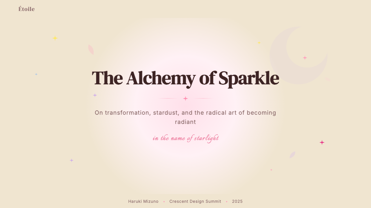
For presentation slides, the style works most powerfully on cover pages and section dividers rather than dense content pages. A cover built in this style benefits from a central figure or motif surrounded by radial sparkle, set against a warm gradient — pink to lavender, or cream to pale gold — with a title in a sweeping italic or script letterform. Section dividers can use full-bleed pastel gradients with a single oversized symbolic element — a star, a crescent, a rose silhouette — centered or offset. Content slides should pull back significantly: a clean pale ground, the primary accent color used sparingly for headers or callout lines, and any decorative elements reduced to small icon-scale motifs in the corners. Data visualizations in this style use the palette's pinks and lavenders as series colors, with sparkle or star-shaped data markers replacing conventional circles or squares.在演示文稿中,这种风格在封面页和章节分隔页上最具力量,而非在内容密集的页面上。以这种风格构建的封面,受益于一个被放射状星光环绕的中心人物或母题,置于暖色渐变底面——粉红过渡薰衣草,或奶油过渡淡金——标题使用大幅倾斜的意大利体或手写体字形。章节分隔页可以使用满版粉彩渐变,配以单个超大象征性元素——星星、新月或玫瑰剪影——居中或偏置。内容页应当显著克制:干净的淡色底面,主强调色稀疏地用于标题或引用线,任何装饰元素降至图标尺度,置于角落位置。这种风格的数据可视化使用色板中的粉红与薰衣草作为系列色,以星形或闪光数据标记替代常规圆点或方块。
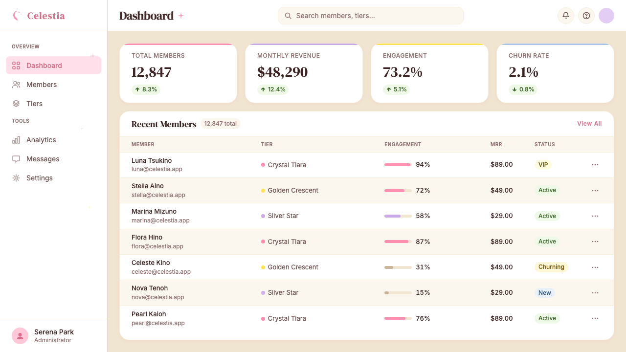
For web interfaces, the style is best suited to contexts that genuinely call for a dreamy, romantic, or celebratory feeling: beauty and cosmetics brands, fashion editorial, event landing pages, fan communities, and products targeting audiences with a shared nostalgic relationship to the genre. Dashboard and information-heavy interfaces should use the style selectively — a styled header zone or hero section can establish the aesthetic context, while content areas adopt a lighter hand, using the palette's soft tones as backgrounds and reserving the full ornamental vocabulary for moments of positive feedback (success states, achievement unlocks, reward screens). Avoid applying the full visual density to utility interfaces where rapid information scanning is required.对于网页界面,这种风格最适合真正需要梦幻、浪漫或庆典感的场景:美妆和护肤品牌、时尚编辑内容、活动落地页、粉丝社区,以及面向与这一流派共享怀旧情结的受众的产品。仪表板和信息密集型界面应当选择性地使用这种风格——设计感强烈的头部区域或英雄区可以建立美学语境,而内容区域则采用更轻的处理方式,使用色板的柔和色调作为背景,将完整的装饰词汇保留给正向反馈时刻(成功状态、成就解锁、奖励屏幕)。避免将完整视觉密度应用于需要快速信息扫读的功能性界面。
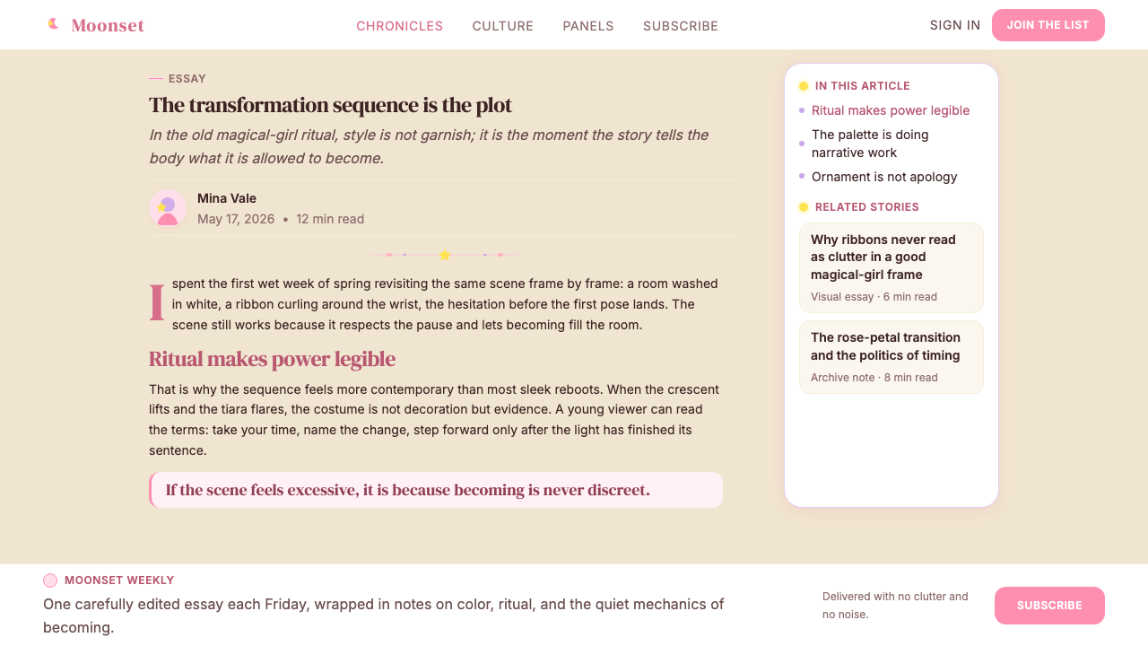
For editorial and marketing work, Sailor Moon Shoujo supports romantic, aspirational, and celebratory campaigns with exceptional natural fit. Magazine layouts can use the style's layered approach: a full-bleed gradient background image with sparkle overlay, display type in an ornamental italic, and body text set on a cream or pale surface panel that lifts from the background. Marketing campaigns benefit from the style's strong color identity — campaigns anchored in the pink-lavender-cream triad are immediately identifiable and perform well in social media contexts where visual distinctiveness matters. The style's nostalgic dimension also makes it effective for anniversary campaigns, reissues, or any communication that aims to evoke warmth and personal history.对于编辑和营销工作,美少女战士少女风格为浪漫、向往和庆典主题的活动提供了极佳的天然适配度。杂志版面可以利用这种风格的层叠方式:满版渐变背景图像配以星光叠层,展示型字体使用装饰性意大利体,正文设置在从背景浮起的奶油色或淡色表面面板上。营销活动受益于这种风格强烈的色彩身份——以粉红—薰衣草—奶油三色组为锚点的活动在社交媒体语境中具有即时识别性,并在视觉独特性至关重要的场合表现出色。这种风格的怀旧维度也使其在周年活动、再版发行,或任何旨在唤起温暖与个人记忆的传播中颇为有效。
A common mistake when applying this style is confusing softness with vagueness — producing work that is pale and diffuse without achieving the style's characteristic luminosity and richness. Authentic Sailor Moon Shoujo compositions are saturated and precise within their softness: the pinks are fully pink, the sparkles are bright against their grounds, and the motifs are cleanly rendered even when surrounded by atmospheric haze. A second frequent error is using the full ornamental vocabulary without establishing the compositional hierarchy that makes it legible. In the original anime and manga, ornament always serves the focal figure; in design applications, decoration should similarly radiate from and serve the primary message rather than compete with it.应用这种风格时最常见的错误是将柔和等同于模糊——产出色调淡薄、形态漫漶的作品,却未能达到这种风格特有的光感与丰盛。真实的美少女战士少女风格构图在柔和之中是饱和而精准的:粉红是充分的粉红,星光在底面上是明亮的,母题的轮廓即便在大气朦胧中依然清晰。第二个常见错误是在不建立使装饰可读的构图层级的情况下使用完整的装饰词汇。在原版动画和漫画中,装饰始终服务于焦点人物;在设计应用中,装饰同样应当从主要信息向外辐射并服务于它,而非与之竞争。
See the Sailor Moon Shoujo design system查看 Sailor Moon Shoujo 完整设计系统
Sailor Moon Shoujo — FAQSailor Moon Shoujo · 常见问题
Is Sailor Moon Shoujo the same as kawaii or general cute Japanese aesthetics?美少女战士少女风格与可爱(kawaii)或一般的日本萌系美学是同一回事吗?
They overlap but are distinct. Kawaii is a broad cultural aesthetic encompassing anything from Sanrio characters to Harajuku fashion, defined primarily by small scale, round forms, and an emphasis on helplessness or innocence. Sailor Moon Shoujo shares the palette preferences but operates at much higher visual complexity and carries strong narrative and symbolic content. Where kawaii tends toward simplicity and rounded minimalism, Sailor Moon Shoujo is ornate, layered, and dramatic. The crescent moon, transformation sequence vocabulary, and bishoujo proportions give it a specificity that distinguishes it from the broader kawaii category.两者有交叠,但并不相同。可爱(kawaii)是一种广泛的文化美学,涵盖从三丽鸥角色到原宿时尚的一切,主要以小尺度、圆润形态和对无助感或纯真感的强调为定义。美少女战士少女风格共享这种色板偏好,但以高得多的视觉复杂度运作,并承载强烈的叙事性和象征性内容。可爱风格倾向于简洁和圆润的极简,而美少女战士少女风格则是繁复的、层叠的、戏剧性的。新月、变身序列词汇和美少女比例赋予它一种特殊性,使之有别于更宽泛的可爱类别。
Can this style work in dark or night-mode interfaces?这种风格能在深色或夜间模式界面中使用吗?
Yes, and dark variants can actually intensify the style's most distinctive quality: its luminosity. The Sailor Moon universe regularly uses deep indigo or midnight-blue grounds in space sequences and dramatic moments, against which pinks and lavenders glow with exceptional brilliance. A dark-mode application of the style should anchor the background in a deep, cool-toned purple or navy — avoiding pure black, which tends to flatten the sparkle elements — and allow the primary pinks and lavenders to read as light sources rather than surface colors. Sparkle and glow effects become even more central in the dark variant, and the crescent moon motif has particular natural resonance against a night-sky ground.可以,而且深色变体实际上能强化这种风格最鲜明的品质:它的光感。美少女战士的宇宙在太空序列和戏剧性时刻中经常使用深靛蓝或午夜蓝底面,在这些底面上,粉红与薰衣草紫以格外耀眼的光彩发光。深色模式的应用方式应当将背景锚定于深邃的冷调紫色或藏青色——避免纯黑,纯黑往往会使星光元素显得扁平——并让主要的粉红和薰衣草紫呈现为光源而非表面颜色。星光和光晕效果在深色变体中变得更加核心,而新月母题在夜空底面上也具有特别自然的共鸣。
How do I avoid the style looking dated or campy rather than nostalgic and intentional?如何避免这种风格看起来过时或滑稽,而非怀旧且有意为之?
The critical distinction is intentionality and precision. Dated or campy execution tends to reach for the most obvious surface signals — pink, stars, maybe a crescent — without achieving the compositional sophistication that makes the original material so compelling. To read as intentional rather than accidental: first, treat the palette with full commitment (half-saturated pinks read as amateur mistakes, not stylistic choices); second, establish clear compositional hierarchy before adding ornament; third, use the symbolic vocabulary with specificity rather than scattering every available motif across the composition; fourth, ensure that any text elements are set with care and commitment to the ornamental typographic register. The style rewards specificity. The more precisely it is applied, the more clearly it reads as knowing and intentional.关键的区别在于意图性与精准度。看起来过时或滑稽的执行,往往只是抓取最显眼的表面信号——粉红、星星、也许加个新月——而没有达成使原版材料如此具有感染力的构图复杂度。要让作品读起来是有意为之而非误打误撞:首先,对色板保持完全的承诺(半饱和的粉红读起来像业余失误,而非风格选择);其次,在添加装饰之前建立清晰的构图层级;第三,以特定性使用象征词汇,而非将所有可用母题散布于整个构图;第四,确保任何文字元素都以对装饰性字体气质的用心和承诺来排设。这种风格回报精准。应用得越精准,就越清晰地被读解为知情且有意为之。
What is the right way to handle photography within this style?在这种风格中处理摄影图像的正确方式是什么?
Photography can be integrated effectively if it is treated as a raw material to be transformed rather than as documentary imagery to be displayed. Typical approaches include duotone or tritone color treatment that replaces the photograph's native tones with the style's pink-lavender palette; sparkle and lens-flare overlays composited over portrait photography to create the transformation-sequence aura; aggressive vignetting and edge softening that dissolve the photographic into the illustrated; and silhouetting of figure photography against gradient or illustrated grounds. What does not work is placing neutral or naturalistic photography directly into a Sailor Moon Shoujo layout without treatment — the tonal and textural mismatch is severe. The photograph must be brought into the style's visual world through chromatic and compositional treatment.摄影图像可以被有效整合,前提是将其视为需要被转化的原始素材,而非被展示的纪实图像。典型的处理方式包括:将照片原始色调替换为这种风格粉红—薰衣草色板的双色调或三色调处理;将星光和镜头耀斑叠层合成于人像摄影之上,创造变身序列的光环;大幅暗角和边缘柔化,使摄影感溶入插画感;以及将人物摄影在渐变或插画底面上进行剪影处理。不起作用的是在不加处理的情况下,将中性或写实的摄影图像直接放入美少女战士少女风格版面——色调和质感的不匹配是严重的。摄影必须通过色彩和构图的处理被带入这种风格的视觉世界。
Which contexts are a poor fit for Sailor Moon Shoujo, and why?哪些场景不适合使用美少女战士少女风格?原因是什么?
The style's strong emotional and cultural associations make it a poor fit for contexts that require neutrality, authority, or credibility as primary signals. Financial services, legal information, healthcare communications, and enterprise software all depend on visual registers that communicate competence and trustworthiness — the style's sweetness and ornamental richness can undermine these qualities. Similarly, applications where rapid information parsing is critical — news interfaces, navigation systems, safety communications — conflict with the style's maximalist approach, which asks viewers to dwell and absorb rather than scan and act. Finally, the style's deeply embedded cultural associations with specifically 1990s Japanese popular culture can create misalignment in contexts where that cultural reference is not shared or desired by the target audience.这种风格强烈的情感与文化联想使其不适合以中立性、权威性或可信度为首要信号的场景。金融服务、法律信息、医疗传播和企业软件都依赖传递能力与可信赖感的视觉基调——这种风格的甜美和繁复装饰可能削弱这些品质。同样,对于快速信息解析至关重要的应用场景——新闻界面、导航系统、安全传播——也与这种风格的极繁主义方式相冲突:它要求观者驻留吸收,而非扫读行动。最后,这种风格与1990年代日本大众文化的深度文化联想,在目标受众不共享或不期望这一文化参照的场景中可能造成错位。
Related design styles相关设计风格
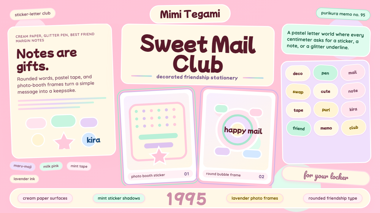 Kawaii Japanese Letter PurikuraCuteness fills every inch. Pink cream paper, mint stickers, lavender frames.可爱填满每寸:粉色奶油纸、薄荷贴纸、薰衣草相框。
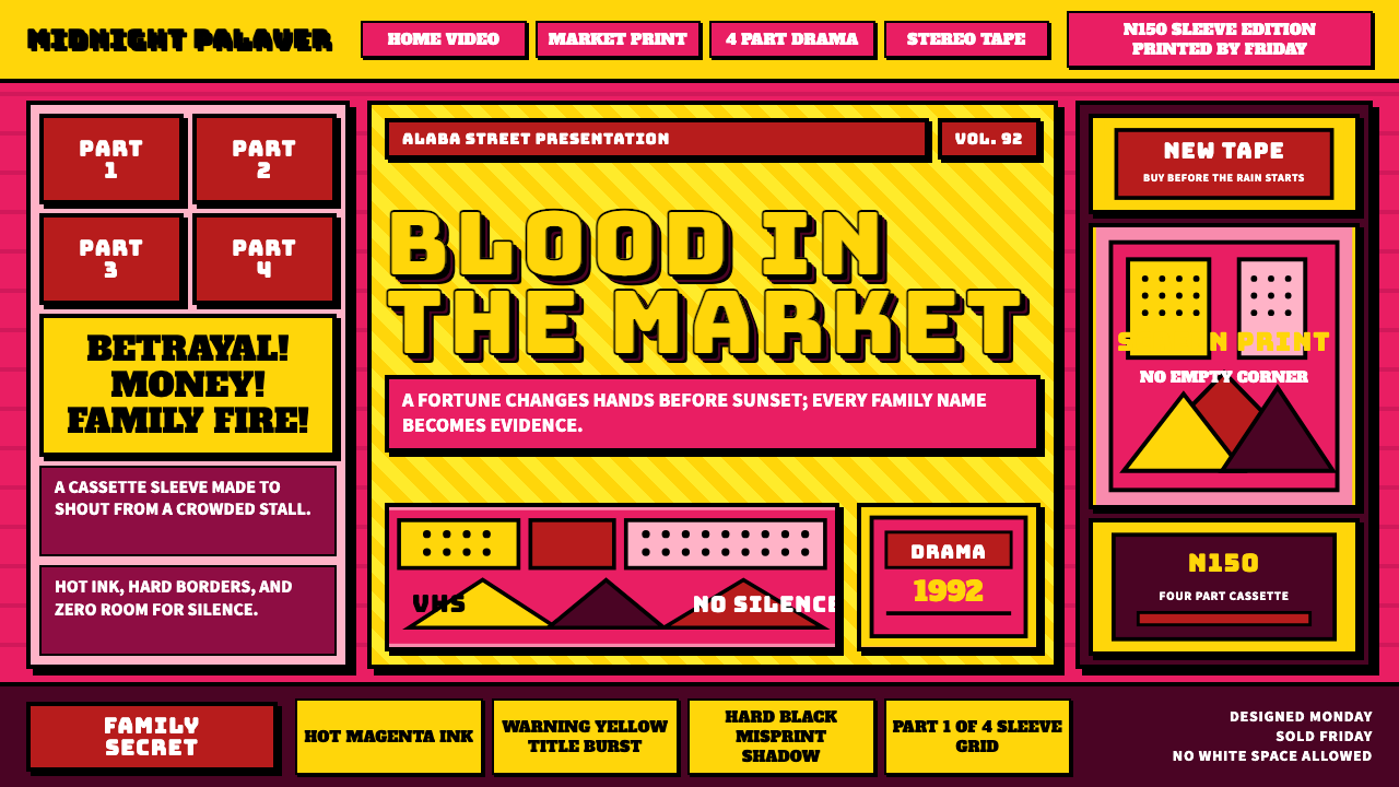 Nollywood VHS CoversEvery inch shouts. Magenta, warning yellow, hard shadows, and part stamps pac…每寸都在叫卖:洋红、警示黄、硬黑投影和分集印章塞满画面。
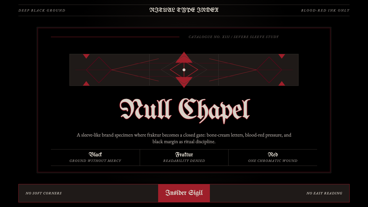 Death Metal BlackletterUnreadable by design. Bone fraktur on black, cut by one blood-red geometric s…以难读划界:黑底骨色哥特字,被一道血红几何符印切开。
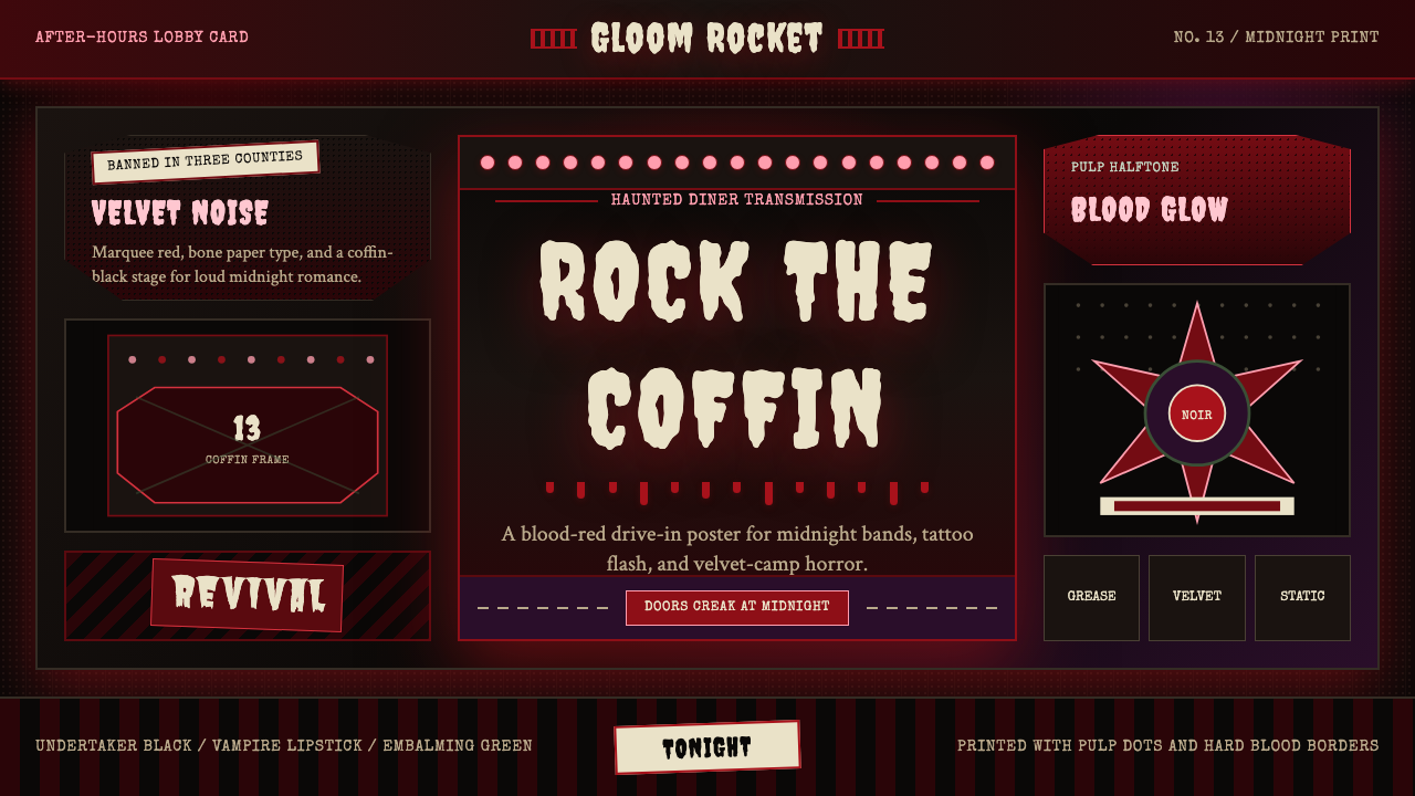 Gothabilly Horror RevivalHaunted swagger. Blood-red marquee type, coffin frames, and pulp halftone on…闹鬼的摇滚张扬:血红跑马灯字、棺材框与黑底半色调。
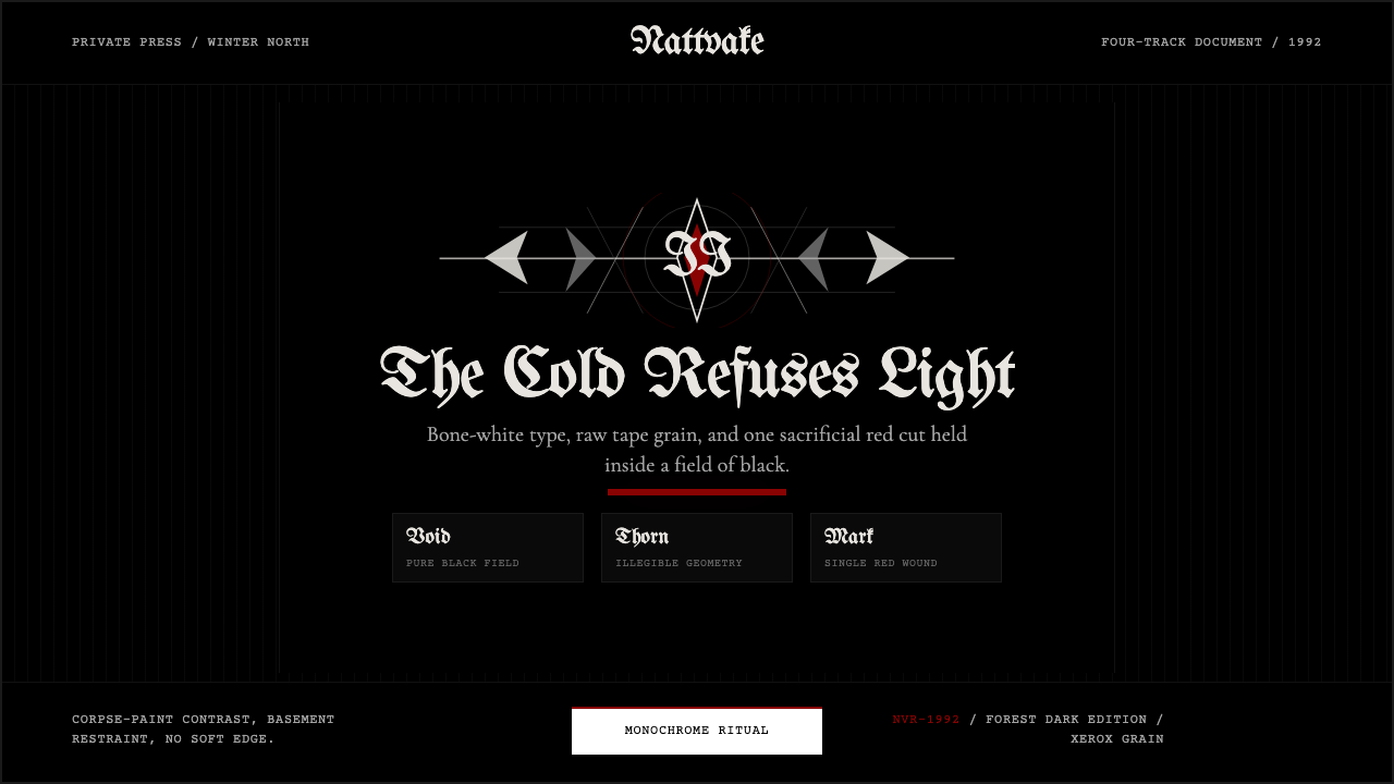 Norwegian Black Metal (1992)Ritual severity. Bone-white blackletter cuts through black grain with one blo…仪式般严酷。骨白哥特字切开黑色颗粒,只留一枚血红印记。
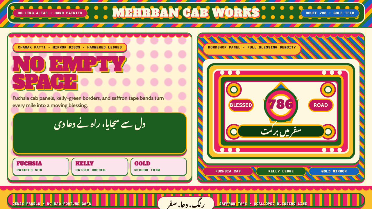 Pakistani Truck ArtBlessing crowds every inch. Fuchsia, kelly green, and gold stack into scallop…祝福挤满每寸空间:玫红、凯利绿与金色叠成扇贝边面板。