What is Shibuya-kei (Flipper's Guitar, 1995)?
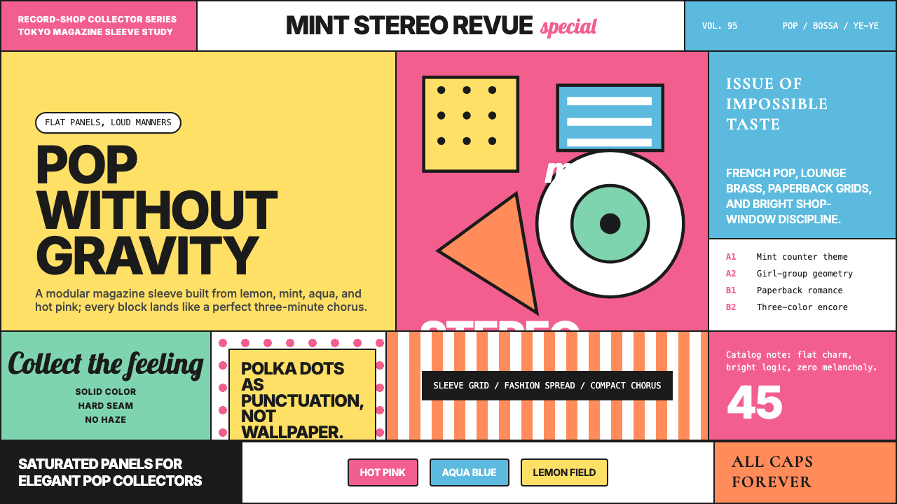
Shibuya-kei turned Tokyo's record-shop culture into a design language — saturated panes of hot pink, mint, and aqua stacked into album-sleeve grids with the confidence of mid-century graphic design.
Shibuya-kei (Flipper's Guitar, 1995) in brief
Shibuya-kei is a Japanese retro-pop micro-movement that flourished in the early-to-mid 1990s, taking its name from Shibuya — the Tokyo district whose record shops, HMV, Tower Records, and WAVE among them, became the hub of a collector culture obsessed with obscure French, Brazilian, and American pop from the 1960s. The movement was at once musical and visual: every album sleeve was a miniature art-history exhibition, borrowing from Saul Bass film poster compositions, Penguin Books typography, French Yé-yé photo shoots, and mid-century Swiss grid layouts.
The visual system that emerged around Flipper's Guitar, Pizzicato Five, and Cornelius distilled this eclecticism into something instantly coherent: blocks of saturated solid color — hot pink, mint green, lemon yellow, aqua — arranged in flat modular grids; tight all-caps sans-serif type treated with the confidence of a fashion magazine; retro script flourishes used as accents rather than decorative wallpaper; and a palette that felt simultaneously nostalgic and aggressively contemporary. The aesthetic was knowing without being ironic, sophisticated without being cold.
Unlike movements that borrow from the past in order to comment on it, Shibuya-kei was genuinely in love with its references. The record collectors who drove the scene had encyclopedic knowledge of obscure catalogue pressings and graphic design history, and that passion showed in the density and specificity of visual quotation. The result was a design language that looked like a collision between a 1965 French pop single sleeve and a 1990s Tokyo boutique window — which is more or less exactly what it was.
Where does Shibuya-kei (Flipper's Guitar, 1995) come from?
The story begins in Shibuya's record shops in the late 1980s. Japan's bubble economy had generated extraordinary disposable income among urban youth, and the import-record shops of Shibuya became destinations for collectors willing to spend serious money on obscure French serge gainsbourg pressings, Brazilian bossa nova originals, and American soft-rock curiosities. The shared aesthetic sensibility among these collectors — an appreciation for tight production, witty arrangement, and graphic sophistication — created the conditions for a scene.
Flipper's Guitar, the band fronted by Keigo Oyamada (later Cornelius) and Kenji Ozawa, crystallized the visual and musical ambitions of the scene with their 1989 debut. Their album sleeves borrowed directly from Penguin Books grid layouts and mid-century pop graphics: flat color fields, tight typography, no photographic realism. When they disbanded in 1991, both Oyamada and Ozawa pursued solo careers that deepened the visual vocabulary — Oyamada's Cornelius project, particularly the 1997 album Fantasma, became internationally recognized as the aesthetic peak of the movement.
Pizzicato Five, led by Yasuharu Konishi and vocalist Maki Nomiya, brought the scene to international attention when their catalog was licensed for Western release in 1993. Konishi's sleeve designs — often done in collaboration with graphic artists — were exercises in mid-century graphic quotation: Saul Bass compositions translated into solid-color blocks, lounge-era script typefaces, and the kind of saturated flat color that recalled French pop photoshoots from thirty years earlier. The international success created a feedback loop: Western audiences and designers discovered the aesthetic, and the scene's visual ambitions intensified accordingly.
By the mid-1990s, Shibuya-kei had become a recognizable graphic mode, influencing not just album art but the visual identity of boutiques, cafes, and magazines in Tokyo's Daikanyama and Shimokitazawa districts. The movement wound down commercially by the late 1990s as J-pop mainstream tastes shifted, but its visual grammar — the tight sans-serif, the saturated color block, the mod-era grid, the retro script accent — entered the broader vocabulary of Japanese graphic design and has experienced repeated international revivals, most recently through the renewed global interest in Y2K-adjacent aesthetics.
What defines the Shibuya-kei (Flipper's Guitar, 1995) look?
Color
The palette is built around a small set of fully saturated, cheerful hues — hot pink, mint green, lemon yellow, and aqua blue are the canonical quartet — deployed as solid flat fields rather than as gradients or tonal ranges. Colors are used at full intensity, which gives layouts a poster-like punch without requiring dramatic contrast between elements. White and cream serve as reset space between color blocks, preventing saturation fatigue. The overall effect is of a fashion shoot color-graded for maximum candy-bright vividness.
Typography
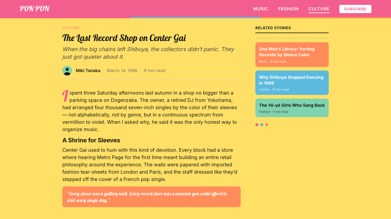
Two typeface registers coexist and play against each other. The first is tight, dense sans-serif set in all caps with minimal letter-spacing — a direct quotation of 1960s record-label and film-title typography. The second is a retro script or italic display face, deployed sparingly as an accent: a band name in looping cursive against a flat-color field, or a single word in a rounded hand-lettered style. These two registers are never allowed to merge into a muddle; they remain in deliberate tension, the geometric and the calligraphic held apart by white space or color boundaries.
Grid and Modularity
Layouts are built on a strict modular grid with defined columns and gutters, producing the characteristic tiled appearance of Shibuya-kei album art. Color blocks snap to the grid with no bleeding or irregular cropping — each pane is a discrete rectangle. Within those panes, type and image elements are anchored to grid lines rather than floating freely. The discipline of the grid is what allows the saturated colors to coexist without creating visual chaos; structure provides the container for expressiveness.
Retro Flat Illustration
Figurative elements — when they appear — are simplified to clean silhouettes or flat, two-tone illustrations reminiscent of 1960s magazine spot art and record-label logos. There is no photographic realism and no drop shadows to simulate depth. Figures and objects are rendered as shape outlines with flat color fills, sometimes with a single offset highlight to suggest form without entering the territory of full shading. The aesthetic is closer to a cut-paper collage than to painting or photography.
Nostalgic-Contemporary Tension
What distinguishes Shibuya-kei from straightforward pastiche is its refusal to simply reproduce the past. Source materials from the 1960s are quoted precisely but recontextualized: a bossa nova sleeve layout becomes the container for 1990s Tokyo pop production. The visual tension between the dated reference and the contemporary application is the style's central energy. It reads as warm and familiar while remaining specific to its moment — impossible to mistake for an actual artifact from the period it references.
Playful Density
Shibuya-kei layouts are not minimalist. Where Bauhaus and Swiss Style use negative space as a structural principle, Shibuya-kei fills the frame — multiple color fields, layered typographic registers, small illustrative elements tucked into corners. The density is managed through the rigid grid rather than through emptiness. Every zone has content, but every zone is also clearly bounded, so the result feels energetic rather than cluttered. This willingness to pack the frame without losing legibility is one of the style's most demanding technical qualities.
Sophistication Without Severity
The style communicates connoisseurship and visual intelligence without the cold authority that characterizes Bauhaus or Swiss International Style. The saturated candy colors and the retro-script accents introduce warmth and playfulness that offset the structural rigor of the grid. This tonal balance — knowing but not austere, graphic but not clinical — made the style accessible to a wide audience while retaining its insider-collector quality. The sophistication is in the selection and arrangement; the pleasure is in the color.
Who shaped Shibuya-kei (Flipper's Guitar, 1995)?
Oyamada co-founded Flipper's Guitar and became the movement's most internationally visible figure under his solo alias Cornelius. His 1997 album Fantasma is widely regarded as the aesthetic peak of Shibuya-kei: its sleeve design and accompanying visual materials synthesized mid-century graphic references — pop art color fields, mod-era typography, lounge-culture illustration — into something entirely contemporary. Oyamada's attention to visual production as an integral part of his music made him a key bridge between the collector subculture and international design audiences.
Konishi was the primary visual and musical architect of Pizzicato Five, the band that brought Shibuya-kei to international attention in 1993. His sleeve designs for the group are the most widely reproduced examples of the aesthetic: solid-color tiled grids, all-caps sans-serif labels, retro script band names, and the particular combination of pink, mint, and lemon yellow that became the movement's signature. His knowledge of mid-century graphic history — from Saul Bass to Penguin Books design — was encyclopedic and directly visible in every layout decision.
Ozawa co-fronted Flipper's Guitar and pursued a parallel solo career that ran alongside the Shibuya-kei boom. His work demonstrated the movement's capacity for pop accessibility — where Cornelius tended toward musical experimentation and visual density, Ozawa's aesthetic was cleaner and more directly influenced by British pop and American soft-rock sleeve art. Together, the two former bandmates defined the range of the movement: from approachable pop poster to dense graphic collage.
As the vocalist and visual centerpiece of Pizzicato Five, Nomiya embodied the movement's fashion dimension. Her image — geometric bob haircut, graphic mod-era clothing, poses drawn from 1960s fashion photography — was inseparable from the visual identity of the group's releases. In Shibuya-kei, the performer's visual presentation was treated with the same graphic intentionality as the sleeve design, and Nomiya's collaborations with the group's art direction team produced some of the most imitated looks of 1990s Tokyo pop culture.
Though more associated with streetwear and the broader harajuku fashion scene than with Shibuya-kei specifically, Fujiwara's role as a taste-arbiter and cultural connector shaped the conditions in which the movement flourished. His record and retail shop operations in Shibuya overlapped with the scene's infrastructure, and his editorial sensibility — blending American and British influences with Japanese graphic rigour — helped establish the visual standards that Shibuya-kei designers worked within and against.
How do you use Shibuya-kei (Flipper's Guitar, 1995) today?
Shibuya-kei translates well to contemporary design contexts where warmth, energy, and a sense of cultural sophistication are all required simultaneously — tasks that severely austere styles like Bauhaus or Swiss International Style cannot perform without a complete character shift. The key is understanding that the style's expressiveness is structural: it comes from the combination of a modular grid with high-saturation color, not from decorative excess applied over a neutral base.
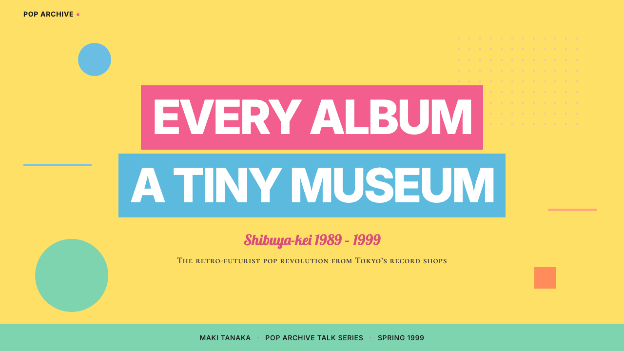
For presentation slides, the style excels on event covers, title cards, and section dividers where an energetic first impression matters. A Shibuya-kei cover works with two or three tiled color blocks anchoring the frame — one dominant, one secondary, one as accent — with the title set in tight all-caps sans-serif and a single retro-script element providing the brand warmth. Content slides should be stripped back: one dominant color zone, strong type hierarchy using size and weight rather than decorative elements, and any data visualization treated as flat geometric objects in the palette's saturated colors. Avoid attempting to recreate full-frame tiled compositions on data-heavy content slides; the grid works best as a framing device rather than a background pattern.
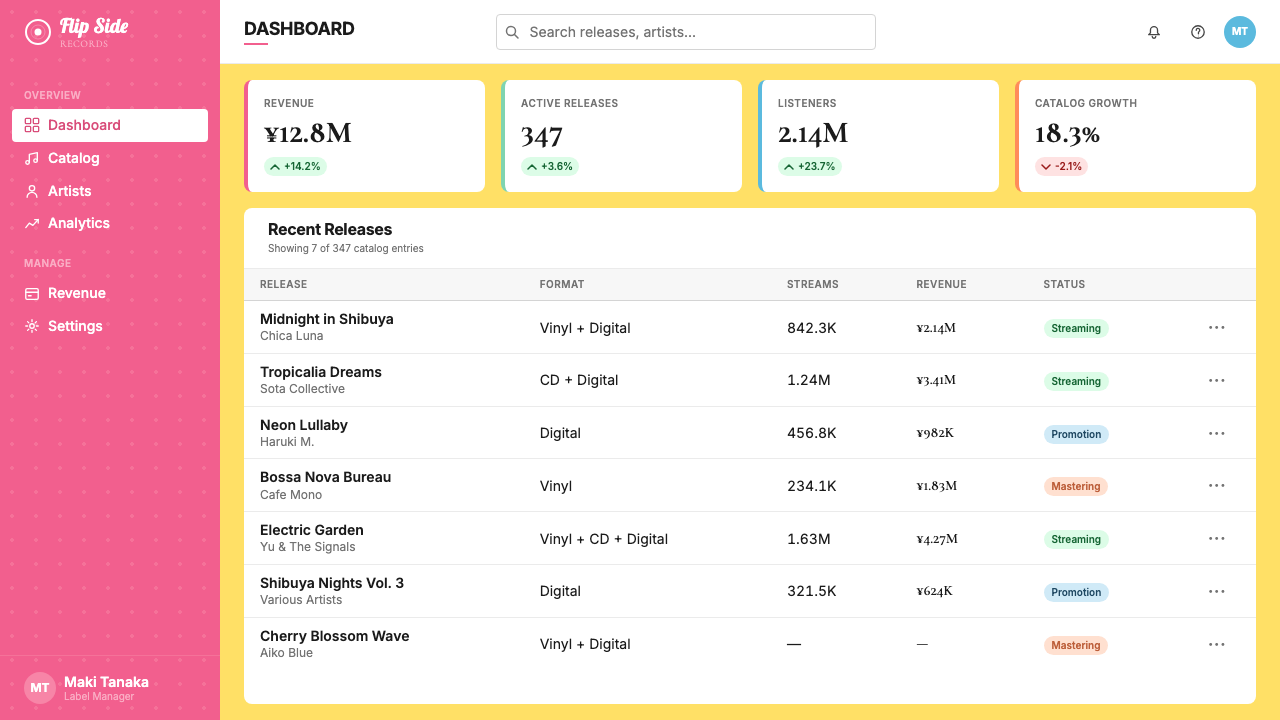
For web interfaces, the style works particularly well for music and entertainment platforms, boutique e-commerce, cultural institutions, and any product where expressing curatorial intelligence is part of the value proposition. Dashboard and pricing pages benefit from the grid structure: define distinct horizontal zones rather than individual cards, use the saturated palette selectively for interactive states and tier differentiation, and let the strong typographic system carry hierarchy without relying on shadows or decorative borders. Navigation and UI controls should remain typographic — the style rewards wordmark-led navigation over icon-heavy chrome.
For editorial and marketing applications, Shibuya-kei's poster DNA is its strongest asset. Full-bleed feature sections in a single saturated color with reversed white or cream type create the immediate visual impact the style is known for. Marketing landing pages work well with alternating color-zone sections — pink zone, then mint zone, then a white reset — that create rhythm without requiring the reader to process new design decisions at every scroll. The retro-script accent element is most effective in brand or product name callouts; overusing it in body text destroys the contrast that makes it effective.
The most common error when applying this style is treating the saturated palette as permission to use all four signature colors at equal weight simultaneously. Authentic Shibuya-kei work leads with one or two dominant hues; the others appear in smaller doses as accents or typographic elements. A second common mistake is abandoning the grid in favor of organic or irregular arrangements — the style's expressiveness depends entirely on the tension between structured grid and saturated color. Remove the grid and what remains is neither retro nor sophisticated, just loud. A third mistake is applying the style to contexts that require professional neutrality — financial services, healthcare, legal — where the candy-bright palette signals frivolity rather than cultural intelligence.
Shibuya-kei (Flipper's Guitar, 1995) — FAQ
Is Shibuya-kei the same as general 1990s retro or Y2K aesthetic?
No, and the distinction matters. General Y2K or 1990s retro design tends to reference the decade's own visual culture: gradients, lens flares, digital textures, early CGI forms. Shibuya-kei is a 1990s movement that was itself looking backward to the 1960s — its visual references are mid-century, not millennial. A Shibuya-kei composition looks closer to a 1965 French pop sleeve than to a 1995 Windows 95 loading screen. The sophistication of the movement came precisely from this double remove: 1990s designers reinterpreting 1960s graphic design produced something that belonged fully to neither decade.
Can this style work in a dark-background version?
It can, but with significant trade-offs. The canonical Shibuya-kei palette was light-to-medium toned: candy colors against white or cream grounds. On a black background, hot pink and lemon yellow tend to vibrate aggressively, and the flat-color blocks lose some of their modular clarity because the ground no longer provides neutral contrast. A dark variant works best if it commits to two or three palette colors rather than the full quartet, and treats black as an active color zone rather than a neutral backdrop. The retro-script and all-caps typographic registers translate to dark grounds without difficulty; the color-block grid requires more careful management.
How does Shibuya-kei differ from other Japanese design traditions like Kawaii or Wabi-sabi?
The differences are fundamental. Kawaii aesthetics center on cuteness, softness, and organic roundness — pastel palettes, bubble lettering, character illustration — and are culturally distinct from Shibuya-kei's graphic sophistication and mid-century Western references. Wabi-sabi is concerned with imperfection, transience, and natural asymmetry — textures, negative space, the beauty of the incomplete — which is almost the opposite of Shibuya-kei's saturated flat color and precise modular grid. Shibuya-kei is an internationalist movement: its reference points are French, Brazilian, and American. It does not draw from traditional Japanese visual culture and makes no claim to represent it.
Is it possible to apply Shibuya-kei without it looking like costume or pastiche?
Yes, but it requires understanding why the originals worked rather than simply copying their surface appearance. The originals worked because they were made by people with genuine encyclopedic knowledge of mid-century graphic design, who applied that knowledge with enough specificity to produce something that felt like quotation rather than imitation. In contemporary application, the equivalent is to use the style's structural logic — modular grid, limited palette, typographic contrast between geometric and script registers — as the actual design system, rather than applying Shibuya-kei visual motifs as a surface skin over a differently structured layout. The style fails when the grid and the color system are decorative; it succeeds when they are genuinely organizing the information.
What kinds of products or brands is this style unsuited for?
Shibuya-kei struggles in contexts that require professional solemnity, institutional trust, or emotional restraint. Financial services, legal platforms, healthcare, and enterprise software generally benefit from visual vocabularies that signal seriousness and stability — the candy palette and retro-pop energy of Shibuya-kei read as playful and culturally niche in these contexts, which undermines the brand's authority claims. The style also struggles with content-heavy interfaces where the saturated color fields compete with information density rather than organizing it. And it is a poor fit for brands positioning themselves as timeless or premium in a classical sense; its pleasures are specific to cultural connoisseurship of a particular mid-century moment, which is a narrower appeal than a neutral or refined aesthetic.
Related design styles
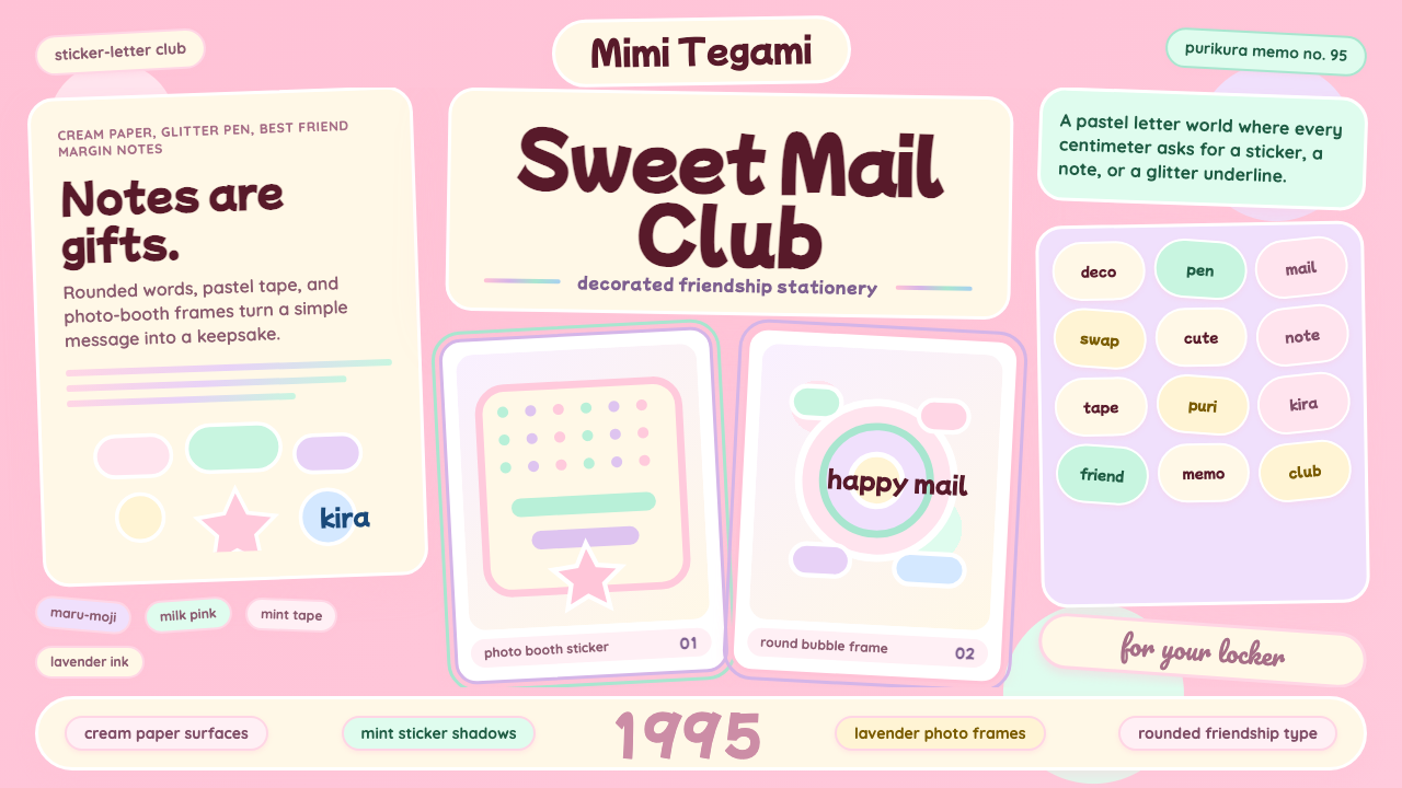 Kawaii Japanese Letter PurikuraCuteness fills every inch. Pink cream paper, mint stickers, lavender frames.
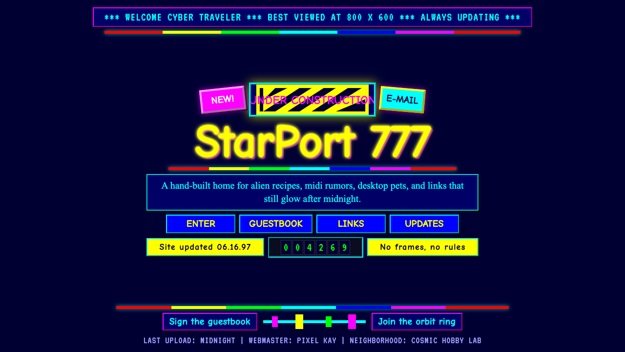 GeoCities Personal WebClutter is celebration. Starfield tiles, cartoon headings, rainbow rules, and…
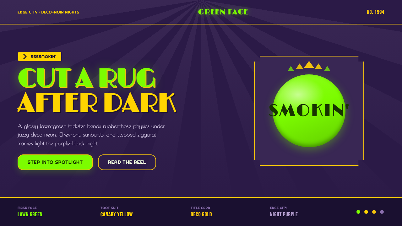 The Mask 1994 Green FaceLoud, theatrical, ssssmokin'. Lawn-green and canary-yellow scream against dec…
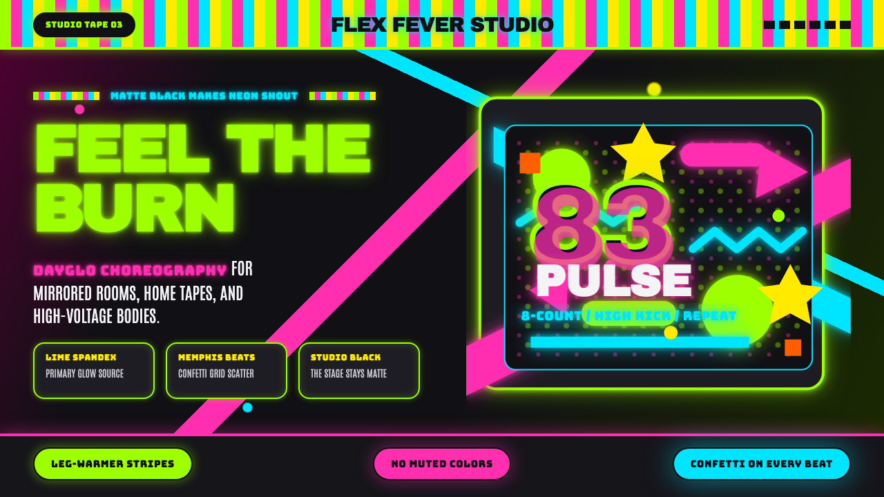 80s Aerobics Fluoro SpandexNeon refuses restraint. Lime spandex, pink-cyan confetti, and black-stage typ…
 Chicago HouseDarkness starts the track. Neon pink, yellow and cyan hit black like Xerox st…
 K-Pop Y2K SeoulCandy chrome goes maximal. Hot pink, aqua, Hangul type, and sticker collage s…