What is K-Pop Y2K Seoul?
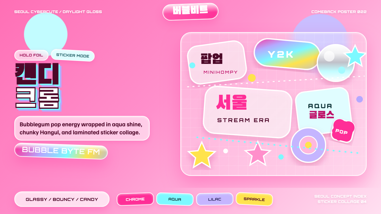
K-Pop Y2K Seoul takes the millennium's chrome-and-glitter optimism and re-shoots it under studio daylight — candy color, holographic shine, and a stack of stickers standing in for a whole decade's worth of longing.
K-Pop Y2K Seoul in brief
K-Pop Y2K Seoul is the visual language that Korean idol agencies built to sell nostalgia to people too young to have lived through the original nostalgia. It draws its palette and props directly from the turn-of-the-millennium — flip phones, digital camera flashes, bubble lettering, gel pens — but restages them with the production polish of a 2020s photo studio: hard gloss instead of grain, printed foil instead of scratched plastic, and a level of art-direction discipline the original Y2K era never had.
The style is built for album cycles, not single images. A single comeback might spread across a concept photo book, a music video set, packaging variants, and a run of promotional posters, and all of them are expected to share the same sticker vocabulary, the same chrome bubble-lettering, and the same candy palette, so that a fan can recognize the era from a single cropped thumbnail. That cross-format discipline — one visual system deployed across a dozen deliverables — is itself part of what makes the style legible as K-pop rather than as generic Y2K revival.
Where a lot of retro-revival design leans wistful or faded, K-Pop Y2K Seoul refuses to look worn. Nothing is dusty, nothing is sepia, nothing is deliberately degraded. The nostalgia is aspirational rather than melancholic: it recreates the shapes of an earlier decade using the manufacturing quality only available now, which is exactly why the style reads as youthful rather than antique.
Where does K-Pop Y2K Seoul come from?
The style crystallized inside Seoul's idol industry roughly between 2021 and 2024, when several major agencies simultaneously turned to Y2K aesthetics for new artist debuts and image relaunches. HYBE sub-label ADOR built NewJeans's entire debut identity around lowered-saturation late-90s and early-2000s teen imagery, while SM Entertainment pushed a more maximalist, hyper-digital reading of the same period through aespa, and IVE folded Y2K glamour into a more grown-up, luxury-adjacent presentation. Three different agencies, three different artists, one shared visual grammar — which is part of why the style reads as an industry-wide movement rather than a single act's gimmick.
The underlying nostalgia is generational rather than invented from nothing. The idols, stylists, and photographers driving this look came of age around Cyworld, Korea's pre-Facebook social network built around personal 'minihompy' pages that users decorated with glitter GIFs, pastel backgrounds, and customizable skins. That platform's DIY-glossy visual instinct — half decoration, half self-presentation — is the folk root the industry-grade version keeps quoting, which is why the style so often feels like a teenager's desktop scrapbook blown up to billboard scale.
It also intersects with a much broader, non-Korean Y2K revival that swept fashion and design starting in the mid-2010s and accelerated through the early 2020s, fed by platforms like Pinterest and TikTok recirculating early-2000s pop culture to audiences who'd never seen it the first time. Seoul's idol industry absorbed that global revival and re-exported a distinctly Korean version of it: more chrome, more Hangul type, more sticker-collage density, and considerably more production polish than the DIY revival aesthetic happening elsewhere.
By 2022, the visual peak of the trend, the aesthetic had become recognizable enough as a genre that fans and design commentators began treating it as its own category — distinct from both plain 'Y2K fashion' and from earlier K-pop concept eras like the 2016-era pastel-girl-group look it partly displaced. Album unboxing videos, photo card trading, and fan-run archive accounts all reinforced the same visual checklist: chrome bubble letters, hot pink and aqua, star and heart stickers, and glossy studio light.
What defines the K-Pop Y2K Seoul look?
Color
The palette centers on hot pink and aqua set against a bubblegum ground, occasionally punctuated with a citrus yellow or lilac accent. Every hue reads as candy rather than as pastel — saturated and slightly synthetic, closer to the color of a plastic toy than to a watercolor. Holographic and iridescent finishes count as a color move in their own right: a foil surface that shifts between pink, silver, and blue depending on the angle is a core palette element, not a texture applied on top of it.
Typography
Two type traditions are deliberately layered rather than kept apart: rounded, bubble-form Hangul display lettering sits alongside retro-futurist Latin lettering borrowed from early-2000s tech and toy branding. Neither is secondary — a headline often sets both scripts at comparable visual weight, letting the two writing systems function as one bilingual logotype rather than a primary language with a translated caption underneath. Letterforms favor soft, inflated, almost balloon-like curves over sharp geometric construction, so the type looks touchable, as if piped or molded rather than drawn.
Chrome and Gloss
Surfaces are rendered as if freshly unwrapped: rounded chrome bubbles, mirror-polished spheres, and glossy plastic highlights recur across type, icons, and product photography alike. The finish behaves like liquid metal caught mid-reflection rather than brushed or matte metal — it catches studio light and throws back a bright, almost wet-looking highlight. This gloss separates the style from a plainer, matte 'retro' treatment; nothing here is allowed to look dry or dusty.
Sticker Collage
Composition frequently borrows the logic of a decorated scrapbook page or an old-school photo booth strip: star shapes, hearts, and rounded badge stickers scatter across a base image at varying scale and rotation, some overlapping the photograph's edge as if physically stuck on top of it. Placement is not random — it follows a loose rhythm that draws the eye toward a focal point — but it is deliberately imperfect, since a too-tidy sticker arrangement would undercut the DIY, personal-page feeling the style quotes.
Layout and Density
Compositions run maximal rather than restrained: a single spread might combine a photograph, several sticker elements, a bilingual logotype, and small decorative motifs like star trails or sparkle bursts, all active at once. Negative space is not the organizing principle it is in more minimal design languages — density itself is part of the appeal. A single dominant photograph or color field usually anchors each composition, though, keeping the density from tipping into visual noise.
Motion and Sparkle
Even in static formats the style implies motion: glitter particles suspended mid-air, light flares suggesting a camera flash just went off, sparkle bursts placed at a highlight's edge. These effects behave less like ambient atmosphere and more like punctuation — a glint placed to draw the eye to a chrome surface, a scatter of glitter used the way a designer might use an underline. The implied motion keeps the density from feeling static; it reads instead as a freeze-frame of something still sparkling.
Daylight Studio Light
Lighting is bright, even, and shadowless in the way a well-lit beauty studio is shadowless — nothing is moody or underlit. This departs deliberately from the grungier, lower-fidelity look of vernacular early-2000s photography, which often carried harsh direct flash and visible noise. Here the flash aesthetic is quoted rather than replicated: the punchy highlight of a flash photograph is kept, but rendered with the clean, high-key evenness of contemporary studio lighting.
Who shaped K-Pop Y2K Seoul?
ADOR, the HYBE sub-label built around NewJeans, anchored its debut identity in lowered-saturation late-90s and early-2000s teen imagery rather than the maximalist chrome-and-glitter end of the style, favoring a more understated, film-photography-adjacent take on Y2K nostalgia. Their approach showed the broader K-Pop Y2K Seoul family could stretch from quiet and wistful to loud and candy-bright while reading as part of the same revival moment.
SM Entertainment pushed a more maximalist, hyper-digital reading of Y2K through aespa, whose concept work leaned into chrome, holographic surfaces, and a sci-fi-adjacent futurism layered over the nostalgic base material. This digitally-inflected end of the spectrum is where the chrome bubble-lettering and sparkle-heavy compositions concentrate most.
IVE folded Y2K glamour into a more grown-up, luxury-adjacent presentation, showing that the style's core vocabulary — chrome, sticker motifs, candy color — could be dialed toward sophistication rather than pure teenage maximalism without losing its identifying features.
Cyworld, Korea's pre-Facebook social network built around personal 'minihompy' pages, is the folk-culture root the industry-grade style keeps quoting. Its users decorated pages with glitter GIFs, pastel skins, and customizable widgets long before any agency turned that DIY instinct into a professional visual system — why the style is often called 'Cyworld reborn for the streaming era.'
A broader, non-Korean Y2K fashion and design revival swept through the mid-2010s and accelerated in the early 2020s, driven largely by Pinterest and TikTok recirculating early-2000s pop culture to audiences encountering it for the first time. Seoul's idol industry absorbed that current and re-exported a distinctly Korean, higher-polish version — a regional dialect of a wider revival rather than an isolated invention.
How do you use K-Pop Y2K Seoul today?
K-Pop Y2K Seoul reads as a deliberate performance of youth and nostalgia rather than a neutral utility style, so it works best where a brand wants to feel playful, current, and unafraid of maximalism — and it works poorly wherever restraint or authority is the goal.
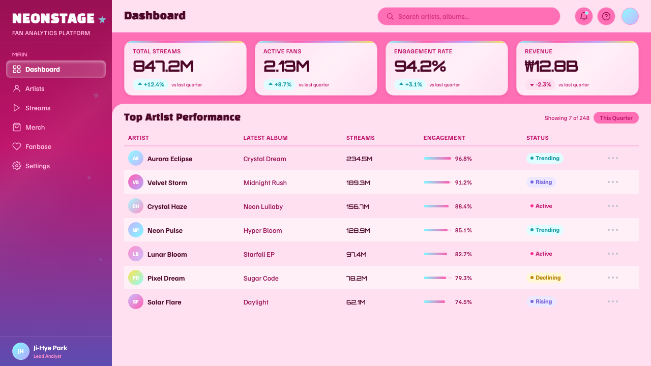
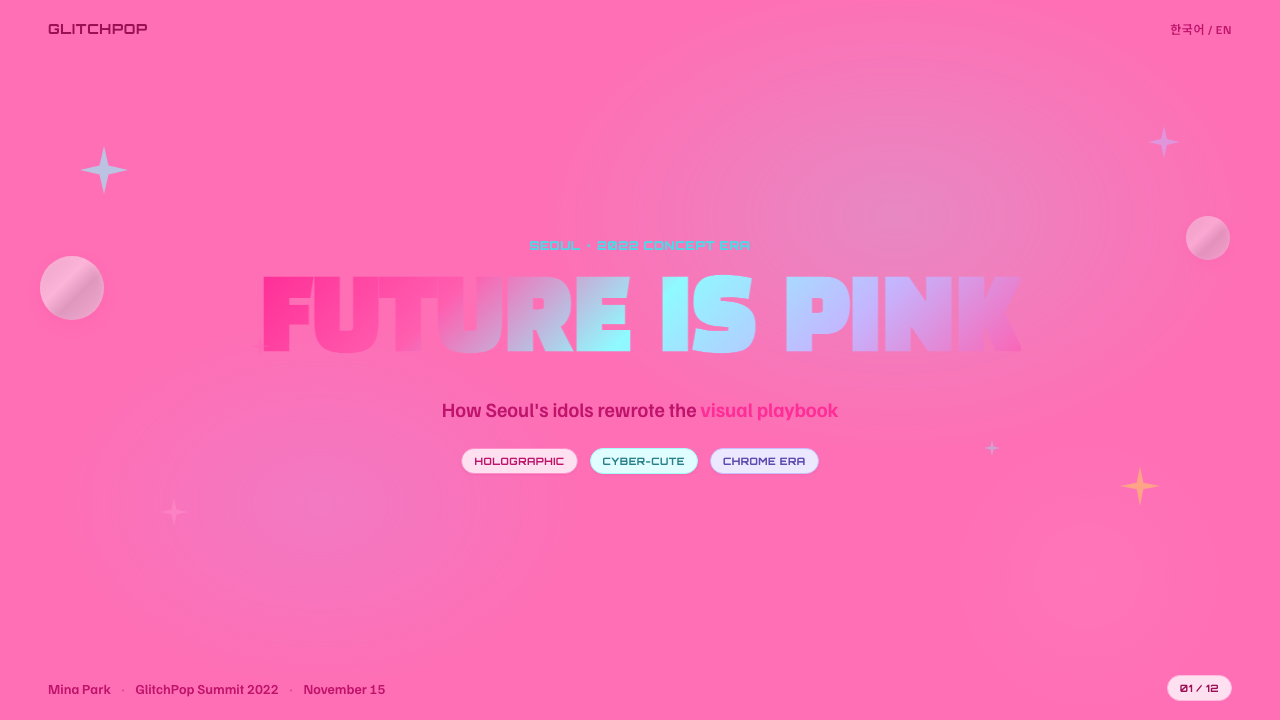
For presentation cover slides, the style thrives on a single hero photograph or bold color field wrapped in chrome bubble-lettering and a scatter of star or heart stickers at the corners — the cover should feel like an album insert, not a corporate title page. Content and data slides need more restraint than a cover: keep the candy palette and sticker accents to a header band or a sidebar, let one clear content hierarchy carry the actual information, and use the chrome-and-sparkle vocabulary as a frame rather than letting it compete with the data itself. A bar chart or table can still take a single hot-pink or aqua accent color, but full-bleed holographic gradients behind dense data will fight the reader rather than help them.
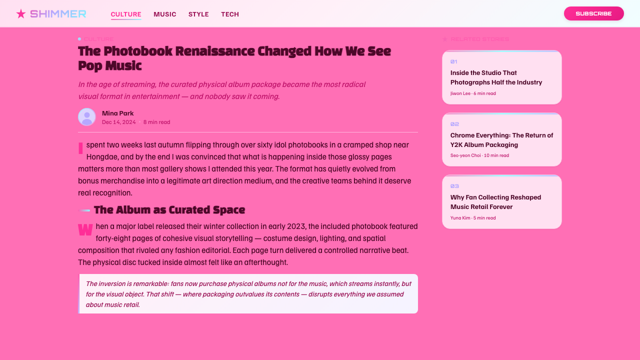
For web interfaces, the style is a strong match for youth-facing consumer products, fan communities, and entertainment or lifestyle brands, but it needs deliberate discipline on dashboards and pricing pages, where the maximal density natively works against scannability. The fix is to reserve the full sticker-and-gloss treatment for hero sections and marketing surfaces, then quiet the palette down to a controlled hot-pink or aqua accent against a clean, mostly-white interface for anything transactional — pricing tables, account settings, checkout flows. A pricing page can use one chrome-bubble badge to flag a recommended tier without asking every element on the page to sparkle.
For editorial and marketing work, the style is close to its native habitat: magazine-style spreads, social campaign graphics, and product launch pages can lean fully into sticker collage, bilingual chrome lettering, and candy color without dialing anything back, since these formats already expect visual density and a strong point of view. Marketing pages benefit especially from treating each section like its own concept photo — a dominant image, a scatter of sticker accents, one bold headline treatment — rather than repeating a single template down the page.
A common mistake when applying this style is treating it as 'pink plus glitter,' which produces a generic girly aesthetic rather than the specific K-pop concept-design language it actually is. The details that make it legible are the bilingual type pairing, the chrome-bubble surface treatment, and the sticker-collage logic working together — drop any one of the three and the result reads as vague Y2K pastiche rather than this particular style. It is also a mistake to apply the style's full maximal density to information-dense interfaces; the style was built for image-led formats, and forcing it onto text-heavy, decision-making surfaces undermines the very usability those surfaces need.
K-Pop Y2K Seoul — FAQ
Is K-Pop Y2K Seoul the same thing as general Y2K fashion revival?
Related but not identical. The broader Y2K revival is a global current that began recirculating early-2000s aesthetics from the mid-2010s onward, spread largely through Pinterest and TikTok. K-Pop Y2K Seoul is a higher-polish regional dialect of that revival, built inside Seoul's idol industry between roughly 2021 and 2024. It shares the source material — chrome, bubble type, candy color — but adds a distinctly Korean signature: bilingual Hangul-Latin type pairing, sticker-collage density, and a cross-format production discipline the DIY global revival doesn't require.
Does this style require Hangul type, or can it work with Latin type alone?
The bilingual pairing is one of the style's defining features, but a Latin-only application can still work if it borrows the same retro-futurist letterform qualities — rounded, inflated, slightly technological in feel. What matters more than the script is that the type feels touchable and dimensional, sharing visual weight with the chrome and sticker elements rather than sitting quietly as a caption. A Latin-only version reads as a slightly more generic Y2K treatment, but stays legible as part of this family if the chrome, gloss, and sticker-collage logic hold.
Why does the style insist on gloss and shine rather than a worn, faded retro look?
Because the nostalgia it sells is aspirational, not melancholic. A worn or faded treatment implies looking back at something lost; this style instead recreates the shapes of an earlier decade using production quality that decade never actually had, so it feels like an upgrade rather than a memory. Much of the audience is too young to remember the early 2000s directly, so the style isn't restoring their memory — it's manufacturing a shinier version of a past they never lived, which only works if the finish stays bright and new.
Can K-Pop Y2K Seoul work for a serious or B2B brand?
Generally no — forcing it tends to undercut trust rather than add charm. The vocabulary of sticker collage, candy gloss, and maximal density signals youth and playfulness, which works against contexts needing authority or seriousness. It fits consumer entertainment, fan-facing platforms, and youth fashion or beauty; it fits poorly with finance, healthcare, or enterprise software, where the audience is evaluating competence over charisma.
What's the easiest way to tell an authentic application of this style from a shallow imitation?
Check whether the three core mechanisms work together: the bilingual or retro-futurist type treatment, the chrome-and-gloss surface finish, and the sticker-collage compositional logic. A shallow imitation usually borrows just the color — hot pink and aqua — producing a generic girly or pastel look with none of the texture this style depends on. An authentic application always pairs candy color with reflective chrome and deliberately imperfect sticker placement; strip out either and color alone can't carry the style.
Related design styles
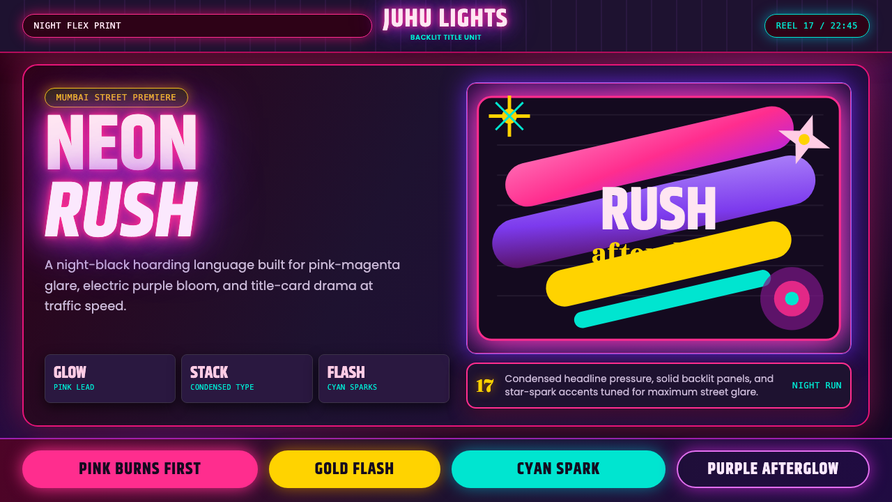 Bollywood Neon MumbaiMumbai pop burns bright. Khand stacks glow over night-black, with pink-purple…
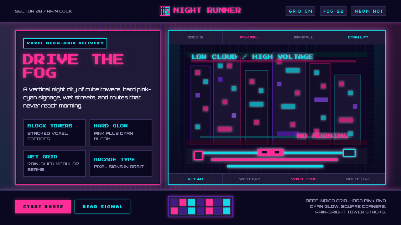 CloudpunkNeon-noir goes voxel. Pink-cyan glow cuts deep-indigo grids and blocky tower…
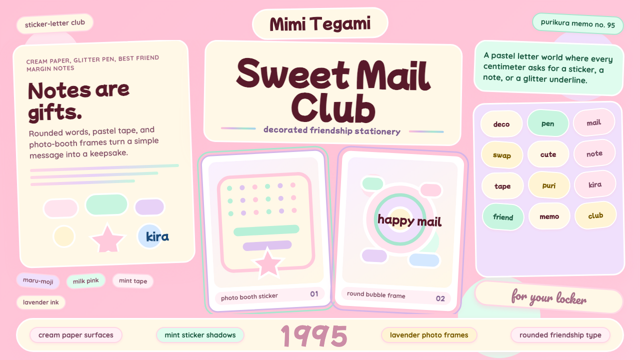 Kawaii Japanese Letter PurikuraCuteness fills every inch. Pink cream paper, mint stickers, lavender frames.
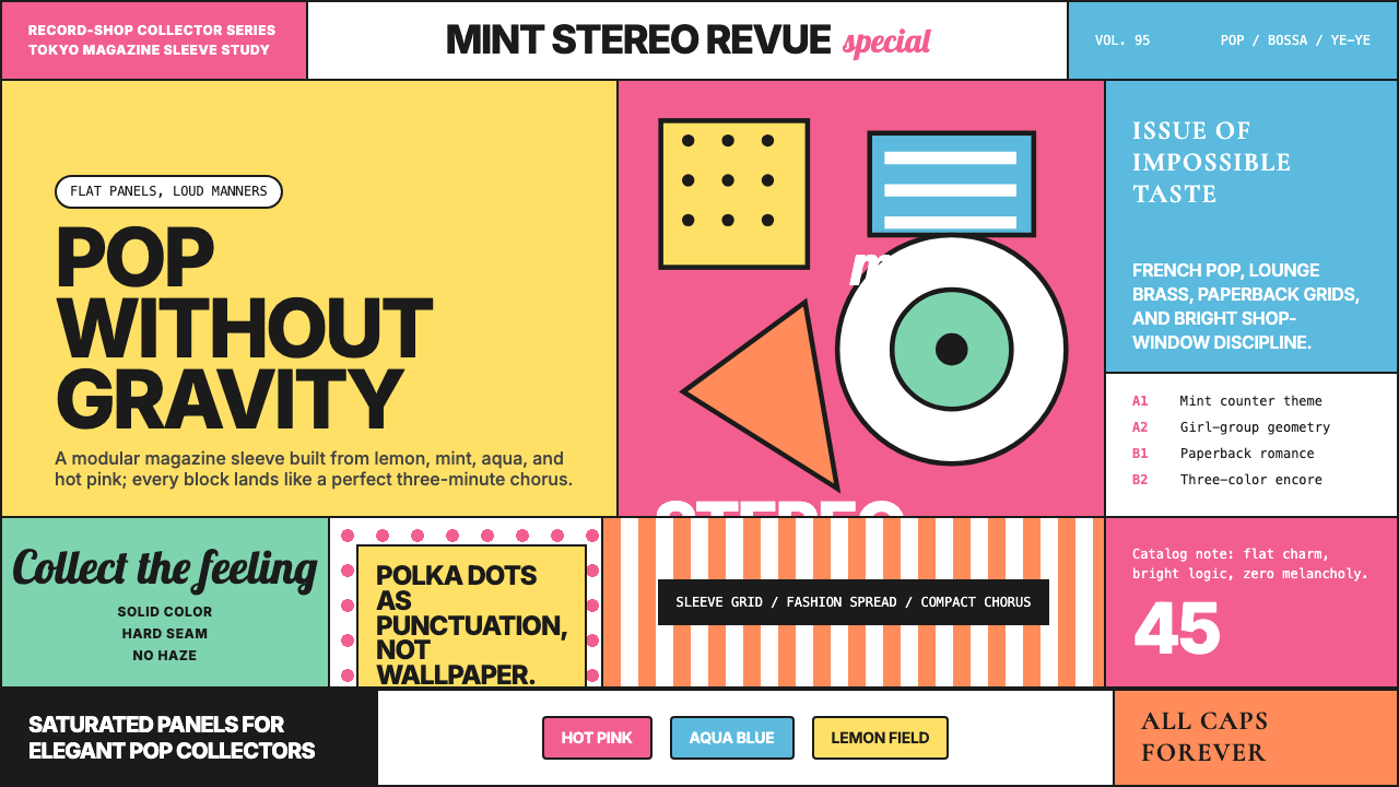 Shibuya-kei (Flipper's Guitar, 1995)Pop without gravity. Hot pink, mint, lemon, and aqua snap into album-sleeve g…
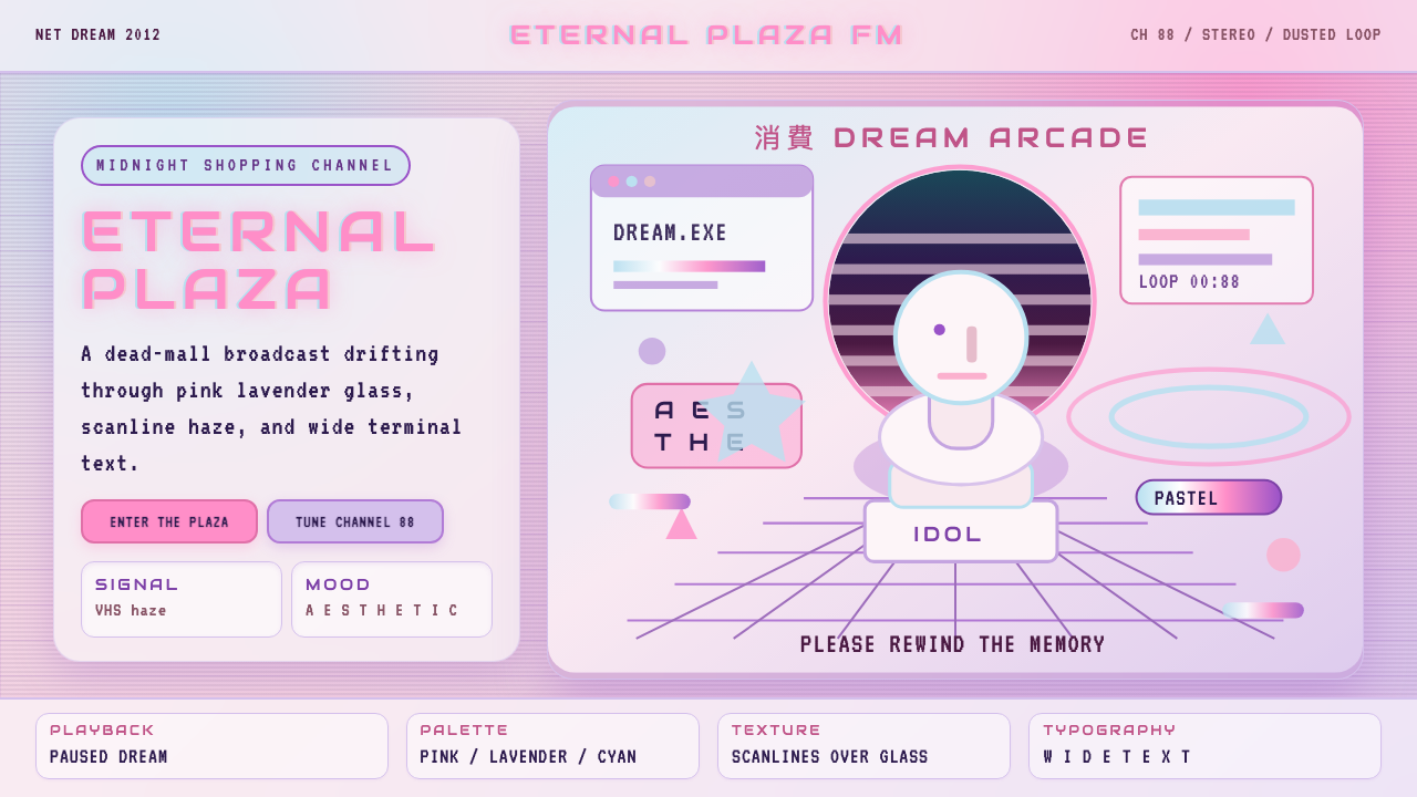 Vaporwave (Tumblr 2012)Dead-mall nostalgia glows. Pink-lavender glass, VHS scanlines, and wide retro…
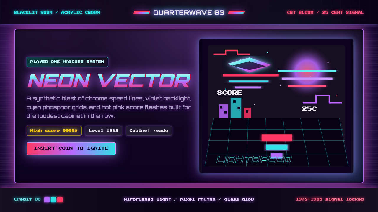 Arcade Cabinet MarqueeToo loud to ignore. Black-indigo glass, violet glow, cyan grids, hot-pink arc…