What is Vaporwave (Tumblr 2012)?什么是 Vaporwave (Tumblr 2012)?
Vaporwave wraps late-capitalism's ghost in dusty pastels, VHS static, and a sunset gradient that has been setting since 1987.蒸汽波用尘粉色调、VHS 静噪与一道自 1987 年起便永不落下的日落渐变,裹住了晚期资本主义的幽魂。
Vaporwave (Tumblr 2012) in briefVaporwave (Tumblr 2012) 速览
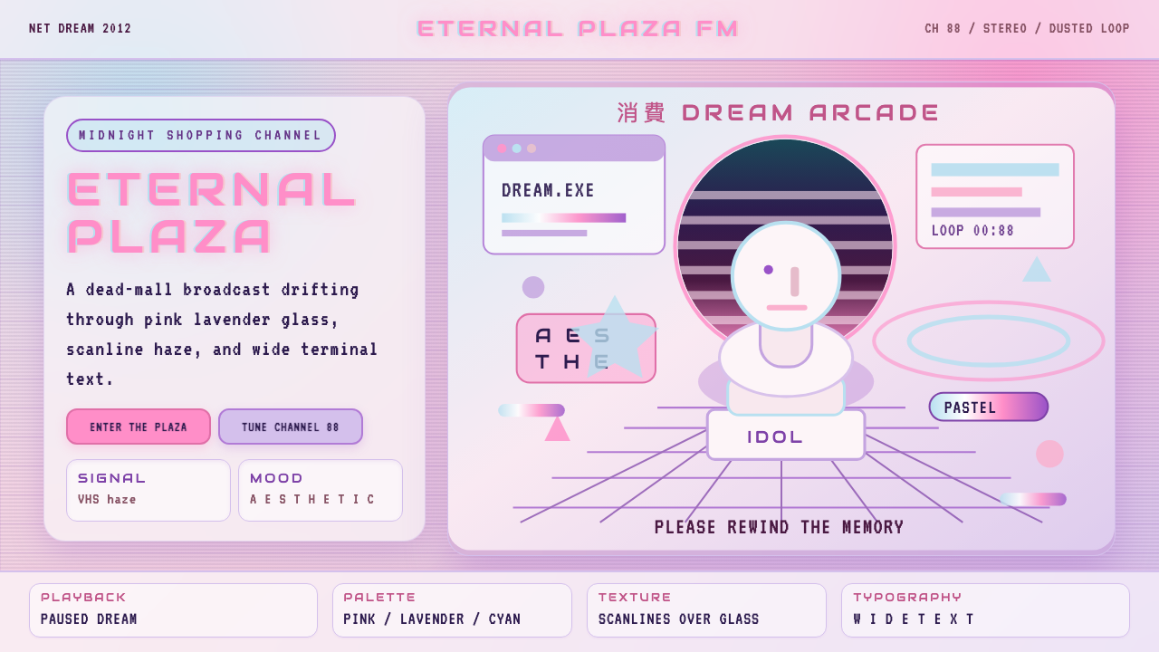
Vaporwave (Tumblr 2012) is an internet-native aesthetic that emerged from a niche musical microgenre and crystallised into one of the most recognisable visual styles of the early 2010s. Its palette orbits pink, lavender, and soft teal — the colours of a cathode-ray sunset — laid over marble textures, wireframe grids, and classical Roman busts that appear stranded in digital space. Wide-spaced, all-caps display type coexists with the half-width katakana of A E S T H E T I C, and scan-lines ghost across every surface as a reminder that this world is transmitted, not real.蒸汽波(Tumblr 2012)是一种互联网原生美学,起源于一个小众音乐微流派,并在 2010 年代初结晶为最具辨识度的视觉风格之一。其色板围绕粉红、薰衣草紫与柔和蓝绿展开——阴极射线日落的颜色——铺陈于大理石纹理、线框网格,以及被搁浅在数字空间中的罗马古典半身像之上。宽字距全大写展示字体与全角片假名的 A E S T H E T I C 并置,扫描线幽灵般覆盖每一个表面,提醒观者:这个世界是被传输出来的,而非真实存在的。
Where Bauhaus or Swiss International Style impose structural logic on visual chaos, vaporwave instead performs a kind of fond mourning: it treats the graphic detritus of 1980s and 1990s consumer culture — Windows 95 dialogue boxes, mall-atrium lighting, corporate stock-photo smiles — as archaeological artefacts worthy of reverent display. The aesthetic is simultaneously nostalgic and critical, sincere and ironic, which is precisely why it resonated so widely on Tumblr, a platform built for layered emotional registers.包豪斯或瑞士国际主义风格将结构逻辑强加于视觉混沌之上,蒸汽波则反其道而行之——它演绎的是一种深情的哀悼:将 1980 至 1990 年代消费文化的视觉碎片——Windows 95 对话框、商场中庭的灯光、企业图库照片里的微笑——当作值得庄重展陈的考古文物。这种美学同时是怀旧的又是批判的,是真诚的又是反讽的,这正是它在 Tumblr 上引发广泛共鸣的原因——那个平台天生适合多层次的情感表达。
As a design system, vaporwave is defined by controlled excess rather than restraint. Gradients are not avoided but embraced; transparency and layering create depth that feels both digital and dreamy. The mood is warm dusk rather than crisp morning: saturated but hazy, rich but soft. Glitch elements — horizontal tears, chromatic aberration, pixelation — appear not as errors to be corrected but as honest admissions of the medium's instability.作为设计体系,蒸汽波以有节制的过剩而非克制为核心特征。渐变不是被回避的,而是被拥抱的;透明度与图层叠加创造出既数字又梦幻的深度感。整体氛围是温暖的黄昏而非清爽的清晨:饱和却朦胧,丰富却柔软。故障元素——水平撕裂、色差、像素化——不是需要纠正的错误,而是对媒介不稳定性的坦诚承认。
See the Vaporwave (Tumblr 2012) design system查看 Vaporwave (Tumblr 2012) 完整设计系统
Where does Vaporwave (Tumblr 2012) come from?Vaporwave (Tumblr 2012) 从何而来?
The musical origins of vaporwave are traceable to a handful of experimental releases in 2010 and 2011. Daniel Lopatin, recording as Chuck Person, released 'Eccojams Vol. 1' in 2010 — a tape of looped, pitch-shifted fragments from 1980s pop and smooth jazz that transformed familiar pleasantness into something uncanny and adrift. James Ferraro's 'Far Side Virtual' (2011) went further, assembling ringtones, default system sounds, and corporate hold-music into an album that sounded like a shopping mall dreaming of itself. These releases circulated on SoundCloud and 4chan's music board, reaching a small audience who recognised something new: music that treated the consumer experience of the late twentieth century as raw material for critique.蒸汽波的音乐源头可追溯到 2010 至 2011 年间的少数实验性发行。丹尼尔·洛帕廷以 Chuck Person 为名,于 2010 年发布了《Eccojams Vol. 1》——一盘由 1980 年代流行乐与平滑爵士碎片循环变调而成的磁带,将熟悉的愉悦感转化为某种怪诞而漂浮的东西。詹姆斯·费拉罗的《Far Side Virtual》(2011 年)走得更远,将手机铃声、系统默认音效和企业等待音乐拼接成一张专辑,听起来像一座商场在梦见自己。这些发行在 SoundCloud 和 4chan 的音乐板块流传,触达了一小群听众——他们认出了某种新事物:将二十世纪末消费体验作为批判原材料的音乐。
The visual aesthetic coalesced in 2012, primarily on Tumblr. Vektroid (Ramona Xavier), releasing as Macintosh Plus, published 'Floral Shoppe' in late 2011 — an album whose cover art, featuring a marble bust set against pink and teal gradients with Japanese text overlaid, became the aesthetic's single most reproduced image. Tumblr users began reblogging edited versions: adding scan-lines, adjusting hues, inserting Windows 95 interface fragments, overlaying Greek columns and chessboard floors. Within months, a coherent visual grammar had assembled itself through collective iteration, without any single designer or manifesto directing it.视觉美学于 2012 年在 Tumblr 上凝聚成形。Vektroid(拉莫纳·扎维尔)以 Macintosh Plus 的名义,于 2011 年底发布了《Floral Shoppe》——专辑封面以大理石半身像为主体,粉红与蓝绿渐变为背景,日文文字叠印其上,成为这种美学中被转发最多的单一图像。Tumblr 用户开始转发其编辑版本:添加扫描线、调整色调、插入 Windows 95 界面碎片、叠加希腊圆柱与棋盘地板。数月之内,一套连贯的视觉语法通过集体迭代自行组装完成,没有任何单一设计师或宣言加以指导。
The style drew from several distinct source pools. Japanese city pop album covers of the late 1970s and 1980s — pastel, luxurious, depicting leisure and consumption — supplied the colour mood. Early-1990s Macintosh graphic design contributed the wireframe grids, teal interfaces, and geometric sans-serif type. Stock photography from the same era added marble surfaces, executive desk props, and generic landscapes. Classical sculpture — particularly busts of Greek and Roman figures — appeared as a recurring motif, functioning simultaneously as a symbol of high culture displaced into low commercial contexts and as a ready-made object with the right monochromatic surface quality.这种风格汲取自几个截然不同的来源池。1970 至 1980 年代末日本城市流行乐专辑封面——粉彩色调、奢华感、描绘休闲与消费——提供了色彩情绪。1990 年代初的麦金塔图形设计贡献了线框网格、蓝绿色界面与几何无衬线字体。同一时代的图库摄影带来了大理石表面、行政桌面道具与通用景观。古典雕塑——尤其是希腊罗马人物的半身像——作为反复出现的母题,既象征被置换至低端商业语境的高雅文化,又是一种拥有恰当单色表面质感的现成品。
By 2013 and 2014, vaporwave had spread beyond Tumblr into broader internet culture, spawning subgenres (mallsoft, hardvapour, future funk) and attracting academic commentary on hauntology and post-internet aesthetics. Its peak Tumblr period — roughly 2012 to 2014 — represents the aesthetic in its purest collective form, before it was adopted by commercial branding. The style has experienced multiple revival cycles since, including a significant resurgence around 2018 and ongoing enthusiasm through the mid-2020s, which speaks to its structural adaptability: the nostalgic grammar it established can be reapplied to each new generation's sense of a lost recent past.到 2013 至 2014 年,蒸汽波已从 Tumblr 扩散至更广泛的网络文化,催生了子流派(商场软波、硬蒸汽、未来放克),并吸引了学界对幽灵学与后互联网美学的关注。其 Tumblr 鼎盛期——大约 2012 至 2014 年——代表了这种美学在被商业品牌收编之前最纯粹的集体形态。此后该风格经历了多次复兴周期,包括 2018 年前后的显著回潮以及贯穿 2020 年代中期的持续热情,这说明它具有深层的结构适应性:它所建立的怀旧语法可以被重新应用于每一代人对逝去的近期过往的感知。
What defines the Vaporwave (Tumblr 2012) look?Vaporwave (Tumblr 2012) 的视觉特征是什么?
Pastel Gradient Palette粉彩渐变色板
The defining colour territory is warm pastel — dusty pink, soft lavender, pale mint, and the deeper magenta that anchors the sunset end of the spectrum. These hues appear most characteristically in multi-stop gradients that shift from pink at the horizon through purple to deep indigo overhead, evoking the specific quality of light in a late-1980s television broadcast. Unlike the flat primaries of Bauhaus, vaporwave colour is always atmospheric: hues bleed into one another, surfaces glow rather than reflect, and the overall impression is of warmth suspended just before cooling.核心色域是温暖的粉彩——尘粉色、柔薰衣草紫、淡薄荷绿,以及锚定日落端的深洋红。这些色调最具代表性地出现在多色节点渐变中,从地平线处的粉红渐变至紫色,再到头顶的深靛蓝,唤起 1980 年代末电视广播特有的光线质感。不同于包豪斯的平涂原色,蒸汽波的色彩始终是大气性的:色调相互渗透,表面发光而非反光,整体印象是即将冷却前悬停的温暖。
Retro-Tech Display Typography复古科技展示字体
Type in vaporwave favours wide-tracked, geometric display letterforms — the kind that appeared in 1980s corporate logotypes and early desktop publishing. All-caps settings are common, with letter-spacing pushed to near-double the normal value, creating a deliberate sense of spaciousness and era-coded authority. Full-width Japanese katakana appears frequently alongside Latin text, not as a linguistic choice but as a graphic texture and cultural collage. The combination signals both the Japanese city-pop influence and the tendency of 1980s Western design to deploy Japanese characters purely as exotic signifiers.蒸汽波的字体倾向于宽字距的几何展示字形——那种出现在 1980 年代企业标志和早期桌面出版中的字体。全大写设定十分常见,字距被推至接近正常值的两倍,制造出刻意的空旷感与时代编码的权威性。全角日文片假名频繁与拉丁文字并置,这不是语言选择,而是图形质感与文化拼贴。这种组合同时指向日本城市流行乐的影响,以及 1980 年代西方设计将日文字符纯粹用作异域能指的倾向。
VHS and Scan-line TextureVHS 与扫描线纹理
Horizontal scan-lines — thin dark bands repeating at regular intervals across an image — are among the most immediately recognisable marks of the vaporwave aesthetic. They reference the interlaced-scan display technology of analogue television and the visual degradation of magnetic tape, signalling that the content is mediated, recorded, and therefore slightly unreliable. Related textures include chromatic aberration (where colour channels shift out of alignment, producing ghost-colour fringes on edges), mild pixelation, and the vertical roll that occurs when a VHS tape degrades. These artefacts are applied intentionally as aesthetic marks rather than corrected as defects.水平扫描线——以规律间隔横跨图像重复出现的细暗条带——是蒸汽波美学最具即时辨识度的标记之一。它们指向模拟电视的逐行扫描显示技术以及磁带的视觉劣化,表明内容是被中介的、被录制的,因而略带不可靠性。相关纹理还包括色差(色彩通道错位,在边缘产生幽灵色彩光晕)、轻微像素化,以及 VHS 磁带劣化时出现的垂直滚动。这些伪影被刻意作为美学标记施加,而非作为缺陷被纠正。
Classical Fragments in Digital Space数字空间中的古典碎片
Marble busts, Greek columns, Roman statuary, and chessboard-tiled floors appear throughout vaporwave imagery, typically set against gradient skies or floating in featureless digital voids. This juxtaposition of ancient material culture with synthetic digital environments is central to the aesthetic's cultural commentary: civilisations built in marble are placed inside computers, rendered weightless, and offered for consumption alongside shopping-channel merchandise. The marble texture itself — cool, veined, monochromatic — also provides a visual counterweight to the warmth of the pastel palette, and the familiar classical forms serve as anchor points within otherwise abstract compositions.大理石半身像、希腊圆柱、罗马雕像与棋盘格地板遍布于蒸汽波图像中,通常被置于渐变天空之前或漂浮于空白数字虚空之中。古代物质文化与合成数字环境的这种并置,是该美学文化评论的核心:以大理石建造的文明被放入计算机,失去重量,与电视购物商品并列供人消费。大理石纹理本身——冷峻、有纹脉、接近单色——也为粉彩调色板的温暖提供了视觉对位,而熟悉的古典形态在原本抽象的构图中充当锚点。
Wireframe Grid and Infinite Floor线框网格与无限地板
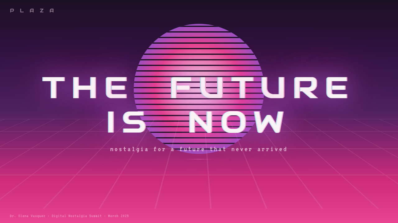
The perspective wireframe grid — a flat plane receding to a vanishing point in classic one-point perspective, rendered in thin glowing lines — is a signature vaporwave spatial motif. It references the primitive three-dimensional graphics of early computer games and visualisation software, where wireframe rendering was a technical necessity before texture-mapping became affordable. In vaporwave, this grid typically appears as a glowing magenta or cyan mesh extending to a horizon bisected by a stylised sun — the 'synthwave sun' — with horizontal bands cut into it. The grid converts digital space into something felt as real place, however artificial.透视线框网格——以经典单点透视向消失点延伸的平面,由细发光线条勾勒而成——是蒸汽波标志性的空间母题。它指向早期电脑游戏和可视化软件的原始三维图形,在那个时代,纹理贴图技术尚未普及,线框渲染是技术必然。在蒸汽波中,这种网格通常表现为发光的洋红或青色网格,延伸至被程式化太阳——「合成波太阳」——切割的地平线,太阳上刻有水平条带。网格将数字空间转化为某种感觉真实的场所,尽管人工痕迹明显。
Layered Transparency and Glow多层透明与发光效果
Unlike flat-colour styles that keep each element opaque and distinct, vaporwave compositions stack translucent layers — gradients, photography, texture, type — at varying opacities so that elements bleed through one another. Glow effects appear around type and geometric shapes: a soft outer radiance that suggests illumination from within rather than from an external source. This treatment gives the aesthetic its characteristic warmth and unreality, as though the entire composition exists slightly behind glass or within the phosphor persistence of a cathode-ray screen.不同于保持每个元素不透明且分明的平涂色风格,蒸汽波构图以不同不透明度叠加半透明层次——渐变、摄影、纹理、字体——使各元素相互渗透。发光效果出现在字体和几何形态周围:一种柔和的外部光晕,暗示由内而外的照明而非来自外部光源。这种处理赋予该美学其标志性的温暖感与超现实感,仿佛整个构图存在于玻璃背后,或笼罩在阴极射线屏幕的荧光余辉之中。
Dead-Mall Spatial Atmosphere废弃商场的空间氛围
Beyond specific graphic elements, vaporwave carries a distinct spatial mood: the quiet of an empty atrium, escalators running for nobody, ambient music cycling through a deserted food court. This atmospheric register is achieved through generous negative space within compositions, deliberately low visual density in some zones, and the sense that depicted spaces are oversized for their current occupancy — a kind of architectural loneliness. When architectural or interior settings appear directly, they favour the materials and proportions of 1980s commercial construction: reflective floor tiles, pastel-painted cinder block, potted palms under skylights.超越具体图形元素,蒸汽波携带着一种独特的空间情绪:空旷中庭的寂静,为无人运行的自动扶梯,循环于荒芜美食广场的背景音乐。这种氛围基调通过构图中慷慨的负空间、某些区域刻意的低视觉密度,以及所描绘空间对其当前使用者而言过于宽大的感觉来实现——一种建筑性的孤独。当建筑或室内场景直接出现时,它们偏爱 1980 年代商业建筑的材质与比例:反光地砖、粉彩涂漆的混凝土砌块、天窗下的盆栽棕榈树。
See the Vaporwave (Tumblr 2012) design system查看 Vaporwave (Tumblr 2012) 完整设计系统
Who shaped Vaporwave (Tumblr 2012)?谁塑造了 Vaporwave (Tumblr 2012)?
Lopatin's 2010 cassette release under the Chuck Person alias, 'Eccojams Vol. 1', is widely regarded as the founding document of the vaporwave sound. By isolating short loops from 1980s smooth jazz and pop songs, slowing them down, and processing them through echo, he created music that treated nostalgia as raw material rather than emotion — studying the texture of a remembered decade rather than sentimentalising it. As Oneohtrix Point Never, Lopatin continued developing similar approaches at a higher level of compositional complexity, influencing successive waves of internet-based experimental music.洛帕廷以 Chuck Person 名义于 2010 年发行的磁带《Eccojams Vol. 1》,被广泛视为蒸汽波声音的奠基文献。通过截取 1980 年代平滑爵士和流行歌曲的短循环片段、降速并施以回声处理,他创作出将怀旧当作原材料而非情感来对待的音乐——研究一个被记忆的年代的质感,而非对其情绪化。作为 Oneohtrix Point Never,洛帕廷以更高的作曲复杂度继续发展相似路径,影响了此后一浪接一浪的互联网实验音乐。
Vektroid's 'Floral Shoppe' (2011), released under the Macintosh Plus alias, supplied the visual template that defined vaporwave for most of its audience. The album cover — a marble bust of Helios set against a pink-to-teal gradient, Japanese text running vertically, the composition stripped to the essentials of colour and classical form — was reblogged tens of thousands of times on Tumblr and became the aesthetic's founding image. The track 'リサフランク420 / 現代のコンピュー' became vaporwave's most recognised musical moment. Vektroid's prolific output under multiple aliases also demonstrated the genre's range, from atmospheric mall-ambient to faster rhythmic variants.Vektroid 以 Macintosh Plus 名义发行的《Floral Shoppe》(2011 年)提供了为大多数受众定义蒸汽波的视觉模板。专辑封面——太阳神赫利俄斯的大理石半身像置于粉红至蓝绿渐变前,日文竖排,构图剥离至色彩与古典形态的本质——在 Tumblr 上被数万次转发,成为这种美学的奠基图像。曲目「リサフランク420 / 現代のコンピュー」成为蒸汽波最具辨识度的音乐时刻。Vektroid 以多个化名发行的大量作品也展示了这一流派的宽度,从大气化的商场环境音乐到更快节奏的变体。
Ferraro's 'Far Side Virtual' (2011) approached vaporwave's themes from a more conceptual angle than Lopatin's loop-based method. Rather than sampling existing music, Ferraro composed original pieces from scratch using ringtones, notification sounds, and corporate sonic signifiers — the sounds of smartphones and software rather than analogue recordings. The result was an album that sounded simultaneously utopian and deeply uncanny: the sonic landscape of a consumer paradise that had no humans in it. Ferraro's work made explicit the aesthetic's implicit critique of how digital technology had colonised ambient experience.费拉罗的《Far Side Virtual》(2011 年)以比洛帕廷基于循环的方法更具概念性的角度处理了蒸汽波的主题。他不是对现有音乐进行采样,而是完全用手机铃声、通知提示音和企业声音符号——智能手机和软件的声音,而非模拟录音——从头创作原创作品。结果是一张听起来同时乌托邦且深度怪诞的专辑:一个消费天堂的声景,其中没有任何人类。费拉罗的作品将这种美学对数字技术如何殖民环境体验的隐性批判明确化。
Though primarily known as a filmmaker and game designer rather than a graphic artist, OReilly's work in the early 2010s shares foundational aesthetic concerns with vaporwave: the use of low-fidelity three-dimensional rendering, the treatment of digital environments as emotionally loaded spaces, and a consistent interest in what computational aesthetics feel like from the inside. His animated short 'Please Say Something' (2009) and later the game 'Mountain' (2014) both explore the uncanny valley of digital experience that vaporwave approaches through collage. OReilly is representative of a broader cluster of artists who arrived at similar sensibilities through adjacent routes.尽管奥雷利主要以电影人和游戏设计师而非图形艺术家著称,他在 2010 年代初的作品与蒸汽波共享根本性的美学关切:使用低保真三维渲染、将数字环境视为情感负载空间,以及对从内部感受计算美学意味着什么的持续兴趣。他的动画短片《Please Say Something》(2009 年)和后来的游戏《Mountain》(2014 年)都探索了数字体验的恐怖谷,而蒸汽波则通过拼贴来接近这同一地带。奥雷利代表了一个更广泛的艺术家群体,他们通过相邻路径抵达了相似的感性。
Unlike most design movements, vaporwave's visual language was not shaped by identifiable individual designers but by the anonymous collective behaviour of Tumblr's image-reblogging infrastructure. Users who edited and recirculated images — adding filters, overlaying text, adjusting saturation, combining elements from different sources — acted as a distributed creative engine. This anonymity is constitutive of the aesthetic, not incidental to it: vaporwave images circulate without clear authorship, which reinforces their feeling of being found objects rather than designed artefacts. Any historical account of the aesthetic must acknowledge this collective authorship as its primary creative mechanism.不同于大多数设计运动,蒸汽波的视觉语言并非由可识别的个人设计师塑造,而是由 Tumblr 图片转发基础设施的匿名集体行为所形成。那些编辑并再传播图片的用户——添加滤镜、叠加文字、调整饱和度、混合来自不同来源的元素——充当了一个分布式创意引擎。这种匿名性是该美学的构成要素,而非附带特征:蒸汽波图像在没有明确作者的情况下流传,这强化了它们作为发现物而非设计品的感觉。任何关于该美学的历史叙述都必须承认这种集体创作是其首要创意机制。
How do you use Vaporwave (Tumblr 2012) today?今天怎么用 Vaporwave (Tumblr 2012)?
Vaporwave's visual grammar is more transferable than its reputation as internet subculture might suggest. Because the style is built from specific, learnable components — gradient direction and hue range, scan-line weight and opacity, type-spacing ratios, the particular spatial atmosphere of empty grandeur — it can be applied with precision to professional design contexts without collapsing into pastiche. The key is understanding which elements carry the emotional weight of the style and which are surface decoration that can be modulated without losing character.蒸汽波的视觉语法比其作为互联网亚文化的声誉所暗示的更具可移植性。由于这种风格建立在具体可学习的组成要素之上——渐变方向与色调范围、扫描线的粗细与不透明度、字距比例、空旷壮观的特定空间氛围——它可以精确地应用于专业设计语境,而不会坍缩为模仿。关键在于理解哪些元素承载了这种风格的情感重量,哪些是可以在不失去性格的情况下调节的表面装饰。
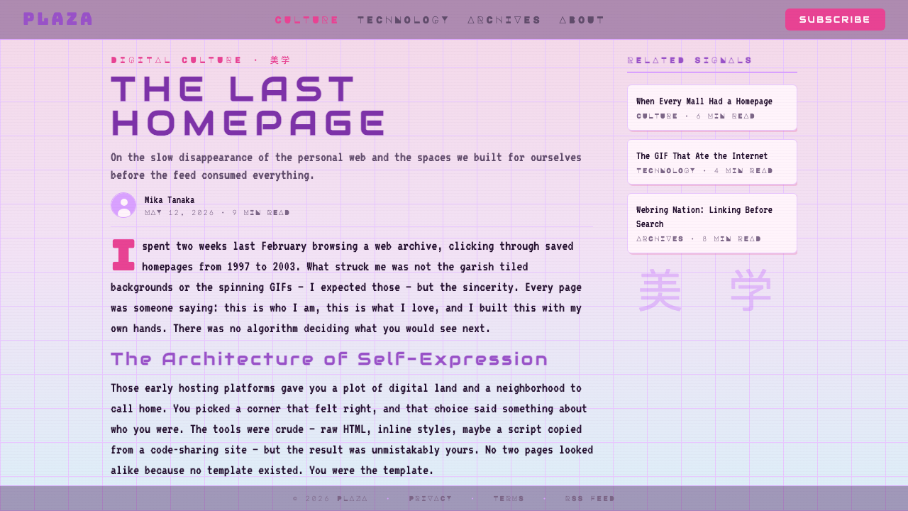
For presentation slides, vaporwave works well on cover pages and section dividers that need to establish mood before content begins. A cover built in this style uses a full-bleed multi-stop gradient as background — moving from a warm pink at the lower edge through lavender to a cooler hue above — with a centred or offset title in wide-tracked display type, possibly complemented by a secondary line in katakana or a translucent classical motif. Section dividers can use the wireframe grid as a visual punctuation mark, with the grid fading into the gradient rather than sitting on top of it. Content slides should be clean and minimal — the style's excess belongs on structural frames, not on pages carrying dense information.在演示文稿中,蒸汽波在需要在内容开始前建立情绪的封面页和章节分隔页上效果出色。以这种风格构建的封面使用全出血多色节点渐变作为背景——从下缘的温暖粉红渐变至薰衣草紫再到上方更冷的色调——以居中或偏移的宽字距展示字体排列标题,可辅以片假名次级文字行或半透明古典母题。章节分隔页可用线框网格作为视觉标点符号,网格消融入渐变而非叠加其上。内容页应保持简洁——这种风格的过剩感属于结构性框架,而非承载密集信息的页面。
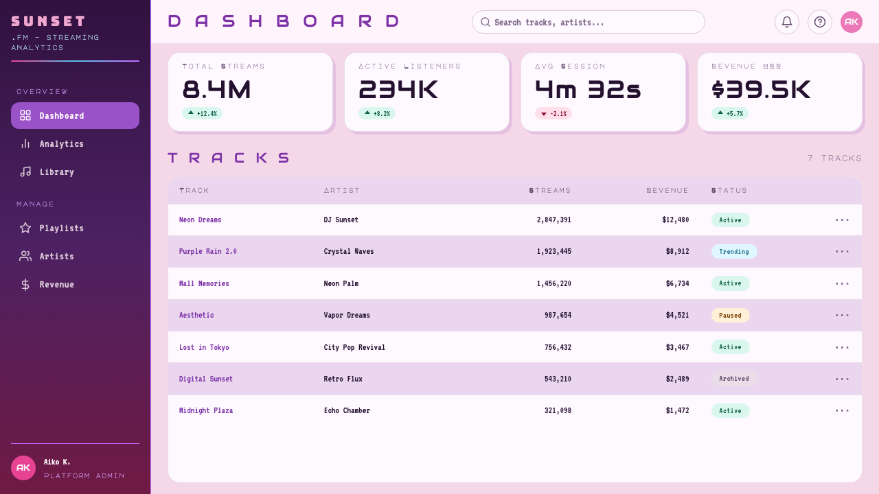
For web interfaces — particularly dashboards, pricing pages, and landing pages for creative or entertainment products — vaporwave offers an immediately distinctive alternative to the neutral design languages that dominate most SaaS products. A vaporwave-derived web palette uses the gradient as a hero-section background, type in pale cream or near-white against the saturated ground, and accent elements in bright magenta or warm gold. Card components work well with a frosted-glass treatment: a translucent light surface set against the gradient background, with a soft glow at the border rather than a hard shadow. Navigation and interactive elements should lean toward the type-forward aesthetic — large, widely-spaced labels — to prevent the decorative richness of the palette from competing with usability.对于网页界面——尤其是仪表板、定价页面以及创意或娱乐产品的落地页——蒸汽波提供了一种立即与众不同的选择,有别于主导大多数 SaaS 产品的中性设计语言。蒸汽波衍生的网页色板将渐变用作英雄区背景,在饱和底色上排列奶油白或近白色文字,以亮洋红或暖金作为强调元素。卡片组件适合磨砂玻璃处理:半透明浅色表面置于渐变背景前,边框处有柔和发光效果而非硬边投影。导航与交互元素应倾向字体优先的美学——大尺寸、宽间距的标签——以防止调色板的装饰丰富性与可用性产生竞争。
In editorial and marketing contexts, vaporwave's palette and spatial atmosphere adapt well to campaigns targeting audiences with cultural fluency around 1980s and 1990s aesthetics, internet nostalgia, or music and gaming culture. A magazine spread in this style might use the gradient as a full-page background for pull-quotes or section openers, set classical imagery at reduced opacity as an underlayer, and run display type in the foreground at a scale that makes the type itself a compositional element. Marketing materials benefit from the style's poster-like boldness: a single dominant gradient, one large typographic statement, and minimal additional elements. The risk in marketing applications is that the style reads as trend-chasing if applied without genuine understanding of its source culture — the irony and mourning that give vaporwave its depth are easily lost when only the colour palette is borrowed.在编辑与营销语境中,蒸汽波的色板与空间氛围非常适合针对对 1980 至 1990 年代美学、互联网怀旧或音乐游戏文化具有文化素养的受众的活动。以这种风格设计的杂志跨页可将渐变用作引语或章节开篇的全页背景,以降低不透明度的古典图像作为底层,在前景以足够大的比例排列展示字体使文字本身成为构图元素。营销材料受益于这种风格的海报式大胆感:单一主导渐变、一句大型排印表达、最少量的附加元素。营销应用中的风险在于,若不真正理解其源文化,这种风格会显得在追逐潮流——当只有调色板被借用时,赋予蒸汽波深度的反讽与哀悼极易消失。
The most common mistakes when applying vaporwave in professional contexts fall into two categories. The first is over-literal adoption: including too many distinct vaporwave signifiers simultaneously — scan-lines, marble busts, wireframe grids, and katakana all in the same composition — which produces pastiche rather than a style-informed design. Professional application requires selecting one or two primary signals and trusting the gradient and type-spacing to carry the rest. The second mistake is treating the palette as if it were flat colour: applying pinks and purples without the characteristic blending and luminosity that make vaporwave colour feel atmospheric rather than merely colourful. The gradient transitions must be smooth and multi-stop, the glow effects must be present if subtle, and the overall lightness should suggest a glowing screen rather than printed ink.在专业语境中应用蒸汽波时,最常见的错误分为两类。第一类是过度字面的采用:在同一构图中同时堆砌过多蒸汽波标志——扫描线、大理石半身像、线框网格和片假名——结果产生模仿而非风格启发的设计。专业应用要求只选择一两个主要信号,让渐变与字距来承载其余部分。第二类错误是将色板视为平涂色:施以粉色和紫色时没有蒸汽波色彩的特征性融合与发光质感,使其感觉只是色彩丰富而非大气弥漫。渐变过渡必须平滑且多色节点,发光效果必须存在(哪怕微妙),整体亮度应暗示发光屏幕而非印刷油墨。
See the Vaporwave (Tumblr 2012) design system查看 Vaporwave (Tumblr 2012) 完整设计系统
Vaporwave (Tumblr 2012) — FAQVaporwave (Tumblr 2012) · 常见问题
What is the difference between vaporwave and synthwave visually?蒸汽波和合成波在视觉上有什么区别?
Both styles draw from 1980s visual culture, but they operate from different emotional registers and with different graphic grammars. Synthwave is fundamentally a night aesthetic: dark backgrounds, neon colours that read as artificial light sources, angular chrome letterforms, and a high-contrast electric quality associated with action and speed. Vaporwave is a daylight-at-dusk aesthetic: soft pastel grounds, glowing rather than blazing colour, classical and consumer imagery, and a mood of stillness and mild disorientation rather than excitement. Synthwave is driving a sports car at night; vaporwave is standing alone in a shopping mall at closing time. They share a palette overlap in pink-to-purple gradients, but their emotional targets and spatial vocabularies are distinct.两种风格都汲取自 1980 年代的视觉文化,但它们来自不同的情感基调,使用不同的图形语法。合成波本质上是夜间美学:深色背景、读作人造光源的霓虹色彩、棱角分明的铬字体,以及与行动和速度相关的高对比度电气质感。蒸汽波是黄昏时分的美学:柔和的粉彩底面、发光而非炫目的色彩、古典与消费意象,以及静止与轻微迷失方向而非兴奋的情绪。合成波是深夜驾驶跑车;蒸汽波是打烊时刻独自站在购物中心里。两者在粉红至紫色渐变上有色板重叠,但它们的情感目标与空间词汇截然不同。
Can vaporwave work in a professional or corporate context, or is it too subcultural?蒸汽波能用于专业或企业语境吗,还是太具亚文化色彩?
Vaporwave can absolutely work in professional contexts, with calibration. The style is too visually loaded to apply wholesale to conservative industries like finance, healthcare, or legal services, where the aesthetic associations — internet subculture, irony, nostalgia — work against the authority signals those sectors require. But for creative industries, entertainment platforms, music and gaming products, youth-oriented consumer brands, and any context where distinctive visual character is a commercial advantage, a vaporwave-informed palette and spatial grammar can be highly effective. The strategy is to use the style's colour logic and typographic spacing while leaving out the most subcultural-coded elements (scan-lines, classical busts, katakana) unless the brand genuinely speaks that cultural language.蒸汽波绝对可以在专业语境中发挥作用,但需要校准。这种风格的视觉负荷过重,无法整体应用于金融、医疗或法律服务等保守行业——在那里,这种美学联想(互联网亚文化、反讽、怀旧)会削弱这些行业所需的权威信号。但对于创意产业、娱乐平台、音乐和游戏产品、面向年轻人的消费品牌,以及任何独特视觉性格具有商业优势的语境,受蒸汽波启发的色板与空间语法可以非常有效。策略是运用这种风格的色彩逻辑与排印间距,同时省略最具亚文化编码的元素(扫描线、古典半身像、片假名),除非品牌真正在说那种文化语言。
How do I apply vaporwave without it looking like a meme?如何应用蒸汽波而不让它看起来像表情包?
The meme-quality of vaporwave comes from its most literal and clustered applications — when every signifier is present simultaneously without editorial restraint. Avoiding this requires two disciplines. First, selection: choose one or two elements from the aesthetic vocabulary (the gradient, the wide-tracked type, the scan-line) and commit to those while leaving the rest out. Second, quality of execution: the gradient must be carefully crafted with considered colour stops and smooth transitions; the type-spacing must be intentional and consistent rather than simply 'a lot'; glow effects must be subtle enough that they read as atmosphere rather than filter. A professional vaporwave application looks like a designer who deeply understood the aesthetic and then made choices; a meme looks like someone applied a preset.蒸汽波之所以显得像表情包,是因为其最字面化和集中化的应用——当所有标志同时出现而没有编辑节制时。避免这种情况需要两种自律。第一是选择:从美学词汇中挑选一两个元素(渐变、宽字距字体、扫描线),坚定使用它们,同时省略其余部分。第二是执行质量:渐变必须精心制作,有经过考量的色节点和平滑过渡;字距必须是刻意且一致的,而不仅仅是「很宽」;发光效果必须足够微妙,读作氛围而非滤镜。专业的蒸汽波应用看起来像是一位深度理解该美学后做出选择的设计师;表情包则像是有人套用了一个预设。
Does vaporwave work in print, or is it inherently a screen aesthetic?蒸汽波适用于印刷品吗,还是它本质上是屏幕美学?
Vaporwave is fundamentally a screen aesthetic — its defining qualities include luminous colour, glow effects, and the specific light behaviour of phosphor or liquid-crystal displays. Translating it to print requires acknowledging that several of its key effects do not survive the transition: glow effects flatten into tinted halos, the luminosity of gradient backgrounds becomes opaque, and scan-lines that read as atmospheric on screen become mechanical-looking dots in offset printing. Print applications work best when they lean into the pastel palette, the wide-tracked display type, and the compositional structure (gradient direction, classical motif placement) rather than attempting to reproduce the texture-based effects. A risograph or screen-printed application can capture some of the warmth and colour layering through ink transparency, though the effect will be more analogue than digital.蒸汽波从根本上是一种屏幕美学——其决定性品质包括发光色彩、发光效果,以及荧光粉或液晶显示器的特定光线行为。将其转化为印刷品需要承认其若干关键效果无法经受这一过渡:发光效果变平为带色晕圈,渐变背景的发光质感变为不透明,屏幕上读作氛围的扫描线在胶印中变成机械感的点阵。印刷应用最好倾向于粉彩色板、宽字距展示字体以及构图结构(渐变方向、古典母题布置),而非尝试复制基于纹理的效果。孔版印刷或丝网印刷应用可以通过油墨透明度捕捉部分温暖感与色彩叠加,尽管效果会更偏模拟而非数字。
How does vaporwave relate to hauntology, and why does that matter for design?蒸汽波与幽灵学有何关联,这对设计有什么意义?
Hauntology — the philosophical concept developed by Jacques Derrida and applied to popular culture most influentially by the critic Mark Fisher — describes the cultural condition of being haunted by a future that never arrived, or a past that cannot be fully processed. Fisher identified hauntology in British popular music that recycled the sound of the postwar welfare-state optimism long after that optimism had been dismantled by Thatcherism. Vaporwave is the American and internet-native version of this sensibility: it processes the broken promise of late-capitalist consumer utopia — the mall, the PC, the smooth-jazz soundtrack of corporate prosperity — through the act of aesthetic recreation. For design, this matters because it means vaporwave is not simply a retro style; it carries a specific emotional argument about the relationship between designed environments and the futures they promised. Applying the style effectively means understanding that undertone, which is what distinguishes design that feels genuinely evocative from design that merely looks pink and purple.幽灵学——雅克·德里达发展的哲学概念,由批评家马克·费舍尔以最具影响力的方式应用于流行文化——描述了一种文化状态:被一个从未到来的未来,或一个无法被充分处理的过去所缠绕。费舍尔在英国流行音乐中识别出幽灵学,那些音乐在战后福利国家乐观主义已被撒切尔主义拆解很久之后仍在回收其声音。蒸汽波是这种感性的美国版本与互联网原生版本:它通过美学再创造的行为,处理晚期资本主义消费乌托邦的破碎承诺——购物中心、个人电脑、企业繁荣的平滑爵士乐配乐。对设计而言,这意味着蒸汽波不仅仅是一种复古风格;它携带着关于设计环境与其所承诺之未来之间关系的特定情感论点。有效应用这种风格意味着理解这种潜台词,而这正是真正唤起情感的设计与仅仅看起来粉紫色的设计之间的区别。
Related design styles相关设计风格
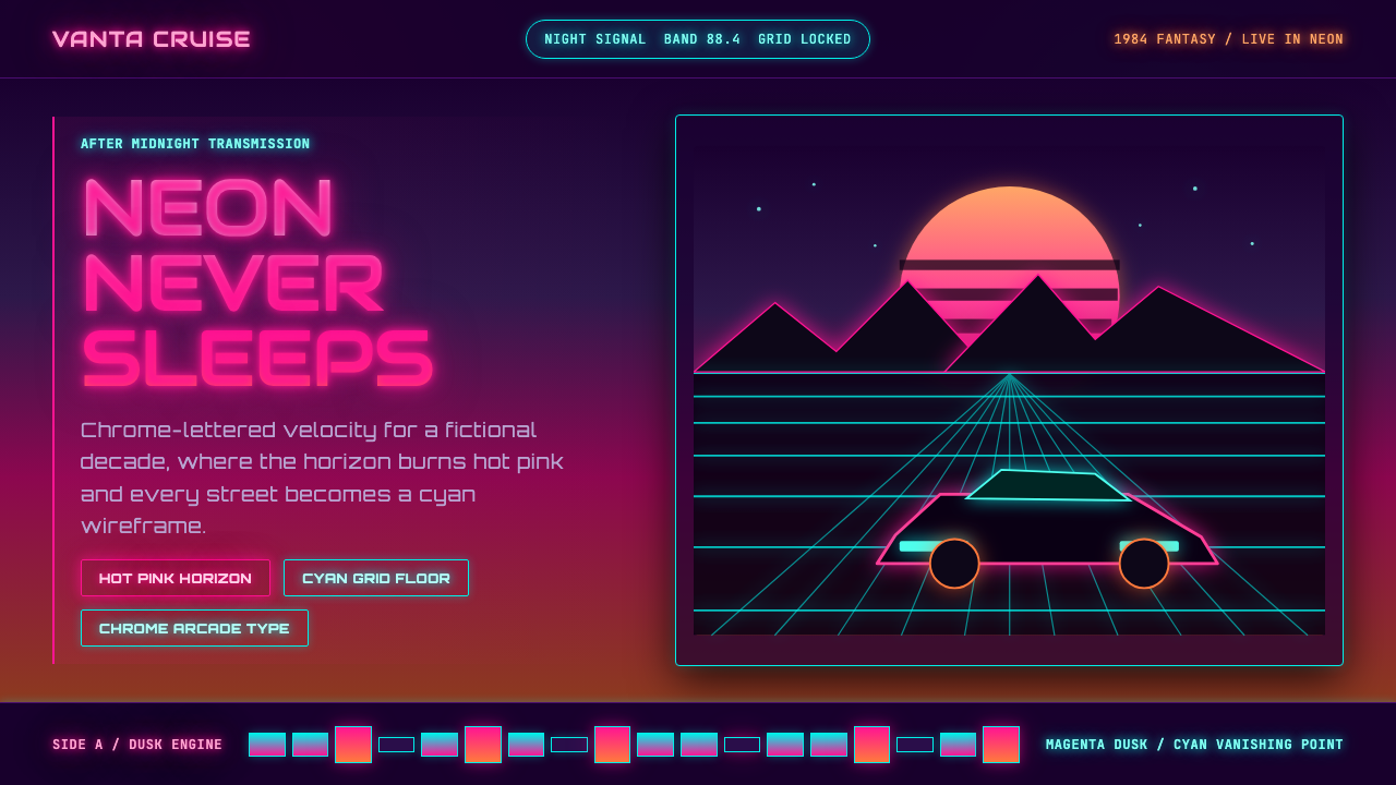 Synthwave Outrun 1984Sincere neon nostalgia. Hot pink sunset, cyan grid, chrome type against pure…真挚的霓虹怀旧。热粉日落、青色网格与镀铬字照亮黑夜。
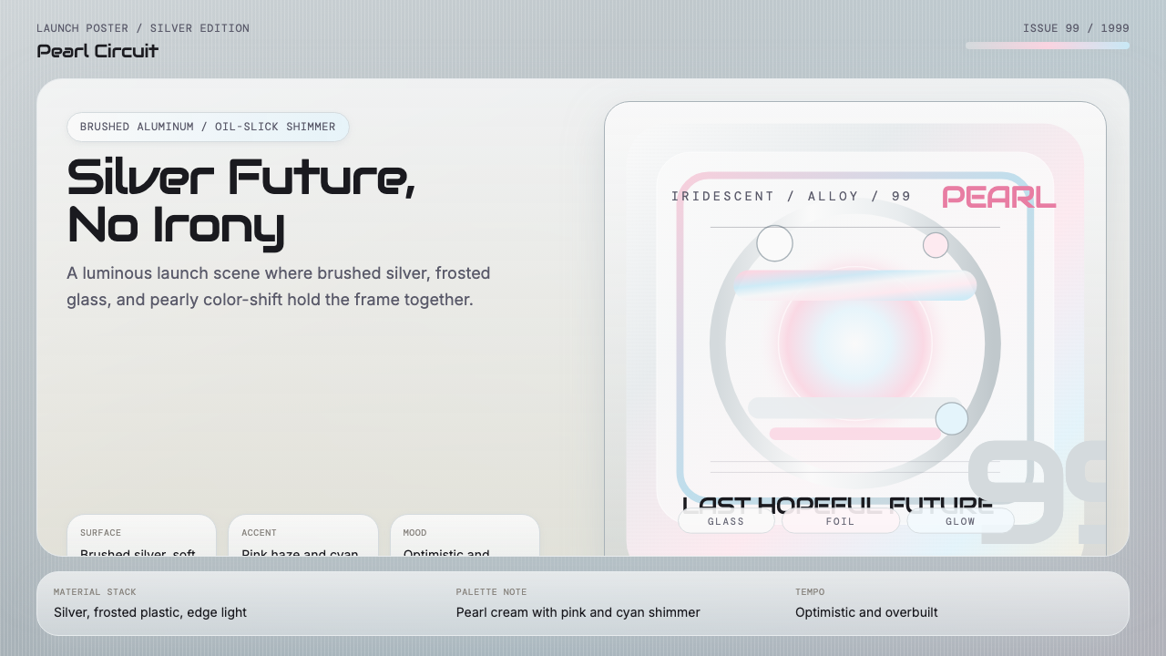 Y2K Aluminum Iridescent (1999)Silver future, no irony. Brushed aluminum with oil-slick pink and cyan shimme…银色未来不带讽刺。拉丝铝面与油膜粉蓝虹彩铺开。
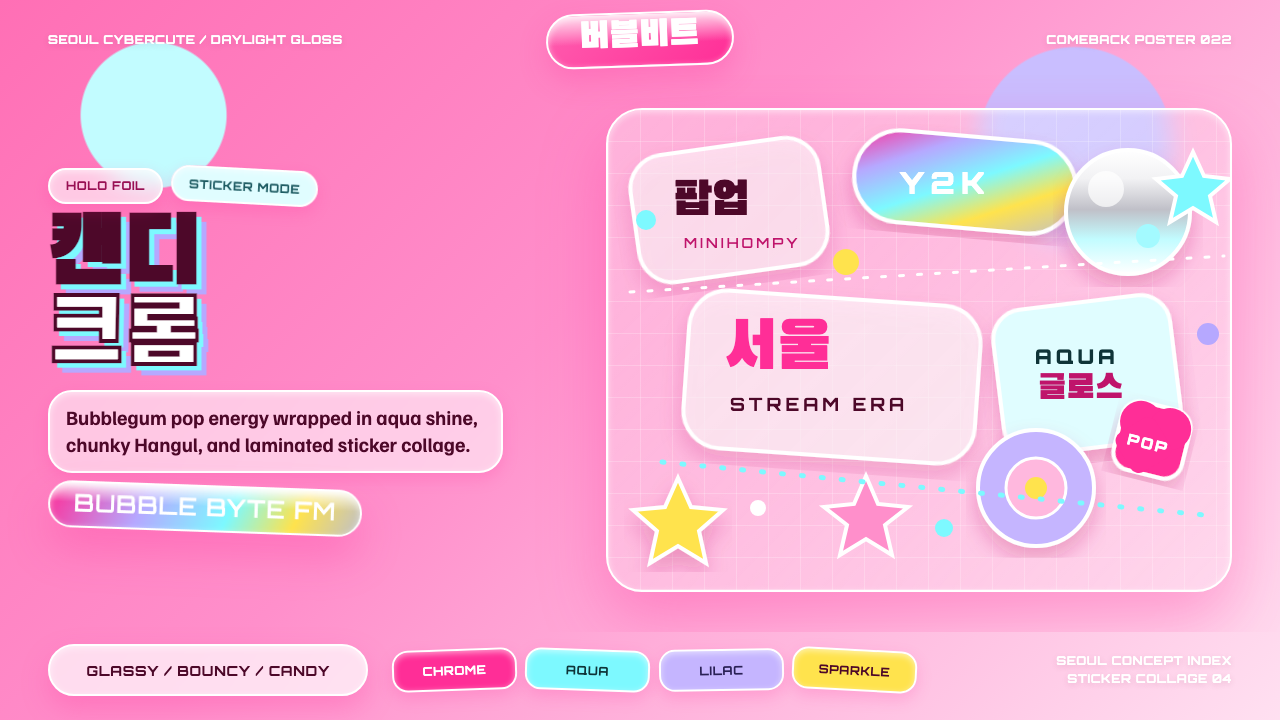 K-Pop Y2K SeoulCandy chrome goes maximal. Hot pink, aqua, Hangul type, and sticker collage s…糖果铬感极繁:热粉、水蓝、韩文字体与贴纸拼贴发光。
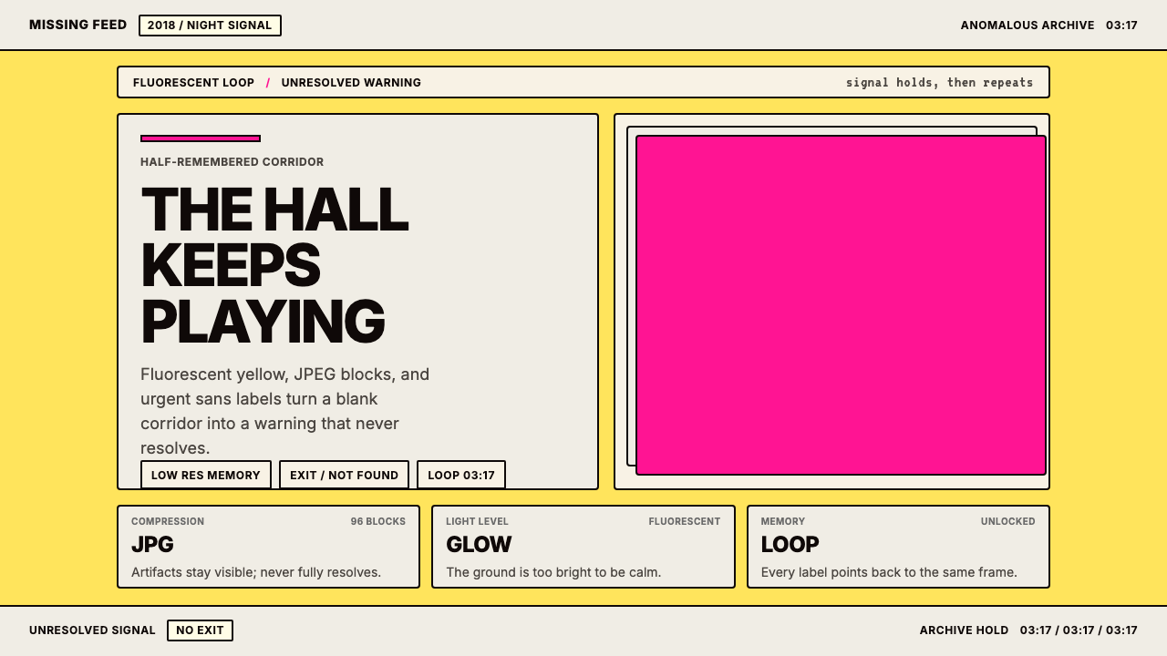 Weirdcore Internet (2018)Wrongness in fluorescent yellow. JPEG blocks and warning labels do the damage.荧光黄里的错位感。JPEG块和警告标签把不安钉住。
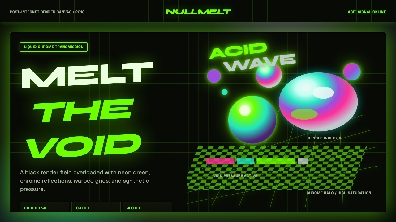 Acidwave 3D RenderPsychedelia hits the render engine. Neon green, chrome orbs, and warped grids…迷幻被塞进渲染引擎:霓虹绿、液态铬球与扭曲网格灼烧黑底。
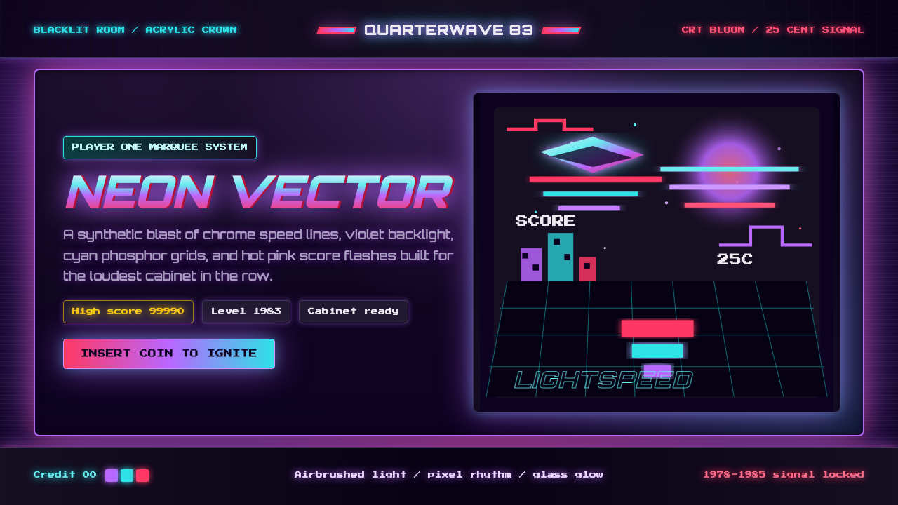 Arcade Cabinet MarqueeToo loud to ignore. Black-indigo glass, violet glow, cyan grids, hot-pink arc…刺眼才对。黑靛玻璃、霓虹紫光、电青网格与品红像素字。