What is Y2K Aluminum Iridescent (1999)?什么是 Y2K Aluminum Iridescent (1999)?
At the turn of the millennium, optimism had a texture — brushed silver that shifted to pink and cyan depending on the angle of the light.千禧年之交,乐观主义有了一种质感——拉丝银在光线角度变换时幻化出粉与青的虹彩。
Y2K Aluminum Iridescent (1999) in briefY2K Aluminum Iridescent (1999) 速览
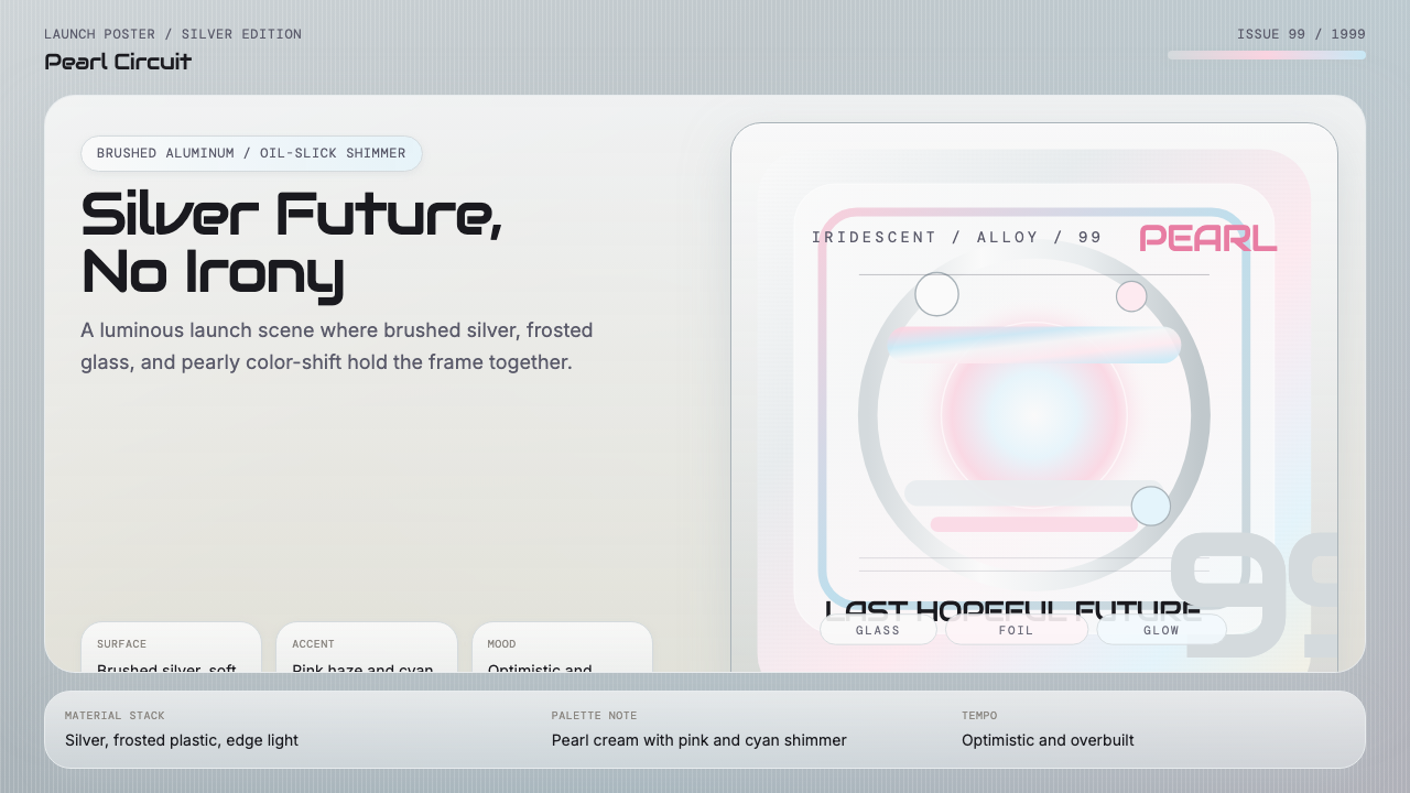
Y2K Aluminum Iridescent is a design style rooted in the visual language of consumer technology and fashion from 1998 to 2002. Its defining characteristics are the directional grain of brushed aluminum, holographic color-shift that moves across surfaces like oil on water, frosted translucency, and pearlescent shimmer. Every surface implies a material reality: cool to the touch, machined, precise, yet alive with iridescent light.Y2K铝质虹彩是一种植根于1998至2002年间消费电子与时尚视觉语言的设计风格。其核心特征包括:拉丝铝的方向性纹理、随观察角度变换的油膜式全息色移、磨砂半透明质感,以及珠光微闪。每一个表面都暗示着一种材质现实:触感冰凉、精密加工,却因虹彩光芒而生动鲜活。
This aesthetic sits in a specific and narrow window of design history. It is not the candy-colored translucency of the original Bondi Blue iMac era, nor is it the austere matte minimalism that followed in the mid-2000s. It occupies the cooler, more refined middle ground — the metallic-iridescent language of products that treated the future as something luminous and tactile. The palette moves from cold silver-white at its base through pale champagne and platinum, then breaks into color-shift accents of soft rose, holographic cyan, and iridescent lavender wherever a surface catches light differently.这一美学占据了设计史上一个特定且狭窄的窗口。它既非最初邦迪蓝iMac时代的糖果色半透明,也非2000年代中期随之而来的哑光极简主义,而是介于两者之间更冷静、更精致的中间地带——那些将未来视为光芒四射、触感丰富之物的产品所共享的金属虹彩语言。调色板从冰冷的银白基调出发,穿越淡香槟与铂金色调,在表面以不同角度捕捉光线时,于柔和玫瑰、全息青与彩虹紫的色移点缀中绽放。
What makes this style distinctive is its relationship to material optimism. The late 1990s consumer technology boom produced objects that people genuinely believed signaled a better future. The brushed aluminum finish, the pearlescent housing, the semi-transparent panel revealing precision-engineered components underneath — these were not merely aesthetic choices but expressions of confidence that technology was becoming beautiful, accessible, and humane. The design style preserves that confidence: it is the last optimistic future, before the irony set in.这一风格的独特之处在于它与材质乐观主义的关系。1990年代末的消费技术浪潮催生了一批让人真切相信它们预示着更美好未来的产品。拉丝铝质饰面、珠光外壳、露出精密工程内部构件的半透明面板——这些不仅仅是美学选择,更是对技术正在变得美丽、可及且人性化的信心表达。这一设计风格保存了这份信心:它是最后一个乐观的未来,在反讽介入之前。
See the Y2K Aluminum Iridescent (1999) design system查看 Y2K Aluminum Iridescent (1999) 完整设计系统
Where does Y2K Aluminum Iridescent (1999) come from?Y2K Aluminum Iridescent (1999) 从何而来?
The Y2K aluminum iridescent aesthetic crystallized between 1998 and 2002, shaped by the convergence of three forces: a consumer electronics industry flush with venture capital and racing toward mass elegance, a fashion world in the midst of a radical deconstruction of craft and material, and a cultural moment that genuinely believed the digital future would be warm, luminous, and physical. Products like the Apple Power Mac G4 Cube, the Sony Cybershot DSC-P1, and the Nokia 8210 were not merely devices but aesthetic manifestos — objects that said something about what the future should feel like.Y2K铝质虹彩美学于1998至2002年间成形,由三股力量的汇聚塑造而成:一个资本充裕、竞相追求大众优雅的消费电子行业;一个正处于工艺与材质激进解构中的时尚界;以及一个真切相信数字未来将是温暖、光明且有形的文化时刻。苹果Power Mac G4 Cube、索尼Cybershot DSC-P1与诺基亚8210,不仅仅是产品,更是美学宣言——用物体的形态诉说未来应该有怎样的触感。
The geography of this aesthetic was genuinely global. In Cupertino, Jony Ive's industrial design group at Apple was developing the visual logic of machined aluminum as a premium consumer material — an approach that would define the company's product language for the next two decades. In Tokyo, Sony's design laboratories were refining a parallel vocabulary of silvered plastics, brushed finishes, and holographic accents that expressed precision engineering for a consumer audience. In Vienna and New York, fashion designers were reaching the same set of surface ideas from a different direction: Helmut Lang stripped garments to their material essences, often using silvered and iridescent fabrics that read as industrial but felt as luxurious as couture. Issey Miyake's pleated and heat-pressed synthetics carried a similar conviction — that new materials could be simultaneously futuristic and humanly beautiful.这一美学的地理版图是真正意义上的全球性的。在库比蒂诺,乔尼·伊夫领导的苹果工业设计团队正在发展机械加工铝材作为高端消费品材质的视觉逻辑——这一方向将定义苹果此后二十年的产品语言。在东京,索尼的设计实验室正在打磨一套平行的视觉语汇:镀银塑料、拉丝饰面与全息点缀,向消费者诉说精密工程的魅力。在维也纳与纽约,时装设计师们则从另一个方向抵达同一套表面理念:赫尔穆特·朗将服装剥离至材质本质,频繁采用兼具工业感与奢华触感的镀银与虹彩面料;三宅一生的褶皱热压合成材料则传递着相似的信念——新材料可以同时是未来感十足的与人性化地美丽的。
The cultural backdrop was the pre-millennium mood itself: a combination of genuine technological optimism, end-of-decade prosperity in much of the industrialized world, and a fascination with what was then called cyberculture. The Y2K computer anxiety — fear that digital infrastructure would collapse at midnight on January 1, 2000 — paradoxically intensified the glamour of technology. Objects that looked like they belonged to the future were desirable precisely because the future felt imminent. The holographic, the pearlescent, and the iridescent carried a readymade cultural meaning: they signified the digital, the advanced, the not-yet-arrived.这一美学的文化背景正是千禧年前夕的社会氛围:真实的技术乐观主义、工业化世界大部分地区的世纪末繁荣,以及对彼时所称「网络文化」的着迷。Y2K计算机危机——担忧数字基础设施将在2000年1月1日午夜崩溃——反而以吊诡的方式强化了技术的魅力。看上去属于未来的产品之所以令人渴望,恰恰因为未来感觉如此迫近。全息、珠光与虹彩携带着现成的文化意义:它们意味着数字的、先进的、尚未抵达的。
After 2001 and 2002, this specific aesthetic moment closed. Consumer electronics shifted toward the black glass rectangles and invisible-interface philosophy that defined the following decade. Fashion moved on from the silvered and iridescent toward other material explorations. The Y2K aluminum iridescent style passed into memory — and eventually into the archive, which is to say into the position from which revivals become possible. The 2018 and onward Y2K aesthetic revival drew heavily on this material vocabulary, particularly in digital design, fashion photography, and social media visual culture, where the style's inherent warmth-within-chrome quality lent itself to nostalgic reinterpretation without irony.2001至2002年之后,这个特定的美学时刻合上了。消费电子转向了黑色玻璃矩形与隐形界面哲学,定义了此后十年。时尚界也从镀银与虹彩转向其他材质探索。Y2K铝质虹彩风格进入记忆,最终进入档案——也就是说,进入了复兴成为可能的位置。2018年以来的Y2K美学复兴大量借鉴了这套材质语汇,尤其是在数字设计、时尚摄影与社交媒体视觉文化中,这一风格铬合金内部固有的温暖质感使其适于无讽刺意味的怀旧再诠释。
What defines the Y2K Aluminum Iridescent (1999) look?Y2K Aluminum Iridescent (1999) 的视觉特征是什么?
Metallic Surface Grain金属表面纹理
The foundational surface quality is the directional grain of brushed aluminum — parallel fine lines that catch light differently depending on angle, creating a subtle but persistent sense of material depth. This grain is not chaotic or organic; it is controlled, uniform, and mechanical. It reads as craftsmanship through industrial process. In two-dimensional design work, this quality is evoked through fine parallel textures that give otherwise flat surfaces a sense of physical presence without becoming decorative noise.最基础的表面质感是拉丝铝的方向性纹理——平行细线随观察角度变化而以不同方式捕捉光线,制造出微妙而持续的材质深度感。这种纹理并非混乱或有机的,而是受控的、均匀的、机械的。它通过工业工艺传递出手工精制的感受。在二维设计工作中,这种质感通过精细平行纹理来召唤,赋予平面以物理存在感,同时不沦为装饰性噪声。
Iridescent Color Shift虹彩色移
The signature color effect is a holographic shift from neutral silver-white through soft rose, pale cyan, and lavender — colors that appear and recede as viewing angle changes, mimicking the behavior of oil on water or the surface of a compact disc. These are not flat colors but transitional ones: the rose is always on its way to becoming silver, the cyan is always about to disappear back into pearl. This shift is applied sparingly, as accent rather than field color, concentrated at edges, highlights, or transitional zones where two surfaces meet.标志性的色彩效果是从中性银白出发,穿越柔和玫瑰、淡青与淡紫的全息色移——这些颜色随观察角度变化而出现或消退,模拟油膜在水面上的行为,或光盘表面的光学现象。这些不是平面色彩,而是过渡中的色彩:玫瑰始终在成为银色的途中,青色始终即将重新消融进珠光。这种色移被克制地运用,作为点缀而非底色,集中于边缘、高光,或两个表面相交的过渡区域。
Frosted Translucency磨砂半透明
A recurring material quality is a milky, frosted translucency — surfaces that admit diffused light without full transparency, as though made from sandblasted glass or frosted polycarbonate. This quality softens contrast without losing luminosity, and it allows layered compositions where background elements bleed through foreground surfaces in a controlled way. The effect is simultaneously technical and delicate: industrial in origin, optical in behavior.一种反复出现的材质特征是乳白色磨砂半透明——表面透入漫射光而不完全透明,仿佛由喷砂玻璃或磨砂聚碳酸酯制成。这种质感在不损失发光感的情况下柔化对比,并允许分层构图以受控方式让背景元素透过前景表面渗透出来。其效果同时是技术性的与精致的:工业起源,光学行为。
Pearl and Champagne Neutrals珍珠与香槟中性色
The base palette avoids pure white and matte gray in favor of warm and cool pearl tones — a champagne that reads as almost-gold without committing to yellow, a platinum that reads as almost-silver without the coldness of pure grey, and an off-white that carries a faint iridescent cast as though the paper itself were slightly luminous. These neutrals provide the ground against which color-shift accents operate. They are never flat or inert; they have a slight reflective quality that distinguishes them from ordinary neutral backgrounds.基础调色板回避纯白与哑光灰,转而采用冷暖珍珠色调——一种接近金色却不承诺为黄色的香槟,一种接近银色却不带纯灰冰冷感的铂金,以及一种带有淡淡虹彩感的灰白,仿佛纸张本身微微发光。这些中性色提供了色移点缀得以运作的底面。它们从不平淡或惰性;它们带有轻微的反光品质,将其与普通中性背景区别开来。
Precision and Softness in Balance精密与柔和的平衡
The style holds a productive tension between hard precision and soft luminosity. Edges are clean and machined-looking — the exactness of a milled component — but the light that falls across surfaces is diffused and gradual rather than harsh. Type and structural lines carry the precision; backgrounds and surface treatments carry the softness. This balance is what separates the aesthetic from cold industrial design on one side and from dreamy irridescent softness on the other. It is the specific combination of the two that makes it feel simultaneously futuristic and approachable.这一风格在硬朗精密与柔和发光之间保持着富有张力的平衡。边缘干净而具有机械加工感——铣削零件的精确性——但落在表面的光线是漫射而渐进的,而非刺眼的。文字与结构线条承载精密;背景与表面处理承载柔和。这种平衡使其与一侧冰冷的工业设计和另一侧梦幻的虹彩柔软感区分开来。正是这两者的特定组合,使它同时感觉是未来感十足的与亲切可近的。
Restrained Use of Accent Color克制的强调色运用
Despite the holographic color range potentially available in the palette, the style is disciplined in its application of color. The dominant register is always achromatic — silver, pearl, platinum — and color appears as accent or as the consequence of a surface catching light at a particular angle. A design that saturates the full color range simultaneously loses the essential quality of material restraint. The iridescent shifts should feel discovered rather than announced, emerging from the composition rather than imposed on it.尽管调色板潜在地包含全息色域,这一风格在色彩运用上是自律的。主导音调始终是无彩色的——银、珍珠、铂金——色彩以点缀的形式出现,或作为表面以特定角度捕捉光线的结果。同时让完整色域充分饱和的设计会失去材质克制这一核心品质。虹彩色移应当让人感觉是被发现的,而非被宣告的,从构图中自然涌现,而非强加于其上。
Typographic Clarity Against Shimmer微光映衬下的排版清晰度
Because the surface treatments are rich and optically active, typography in this style must maintain absolute clarity. Type is set in clean, geometric letterforms — without decorative flourishes, without simulated metal effects — that read crisply against iridescent grounds. The contrast between the shimmering background and the legible foreground type is itself part of the aesthetic: the shimmer says future, the clear type says precision. The two together communicate the style's core promise — that beauty and function are the same material.由于表面处理丰富且光学活跃,这一风格中的字体排印必须保持绝对清晰。文字以干净的几何字形设置——不带装饰花饰,不带模拟金属效果——在虹彩底面上清晰可读。闪烁背景与清晰前景文字之间的对比本身就是美学的一部分:微光说未来,清晰文字说精密。两者共同传递这一风格的核心承诺——美与功能是同一种材质。
See the Y2K Aluminum Iridescent (1999) design system查看 Y2K Aluminum Iridescent (1999) 完整设计系统
Who shaped Y2K Aluminum Iridescent (1999)?谁塑造了 Y2K Aluminum Iridescent (1999)?
As Senior Vice President of Industrial Design at Apple from 1997, Jony Ive oversaw the development of the Power Mac G4, Power Mac G4 Cube, and early PowerBook designs that became the canonical expressions of brushed aluminum as a consumer material. His design group's work established the principle that precision-manufactured metal finishes could carry emotional weight — that a material normally associated with aerospace and professional equipment could make a personal computer feel both powerful and personal. Ive's influence extended far beyond Apple: the aluminum-as-premium-consumer-material language he refined became the default register of aspirational technology design through the first decade of the twenty-first century.自1997年起担任苹果工业设计高级副总裁的乔尼·伊夫,主导开发了Power Mac G4、Power Mac G4 Cube及早期PowerBook系列,这些产品成为拉丝铝材作为消费品材质的标志性表达。他的设计团队确立了一项原则:精密加工的金属饰面可以承载情感重量——一种通常与航空航天和专业设备相关联的材质,可以让个人电脑感觉既强大又私人化。伊夫的影响远超苹果:他所精炼的铝材作为高端消费材质的语言,成为二十一世纪头十年中科技设计追求卓越的默认基调。
Issey Miyake's work in the late 1990s — particularly the Pleats Please line and the collaborations with engineers to develop heat-pressed synthetic fabrics — explored the same material territory as the consumer electronics aesthetic from within the fashion system. His fabrics caught light iridescently, moved with precision-engineered behavior, and felt simultaneously industrial and luxurious. Miyake demonstrated that the visual language of the Y2K aesthetic was not accidental or merely technological but corresponded to a genuine shift in how designers across disciplines thought about the relationship between material, light, and the human body.三宅一生1990年代末的工作——尤其是「Pleats Please」系列及与工程师合作开发热压合成面料的探索——从时尚体系内部探索了与消费电子美学相同的材质领域。他的面料以虹彩方式捕捉光线,以精密工程化的方式运动,同时兼具工业感与奢华触感。三宅一生证明,Y2K美学的视觉语言并非偶然或纯粹技术性的,而是对应着跨学科设计师在材质、光线与人体关系方面真实发生的思维转变。
Helmut Lang's fashion work of the late 1990s shared the Y2K aesthetic's material seriousness from a different angle. Where other designers of the period chased warmth or maximalism, Lang pursued a cold, precise, and almost clinical beauty — using iridescent and silvered fabrics, industrial closures, and stripped-back silhouettes that made clothing feel like precision instruments. His work had significant influence on how the broader culture understood the iridescent-metallic aesthetic as serious rather than frivolous, connecting it to a lineage of conceptual design rather than pop gloss.赫尔穆特·朗1990年代末的时装工作从另一个角度分享了Y2K美学的材质严肃性。同期其他设计师追求温暖感或最大化主义时,朗追求的是一种冷峻、精密、近乎临床的美——使用虹彩与镀银面料、工业感扣件和精简廓形,让服装感觉像精密仪器。他的工作对更广泛的文化理解虹彩金属美学的方式产生了重要影响,将其定性为严肃的而非轻浮的,与概念设计的谱系相连,而非流行文化的光鲜表面。
Marc Jacobs, particularly during his tenure at Louis Vuitton beginning in 1997 and through his own label, engaged the Y2K iridescent aesthetic from within the luxury system, commissioning collaborations and developing accessories and garments that translated holographic and iridescent surface effects into high fashion contexts. His work demonstrated that the aesthetic could travel vertically through the market — from mass consumer electronics to luxury goods — while retaining its essential character. Jacobs's contribution was to establish the style's legitimacy within fashion's most prestigious tier, a move that accelerated its cultural saturation.马克·雅可布,尤其在1997年开始主持路易威登期间及通过其同名品牌,从奢侈品体系内部介入了Y2K虹彩美学,委托合作、开发饰品与服装,将全息与虹彩表面效果转译进高级时尚语境。他的工作证明,这一美学可以在市场中垂直流动——从大众消费电子到奢侈品——同时保持其本质特征。雅可布的贡献在于确立了这一风格在时尚界最高层级的合法性,这一举措加速了其文化饱和度的提升。
How do you use Y2K Aluminum Iridescent (1999) today?今天怎么用 Y2K Aluminum Iridescent (1999)?
Y2K Aluminum Iridescent is a style with specific emotional and contextual affinities. It works best when the design goal includes signaling forward-looking optimism, material quality, and a light-meets-precision sensibility. The style carries built-in cultural resonance for audiences who experienced the late 1990s consumer technology moment, and for younger audiences it carries the appeal of a recently archived aesthetic — familiar enough to feel warm, distant enough to feel fresh. Understanding both registers is important when deploying it intentionally.Y2K铝质虹彩是一种具有特定情感与情境亲和力的风格。当设计目标包含传递前瞻性乐观主义、材质品质感与光线精密感的交汇时,它的效果最佳。这一风格对经历过1990年代末消费科技时刻的受众携带内建的文化共鸣,而对年轻受众则携带近期档案化美学的吸引力——熟悉到让人感觉温暖,又遥远到让人感觉新鲜。有意部署时,理解这两种接受维度都很重要。
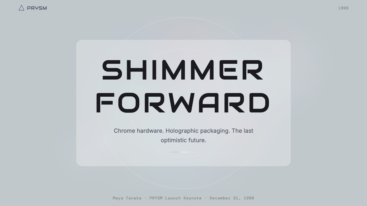
For presentation slides, the style is particularly effective on cover pages and section dividers, where its material richness and visual specificity create immediate atmosphere. A cover benefits from a surface treatment that suggests brushed metal — fine directional texture in the background, a title set in clean geometric type without simulated metal effects — with iridescent color-shift used sparingly at edges or as a subtle gradient that moves from pearl through rose to pale cyan across the width of the composition. Content slides require more discipline: the iridescent accent should appear only in structural markers — active section indicators, data highlights, call-to-action elements — while body text sits against lighter, near-neutral grounds. Data visualization in this style takes on a material quality: chart elements read as precision components, with shimmer reserved for the highlighted or featured value.对于演示文稿,这一风格在封面页与章节分隔页上尤为有效,其材质丰富性与视觉特异性能立即营造出氛围。封面受益于暗示拉丝金属的表面处理——背景中的精细方向性纹理、以干净几何字形设置的标题(不带模拟金属效果)——虹彩色移则被克制地用于边缘,或作为在构图宽度上从珍珠过渡到玫瑰再到淡青的微妙渐变。内容页需要更多自律:虹彩点缀应仅出现在结构性标记中——当前章节指示符、数据高光、行动号召元素——而正文则置于更浅的近中性底面上。这一风格的数据可视化呈现出一种材质品质感:图表元素读起来像精密零件,微光被保留给高亮或特色数值。
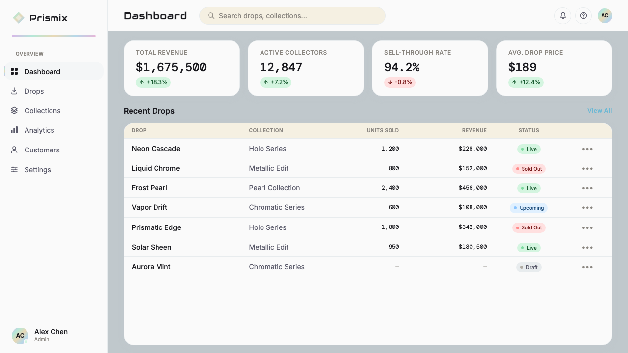
For web interfaces, the style suits products that want to signal quality, precision, and forward-looking confidence — technology platforms, fintech dashboards, creative tools, and premium consumer services. The approach for dashboards involves a layered neutral background using pearl and platinum tones, with iridescent accents on interactive states, active indicators, and primary calls to action. Pricing pages work well with the style's inherent sense of material tiers: base tiers in silver-cool neutral, premium tiers in champagne or light gold, and highlighted or enterprise tiers with a restrained iridescent treatment on the card border or header. Navigation and typography must remain legible against the optically active backgrounds — this means clean geometric letterforms with sufficient contrast, never decorative or simulated-metallic type.对于网页界面,这一风格适合希望传递品质、精密与前瞻信心的产品——科技平台、金融科技仪表板、创意工具与高端消费者服务。仪表板的方法涉及使用珍珠与铂金色调构建分层中性背景,虹彩点缀置于交互状态、激活指示符与主要行动号召处。定价页面适合这一风格固有的材质层级感:基础层在银冷中性色,高级层在香槟或淡金,高亮或企业层在卡片边框或页眉上采用克制的虹彩处理。导航与字体排印必须在光学活跃的背景上保持可读性——这意味着使用对比度充足的干净几何字形,绝不使用装饰性或模拟金属效果的文字。
For editorial and marketing contexts, the Y2K aluminum iridescent style lends itself to product photography art direction, social media visual systems, and brand campaigns for audiences with an affinity for the aesthetic's cultural moment. In editorial layouts, the background surface treatment does much of the atmospheric work: a subtle brushed texture with iridescent cast allows body text to remain readable while the overall composition carries material depth. Marketing pages and hero sections benefit from the style's boldness — a full-width surface in the platinum-pearl range, with a single iridescent accent color used consistently for emphasis, creates a sense of quality without visual chaos. The style works particularly well in fashion, beauty, and technology categories where material sophistication is a core brand value.对于编辑与营销情境,Y2K铝质虹彩风格适合产品摄影艺术指导、社交媒体视觉系统,以及面向与该美学文化时刻有情感共鸣受众的品牌活动。在编辑版面中,背景表面处理承担大部分氛围营造工作:带有虹彩感的微妙拉丝纹理允许正文保持可读性,同时整体构图携带材质深度。营销页面与英雄区域受益于这一风格的大胆感——铂金珍珠色域内的全宽表面,配合一种一致用于强调的虹彩点缀色,营造出品质感而不制造视觉混乱。这一风格在时尚、美妆与科技品类中尤为有效,在这些领域中材质精致感是核心品牌价值。
A common mistake when applying this style is treating the iridescent color-shift as a license to saturate every surface with pink, cyan, and purple simultaneously. Authentic Y2K aluminum iridescent work is fundamentally achromatic at its base — the silver, pearl, and platinum tones should dominate — with iridescence appearing as a discovered quality rather than a designed-in feature. Another frequent error is applying simulated metallic effects to type, which tends to read as dated rather than elegant. Type in this style should be clean and precise, maintaining contrast against the shimmering background rather than competing with it. Finally, the style requires restraint in texture application: one or two surface treatments applied consistently will produce more convincing results than layering multiple effects that undermine each other.应用这一风格时最常见的错误,是将虹彩色移理解为同时在每个表面铺满粉色、青色与紫色的许可。真实的Y2K铝质虹彩作品在基础调上根本是无彩色的——银、珍珠与铂金色调应当占主导——虹彩作为被发现的品质而非被设计进去的特征出现。另一种频繁的错误是对文字应用模拟金属效果,这往往读起来是过时的而非优雅的。这一风格中的文字应当干净精准,在闪烁背景上保持对比度,而非与之竞争。最后,这一风格要求在纹理应用上保持克制:一到两种一致应用的表面处理将比叠加多种相互削弱的效果产生更令人信服的结果。
See the Y2K Aluminum Iridescent (1999) design system查看 Y2K Aluminum Iridescent (1999) 完整设计系统
Y2K Aluminum Iridescent (1999) — FAQY2K Aluminum Iridescent (1999) · 常见问题
Is Y2K Aluminum Iridescent the same as the general Y2K aesthetic?Y2K铝质虹彩和泛化的Y2K美学是同一回事吗?
No — it is a specific subset. The general Y2K aesthetic is broad, encompassing candy-colored translucent plastics, inflated bubbly letterforms, bright lime greens and hot pinks, and the playful exuberance of the late 1990s internet and pop culture. Y2K Aluminum Iridescent is narrower and cooler in temperature: it focuses specifically on the brushed metal, holographic shimmer, and pearl-neutral palette associated with consumer electronics and high fashion of the same period. Where the general Y2K aesthetic is warm and playful, the aluminum iridescent variant is precise and luminous. Think of the general Y2K aesthetic as the iMac G3; think of aluminum iridescent as the Power Mac G4.不——它是一个特定的子集。泛化的Y2K美学范围宽泛,涵盖糖果色半透明塑料、膨胀气泡感字形、明亮的莱姆绿与荧光粉,以及1990年代末互联网与流行文化的嬉闹活力。Y2K铝质虹彩更为狭窄,色温更冷:它专注于同期消费电子与高端时尚相关联的拉丝金属、全息微光与珍珠中性调色板。泛化Y2K美学温暖而充满活力,铝质虹彩变体则精密而发光。可以这样理解:泛化Y2K美学是iMac G3,铝质虹彩是Power Mac G4。
Can this style work on dark backgrounds, or does it need a light ground?这一风格能用在深色背景上吗,还是必须有浅色底面?
It works on both, but with different handling. The historical reference point for the style is light-ground — pearl, platinum, and near-white — because the consumer electronics and fashion objects it derives from were typically light in overall tone. A dark ground is possible and can be effective, particularly in contexts where the product wants to feel premium or nocturnal — think of a high-end audio equipment interface or a luxury watch brand. On a dark ground, the iridescent accents tend to read more dramatically, but they can also tip into feeling generic if not handled with restraint. The key on a dark ground is to maintain the sense of material precision: the background should feel like anodized metal or smoked glass, not just darkness.两者都可行,但处理方式不同。这一风格的历史参照点是浅色底面——珍珠、铂金与近白色——因为它所衍生的消费电子产品与时尚单品在整体色调上通常是浅色的。深色底面是可能的,也可以很有效,尤其是在产品希望传递高端感或夜间感的情境中——想象高端音响设备界面或奢侈腕表品牌。在深色底面上,虹彩点缀往往读起来更戏剧化,但若不加克制也可能滑向平庸感。深色底面上的关键是保持材质精密感:背景应当感觉像阳极氧化金属或烟熏玻璃,而不仅仅是黑暗。
How do I prevent this style from looking like a nostalgic novelty rather than a serious design choice?如何防止这一风格看起来像怀旧新奇物而非严肃的设计选择?
The key is structural seriousness. The Y2K aluminum iridescent aesthetic fails when it is applied as pure surface — iridescent gradients pasted onto a layout that has no other coherent visual logic. It succeeds when the visual system underneath is rigorous: a clear typographic hierarchy, a well-resolved grid, and restrained color use, with the iridescent surface treatment operating as material depth rather than decorative entertainment. In practice, this means spending as much effort on the structure of the composition as on the surface effects. The shimmer should enhance a well-organized layout, not compensate for an unresolved one.关键在于结构性的严肃。当Y2K铝质虹彩美学被纯粹作为表面处理应用时——将虹彩渐变贴在没有其他连贯视觉逻辑的版面上——它会失败。当底层视觉系统是严格的时候,它会成功:清晰的字体层级、完善的网格、克制的色彩使用,虹彩表面处理作为材质深度而非装饰性娱乐运作。实践中,这意味着在构图结构上投入与表面效果同等的精力。微光应当强化一个组织良好的版面,而非补偿一个未经解决的版面。
What kinds of products and brands should avoid this style?哪些产品和品牌应该避免这一风格?
The style struggles in contexts where warmth, earthiness, or human vulnerability are core brand values. Healthcare products, children's educational platforms, food and beverage brands emphasizing natural provenance, and any service where the user experience depends on organic warmth and low-friction emotional accessibility will generally find the aluminum iridescent aesthetic too cool and material-focused. The style also struggles when applied to brands that need to communicate long institutional history or traditional craft heritage — the forward-looking, technological optimism embedded in the aesthetic sits awkwardly with claims to centuries of artisanal tradition. Finally, any context where legibility at small sizes or in print is critical requires caution: the surface richness that makes the style compelling at large scale can undermine clarity at reduced sizes.这一风格在温暖感、土地感或人性脆弱性是核心品牌价值的情境中力不从心。医疗健康产品、儿童教育平台、强调天然来源的食品饮料品牌,以及任何用户体验依赖有机温暖感与低摩擦情感可及性的服务,通常会发现铝质虹彩美学过于冰冷且过于聚焦材质。这一风格也不适合需要传递悠久机构历史或传统工艺传承的品牌——美学中内嵌的前瞻性技术乐观主义与对数百年手工艺传统的声索格格不入。最后,任何对小尺寸或印刷可读性有严格要求的情境都需谨慎:使这一风格在大尺寸下引人注目的表面丰富性,可能在缩小后损害清晰度。
Is the Y2K revival in digital design faithful to the original aesthetic, or is it a reinterpretation?数字设计中的Y2K复兴忠实于原始美学,还是一种再诠释?
It is primarily reinterpretation, and understanding the difference matters for using the style well. The original aesthetic of 1998 to 2002 was rooted in physical materials — actual brushed aluminum, actual holographic foil, actual frosted polycarbonate — and its visual properties emerged from the behavior of those materials in light. The contemporary digital revival translates those material properties into screen-rendered effects: iridescent gradients, frosted glass blur treatments, simulated surface textures. These translations are sophisticated and often beautiful, but they carry the sensibility of designers working from memory and image archives rather than from physical prototypes. The best contemporary applications acknowledge this gap — they use the style's emotional register and cultural references while solving the specific design problems of the current moment, rather than attempting literal period reconstruction.主要是再诠释,理解这一差异对于善用这一风格很重要。1998至2002年的原始美学植根于物理材质——真实的拉丝铝、真实的全息箔、真实的磨砂聚碳酸酯——其视觉特性源自这些材质在光线中的行为方式。当代数字复兴将这些材质特性转译为屏幕渲染效果:虹彩渐变、磨砂玻璃模糊处理、模拟表面纹理。这些转译是精致的,往往也是美丽的,但它们携带的是从记忆与图像档案而非物理原型出发工作的设计师的感受力。当代最佳应用承认这一差距——它们使用这一风格的情感音域与文化参照,同时解决当下时刻的具体设计问题,而非尝试字面意义上的年代还原。
Related design styles相关设计风格
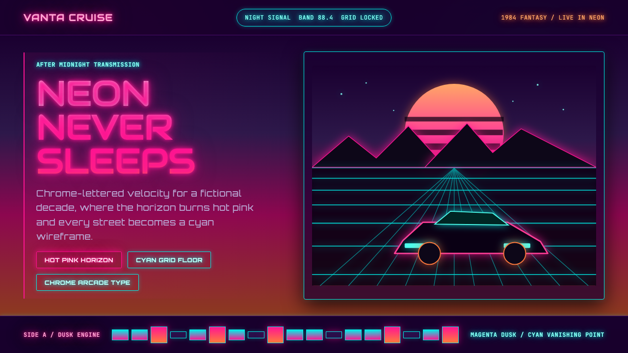 Synthwave Outrun 1984Sincere neon nostalgia. Hot pink sunset, cyan grid, chrome type against pure…真挚的霓虹怀旧。热粉日落、青色网格与镀铬字照亮黑夜。
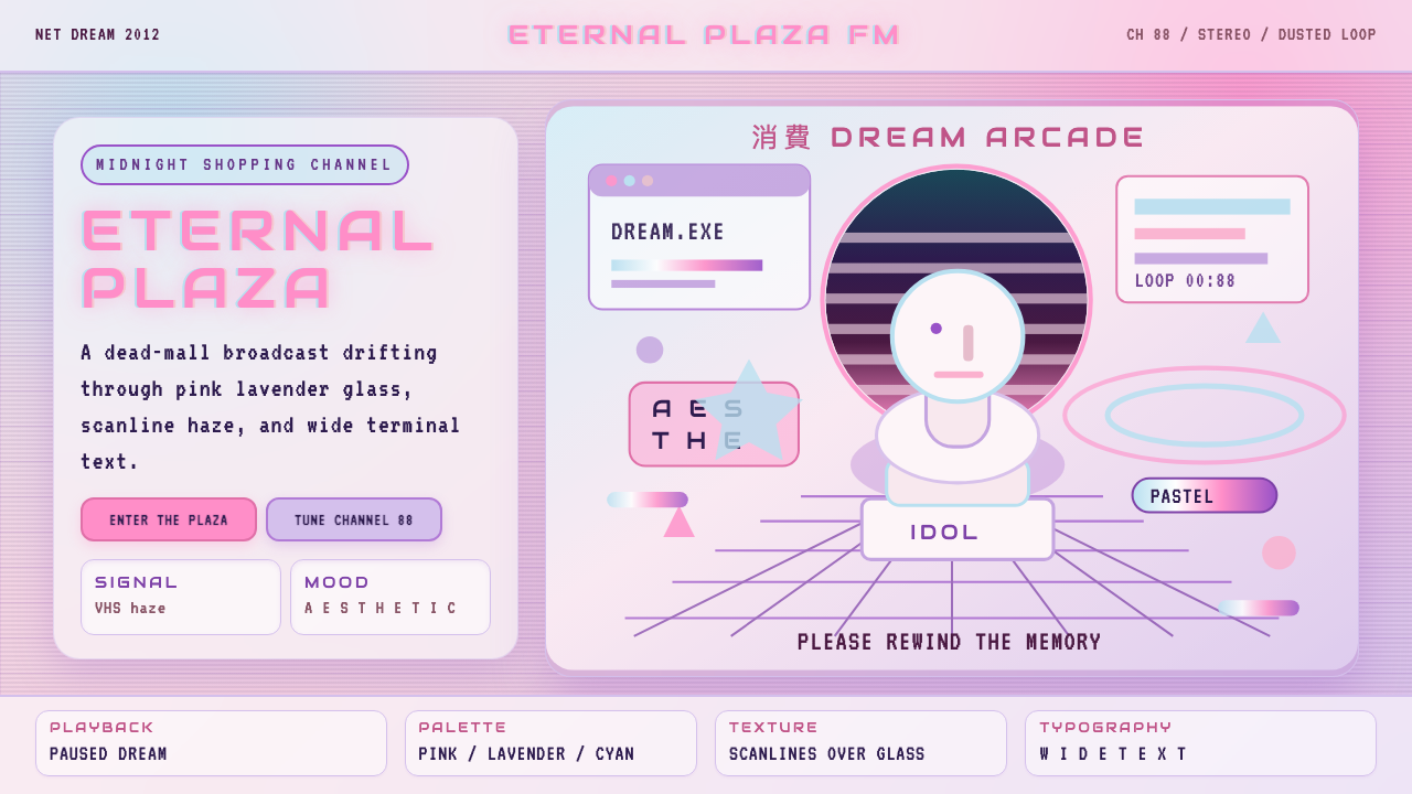 Vaporwave (Tumblr 2012)Dead-mall nostalgia glows. Pink-lavender glass, VHS scanlines, and wide retro…废墟商场的柔光怀旧:粉紫玻璃、VHS 扫描线与宽字距复古字体。
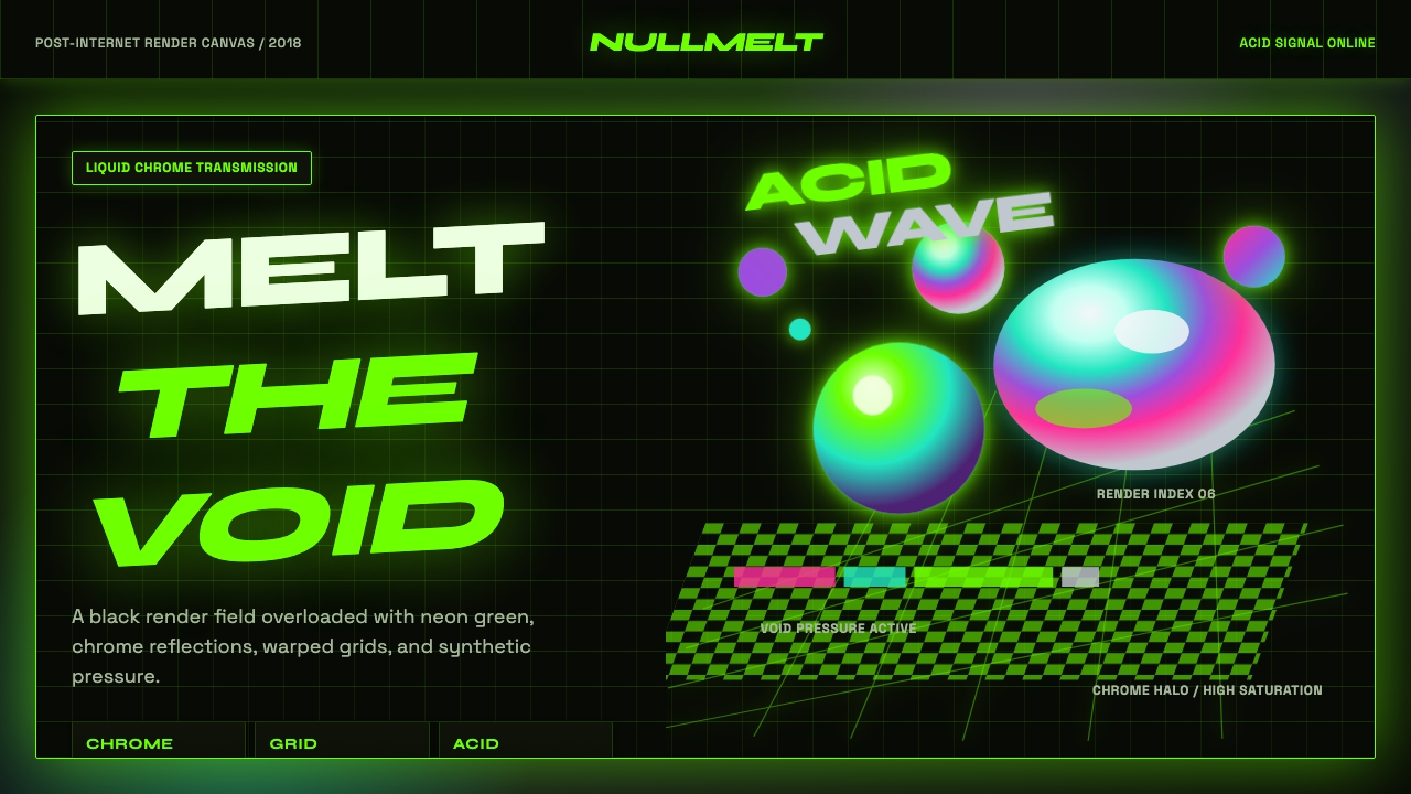 Acidwave 3D RenderPsychedelia hits the render engine. Neon green, chrome orbs, and warped grids…迷幻被塞进渲染引擎:霓虹绿、液态铬球与扭曲网格灼烧黑底。
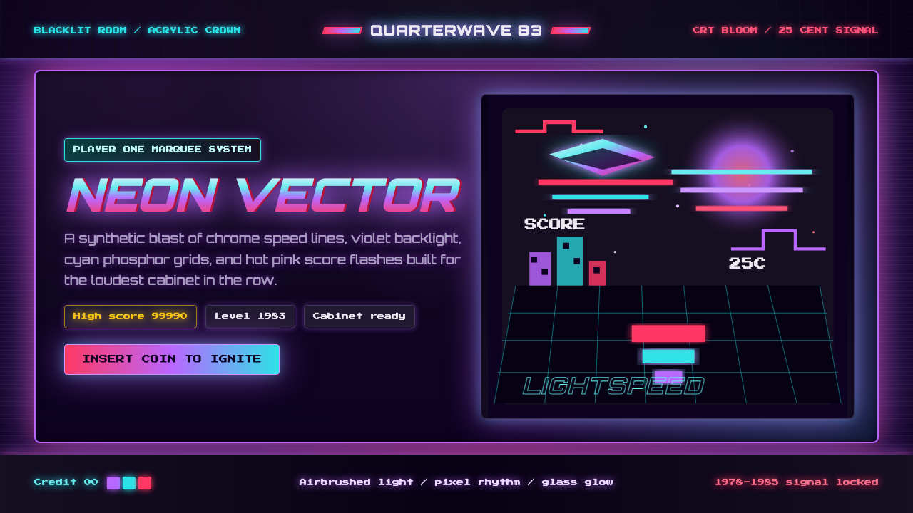 Arcade Cabinet MarqueeToo loud to ignore. Black-indigo glass, violet glow, cyan grids, hot-pink arc…刺眼才对。黑靛玻璃、霓虹紫光、电青网格与品红像素字。
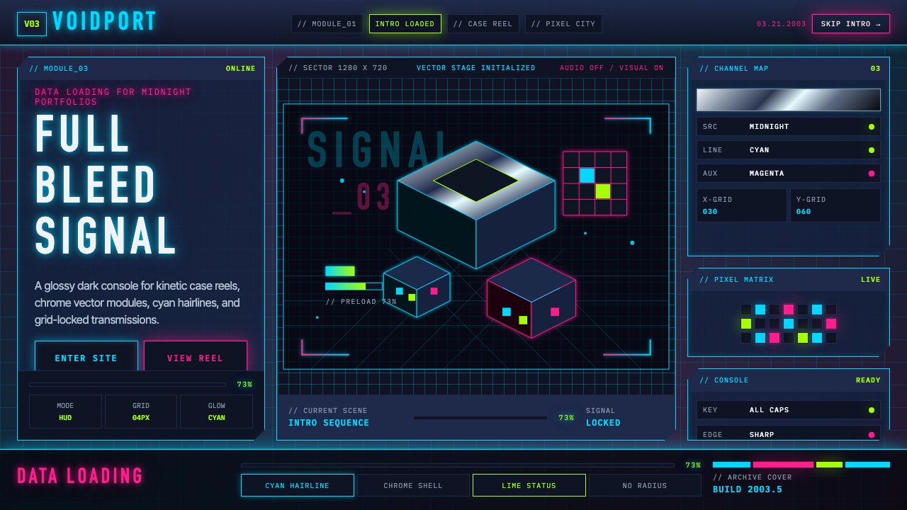 Flash Website Era (2003)A browser turned sci-fi console. Cyan HUD hairlines, chrome gradients, and 4p…浏览器变身科幻控制台:电光青描边、铬渐变与4px网格。
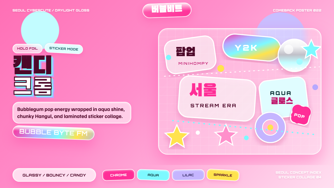 K-Pop Y2K SeoulCandy chrome goes maximal. Hot pink, aqua, Hangul type, and sticker collage s…糖果铬感极繁:热粉、水蓝、韩文字体与贴纸拼贴发光。