What is Flash Website Era (2003)?什么是 Flash Website Era (2003)?
When the browser became a sci-fi cockpit — dark-navy HUDs, electric-cyan hairlines, chrome gradients, and a loading bar that made you wait.当浏览器变成一座科幻驾驶舱——深海军蓝 HUD、电光青描边、铬渐变,还有那条让你心甘情愿等待的进度条。
Flash Website Era (2003) in briefFlash Website Era (2003) 速览
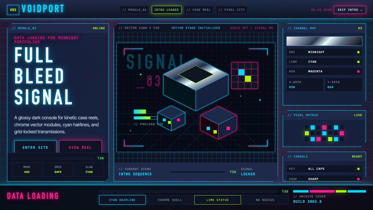
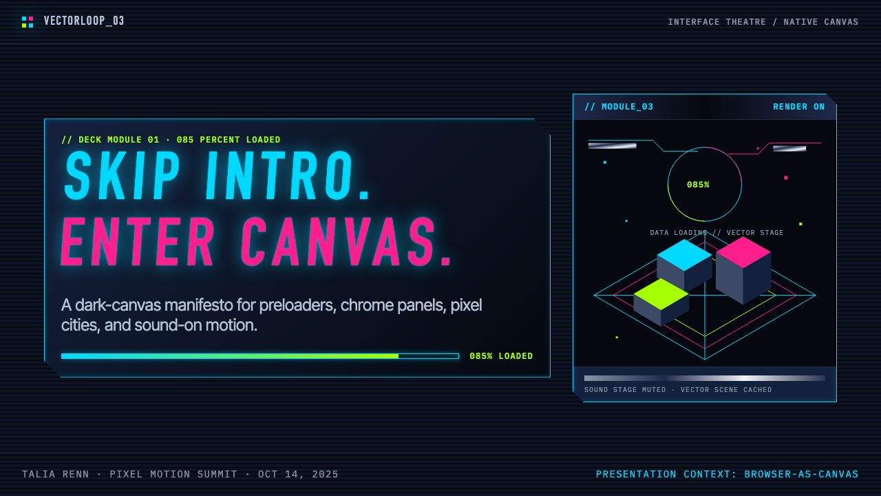
The Flash Website Era is the high-water mark of pre-mobile web design: a period roughly spanning the late 1990s through the mid-2000s, with its design-portfolio peak concentrated around 2003 to 2005, when studios and independent designers treated the browser window not as a page but as a full-bleed interactive canvas. Powered by Macromedia Flash — a plugin that delivered vector animation, synchronized audio, and scripted interactivity at a time when HTML offered none of those capabilities — these sites operated as self-contained cinematic experiences. Navigation was revealed only after an opening animation played. The 'SKIP INTRO' button, perched at the corner of the screen, became one of the era's most recognizable typographic artifacts.Flash 黄金时代是移动端来临前整个网页设计最张扬的一段岁月。这一时期大致始于1990年代末,延续至2000年代中期,设计组合网站的创作顶峰集中于2003至2005年前后。彼时,工作室与独立设计师并不把浏览器窗口视为一个页面,而是将其当作一块满铺的交互画布。Macromedia Flash 是这一切的技术支柱——这款插件在 HTML 尚无能力的年代,提供了矢量动画、同步音频与脚本交互。网站作为自足的电影化体验而运作:导航需等开场动画播毕才会出现,「SKIP INTRO」按钮悬浮于屏幕角落,成为那个时代最具辨识度的排版遗迹之一。
The visual language of the Flash era is immediately legible: a deep navy or near-black background serves as the stage; electric-cyan or ice-blue hairlines draw the HUD panels and dividers; chrome and brushed-metal gradients coat buttons and interface rails; neon magenta and acid-lime punctuate status indicators and hover states. Typography runs in condensed all-caps — tight, military, and data-driven. Percentage-counter loading bars, animated particle fields, and rotating orbital rings fill the transitional moments. The total effect is a sci-fi operating console designed for an audience that had grown up on James Cameron films and cyberpunk fiction.Flash 时代的视觉语言一目了然:深海军蓝或近黑的背景充当舞台,电光青或冰蓝色的细线勾勒 HUD 面板与分隔条,铬金属与拉丝金属渐变包覆按钮与界面导轨,霓虹洋红与酸橙绿点亮状态指示器与悬停态。字体以极窄的全大写排印——紧凑、军事化、充满数据感。百分比计数进度条、粒子场动画与旋转轨道环填满各个过渡时刻。整体效果如同一台科幻操控台,专为那些看着詹姆斯·卡梅隆电影、读着赛博朋克小说长大的观众而设计。
The style sits at the intersection of two currents: the isometric pixel art of digital illustrators like eBoy, who built intricate low-resolution city panoramas, and the motion-design ambitions of new-media studios like 2Advanced, who treated every page-load as a broadcast event. What unites them is the conviction that the web could be a medium with the same authorial control as film — that a designer could choreograph exactly what a visitor saw, heard, and experienced, down to the millisecond.这种风格汇聚了两股潮流:以 eBoy 为代表的数字插画师的等距像素艺术——他们用细密的低分辨率像素搭建城市全景——以及以 2Advanced 为代表的新媒体工作室的动态设计野心——他们将每一次页面加载都当作一次广播事件。将两者联结的,是一个共同信念:网络可以成为一种拥有电影级叙事控制力的媒介,设计师能够精确编排访客的所见、所听与所感,精确到毫秒。
See the Flash Website Era (2003) design system查看 Flash Website Era (2003) 完整设计系统
Where does Flash Website Era (2003) come from?Flash Website Era (2003) 从何而来?
The technical foundation was laid in 1996 when Macromedia acquired FutureSplash Animator, a small vector-animation tool, and relaunched it as Flash 1.0. In its first years, Flash was used primarily for simple banner animations and modest interactive elements. The plugin's ubiquity grew steadily through the late 1990s as Macromedia distributed it aggressively, and by 1999 Flash 4 had introduced ActionScript — a rudimentary scripting language — which transformed the tool from an animation player into a genuine programming environment. By Flash 5 and MX (released in 2000 and 2002 respectively), designers and developers had the means to build entire site architectures inside a single SWF file: loading sub-SWFs on demand, controlling sound, detecting mouse position, and executing conditional logic. The technical ceiling had risen dramatically.技术基础奠定于1996年,Macromedia 收购了一款名为 FutureSplash Animator 的小型矢量动画工具,并将其重新发布为 Flash 1.0。最初几年,Flash 主要用于简单的横幅动画和有限的交互元素。整个1990年代末,随着 Macromedia 积极推送插件,其普及率稳步攀升。1999年,Flash 4 引入了 ActionScript——一种初级脚本语言——将这款工具从动画播放器转变为真正的编程环境。到 Flash 5 和 MX(分别于2000年和2002年发布),设计师与开发者已能在单个 SWF 文件内构建完整的网站架构:按需加载子 SWF、控制音效、检测鼠标位置,并执行条件逻辑。技术天花板大幅抬升。
The cultural context was equally formative. The late 1990s dot-com boom flooded the web with investment capital and a corresponding hunger for prestige. Agencies competed for interactive design awards — most notably the FWA (Favourite Website Awards, founded in 2000) and Webby Awards — and the winning work was almost universally Flash-heavy. Studios like 2Advanced (founded by Eric Jordan in San Diego), Hi-ReS!, and Hillman Curtis in New York attracted blue-chip clients by promising an entirely new kind of web presence: not a brochure online, but an event. Meanwhile, independent designers — particularly Yugo Nakamura in Japan and Joshua Davis in New York — published experimental Flash work on personal portfolio sites that the industry tracked obsessively. Davis's praystation.com, which generated generative artwork in real time using ActionScript, became a canonical reference for what the medium could aspire to.文化背景同样具有决定性意义。1990年代末的互联网泡沫将大量投资资本注入网络,同时带来了对声誉的强烈渴求。各工作室竞相角逐互动设计奖项——尤其是2000年创立的 FWA(最受喜爱网站奖)和 Webby Awards——获奖作品几乎无一例外地以 Flash 为重心。以 Eric Jordan 在圣地亚哥创立的 2Advanced、Hi-ReS! 以及纽约的 Hillman Curtis 为代表的工作室,以打造全新网络存在形态为承诺吸引顶级客户:不是把宣传册搬到网上,而是制造一个事件。与此同时,独立设计师们——尤其是日本的中村勇吾(Yugo Nakamura)和纽约的 Joshua Davis——在个人作品集网站上发布实验性 Flash 作品,令整个行业为之着迷。Davis 的 praystation.com 使用 ActionScript 实时生成生成艺术,成为这种媒介所能企及之高度的典范参照。
The visual grammar that emerged drew from several contemporary sources: the HUD aesthetics of late-1990s science-fiction films (particularly The Matrix and its contemporaries), the UI design of PC strategy and flight-simulator games, and the isometric pixel illustration style pioneered by eBoy — a Berlin-based design collective whose work appeared on postcard merchandise and in editorial illustration throughout the early 2000s. All of these shared an interest in dense, information-rich surfaces, technical precision, and the visual language of screens monitoring complex systems. The Flash designer absorbed these references and adapted them to the constraints of a browser window running over dial-up connections.由此形成的视觉语法汲取了多个当代来源:1990年代末科幻电影(尤其是《黑客帝国》及其同期作品)的 HUD 美学,PC 战略游戏和飞行模拟器的 UI 设计,以及 eBoy 所开创的等距像素插画风格——这家总部位于柏林的设计团体的作品在整个2000年代初出现于明信片商品和编辑插图中。所有这些来源都共享对密集信息表面、技术精确性与监控复杂系统的屏幕视觉语言的兴趣。Flash 设计师吸收了这些参照,并将其适配到通过拨号连接运行的浏览器窗口的限制之内。
The era ended in stages rather than all at once. Apple's iPhone launch in 2007, followed by Steve Jobs's public declaration in 2010 that iOS would never support Flash, dealt the decisive blow. But the creative peak had already passed by 2006 or 2007 as broadband expansion and shifting user expectations began to favor lighter, faster-loading sites. Adobe (which had acquired Macromedia in 2005) continued developing Flash until it formally announced end-of-life in 2017, with browser support terminating at the close of 2020. The design vocabulary of the era has since migrated into CSS animation, WebGL, and contemporary dark-mode UI systems that still echo the HUD palette.这个时代并非戛然而止,而是分阶段落幕。2007年苹果 iPhone 的发布,加上史蒂夫·乔布斯于2010年公开宣称 iOS 永不支持 Flash,给出了决定性一击。但创作巅峰实际上在2006至2007年前后便已过去,因为宽带扩张与用户期待的转变开始令更轻量、加载更快的网站占据优势。Adobe(于2005年收购 Macromedia)继续开发 Flash,直至2017年正式宣布停止维护,浏览器支持于2020年底终止。这个时代的设计词汇此后迁移进了 CSS 动画、WebGL 以及至今仍回响着 HUD 调色板余韵的当代深色模式 UI 系统之中。
What defines the Flash Website Era (2003) look?Flash Website Era (2003) 的视觉特征是什么?
Dark-Field HUD Palette深底 HUD 调色板
The canonical Flash-era background is a very deep navy or near-black field, positioned as the 'stage' on which all interface elements perform. Against this ground, electric cyan and ice blue serve as the primary structural color — hairline borders, panel dividers, glowing labels, and active-state indicators. Neon magenta and acid lime appear as secondary punctuation: percentage counters, alert states, and hover highlights. Chrome gradients running from near-white to mid-grey coat interactive rails, buttons, and panel edges, lending a sense of physical material to what is otherwise a flat screen.Flash 时代的标准背景是极深的海军蓝或近黑色底面,充当所有界面元素的「舞台」。在此底色之上,电光青与冰蓝色作为主要结构色出现——细线边框、面板分隔条、发光标签与激活态指示器。霓虹洋红与酸橙绿作为次要点缀:百分比计数器、警示状态与悬停高亮。从接近白色到中灰的铬渐变覆盖交互导轨、按钮与面板边缘,为本质上平面的屏幕赋予物质感。
Condensed All-Caps Typography极窄全大写字体排印
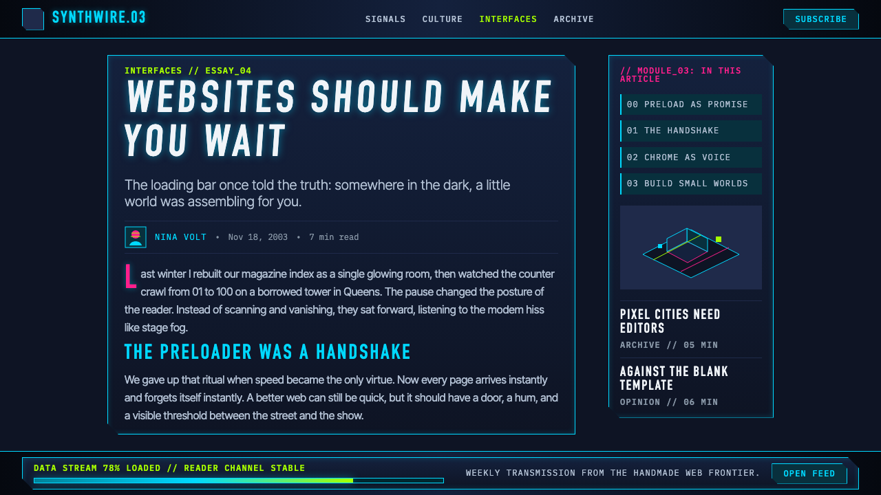
Text in Flash-era interfaces is treated as a form of data — terse, precise, and systematically sized. Labels run in extremely condensed grotesque letterforms, set entirely in capitals, often with generous tracking. Longer descriptive text, when it appears, uses a slightly wider but still technical-looking sans-serif. Type sizes are handled through strict contrast: navigational labels are small and methodical; headline text is large and commanding. No decorative serifs, no calligraphic flourish — the letterform should look like it belongs in a cockpit manual or a military schematic.Flash 时代界面中的文字被当作一种数据形式处理——简洁、精确、系统性地分级。标签采用极度压缩的怪诞体(grotesque)字形,全部大写,常配以宽松的字间距。较长的描述性文字(若出现)使用稍宽但仍具技术感的无衬线体。字号通过强烈对比处理:导航标签小而严谨,标题文字大而有力。没有装饰性衬线,没有书法式花饰——字形应当看起来像属于驾驶舱手册或军事图示。
Panel-Based Interface Architecture面板式界面架构
Rather than a scrolling document, Flash-era sites organize content into discrete panels — rectangular regions with hairline borders, sometimes with softly glowing edges — that animate into view on demand. The metaphor is closer to a multi-window operating system than a book: tabs, sub-panels, expandable drawers, and modal overlays all feature prominently. Empty space within panels is intentional and structural, creating the impression of a precision instrument rather than a layout. Panel corners are often chamfered or squared with deliberate geometry.与其说是可滚动的文档,Flash 时代的网站更倾向于将内容组织为一个个独立的面板——带有细线边框、有时带有柔和发光边缘的矩形区域——按需以动画方式进入视图。这个比喻更接近多窗口操作系统而非书本:标签页、子面板、可展开的抽屉、模态弹层都是常见元素。面板内的空间是有意为之的、结构性的,制造精密仪器而非版面的印象。面板角落往往经过切角处理或以特意的几何形状修饰。
Kinetic Transitions and Loading Theater动态过渡与加载剧场
Motion is not decorative in the Flash era — it is structural. Panels slide, rotate, or materialize; particles stream across the background field; orbital rings and scanning lines suggest a living system. The loading preloader — a progress bar with a percentage counter, often accompanied by an animated logo or particle effect — is itself a designed experience, not an apology for slow bandwidth. The transition between states is choreographed to give the impression that the site 'knows' the visitor is there and is responding with intention.Flash 时代的动效并非装饰性的——它是结构性的。面板滑动、旋转或实体化出现;粒子流横贯背景;轨道环与扫描线暗示着一个有生命的系统。加载预加载界面——一条带有百分比计数器的进度条,往往配有动画 logo 或粒子效果——本身就是一个经过设计的体验,而非对低速带宽的道歉。状态之间的过渡经过编排,令人感觉网站「知道」访客在此,并有意图地作出回应。
Isometric and Orthographic Illustration等距与正交插画
Alongside the HUD-and-panel school, a parallel current within Flash-era design favored isometric pixel illustration: densely rendered city scenes, machines, and characters built on a strict diagonal grid without perspective distortion. eBoy's work is the clearest example — pixel cities packed with visual jokes, brand references, and hyperdetailed vignettes. This approach treats the low resolution of early digital screens as an expressive material rather than a technical limitation, and its grid discipline is as rigorous as any modernist design system.与 HUD 面板流派并行,Flash 时代设计的另一股潮流偏爱等距像素插画:在严格的对角网格上构建的密集城市场景、机器与角色,不带透视变形。eBoy 的作品是最典型的例证——像素城市里塞满了视觉笑话、品牌引用与超细节小场景。这种方式将早期数字屏幕的低分辨率当作表现材料而非技术限制,其网格纪律与任何现代主义设计系统一样严格。
Chrome and Metallic Gradients铬金属渐变
Where gradients are applied — on buttons, rails, and panel headers — they describe a specific material: polished chrome or brushed aluminum. The gradient runs from a near-white highlight at one edge through a cool mid-grey to a deep shadow at the opposite edge, producing a cylindrical or banded metallic effect. This is not gradient used for atmospheric warmth or visual interest in the abstract; it is gradient as a material claim, asserting that the interface is built from physical stuff — that the button you are about to press has weight.在渐变被施用之处——按钮、导轨与面板标题——它们描述的是一种特定材质:抛光铬或拉丝铝。渐变从一侧的接近白色高光,经过冷灰色中间调,延伸至另一侧的深阴影,产生圆柱形或条纹状的金属效果。这里的渐变并非出于营造氛围或抽象视觉趣味而使用;它是一种材质主张,断言界面由实体物质构成——你即将按下的按钮是有重量的。
Parametric Generative Accents参数化生成装饰
At the experimental fringe of the era, designers like Joshua Davis used ActionScript to generate visual elements algorithmically — branching structures, recursive geometries, ink-wash simulations — in real time, so that no two visits to a site looked identical. These generative accents were not purely decorative: they demonstrated that the web could be a medium of genuine formal invention, not only delivery of pre-authored content. The aesthetic outcome tends toward dense organic-geometric hybrids: forms that look grown rather than drawn, set against the dark ground of the HUD canvas.在这个时代的实验前沿,Joshua Davis 等设计师使用 ActionScript 以算法实时生成视觉元素——分支结构、递归几何、水墨模拟——使得每次访问网站的视觉呈现都不尽相同。这些生成性装饰并非纯粹装饰性的:它们证明了网络可以成为真正形式发明的媒介,而不仅仅是预先创作内容的传递渠道。其美学结果趋向于密集的有机-几何混合体:看起来像是生长出来而非绘制出来的形态,置于 HUD 画布的深色底面之上。
See the Flash Website Era (2003) design system查看 Flash Website Era (2003) 完整设计系统
Who shaped Flash Website Era (2003)?谁塑造了 Flash Website Era (2003)?
Eric Jordan founded 2Advanced Studios in San Diego in 1999 and became the most influential practitioner of the sci-fi HUD aesthetic. His sites for clients including Acer, NVIDIA, and various government agencies set the template for dark-navy backgrounds, electric-cyan hairlines, and choreographed panel-reveal animations. 2Advanced's work won FWA recognition repeatedly and was widely imitated by agencies worldwide. Jordan's design language was so coherent and so technically accomplished that 2Advanced volumes became reference books for the generation of Flash designers that followed.Eric Jordan 于1999年在圣地亚哥创立 2Advanced Studios,成为科幻 HUD 美学最具影响力的实践者。他为宏碁、NVIDIA 及多家政府机构打造的网站确立了深海军蓝背景、电光青细线与编排式面板揭示动画的范本。2Advanced 的作品屡获 FWA 认可,并被世界各地的工作室广泛模仿。Jordan 的设计语言如此连贯、技术上如此精湛,以至于 2Advanced 出版的作品集成为后来一代 Flash 设计师的参考书。
Joshua Davis, working under the alias Praystation and later Once-Upon-a-Forest, used ActionScript as an artistic medium rather than a production tool. His personal site praystation.com generated abstract generative artworks in real time, using randomized algorithms to combine geometric modules into compositions that changed with every visit. Davis won a Prix Ars Electronica Golden Nica in 2000 for this work and delivered the keynote at the first Flash Forward conference. More than any other figure, he established the idea that the Flash designer could be an author — someone whose creative intentions shaped an experience, not merely someone who built to a brief.Joshua Davis 以 Praystation 和后来的 Once-Upon-a-Forest 为笔名,将 ActionScript 作为艺术媒介而非生产工具使用。他的个人网站 praystation.com 实时生成抽象生成艺术,使用随机算法将几何模块组合成每次访问都不同的构图。Davis 凭借这些作品于2000年获得林茨电子艺术节金尼卡奖,并在首届 Flash Forward 大会上发表主题演讲。在所有人物中,他最清晰地建立了 Flash 设计师可以是一位「作者」的理念——一个以创作意图塑造体验的人,而不仅仅是按brief执行的人。
Tokyo-based designer Yugo Nakamura brought a uniquely physical and poetic sensibility to Flash interaction. His work at yugop.com explored gesture, mass, and elasticity — interfaces that responded to mouse movements with the kind of deferred, weighted momentum you might feel in a physical object. Nakamura's influence was particularly strong on the interaction-design side of the discipline: his experiments demonstrated that the 'feel' of an interface — how it moved, how it resisted and responded — was as much a design decision as its visual appearance. He later went on to found IDEO Japan.东京设计师中村勇吾(Yugo Nakamura)为 Flash 交互带来了独特的物理感与诗意。他在 yugop.com 上的作品探索手势、质量与弹性——界面以延迟的、有重量的惯性响应鼠标移动,仿佛你感受到的是一个实体物体的动态。中村勇吾对这门学科交互设计层面的影响尤为深远:他的实验证明,界面的「手感」——它如何运动、如何抵抗与响应——与视觉外观同样是设计决策。他后来创立了 IDEO Japan。
New York-based Hillman Curtis occupied a distinctive position in the Flash era as both a practitioner and a chronicler. His agency created motion-centric web work for clients including Adobe, Fox Searchlight, and MTV, but his deeper contribution was authorial: his books Flash Web Design and MTIV (Moving to Intelligence and Vision) gave the discipline its first serious critical framework, explaining not just how to use Flash but why particular design decisions produced meaning. Curtis also directed a long-running series of short documentary films profiling designers, artists, and musicians, and died in 2012 at fifty-one.纽约的 Hillman Curtis 在 Flash 时代同时以实践者和记录者的身份占据独特位置。他的工作室为 Adobe、Fox Searchlight 和 MTV 等客户创作了以动态为核心的网页作品,但他更深远的贡献在于文字:他的《Flash Web Design》与《MTIV》(迈向智慧与愿景)为这门学科提供了第一套严肃的批评框架,不只解释如何使用 Flash,更解释为何特定设计决策产生特定意义。Curtis 还执导了一系列长期短片纪录片,记录设计师、艺术家与音乐人,于2012年辞世,享年五十一岁。
eBoy is a Berlin-based design collective founded in 1997 by Steffen Sauerteig, Svend Smital, and Kai Vermehr. Working in isometric pixel illustration long before the style became fashionable, they built extraordinarily dense scenes — pixel cities, pixel portraits, pixel branding — that were collected as merchandise, licensed to magazines, and circulated widely online. Their aesthetic sits in deliberate tension with the HUD current: where 2Advanced sought technological authority, eBoy sought playful density and cultural saturation. Yet both drew on the same underlying discipline — the pixel grid as a precise, unforgiving medium — and eBoy's influence is visible everywhere from early 2000s editorial illustration to contemporary nostalgia-retro game art.eBoy 是1997年由 Steffen Sauerteig、Svend Smital 和 Kai Vermehr 在柏林创立的设计团体。在这种风格流行之前,他们便开始从事等距像素插画创作,构建密度惊人的场景——像素城市、像素人物肖像、像素品牌形象——这些作品被制成周边商品、授权给杂志,并在网络上广泛流传。他们的美学与 HUD 流派之间存在刻意的张力:2Advanced 追求技术权威感,eBoy 追求玩乐性密度与文化饱和度。然而两者都建立在相同的底层纪律之上——像素网格作为一种精确而不宽容的媒介——eBoy 的影响从2000年代初的编辑插图到当代怀旧复古游戏艺术随处可见。
How do you use Flash Website Era (2003) today?今天怎么用 Flash Website Era (2003)?
The Flash Website Era aesthetic translates most naturally into contemporary contexts where technological authority, precision, and controlled drama are desired — dark-mode dashboards, developer-tool landing pages, gaming or esports platforms, and any product positioning itself at the intersection of software and spectacle. The key is to commit fully to the dark-stage principle: the background must be deep enough that the electric-cyan and metallic accents read as luminous, not merely colored.Flash 黄金时代的美学最自然地迁移到当代那些追求技术权威感、精准性与可控戏剧张力的场景中——深色模式仪表板、开发者工具落地页、游戏或电竞平台,以及任何将自身定位于软件与视觉奇观交汇处的产品。关键在于完全践行「深色舞台」原则:背景必须足够深,使得电光青与金属质感的强调色读起来是发光的,而非仅仅是着了色的。
For presentation slides, the style rewards full commitment on cover slides and transitions, and disciplined restraint on content slides. A cover works best as a composed HUD panel: a deep navy field, a central focal element rendered with a chrome or cyan accent, the title in condensed all-caps at commanding scale, and a supporting label in smaller condensed type. Content slides should use the panel metaphor — defined borders, structured data zones, minimal prose — rather than attempting to reproduce the full kinetic complexity of a Flash site. Data slides suit the era's language naturally: bar charts and graphs become interface readouts, with data series colored in the electric accent palette against the dark ground.在演示文稿中,这种风格在封面幻灯片和过渡效果上回报丰厚,在内容页上则需要有纪律的克制。封面最适合作为一个完整的 HUD 面板来构图:深海军蓝底面,以铬或青色强调色呈现的中央焦点元素,标题以极窄全大写字体呈现于主导性的大字号,辅助标签以更小的窄字体衬于下方。内容页应使用面板隐喻——清晰边框、结构化数据区、最少化散文——而非试图再现 Flash 网站的完整动态复杂性。数据页天然契合这个时代的语言:柱状图与图表化身界面读数,数据系列以电光强调色在深色底面上着色。
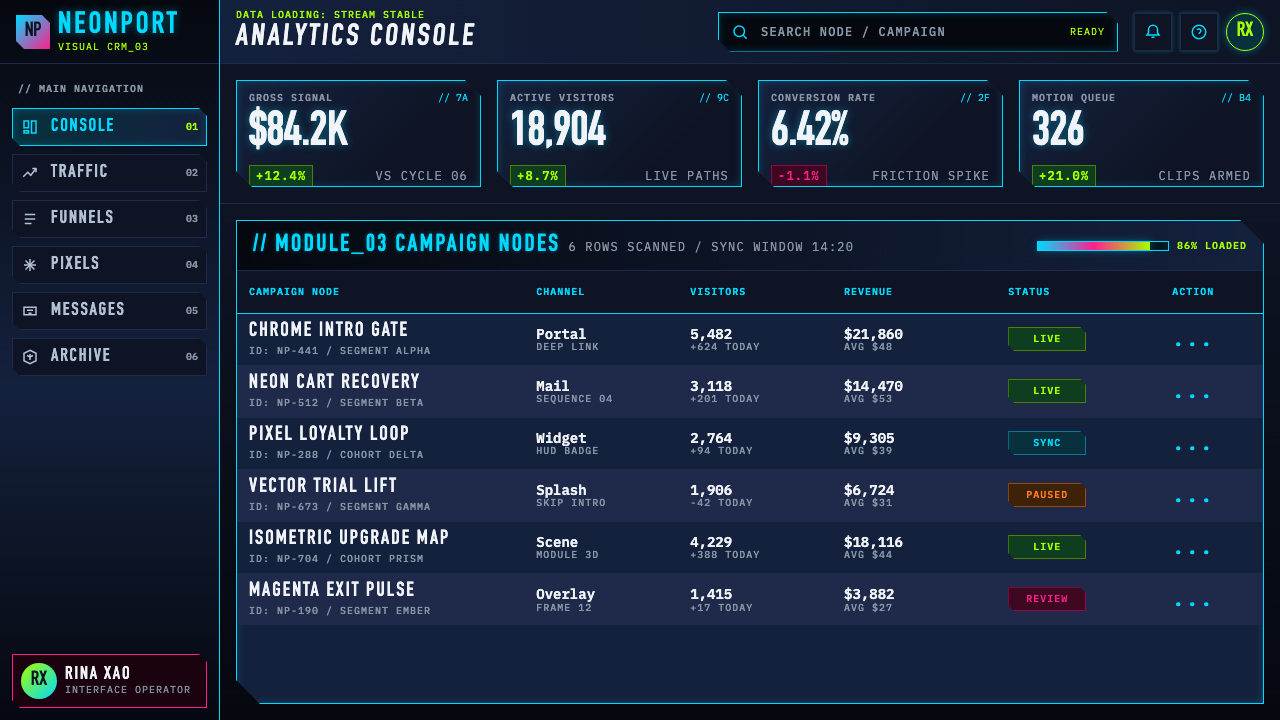
For web interfaces, the style is well-matched to dashboards, admin panels, and monitoring tools where users are expected to read dense information at speed. Apply a strict column grid; reserve the dark navy or near-black for the primary surface; use the cyan-and-metallic accent system for interactive affordances, alerts, and status indicators only. Navigation should be typographic and condensed, not icon-heavy. Components that work especially well in this mode include bordered cards with subtle glow-border hover states, panel headers with a thin metallic gradient rail, and tabbed interfaces that slide between states rather than full-page reload.在网页界面中,这种风格最适合仪表板、管理面板与监控工具——这些场景中,用户需要快速读取密集信息。应用严格的列网格;将深海军蓝或近黑色保留给主要表面;仅将青色与金属质感强调体系用于交互 affordance、警报与状态指示器。导航应以字体为主、极窄压缩,而非图标密集。在这种模式下特别有效的组件包括:带有微妙发光边框悬停态的描边卡片、带有细铬渐变导轨的面板标题,以及以状态滑动切换而非整页重载的标签页界面。
For editorial and marketing work, the Flash-era vocabulary supports high-drama feature moments — hero sections, product announcement pages, and event-specific microsites. A full-width dark hero with a scanning-line or particle animation in the background, a central product image treated with a cyan or chrome outline, and a condensed all-caps headline reads as serious and technically credible. Restraint becomes essential in long-form editorial: use the dark palette for emphasis sections only, alternating with a near-white ground for body text to maintain readability.在编辑与营销内容中,Flash 时代的词汇支撑起高戏剧感的特色时刻——英雄区、产品发布页面与特定活动微站。全宽深色英雄区配以背景扫描线或粒子动画、以青色或铬色轮廓处理的中央产品图像、极窄全大写标题,读来严肃且具有技术可信度。在长篇编辑内容中,克制变得至关重要:仅将深色调色板用于强调性区块,交替以近白色底面承载正文,以维持可读性。
A common mistake when working in this aesthetic is confusing drama with noise. Flash-era masters like Eric Jordan and Yugo Nakamura were precise and economical — every animated element served a navigational or informational purpose. Contemporary applications that add glow effects, particle systems, and gradient overlays without structural logic produce visual fatigue rather than technological authority. A second frequent error is treating the electric-cyan accent as an ambient color rather than a signal color: it should appear on interactive elements, active states, and primary data labels — never as a background fill or decorative wash.在运用这种美学时,最常见的错误是将戏剧感与噪声混为一谈。Eric Jordan 和中村勇吾等 Flash 时代大师是精确而经济的——每一个动画元素都服务于导航或信息目的。当代作品若在缺乏结构逻辑的情况下叠加发光效果、粒子系统与渐变覆层,产生的是视觉疲劳而非技术权威感。第二个常见错误是将电光青强调色当作环境色而非信号色:它应出现在交互元素、激活态与主要数据标签上——绝不作为背景填充或装饰性渲染。
See the Flash Website Era (2003) design system查看 Flash Website Era (2003) 完整设计系统
Flash Website Era (2003) — FAQFlash Website Era (2003) · 常见问题
Is the Flash Website Era the same as 'Y2K aesthetic'?Flash 黄金时代和「Y2K 美学」是同一回事吗?
They overlap but are not identical. The Y2K aesthetic — which became a popular revival term in the early 2020s — covers a broader cultural moment from roughly 1997 to 2003, encompassing the chrome-and-silver consumer product design of that era, the fashion of low-waist jeans and metallic fabrics, and the techno-optimism of the millennial transition. The Flash Website Era is a subset of that cultural moment, focused specifically on screen-based digital design. A Y2K product design might be about curves, silver plastics, and translucency; a Flash-era web design is about dark backgrounds, HUD interfaces, and kinetic interactivity. The color palette and material language overlap in the chrome and metallic directions, but the Flash era's dark-ground HUD aesthetic has no equivalent in Y2K product design.两者有重叠,但并不完全相同。Y2K 美学——在2020年代初成为流行复兴术语——覆盖了大约1997至2003年间更广泛的文化时刻,涵盖那个年代的铬银消费品设计、低腰牛仔裤与金属面料的时装,以及千禧年转折的技术乐观主义。Flash 黄金时代是这一文化时刻的一个子集,专注于基于屏幕的数字设计。Y2K 产品设计可能关于曲线、银色塑料与半透明;Flash 时代的网页设计关于深色背景、HUD 界面与动态交互性。两者在铬与金属质感的方向上共享调色板与材质语言,但 Flash 时代以深色底面为基础的 HUD 美学在 Y2K 产品设计中没有对应物。
Can this style work in a light-background context?这种风格能用在浅色背景的场景中吗?
With significant modifications, yes — but the result is no longer recognizably the Flash era aesthetic. The style's most distinctive qualities (glowing edge-light on dark panels, luminous cyan against near-black) depend entirely on the dark ground. On a light or white background, the electric cyan reads as merely teal, the chrome gradients flatten to grey, and the sense of a luminous interface disappears entirely. A light-ground adaptation can preserve the condensed all-caps typography, the panel-and-grid architecture, and the metallic button language — but it will read as a generic technical style rather than as a specific reference to the Flash era. If a light background is required by the design brief, a different historical reference — Swiss International Style, for instance — will likely serve the goals more coherently.经过重大调整后可以——但结果将不再是可辨认的 Flash 时代美学。这种风格最显著的特质(深色面板上的发光边缘光、近黑底面上的电光青)完全依赖于深色底面。在浅色或白色背景上,电光青看起来不过是普通蓝绿色,铬渐变变成平淡的灰色,发光界面的感觉彻底消失。浅色底面的改编可以保留极窄全大写排印、面板与网格架构以及金属质感按钮语言——但读起来将像一种通用技术风格,而非对 Flash 时代的特定参照。如果设计方案要求浅色背景,另一个历史参照——例如瑞士国际主义风格——很可能能更连贯地服务于目标。
Why did Flash-era design rely so heavily on opening animations and intro sequences?Flash 时代的设计为何如此依赖开场动画和片头序列?
Several forces converged. Technically, opening animations served as preloaders: while the animation played, the rest of the site's assets loaded in the background, so the user was entertained rather than confronted with a progress bar. Culturally, the studios making these sites — many of which had roots in broadcast and film production — brought with them an expectation that a designed experience should have a beginning, a middle, and an end. The opening sequence was the 'establishing shot' of a web experience, setting tone and demonstrating craft before the user reached the functional content. And commercially, the intro was where a studio could demonstrate its full motion-design capabilities to potential clients — the rest of the site might be relatively static, but the intro was the showreel. The backlash was real: by 2004 or 2005, usability researchers were documenting that users actively resented forced waits, and the 'SKIP INTRO' button's omnipresence was itself an admission that the medium had overreached.多股力量在此汇聚。从技术上看,开场动画充当预加载器:在动画播放期间,网站其余资产在后台加载,用户被娱乐着,而非面对一根进度条。从文化上看,制作这些网站的工作室——许多有着广播与电影制作的根源——带来了一种期待:一个经过设计的体验应该有开头、中间与结尾。开场序列是网络体验的「建立镜头」,在用户抵达功能性内容之前奠定基调、展示工艺。从商业上看,片头是工作室向潜在客户展示其完整动态设计能力的地方——网站其余部分可能相对静态,但片头就是样片集锦。反弹是真实的:到2004或2005年前后,可用性研究者已在记录用户对强制等待的主动厌烦,「SKIP INTRO」按钮的无处不在本身就是对这种媒介过度扩张的一种承认。
What happened to the designers who defined this era after Flash ended?定义了这个时代的设计师们在 Flash 终结后走向了何方?
Their trajectories diverged considerably. Eric Jordan continued as a creative director and digital agency leader, applying his design sensibility to post-Flash technologies. Joshua Davis became a professor, creative director at Hulu, and a continuing figure in generative art — his approach translated directly into JavaScript-based creative coding environments. Yugo Nakamura founded Tha Ltd. in Tokyo and continued designing interaction-rich experiences for major Japanese brands, adapting his physical-metaphor interaction language to mobile and web technologies. Hillman Curtis transitioned to documentary filmmaking before his death in 2012. eBoy continued producing pixel illustration work that gained new appreciation with the retro-gaming revival of the 2010s. The broader community of Flash designers largely migrated to HTML5, CSS animation, and JavaScript frameworks — skills that, while technically different, drew on the same core discipline of designing time-based, interactive experiences.他们的轨迹大相径庭。Eric Jordan 继续担任创意总监与数字工作室领导者,将自己的设计感性应用于后 Flash 时代的技术。Joshua Davis 成为一名教授、Hulu 的创意总监,并持续活跃于生成艺术领域——他的方式直接迁移进了基于 JavaScript 的创意编程环境。中村勇吾在东京创立了 Tha Ltd.,继续为日本主要品牌设计交互丰富的体验,将他以物理隐喻为核心的交互语言适配到移动与网页技术上。Hillman Curtis 在2012年辞世前转型为纪录片导演。eBoy 继续创作像素插画作品,在2010年代复古游戏热潮中获得新的欣赏。更广泛的 Flash 设计师群体大多迁移至 HTML5、CSS 动画与 JavaScript 框架——这些技能虽然在技术上不同,却源于同一核心学科:设计基于时间的交互体验。
Is the Flash Website Era aesthetic appropriate for brands that want to appear approachable or consumer-friendly?Flash 黄金时代的美学适合希望显得亲切或消费者友好的品牌吗?
Not as a primary aesthetic system, and the mismatch is worth understanding clearly. The Flash-era aesthetic projects authority, technical sophistication, and controlled intensity — qualities that serve B2B software, developer tools, gaming platforms, and defense or aerospace applications well. It does not project warmth, playfulness, accessibility, or organic human connection. A wellness brand, a food company, a children's platform, or any brand whose value proposition depends on emotional approachability will find this aesthetic works against them: the dark ground, metallic surfaces, and all-caps typography read as exclusive rather than welcoming. The style can be deployed selectively for a single dramatic product-launch moment within a broader approachable brand system — but as the dominant visual language, it signals a very specific attitude that not every product benefits from.作为主要美学体系,不适合——而且这种不匹配值得清晰理解。Flash 时代的美学传达权威感、技术复杂性与可控的强度——这些特质服务于 B2B 软件、开发者工具、游戏平台以及国防或航空航天应用。它不传达温暖、趣味性、易达性或有机的人文连接。一个健康品牌、食品公司、儿童平台,或任何价值主张依赖情感亲切感的品牌,会发现这种美学在与它们作对:深色底面、金属质感表面与全大写字体读来是排他性的,而非欢迎性的。这种风格可以在更广泛的亲切品牌体系中,被选择性地用于某一单一戏剧性产品发布时刻——但作为主导视觉语言,它传达了一种非常特定的态度,并非所有产品都能从中受益。
Related design styles相关设计风格
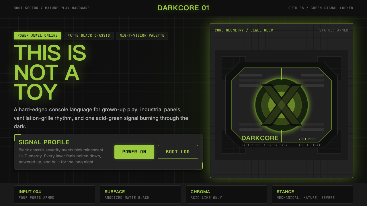 Xbox Original (2001)Not a toy. Acid green cuts matte black in a rigid grille-and-jewel hardware p…不是玩具:酸绿切开哑黑,以格栅与发光宝石构成硬件海报。
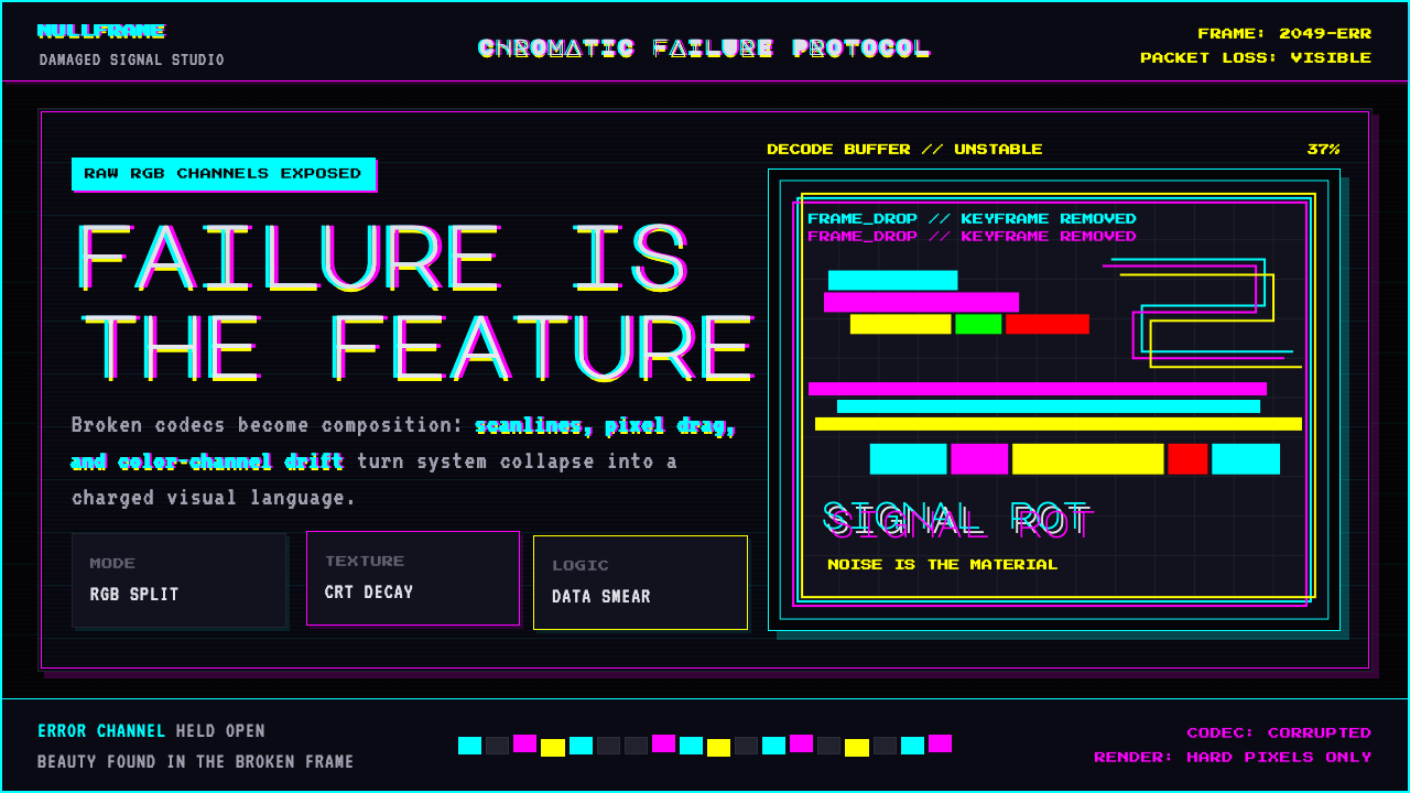 Glitch DatamoshErrors as composition. Corrupted JPEGs, RGB splits, scanlines — failure treat…把数字错误升华为视觉语言:损坏的 JPEG、RGB 色差偏移、扫描线、像素排序…
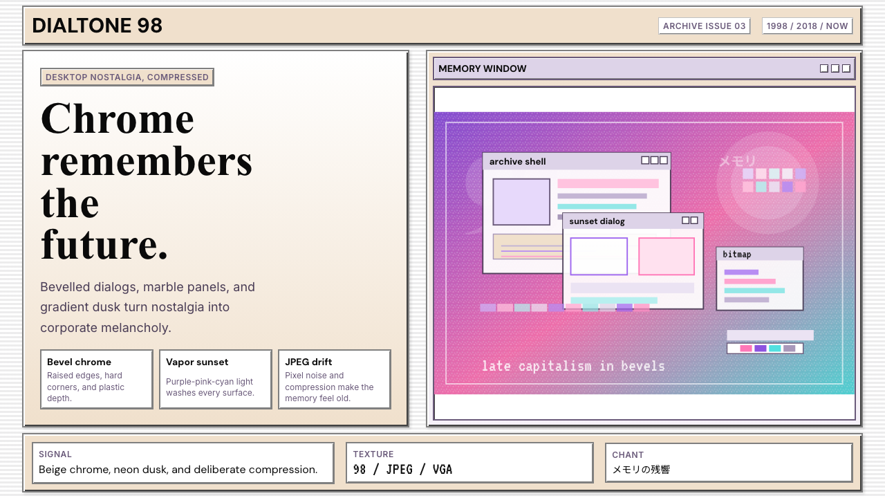 Windows 98 VaporwaveCorporate melancholy glows. Bevelled panels and purple-pink-cyan dusk do the…企业忧郁发光。凸起面板与紫粉青渐变撑起画面。
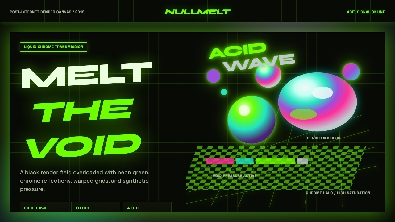 Acidwave 3D RenderPsychedelia hits the render engine. Neon green, chrome orbs, and warped grids…迷幻被塞进渲染引擎:霓虹绿、液态铬球与扭曲网格灼烧黑底。
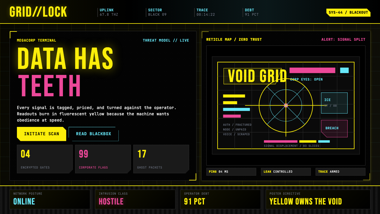 Cyberpunk 2077 (Screen UI)Weaponized terminals. Fluorescent yellow on black, scanlines and bracketed HU…被武器化的终端:黑底荧光黄、扫描线与HUD方括号网格。
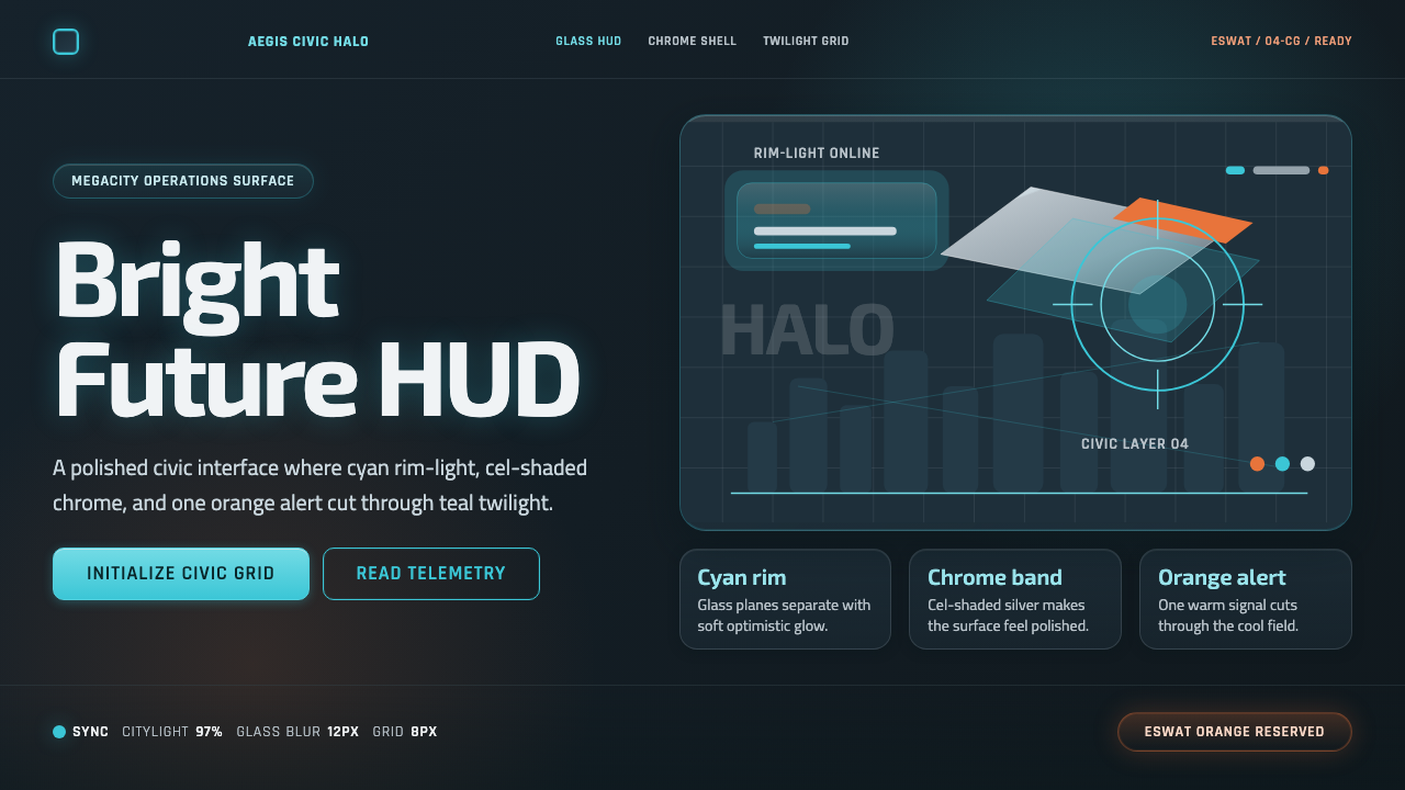 Appleseed (Olympus)Polished future, not noir. Cyan HUD glow and chrome panels float over teal tw…光洁未来而非黑色赛博:青色 HUD 辉光与铬面漂浮于青灰暮色。