What is Appleseed (Olympus)?
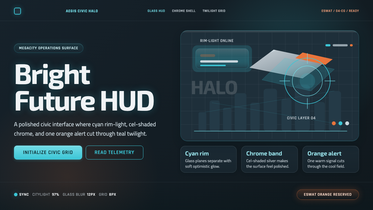
A cel-shaded megacity glows cyan and chrome against a teal twilight sky — a utopian future rendered as optimism, never as noir.
Appleseed (Olympus) in brief
Appleseed (Olympus) is a design system drawn from the 2004 cel-shaded CG film's rendering of Olympus, its utopian megacity setting. The visual world is glossy, glass-and-chrome optimistic rather than gritty or noir — soft cyan glows, polished silver surfaces, and warm orange accents float over a dark teal-slate twilight backdrop, producing a bright-future aesthetic distinctly different from the darker, rain-soaked cyberpunk visions common in the genre.
The system is built around a specific technical signature: cel-shaded, toon-rendered 3D computer graphics from the mid-2000s, where surfaces carry smooth gradient shading rather than either flat 2D cel color or fully photorealistic lighting. This gives every element a rounded, technical HUD quality — interface panels look like heads-up display elements a pilot or operator might actually see, complete with rim lighting along their edges.
Color is deployed with restraint: cyan is the dominant glow, used for primary interactive and informational elements; silver and chrome carry structural weight; a warm orange, associated with the film's ESWAT special forces, appears sparingly as a contrasting accent against the cool palette. Nothing in the system reads as dystopian — the megacity silhouettes and glass towers are clean, orderly, and hopeful even at night.

Where does Appleseed (Olympus) come from?
Appleseed was originally a manga created by Masamune Shirow, first published in 1985, set in the post-apocalyptic utopian city-state of Olympus, where genetically engineered beings called bioroids work alongside humans to maintain a fragile peace after a devastating global war. Shirow, also known for creating Ghost in the Shell, brought a similarly dense, technically detailed vision of a future society grappling with the costs and benefits of engineered order.
The 2004 film adaptation was directed by Shinji Aramaki, who made the pivotal choice to render the entire film using cel-shaded 3D computer graphics rather than traditional cel animation or photorealistic CG. This technique, sometimes called toon-shading, applies smooth gradient lighting to 3D-modeled characters and environments while retaining flat, graphic color fills reminiscent of hand-drawn animation — a hybrid approach that was still relatively novel for a feature-length film in 2004 and gave Appleseed a distinctive, polished look that separated it from both fully hand-drawn anime and fully photorealistic CG films of the era.
Aramaki's visual treatment of Olympus deliberately avoided the dystopian, rain-slicked, neon-noir aesthetic that had become a genre convention following films like Blade Runner and Shirow's own Ghost in the Shell. Olympus is depicted as a genuinely beautiful, orderly, glass-and-chrome city bathed in soft light — a choice that reinforced the story's central tension, since the film asks whether this beautiful, engineered peace is worth its ethical costs precisely because the city itself looks so appealing rather than oppressive.
The ESWAT special forces unit within the story, associated with a warm orange accent color against the film's cooler cyan-and-teal palette, provided a visual counterpoint representing human agency and conflict within the otherwise serene megacity — a small warm note against a large cool field, much like the film's narrative tension between individual human choice and the managed peace of the bioroid-run society. Appleseed's visual approach influenced subsequent cel-shaded CG animation and remains a reference point for 'optimistic sci-fi HUD' aesthetics distinct from darker cyberpunk visual traditions.
What defines the Appleseed (Olympus) look?
Cyan HUD Glow
A soft, luminous cyan carries the system's primary interactive and informational weight, appearing as glowing edges, panel outlines, and rim light rather than flat fills. This glow reads as technical and optimistic rather than harsh, mimicking a heads-up display designed for clarity rather than alarm.
Polished Silver and Chrome
Structural elements — panel frames, dividers, interface housings — carry a smooth, reflective silver quality reminiscent of polished metal and glass, giving the system a sense of high manufacturing quality and technical refinement rather than rough or industrial texture.
Teal-Slate Twilight Ground
The base surface sits in a dark teal-slate tone rather than pure black or pure white — a twilight ground that gives the cyan and silver elements a rich, contrasting field to glow against while maintaining an overall calm, evening mood rather than the harsh darkness of noir.
Warm Orange Counterpoint
A single warm orange accent, associated with the ESWAT special forces within the source film, appears sparingly against the otherwise cool palette — used for a specific alert, a human-agency marker, or a single call to action, never spread broadly enough to compete with the dominant cyan.
Cel-Shaded Gradients
Surfaces carry smooth, controlled gradient shading rather than either flat cel color or photorealistic rendering — a hybrid quality that gives every shape a rounded, dimensional but still graphic and stylized appearance, characteristic of mid-2000s toon-shaded CG.
Rounded Technical Panels
Interface panels and containers favor soft, rounded corners over sharp geometric edges, echoing the film's HUD elements, which were designed to feel approachable and human-operated rather than cold or purely mechanical.
Clean Megacity Silhouettes
Where architectural or skyline imagery appears, it favors clean, orderly, glass-tower silhouettes rather than cluttered, dystopian density — reinforcing the utopian rather than dystopian reading of the source material's future city.

Who shaped Appleseed (Olympus)?
Shirow created the original Appleseed manga in 1985, establishing the utopian city-state of Olympus and its central tension between engineered peace and human agency — the conceptual foundation that the 2004 film's visual style was built to serve.
Aramaki directed the 2004 film and made the defining choice to render it in cel-shaded 3D CG rather than traditional or photorealistic animation, and to depict Olympus as genuinely beautiful and optimistic rather than dystopian — decisions that together define this design system's entire visual identity.
How do you use Appleseed (Olympus) today?
This style suits products that want to feel technologically advanced, optimistic, and polished rather than gritty or dystopian — a distinctive alternative to the darker cyberpunk conventions that dominate most 'futuristic' visual design.
For presentation slides, the teal-slate ground and cyan glow work well on a cover slide depicting a confident, forward-looking vision: a rounded HUD-style panel arrangement with glowing cyan edges against the twilight ground. Content slides should use cyan consistently for primary information and a single warm orange accent for the one most important call-out per slide, keeping the overall mood bright and hopeful rather than tense.
For web interfaces, the system suits futuristic product marketing, technology or SaaS dashboards wanting a polished, optimistic feel, and gaming or entertainment platforms set in advanced-technology worlds. Interactive elements should carry the soft cyan glow and rounded-panel treatment consistently, with the warm orange reserved specifically for alerts or a single primary call to action.
For editorial and marketing content, the style suits science fiction storytelling, technology futurism content, and any brand narrative built around confident, utopian visions of advanced technology rather than cautionary or dystopian ones. Pull quotes or key statistics can use the cyan glow treatment to feel like an in-world HUD readout.
A common mistake is defaulting to a darker, noir-influenced palette out of habit when working with 'futuristic sci-fi' styles generally — this specific system depends on staying bright, optimistic, and glass-and-chrome rather than shadowy. Another mistake is overusing the orange accent, which should remain a rare counterpoint rather than a co-equal color to the dominant cyan.

Appleseed (Olympus) — FAQ
How does this style differ from typical cyberpunk or Blade Runner-inspired design?
Typical cyberpunk styling leans dark, rain-slicked, and neon-noir, using its futuristic setting to suggest social decay or dystopia. This style deliberately inverts that convention — the same futuristic technology and megacity setting is rendered as clean, bright, and optimistic, with soft cyan and silver replacing harsh neon and heavy shadow.
Is the cel-shaded gradient quality essential, or can this style work as flat color?
The soft gradient shading is a defining part of the look — it is what gives interface panels their rounded, dimensional HUD quality. A fully flat-color treatment would lose the specific mid-2000s toon-shaded CG texture that distinguishes this style from generic flat sci-fi UI design.
How prominent should the orange accent be relative to cyan?
Orange should function as a rare counterpoint, not a co-equal partner — think one alert state, one highlighted human-agency element, or a single call-to-action button per screen. Cyan should always read as the dominant, default color of the system's technical world.
Does this style suit a somber or serious brand tone?
Not particularly. The style's entire purpose is to communicate confident optimism about advanced technology — it works best for brands that want to feel hopeful, capable, and forward-looking. A brand wanting a somber or cautionary tone about technology would be better served by a darker, more traditionally dystopian style.
Related design styles
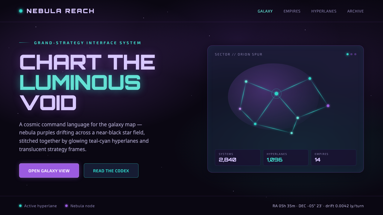 StellarisQuietly grand cosmic command UI. Nebula purples on near-black void, teal-cyan…
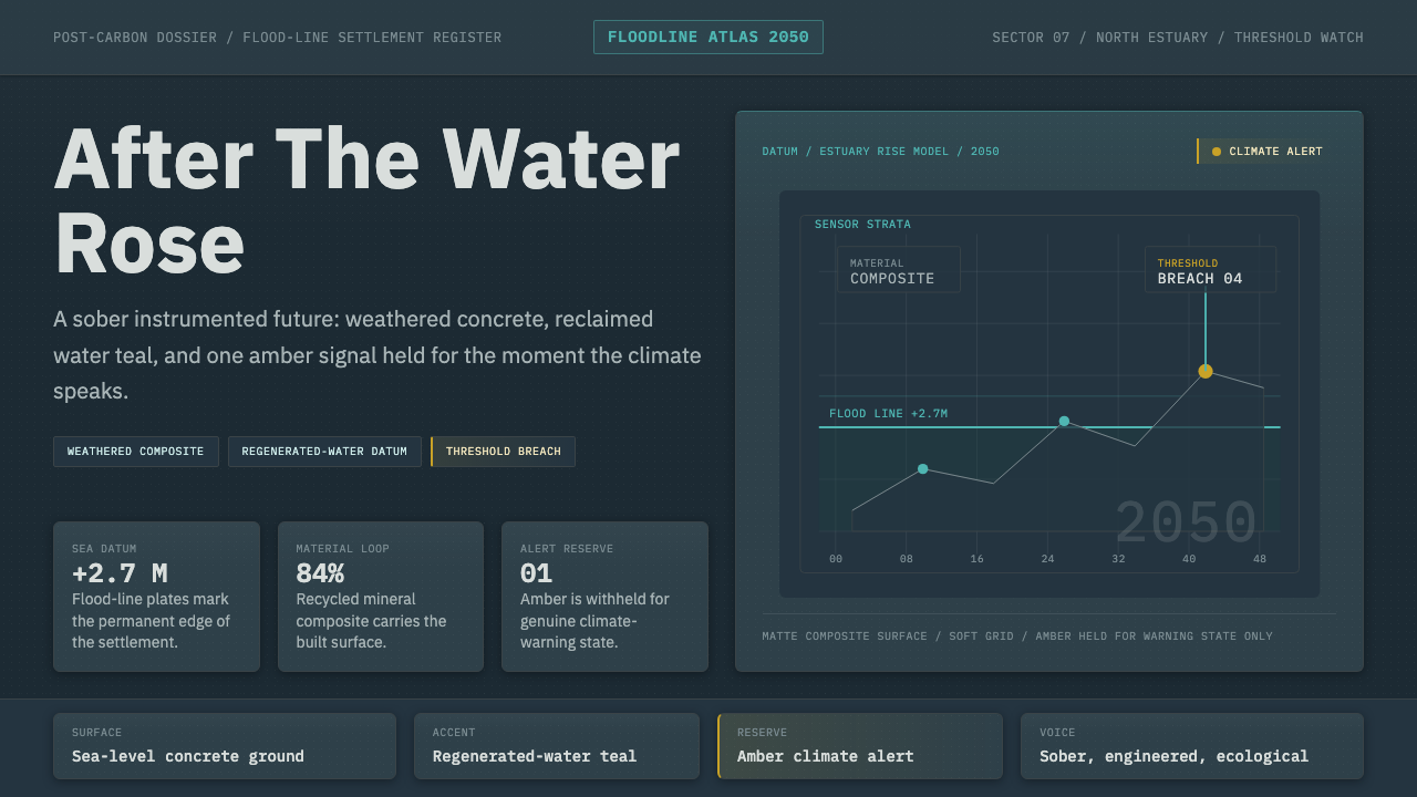 Cli-Fi 2050Pragmatic after the flood. Concrete blue-gray, muted teal, and one amber aler…
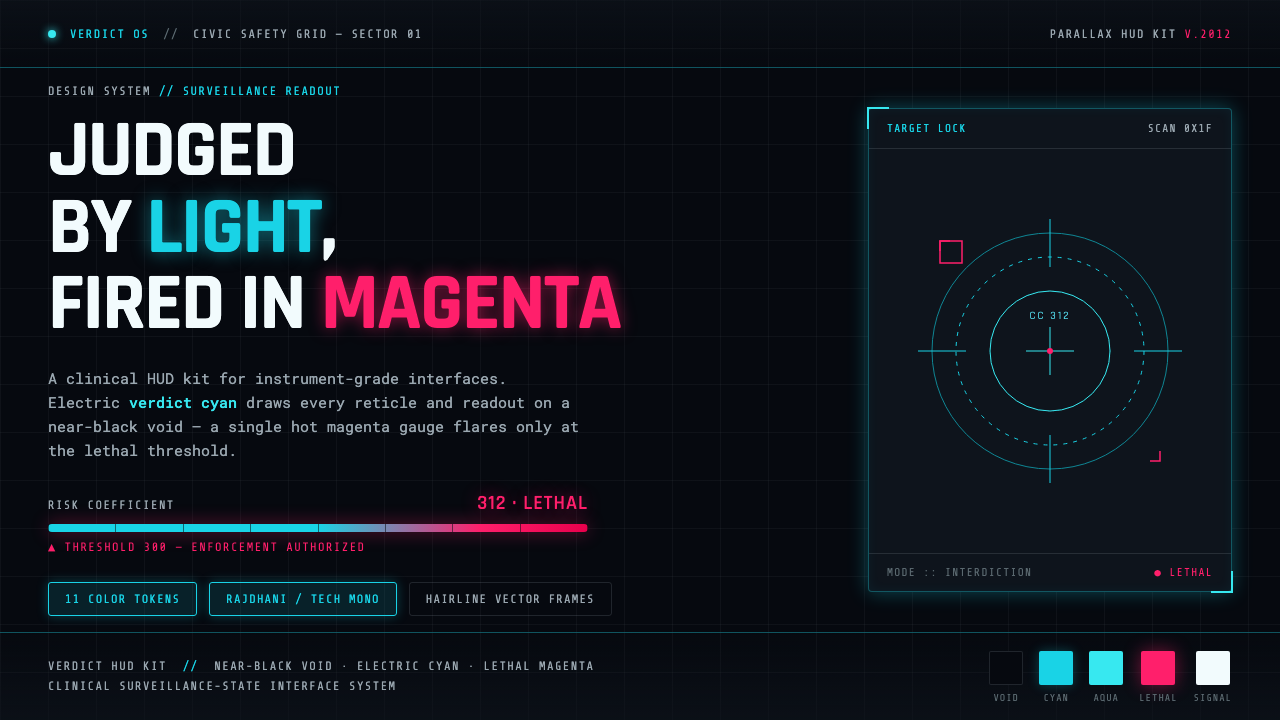 Psycho-PassA surveillance HUD. Cyan reticles on a near-black void; magenta flares only a…
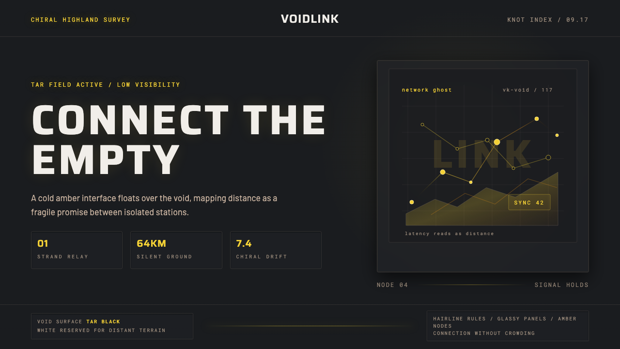 Death StrandingLonely connection, made visible. Amber HUD lines hover over a tar-black void.
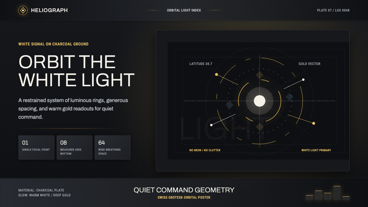 DestinyLuminous restraint. White-gold rings orbit charcoal plates in clean grotesk t…
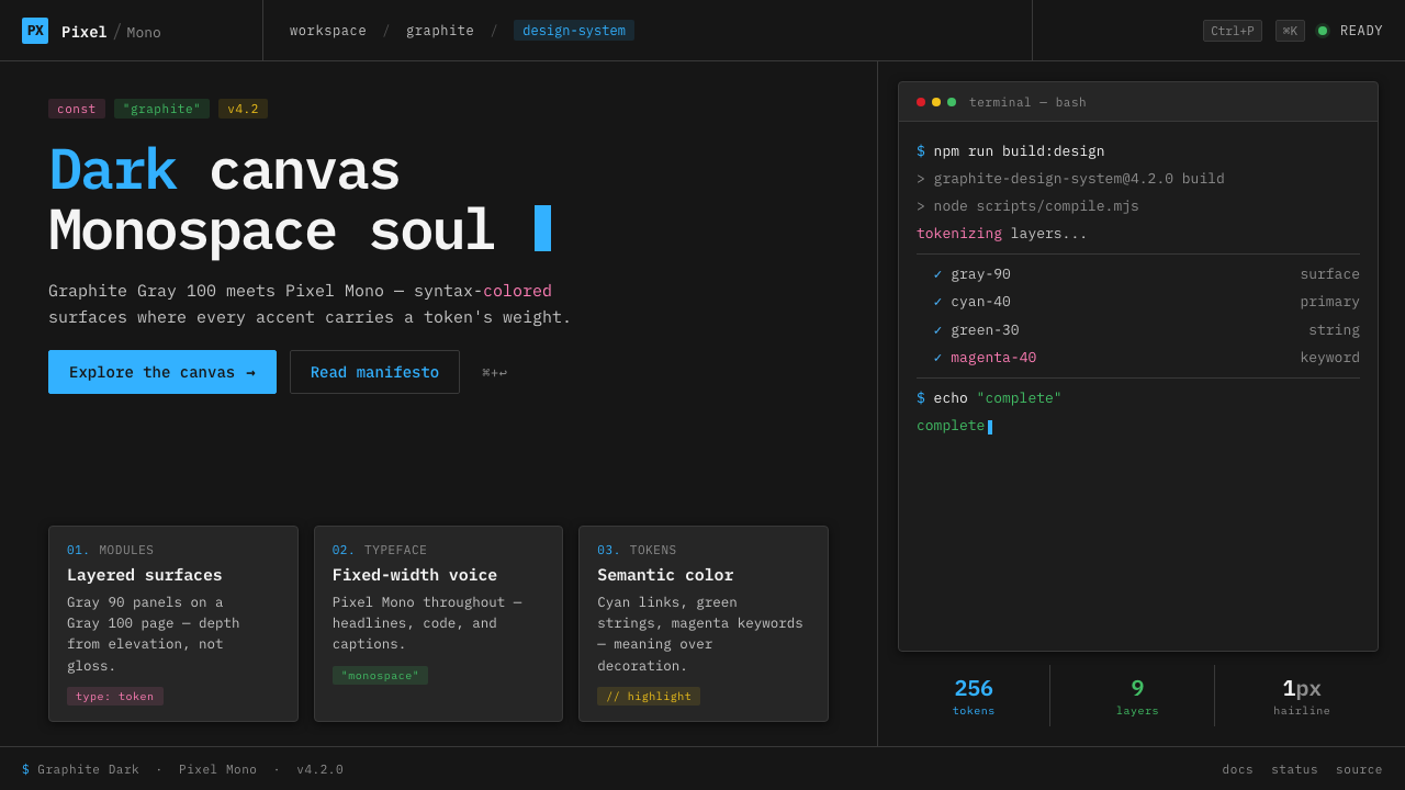 IBM Plex Mono DevColor used like syntax highlighting. Carbon Gray 100 canvas, IBM Plex Mono th…