What is Psycho-Pass (Sibyl System)?
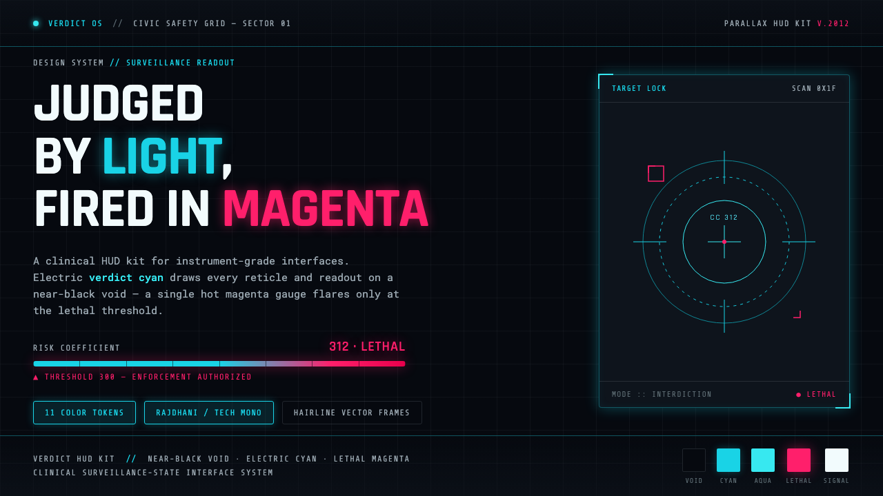
Psycho-Pass turns the interface of public safety into a threat: cyan measurements suspend judgment over a black void, while magenta appears only when the system has crossed toward lethal force.
Psycho-Pass (Sibyl System) in brief
Psycho-Pass is a 2012 dystopian science-fiction anime from Production I.G, set in a near-future Tokyo governed by the Sibyl System. In this world, every citizen is judged through a measurable Crime Coefficient. The visual language associated with that premise is not a friendly productivity interface or a decorative futuristic skin. It is a surveillance display: clinical, instrument-like, and deliberately impersonal. Its central image is the Dominator weapon’s holographic readout, where electric cyan vector graphics float over an almost black field.
The resulting style is a dark cyberpunk HUD system built from contrast and restraint. The ground recedes into near-blackness so that lines, reticles, gauges, and fragments of measurement feel projected rather than placed on a conventional page. Cyan carries the ordinary work of observation: targeting, framing, data indication, and system attention. Magenta-pink has a much narrower role. It signals a threshold, an alarm, or the proximity of lethal force. The palette therefore communicates state before the viewer reads any detail.
What makes the Psycho-Pass Sibyl System aesthetic unsettling is its combination of precision and moral distance. Fine vector frames imply that everything can be captured, measured, and classified. Sparse displays create the impression that the system has already done the difficult analysis elsewhere and is merely presenting its verdict. The interface is cold not because it lacks visual drama, but because its drama is tightly controlled: calm cyan observation gives way to a hot magenta warning only when judgment becomes irreversible.
Where does Psycho-Pass (Sibyl System) come from?
The style originates in Psycho-Pass, a 2012 Production I.G television series situated in a near-future Japanese cyberpunk setting. Tokyo is not presented merely as a backdrop for advanced technology. It is the territory of the Sibyl System, a governing apparatus whose defining operation is to judge citizens through their Crime Coefficients. That premise gives the interface its authority: the screen is not simply reporting information, but visualizing a social order that claims the right to convert human risk into a legible measure.
Its immediate visual source is the Dominator’s holographic readout. The approved description identifies glowing cyan vector graphics against a near-black void, interrupted by a hot magenta-pink gauge that denotes lethal force. This arrangement establishes a hierarchy with narrative consequences. Cyan belongs to continuous observation and technical control; magenta breaks that control’s apparent neutrality by marking the dangerous threshold. The display’s threat comes from its economy: a small change in accent color can carry the implication that the system’s judgment has escalated.
Psycho-Pass belongs to the intersecting territory of Japanese cyberpunk, dystopian science-fiction anime, and surveillance-state UI design. Within that intersection, the screen language is less interested in exuberant gadgetry than in the emotional pressure of classification. The near-black void removes environmental comfort. The thin frames and data graphics evoke a system that sees through the viewer’s space without inhabiting it. The effect is a future interface that feels at once technologically advanced and institutionally absolute.
The source material identifies Gen Urobuchi, Naoyoshi Shiotani, and Production I.G as key figures connected to the work. Their presence situates the aesthetic within a created television series rather than an anonymous generic cyberpunk reference. For designers, that distinction matters. The style’s most recognizable components are inseparable from the Sibyl System’s premise: surveillance, measurable judgment, and a visibly escalating force threshold. Borrowing the cyan-on-black look while abandoning those relationships produces a different mood—ordinary futuristic decoration rather than controlled institutional unease.
What defines the Psycho-Pass (Sibyl System) look?
Near-Black Ground
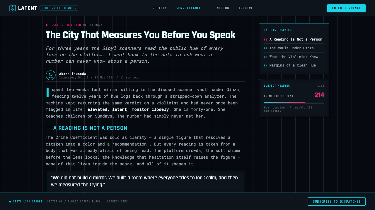
The background should feel like a void rather than a dark-colored canvas. It creates distance around every illuminated element and makes the display appear holographic, isolated, and watched. Large empty areas are essential: they suggest an interface with access to more information than it chooses to reveal. Avoid texture, scenic imagery, or decorative atmosphere that would make the ground feel warm, material, or inhabited.
Electric Cyan Vectors
Cyan is the default language of system vision. Use it for reticles, outlines, readings, directional marks, and technical diagrams so that the interface appears to be scanning or calculating in real time. The linework should be fine, controlled, and purposeful. It is not neon decoration; it is visual evidence of observation. Dense clusters can imply focus, while isolated marks can imply that a target has been singled out.
Threshold Magenta
Magenta-pink is reserved for the moment when neutral measurement becomes danger. Its rarity is its power. A gauge, warning segment, or sharp flare in this accent should communicate escalation immediately, without requiring a crowded alert treatment. If magenta is spread across navigation, body copy, and decoration, it loses the lethal-threshold logic that makes the palette distinctly Psycho-Pass-derived.
Hairline Frames and Reticles
Frames do not behave as containers with cozy boundaries. They behave as instruments: incomplete brackets, targeting corners, axis lines, and suspended delimiters that imply a system is locating an object. Let frames crop, point, and classify. Their apparent fragility makes the system feel more exacting, because even the smallest line seems to be placed by a precise evaluative process rather than by a decorative layout habit.
Holographic Separation
Elements should appear to hover at different conceptual layers without relying on soft naturalistic depth. Separate information through overlap, interruption, cropping, and unequal density. A reticle may sit across a data field; a warning gauge may cut through an otherwise calm composition. The goal is not realistic projection technology. It is the sensation that machine judgment occupies the same visual space as the subject while remaining detached from human touch.
Clinical Information Hierarchy
This style privileges status over ornament and judgment over personality. The most important reading should be immediately legible, while supporting marks establish that a larger surveillance process is active in the background. Typography and symbols should feel factual, concise, and procedural. Do not add playful illustrations, expressive stickers, or warm conversational cues. The interface gains force when it sounds as though it has already reached a conclusion.
Who shaped Psycho-Pass (Sibyl System)?
The approved source identifies Gen Urobuchi as a key figure associated with Psycho-Pass. Within this style guide, that association matters because the visual system is inseparable from the series’ central premise: a society in which the Sibyl System measures and judges citizens through Crime Coefficients. The interface should therefore retain the tension between technical readability and institutional judgment.
Naoyoshi Shiotani is named in the approved source as a key figure connected to Psycho-Pass. The series’ visual identity gives designers a disciplined model for dystopian interface work: cyan observation, near-black spatial isolation, and magenta escalation are not interchangeable accents. Together they make surveillance feel operative rather than merely cinematic.
Production I.G is the studio named in the source material for the 2012 Psycho-Pass television series. Its inclusion anchors the aesthetic in a specific anime work and setting: near-future Tokyo under Sibyl System governance. A faithful application should preserve that source distinction and avoid reducing the language to a generic dark science-fiction dashboard.
How do you use Psycho-Pass (Sibyl System) today?
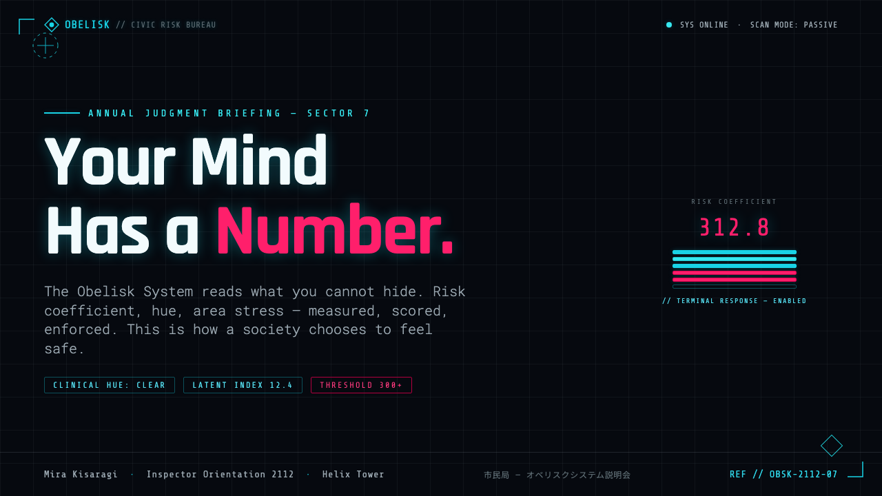
For presentation covers, use the near-black field as a stage for a single surveillance event. A cyan reticle, a fragmentary vector frame, or a controlled gauge can establish the premise before the title appears. Keep the title concise and let it feel indexed by the system rather than celebrated by a brand. On content slides, maintain a stable reading area in cyan or restrained light text, with fine structural marks used to group evidence and sections. Do not turn every slide into a targeting screen; the visual language is strongest when scanning elements appear only where they clarify the argument.
Data slides are a particularly natural setting for this aesthetic. Treat charts, values, and status summaries as readings under observation. Cyan can carry the baseline data and vector scaffolding, while magenta identifies only the value, segment, or condition that has crossed a consequential threshold. This creates a clear narrative distinction between normal system operation and escalation. The data should remain intelligible without the theme; the HUD layer should sharpen attention, not obscure labels or turn analysis into visual noise.
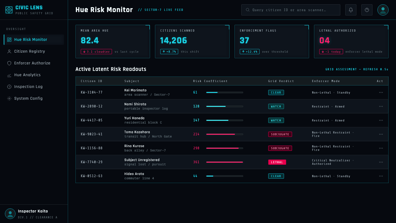
For web interfaces, the style suits dashboards, control surfaces, monitoring tools, and security-oriented product views, especially when users need to identify exceptions quickly. Start from a sparse near-black ground, establish cyan as the language of ordinary system state, and make critical conditions unmistakable through the reserved magenta accent. Cards should feel like instrument panels rather than lifestyle containers. Navigation can be quiet and factual, while frames, reticles, and clipped dividers identify what the system is currently examining.
Pricing or account-state pages can use the language more selectively. It can make plan comparison, access control, or usage monitoring feel precise and consequential, but a fully punitive treatment may be wrong for a commercial decision. Use the surveillance atmosphere to organize tiers and states, not to make ordinary choices look dangerous. Editorial and marketing layouts benefit from the style when the story concerns technology, risk, analysis, or speculative futures: large dark fields, cyan evidence marks, and a single threshold accent can build a strong campaign structure without needing dense imagery.
The common mistake is to treat Psycho-Pass as permission for indiscriminate neon cyberpunk. Filling every surface with glowing lines, frequent magenta, floating technical jargon, and decorative targets destroys the system’s hierarchy. Another mistake is making the interface cheerful, game-like, or overly friendly. The source language works because it withholds: blackness creates absence, cyan performs observation, and magenta announces a rare escalation. Preserve that sequence of calm measurement followed by alarm, and the style remains legible, tense, and specific.
Psycho-Pass (Sibyl System) — FAQ
Is this simply a generic cyberpunk HUD style?
No. It shares cyberpunk’s technological darkness, but its defining logic comes from the Sibyl System’s surveillance and judgment. Cyan represents routine machine observation across a near-black void; magenta-pink is reserved for a threshold associated with lethal force. A generic cyberpunk interface may use bright color everywhere for spectacle. A Psycho-Pass-derived interface is disciplined by the difference between observation and escalation.
Why should magenta be used so sparingly?
Because the source material gives magenta-pink a specific narrative function: it marks the gauge associated with lethal force and danger thresholds. If it becomes a general accent for buttons, decoration, and ordinary categories, viewers lose the instant sense that something exceptional has happened. Its visual heat depends on the calm cyan field around it. Reserve it for meaningful escalation, not routine emphasis.
Can the aesthetic work for a light-background interface?
A light-background adaptation may retain cyan vectors and threshold magenta, but it will lose a central part of the source image: glowing graphics suspended over a near-black void. The dark field supplies isolation, authority, and holographic separation. If a light interface is necessary, use the language as a limited monitoring mode or an embedded diagnostic panel rather than claiming the full Psycho-Pass Sibyl System effect.
What kinds of products fit this style best?
It is strongest where monitoring, analysis, anomaly detection, access control, or critical status are genuine parts of the product. Dashboards and control surfaces can use its hierarchy to separate ordinary readings from consequential alerts. It is less natural for warm, intimate, or playful experiences, because the style intentionally makes the system feel detached from the person being observed. Product meaning should justify that emotional distance.
How can designers keep the interface readable instead of making it feel overloaded?
Begin with the reading task, then add only the vectors that explain the system’s attention. Keep primary data, labels, and current status clear before introducing reticles or decorative fragments. Use empty near-black space as an active part of the composition, let cyan establish normal operation, and introduce magenta only when a threshold truly matters. The source aesthetic is sparse by design; visual restraint is what makes its warnings credible.
Related design styles
 Blade Runner 2049Noir with tectonic weight. Orange dust, cyan hairlines, and monumental Inter…
 Dead Space IshimuraLast light in the dark. Near-black rust cut by aqua holographic panels.
 Breaking Bad (2008)Precision turns dangerous. Hazmat yellow and element tiles cut through asphal…
 Kanjōzoku Loop RacerSpeed as contraband. Hot red numbers slice black tarmac with amber grid glare.
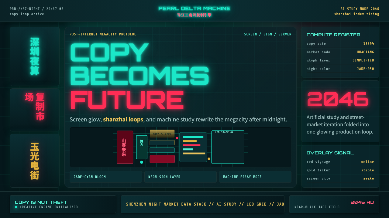 SinofuturismCopy becomes future. Jade-cyan grids, red signage, and Orbitron data stack th…
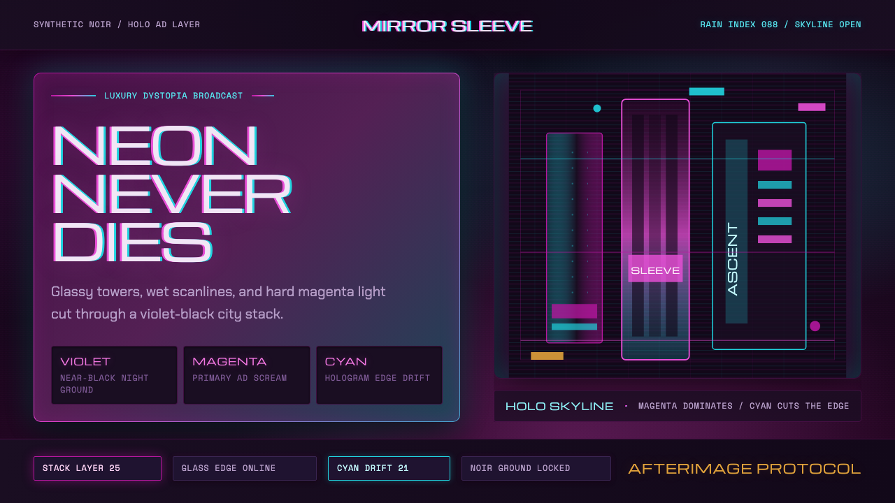 Altered CarbonNeon screams off noir. Magenta glass, cyan scanlines, and stacked vertical si…