What is Arknights?
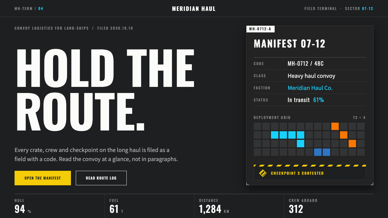
Arknights turned a mobile game menu into the working terminal of a mobile land-ship, where every color has exactly one job and hazard yellow is never decoration.
Arknights in brief
The Arknights interface style is the visual language of Hypergryph's 2019 tower-defense role-playing game, built around a single fiction: you are the Doctor, and the screens in front of you are the internal terminals of Rhodes Island, a pharmaceutical company whose headquarters is a land-ship crossing a ruined continent. Because the fiction is a workplace, the interface behaves like workplace software. Panels are translucent and charcoal, type is white, and information is laid out in labelled fields the way an operator dossier would be.
Several habits make the look instantly readable. Latin and Chinese characters share the same pale, neutral treatment. Capital letters are set wide, with generous space between them, and serial codes and file numbers run alongside the real content as if the ship were cataloguing everything. Layout is compartmentalised rather than flowing: a screen is a set of bays, each with a header, a thin rule and a short block of data, instead of one long paragraph of prose.
The most distinctive discipline is the rationing of color. Cyan marks what is currently selected. Orange marks the enemy or the thing that opposes you. Yellow-and-black hazard diamonds, borrowed from industrial safety signage, appear only where there is a genuine warning. Everything else stays in the quiet range between charcoal and white. A system built this way is closer to an instrument panel than to a poster, and that is exactly why it translates so well to dashboards, internal tools and data-dense products.

Where does Arknights come from?
Arknights was developed by Hypergryph, a studio based in Shanghai. The game launched in mainland China on May 1, 2019, and reached international players with its global launch on January 16, 2020. It belongs to the wave of Chinese mobile gacha games, a genre that combines collectible characters with a regular stream of events and a heavily polished presentation layer. Within that crowded field, Arknights is often singled out for the coherence of its interface, which treats the menu not as a wrapper around the game but as part of the world.
The people most often associated with the project are Huang Yifeng and Hai Mao, the latter known under the studio name Hai Mao Luo He Wu. Their game set out to be a tower-defense title where the story, the operators and the screens all spoke the same dialect. Rather than decorating the interface with fantasy ornament, the team leaned on a different lineage: industrial and military terminal design, the kind of grey-on-dark screens used in control rooms, together with the language of safety and hazard signage found on factory floors and construction sites.
That lineage explains the details. A hazard diamond in a game about disease, conflict and a travelling pharmaceutical company is not a stylistic flourish; it is a believable piece of equipment. Wide-tracked capitals and serial codes recall technical documentation and laboratory labels. The translucent panels suggest layered overlays on a larger operations display. Each of these choices could be justified from within the fiction, which is why the whole thing feels designed rather than themed.
The brand later extended beyond the game. An anime adaptation, Prelude to Dawn, arrived in 2022 and carried the same restrained palette and dossier-like typography into motion. The current visual identity, in use from the 2019 launch into the present, has remained recognisably stable, which says something about how well the underlying rules hold up. When a system can be described in a few sentences and still generate hundreds of screens, it has probably been designed around principles rather than around a mood board.
What defines the Arknights look?
Charcoal terminal panels
The ground is a dark, slightly translucent charcoal that lets a faint backdrop show through. Panels feel like overlays on a larger display rather than solid cards. Depth comes from layering and transparency, not from heavy shadows, so the whole interface stays flat, quiet and legible at a glance.
One job per color
Cyan means selected, orange means enemy or opposition, and yellow means danger. No color is allowed to wander into another role. This rationing is the heart of the system: because accents are scarce, each one carries real information, and a user learns the code after a few minutes.
Wide-tracked capitals
Labels, section titles and category names are set in capitals with generous letter spacing, a habit borrowed from technical manuals and equipment plates. The effect is calm and authoritative. Body text stays lighter and tighter, so the two registers separate cleanly.
Dossier-style fields
Information is broken into short labelled fields, the way an operator file lists name, role and status. Long paragraphs are avoided. This makes screens scannable, and it gives designers a ready-made rule for any data-heavy page: if it can be a field, it should be a field.
Hazard diamonds
Yellow-and-black diamonds echo industrial safety signage. They are the only truly loud element in the system, and they appear solely where something is genuinely wrong or irreversible. Used once or twice a screen, they stop a user in their tracks; used everywhere, they would mean nothing.
Serial codes as texture
Small catalogue numbers, file codes and fine rules run alongside the main content. They carry little meaning on their own but supply texture, scale and a sense of bureaucratic realism, so large empty areas never feel unfinished.

Who shaped Arknights?
Huang Yifeng is one of the creators most closely associated with Arknights and the studio's early direction. The decision to make the interface part of the fiction, rather than a neutral wrapper, belongs to the broader creative stance of the project he helped lead.
Hai Mao, working under the name Hai Mao Luo He Wu, is another key name tied to the game's creation and world. The coherence between story, characters and screens reflects the kind of integrated authorship the project is known for.
Hypergryph, the Shanghai studio behind the game, is the institutional author of the style. Its launch of Arknights in China in 2019 and worldwide in 2020, and the later anime Prelude to Dawn, carried one stable visual identity across media.
How do you use Arknights today?
For slides, the Arknights style works best as a briefing-room deck. A cover can use a dark translucent panel with a wide-tracked capital title and a single serial code in the corner. Content slides should be built as a small set of labelled bays rather than free-flowing bullets: a heading, a thin rule, and two or three short fields. Keep one accent per slide, and reserve the hazard yellow for a risk, a deadline or a number that must not be missed.
For data slides, the style is a natural fit. Charts can sit in a dark panel, with cyan for the series being discussed and orange for the benchmark or competitor. Axis labels and annotations in small wide-tracked capitals look like instrument readouts. Resist the temptation to add decorative gradients; the credibility of the look depends on restraint.
For web interfaces, think dashboards, admin consoles, monitoring tools, security products and anything with a status vocabulary. Navigation reads well as a column of labelled entries, selected states take the cyan accent, and destructive or alert states take the hazard treatment. Pricing pages can follow the dossier logic, with each plan presented as a file of fields instead of a marketing paragraph.
For editorial and marketing work, the style suits technical launches, game and tool landing pages, and any story that benefits from an organisational or fictional-institution voice. Short labelled blocks and catalogue numbers give a page structure without needing photography, which makes it a good choice when image budgets are small.
The most common mistake is spreading the accents around. If cyan, orange and yellow all appear in every component, the colors stop meaning anything and the page collapses into a generic dark theme. The second mistake is using hazard diamonds as ornament. Keep them rare, keep the charcoal quiet, and let the labelled fields do the talking.

Arknights — FAQ
What is the Arknights interface style in one sentence?
It is a dark, translucent charcoal terminal look with wide-tracked capitals, dossier-style fields and strictly rationed colors: cyan for selection, orange for the enemy and yellow hazard diamonds only for real warnings. It comes from Hypergryph's 2019 game and its fiction of a mobile land-ship headquarters.
Who made Arknights and when did it launch?
Arknights was developed by Hypergryph, a studio in Shanghai. It launched in mainland China on May 1, 2019 and globally on January 16, 2020. An anime, Prelude to Dawn, followed in 2022. Huang Yifeng and Hai Mao are the names most closely tied to the project.
Why are the colors so limited?
Because each color carries a meaning. When cyan always means selected, orange always means enemy and yellow always means danger, users read state instantly without labels. Using those colors for decoration would destroy the code, which is why the style treats them as scarce signals.
Is this style only suitable for games?
No. Its logic comes from industrial and military terminal design, so it transfers well to dashboards, admin tools, monitoring products, security software and technical landing pages. It is less suited to warm, playful or highly emotional brands, where its cool and procedural tone can feel distant.
How do I avoid making it look like a generic dark theme?
Keep the accents scarce and meaningful, set labels in wide-tracked capitals, break content into labelled fields rather than paragraphs, and use hazard yellow only for genuine warnings. The discipline of one job per color is what separates this style from simply being dark.
Related design styles
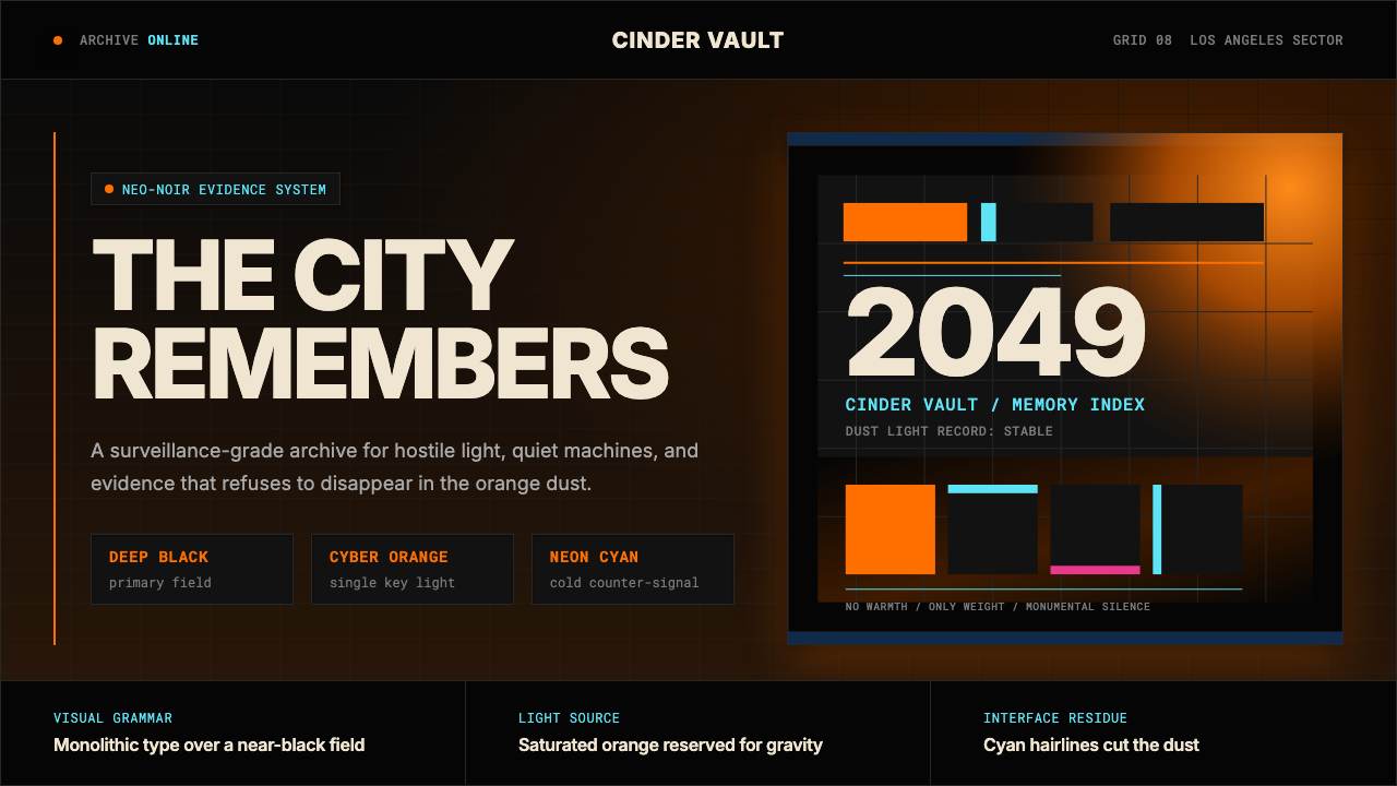 Blade Runner 2049Noir with tectonic weight. Orange dust, cyan hairlines, and monumental Inter…
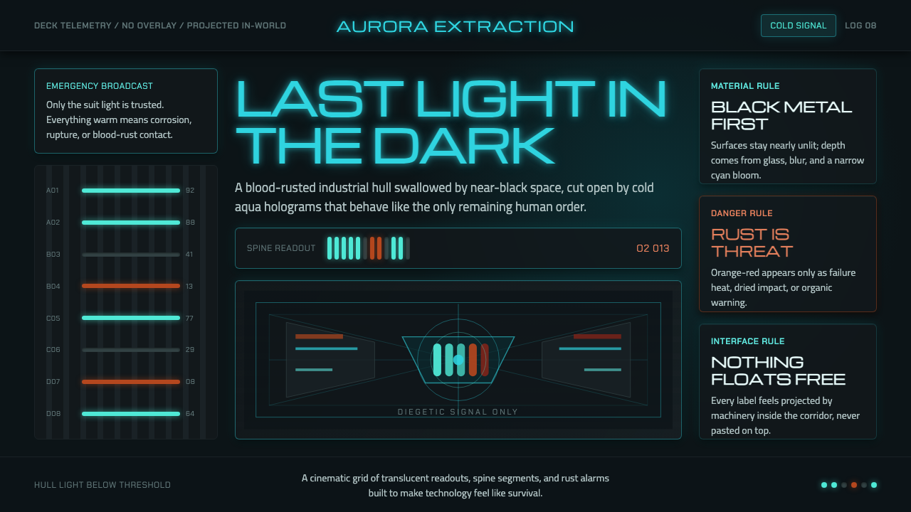 Dead Space IshimuraLast light in the dark. Near-black rust cut by aqua holographic panels.
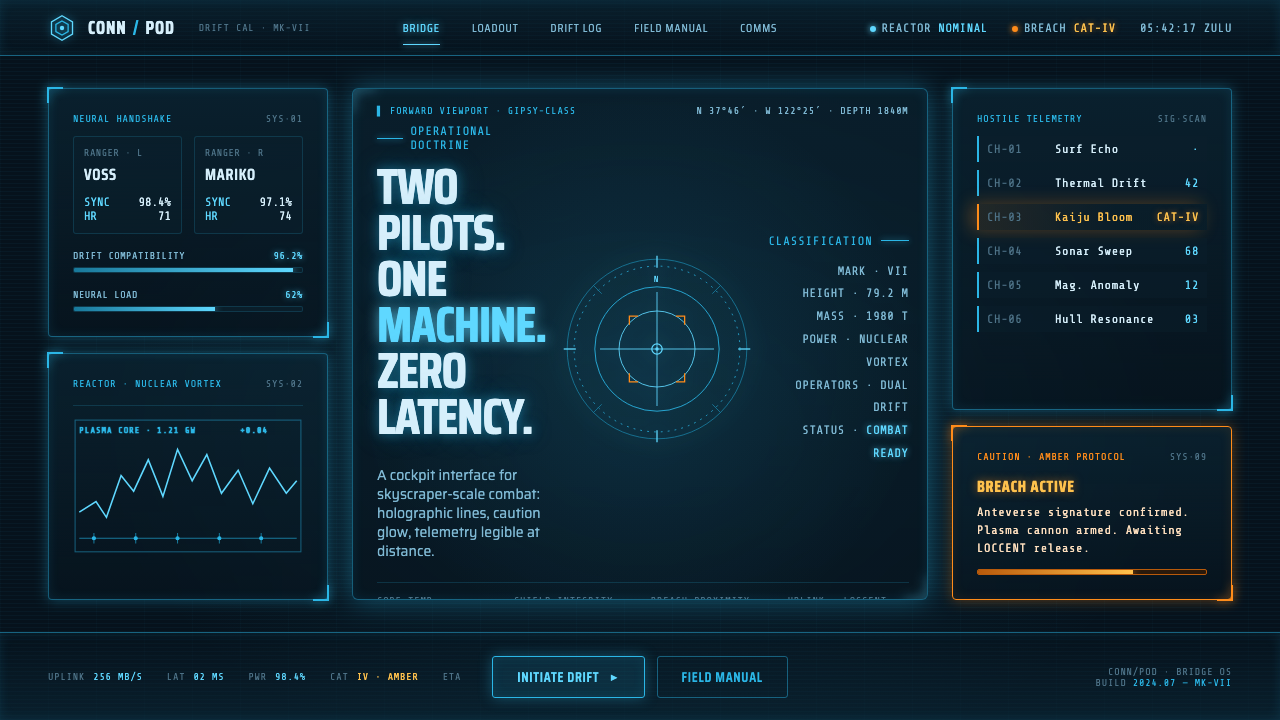 Pacific Rim Jaeger HUDTwo pilots, one machine. Faded Corsair-cyan holograms on near-black steel, am…
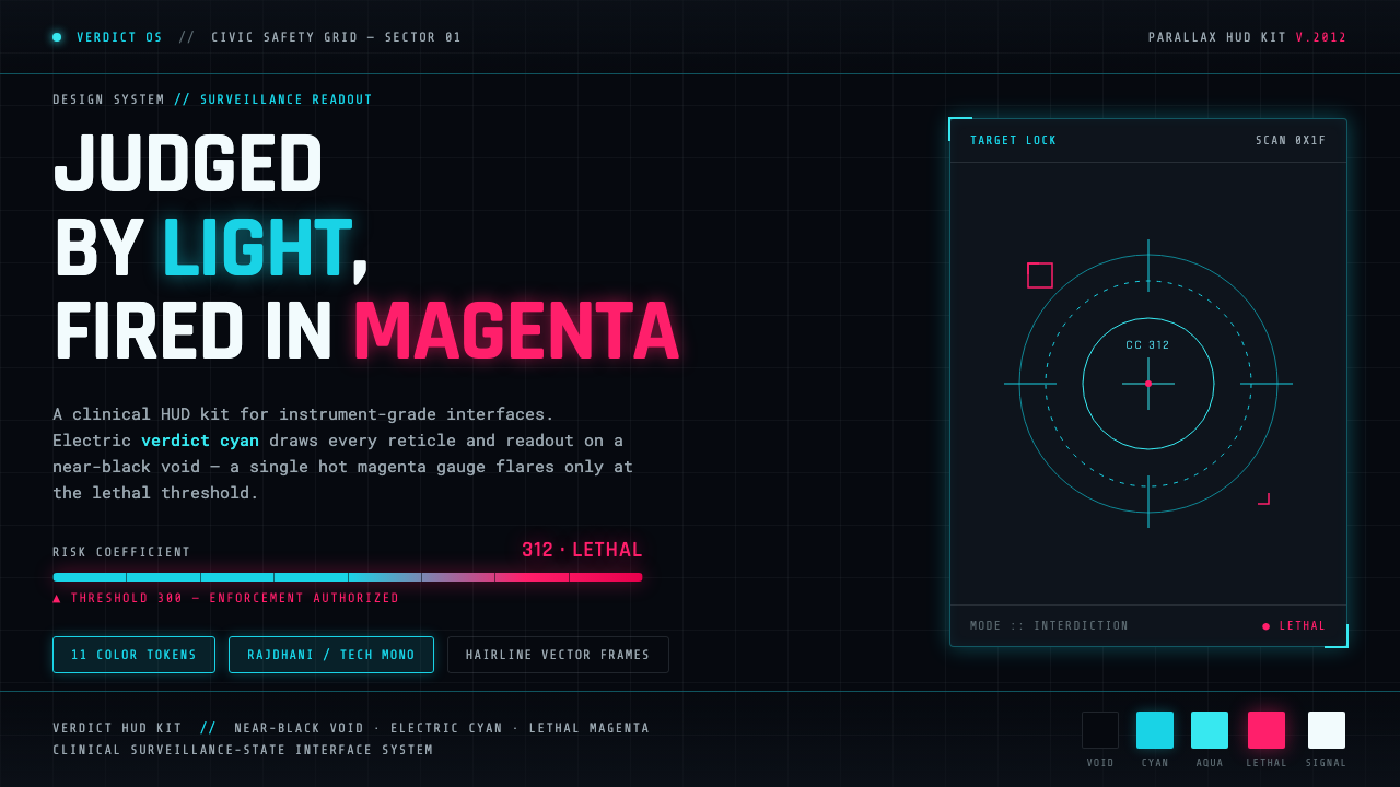 Psycho-PassA surveillance HUD. Cyan reticles on a near-black void; magenta flares only a…
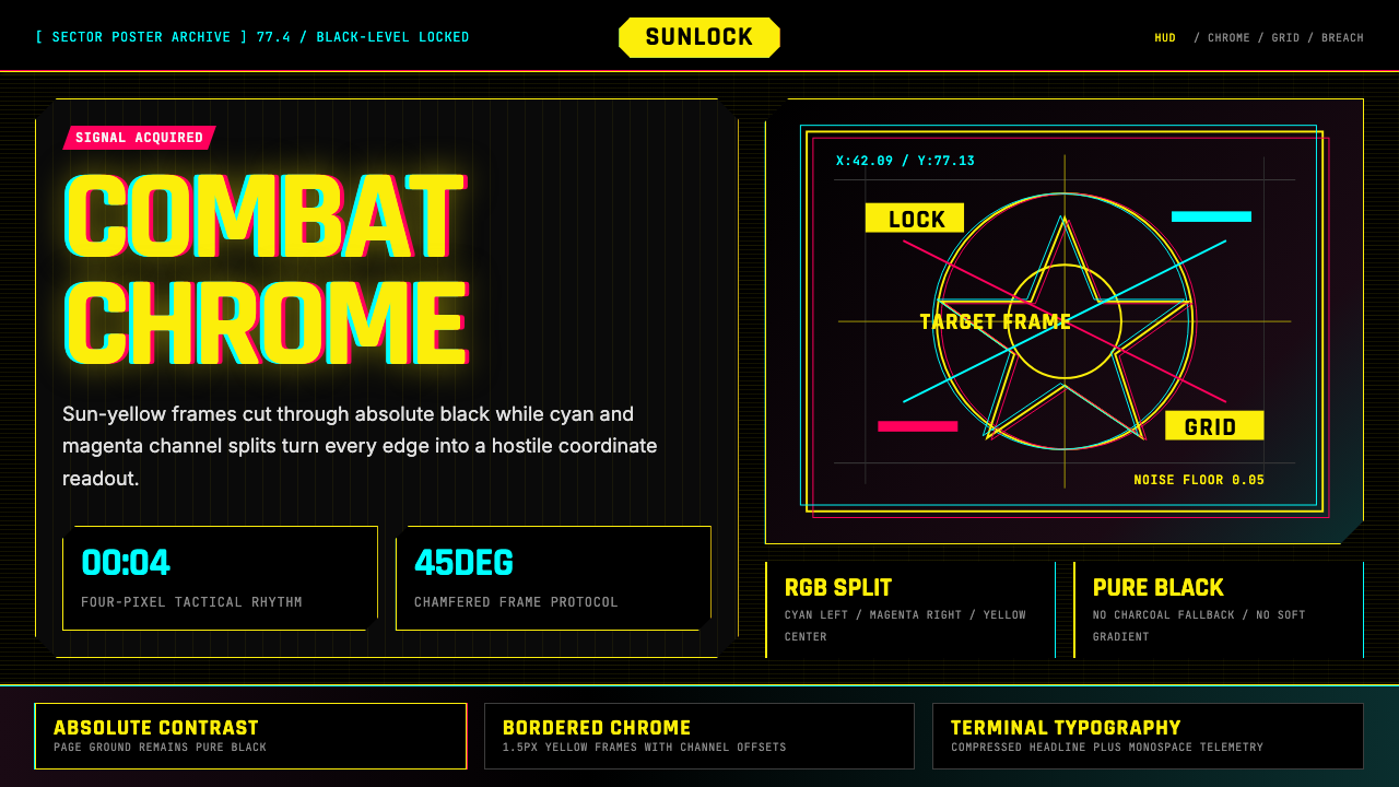 Cyberpunk 2077 Night City YellowCombat HUD on black. Sun-yellow chrome splits into magenta-cyan coordinate gr…
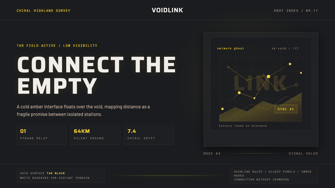 Death StrandingLonely connection, made visible. Amber HUD lines hover over a tar-black void.