What is Pacific Rim Jaeger HUD?
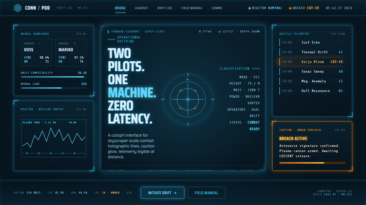
Pacific Rim Jaeger HUD turns a giant-mecha cockpit into disciplined visual pressure: cold cyan information suspended over near-black steel, with amber reserved for the moment the machine needs attention.
Pacific Rim Jaeger HUD in brief
Pacific Rim Jaeger HUD is a cinematic interface language derived from the Conn-Pod cockpit in Guillermo del Toro’s Pacific Rim, released in 2013. Its defining image is not a conventional screen but a dark steel chamber occupied by floating projections. Faded Corsair-cyan linework, translucent diagrams, targeting reticles, and status panels appear luminous against an almost black field, while amber light marks warnings and exceptional states.
The style treats information as an industrial instrument rather than a decorative digital surface. Panels feel projected into physical space, yet their structure remains legible through frames, brackets, lines, readouts, and wireframe overlays. The visual system suggests that an enormous machine is constantly measuring position, load, threat, and readiness, even when the interface is calm.
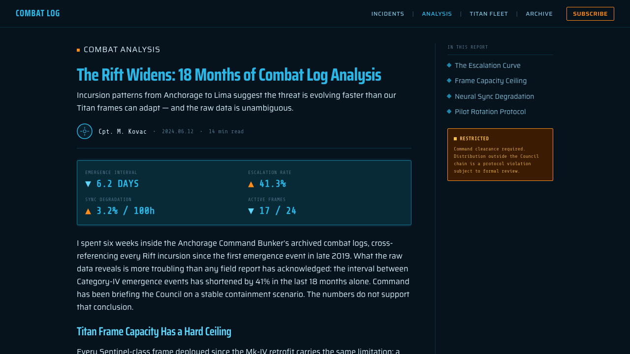
Its core discipline is the blue-and-orange split. Cyan carries normal operation, navigation, geometry, and machine status; amber interrupts that calm for caution, priority, or danger. The contrast is powerful because it is not distributed evenly. The cold system remains dominant, while the warm signal is scarce enough to feel consequential.
Where does Pacific Rim Jaeger HUD come from?
The language belongs to a near-future kaiju and mecha world, framed around the Pacific theatre and the PPDC. Pacific Rim presents the Jaeger not as a sleek consumer object but as a machine of immense industrial consequence. The Conn-Pod therefore needs to feel like a place where human operators confront scale, force, and risk through instruments that are both technical and theatrical.
Guillermo del Toro’s film establishes the larger visual premise: the cockpit is a dark steel shell, and the interface seems to hover inside it rather than sit politely inside rectangular monitors. This spatial treatment is central to the style. Information is layered in front of, around, and beyond the pilots, making data feel embedded in the act of operating a colossal machine.
Hybride Technologies created the cockpit visual effects identified with this environment. The resulting system emphasizes luminous, semi-transparent projections and line-based cyan holography rather than dense, opaque application windows. Its visual logic is less about imitating an office interface than about making technical information read clearly inside a dramatic industrial volume.
The faded Corsair-cyan designation points to the Vought F4U Corsair as a livery reference. That reference gives the interface color a material, aviation-adjacent character rather than a generic futuristic glow. Together with the amber caution signal, it produces a cockpit vocabulary that is cold, mechanical, and readable under pressure.
What defines the Pacific Rim Jaeger HUD look?
Near-Black Steel
The background is a near-black industrial shell, not an empty void. It should feel dense, metallic, and recessive enough for projected information to emerge from it. Large dark fields create depth through contrast and restraint, leaving the luminous system to define the active surface.
Cyan Holography
Faded Corsair-cyan is the normal language of the machine. It appears as luminous outlines, translucent panes, measurements, and technical marks. The color should read as cold and slightly weathered rather than candy-bright, preserving the sense of a working cockpit instead of a neon entertainment display.
Line-Based Information
The system privileges outlines over filled decoration. Frames, vectors, arcs, ruled divisions, and wireframes make complex information feel engineered. A line is rarely ornamental: it locates, connects, measures, brackets, or directs attention. This gives even abstract data the authority of a technical drawing.
Floating Layers
Panels and diagrams should appear suspended in a shared cockpit volume. Overlap is useful when it communicates depth, priority, or relation between systems. The effect depends on translucency and disciplined spacing: layers should feel simultaneous without collapsing into visual fog.
Reticles and Targeting
Targeting reticles provide the style’s strongest directional motif. Rings, crosshair-like marks, brackets, and converging guides turn an interface from a passive display into an active instrument. They work best when attached to a meaningful object, coordinate, or alert rather than scattered as generic science-fiction decoration.
Amber Exception
Amber is not a second decorative theme; it is the exception channel. Use it for caution, escalation, confirmation, or a state that needs to cut through the cyan baseline. When amber becomes commonplace, it loses urgency and the entire status-versus-warning distinction becomes unreadable.
Who shaped Pacific Rim Jaeger HUD?
Del Toro is the filmmaker associated with Pacific Rim and the Conn-Pod’s larger cinematic world. The relevant contribution is the premise of a giant-mecha cockpit as a dark, physical industrial chamber, where holographic information supports a sense of scale and operational intensity rather than replacing the machine with a clean digital abstraction.
Hybride Technologies created the cockpit visual effects for the setting. Its work is the direct source of the luminous semi-transparent projections, cyan wireframe language, reticles, and layered technical overlays that make the Conn-Pod HUD feel spatial rather than screen-bound.
The Vought F4U Corsair appears here as a livery reference for the faded Corsair-cyan identity. Its relevance is chromatic and referential: the name gives the cold blue holographic system a specific aviation-inflected association within the otherwise futuristic mecha environment.
How do you use Pacific Rim Jaeger HUD today?
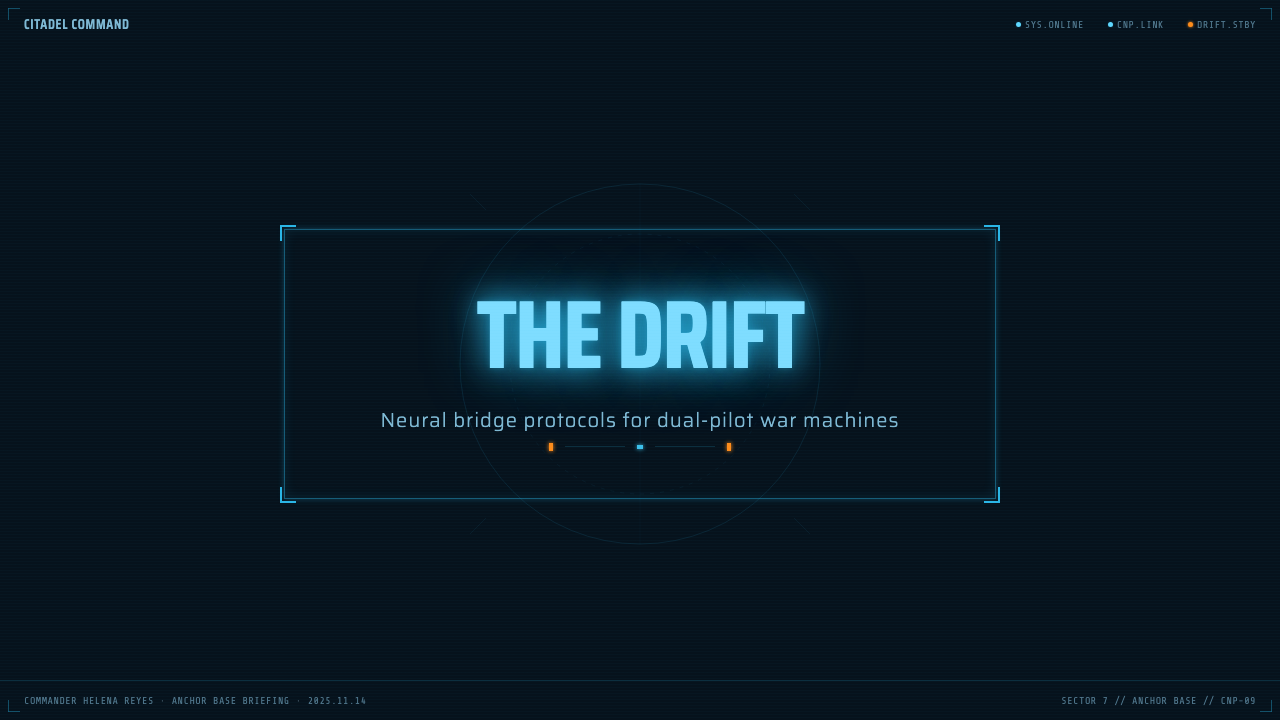
For presentation covers, use the Jaeger HUD language as a controlled stage rather than a full simulation. Let a near-black field carry a single large wireframe subject, reticle, or panel cluster, then place the title within the cyan system. On content slides, preserve a stable reading area and use lines, brackets, and faint translucent panels to organize sections. Data slides can turn charts into technical instrumentation: cyan carries baseline series and structure, while amber identifies the one comparison, threshold, or exception that matters.
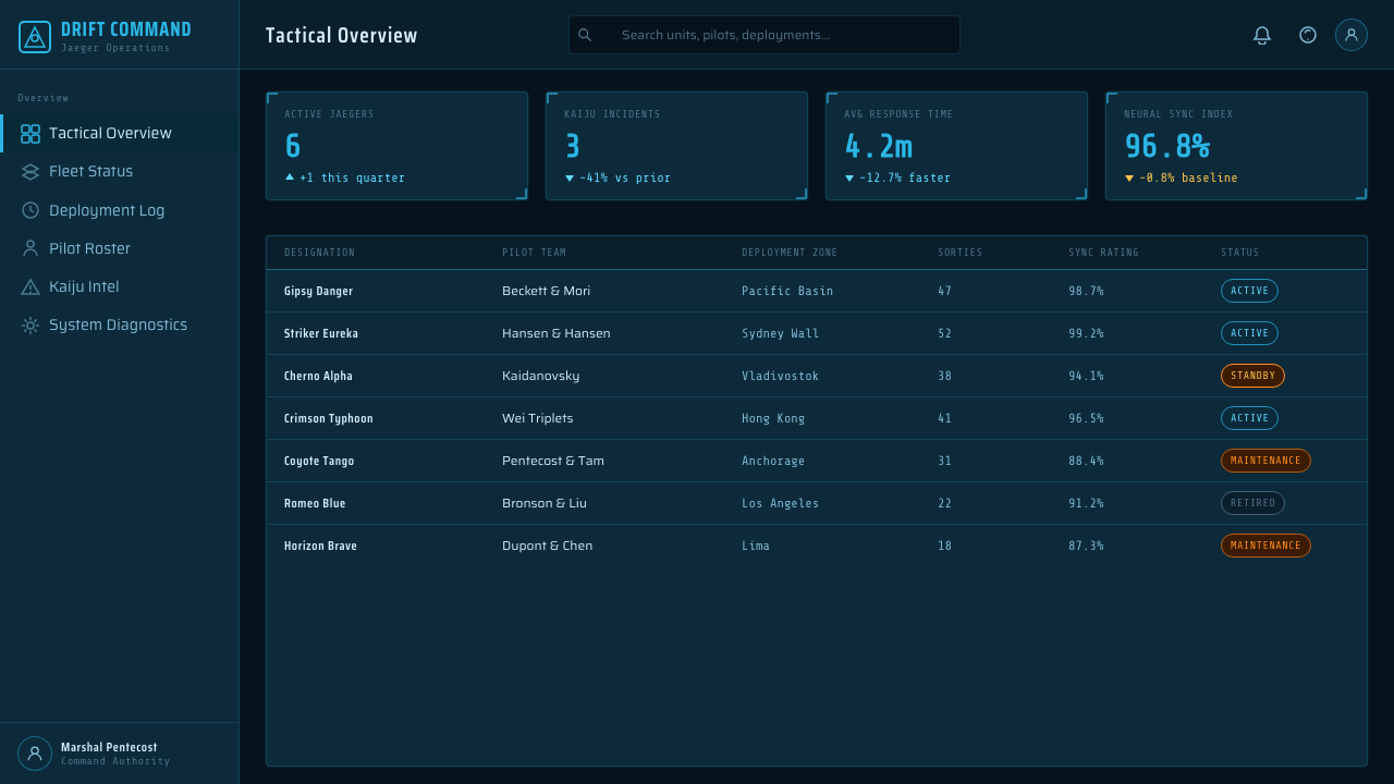
For web interfaces, the style is particularly effective for dashboards, monitoring tools, operational consoles, and products that benefit from an industrial command-center mood. Treat information hierarchy as the first priority. Navigation, controls, and values should remain unmistakably legible before any holographic treatment is added. Use the dark field to reduce visual noise, cyan to establish normal system continuity, and amber only where a user must make a decision or notice a changed condition.
For editorial and marketing work, this language can frame a launch, capability story, technical case study, or event experience with cinematic force. A feature image or product diagram can sit inside a wireframe field; short callouts can behave like instrument labels; section breaks can resemble projected scan lines or bracketed coordinates. The strongest executions retain generous dark silence around the information, allowing a few luminous marks to feel intentional rather than merely futuristic.
The common mistake is to make every component glow, move, overlap, and announce itself. That produces visual noise, not a Conn-Pod system. Do not use amber as a general accent, do not scatter reticles without targets, and do not bury ordinary reading tasks beneath decorative wireframes. The style succeeds when its spectacle is subordinate to operational clarity: a calm cyan baseline, a small number of purposeful layers, and a warm interruption that genuinely means something.
Pacific Rim Jaeger HUD — FAQ
Is Pacific Rim Jaeger HUD simply a generic cyberpunk interface?
No. Its central mood is industrial mecha operation, not urban digital excess. The system is rooted in a dark steel cockpit and organized around cyan holographic instrumentation, wireframes, and targeting structures. Generic cyberpunk often treats neon abundance as atmosphere; Jaeger HUD depends on restraint, technical purpose, and the explicit separation between normal status and amber warning.
Can this style work without animation or three-dimensional effects?
Yes. The essential qualities are contrast, layered transparency, line-based hierarchy, and meaningful warning color. A still composition can imply projection and depth through overlapping panels, faint wireframes, and carefully placed reticles. Motion may reinforce the cinematic reference, but it is not the system’s foundation and should never be required for basic comprehension.
Why should amber be used so sparingly?
Because amber carries the style’s interruption logic. Against a cold cyan system, it immediately reads as caution, priority, or changed conditions. If it appears on ordinary labels, decorative borders, and routine controls, the visual alarm loses its meaning. The most convincing layouts make amber feel like a decision point rather than a general source of warmth.
What products suit the Jaeger HUD language best?
It suits products where monitoring, systems thinking, technical performance, or command-and-control are part of the story: operational dashboards, analytical tools, game-adjacent experiences, technical demonstrations, and cinematic campaign pages. It is less suitable where calm warmth, softness, or broad everyday readability is the main value. The question is not whether the look is dramatic, but whether an industrial instrument metaphor helps the user understand the product.
Related design styles
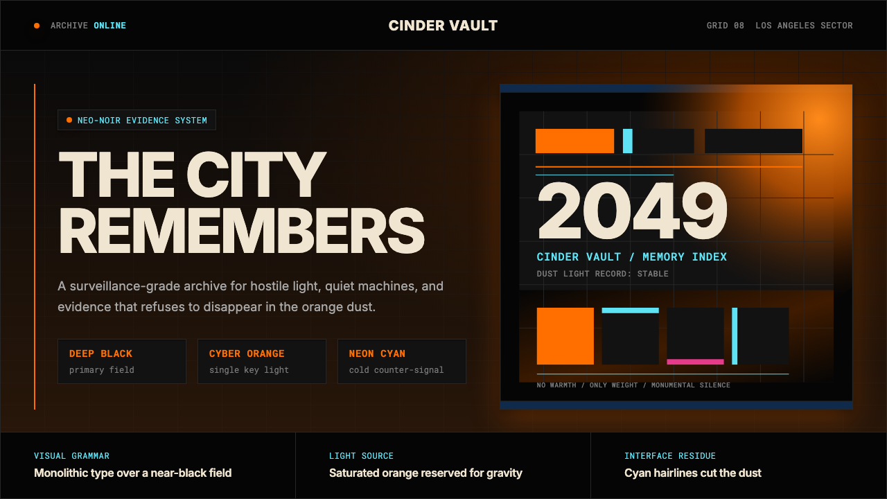 Blade Runner 2049Noir with tectonic weight. Orange dust, cyan hairlines, and monumental Inter…
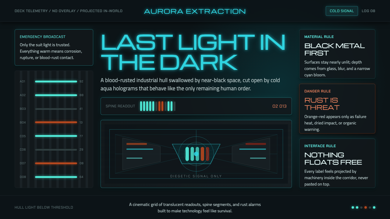 Dead Space IshimuraLast light in the dark. Near-black rust cut by aqua holographic panels.
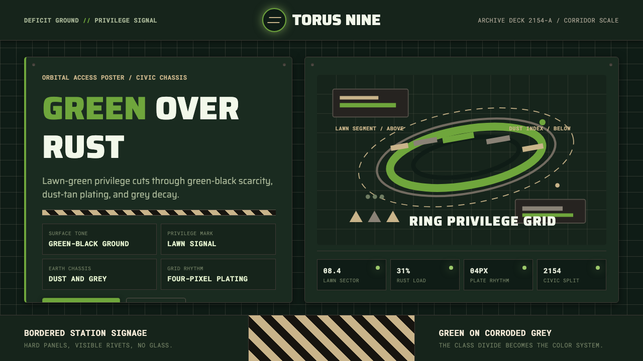 Elysium OrbitalClass divide made visible. Lawn green cuts through green-black plating and du…
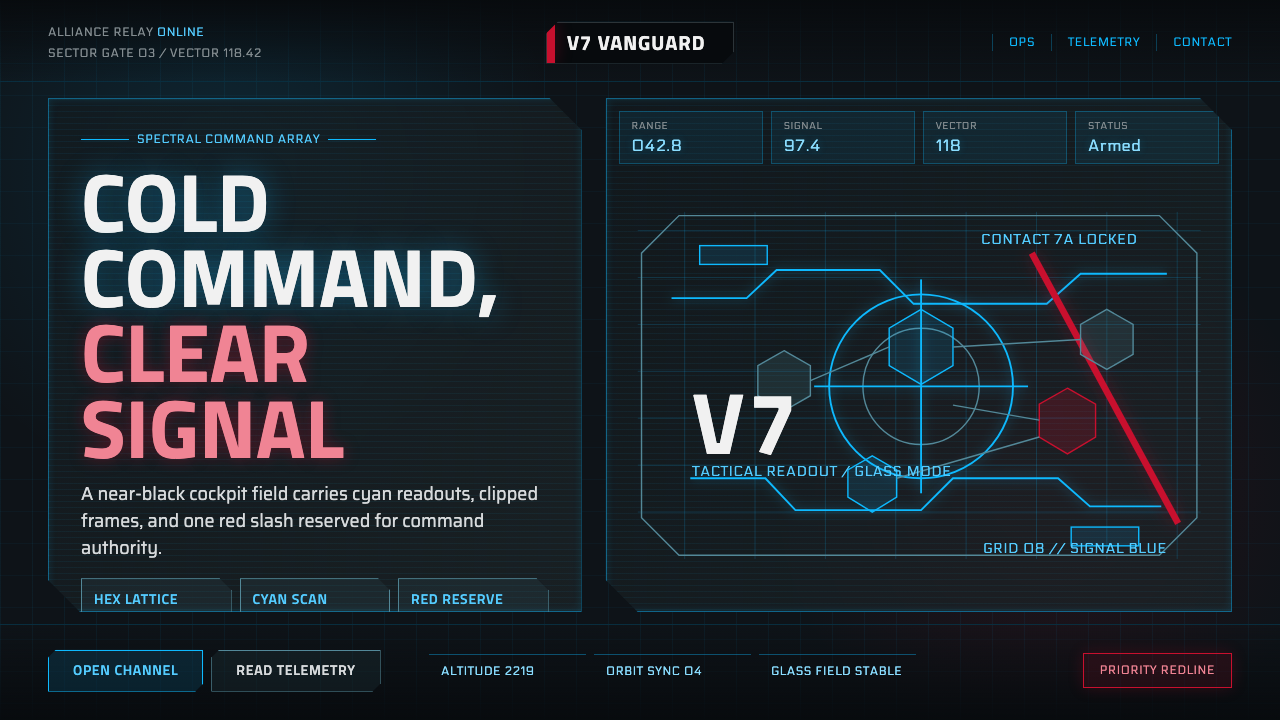 Mass Effect N7Cold military futurism. Cyan HUD grids on near-black glass, cut by one red st…
 Metroid Prime Scan VisorDiegetic helmet HUD on black glass. Amber reticles lock content, cyan telemet…
 Breaking Bad (2008)Precision turns dangerous. Hazmat yellow and element tiles cut through asphal…