What is Mass Effect N7?
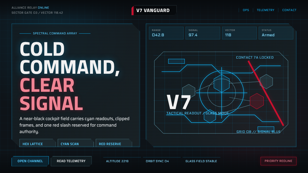
Mass Effect's N7 interface turns the cockpit glass of a starship into a design language — cyan holographic readouts on near-black glass, sliced by one disciplined red stripe.
Mass Effect N7 in brief
Mass Effect N7 is the visual system built around the in-universe user interface of BioWare's 2007 military science-fiction game Mass Effect — specifically the holographic overlays of the SR-1 Normandy's cockpit and the branding of the Systems Alliance's N7 special-forces designation. Where a lot of science-fiction interface design reaches for either sterile white minimalism or a chaotic wall of glowing dials, this system commits to something narrower and colder: a near-black field, thin cyan geometric readouts, and a single red accent reserved almost exclusively for the N7 brand mark and critical alerts.
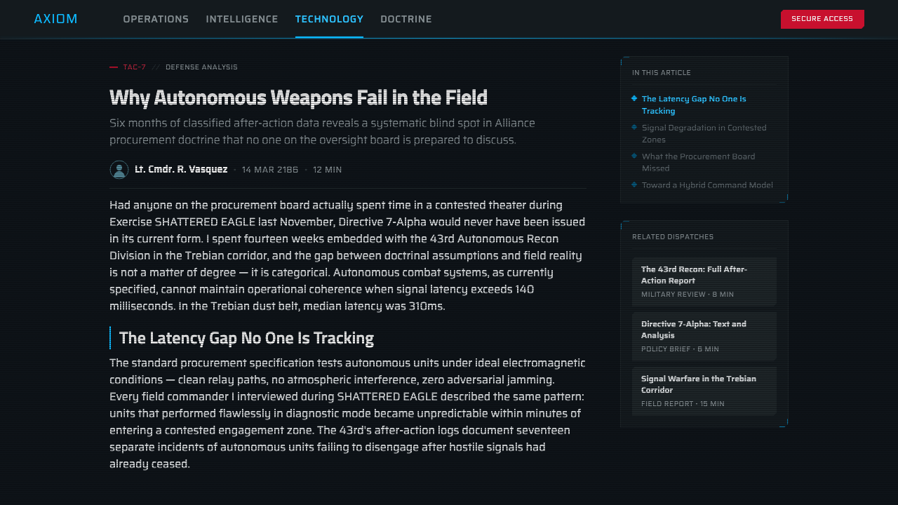
The visual logic borrows directly from military heads-up display conventions — cockpit glass, targeting reticles, radar sweeps — but pushes the geometry toward something more angular and deliberate than a real fighter jet's HUD. Corners are chamfered rather than rounded, lines are thin rather than bold, and everything sits on a backlit black console rather than a paper or screen surface. The effect is precise without being busy: information density is high, but it never becomes a wall of noise because the palette itself is so tightly rationed.
What makes the system transferable beyond its game of origin is that its restraint is structural rather than incidental. The near-black ground, the cyan-for-information / red-for-alert division of labor, and the angular chamfered geometry are rules that hold regardless of what specific content fills them — a targeting reticle, a dialogue menu, or a status readout are all built from the same small vocabulary of shapes and two colors, which is exactly what makes a military-futurist HUD feel coherent rather than like a pile of individually designed screens.
Where does Mass Effect N7 come from?
Mass Effect was released in November 2007 by BioWare, a studio based in Edmonton, Canada, that had built its reputation on narrative-driven role-playing games. Mass Effect was conceived as a science-fiction space opera in the tradition of military sci-fi — closer in tone to Battlestar Galactica or Aliens than to the brighter, more utopian register of something like Star Trek. That tonal choice mattered directly to the interface design: the game's galaxy needed to feel militarized, bureaucratic, and technologically plausible rather than gleaming and idealized, and the UI design decisions followed from that brief.
The game's art direction was led by Derek Watts, BioWare's art director, working alongside a design team that included Preston Watamaniuk on systems and interface design. Casey Hudson served as project director and had a direct hand in shaping the tone of the Normandy's cockpit and the overall 'lived-in military spacecraft' feeling that the interface needed to support. The design brief was explicit: the player needed to feel like a soldier looking at genuine mission-critical equipment, not a civilian looking at a consumer gadget, and every interface decision — from color restriction to the angularity of the frames — served that goal.
The N7 branding itself, the red stripe and lettering that gives the system its name, refers to an in-universe designation: N7 is the highest qualification a Systems Alliance special-forces soldier can earn, roughly analogous to a real-world special-operations badge. The choice to make this specific piece of branding the system's single reserved use of red — rather than scattering red throughout the interface as a generic accent — was a deliberate hierarchy decision. Red had to mean something specific (elite status, or danger) rather than being available for generic decoration, which is why alert states and the N7 mark are the only places it consistently appears against the cyan-on-black field.
Mass Effect arrived at a moment, 2007, when science-fiction game and film interfaces were shifting away from the chrome-and-glass aesthetic of the late 1990s and early 2000s toward something more diegetic — interfaces that looked like they existed as real, physical hardware inside the fiction rather than as an abstract overlay for the player's benefit. The cockpit-glass framing device, where HUD elements appear to be etched onto or projected against actual glass rather than floating free in space, was part of that broader shift toward interfaces that had to make sense as objects a character could plausibly be looking at, not just information a player needed to see.
What defines the Mass Effect N7 look?
Color
The ground is near-black, functioning as backlit console glass rather than a neutral canvas. Cyan carries almost all information display — readouts, reticles, scan-lines, hexagonal data nodes — while red is rationed to exactly two roles: the N7 brand mark and alert or danger states. There is no tertiary accent color; the entire system runs on this two-color division of labor against black, which is what keeps a dense interface legible rather than noisy.
Typography
Lettering is geometric and techno-industrial in feel, built from clean, evenly weighted strokes that read as etched or laser-cut rather than hand-drawn. Labels tend toward compact, all-capital treatments reminiscent of stenciled military equipment markings. Numerals and codes carry equal visual weight to labels, reinforcing the sense that every piece of text is functional data rather than decorative branding.
Geometry and Framing
Frames are angular with deliberately chamfered — cut-off, not rounded — corners, a small but consistent geometric signature that distinguishes this system from the rounded-corner conventions of most consumer software interfaces. Thin reticles and scan-lines cross the field at precise angles, and hexagonal shapes appear repeatedly as data-node motifs, giving the system a crystalline, mechanical rather than organic character.
Layering and Depth
Depth is communicated through overlapping translucent panels rather than shadows or gradients — a readout panel appears to float slightly in front of the black glass behind it, implied by a thin glowing edge rather than a drop shadow. This layering mimics how a real holographic projection would behave: light and edge, not occlusion and cast shadow, is what tells the eye one element sits in front of another.
Restraint and Density
Despite a high volume of simultaneous readouts — status bars, targeting data, system diagnostics — the interface never feels cluttered, because every element is constructed from the same narrow vocabulary of thin lines, chamfered rectangles, and hexagons in only two colors. Density is managed through consistency of form rather than through empty space, which is what distinguishes this system from sparser minimalist interfaces.
Red as Signal, Not Decoration
Red never appears as a generic accent color the way it might in a typical interface's call-to-action buttons. It is reserved specifically for the N7 brand mark and for alert or critical states, which means its every appearance carries meaning — the viewer learns to treat red as a signal worth pausing on, precisely because the system never wastes it on ordinary content.
Diegetic Materiality
The interface is designed to look like it exists as a real object within the fiction — projected onto or etched into physical cockpit glass — rather than as an abstract overlay for the player's convenience. This diegetic commitment shows up as subtle scan-line texture, faint glass reflections, and readouts that appear to be viewed at a slight angle rather than presented flat-on, reinforcing the sense of a physical console rather than a floating menu.
Who shaped Mass Effect N7?
Hudson served as project director on Mass Effect and shaped the game's overall military-science-fiction tone, directly influencing the decision to make the Normandy's interface feel like functional mission hardware rather than a stylized consumer display. His direction prioritized plausibility and restraint over visual spectacle for its own sake.
As BioWare's art director, Watts oversaw the visual language of Mass Effect's universe, including the cockpit and HUD design that grounds the N7 aesthetic. His work established the near-black, cyan-dominant palette as the studio's signature approach to conveying a militarized, technologically advanced setting without resorting to clichéd chrome-and-glow science-fiction tropes.
Watamaniuk worked on systems and interface design for the Mass Effect series, contributing to the functional logic behind the HUD's information hierarchy — how targeting data, dialogue options, and status readouts were organized within the same restrained visual vocabulary so the interface stayed legible under the pressure of real-time combat.
How do you use Mass Effect N7 today?
Mass Effect N7 works best wherever a brand or product wants to communicate precision, authority, and technical competence without warmth — the opposite emotional register from most consumer software, which usually reaches for approachability. Because its discipline is structural (a two-color division of labor, chamfered geometry, a near-black ground), the system translates cleanly to flat digital media even though it originated as an in-fiction physical console.
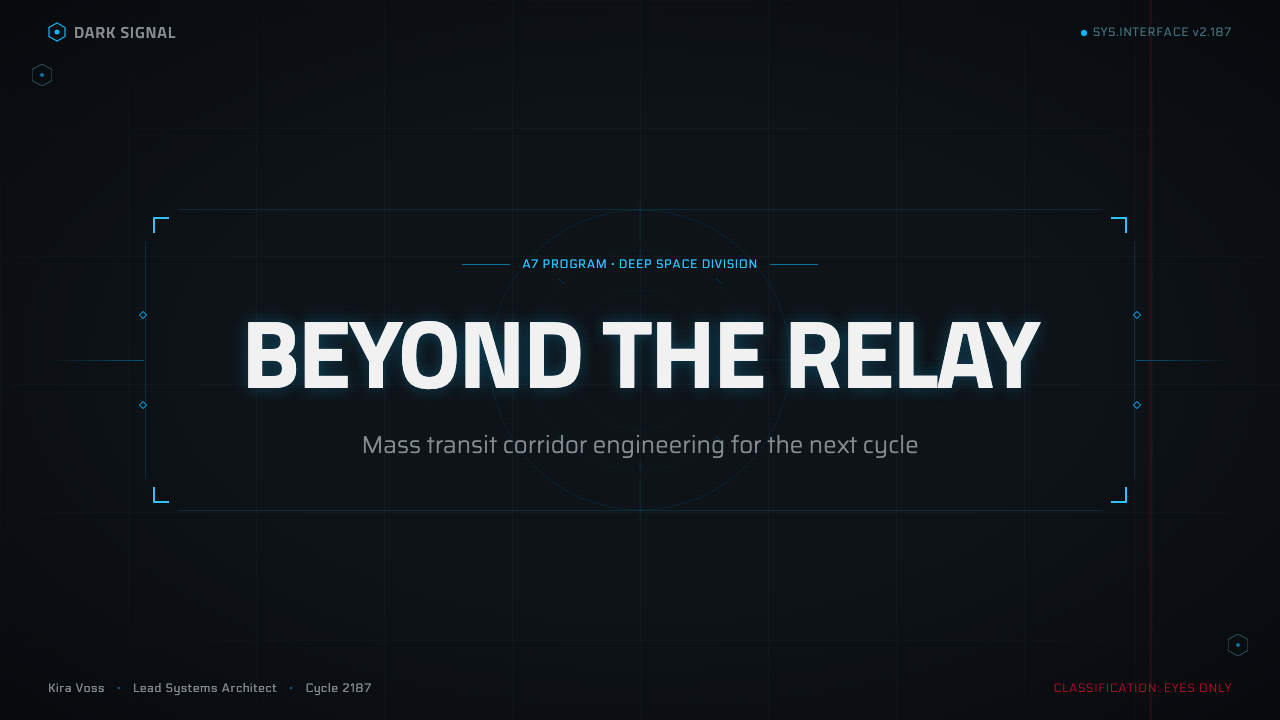
For presentation slides, this system suits a cover page built on a near-black field with a single cyan geometric motif — a chamfered frame, a thin reticle line — anchoring the composition, and the N7 red reserved for a single title accent or logo mark rather than spread across the page. Content slides should keep body copy in cyan or light neutral tones against the black ground, use chamfered rectangles rather than rounded cards to frame data blocks, and hold red back entirely unless a slide genuinely needs to flag a warning, a risk, or a critical metric — treating every red element as an alert keeps the hierarchy legible the way it does in the source material.
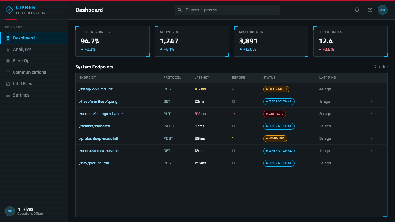
For web interfaces, the system is well suited to dashboards, monitoring tools, and technical products where a dark, high-precision aesthetic reinforces the sense of serious infrastructure — status pages, security consoles, developer tooling. Cyan should carry the bulk of interactive elements and data visualization, black or near-black should be the dominant background, and red should be held in reserve exclusively for error states, critical alerts, or a single branded accent, never for routine buttons or links.
For editorial and marketing work aimed at gaming, technology, or science-fiction audiences, the system supports a cold, authoritative tone well suited to product launches, technical announcements, or anything wanting to signal 'engineered with precision.' Photography or illustration paired with this system should favor cool lighting and hard-edged forms rather than warm tones or soft focus, since warmth undercuts the militarized, glass-cockpit feeling the palette depends on.
A common mistake when applying this system is treating cyan and red as interchangeable accent colors, using red liberally for buttons, links, or general branding the way a typical UI kit would. This collapses the entire hierarchy that gives the source material its clarity — red only works because it is rare. A second common mistake is rounding every corner for a friendlier feel; softening the chamfered geometry erases the angular, military-precision signature that separates this system from generic dark-mode dashboards.
Mass Effect N7 — FAQ
Is Mass Effect N7 just a generic 'sci-fi dark mode' style?
No. Generic sci-fi dark modes usually just mean dark backgrounds with neon accents in any bright color. This system is more specific: near-black ground, cyan for essentially all information display, red rationed to exactly two roles (brand mark and alerts), chamfered rather than rounded geometry, and layering communicated through glowing edges rather than shadows. The strict two-color discipline and the chamfered corner signature are what separate it from a loosely 'neon cyberpunk' aesthetic, which tends to mix multiple saturated neon hues freely.
Why is red used so sparingly in this system?
Because red's value depends entirely on its scarcity. In the source material, red is reserved for the N7 brand designation and for genuine alert or danger states, which trains the viewer to treat any red element as significant. If red were used freely — for ordinary buttons, decorative accents, or general branding — it would lose that signaling power and the whole hierarchy the palette depends on would collapse into visual noise.
Does this style require a black background, or can it work on light backgrounds?
The near-black ground is a core structural element, not an optional preference — it is what makes the cyan readouts read as backlit glass rather than printed ink, and it is essential to the 'cockpit console' feeling the system depends on. Attempting a light-background version would require rebuilding the entire logic from scratch, since the glow, layering, and holographic quality that define the system only make visual sense against darkness. This is not a style that translates to a light theme.
How does this system differ from other cyan-and-black military HUD aesthetics in other games or films?
Many military-futurist interfaces use a cyan-on-black palette broadly, but Mass Effect N7's specific signature is the combination of chamfered (not rounded, not sharply pointed) geometry, hexagonal data-node motifs, and the strict single-role reservation of red for brand and alert use only. Other properties in the same broad genre often let their accent color do more general duty, or favor a rounder, softer console geometry. It is the combination of all these specific choices together, not any single one, that identifies this particular system.
Is this style suitable for consumer-facing products aimed at a broad, non-technical audience?
Generally not as a primary interface style — its coldness and technical precision can read as intimidating or unapproachable to audiences expecting warmth or simplicity, such as retail, hospitality, or wellness products. It is much better suited to audiences that already value or expect technical seriousness: gaming, developer tools, security products, or technology brands specifically wanting to signal engineering rigor. Used as an occasional accent — say, a single dashboard panel within a broader friendly product — it can work, but as the dominant tone across an entire consumer product it risks alienating users who are not already primed to read coldness as a positive trait.
Related design styles
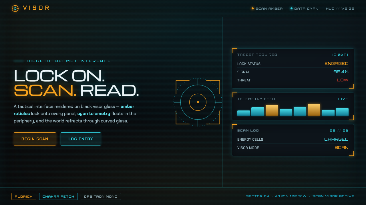 Metroid Prime Scan VisorDiegetic helmet HUD on black glass. Amber reticles lock content, cyan telemet…
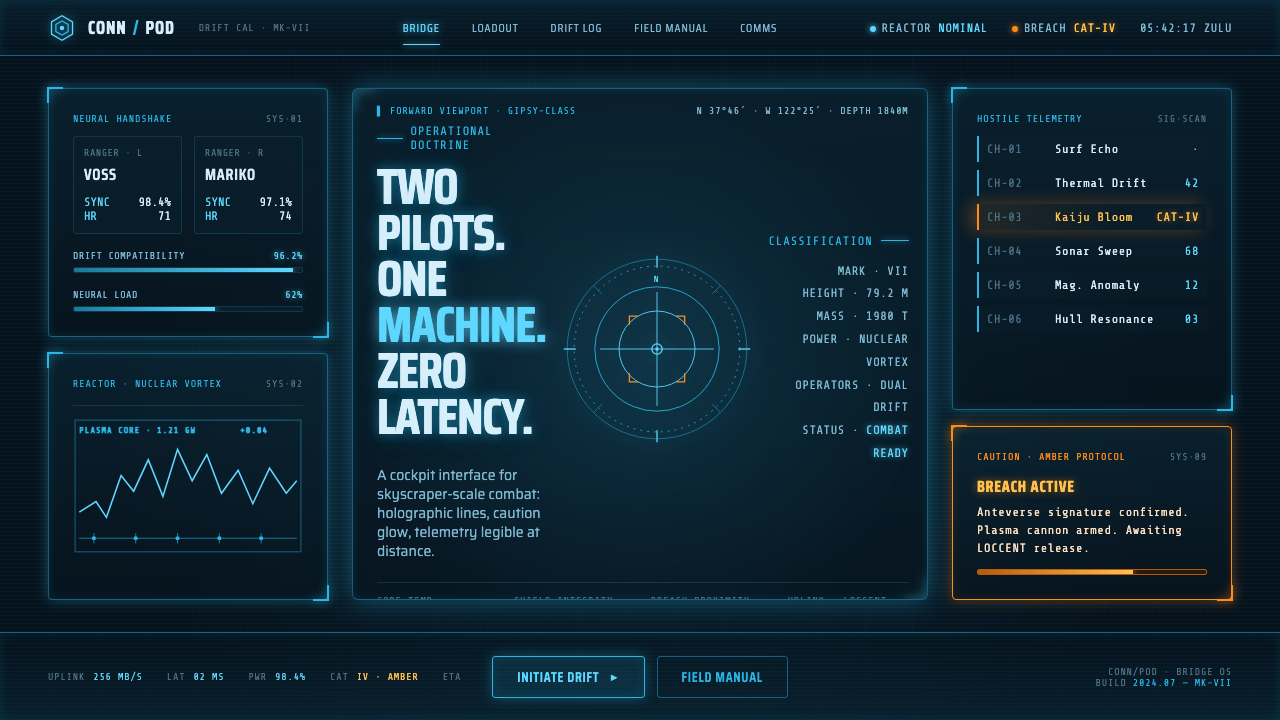 Pacific Rim Jaeger HUDTwo pilots, one machine. Faded Corsair-cyan holograms on near-black steel, am…
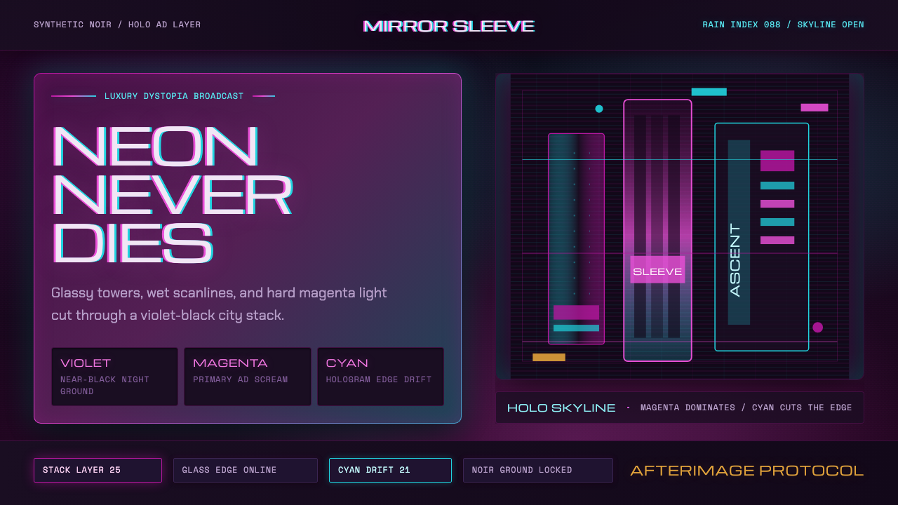 Altered CarbonNeon screams off noir. Magenta glass, cyan scanlines, and stacked vertical si…
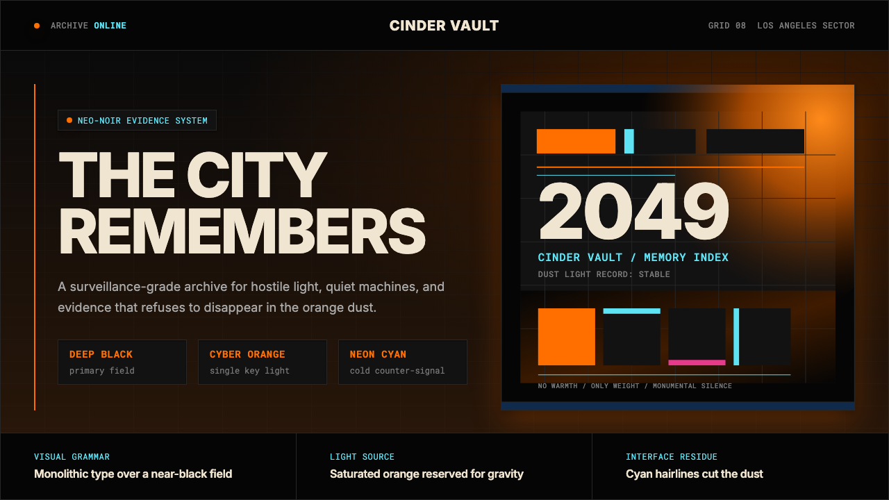 Blade Runner 2049Noir with tectonic weight. Orange dust, cyan hairlines, and monumental Inter…
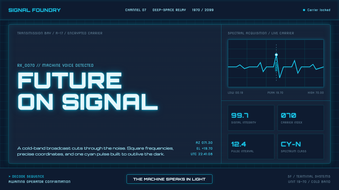 Data 70 Techno DisplayThe machine speaks in light. Cyan CRT type burns through a gridded blue-black…
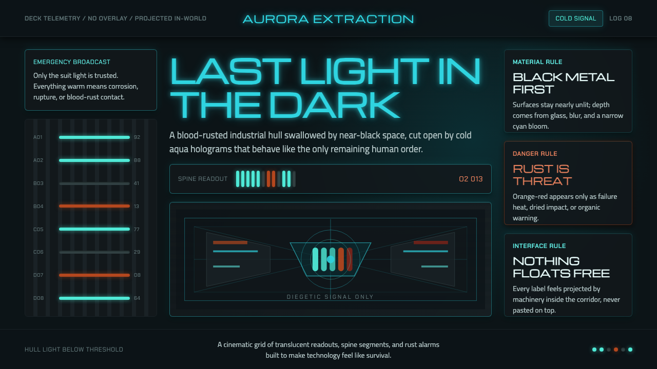 Dead Space IshimuraLast light in the dark. Near-black rust cut by aqua holographic panels.