What is Death Stranding?
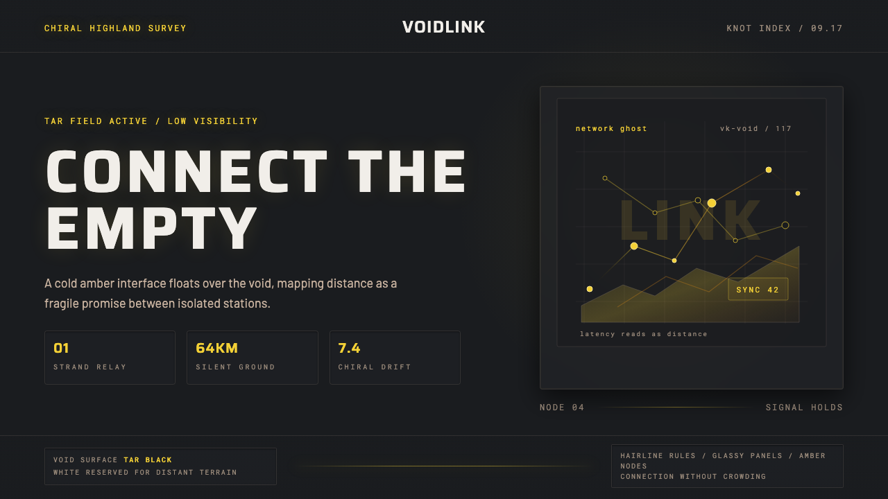
Death Stranding's visual language is built on a single, haunting contrast: the near-black void of chiral tar against translucent amber holography that seems to hover in mid-air, cold and precise and impossibly lonely.
Death Stranding in brief
Death Stranding is a 2019 action game directed by Hideo Kojima and developed at Kojima Productions. Its visual design system — dark void grounds, amber chiral holography, hairline HUD rules, monospace technical readouts, and engraved all-caps gothic letterforms — creates one of the most immediately recognizable interface aesthetics in contemporary game design. The style has since crossed into application design, dark-mode dashboards, and science-fiction UI references worldwide.
The design philosophy centers on what the game calls the 'chiral network': connections that are fragile, invisible, and precious. The interface makes this legible. Amber-gold lines on near-black convey the sense that every data point is a lifeline stretched across an abyss. Nothing is decorative. Every readout, every gauge, every hairline border exists because some piece of information is being delivered to a person who is very far from any help.
Aesthetically, the system draws from military telemetry, geological survey instruments, and scientific field equipment — not from consumer electronics. The typography is monospaced and capitalized, as if drawn from a seismograph printout or a deep-sea monitoring terminal. The color palette is binary: the tar-black void and the amber glow. Between them, the moss-pale whites of distant Icelandic landscape appear as a reminder that the natural world still exists somewhere beyond the interface.
Where does Death Stranding come from?
The aesthetic of Death Stranding emerged from a precise creative brief: Hideo Kojima wanted the game's world to feel geologically ancient and institutionally cold at the same time. The setting — a post-catastrophic version of the United States whose landscape was modelled on Iceland's volcanic highlands — demanded an interface that felt like scientific field equipment: authoritative, stripped of comfort, designed by people who cared only about function and survival. The tar-black void that underlies every UI panel references the 'Death Stranding' event in the game's fiction, a catastrophic merging of the living world with the realm of the dead. The visual darkness is not stylistic — it is narrative.
Kojima Productions worked with concept artist Yoji Shinkawa, whose background in drawing mecha and military equipment runs through much of the game's hardware design, and with interface and UX designers who drew heavily from real-world scientific instrumentation. The amber-gold used for chiral holography was selected not for visual warmth but for its association with geological and biological imaging: amber is the color of scientific specimen jars, of resin-preserved insects, of things held in suspension between one state and another. In the game's story, chiral matter exists in a liminal state between the living and the dead — the color choice is precisely that literal.
Iceland provided the single most important visual reference. Shoots conducted in Iceland for the game's motion capture and visual development gave the team direct experience of a landscape that looks both primordially old and completely inhospitable — vast, flat, dark basalt plains broken by pale lichen and distant glacial white. The decision to make the presentation surface of the interface the dark basalt rather than the sky or the light reversed the conventional game UI logic: most interfaces are designed as overlays on a lit world; Death Stranding's interface is itself the darkness, and the content floats within it.
The game was released in November 2019 on PlayStation 4, directed by Hideo Kojima and published by Sony Interactive Entertainment. It arrived as a landmark statement in the aesthetics of isolation: every visual decision, from the monospace typography to the amber holography to the hairline rules, was resolved around a single emotional truth — connection across distance is precious because distance is vast and the void is real.
What defines the Death Stranding look?
The Void Ground
The presentation surface is near-absolute darkness — not a neutral dark gray but a deep, absorbing black that reads as material, like tar or basalt or the surface of still water at night. UI panels do not sit on a background; they float within a void. This inverts the standard interface logic where dark is used for contrast against a light ground. In Death Stranding's system, light is the signal and dark is the medium — the darkness is not empty but full of presence.
Amber Chiral Holography
All active UI elements — gauges, readouts, maps, status indicators — are rendered in translucent amber-gold. The translucency is crucial: these elements appear to be projected light, not solid panels, which reinforces the sense that the interface is fragile and temporary, a signal struggling to maintain itself across distance. The amber hue is warm enough to be visible against black without becoming harsh, and its association with preservation — specimen jars, geological resin, biological amber — gives the color a quality of things suspended in time.
Hairline Rules and Technical Precision
The structural vocabulary of the interface is built from extremely fine lines — borders, dividers, gauge tracks, map grids — that are drawn at the minimum weight required for legibility. This hairline quality signals precision-instrument aesthetics: the lines feel measured and deliberate, as if each one was placed to carry exactly as much information as possible with no weight to spare. The result reads as scientific rather than designed, functional rather than styled.
Monospace Technical Typography
All numerical readouts, status labels, and system identifiers are set in monospaced typefaces in full caps. Monospace is chosen not for retro effect but because it carries the correct register: military telemetry, scientific logging, seismographic printout. The fixed-width spacing of monospace type also creates a natural visual grid within text strings, making numbers and codes scannable at a glance. There are no display typefaces used for expressive purposes — typography is purely instrumental.
Engraved Gothic Labeling
Where longer labels or equipment names appear, the style uses condensed gothic letterforms — tall, narrow, all-caps — that read as engraved or stamped rather than printed. This gives the impression of military stenciling and industrial marking, as if the equipment itself has been labeled in a factory rather than on a design screen. The condensed proportion allows for long identifiers in small spaces without scaling down to illegibility.
Naturalist Negative Space
The pale, near-white tones of distant landscape — Icelandic moss, glacial melt, overcast sky — appear at the periphery of the visual system as negative space rather than decoration. These desaturated whites and pale grays are never used for active UI elements; they belong to the world beyond the interface, visible through or around it. Their presence gives the darkness of the active interface a sense of spatial depth: the void is not a flat plane but a layer suspended over a receding landscape.
Connection as Visual Motif
Lines that represent connections — network links, delivery routes, social strands — are drawn as thin, luminous threads across the dark ground. They are never bold or assertive; their fragility is the point. A single hairline of amber light crossing an empty black field conveys more about the cost and meaning of connection than any icon or label could. The visual weight of connection is deliberately kept lower than the visual weight of the surrounding void, so that the act of linking feels earned rather than given.
Who shaped Death Stranding?
The game's director and primary creative vision. Kojima's career — spanning Metal Gear, Snatcher, Zone of the Enders, and subsequent work — established a consistent aesthetic interest in surveillance interfaces, military telemetry, and the visual language of cold-war technological anxiety. For Death Stranding, he pushed this aesthetic toward isolation and connection rather than conflict and concealment, resulting in an interface language that expresses loneliness as a material condition rather than a narrative one. Kojima Productions, the studio he founded after leaving Konami in 2015, operates as a vertically integrated creative environment where visual design, narrative, and mechanical design are developed in close contact.
Chief concept artist and visual designer for Death Stranding. Shinkawa was Kojima's longtime collaborator at Konami, responsible for the industrial-military character and hardware design language of the Metal Gear series. His approach combines precise mechanical draftsmanship with an expressionist painterly quality in character work. For Death Stranding, his hardware design — the exoskeletal cargo suit (BB Pod, Bridges suit) — established the visual register that the UI was then designed to match: worn, functional, stripped of consumer ergonomics, made for survival rather than comfort.
The UI and UX designers at Kojima Productions who translated the narrative and aesthetic brief into specific interface systems. Unlike most game UI work — which treats the interface as a separate layer from the world — the Death Stranding UI team embedded themselves in the fiction. The chiral network concept was not just a narrative device but a design constraint: every element of the interface had to be justifiable as technology that could plausibly exist in the game's post-catastrophic world, built by engineers under extreme resource scarcity.
As the protagonist whose face is present throughout the game's cutscenes and in-engine sequences, Reedus anchored the visual design to a specific human register. The interface was designed to frame his experience rather than replace it — the UI is sparse enough that the human face and body remain the primary visual subject. This decision about the relationship between character and UI has design consequences: the system is built for readability at the periphery of attention, not for visual dominance.
Not a person but a landscape that functioned as a primary design reference. The Icelandic highlands — black basalt plains, lichen-pale moss, white glacial runoff, overcast light — provided the color logic of the entire system: near-black as ground, amber as signal, pale desaturated white as the world beyond the interface. The production team spent time in Iceland specifically to absorb the visual and material character of the landscape before finalizing the game's aesthetic direction. In this sense, Iceland is as much an author of the visual system as any individual designer.
How do you use Death Stranding today?
Death Stranding's visual language transfers well to contexts where isolation, technical precision, and the weight of connection need to be made visible. It is not a style for cheerful consumer apps or accessible onboarding flows — it is a style for tools that take themselves seriously and assume the user does too. The core transfer is this: dark void as ground, amber or amber-adjacent as signal color, hairline rules as structural elements, monospace uppercase as all informational labeling.
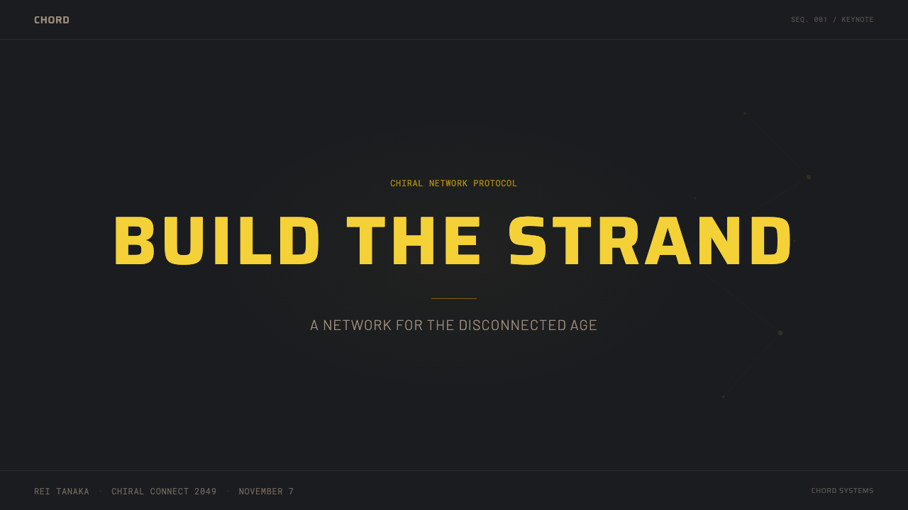
For presentation slides, the style works with high authority on technical, scientific, or data-heavy content. A cover slide treated as the Death Stranding system uses near-black as the full-bleed background, with the title set in condensed all-caps letterforms in a neutral off-white or amber, underlined by a single hairline rule. No imagery required — the darkness is the atmosphere. Data slides gain enormous legibility from the monospace-on-dark approach: numbers and statistics read as instrument readouts rather than designed graphics, which in technical contexts signals trustworthiness. Avoid warm or decorative backgrounds; the moment the void is replaced with anything gradient or colored, the aesthetic collapses.
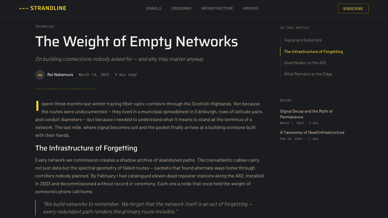
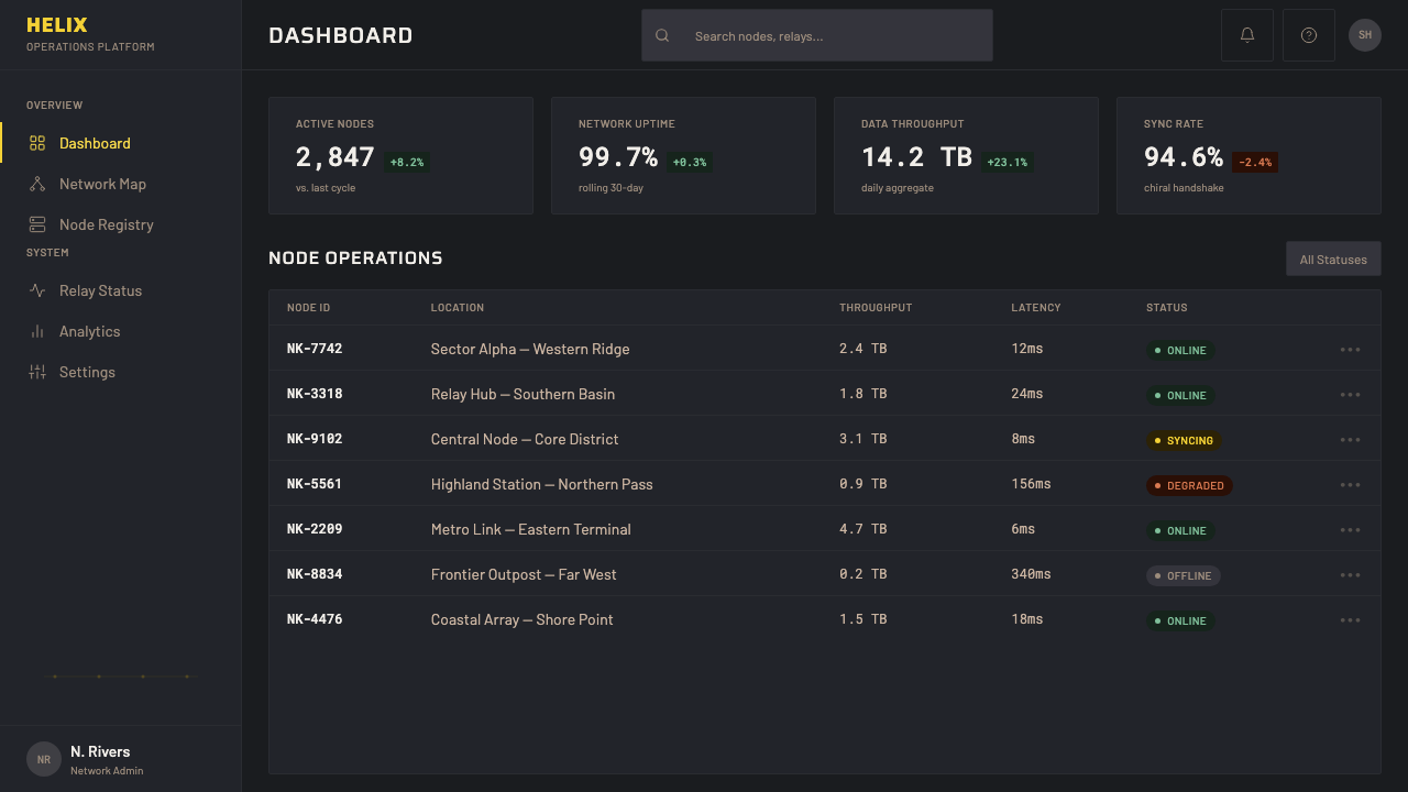
For web UI, the style is best suited to dark-mode dashboards, monitoring tools, scientific data interfaces, and developer tooling. The pattern: near-black body with amber accent for interactive elements and data highlights, hairline borders on all card components, uppercase monospace for all numerical and status data. Avoid soft shadows entirely — any drop shadow should be a hard offset in a slightly lighter shade of the background dark. Navigation and labeling should be typographic only, with no decorative iconography beyond functional geometric indicators.
For editorial and marketing work, the style supports strong contrast visual layouts that carry the weight of significance. A Death Stranding-influenced editorial page uses a full-dark background with amber used as a single accent color for pull quotes, section labels, or key data points. Body text runs in a neutral off-white, set tight with generous line spacing for legibility. Photography, if used, should be treated as luminous objects emerging from darkness — high-contrast, color-graded toward amber-neutral, never warm or pastel.
The most common mistake when applying this aesthetic is using it for softness. Developers and designers sometimes see the dark-and-amber palette and try to add organic textures, gradient glows, or warm amber tones to create comfort — this is exactly wrong. The amber in Death Stranding is cold amber: the amber of scientific resin, not candlelight. Every soft-shadow element, every gradient glow, every decorative texture added to the system erodes the core quality that makes the style meaningful: the sense that the interface is barely holding itself together across a vast and indifferent distance.
Death Stranding — FAQ
Is Death Stranding's UI aesthetic the same as cyberpunk or sci-fi HUD design generally?
Not quite. Cyberpunk UI typically embraces color density — neon greens, electric blues, aggressive magenta — and conveys a sense of urban overstimulation and corporate surveillance. Sci-fi HUD design in the blockbuster tradition often leans into visual complexity, layered data streams, and the impression of information overload. Death Stranding's system is the opposite on both counts: it uses a two-color palette (black and amber), and it conveys scarcity rather than abundance. The closest relative is military telemetry and scientific field instrumentation — the aesthetic of things that must work when nothing else does, in conditions where the margin for error is zero.
How do you apply the Death Stranding aesthetic to a light-mode interface?
With significant adaptation. The void-ground is fundamental to the aesthetic — it is not a stylistic preference but the structural logic of the entire system. A light-mode inversion is possible, but it requires inverting the hierarchy as well: the background becomes a pale, desaturated near-white (the Icelandic landscape color, not a warm cream), text and borders become near-black rather than amber, and amber is reserved for a single accent — perhaps interactive elements or critical data. The result reads as clinical and precise rather than atmospheric and isolated, but it retains the typographic DNA: monospace, all-caps labels, hairline rules, and the absence of decorative elements.
What makes this style feel lonely rather than just dark?
Sparsity. Dark backgrounds are used in countless interface styles — dark mode is now a standard preference. What distinguishes the Death Stranding approach is the ratio of signal to void: the interface elements occupy a tiny fraction of the available space, and the darkness is not filled with ambient texture, gradient depth, or visual noise to compensate. Each element feels isolated on the dark field, separated from other elements by more void than is strictly necessary. This deliberate spatial loneliness is the core of the emotional register. A dark interface with generous spacing and high-contrast elements reads as sophisticated; a dark interface where elements seem to be calling across empty space reads as lonely.
Can this aesthetic be used for branding and marketing, or is it only for product UI?
It works well for branding and marketing in the right sectors. Technology brands positioning themselves as serious, precise, and built for demanding conditions — security tools, industrial software, scientific instrumentation, professional audio and visual equipment — can use the aesthetic credibly. It communicates: we do not decorate, we deliver. It works poorly for consumer-facing warmth: food, lifestyle, wellness, children's products, or any category where the user relationship depends on sensory pleasure or emotional accessibility. It also requires commitment — the aesthetic fails the moment it mixes with softer or more decorative elements. A brand that uses it selectively will look inconsistent; brands that adopt it fully will project a coherent and distinctive character.
How is this style related to the broader minimalism trend in game UI design?
It shares the minimalist impulse — reduce what is on screen to only what is necessary — but its motivation is different. Contemporary game UI minimalism (as seen in titles like The Last of Us or Ghost of Tsushima) often comes from immersion logic: the goal is for the player to forget there is an interface at all. Death Stranding's minimalism is expressive: the sparsity is meant to be felt, not disappeared into. The interface is part of the emotional content of the game. This is an important distinction for designers borrowing from the style — if you want the Death Stranding quality, you are not trying to make the UI invisible; you are trying to make its isolation visible.
Related design styles
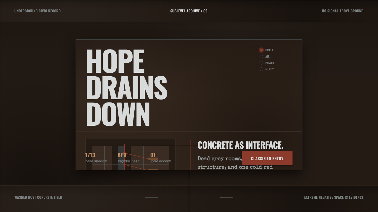 Texhnolyze Lux UndergroundHope drains into concrete. Rust-red grafts cut through dead grey negative spa…
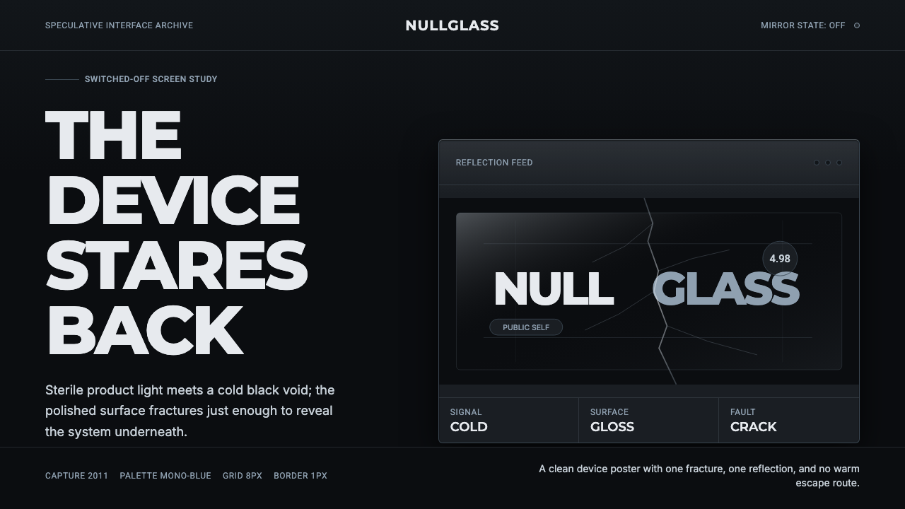 Black MirrorSterile tech turns accusatory. Screen-black, cold Montserrat, and a single gl…
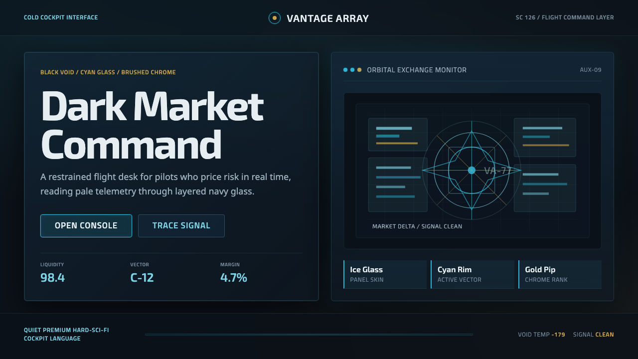 EVE OnlineCold cockpit luxury. Cyan glass panels float over a black nebula void.
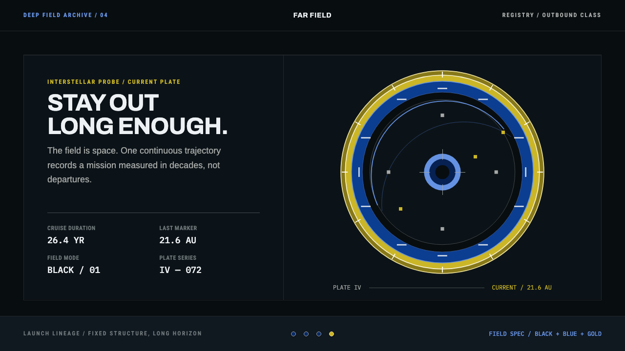 Interstellar Probe PatchCruise made visible. Black space, blue name rings, and a gold-ticked trajecto…
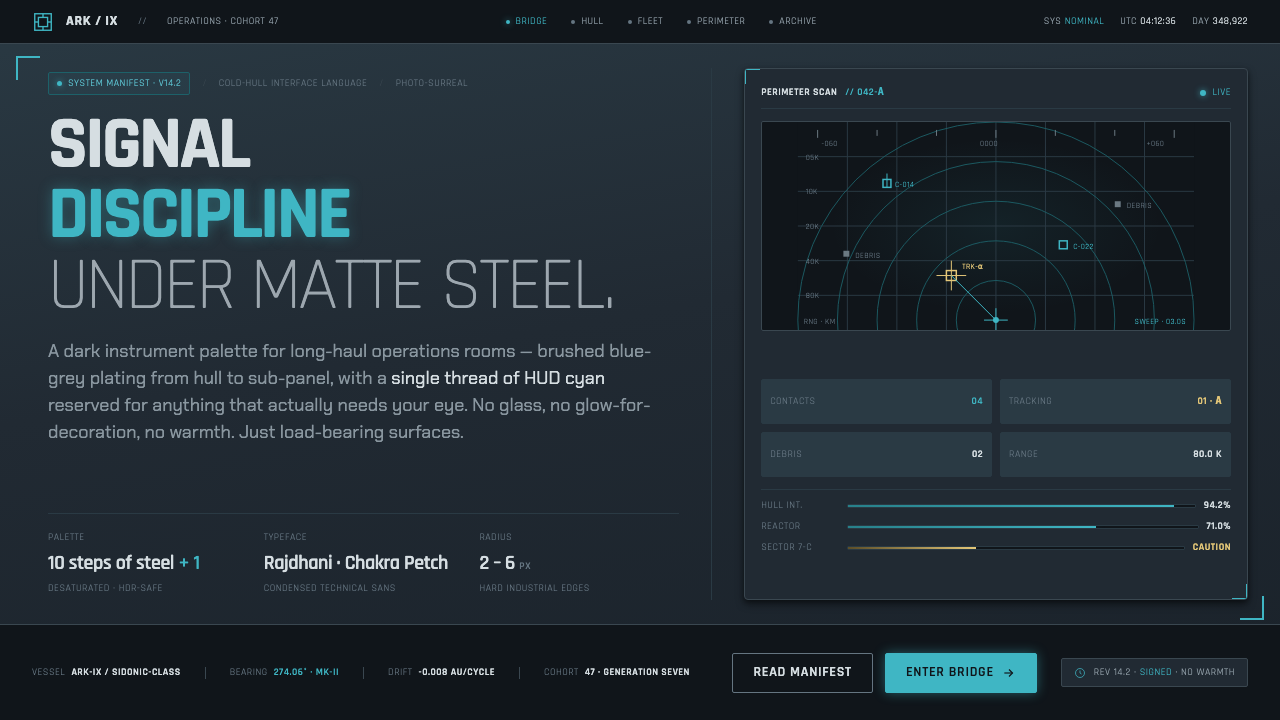 Knights of SidoniaSignal discipline under matte steel. Blue-grey hull, condensed Rajdhani, one…
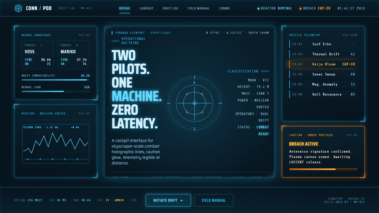 Pacific Rim Jaeger HUDTwo pilots, one machine. Faded Corsair-cyan holograms on near-black steel, am…