What is Processing / Generative?什么是 Processing / Generative?
In Processing, the algorithm is the brush — every artwork is a runnable file, every form is mathematics made visible.在 Processing 里,算法即画笔——每件作品都是可运行的代码,每个形态都是数学的显影。
Processing / Generative in briefProcessing / Generative 速览
Processing / Generative is the visual language that emerged from creative coding — a tradition in which the computer program is not a tool for making art, but the art itself. Founded in 2001 by Casey Reas and Ben Fry at MIT Media Lab's Aesthetics & Computation Group, Processing gave artists and designers a direct path from written code to rendered image, establishing an aesthetic vocabulary that has since spread across digital art, data visualization, interactive installation, and computational design.Processing / 生成艺术是从创意编程中生长出来的视觉语言——在这个传统里,计算机程序不是制作艺术的工具,而是艺术本身。2001年,Casey Reas 与 Ben Fry 在麻省理工学院媒体实验室的美学与计算小组创立了 Processing,为艺术家和设计师开辟了一条从书写代码直通渲染图像的路径,由此建立起一套视觉词汇,并向数字艺术、数据可视化、互动装置与计算设计全面蔓延。
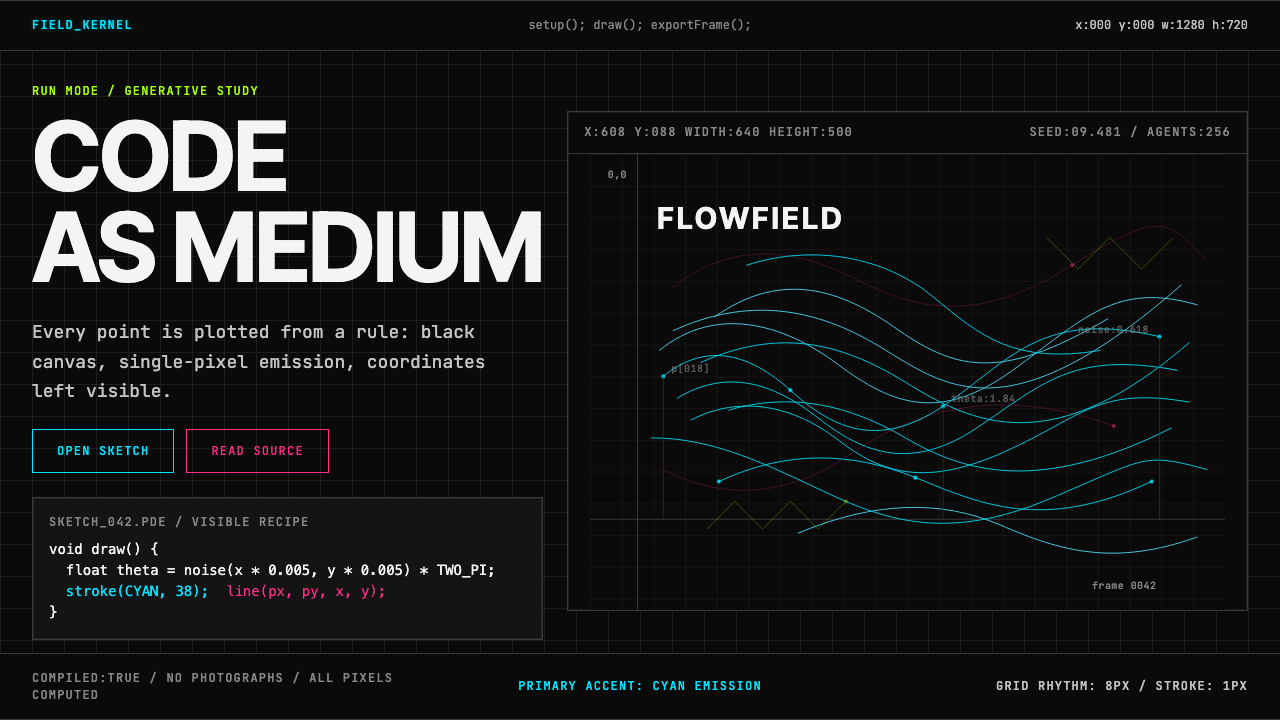
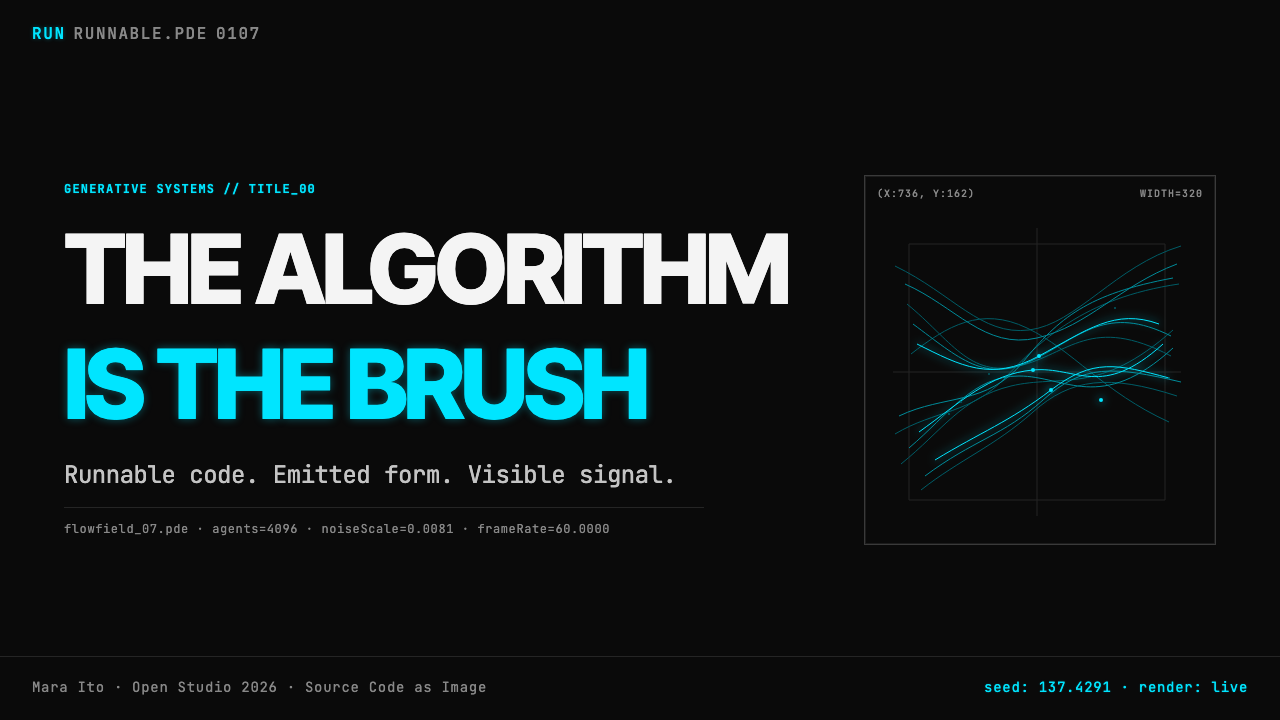
The defining visual signature of this tradition is a deep, near-absolute black canvas on which luminous lines and particles seem to emit their own cold light. Where oil painting builds from darkness to light by layering pigment, generative art builds from darkness by adding single-pixel strokes of saturated cyan, magenta, or electric lime — colors that glow with an additive logic reminiscent of cathode-ray tubes. The forms themselves are never drawn by hand: they emerge from Perlin noise flow fields, particle simulations, recursive subdivision, agent-based behavior, and mathematical attractor systems. Regularity and irregularity coexist because both are products of the same underlying computation.这一传统最鲜明的视觉标志,是一块深邃而近乎绝对的黑色画布——在那上面,发光的细线与粒子似乎在自发地放射冷光。油画从黑暗出发,靠颜料一层层堆叠走向光明;生成艺术则从黑暗出发,以单像素笔触叠加饱和的青色、品红或荧光绿,以加法混色的方式让颜色燃烧起来,令人联想到阴极射线管屏幕的辉光。那些形态从不出自手绘:它们从柏林噪声流场、粒子模拟、递归细分、基于智能体的行为系统与数学吸引子中自发涌现。规则与不规则并存,因为两者都是同一底层计算的产物。
Monospace typefaces, coordinate readouts, and code annotations often appear at the margins of the work — not as decoration, but as evidence. They remind the viewer that the image has a source, that behind every curve there is an equation, and that the artwork and its algorithm are indistinguishable from each other. This is not a style borrowed from computation; it is a style produced by computation, from the inside out.等宽字体的坐标读数和代码注释常常出现在画面边缘——不是装饰,而是证据。它们提醒观者:这张图像有来源,每条曲线背后都有一个方程,作品与它的算法彼此无法区分。这不是一种向计算机借来的风格;它是计算机从内部生产出来的风格。
See the Processing / Generative design system查看 Processing / Generative 完整设计系统
Where does Processing / Generative come from?Processing / Generative 从何而来?
The roots of generative art reach back to the 1960s, when a small group of mathematicians and engineers began using plotters and mainframe computers to produce images governed entirely by algorithmic rules. Georg Nees, Frieder Nake, and Vera Molnár — working independently in Germany and France — exhibited computer-generated drawings as early as 1965, establishing the principle that systematic variation of mathematical parameters could be a legitimate creative act. These early practitioners worked in near-total isolation from the art world, and their work was often dismissed by galleries as mechanical rather than artistic. The conceptual foundation they laid, however, proved durable: the algorithm as author, the execution as performance, and the viewer as interpreter of a system rather than a representation.生成艺术的根源可以追溯到1960年代,彼时一小群数学家和工程师开始使用绘图机与大型计算机,创作完全由算法规则支配的图像。Georg Nees、Frieder Nake 与 Vera Molnár——分别在德国和法国独立工作——早在1965年就展出了计算机生成的图像,确立了一个原则:对数学参数进行系统性变化可以是一种正当的创造行为。这些早期实践者几乎在与艺术界完全隔绝的状态下工作,他们的作品经常被画廊以「机械性」而非「艺术性」为由驳回。然而他们奠定的概念基础被证明是持久的:算法作为作者,执行作为表演,观者作为一套系统的阐释者,而非一幅再现的接受者。
By the 1980s and 1990s, personal computers had made programming accessible beyond university research labs, and a new generation of artists began exploring what could be made with BASIC, PostScript, and eventually C and Java. John Maeda at MIT was a pivotal figure in this transition. His Design By Numbers project (1999) proposed that visual designers should be literate in code, and his teaching at the MIT Media Lab directly shaped the environment from which Reas and Fry emerged. Maeda's influence was both pedagogical and philosophical: he argued that computation was not a medium among others but a new kind of thinking about form, time, and interactivity.到了1980至90年代,个人计算机使编程从大学研究室延伸至更广泛的人群,新一代艺术家开始探索用 BASIC、PostScript,乃至 C 和 Java 可以做出什么。麻省理工学院的 John Maeda 是这一转变的关键人物。他的《以数字设计》(Design By Numbers,1999年)项目主张视觉设计师应当具备代码素养,他在 MIT 媒体实验室的教学直接塑造了 Reas 和 Fry 成长其中的学术氛围。Maeda 的影响既是教学层面的,也是哲学层面的:他主张,计算不是众多媒介之一,而是一种关于形态、时间与交互性的全新思维方式。
Processing itself was born in 2001 as a teaching tool — a simplified Java environment intended to make programming legible to visual artists and designers who found standard development environments hostile and abstract. Reas and Fry wanted the feedback loop between writing code and seeing its output to be as immediate as possible. The original Processing IDE showed a plain text editor on one side and rendered the sketch in real time on the other: a drawing surface that responded to every keystroke. This immediacy was transformative. Artists who had never thought of themselves as programmers began producing work that could not have been made any other way.Processing 本身诞生于2001年,起初是一个教学工具——一个简化的 Java 环境,旨在让觉得标准开发环境陌生而抽象的视觉艺术家和设计师能够读懂编程。Reas 和 Fry 希望写代码与看到输出结果之间的反馈回路尽可能即时。最初的 Processing IDE 在一侧显示纯文本编辑器,在另一侧实时渲染草图:一个响应每一次按键的绘图表面。这种即时性具有变革性的意义。那些从未认为自己是程序员的艺术家,开始创作出用任何其他方式都无法完成的作品。
The open-source release of Processing and the subsequent launch of p5.js — a JavaScript port created by Lauren McCarthy with support from the Processing Foundation — expanded the community from a specialized art-school audience to a global network of practitioners. Daniel Shiffman's teaching, first through his book The Nature of Code (2012) and later through his YouTube series The Coding Train, made the aesthetic available to hundreds of thousands of learners worldwide. By the 2010s, generative aesthetics had migrated from gallery installations to music video production, brand identity systems, and interactive web experiences. The visual grammar — dark grounds, luminous lines, emergent structure — became one of the defining looks of digital culture.Processing 的开源发布,以及随后 p5.js 的推出——这个由 Lauren McCarthy 在 Processing 基金会支持下创建的 JavaScript 移植版本——将社群从专业艺术院校的小圈子扩展至全球从业者网络。Daniel Shiffman 的教学,先是通过他2012年出版的《代码本色》(The Nature of Code),后来通过他的 YouTube 系列《编码列车》(The Coding Train),让全球数十万学习者得以接触这种美学。到2010年代,生成美学已从画廊装置迁移至音乐录影带制作、品牌视觉识别系统与互动网页体验。那套视觉语法——深色底面、发光细线、涌现的结构——成为数字文化的标志性面貌之一。
What defines the Processing / Generative look?Processing / Generative 的视觉特征是什么?
Deep Black Ground深黑底面
The canonical Processing canvas is near-absolute black — not the dark gray of a dimmed interface, but a true void that functions as an emission substrate. Every colored element appears to radiate rather than reflect light, mimicking the visual logic of phosphorescent screens and bioluminescent organisms. This ground is both an aesthetic choice and a structural one: against near-black, even the faintest single-pixel line registers with clarity, allowing extremely fine detail to coexist with large-scale compositional drama.标准的 Processing 画布是近乎绝对的黑色——不是界面调暗后的深灰,而是真正的虚空,作为一种发射基底存在。每个有色元素看起来是在辐射光,而非反射光,模拟磷光屏幕与生物发光体的视觉逻辑。这个底面既是美学选择,也是结构选择:在近黑色的衬托下,即使最细微的单像素线条也能清晰呈现,使极度精细的细节与大尺度的构图张力得以共存。
Additive Color Logic加法混色逻辑
Where traditional print and painting work subtractively — mixing pigments darkens toward black — generative work builds color additively, as light does. The palette leans toward highly saturated, spectrally pure hues: electric cyan, acid lime, hot magenta, and charged cobalt. These colors are rarely blended into intermediate tones; instead they are layered with low opacity so that overlapping strokes produce luminous secondary mixes that feel emergent rather than chosen. The overall effect is that color seems to belong to the light itself, not to any surface.传统印刷与绘画以减法混色运作——颜料混合走向黑暗;生成艺术则如光一样以加法方式堆积色彩。调色盘偏向高度饱和、光谱纯净的色调:电子青、酸性黄绿、炽热品红、带电钴蓝。这些颜色很少被混合成中间色调;相反,它们以低不透明度层叠,使交叠的笔触产生发光的二次混合——那种混合感觉是涌现出来的,而非预先选定的。整体效果是,颜色看起来属于光本身,而非任何表面。
Algorithmic Form — Flow Fields and Emergence算法形态——流场与涌现
The defining shapes of generative work are not drawn but grown. Perlin noise flow fields direct thousands of particles along smooth, organic trajectories that fill the canvas with sinuous curves no human hand could consistently replicate. Recursive subdivision produces branching structures that echo natural growth: coral, lightning, river deltas, lung tissue. Agent-based systems generate dense, tangled masses that read simultaneously as chaotic and ordered. The visual signature is that forms have memory — they accumulate, they collide, they leave trails — and no two runs of the same algorithm produce exactly the same image.生成艺术的标志性形态不是绘制出来的,而是生长出来的。柏林噪声流场引导数千个粒子沿着平滑、有机的轨迹运动,以人手无法持续复现的蜿蜒曲线填满画面。递归细分产生分支结构,呼应自然的生长方式:珊瑚、闪电、河流三角洲、肺部组织。基于智能体的系统生成密集纠缠的团块,同时呈现出混沌与有序的双重气质。视觉标志在于:形态拥有记忆——它们积累、碰撞、留下痕迹——同一算法的每次运行都不会产生完全相同的图像。
Monospace Typography and Code Annotation等宽字体与代码注释
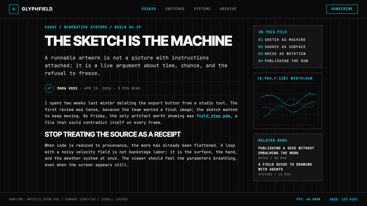
Monospace letterforms — the typefaces associated with terminals, source code, and technical documentation — appear throughout generative work as labels, coordinate readouts, seed values, and system parameters. Their presence is not decorative but testimonial: they assert that the image is computational in origin, that its aesthetic properties are measurable, and that the viewer is looking at the output of a process rather than the expression of a hand. This typographic vocabulary distinguishes Processing-derived work from other dark-palette digital aesthetics that share some superficial visual qualities.等宽字体——与终端、源代码和技术文档相关联的字形——以标签、坐标读数、随机种子值和系统参数的形式贯穿生成艺术。它们的存在不是装饰性的,而是见证性的:它们断言图像在起源上是计算性的,其美学属性是可测量的,观者看到的是一个过程的输出,而非一双手的表达。这种排印词汇将 Processing 衍生的作品与其他共享某些表面视觉品质的深色调数字美学区分开来。
Iterative Time and Accumulation迭代时间与积累
Many Processing works are not static images but living systems captured at a particular moment — the canvas updates continuously, and the final frame is a record of thousands of incremental decisions made by the algorithm over time. Even when printed or exported as a still, the image carries the visual evidence of this accumulation: the density of overlapping lines, the gradual brightening of frequently visited regions, the slow emergence of structure from randomness. This temporal quality sets generative work apart from design styles where the final composition is planned and executed in a single pass.许多 Processing 作品不是静态图像,而是在某一特定时刻被捕获的活系统——画布持续更新,最终帧是算法随时间做出的数千次增量决定的记录。即使以静态图像形式打印或导出,这幅图像仍然承载着这种积累的视觉证据:交叠线条的密度、频繁经过区域的渐进变亮、结构从随机性中缓慢涌现。这种时间性品质使生成艺术有别于构图在单次操作中被规划和执行完成的设计风格。
Mathematical Structure as Composition数学结构即构图
Generative compositions are rarely designed in the conventional sense — they are parameterized. The artist sets rules: how many agents, what force fields, what attraction strengths, what probability thresholds. The composition that results is the consequence of those parameters interacting over time. This means that visual balance, density, focal points, and movement all emerge from mathematical relationships rather than from intuitive gestural decisions. The resulting images often have a quality of inevitability — as though the form could not have been otherwise — because, within the parameter space, it could not.生成构图很少以传统意义上的方式被设计——它们是被参数化的。艺术家设定规则:多少个智能体、什么力场、什么吸引强度、什么概率阈值。最终呈现的构图是这些参数随时间相互作用的结果。这意味着视觉平衡、密度、焦点和运动,全部从数学关系中涌现,而非来自直觉性的手势决定。由此产生的图像常常具有一种必然性品质——仿佛这种形态本不可能是其他样子——因为在参数空间内,它确实不可能是其他样子。
System Transparency系统透明性
A distinguishing ethical and aesthetic principle of the Processing tradition is that the system behind the work is understood to be visible, at least in principle. The source code is often published alongside the artwork. The random seed is frequently displayed. Parameters are documented. This transparency is in direct contrast to design traditions that conceal their methods to preserve the appearance of spontaneous creativity. In generative art, exposing the mechanism does not reduce the work's power — in many cases it amplifies it, because understanding how the image was made makes its complexity more, not less, astonishing.Processing 传统的一个鲜明的伦理与美学原则,是作品背后的系统至少在原则上被理解为是可见的。源代码经常与作品一同发布。随机种子经常被展示。参数被记录在案。这种透明性与那些为了维护自发创造力外观而刻意隐藏方法的设计传统形成直接对比。在生成艺术中,暴露机制并不会削弱作品的力量——在很多情况下反而会放大它,因为理解图像是如何被制作出来的,会使其复杂性变得更加——而非更少——令人震撼。

See the Processing / Generative design system查看 Processing / Generative 完整设计系统
Who shaped Processing / Generative?谁塑造了 Processing / Generative?
Reas co-created Processing in 2001 alongside Ben Fry while both were graduate students at MIT Media Lab. His artistic practice explores software as a medium for visual form, with a sustained interest in how simple rule sets generate complex, seemingly organic imagery. His solo works — exhibited internationally at venues from the Whitney Museum to the Ars Electronica festival — frequently involve thousands of autonomous elements interacting on a shared canvas. As a professor and writer, Reas has shaped how an entire generation of artists and designers think about code as a creative substrate, most influentially through the book Processing: A Programming Handbook for Visual Designers and Artists, co-authored with Fry.Reas 于2001年与 Ben Fry 在麻省理工学院媒体实验室读研究生期间共同创建了 Processing。他的艺术实践将软件作为视觉形态的媒介加以探索,持续关注简单规则集如何生成复杂的、看似有机的图像。他的个人作品——在惠特尼博物馆、奥地利电子艺术节等国际场馆展出——通常涉及数千个在共享画布上相互作用的自主元素。作为教授和作家,Reas 塑造了整整一代艺术家和设计师对代码作为创意基底的思考方式,影响最深远的是他与 Fry 合著的《Processing:视觉设计师和艺术家的编程手册》。
Fry co-created Processing and has spent his career at the intersection of data, design, and biology. His work is characterized by the use of large, complex data sets — genomic sequences, text corpora, network graphs — rendered as visual systems in which structure and pattern become legible through careful visual encoding. His doctoral dissertation at MIT, Computational Information Design, established many of the principles that would later define the field of data visualization as practiced by designers rather than statisticians. Fry's Visualizing Data (2007) translated those principles into accessible form for a generation of practitioners.Fry 共同创建了 Processing,他的职业生涯一直处于数据、设计与生物学的交汇点。他的作品以使用大型复杂数据集为特征——基因组序列、文本语料库、网络图谱——将其渲染为视觉系统,通过精心的视觉编码使结构与规律变得可读。他在麻省理工学院的博士论文《计算信息设计》奠定了许多原则,这些原则后来定义了由设计师(而非统计学家)实践的数据可视化领域。Fry 的《数据可视化》(2007年)将这些原则以平易近人的形式呈现给新一代从业者。
Maeda was the intellectual and institutional predecessor to Processing at MIT Media Lab, where he led the Aesthetics & Computation Group that Reas and Fry joined. His Design By Numbers project (1999) was an early attempt to create a simplified programming language specifically for visual artists, predating Processing by two years and demonstrating that the problem of the hostile development environment was real and solvable. His books — particularly The Laws of Simplicity (2006) and Design in Tech — influenced how technology companies began thinking about design as a strategic discipline rather than a finishing step.Maeda 是 MIT 媒体实验室 Processing 在智识与机构层面的前驱,他领导的美学与计算小组正是 Reas 和 Fry 后来加入的地方。他的《以数字设计》项目(1999年)是为视觉艺术家专门创建简化编程语言的早期尝试,比 Processing 早两年,证明了对抗性开发环境的问题是真实存在且可以解决的。他的著作——尤其是《简单法则》(2006年)和《设计在科技中》——影响了科技公司开始将设计视为战略性学科而非最终装饰步骤的思维方式。
Shiffman democratized generative aesthetics at a scale none of the original Processing founders could have anticipated. His book The Nature of Code (2012) translated complex simulation systems — physical forces, cellular automata, neural networks, genetic algorithms — into clear, example-driven explanations aimed at artists and designers with limited mathematical backgrounds. His YouTube channel The Coding Train, launched in 2015, extended this work into an ongoing series of live-coded tutorials that have collectively accumulated hundreds of millions of views. Shiffman's contribution is pedagogical above all: he made the visual grammar of Processing feel welcoming rather than exclusive.Shiffman 以任何一位 Processing 原创者都无法预料的规模普及了生成美学。他的《代码本色》(2012年)将复杂的模拟系统——物理力场、细胞自动机、神经网络、遗传算法——转化为清晰的、以实例驱动的讲解,面向数学背景有限的艺术家和设计师。他于2015年创建的 YouTube 频道《编码列车》将这项工作延伸为一系列持续更新的实时编程教程,累计观看量达数亿次。Shiffman 的贡献首先是教学层面的:他让 Processing 的视觉语法感觉像一种欢迎,而非一种排斥。
Molnár is the foundational figure of algorithmic art, working with computer-generated imagery from 1968 onward — more than three decades before Processing existed. Her work established that the aesthetics of systematic variation, rule-based composition, and controlled randomness were legitimate artistic concerns independent of any particular technology. Working first with imagined machines she called 'machine imaginaire' before gaining access to actual computers, Molnár demonstrated that the conceptual framework of generative art preceded its technical means. Her long career — she continued producing work into her late nineties — made her the direct ancestor of the entire Processing tradition.Molnár 是算法艺术的奠基人物,从1968年起便开始使用计算机生成图像——比 Processing 存在早了三十多年。她的工作确立了一个原则:系统性变化、基于规则的构图与受控随机性的美学,是独立于任何具体技术的正当艺术关切。在获得真正的计算机使用权之前,她先用想象中的机器——她称之为「机器想象」(machine imaginaire)——来工作,由此证明生成艺术的概念框架先于其技术手段而存在。她漫长的职业生涯——她在九十多岁时仍在创作——使她成为整个 Processing 传统的直接先祖。
How do you use Processing / Generative today?今天怎么用 Processing / Generative?
Processing / Generative is a high-specificity aesthetic — it carries strong associations with technology, mathematics, and digital culture, and works best when those associations align with what the product or message is actually about. Applied carelessly, it can read as generic tech-darkness or visual noise. Applied with precision, it communicates intelligence, complexity, and the kind of beauty that emerges from systems rather than from craft.Processing / 生成美学是一种高度特定性的风格——它与技术、数学和数字文化有着强烈的关联,当这些关联与产品或信息的实际内容相符时,效果最佳。应用不当,它可能被读解为通用的科技暗黑或视觉噪音。应用精准时,它传递出智识、复杂性,以及那种从系统中——而非从工艺中——涌现出来的美。
For presentation slides, the generative aesthetic works powerfully on cover and section-break pages, where a full-bleed composition — flow field, particle swarm, or recursive structure — establishes the visual register before any content appears. Cover slides should commit fully to the dark ground and let a single luminous form dominate; resist the temptation to over-annotate. Content slides are a different challenge: the aesthetic calls for restraint, with monospace type for data labels and coordinates, and a narrow palette limited to one or two accent colors drawn from the established composition. Data visualization slides are where the style reaches its natural home — charts, graphs, and network diagrams rendered in the generative palette become part of the same visual world rather than conventional office graphics dropped into a dark template.在演示文稿中,生成美学在封面页与章节转场页上最具冲击力,满版的构图——流场、粒子群或递归结构——在任何内容出现之前就已建立视觉基调。封面页应当完全投身于深黑底面,让单一的发光形态主导画面;克制过度注释的冲动。内容页是另一种挑战:这种风格要求克制,数据标签和坐标使用等宽字体,调色盘收窄至从既有构图中提取的一到两种强调色。数据可视化页是这种风格找到其天然归宿之处——以生成调色盘渲染的图表和网络关系图,成为同一视觉世界的组成部分,而非被丢进深色模板的常规办公图形。
For web interfaces and dashboards, the generative aesthetic reads as authoritative in contexts associated with technical sophistication: developer tools, analytics platforms, financial terminals, security dashboards, and scientific data products. The approach calls for a deep background, near-black with a trace of warmth or coolness to avoid pure void, with interface elements rendered in luminous accent colors that preserve the additive light logic. Typography should be monospace or geometric-grotesque at small weights — the texture of technical documentation. Interactive states — hover, active, focus — should feel like they are emitting rather than reflecting: a subtle glow rather than a fill change.对于网页界面与仪表板,生成美学在与技术复杂性相关联的场景中显得权威而自然:开发者工具、分析平台、金融终端、安全仪表板与科学数据产品。这种方法要求深色背景——接近黑色,带有一丝暖意或冷意以避免纯粹虚空——界面元素以发光的强调色呈现,保持加法光逻辑。排版应当是细字重的等宽或几何无衬线字体——技术文档的质感。交互状态——悬停、激活、聚焦——应当感觉像在发光,而非反光:是微妙的辉光,而非填充色的改变。
For editorial and marketing work, the style supports content about technology, science, complexity, and systems thinking. A feature article on artificial intelligence, climate modeling, or network infrastructure can use generative imagery to give abstract subject matter a concrete visual presence. Full-bleed generative covers work especially well for annual reports, conference programs, and publication issues where the theme is explicitly computational or systemic. Marketing pages for developer products, data platforms, and creative technology companies can use animated generative backgrounds as hero sections, provided the motion is slow and purposeful — flowing rather than flashing.对于编辑与营销内容,这种风格支持关于技术、科学、复杂性与系统思维的内容。关于人工智能、气候建模或网络基础设施的特稿,可以用生成图像赋予抽象主题以具体的视觉存在。满版生成封面尤其适合年报、会议手册与主题明确为计算性或系统性的出版物。面向开发者产品、数据平台和创意科技公司的营销页面,可以使用动态生成背景作为主视觉区域——前提是动效缓慢而有目的性:是流动,而非闪烁。
The most common mistake when applying this aesthetic is mistaking darkness and cyan for the style itself. A dark background with teal accents is not generative art — it is dark mode with an accent color. The generative aesthetic is defined by the quality of the forms: their emergence, their accumulation, their algorithmic origin. Using stock photography with a dark overlay, or drawing geometric shapes manually and coloring them cyan, produces a simulacrum that lacks the defining quality of the original. When the forms themselves are not products of computation — when they were drawn or placed by hand — the aesthetic collapses into pastiche. The second common mistake is applying this style to warm, human, or emotional contexts: wellness, food, children's products, community platforms. The mathematical clarity and cold luminosity that make the style powerful in technical contexts read as alienating in contexts that call for warmth.应用这种美学时最常见的错误,是将黑暗与青色误认为风格本身。深色背景配青绿强调色不是生成艺术——那只是带强调色的深色模式。生成美学由形态的品质定义:它们的涌现性、积累性、算法起源。使用带深色叠加层的素材摄影,或手动绘制几何形状再用青色着色,只能产生一个缺乏原作根本品质的仿制品。当形态本身不是计算的产物——当它们是被手工绘制或摆放时——这种美学就崩塌为一种风格模仿。第二个常见错误是将这种风格应用于温暖、人文或情感性的场景:健康养生、食品、儿童产品、社群平台。那种让这种风格在技术语境中充满力量的数学清晰度与冷冽光辉,在呼唤温度的场景中会被读解为疏远感。
See the Processing / Generative design system查看 Processing / Generative 完整设计系统
Processing / Generative — FAQProcessing / Generative · 常见问题
Is Processing / Generative a dark-mode aesthetic, or is a light-ground version possible?Processing / 生成美学只能用深色模式吗?还是可以有浅色底面版本?
The dark ground is not arbitrary — it is load-bearing. The additive color logic that gives generative work its luminous quality depends on a near-black substrate: colors that appear to glow only glow against darkness. A light-ground version is technically possible, and some computational artists have explored it, but the result is a fundamentally different aesthetic — closer to scientific illustration or information graphics than to the canonical generative tradition. If your context requires a light background, it is more honest to acknowledge that you are drawing on the graphic vocabulary of data visualization rather than claiming the full generative aesthetic. The two are related but distinct.深色底面并非任意的选择——它是承重的。赋予生成艺术发光品质的加法混色逻辑,依赖于近黑色的基底:看起来在发光的颜色,只在黑暗中才发光。浅色底面的版本在技术上是可能的,一些计算艺术家曾加以探索,但结果是一种根本不同的美学——更接近科学插图或信息图形,而非标准的生成传统。如果你的场景需要浅色背景,更诚实的做法是承认你正在借用数据可视化的图形词汇,而非宣称完整的生成美学。两者相关,但截然不同。
How does generative art differ from glitch aesthetic or cyberpunk visual style?生成艺术与故障美学或赛博朋克视觉风格有何不同?
All three operate on dark grounds with high-saturation color, which accounts for the frequent confusion. The differences are substantive. Glitch aesthetic celebrates malfunction — it reproduces the visual artifacts of data corruption, signal failure, and hardware error: scan lines, pixel displacement, color channel separation. Cyberpunk aesthetic draws on urban decay, neon signage, and dystopian density — it is culturally narrative. Generative art, by contrast, is neither broken nor dystopian: it is orderly at the system level, even when locally complex. Its forms are the consequence of correct computation, not failed computation. Where glitch feels damaged and cyberpunk feels dangerous, generative work feels inevitable — the beauty of a system doing exactly what it was designed to do.三者都在深色底面上运作,色彩高度饱和,这解释了为何它们经常被混淆。但差异是实质性的。故障美学颂扬故障——它再现数据损坏、信号失败和硬件错误的视觉痕迹:扫描线、像素位移、色彩通道分离。赛博朋克美学借鉴城市衰败、霓虹招牌和反乌托邦密度——它是文化叙事性的。生成艺术则相反:它既不破碎,也非反乌托邦——它在系统层面是有序的,即使在局部层面复杂。它的形态是正确计算的结果,而非失败计算的结果。故障感觉受损,赛博朋克感觉危险,生成艺术感觉必然——一个系统精确地做着它被设计去做之事所呈现的美。
Can this aesthetic work for a brand that is not a technology company?这种美学适用于非科技公司的品牌吗?
Yes, but the application requires genuine conceptual grounding rather than surface borrowing. The generative aesthetic works for any brand whose core proposition involves systems, emergence, complexity, or the intersection of natural and computational processes — scientific research organizations, financial data companies, environmental monitoring platforms, genomics companies, architecture and engineering firms working at scale. It also works for cultural institutions whose programming engages with digital art or computational creativity. What it does not work for is borrowing the visual vocabulary as a signifier of vague technological aspiration — a wellness startup deploying flowing cyan lines because it seems futuristic. The aesthetic is too specific to survive that kind of contextual mismatch without looking hollow.可以,但应用需要真正的概念根基,而非表面借用。生成美学适用于任何核心主张涉及系统、涌现、复杂性,或自然与计算过程交汇的品牌——科学研究机构、金融数据公司、环境监测平台、基因组学公司、大规模运作的建筑与工程公司。它也适用于编程内容涉及数字艺术或计算创意的文化机构。它不适用的情形是:将视觉词汇作为模糊技术抱负的能指来借用——一家健康初创公司因为看起来未来感而使用流动的青色线条。这种美学过于特定,无法在那种语境错位中幸存,否则只会显得空洞。
What is the relationship between Processing and NFT / generative art markets?Processing 与 NFT / 生成艺术市场是什么关系?
Processing and p5.js became central tools in the generative NFT art movement that emerged between 2020 and 2022, particularly through platforms like Art Blocks, where collectors could mint unique outputs from a shared algorithm by providing different random seeds. This market moment brought generative aesthetics to a much wider audience and produced enormous amounts of work in the canonical visual vocabulary — dark grounds, flow fields, saturated emission colors, monospace annotations. It also produced a significant volume of derivative work that reproduced the surface appearance without the depth of system design. The market has since contracted, but the broader cultural familiarity with generative aesthetics that the period produced has persisted, making the visual language legible to audiences well beyond the art and technology worlds.Processing 和 p5.js 成为2020至2022年间涌现的生成 NFT 艺术运动的核心工具,尤其是通过 Art Blocks 等平台——收藏者可以通过提供不同的随机种子,从共享算法中铸造独特的输出。这个市场时刻将生成美学带给了更广泛的受众,并产生了大量使用标准视觉词汇的作品——深色底面、流场、饱和的发光色彩、等宽注释。与此同时,它也产生了大量再现表面外观而缺乏系统设计深度的衍生作品。市场此后已经收缩,但那个时期所产生的更广泛的文化熟悉度——对生成美学的认知——已经持续下来,使这套视觉语言在艺术与科技世界之外的受众中同样可读。
How do I know if my generative-inspired design is authentic or pastiche?我怎么判断自己受生成艺术启发的设计是真实的还是风格模仿?
The clearest test is whether the forms in your design could have been produced by a system. If you drew the curves by hand, adjusted them visually until they looked organic, and colored them cyan on a dark background, you have made a pastiche — you have reproduced the appearance of generative work without the process that gives it meaning. Authentic application means either actually using a generative process to produce some or all of the visual elements, or — if using static elements — committing to forms that are explicitly algorithmic in character: grids, coordinates, mathematical curves, systematic variation. The second test is context: does the computational vocabulary mean something in your context, or is it purely decorative? If the answer is purely decorative, the honest choice is a different aesthetic.最清晰的检验是:你设计中的形态是否有可能由某个系统产生。如果你是手工绘制曲线,视觉性地调整直到它们看起来有机,然后在深色背景上涂成青色——你制作了一个风格模仿,你再现了生成艺术的外观,却没有赋予它意义的过程。真实的应用意味着:要么实际使用生成过程来产生部分或全部视觉元素;要么——如果使用静态元素——坚持明确具有算法特征的形态:网格、坐标、数学曲线、系统性变化。第二个检验是语境:计算性词汇在你的语境中意味着什么,还是纯粹是装饰性的?如果答案是纯粹装饰性的,诚实的选择是换一种美学。
Related design styles相关设计风格
 Death StrandingLonely connection, made visible. Amber HUD lines hover over a tar-black void.孤独连接被看见:琥珀 HUD 线悬浮在焦油黑虚空上。
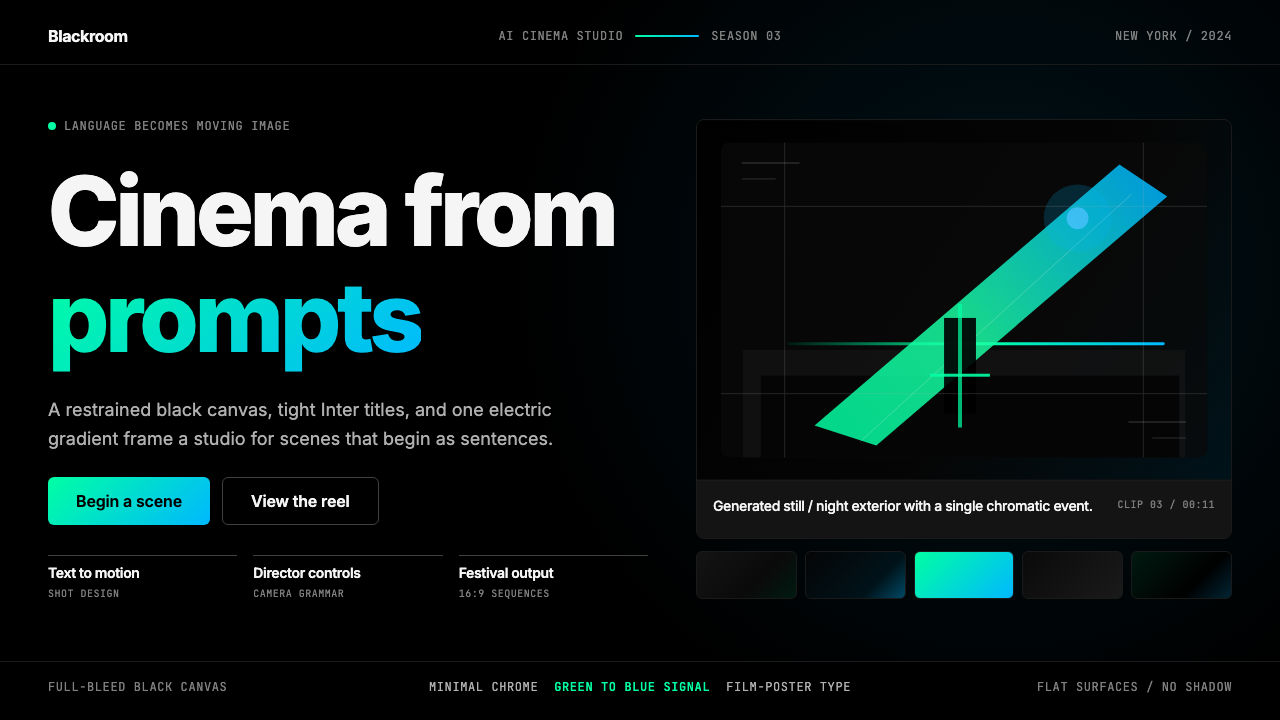 Runway MLCinema, not dashboard. Deep black frames tight Inter type and one green-blue…不是仪表盘,是电影感:纯黑画布、紧排 Inter 与绿蓝电光。
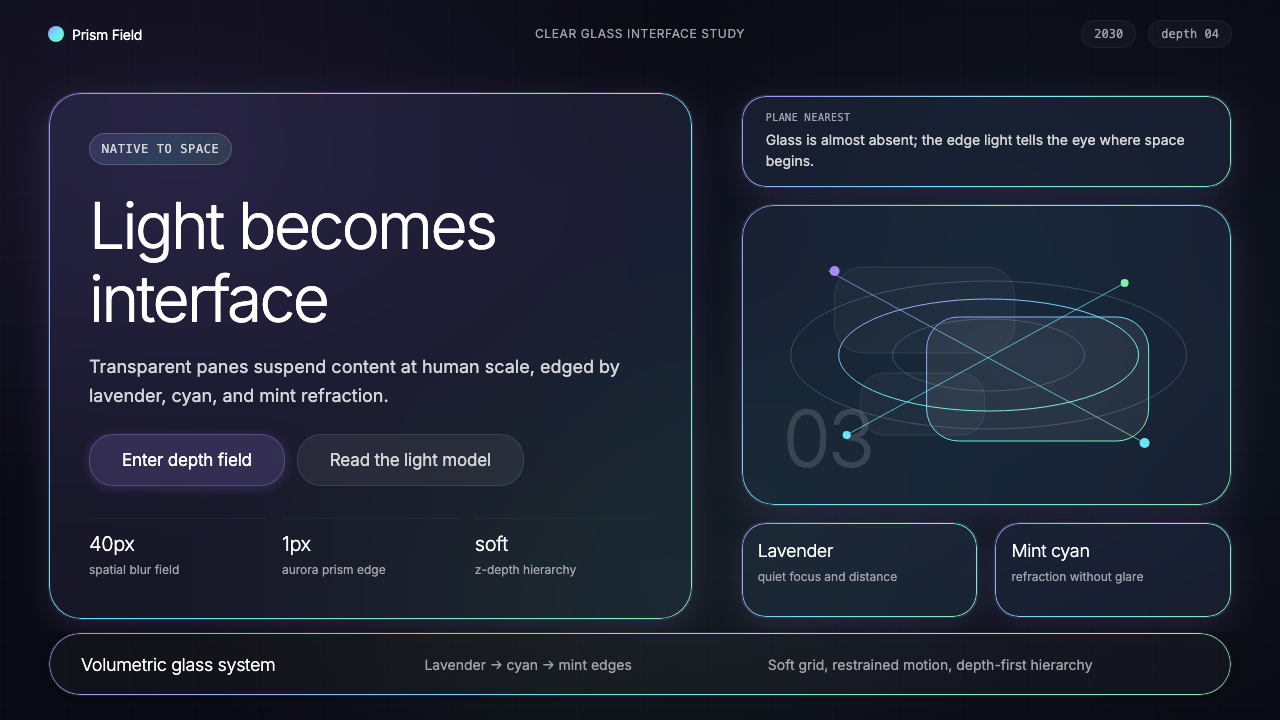 Vision Pro Spatial UI (2030)Structured light, not software. Deep navy glass panels glow with lavender-cya…结构化光感,不像软件。深夜蓝玻璃面板,以薰衣草-青-薄荷边缘发光。
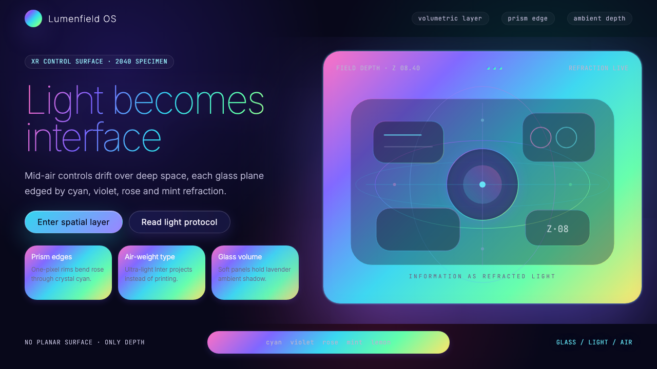 Holographic UI 2040Information made of light. Deep-space black, ultra-light Inter and prismatic…信息由光构成:深空黑、极细 Inter 与棱镜玻璃边缘。
 MidjourneyInvisible chrome, visible art. Pure black grid and Cormorant serif give color…界面隐身,图像发声。纯黑网格与细衬线让色彩只属于作品。
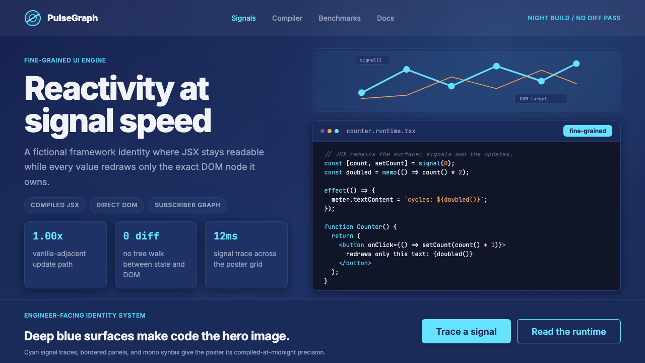 SolidJS Reactive FrameworkCode is the hero. Deep indigo panels, cyan signal arcs, and mono JSX carry th…代码就是主角:深靛蓝面板、青色信号弧与等宽 JSX 托起品牌。