What is Metroid Prime Scan Visor?
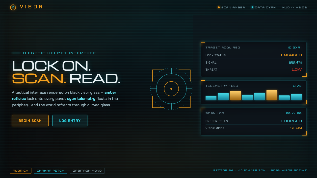
The Metroid Prime Scan Visor turns a helmet display into a world of its own — black glass, amber targeting signals, cyan telemetry, and information that appears to be discovered rather than placed.
Metroid Prime Scan Visor in brief
The Metroid Prime Scan Visor is a diegetic helmet HUD: an interface that appears to exist inside Samus Aran’s helmet rather than hovering above the game world as an external layer. Its black interior becomes the ground for amber-orange scan reticles and cyan holographic data widgets, while the outside world remains visible through curved, tinted, refracted visor glass.
Its design language is built around tension between targeting and telemetry. Amber marks the act of looking, selecting, and locking onto a scan point. Cyan carries the cooler language of data, measurement, and system feedback. Neither color is decorative. Each behaves like a signal emitted by a functioning instrument.
The result is cold, tactical, and restrained. Angular wide-set glyphs, targeting frames, scanline glints, and rain-on-glass beads create the impression of an active helmet system responding to its surroundings. The interface feels technological because every visual element appears to have a job.
Where does Metroid Prime Scan Visor come from?
The Scan Visor belongs to the science-fiction design language of 2002 and the GameCube era. Its visual identity is inseparable from the first-person helmet-HUD idea: the player is not simply reading a game interface but looking through an instrument attached to a character’s body. This shift makes interface graphics part of the fictional world.
The origin record places the style within a Japan and United States context, shaped by Nintendo’s intellectual property and Retro Studios in Austin, Texas. It is therefore not a generic futuristic interface. Its identity comes from a specific collaboration between a console-era science-fiction world and a studio vocabulary built around first-person viewing.
The visual language developed across the period from 2002 to 2007, when game interfaces increasingly had to share space with rendered three-dimensional environments. The Scan Visor answers that challenge by making information feel optically embedded: data glows over black glass, the world is tinted and refracted, and scanline highlights imply that the display has physical depth.
Its lasting importance comes from the way it joins interface function with atmosphere. A reticle is both a control signal and a compositional device. A data widget is both readable information and evidence that the helmet is processing the environment. The style succeeds because its science-fiction surface is supported by a clear diegetic premise.
What defines the Metroid Prime Scan Visor look?
Black Glass Ground
The foundation is not an ordinary dark background but the interior surface of a visor. Black creates visual pressure and allows amber and cyan signals to read as emitted light. The curved glass premise also permits tinting, refraction, rain beads, and scanline glints without making the interface feel ornamented.
Signal Color
Amber-orange belongs to targeting, scanning, and commitment: it tells the viewer where attention is being directed. Cyan belongs to telemetry and holographic information: it feels cooler, more remote, and more systemic. Keeping these roles distinct gives the palette meaning and prevents glow from becoming visual noise.
Targeting Frames
Content is enclosed by angular frames that appear to lock onto scan points. These frames should feel slightly mechanical rather than ornamental, with corners, brackets, and interrupted edges suggesting an active tracking system. Their purpose is to identify, isolate, and confirm information.
Angular Glyphs
Typography is wide-set, angular, and deliberately unlike a neutral editorial sans serif. The glyphs should feel engineered for a visor display, with enough openness to remain legible while retaining a constructed, alien quality. Type is part of the device’s physical identity, not a separate layer applied afterward.
Telemetry Hierarchy
Cyan data widgets should be organized as readings, annotations, and system responses rather than decorative labels. Small supporting information can hover around a dominant scan target, while the target itself remains visually decisive. The hierarchy should resemble an instrument reporting conditions in real time.
Optical Interference
Tinted glass, refraction, rain-on-glass beads, and scanline glints introduce a controlled sense of interference. They suggest that the viewer is looking through a physical optical system. These effects work best when they remain subordinate to targeting and telemetry, reinforcing the visor fiction without obscuring content.
Who shaped Metroid Prime Scan Visor?
Retro Studios is the central studio name in the origin material, located in Austin, Texas, and associated with the Metroid Prime Scan Visor’s United States production context. Its importance here is the connection between first-person helmet-HUD design and a coherent GameCube-era three-dimensional interface language.
Nintendo provides the intellectual-property context in which the Scan Visor exists. The style is therefore tied to a recognizable science-fiction universe rather than being an isolated collection of cyan glow, amber marks, and dark glass effects.
Mark Pacini is listed in the source material among the key figures connected to this visual history. His inclusion keeps the style grounded in the authored production lineage of the Metroid Prime interface rather than treating it as an anonymous genre convention.
Gene Kohler is also named among the key figures in the approved origin material. The name belongs to the credited context of the Scan Visor’s design language, whose identity depends on coordinated visual decisions across interface, viewpoint, and fictional hardware.
How do you use Metroid Prime Scan Visor today?
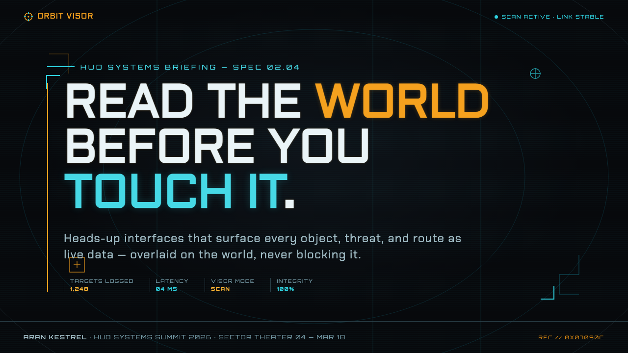
For presentation slides, the Scan Visor language is strongest when the cover establishes the helmet fiction immediately: a black field, a restrained amber targeting frame, and a title treated as a discovered scan point. Content slides can use cyan telemetry blocks for supporting explanation while amber marks the active section or selected object. Data slides should feel like readings from an instrument, with labels, markers, and framing doing the organizational work instead of decorative charts or luminous backgrounds.
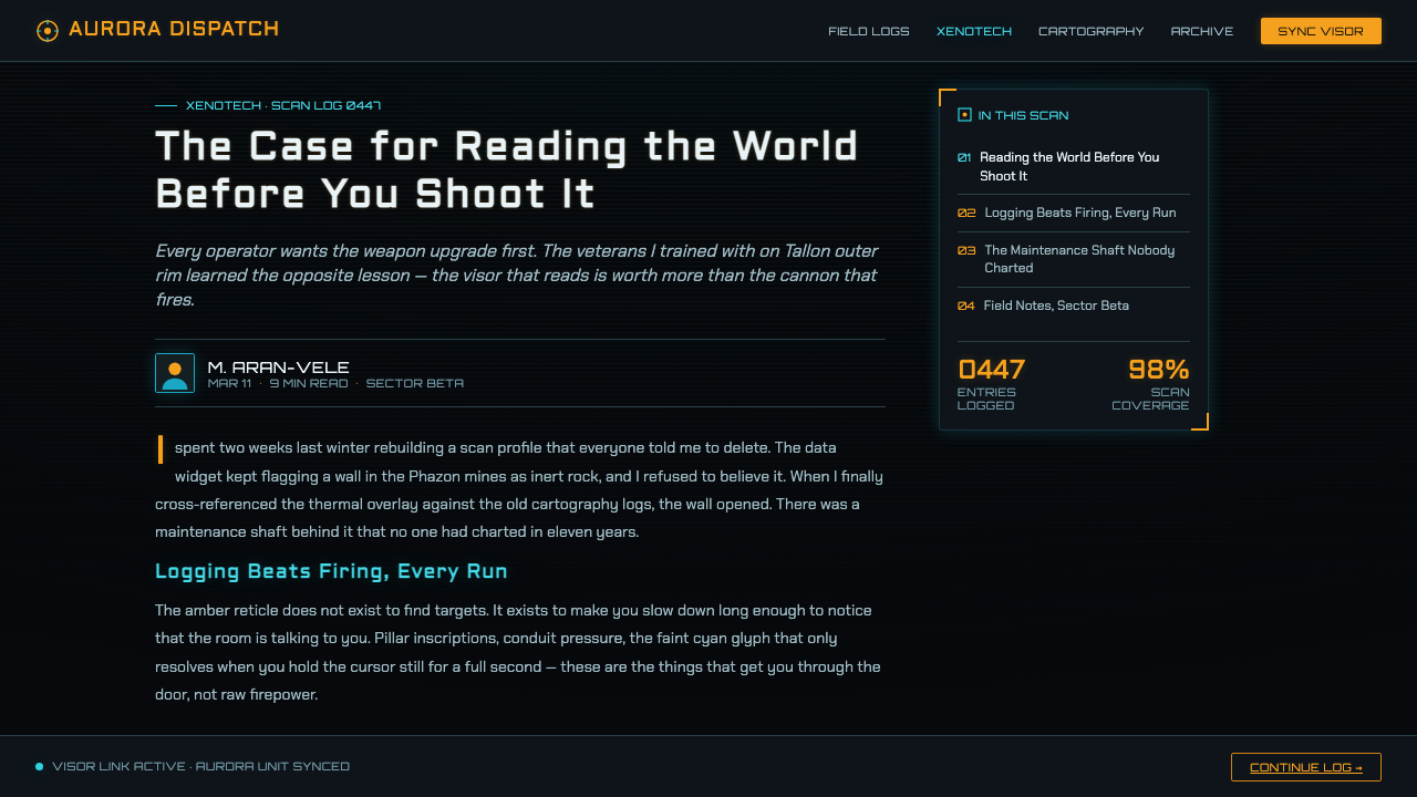
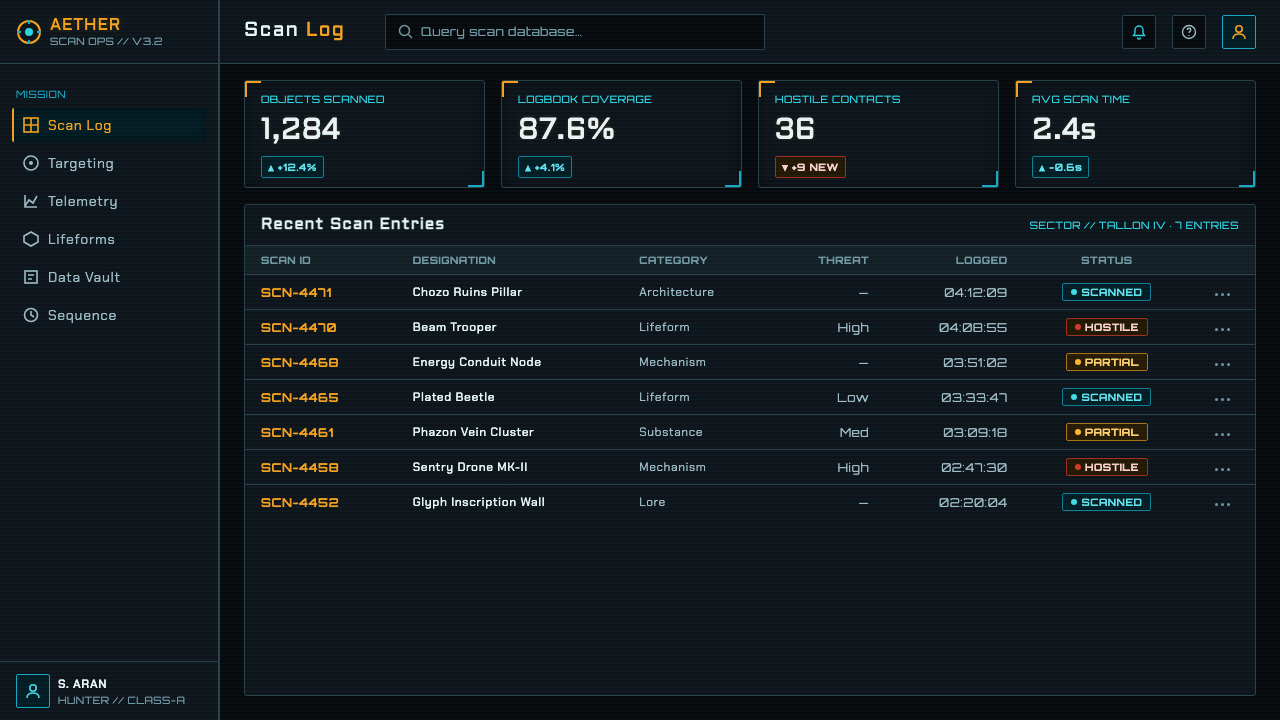
For web dashboards and pricing pages, the system supports clear state communication in a dark interface. Use amber for the plan, item, or action currently being examined; use cyan for supporting metrics, descriptions, and system feedback. Cards and panels should feel like modules within a visor, with angular framing and restrained optical interference. The interface becomes especially effective when the user can tell what is active, what is being measured, and what is merely contextual.
For editorial and marketing work, the style turns information into an encounter. An article can present its main subject as a scan target, with cyan annotations hovering around a dominant title or image and amber brackets directing the reading path. Marketing pages can use the language of discovery: a product appears through curved-glass distortion, a feature is isolated by a targeting frame, and supporting claims arrive as telemetry. The mood should remain cold and precise rather than becoming generic cyberpunk spectacle.
The common mistake is to make every element glow, frame, or flicker. That removes the distinction between signal and atmosphere. A stronger application gives each color a responsibility, reserves targeting frames for meaningful selection, keeps telemetry subordinate to the main subject, and treats rain beads or scanlines as occasional optical evidence. The Scan Visor works through disciplined fiction: every effect should make the viewer believe the interface is part of a helmet.
Metroid Prime Scan Visor — FAQ
What makes the Scan Visor interface diegetic?
It appears to exist inside the character’s helmet and to mediate the character’s view of the world. Black glass, curved refraction, scan reticles, and telemetry are not presented as external decoration; they are evidence of a fictional instrument operating in front of the viewer.
Why are amber and cyan kept separate?
They represent different kinds of information. Amber is associated with scanning, targeting, and active selection, while cyan represents telemetry, holographic data, and system feedback. Their separation creates a readable operating logic and keeps the palette from becoming indiscriminate neon.
Can this style work on a light background?
It can be adapted, but the black glass ground is central to the original language. On a light field, amber and cyan lose some of their instrument-like intensity, and the visor fiction becomes weaker. If the dark ground is removed, the design needs another convincing explanation for why the signals appear to emit light.
How should scanlines and rain-on-glass effects be used?
Use them as restrained evidence of optical hardware, not as a permanent texture layer. They should reinforce the sense of looking through tinted, refracted glass while leaving targeting and telemetry legible. If they compete with the information, they stop supporting the fiction and become surface decoration.
Related design styles
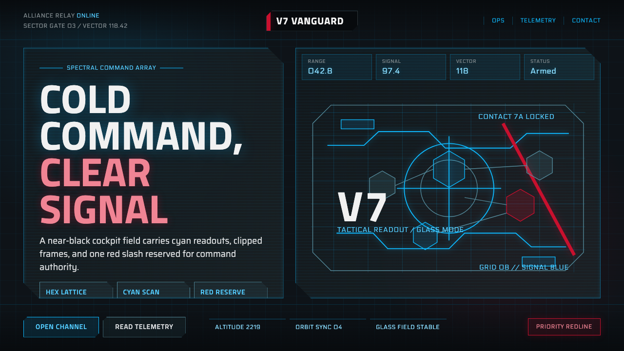 Mass Effect N7Cold military futurism. Cyan HUD grids on near-black glass, cut by one red st…
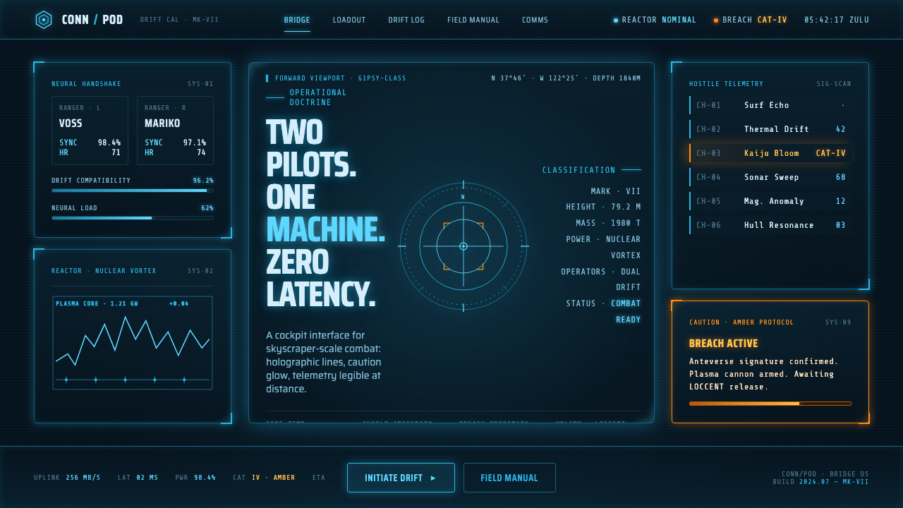 Pacific Rim Jaeger HUDTwo pilots, one machine. Faded Corsair-cyan holograms on near-black steel, am…
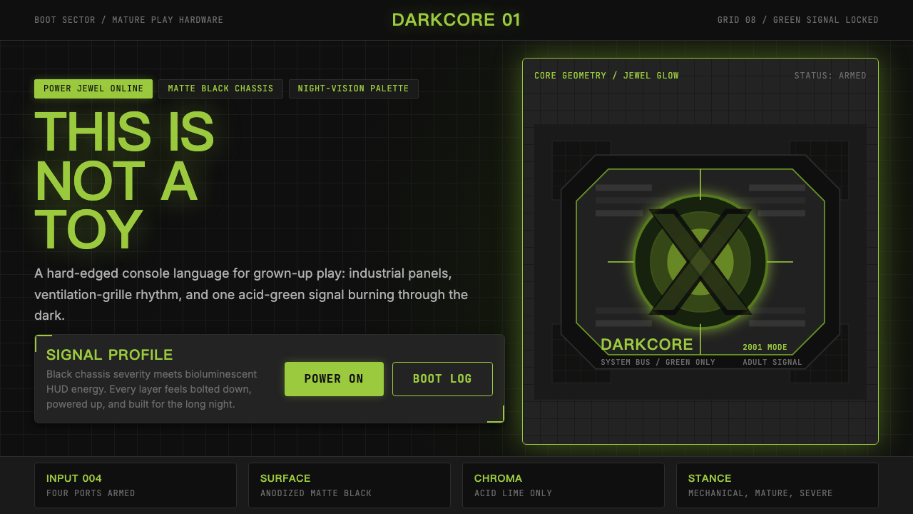 Xbox Original (2001)Not a toy. Acid green cuts matte black in a rigid grille-and-jewel hardware p…
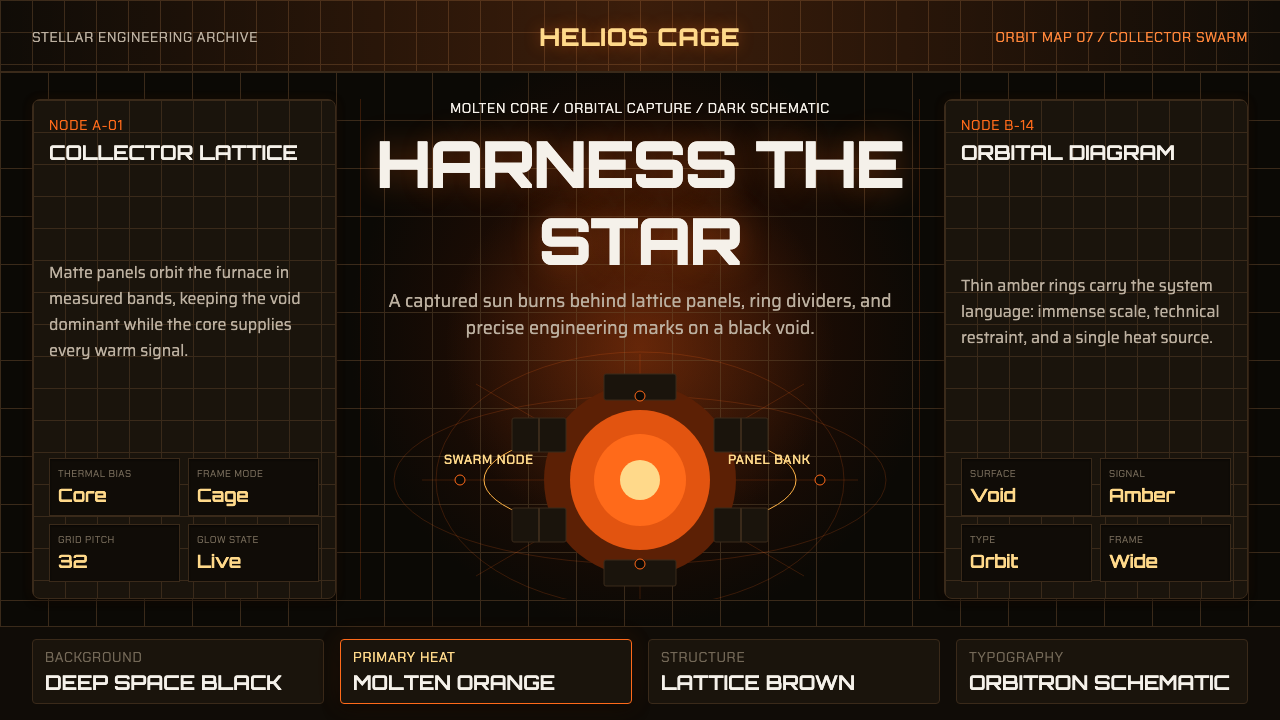 Dyson Sphere MegastructureCold void, captive heat. Molten orange core caged by brown lattice and orbita…
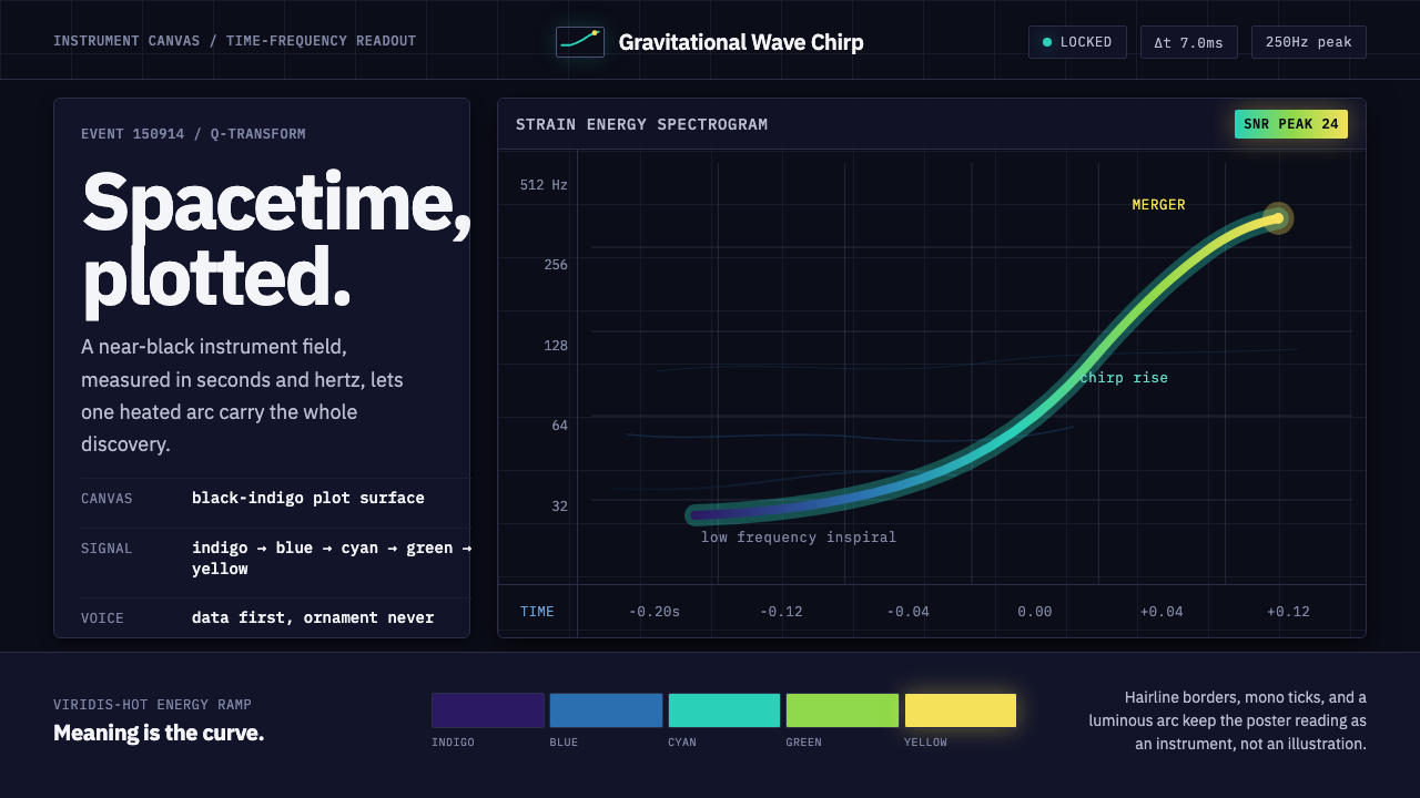 Gravitational Wave ChirpData makes the drama. Near-black grid, mono Hz ticks, and a viridis-hot chirp…
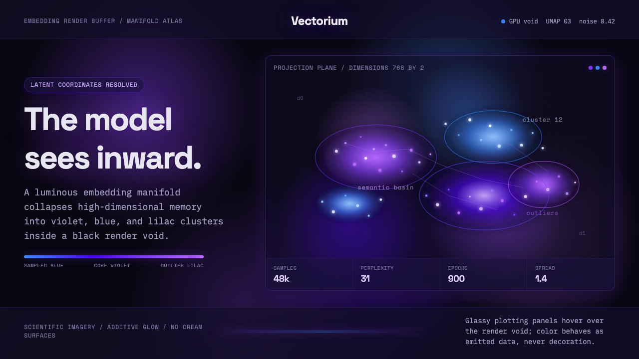 Latent SpaceSees the model from inside. Violet-blue point clouds glow on a black GPU void.