What is Gravitational Wave Chirp?
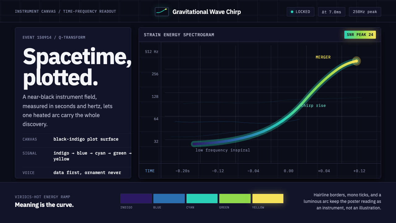
Gravitational Wave Chirp turns an invisible collision into visible drama — a near-black scientific canvas where a single heated arc makes spacetime, frequency, and time legible.
Gravitational Wave Chirp in brief
Gravitational Wave Chirp is a visual system derived from the defining image of GW150914, the signal captured by LIGO on 14 September 2015 when two black holes roughly a billion light-years away spiralled together. Its subject is not outer space as scenery but measurement as evidence: the moment a violent cosmic event becomes a trace that can be read.
The composition is deliberately dark and instrument-like. A solid near-black to dark-indigo canvas carries a restrained grid, with frequency and time marked in a monospace voice. Against that field, a single bright arc rises through indigo, blue, cyan, and green before reaching its most intense yellow near merger. The arc is the drama; everything else establishes how to interpret it.
This is scientific data-plot visualization treated as a complete design language. It belongs to gravitational-wave astronomy, but its visual discipline is transferable: preserve the dark field, make notation feel operational, and let color describe energy rather than decorate the surface. The governing principle is simple: data first, ornament never.

Where does Gravitational Wave Chirp come from?
The visual origin is the first direct detection of a gravitational wave, identified as GW150914. On 14 September 2015, two black holes a billion light-years away spiralled together and collided. The event is presented not through an illustration of the bodies themselves but through the signal they left behind, an approach that makes the trace more important than the imagined scene.
LIGO provides the system's physical and institutional anchor. Its twin interferometers at Hanford and Livingston, associated with Caltech and MIT in the United States, are represented here through the language of instrumentation: dark grounds, measured axes, technical lettering, and a field in which every bright mark appears to carry evidence.
The signal was announced in February 2016, and the Q-transform spectrogram that plotted it became the defining image of a new astronomy. That spectrogram supplies the structure of the style. Time and frequency are not secondary labels placed around an illustration; they form the world in which the event becomes visible. The rising chirp is therefore both subject and composition.
The broader movement is the meeting of gravitational-wave astronomy and scientific data-plot visualization. Its influence is methodological rather than decorative. It asks a designer to translate a measured phenomenon without diluting its technical identity: darkness establishes concentration, the grid establishes reading conditions, and the heated arc gives a changing signal a visible emotional contour.
What defines the Gravitational Wave Chirp look?
Near-Black Field
The background is a solid near-black that can deepen toward dark indigo. It should feel like an instrument display with the ambient world removed, not like a decorative night sky. The darkness concentrates attention on the signal and gives every luminous mark a clear observational role. Surfaces remain quiet, continuous, and free of texture.
Monospace Measurement
Typography should resemble a working scientific readout. Monospace lettering gives Hz and seconds an even, mechanical rhythm and makes labels feel attached to an instrument rather than a poster. The type is functional and restrained, with hierarchy created through placement, contrast, and spacing instead of expressive display lettering.
Time-Frequency Grid
The grid is the interpretive skeleton of the composition. Horizontal and vertical guides make the signal readable as movement through frequency and time, while the labels remain sparse enough to preserve tension. Lines should be subordinate to the arc: visible when needed, quiet when not, and never treated as a decorative pattern.
Rising Chirp Arc
The defining form is a single arc that sweeps upward as the chirp climbs toward roughly two hundred and fifty hertz at merger. Its curvature carries the narrative: the signal begins cool and distant, then accelerates toward concentration and brightness. The arc should remain singular and legible, never fragmented into competing decorative marks.
Thermal Color Progression
Color behaves like a reading of intensity. The arc moves from indigo through blue, cyan, and green toward yellow at its most concentrated point. This sequence should feel continuous but directional, with the warmest passage reserved for the event's climax. The rest of the interface stays comparatively muted so the progression retains meaning.
Data Before Ornament
Every element must justify its presence through interpretation. Grid marks, labels, axis cues, and color transitions explain the signal; anything that merely adds atmosphere weakens the system. Avoid ornamental illustration, soft visual effects, and unrelated imagery. The style is dramatic because the data is dramatic, not because the surface is embellished.

Who shaped Gravitational Wave Chirp?
Rainer Weiss is identified in the source as one of the key figures connected with the GW150914 origin story. Within this design language, his name anchors the visual system to measurement and instrumentation. The reference is therefore not a portrait cue but a reminder that the luminous arc begins with an engineered act of listening.
Kip Thorne appears in the source's list of key figures for the first direct detection. His place in the article connects the style to the intellectual frame of gravitational-wave astronomy rather than to generic science fiction. The design should preserve that distinction by keeping its visual language analytical, measured, and tied to the signal.
Barry Barish is also named among the key figures associated with the origin of the system. His inclusion reinforces the collective, institutional character of the story: the visual identity belongs to a scientific effort, not to a lone dramatic image-maker. Interfaces using the style should retain that sense of organized observation.
The LIGO Scientific Collaboration is the collective figure that gives the system its widest human context. The source links the detection to LIGO's twin interferometers at Hanford and Livingston and to the Caltech and MIT setting. The design therefore reads best when it feels like a shared observatory record rather than a personal brand.
How do you use Gravitational Wave Chirp today?
For presentation covers, use the near-black field as an immediate act of concentration. Let a single rising arc occupy the visual center or sweep in from an edge, with the title set in restrained monospace type and the frequency or time notation treated as evidence around it. The cover should feel like the opening frame of a measurement, not a generic space illustration.
For content and data slides, turn the grid into the organizing structure. Use the arc to show progression, change, or escalation, and let labels sit where they clarify the reading path. Charts should remain sparse and instrument-like, with the viridis-hot progression reserved for meaningful intensity. A slide becomes stronger when the data occupies the stage and the typography explains how to read it.
For web interfaces, the style suits observatory dashboards, analytical tools, monitoring surfaces, and pricing pages that want to communicate technical seriousness. Use the dark field for the main workspace, monospace labels for operational information, and the bright color sequence for active states, rising values, or the most important tier. Cards and panels should feel like sections of an instrument display rather than floating decorative containers.
For editorial and marketing work, the system can frame a scientific story without softening its complexity. A feature article may open with the chirp arc, then use dark sections, measured captions, and restrained diagrams to guide the reader through the evidence. Marketing pages can borrow the contrast between a quiet field and a single luminous signal, especially when the product claims precision, monitoring, research, or analytical clarity.
The common mistake is to treat the palette as a license for neon decoration. Adding many glowing lines, star fields, gradients, or unrelated space imagery breaks the logic of the source. The arc must remain the principal event, the grid must remain interpretable, and the warmest color must retain its association with concentration. If everything glows, nothing is data.

Gravitational Wave Chirp — FAQ
Is Gravitational Wave Chirp a space aesthetic or a scientific visualization style?
It is fundamentally a scientific visualization style. Its space-related subject comes from the collision of two black holes, but its visual authority comes from the signal, the grid, the frequency and time notation, and the Q-transform spectrogram. Removing the cosmic subject would change the story, but removing the measurement logic would destroy the style.
Why is the background so dark?
The dark field creates the concentration associated with an instrument display and gives the chirp arc maximum legibility. It also keeps the surrounding information quiet, so the eye can distinguish the signal from its coordinates. A lighter treatment is possible as an adaptation, but it would no longer carry the same focused, observatory-like character.
What does the color progression communicate?
The progression communicates concentration and rising intensity. Indigo, blue, cyan, and green carry the arc through its cooler passages, while yellow marks the brightest and most concentrated region near merger. The sequence should not be scattered across unrelated interface elements, because its meaning depends on following the signal's movement.
Can the style use more than one bright graphic element?
It can, but only when each additional mark improves interpretation. Secondary guides, indicators, or comparison traces may be appropriate in a data interface, provided they remain subordinate to the principal chirp. Decorative luminous lines, star fields, and unrelated glowing objects are counterproductive because they turn evidence into atmosphere.
Which products benefit most from this visual language?
It is strongest for products that need to communicate monitoring, research, technical evidence, or analytical precision: observatory dashboards, scientific tools, data platforms, and serious pricing or operations interfaces. It is less suitable when the product depends on softness, warmth, organic texture, or casual emotional expression. The style works when the product's value is clarity under complexity.
Related design styles
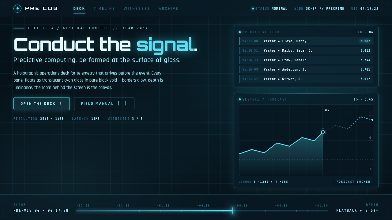 Minority Report Gestural UIPredictive computing, conducted on glass. Luminous cyan panels floating in pu…
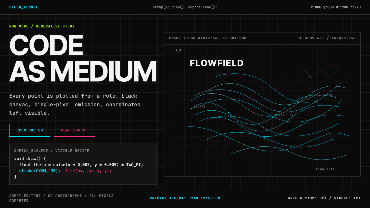 Processing / GenerativeCode becomes image. Cyan hairlines trace black-grid flowfields with mono coor…
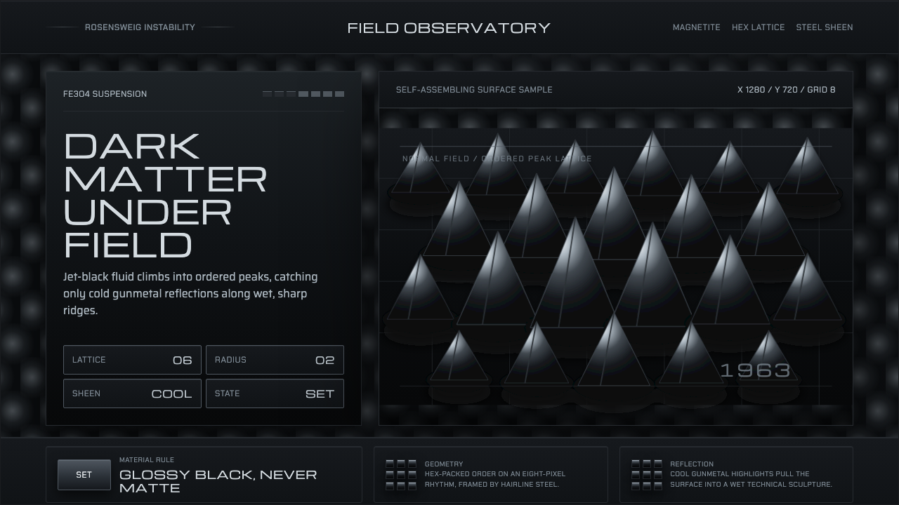 Ferrofluid Spike FieldPhysics turns sculptural. Jet black peaks, steel sheen, hex order.
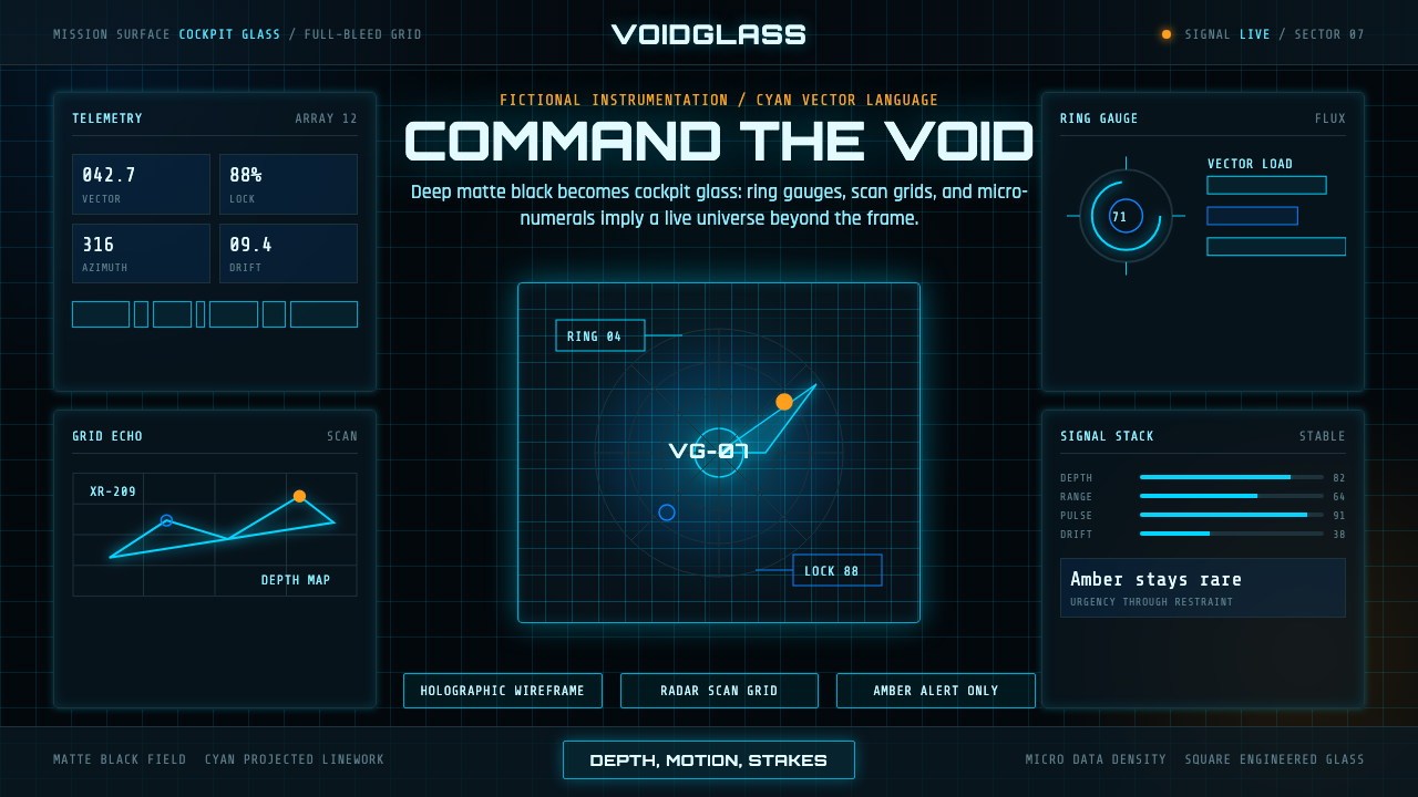 FUI Sci-Fi HUDBlack until it glows. Cyan wireframes, ring gauges, and radar grids sell live…
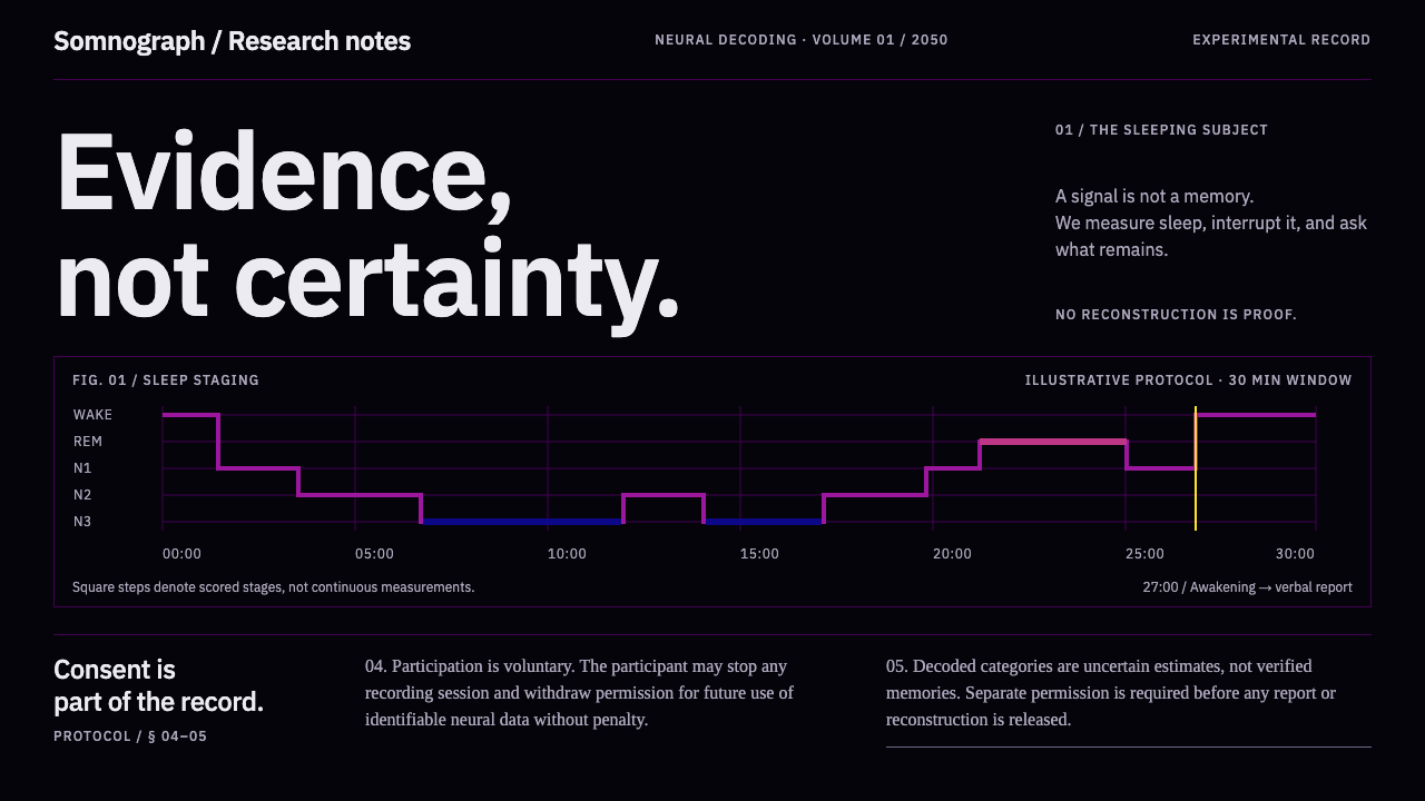 Dream Recording LabEvidence, not certainty. Plasma sleep-stage traces on black; consent stays fu…
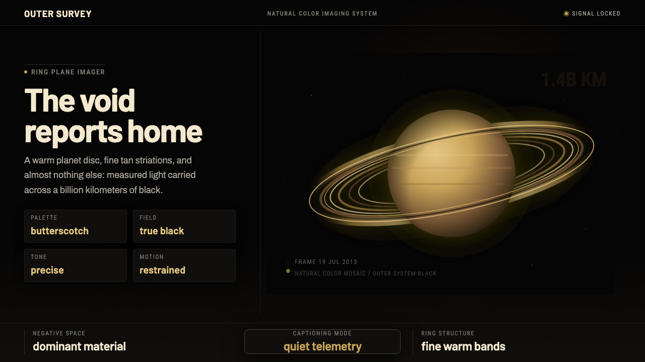 Cassini Saturn ImagingDeep space feels exact. Butterscotch Saturn floats in black with fine tan rin…