What is FUI Sci-Fi HUD?
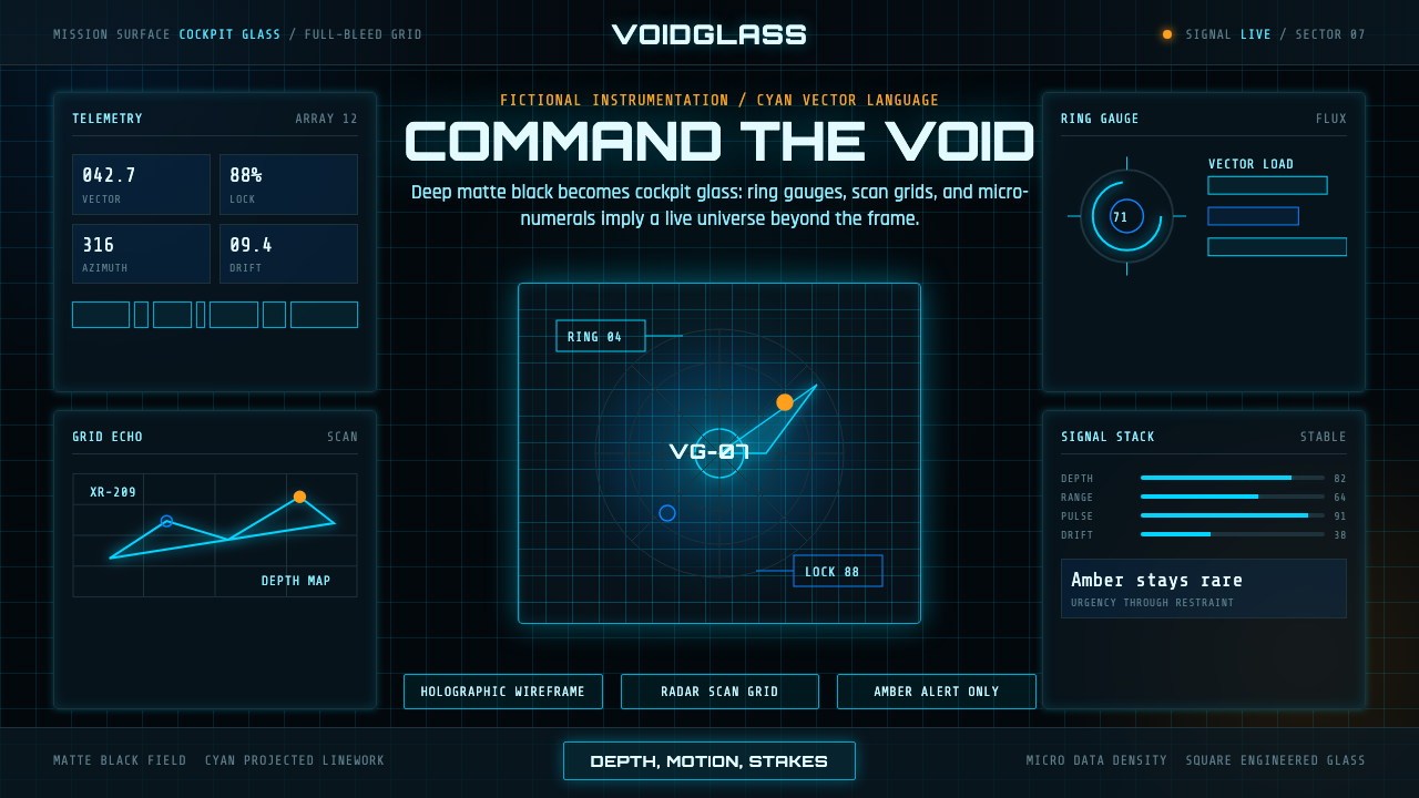
FUI turns a black screen into a command surface—cyan wireframes, circular telemetry, and scanning grids make imagined data feel urgent before anyone can read it.
FUI Sci-Fi HUD in brief
FUI, or Fictional User Interface, is the screen-graphics craft developed for cinematic science fiction. Its designers create cockpit displays, tactical HUDs, and command consoles that do not need to function as ordinary software. They need to convince an audience almost instantly that the surrounding world is technologically real, instrumented, and under pressure.
Its visual language is built from a dark void-like field, thin glowing vector lines, cyan wireframes, ring gauges, radar grids, scan marks, and compact numerical readouts. These elements imply telemetry, navigation, surveillance, and hidden systems beyond the frame. The viewer does not need to understand every label. The density and behavior of the graphics create the feeling that an entire operational world is active behind the glass.
FUI differs from ordinary dashboard design because its first responsibility is not efficient reading. Every arc, tick, grid, and readout exists to suggest motion, depth, scale, and stakes. The craft has since moved beyond film and visual effects into game overlays, esports broadcast graphics, and product interfaces that want to borrow the authority of a spaceship cockpit.

Where does FUI Sci-Fi HUD come from?
FUI emerged from contemporary North American film, visual-effects, and motion-graphics practice. Its setting was not the office application or the conventional information dashboard, but the imagined cockpit, tactical display, and command center of cinematic science fiction. The craft developed around a practical problem: a fictional interface had to communicate technological credibility immediately, even when no one would ever operate it in the real world.
Because these graphics are seen inside a moving image, they are judged by speed, atmosphere, and dramatic clarity. A successful display can establish scale, danger, location, or system failure before the audience has consciously identified a single word. Dense instrumentation therefore became a storytelling device. The interface is part of the world-building, not merely a surface placed over it.
Pioneers such as Mark Coleran and studios such as Territory Studio helped turn this screen language into a disciplined craft. Their practice established a vocabulary of luminous vector lines, ring-based instruments, scan grids, micro-numerals, and layered depth cues. The result feels technical without needing to reproduce the full logic of a real operating system.
FUI is recognized today as a contemporary cinematic interface movement, with current practice extending from roughly 2010 to the present. It has migrated into gaming overlays, esports broadcast graphics, and product interfaces. In each setting, the appeal is similar: the visual system makes the user feel positioned inside a live command environment, even when the underlying task is entertainment, presentation, or ordinary digital work.
What defines the FUI Sci-Fi HUD look?
Void Black and Cyan Glow
The ground is nearly black, creating the sense of a window opening into deep space or an unlit control room. Cyan provides the primary luminous vocabulary: cool, technical, and highly legible against darkness. The contrast should feel emissive rather than printed, as though the interface is generating its own light. Other accents are most effective when subordinate to this central glow.
Wireframe Linework
FUI prefers outlines, arcs, brackets, crosshairs, and vector paths over filled illustrations. Wireframes suggest that the system is mapping an object, scanning a space, or calculating a route in real time. Lines may be delicate, broken, layered, or partially occluded, but they should always feel intentional. Their purpose is to imply an underlying model rather than decorate an empty surface.
Ring Gauges and Telemetry
Circular gauges are among the style’s strongest symbols of live instrumentation. Concentric rings, segmented arcs, radial ticks, and moving indicators imply energy, pressure, distance, or system health without requiring literal explanation. The circle also creates a visual focal point inside a wide interface field. A gauge should appear to measure something, even when its subject remains deliberately ambiguous.
Radar Grids and Spatial Depth
Grid structures transform a flat screen into a navigable field. Perspective lines, sweeping scans, coordinate marks, and layered planes imply distance and orientation. Depth is usually suggested through overlap and luminosity rather than realistic rendering. A distant grid can remain faint while a nearer instrument glows more strongly, making the display feel spatial without becoming pictorial.
Micro-Numerals and Data Density
Small numerical fragments, labels, timestamps, and status marks create the impression of a larger data universe. In cinematic FUI, many of these details are atmospheric rather than informational. They should support hierarchy by clustering around meaningful instruments, leaving quieter areas where the eye can rest. Density suggests capability, but uncontrolled density becomes visual noise and weakens the illusion of command.
Scan Motion and Live Stakes
Motion is not an ornament added after the interface is designed. Scans, pulses, rotating arcs, expanding rings, and changing readouts explain why the display feels alive. Movement should imply an event: a system is searching, acquiring, warning, or recalculating. Even a still composition benefits from directional cues that make the next state imaginable.
Layered Command Hierarchy
FUI organizes attention through layers rather than conventional card layouts. A dominant instrument or target sits above secondary telemetry, while peripheral marks recede into the field. Brightness, line intensity, motion, and scale establish priority. The composition should feel like a control surface with a center of action, not a collection of equally important widgets arranged for administrative efficiency.

Who shaped FUI Sci-Fi HUD?
Mark Coleran is identified as a pioneer of FUI. His place in the field represents the designer’s role in making fictional interfaces feel technically credible, dramatically active, and immediately understandable as instruments of a larger world.
John LePore is listed among the key figures associated with FUI and sci-fi screen graphics. His inclusion reflects the craft’s development through specialist practitioners who treat interface imagery as a form of cinematic world-building.
Territory Studio is a key studio associated with the discipline. Its role demonstrates that FUI is not only an individual designer’s effect language but also a structured studio practice spanning visual effects, motion graphics, and imagined systems.
Mike Pangrazio is identified in the source material as one of the key figures connected with contemporary FUI practice. His inclusion places the style within a wider professional field rather than attributing its visual language to a single author.
How do you use FUI Sci-Fi HUD today?
For presentation slides, FUI works best when the cover establishes a dramatic command environment and the content pages preserve a clear operational hierarchy. A cover can use a large ring instrument, a wireframe target, or a radar sweep as the visual anchor, with the title treated like a mission designation. Content slides should retain generous dark space around the main message. Data slides can turn charts into telemetry displays, using glowing arcs, scan paths, and status indicators to make trends feel live while keeping the actual comparison legible.
For web interfaces, FUI is suited to dashboards, monitoring tools, control rooms, and pricing pages that need to communicate activity or technical authority. A dashboard can place a dominant status instrument above quieter supporting readouts, with grid lines and coordinate marks creating a sense of navigable space. A pricing page can treat each tier as a system state, using ring progress, signal intensity, or alert language to differentiate levels. The interface must still reveal actions and costs plainly; atmosphere should frame the decision, not obscure it.
For editorial and marketing work, FUI can turn a campaign into a transmission from an imagined operational world. Feature spreads may combine black fields, luminous diagrams, cropped wireframes, and compact labels that make ordinary products feel engineered for a mission. Marketing pages benefit from a strong opening signal, followed by calmer explanatory sections where the product story becomes readable. The style is especially effective when the subject involves technology, exploration, security, gaming, or systems thinking.
In gaming and esports, FUI naturally supports live overlays, player status displays, match transitions, broadcast packages, and spectator information. Its strongest contribution is psychological: scanning motion and reactive gauges make the event feel monitored in real time. The visual system should distinguish game-critical information from broadcast atmosphere. A ring or grid can establish identity, but the score, player state, and current event must remain immediately findable.
The common mistake is treating FUI as permission to fill every dark surface with glowing lines and microscopic labels. Density without hierarchy looks like decoration, and decoration without believable system behavior quickly becomes a cliché. Another failure is copying the cyan-on-black palette while omitting the underlying logic of scanning, measurement, and command. Use fewer instruments, give each a role, and let motion or brightness explain which part of the imagined system matters now.

FUI Sci-Fi HUD — FAQ
Is FUI the same as a normal dashboard?
No. A normal dashboard is primarily organized for reading, comparison, and action. FUI is primarily organized for cinematic credibility, atmosphere, and implied activity. It may contain dashboard-like information, but its gauges, scans, and microdata often exist to make the surrounding world feel operational. When FUI is adapted to a real product, the designer must preserve actual usability beneath the fictional command language.
Must FUI always use cyan on black?
The black field and cyan glow are its strongest recognizable signals, but they are not the entire definition. What matters more is the relationship between luminous linework, implied instrumentation, spatial grids, and live system behavior. Changing the accent color can alter the emotional temperature, yet the result still needs to feel like an active interface rather than a generic dark theme. The closer the design moves toward ordinary product UI, the more carefully it should preserve the FUI logic.
How does FUI create depth without becoming realistic?
It uses overlap, line intensity, perspective grids, segmented rings, and different levels of glow to imply spatial order. A distant layer can recede through faintness, while a foreground instrument can assert itself through stronger luminosity and motion. The system suggests a space being measured rather than depicting a fully rendered physical environment. This keeps the result diagrammatic, technical, and open to interpretation.
Does every FUI element need to be readable?
No. Cinematic FUI often includes atmospheric data whose purpose is to suggest scale and complexity rather than deliver a literal message. However, unreadable detail should still have structure. Labels should cluster around instruments, scans should point toward meaningful targets, and repeated marks should imply a consistent system. In a real interface, critical actions and states must become readable even if peripheral details remain atmospheric.
Where does FUI work well, and where does it struggle?
It works well where technology, monitoring, exploration, competition, or command are part of the product’s identity. Dashboards, games, esports, cinematic campaigns, and system-oriented tools can all benefit from its sense of live stakes. It struggles when the experience depends on warmth, softness, calmness, or effortless everyday reading. In those contexts, its dark density and instrumental tension may feel theatrical or exhausting. The style should serve the product’s emotional promise, not replace it.
Related design styles
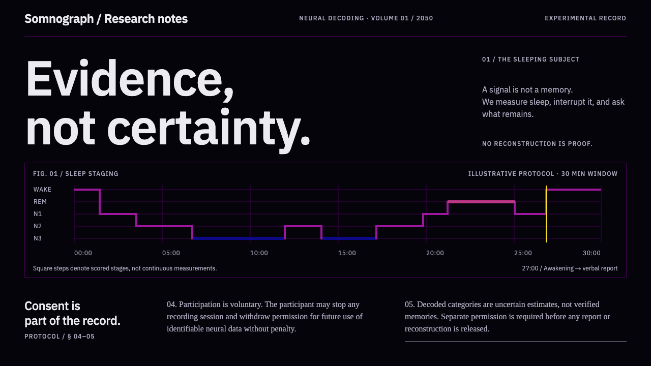 Dream Recording LabEvidence, not certainty. Plasma sleep-stage traces on black; consent stays fu…
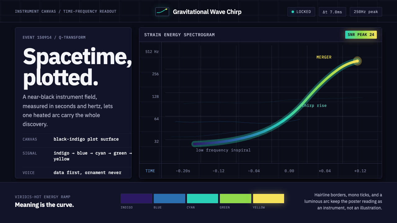 Gravitational Wave ChirpData makes the drama. Near-black grid, mono Hz ticks, and a viridis-hot chirp…
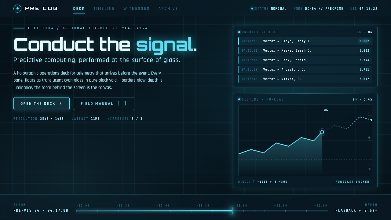 Minority Report Gestural UIPredictive computing, conducted on glass. Luminous cyan panels floating in pu…
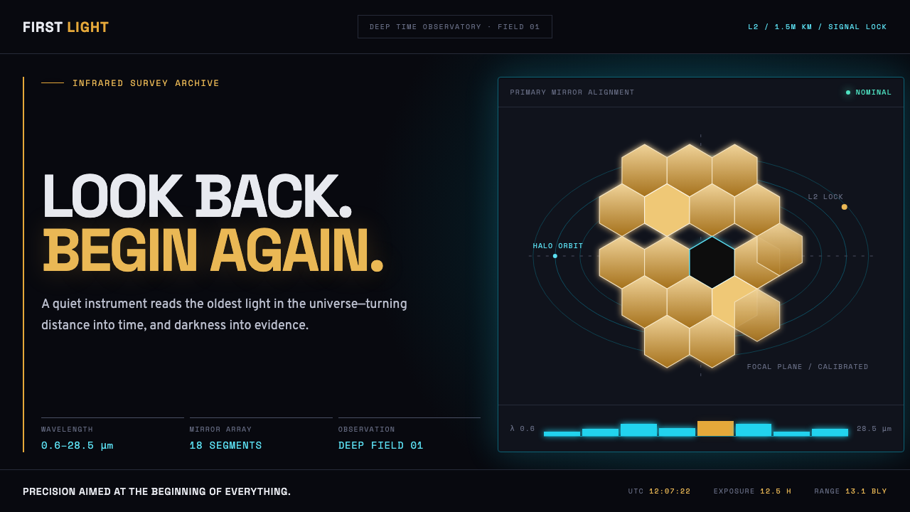 James Webb Telescope (2022)Precision meets deep time. Mirror gold hexagons and cyan telemetry glow acros…
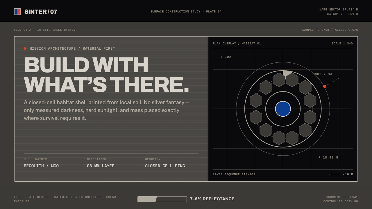 Lunar Regolith SettlementMoonlight without the myth. Regolith gray, hard terminators, and a strict tec…
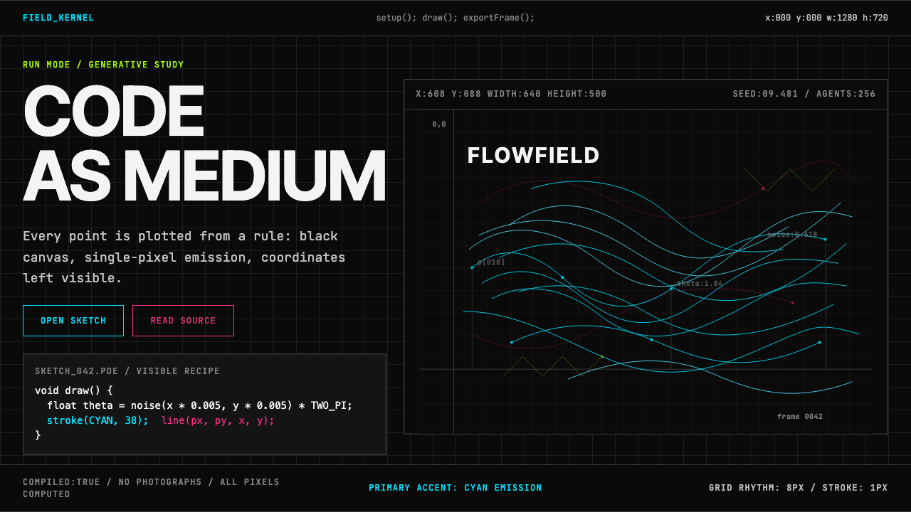 Processing / GenerativeCode becomes image. Cyan hairlines trace black-grid flowfields with mono coor…