What is James Webb Telescope (2022)?
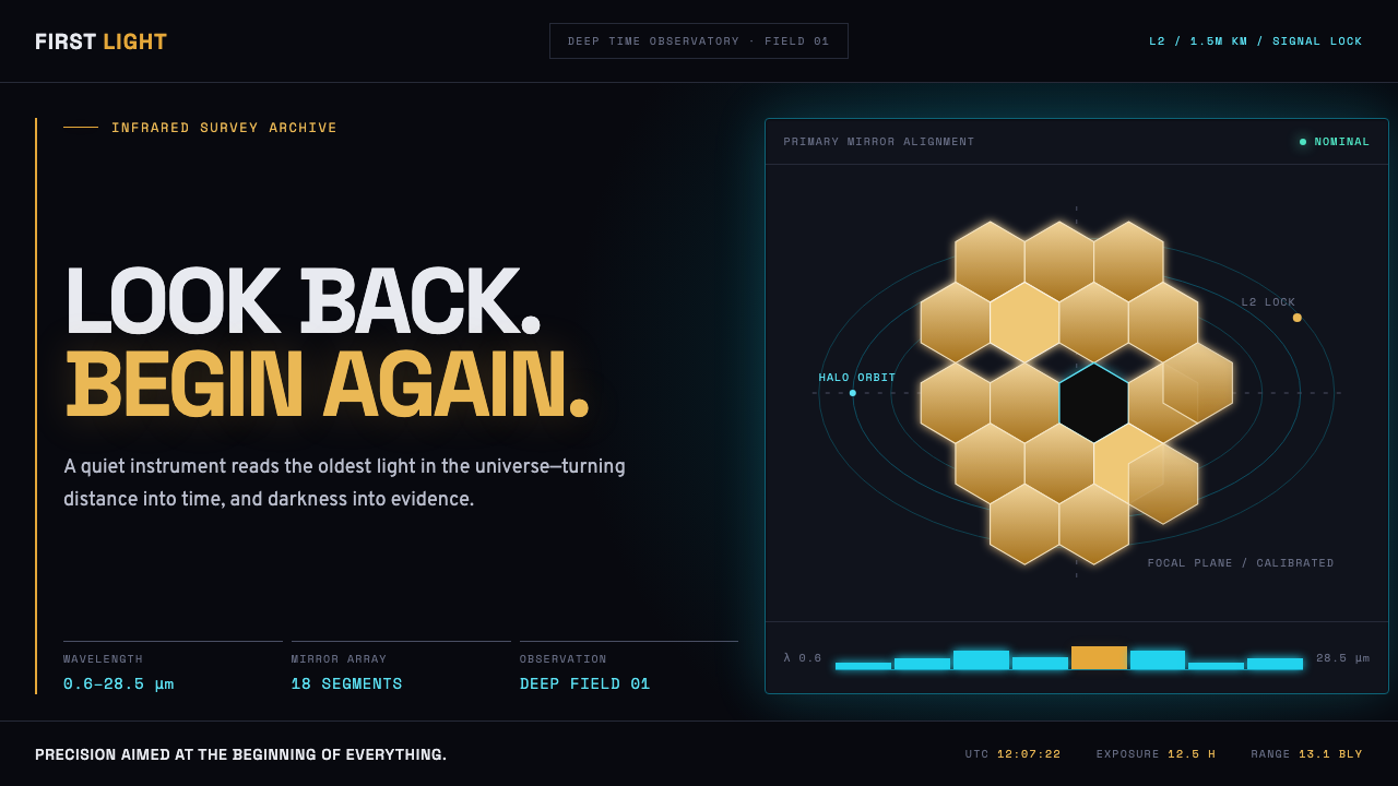
The James Webb Space Telescope turned deep time into an interface — gold hexagons, glowing cyan telemetry, and a black void that never fills flat.
James Webb Telescope (2022) in brief
This style renders the most ambitious optical machine ever launched as a live instrument panel. The mirror — eighteen hexagonal beryllium segments coated in gold — becomes the dominant visual motif, its tessellated geometry carrying entire layouts the way a grid carries type. Everything sits on a ground that is nearly pure black, not decorative black but the black of vacuum, of a telescope parked a million miles from Earth where no ambient light exists to soften an edge.
Against that void, only two colors are permitted to exist, and both of them glow rather than sit flat: mirror gold for the telescope's own hardware and structural motifs, ionized cyan for data, telemetry, and readouts. Neither color is a fill — both behave like light sources against darkness, the visual logic of a screen glowing in a control room rather than ink on paper. Numbers, labels, and mission callouts run in monospace, the typeface of engineering rather than communication design, because this is a system built by people who needed to read a coordinate correctly before they needed it to look beautiful.
The overall mood splits evenly between two real documents: a NASA mission-control dashboard, dense with live readouts, and a first-light press image, composed and quiet. Nothing decorative survives — no gradient exists that isn't physically accurate to how gold reflects or cyan telemetry glows, no ornament exists that wasn't already present in the engineering drawings the telescope was actually built from.
Where does James Webb Telescope (2022) come from?
The telescope launched on 25 December 2021 aboard an Ariane 5 rocket from Kourou, French Guiana, a joint undertaking of NASA, the European Space Agency, and the Canadian Space Agency. It traveled roughly a million miles to Lagrange point 2, a gravitationally stable position beyond the Moon's orbit where the telescope, the Sun, and Earth stay in a fixed configuration, letting a sunshield the size of a tennis court permanently block heat and light from all three bodies at once.
Unlike its predecessor Hubble, which observes largely in visible light, Webb was built to see in infrared — a choice driven by cosmology itself. Light from the earliest galaxies has been stretched by the universe's expansion into infrared wavelengths by the time it reaches us, so an infrared-optimized instrument can look further back in time than any visible-light telescope. That scientific mission is the origin of the aesthetic's obsession with depth, glow, and darkness: the telescope's entire purpose is to make the faint and the ancient visible against black.
The eighteen-segment gold mirror was itself a design solution to a transport problem: no rocket fairing could carry a mirror as large as the science required in one rigid piece, so the mirror was engineered to fold for launch and unfold in space, each hexagonal segment individually adjustable to sub-micron precision once deployed. The gold coating is not cosmetic — a thin layer of gold on beryllium reflects infrared light far more efficiently than bare metal, making the mirror's color a direct consequence of its function rather than a stylistic choice.
On 12 July 2022, NASA released the telescope's first full set of science images and spectra, including the deepest and sharpest infrared view of the distant universe captured to date. The reveal was staged deliberately as both a scientific milestone and a media event, and the visual language that accompanied it — mission patches, engineering diagrams, glowing deep-field imagery — is the direct source of this style.
What defines the James Webb Telescope (2022) look?
Color
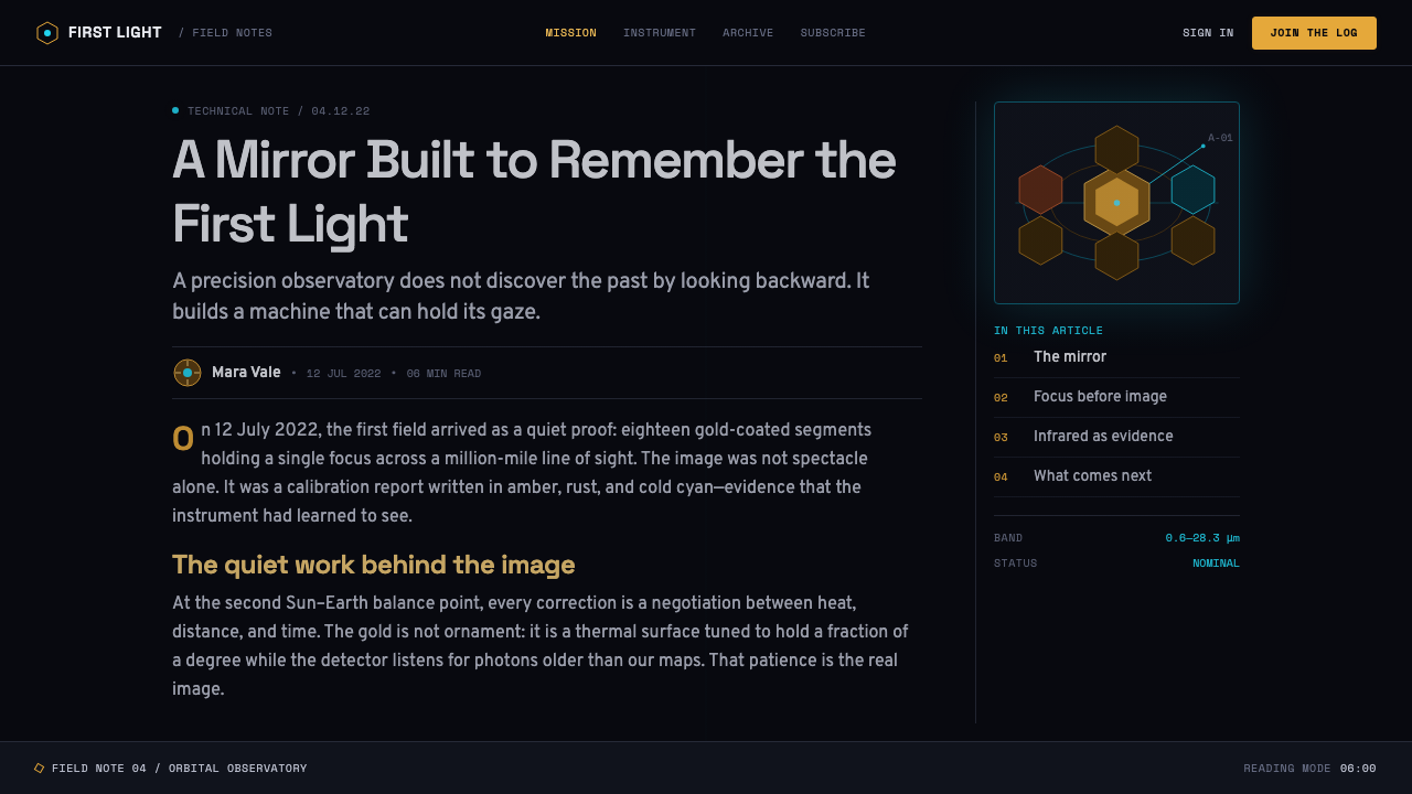
Only two hues are permitted against a near-black void: mirror gold for hardware and structural motifs, ionized cyan for data and telemetry. Both behave as glowing light rather than flat fill, echoing how the actual mirror reflects light and how real telemetry readouts glow on a dark screen. No third accent color intrudes — restraint is what keeps the void feeling vast rather than merely dark.
Typography
Monospace type dominates for data, coordinates, and mission callouts — the typeface of engineering logs rather than editorial design, chosen because every character must occupy predictable space for readouts to align. Headlines and mission titles can use a clean geometric sans, but always secondary to the monospace data layer, which reads as the system's true voice.
Hexagonal Tessellation
The eighteen-segment mirror's hexagonal geometry becomes a structural grid in its own right — content blocks, cards, and section dividers can echo the tessellation without literally depicting the mirror. The hexagon carries the same organizing weight that a rectangle carries in most interface grids.
Glow Over Flat Fill
Gold and cyan elements read as luminous — soft outer bloom, brightened edges — rather than solid color fills. This is the single most important technical habit of the style: a flat gold rectangle looks like a sticker, while a gold shape that glows at its edge looks like hardware catching starlight.
Telemetry and Diagrammatic Elements
Orbit paths, spectral curves, sunshield cross-sections, and coordinate readouts appear as real diagrammatic content, styled to look pulled directly from mission documentation rather than illustrated for effect. These elements function as content, not decoration, standing in for narrative the way a chart stands in for an argument.
Depth Through Darkness
Depth is created not by layering shadows but by the sheer scale of black negative space surrounding small, precise, glowing elements. A single hexagon or telemetry readout floating in a vast dark field communicates distance and scale more effectively than any drop shadow could.
Engineering Precision
Lines are drawn with schematic exactness — thin, consistent weight, right angles and clean arcs, the visual manner of a blueprint rather than a poster. Nothing wobbles or feels hand-drawn; the precision is itself part of the message, since the mirror's own segments were adjusted to sub-micron tolerances.
Who shaped James Webb Telescope (2022)?
Senior project scientist for the James Webb Space Telescope and a Nobel laureate in physics, Mather shaped the mission's core scientific goals over decades of development, guiding the telescope toward its central purpose of observing the earliest galaxies in infrared. His long institutional stewardship is part of why the telescope's identity is inseparable from rigorous, mission-driven precision.
Principal investigator for the Near-Infrared Camera (NIRCam), the telescope's primary imaging instrument, Rieke led the science team responsible for the instrument that captured the first deep-field images released in July 2022. Her work sits at the exact intersection of engineering precision and image-making that defines the style.
Principal investigator for the Mid-Infrared Instrument (MIRI), a European-led instrument capable of detecting longer infrared wavelengths than the telescope's other sensors, Wright's work extended Webb's reach into some of the coldest, most distant, and most obscured objects the telescope observes, reinforcing the mission's identity as an instrument built to see into darkness itself.
Project manager for the James Webb Space Telescope at NASA, Ochs oversaw the engineering execution of the mission through its most technically fraught phase — the folded launch configuration and the multi-week, multi-stage deployment sequence that had to unfold flawlessly a million miles from any possibility of repair.
How do you use James Webb Telescope (2022) today?
This style works anywhere a product wants to feel precise, vast, and quietly awe-inspiring rather than warm or approachable — its entire vocabulary is borrowed from mission-critical aerospace engineering, and it carries that authority into any context that can support a dark, glowing interface.
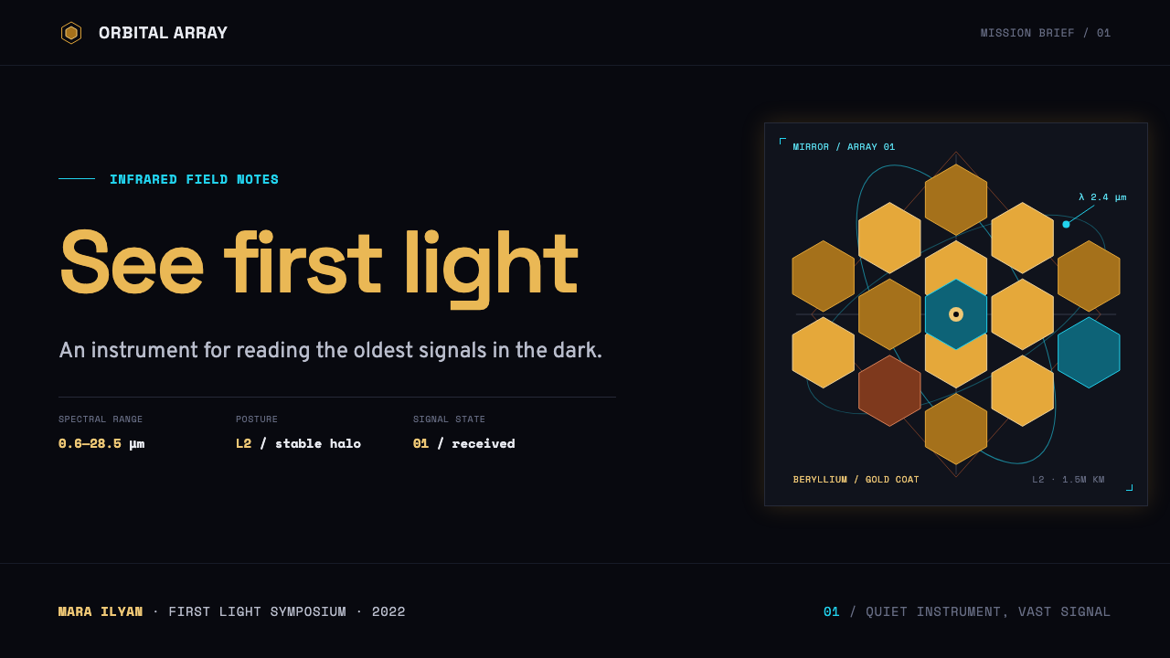
For presentation slides, a cover built on a hexagonal fragment glowing gold against black, with the title set in clean monospace or geometric sans, immediately signals technical seriousness. Content slides work best as near-black fields with cyan data callouts and thin gold structural lines dividing sections — treat every slide like a mission-control readout rather than a marketing panel. Data slides are a natural home for this style: a glowing cyan chart line against black reads as more credible than the same line on white.
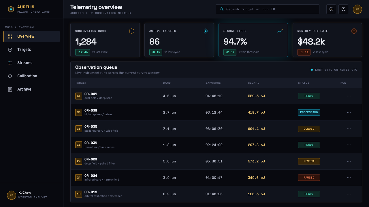
For web interfaces, the aesthetic suits dashboards, developer tools, scientific and data platforms, and premium technical products where a dark theme is already expected. Use near-black backgrounds throughout, reserve gold for primary actions or brand accents, and let cyan carry live data, status indicators, and telemetry-style readouts. Hexagonal card shapes or section dividers, used sparingly, reinforce the mirror motif without becoming a gimmick.
For editorial and marketing work, the style supports long-form science journalism, space and astronomy content, and premium technology brand storytelling. Pull quotes and captions read well in monospace against black; hero images benefit from the same glow treatment used for the mirror itself, so that a photograph and an illustrated diagram feel like they belong to the same visual system.
The most common mistake is treating gold and cyan as ordinary flat brand colors and applying them as solid fills across large areas. This flattens the entire aesthetic into a generic dark theme with two accent colors. The style only works when gold and cyan are treated as light — glowing, concentrated, surrounded by darkness — never as a background fill or a large solid shape.
James Webb Telescope (2022) — FAQ
Is this the same as a generic 'space' or 'sci-fi' theme?
No. Generic space themes tend to use starfields, nebula gradients, and decorative planets as atmosphere. This style is stricter and more specific — it borrows only what the actual telescope's engineering produced: a hexagonal gold mirror, ionized cyan telemetry, and a near-black void. Every visual choice traces back to a real design decision made by aerospace engineers, not to an artist's impression of outer space.
Can this style work on a light background?
Not convincingly. The entire logic depends on gold and cyan behaving as glowing light against darkness — remove the near-black void and both colors collapse into ordinary flat accents with no special quality. If a light variant is unavoidable, the gold mirror motif can survive as a line-art or outline treatment, but the glowing telemetry effect should be considered lost.
Why only two accent colors — gold and cyan?
Because both colors are functionally accurate rather than arbitrary: gold is the actual coating on the mirror's beryllium segments, chosen for infrared reflectivity, and cyan is the conventional color for live telemetry and data readouts on dark mission-control displays. Introducing a third accent color would break that functional logic and start to feel like generic branding rather than engineering truth.
How much hexagonal geometry is too much?
The tessellation should organize structure — grids, card shapes, section dividers — not appear on every element indiscriminately. If every button, icon, and avatar becomes a hexagon, the motif stops reading as 'the mirror' and starts reading as a repeating pattern. The mirror itself uses hexagons for a structural reason; the design should use them the same way, sparingly and where they carry real organizational weight.
Does this style suit warm, consumer-friendly products?
Generally not. Its power comes from cold precision and the implied vastness of deep space, which reads as impressive but distant rather than warm or inviting. It suits technical, scientific, and premium engineering-adjacent products far better than anything built around comfort, playfulness, or everyday familiarity.
Related design styles
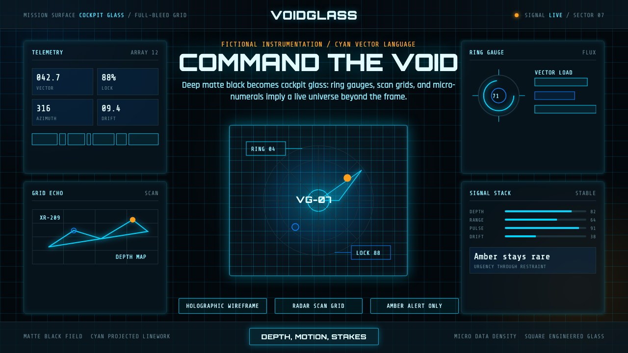 FUI Sci-Fi HUDBlack until it glows. Cyan wireframes, ring gauges, and radar grids sell live…
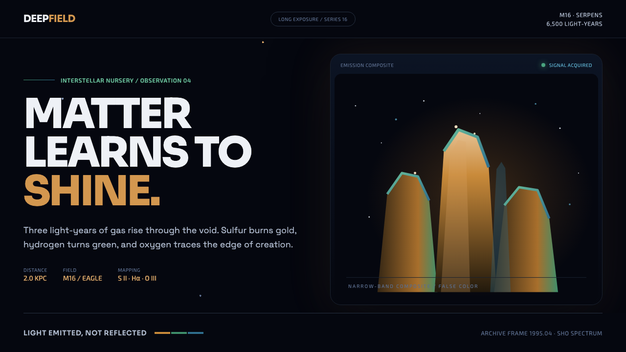 Hubble Pillars of CreationCreation glows from within. Amber towers rise through a cyan-green rim into t…
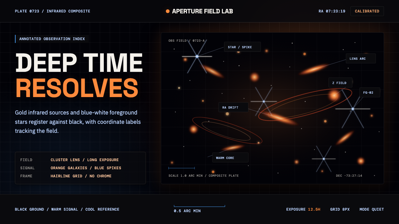 JWST Deep FieldPrecision in deep black. Orange galaxies, blue spikes, and DM Mono callouts m…
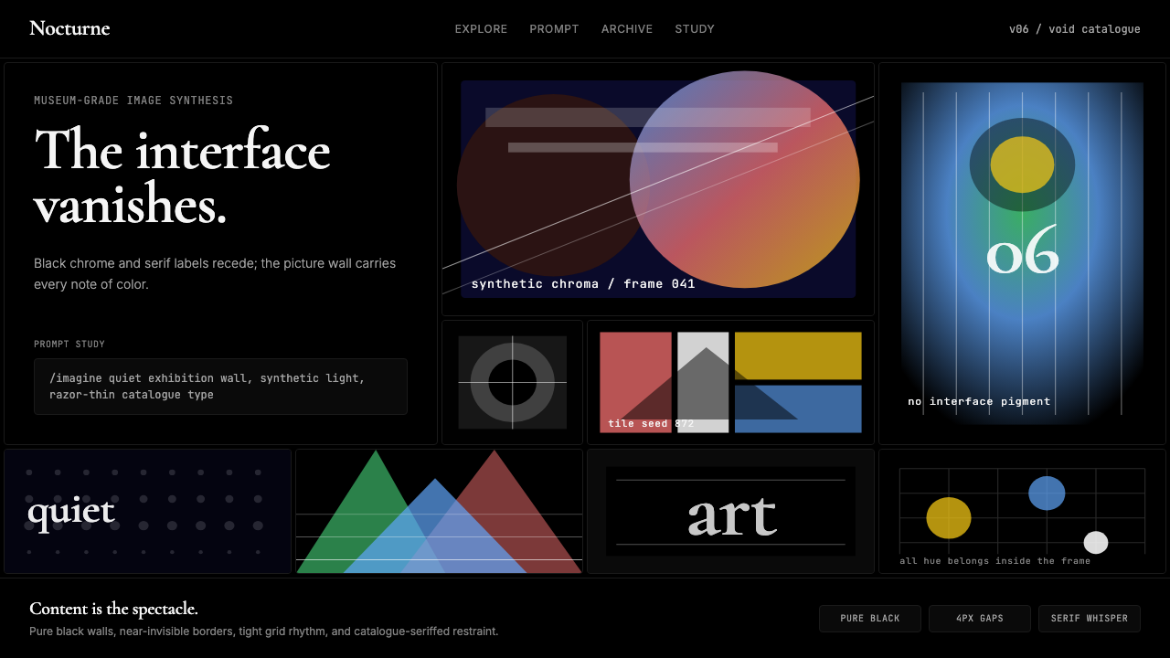 MidjourneyInvisible chrome, visible art. Pure black grid and Cormorant serif give color…
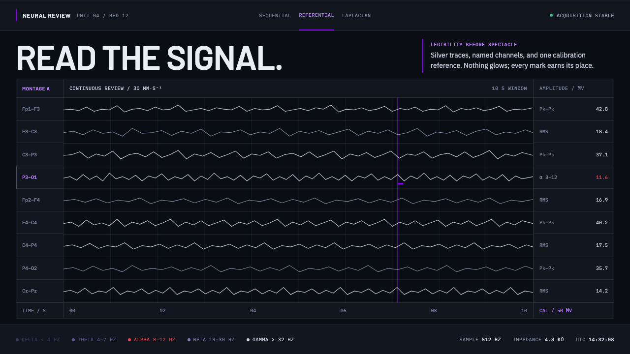 Neural Interface ClinicalClinical restraint makes signals legible. Silver traces cross near-black; vio…
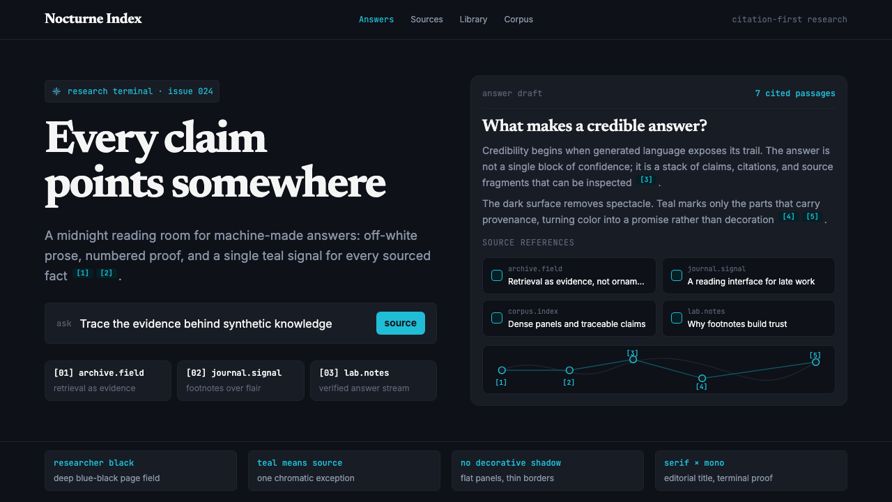 Perplexity AISerious search after midnight. Teal citations cut through black panels and de…