What is Hubble Pillars of Creation?
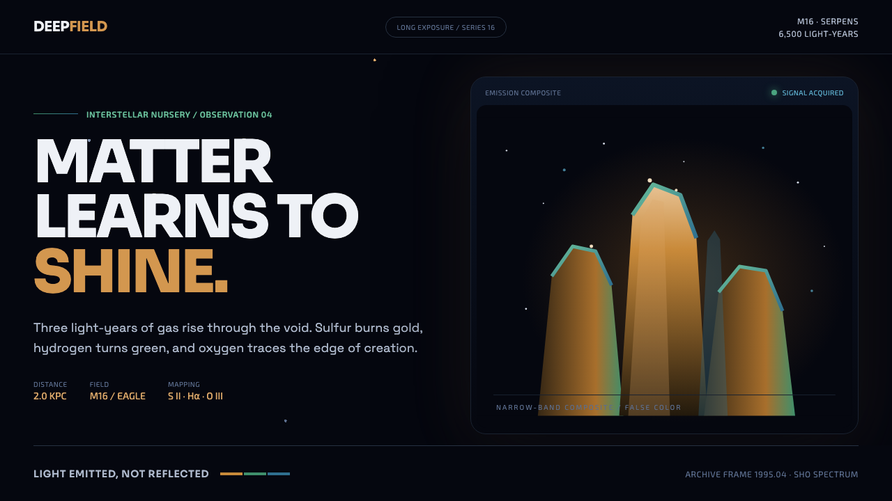
Creation glows from within: amber towers pierce a cyan-green rim and rise into a navy void where every star feels deliberate.
Hubble Pillars of Creation in brief
Hubble Pillars of Creation is a dark astronomical visual language drawn from the Eagle Nebula image returned by Hubble’s WFPC2 camera in April 1995. Its central image is not a landscape and not a decorative space backdrop: it is a towering structure of interstellar gas and dust, rising upright through darkness. The composition feels monumental because the forms are vertical, compressed, and larger than the surrounding field.
The palette comes from narrow-band mapping by Jeff Hester and Paul Scowen. The pillars burn in gold and amber, their edges are surrounded by fluorescing green and ionized cyan, and the background recedes into a near-black navy void. Pinpoint stars interrupt that darkness without competing with the main forms. Color therefore behaves like evidence of emission: it seems to originate inside the subject and escape along its edges.
As an interface style, Hubble Pillars of Creation carries scientific imagery into a system of hierarchy, contrast, and atmosphere. Large vertical forms establish scale, emitted light creates focus, and the dark field gives every bright element room to breathe. The result should feel like a cosmic incubator translated into design: observant rather than fantastical, luminous rather than glossy, and grounded in a palette earned by a telescope.

Where does Hubble Pillars of Creation come from?
The style begins with the Eagle Nebula observation made by Hubble’s WFPC2 camera in April 1995. Its stated setting is the United States, within the institutional context of NASA, the Space Telescope Science Institute, and the Hubble Space Telescope. That origin matters because the visual language is inseparable from the act of looking into deep space and returning a structured image from near-blackness.
The original composition is defined by three light-years of interstellar gas and dust standing upright against the dark. This verticality became the style’s first design principle. The subject is not spread evenly across the frame; it gathers into monumental columns, allowing the surrounding darkness to act as active space rather than empty background.
Jeff Hester and Paul Scowen’s narrow-band mapping gave the image its characteristic chromatic organization. Gold and amber establish the bodies of the towers, while fluorescing green and ionized cyan form a luminous rim. The result belongs to the broader language of space-telescope science imaging and narrow-band SHO astrophotography, where color is used to reveal structure rather than simply create mood.
The source also identifies a 2015 re-image made for the twenty-fifth anniversary of the original WFPC2 image. That later image does not erase the first visual idea; it reinforces the continuity of the subject and of the design language. Hubble Pillars of Creation therefore carries both an original scientific image and its later re-imaging as part of its cultural and visual foundation.
What defines the Hubble Pillars of Creation look?
Emitted Light
Light should appear to come from within the subject, not bounce off a polished surface. Amber cores, cyan edges, and green rims suggest energy escaping from dense forms. Use glow as a sign of activity and structure, keeping it concentrated near boundaries rather than spreading it evenly across the interface.
Amber Mass
The main forms are warm, dense, and mineral in feeling. Gold and amber create the impression of material gathered under pressure, giving vertical objects visual weight without making them look metallic. Warm color belongs to the body of the form; cooler tones belong to its illuminated edge and surrounding space.
Vertical Monumentality
Pillars, towers, columns, and upward-reaching silhouettes are the primary compositional gestures. They should feel larger than the interface containing them. Avoid scattering equivalent elements across the screen; establish a dominant vertical presence and let secondary forms support its scale.
Navy Void
The background is nearly black but not inert. Navy gives the darkness a faint spatial identity, allowing the interface to feel deep rather than merely empty. Large quiet areas are essential: they separate glowing forms, slow the eye, and preserve the impression of looking into distance.
Cyan-Green Rim
Cool color belongs to the threshold between form and void. A cyan or green rim can outline a tower, separate a card from the background, or mark an active state, but it should remain subordinate to the amber mass. The edge is where the system becomes visibly energetic.
Pinpoint Precision
Stars appear as sparse points rather than decorative texture. Their value comes from restraint and placement. Small luminous details can guide attention toward a headline, status, or data point, while excessive particles turn the scientific atmosphere into generic space fantasy.

Who shaped Hubble Pillars of Creation?
Hester is one of the two astronomers named in connection with the narrow-band mapping that gave the pillars their gold, amber, green, and cyan organization. His place in the style is therefore tied to color as a method of revealing structure.
Scowen worked alongside Jeff Hester in the narrow-band mapping associated with the Eagle Nebula image. The resulting visual system treats color as emitted information, making his contribution central to the style’s scientific rather than purely atmospheric character.
NASA is part of the American institutional setting identified for the Hubble image. In the design language, it represents the public scientific framework behind the image: observation, instrumentation, and a visual record of the cosmos.
ESA is named among the key institutional figures associated with the source material. Its presence places the style within a wider space-science constellation rather than treating the image as an isolated artistic reference.
The Space Telescope Science Institute is explicitly paired with NASA in the origin context. It anchors the style in the scientific stewardship of Hubble imagery and reinforces the distinction between evidence-based cosmic color and invented space decoration.
How do you use Hubble Pillars of Creation today?
For presentation covers, use a dark navy field with a single monumental vertical form entering from below or rising along one edge. Let the title sit in a clear area of darkness, with amber used for the primary emphasis and cyan-green reserved for a luminous contour or small marker. The cover should feel like an encounter with scale: sparse, vertical, and quietly charged.
Content slides should use the same visual logic at a calmer intensity. Treat each section as a field of space with one dominant organizing form, then place text in well-separated clusters. Data slides can turn bars, lines, or points into emitted signals: amber for the main series, cyan or green for a comparison or active state, and pinpoint accents for important observations. Keep the chart legible before adding atmosphere.
For web interfaces, the style suits dashboards, monitoring tools, scientific products, and pricing pages that need authority without becoming sterile. Use near-black navy as the structural field, warm amber for primary values or selected plans, and cool rims for focus, progress, or interaction. Cards should feel like illuminated objects suspended in space, with clear boundaries and restrained glow rather than glossy surfaces.
Editorial and marketing pages can use the style to frame launches, research stories, technology narratives, and products that want to suggest discovery. Open with a large vertical image or pillar-like typographic composition, then alternate dense information with quiet dark passages. Headlines can be warm and luminous; supporting copy should remain subdued so the page preserves the contrast between a small human reading surface and an immense cosmic subject.
The common mistake is turning the style into generic sci-fi decoration. Filling every surface with stars, gradients, neon color, or equal-strength glow destroys the hierarchy that makes the reference powerful. Another mistake is using cyan-green as the main color and amber as a minor accent. The source image is organized around warm towers inside a cool rim and dark void; reversing that relationship changes the style’s identity.

Hubble Pillars of Creation — FAQ
Is Hubble Pillars of Creation a general space aesthetic?
No. Its defining reference is the Eagle Nebula image captured by Hubble’s WFPC2 camera in April 1995. The style depends on upright gas-and-dust forms, a warm amber core, a cyan-green luminous edge, a near-black navy field, and sparse pinpoint stars. Removing that structure leaves only generic space imagery.
Why should the light feel emitted rather than reflected?
The source describes the palette as emitted light and presents the towers as glowing from within. Reflected light makes a surface appear polished or externally lit; emitted light makes the form feel active and internally energized. That distinction is important for interface use: glow should reveal hierarchy and state, not merely make every component look attractive.
Can the style work with a light background?
It can be adapted, but the dark navy void is a foundational part of the reference, not an optional mood. A light background weakens the sense of depth and makes the emitted palette read more like colored illustration. If a light variant is necessary, preserve the vertical monumentality, warm body, cool rim, and sparse star-like accents so the composition remains recognizable.
How should stars be used in an interface?
Use them as sparse pinpoint signals. A small luminous point can mark a status, draw attention to a data observation, or add scale to an otherwise quiet field. They should not become a repeated texture behind every panel. The reference gains power from the contrast between a few precise points and a large field of darkness.
What products suit this visual language best?
It is especially suitable for dashboards, monitoring tools, scientific interfaces, technology launches, research stories, and pricing pages that want to communicate discovery and scale. It is less suitable when the product depends on everyday warmth, playful abundance, or tactile softness. The style asks for restraint, darkness, vertical hierarchy, and purposeful light; the product should share those values.
Related design styles
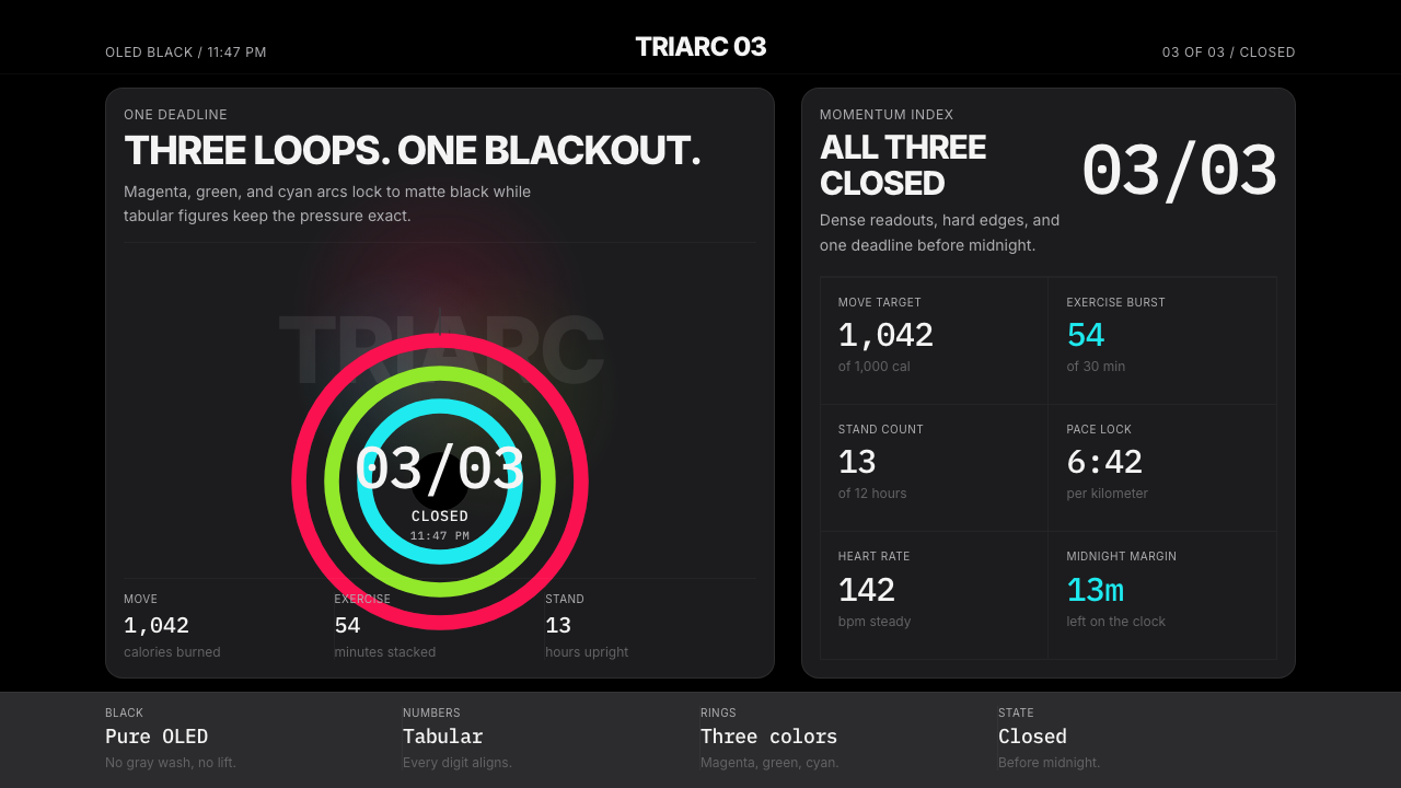 Apple Fitness Rings Closed (2024)Midnight feels exact. Magenta, green, and cyan rings lock onto OLED black.
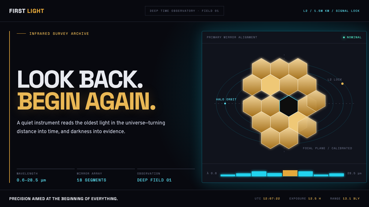 James Webb Telescope (2022)Precision meets deep time. Mirror gold hexagons and cyan telemetry glow acros…
 Cash App 2024Fintech that talks like a record label. Pure black, dollar-bill green, type a…
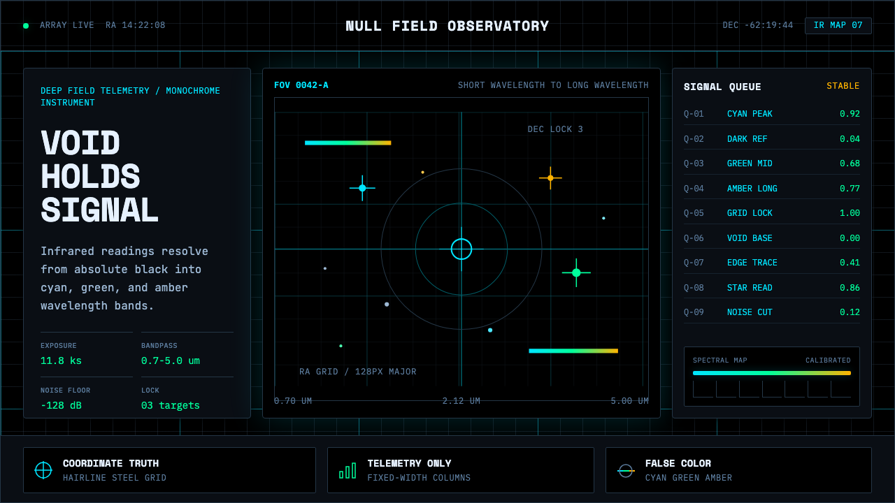 Deep Space ObservatoryTrust the void. Cyan telemetry and amber wavelength bars lock to a steel grid.
 Fencing PisteTurns darkness into signal. Rajdhani HUD type frames a white piste and red-gr…
 JWST Deep FieldPrecision in deep black. Orange galaxies, blue spikes, and DM Mono callouts m…