What is JWST Deep Field?
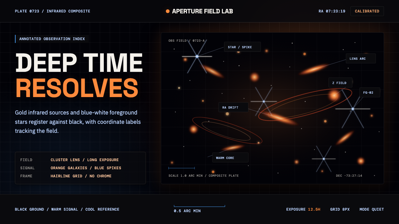
JWST Deep Field turns the blackness of space into an illuminated research surface, where ancient-looking galaxies glow beneath a precise layer of coordinates, labels, and lines.
JWST Deep Field in brief
JWST Deep Field is a contemporary visual style derived from Webb’s First Deep Field, the image of SMACS 0723 unveiled on 2022-07-11. Its defining field is nearly pure black, populated by thousands of gold-orange galaxies, white-blue foreground stars with six-point diffraction spikes, and elongated arcs created by gravitational lensing. The result feels immense but not empty: darkness acts as active space, allowing every luminous object to register with unusual intensity.
As a design system, the style combines that high-contrast astrophotographic language with the conventions of scientific data visualization. Monospaced labels, coordinate readouts, thin connector lines, and restrained annotations map selected objects without overwhelming the field. The emotional spectacle of deep space is therefore held inside an analytical frame: wonder remains visible, but it is organized as evidence.
The central tension is between abundance and control. The image layer may contain countless points, smears, arcs, and radiant spikes, while the interface layer stays sparse and exact. Warm galaxies provide depth and density; cool stars puncture the darkness; pale typography supplies orientation. A successful composition preserves all three registers without allowing any one of them to flatten the others.
Where does JWST Deep Field come from?
The visual source is Webb’s First Deep Field, an image of the galaxy cluster SMACS 0723 released on 2022-07-11. Produced within the global NASA, ESA, and CSA collaboration, with the STScI Webb imaging team named among its key figures, the image quickly became the James Webb Space Telescope’s defining public visual. Its recognition came not from a conventional centered subject but from an entire field of luminous information.
The image belongs to infrared deep-field astronomy, a mode of observation whose public appearance differs sharply from ordinary night-sky imagery. Rather than a few isolated stars against soft darkness, the field is crowded with galaxies in varied shapes and warm tones. White-blue foreground stars carry prominent six-point spikes, while long gravitational-lensing arcs bend through the scene. These elements created a vocabulary of dots, streaks, halos, spikes, and curves distributed across black space.
Its transformation into a design language comes through scientific data visualization. The astronomical field supplies richness, scale, and emotional force; the annotation layer supplies selection and legibility. Coordinates, monospaced callouts, and fine connectors suggest that the viewer is not merely looking at a beautiful picture but inspecting a mapped observation. The style therefore sits between public science communication and interface design.
Because the source emerged through a global collaboration and circulated through the internet, JWST Deep Field does not belong to a single national graphic tradition. Its identity is institutional and networked: an image produced by scientific cooperation becomes a shared visual reference, then a reusable system for slides, dashboards, editorial pages, and marketing. What persists across those formats is the same proposition — deep black can hold both cosmic mystery and disciplined information.
What defines the JWST Deep Field look?
Deep-Black Field
Black is not a decorative background but the primary spatial material. It creates the impression of an unbounded observational field and gives luminous objects room to separate from one another. Large areas should remain genuinely dark and visually quiet; lifting the ground toward smoky gray weakens both the cosmic depth and the precision of the annotation layer.
Luminous Spectrum
Color emerges from darkness rather than covering it. Gold and orange galaxies form the warm body of the field, while white-blue stars provide cooler, sharper interruptions. The contrast implies different kinds of visual information without requiring a decorative rainbow. Warmth carries density and distance; cool light creates immediate focal points.
Diffraction Spikes
Six-point star spikes are the style’s most recognizable geometric motif. They should appear as concentrated flashes attached to selected bright stars, not as a repeated ornament scattered uniformly across the page. Their sharp linearity contrasts with the softer forms of galaxies and lensing arcs, creating moments of optical punctuation.
Scientific Typography
Monospaced type gives labels and coordinate readouts the cadence of measured data. It works best in compact callouts, captions, identifiers, and small clusters of metadata rather than in every passage of body copy. Broader editorial text can remain clean and neutral, allowing the monospaced voice to retain its technical authority.
Mapped Annotation
Thin connector lines link information to specific points in the field, turning visual attention into a traceable path. Labels should sit outside the densest luminous clusters whenever possible, with connectors crossing darkness rather than important objects. The restraint of the linework is essential: annotation must clarify the image, not cage it.
Scale and Density
The style depends on a contrast between a seemingly innumerable field and a very small number of chosen annotations. Dense celestial imagery establishes cosmic scale, while generous untouched darkness around headings and controls preserves usability. Cropping can be dramatic, but it should suggest that the visible frame is only one portion of a much larger field.
Who shaped JWST Deep Field?
NASA is one of the three named agencies in the global collaboration behind the James Webb Space Telescope imagery. Within the style’s public identity, it represents the institutional voice of space observation: authoritative, evidence-led, and designed for broad communication. The association helps explain why technical annotation feels integral rather than ornamental.
ESA forms another part of the NASA, ESA, and CSA collaboration associated with Webb’s First Deep Field. Its presence reinforces the image’s international character and prevents the visual language from reading as the expression of one national program. In design terms, that global origin supports a neutral, scientific, and widely legible presentation.
CSA completes the three-agency collaboration named in the source material. Together, the agencies frame the deep field as the product of shared scientific infrastructure rather than an isolated artwork. This collaborative context is important to the style: its grandeur comes from observation, but its credibility comes from the organized system surrounding that observation.
The STScI Webb imaging team is the named imaging group associated with the source. Its role in the style’s lineage is represented by the careful conversion of observational material into a public-facing image capable of sustaining close inspection. The resulting balance of spectacle and readability became the foundation for the design system.
How do you use JWST Deep Field today?
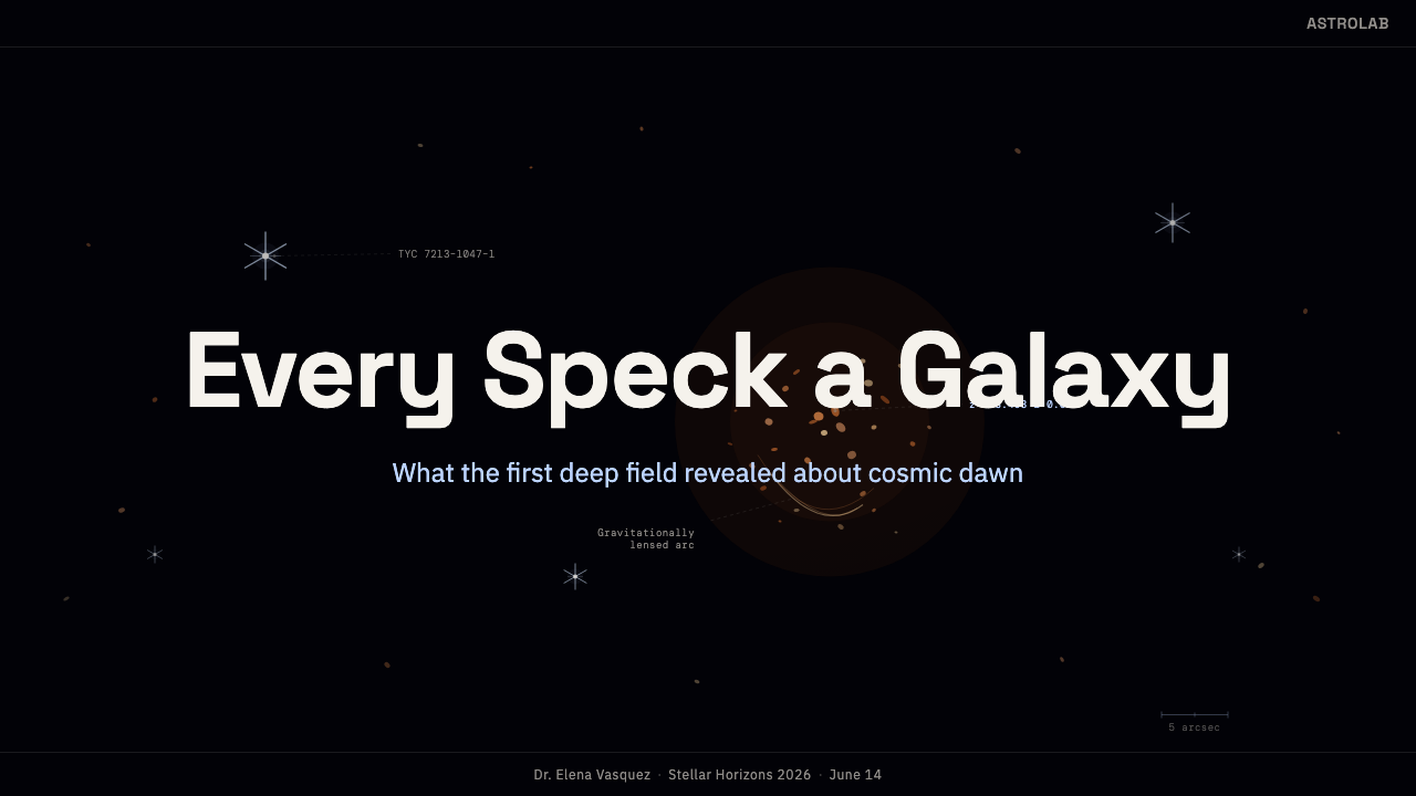
For presentation covers, begin with the field rather than a conventional title block. A cropped concentration of warm galaxies can occupy one region while the title rests in a quieter span of black. One cool star or lensing arc may act as the focal counterweight. A short monospaced identifier or coordinate-like line can establish the scientific voice without competing with the main title.
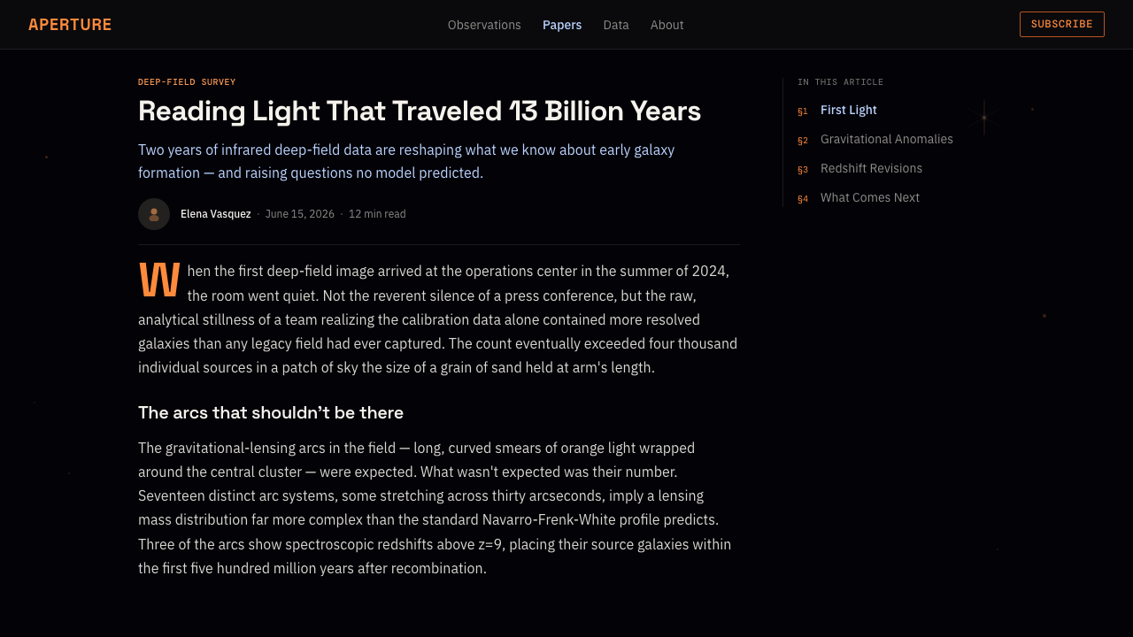
Content slides should separate observation from explanation. Place imagery in a clearly bounded field, then use sparse callouts to identify only the objects discussed in the accompanying text. Section titles need generous darkness around them, while captions and source-like notes can adopt the monospaced register. The visual hierarchy should move from luminous evidence to selected annotation and finally to interpretation.
Data slides can extend the mapping logic without pretending that every chart is a star field. Use deep black as the shared ground, warm luminous marks for primary quantities, and cool accents for comparison or selection. Fine rules and concise labels should connect values to explanations. Charts remain clean and analytical, while a restrained celestial image or arc supplies continuity with the theme.
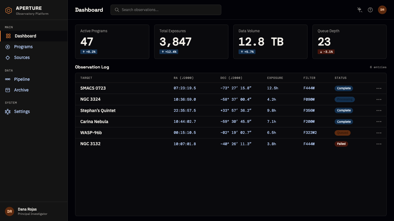
For web interfaces, JWST Deep Field is especially effective for dashboards, observatories, research portals, and pricing pages that benefit from a sense of advanced capability. Cards should feel like observation windows placed within continuous darkness, with clear boundaries and compact metadata. Pricing tiers can be differentiated through warm and cool light rather than multiple decorative surfaces; the primary action should appear as a selected target, not a glowing novelty.
Editorial and marketing pages should alternate dense visual passages with quiet explanatory ones. Full-field images work well as openings or section transitions, while articles benefit from narrow text measures, monospaced captions, and occasional mapped callouts. The common mistake is to turn every element into a neon space effect. Excessive glow, crowded labels, and repeated starbursts replace scientific precision with generic futurism; the authentic style depends on darkness, selection, and restraint.
JWST Deep Field — FAQ
Is JWST Deep Field simply a space-themed dark mode?
No. A generic space theme may use stars and black backgrounds decoratively, but JWST Deep Field is organized around a specific relationship between deep-field imagery and scientific annotation. Gold-orange galaxies, white-blue spiked stars, lensing arcs, monospaced readouts, and thin connectors each have a distinct role. Removing the observational logic leaves only a space motif.
Can the style work without a full astronomical image?
Yes, provided the composition preserves the field-and-map relationship. A sparse crop of galaxies, a single spiked star, or one elongated arc can establish the image layer, while coordinates and connectors establish the analytical layer. What matters is not visual quantity but the impression that selected luminous evidence is being located within a larger unseen field.
How much annotation should appear over the image?
Only enough to direct attention and establish meaning. The source field already contains enormous visual density, so annotation should be selective. Identify the few objects relevant to the narrative, keep labels away from crowded clusters, and let connectors travel through dark space. When every object is named, the field stops feeling deep and starts feeling administratively cluttered.
Does every text element need to use monospaced type?
No. Monospaced type is most persuasive when it signals coordinates, identifiers, captions, or technical metadata. Applying it to long editorial passages can make the page visually rigid and reduce the distinction between narrative and data. A clean neutral face can carry extended reading, while monospaced callouts retain the voice of an instrument panel.
Where does JWST Deep Field work poorly?
It struggles when warmth, intimacy, or effortless everyday familiarity is the primary goal. The black field and observational framing naturally suggest distance, technical authority, and vast scale. Those qualities suit research, advanced technology, education, and ambitious launches, but can feel remote in products centered on domestic comfort or casual sociability. The style should support the subject’s meaning, not merely make it look futuristic.
Related design styles
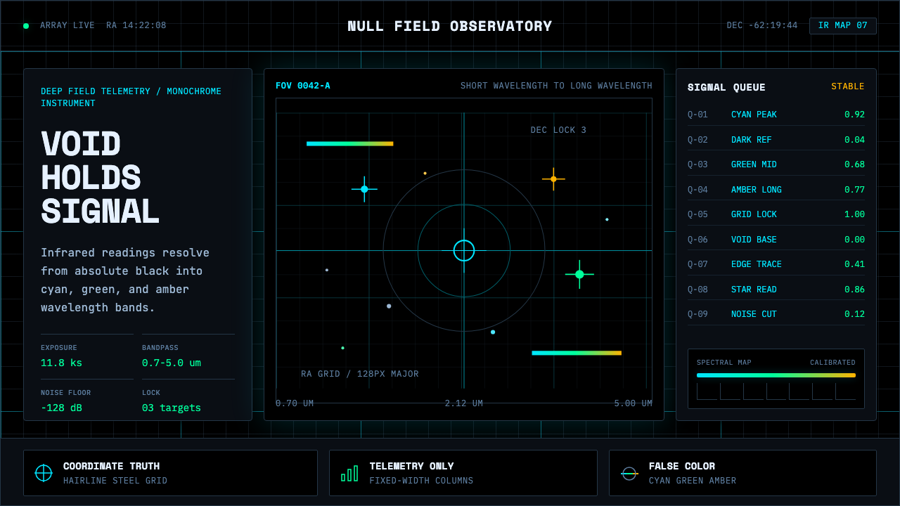 Deep Space ObservatoryTrust the void. Cyan telemetry and amber wavelength bars lock to a steel grid.
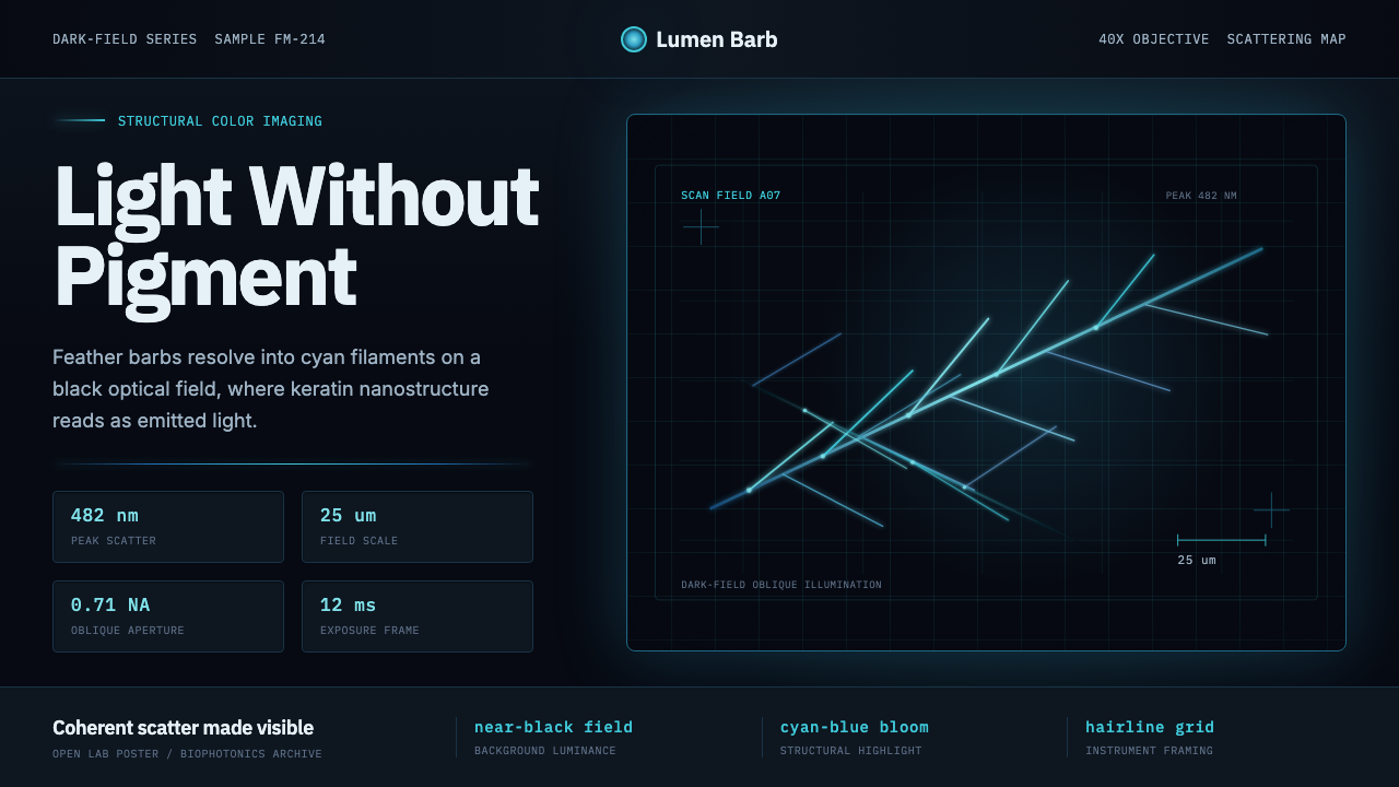 Feather MicroscopyPhysics glows in the dark. Cyan filaments and mono scale bars cut a black ima…
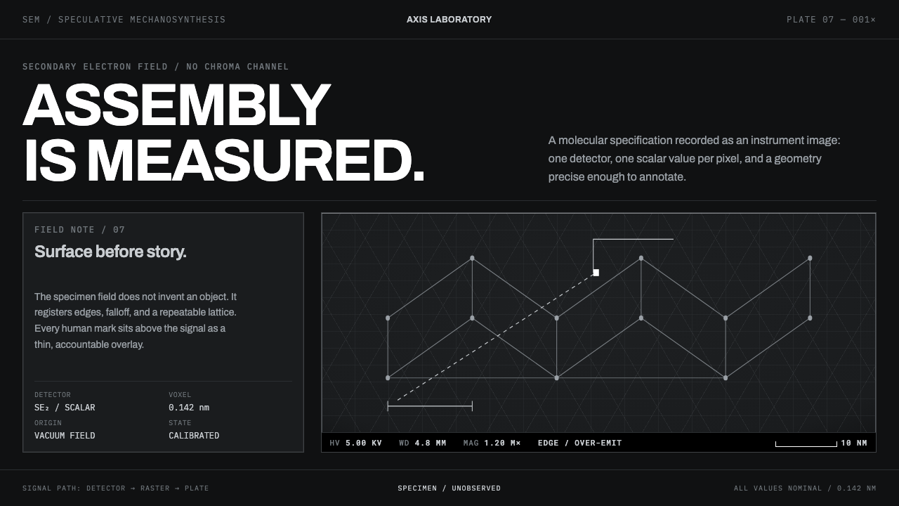 Nanotech AssemblerNothing is illustrated. Grey micrograph fields and hairline measurement overl…
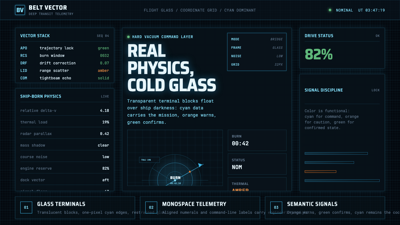 The Expanse Belter UIEngineering, not neon. Cyan glass panels, mono data, orange warnings on ship-…
 Fencing PisteTurns darkness into signal. Rajdhani HUD type frames a white piste and red-gr…
 FUI Sci-Fi HUDBlack until it glows. Cyan wireframes, ring gauges, and radar grids sell live…