What is The Expanse Belter UI?
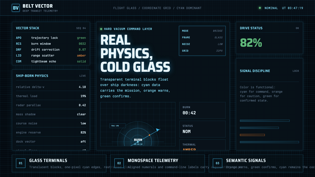
The Expanse Belter UI imagines the future as working machinery: cyan glass terminals, monospaced telemetry, and rare orange warnings suspended in ship-black.
The Expanse Belter UI in brief
The Expanse Belter UI is a hard-science-fiction interface language associated with the series’ starships and spacefaring world. Across the Rocinante, MCRN, and UNN bridges, cool cyan information glows against near-black surroundings. Transparent terminal blocks, command-line readouts, orbital plots, and hairline grids make each display resemble an engineering instrument rather than a decorative vision of cyberspace.
Its defining metaphor is NASA instrumentation fused with the operational gravity of a World War II battleship. Information appears because somebody must navigate, diagnose, calculate, or respond. Panels feel dense but purposeful: coordinates, trajectories, system states, and procedural commands share the screen without becoming a field of ornamental light. The future is conveyed through capability and complexity, not through visual extravagance.
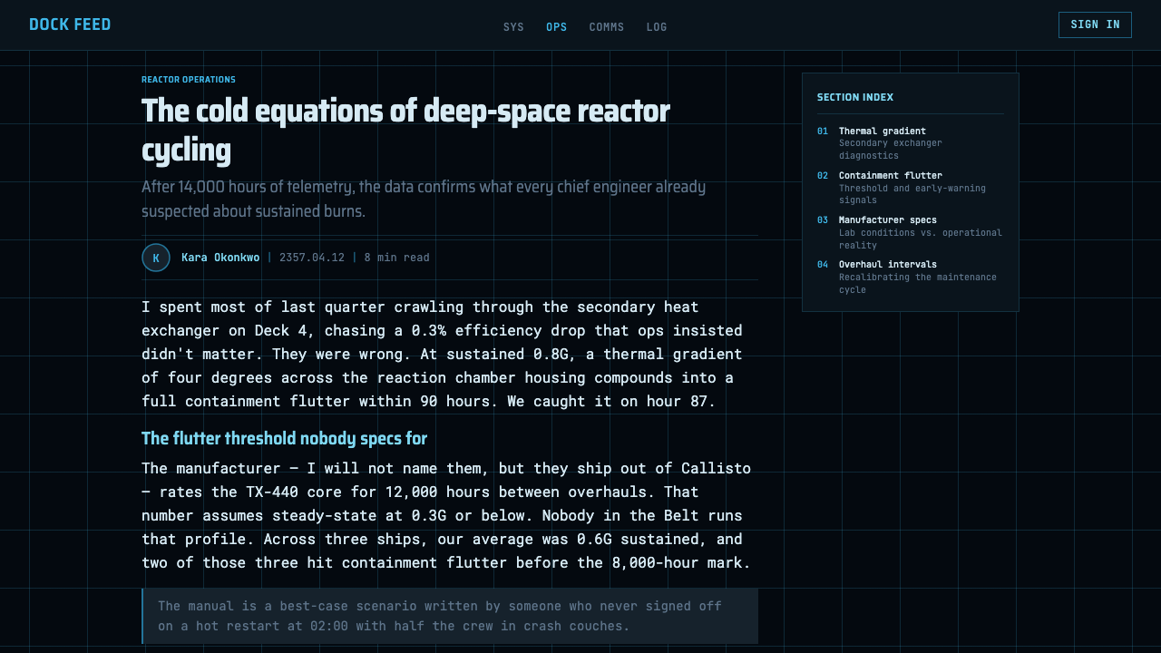
Cyan establishes the working layer of the system, orange identifies warnings, and green confirms status. Monospaced typography gives every readout the voice of measured technical data. Transparency suggests information floating between operator and spacecraft, while the surrounding darkness preserves the sense that these interfaces belong inside vessels crossing a hostile void.
Where does The Expanse Belter UI come from?
The style belongs to The Expanse television series, which ran from 2015 to 2022 and depicts a civilization roughly two centuries in the future. Its international production context supported a visual language intended to remain legible across the Rocinante, the militarized bridges of the MCRN and UNN, and the broader networked culture of human spaceflight.
The source material identifies Timothy Peel and Junction Box as key figures associated with the theme. Rather than presenting future computing as magical or immaterial, the resulting language treats every screen as part of a spacecraft’s working infrastructure. Displays communicate vectors, orbits, commands, and machine conditions; their drama comes from the consequences of the information, not from decoration around it.
The principal lineage is hard-science-fiction FUI, or fictional user interface, filtered through NASA-inspired functional design and the monospaced terminal tradition. NASA contributes procedural clarity, telemetry, plotting, and the expectation that labels must support action. The battleship comparison adds command hierarchy, operational severity, and the sense that a bridge display belongs to a larger system under pressure.
Within the series’ future setting, transparent panels and luminous data provide the speculative layer, but the composition remains grounded in real-physics thinking. Orbit lines imply calculated motion rather than arbitrary animation; warnings interrupt a stable baseline instead of producing constant spectacle. This balance lets the interfaces appear advanced without losing the credibility of tools built for trained operators.
What defines the The Expanse Belter UI look?
Ship-Black Ground
Near-black is not merely a fashionable dark mode; it represents the vessel, the unlit bridge, and the void beyond the hull. It creates a continuous field from which information can emerge without making the screen feel like a separate luminous object. Large dark regions also keep dense telemetry from becoming visually exhausting.
Cyan Working Layer
Cool cyan carries ordinary operational information: labels, readouts, grids, paths, and terminal text. Its consistency makes the interface feel like one engineered system rather than a collection of colorful applications. Brighter cyan indicates attention or emphasis through intensity, while remaining within the same technical voice.
Disciplined Alerts
Orange is reserved for warnings and exceptional conditions, while green communicates affirmative status. Because neither color is used as ambient decoration, each retains semantic force. An orange element feels urgent precisely because the surrounding interface does not compete with it.
Monospaced Data Voice
Monospaced type makes language resemble telemetry, source output, or a command terminal. Repeated character widths create vertical alignment naturally and reinforce the impression that every value is machine-readable. Hierarchy comes from brightness, grouping, case, and relative scale rather than from ornamental type changes.
Glass Terminal Blocks
Panels behave like translucent panes suspended over darkness. Their boundaries are suggested by faint lines, restrained glow, and changes in information density rather than by heavy containers. Layering permits several operational contexts to coexist while preserving a view into the larger navigational field.
Orbital Geometry
Curves, vectors, target marks, and hairline grids express movement governed by physics. These marks are not abstract decoration: they suggest position, direction, interception, and changing relationships between objects. The result is diagrammatic, with empty space treated as measurable territory.
High Signal, Low Noise
The interface can show abundant information without becoming ornamental. Repetition establishes systems, spacing separates tasks, and color appears only when it carries meaning. The defining restraint is not emptiness but the refusal to add visual events that do not support observation, calculation, or command.
Who shaped The Expanse Belter UI?
Timothy Peel is identified in the supplied origin material as a key figure associated with The Expanse Belter UI. The credited visual language helps frame fictional spacecraft computing as operational equipment: cool data, transparent terminals, plotted motion, and alerts whose scarcity preserves their urgency.
Junction Box is likewise named as a key contributor to the theme. Its association belongs to an interface system that favors coherent engineering logic over isolated spectacle, allowing shipboard displays to share a recognizable grammar of cyan information, dark space, monospaced text, and functional plotting.
NASA functions as a central visual and conceptual reference rather than as a fictional faction. Its influence appears in telemetry, procedural labeling, trajectory plots, and the assumption that a display must help an operator understand a physical system. This lineage gives the speculative glass surfaces an underlying documentary credibility.
The Rocinante is one of the principal shipboard contexts through which the interface language is recognized. Its displays embody the theme’s balance: advanced enough to float luminous information over darkness, yet practical enough to read as tools for navigation, diagnosis, and command within a real-physics universe.
How do you use The Expanse Belter UI today?
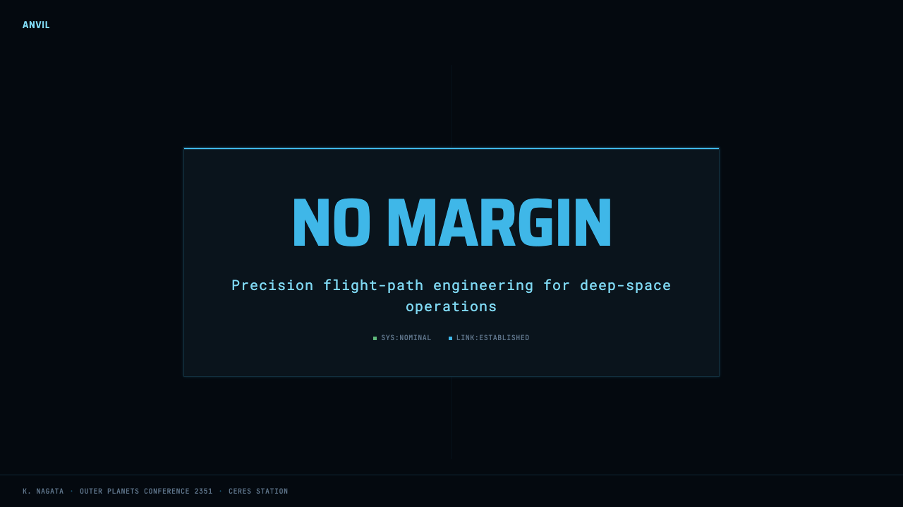
For presentation slides, begin with darkness and restraint. A cover can place a compact cyan title block beside a partial orbital curve, a sparse coordinate field, or a terminal-like subtitle. Content slides should divide information into translucent operational panes, with monospaced labels and clear grouping. Data slides are the style’s natural strength: plots, paths, tables, and system states can appear as parts of one instrument panel rather than as separately decorated charts.
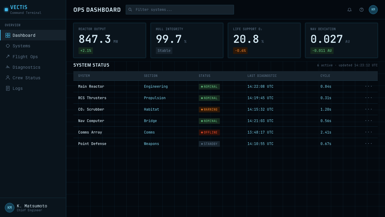
For web dashboards and pricing interfaces, translate the spacecraft metaphor into task-oriented hierarchy. Use near-black as the continuous environment, cyan for ordinary navigation and data, green for confirmed states, and orange for conditions that require intervention. Pricing tiers can resemble system configurations, but their differences should remain readable through grouping and language; warning color should never become a generic promotional accent.
For editorial layouts, the style works best when technical evidence drives the story. Timelines can become mission logs, diagrams can resemble orbital analysis, and quotations can sit in terminal-like blocks without pretending to be executable commands. Marketing pages should borrow the atmosphere selectively: a dark field, a disciplined data layer, and one decisive warning or action color are more convincing than covering every section with simulated controls.
The most common mistake is confusing engineering luminescence with neon cyberpunk. Excessive glow, numerous saturated colors, ornamental code, and constant animation destroy the system’s credibility. Another error is filling every dark region with tiny unreadable marks merely to imply complexity. Authentic application depends on meaningful density: every line should describe a relationship, every status color should preserve a stable meaning, and every alert should deserve interruption.
The Expanse Belter UI — FAQ
Is The Expanse Belter UI simply a cyberpunk interface?
No. Both may use dark environments and luminous information, but their priorities differ. Neon cyberpunk often treats color, glow, and visual congestion as atmosphere. The Expanse style treats illumination as an operational necessity. Its restricted cyan, orange, and green system encodes meaning, while plots and grids refer to physical relationships. The correct comparison is an advanced engineering console, not a futuristic entertainment district.
Why is cyan the dominant color?
Cyan provides a cool, technical working layer that remains distinct against near-black without carrying the emotional urgency of orange. Using one dominant information color also unifies labels, terminal output, grids, and trajectories into a single system. Because ordinary data stays chromatically stable, orange warnings and green confirmations can communicate state immediately.
Can the style remain usable outside fictional spacecraft?
Yes, particularly in analytical products, monitoring tools, technical presentations, and interfaces built around changing system states. The spacecraft details should be translated rather than copied. Orbital plots can become relationship diagrams, terminal blocks can become data panels, and status colors can map to real product conditions. Usability declines when atmosphere is preserved but semantic structure is discarded.
Does every panel need to be transparent?
No. Transparency is useful when several information layers must share a spatial field, but it is not the style’s central purpose. Too many overlapping panes can weaken contrast and make operational hierarchy ambiguous. Solid or nearly opaque regions are appropriate for sustained reading, critical commands, and warnings. What matters is the sensation of an integrated instrument environment, not a mandatory glass effect.
How should motion be handled in this interface language?
Motion should explain changing physical or system relationships. A trajectory may update, a status may change, or a warning may interrupt the baseline; movement should not exist merely to keep the screen alive. The real-physics character of the theme depends on cause and consequence. When every line drifts and every panel pulses, the display stops feeling calculated and begins to resemble decorative science fiction.
Related design styles
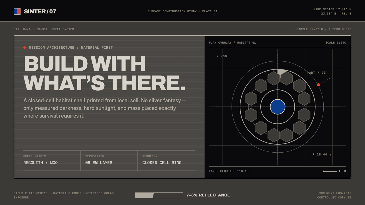 Lunar Regolith SettlementMoonlight without the myth. Regolith gray, hard terminators, and a strict tec…
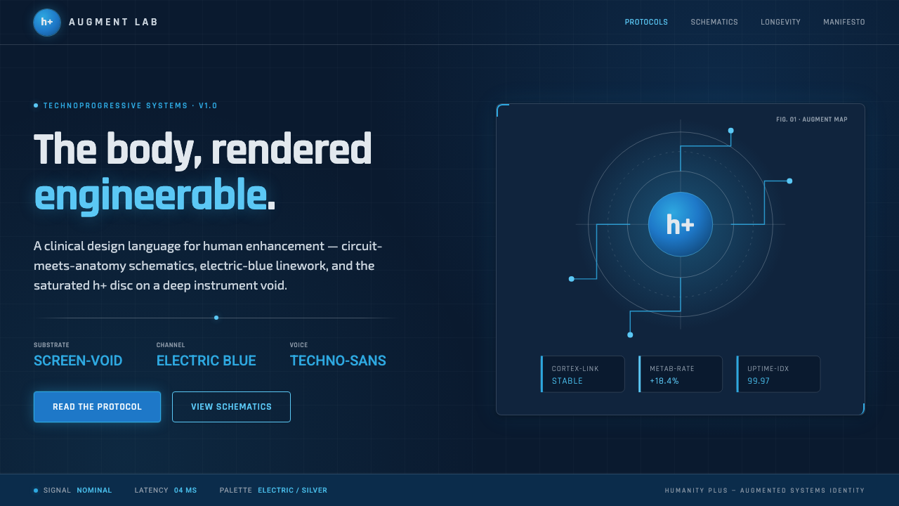 Transhumanism (H+)The body, rendered engineerable. Electric-blue circuit-anatomy schematics and…
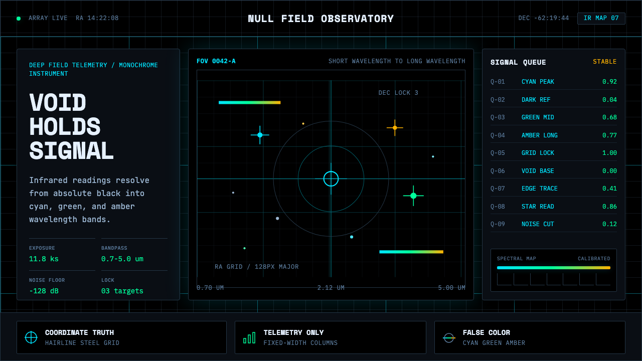 Deep Space ObservatoryTrust the void. Cyan telemetry and amber wavelength bars lock to a steel grid.
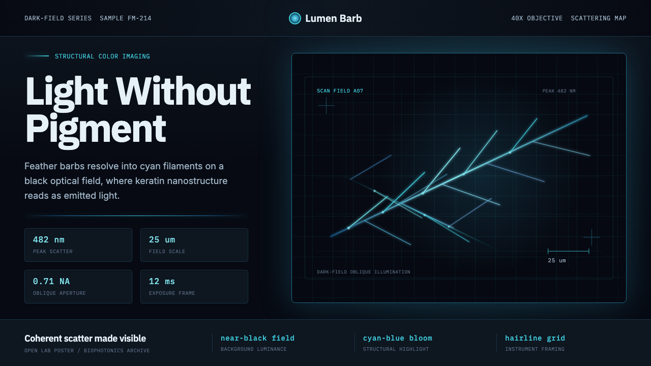 Feather MicroscopyPhysics glows in the dark. Cyan filaments and mono scale bars cut a black ima…
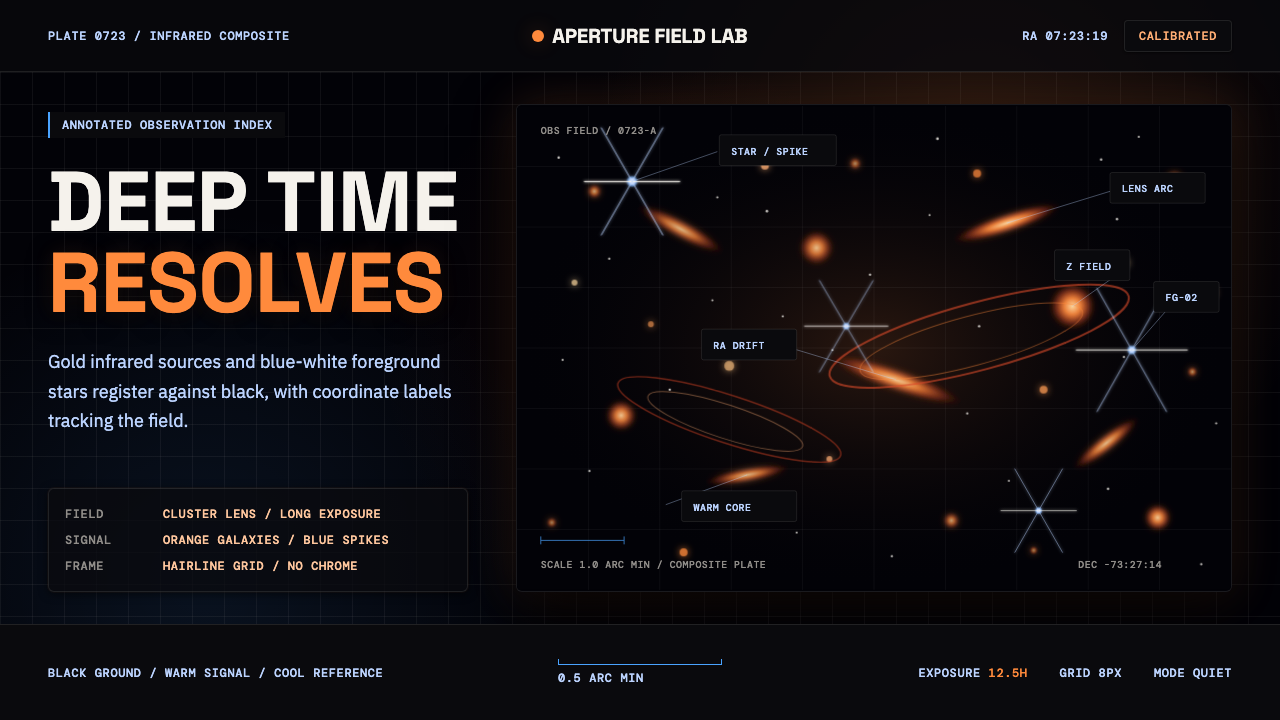 JWST Deep FieldPrecision in deep black. Orange galaxies, blue spikes, and DM Mono callouts m…
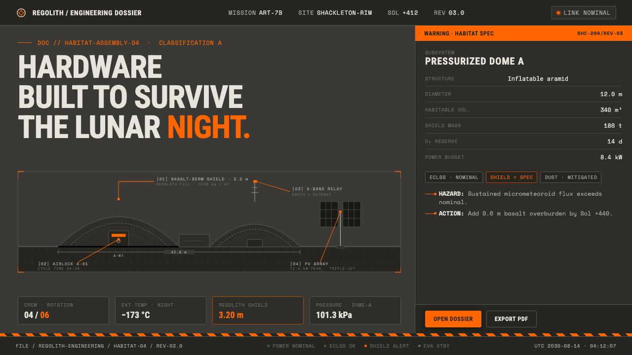 Lunar Base 2030Hardware built to survive the lunar night. Regolith gray, ANSI hazard orange,…