What is Europa Ice Drill Station?
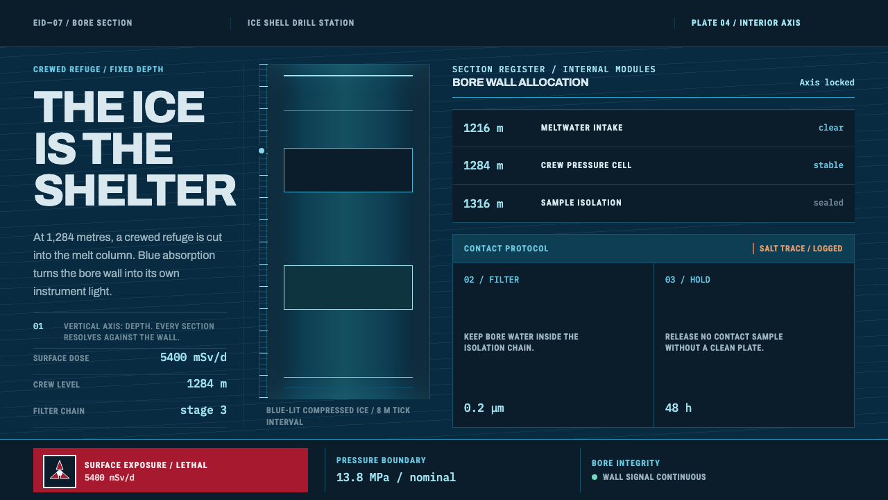
Europa Ice Drill Station is design by depth: a blue-lit bore wall running down the page, engineering-drawing precision on every readout, and a single red held back for the places where radiation is real.
Europa Ice Drill Station in brief
Europa Ice Drill Station is a dark, near-future design style built around one premise: everything human on Europa lives under the ice. The surface of the moon takes roughly 5400 mSv a day, a dose that is lethal inside a single day, so the station is not a building on a plain but a string of modules cut into a hot-water borehole. The only view is the bore wall itself. Shelter, in this style, is a depth rather than a room.
That premise decides the layout. A blue ice column runs through the full height of the page like the shaft it represents. A depth scale counts down along the edge, and station modules are sliced open at fixed depths the way an engineer's section drawing cuts through a structure. Instruments, readouts and tables sit inside this vertical frame. The result reads as a technical document rather than a science-fiction poster: thin leader lines, numbered callouts, and hard-edged tables of dose and filtration stages.
The colour logic is physical rather than decorative. Deep compressed ice looks blue because the overtone of the O–H bond stretch absorbs the red end of the light spectrum, so light that travels far enough through ice comes out blue. The style takes that single fact and builds the palette from it: a blue-lit wall as the ground, an ice-face cyan as the colour of instruments, a pale melt-water cyan-white to lift readouts, a radiation red used only where a dose warning is real, and one warm ochre-brown taken from the hydrated-salt streaks of Europa's lineae as the only warmth in the system.

Where does Europa Ice Drill Station come from?
Europa is the ice-covered moon of Jupiter, and this style belongs to near-future station design: a speculative genre built on real hardware. The source material runs from 1998 to the present and includes Galileo imaging of the moon's surface, the VALKYRIE cryobot field tests of 2014 and 2015, and the Europa Clipper mission. None of these is a station, but together they supply the facts the design leans on: what the ice looks like, how a probe melts its way down through it, and what a mission to the moon has to be built to survive.
The lineage runs through Earth. The terrestrial analogue named for this style is Mercer Subglacial Lake in West Antarctica, a body of liquid water beneath a thick ice sheet that scientists can reach only by drilling. Bill Stone, associated with the VALKYRIE cryobot, and John Priscu, associated with the Antarctic subglacial lake work, stand for the two halves of that problem: the machine that melts down through ice, and the science of what may live beneath it. A design built from the borehole view is a design built from their working situation.
The visual grammar comes from two graphic traditions. One is the NASA Graphics Standards Manual, whose signage and system-wide discipline established how the agency's information should look: clear, systematic and difficult to misread. Richard Danne and Bruce Blackburn are the names tied to that heritage. The other is the International Typographic Style, with its objective grids, flush-left sans-serif type and numbered, ruled layouts. Put together, they give the station its instrument-panel tone, in which every mark is a label, a measurement or a boundary.
A third strand is astrobiology planetary protection, the field concerned with keeping Earth life from contaminating worlds that might host life of their own, and the reverse. It explains why filtration stages are a first-class element in the tables, and why the interface treats a boundary, whether of radiation or of contamination, as something to be drawn and numbered precisely. The aesthetic is austere because the setting is unforgiving: a station under the ice has no room for ornament that does not carry information.
What defines the Europa Ice Drill Station look?
The Bore Wall
The ground is the bore wall: a deep, cold blue that suggests ice lit from within rather than a painted background. It runs as a continuous column through the full height of the layout. Because the blue comes from absorption rather than a filter, it should feel dense and mineral, with subtle variation in depth but no glow effects, lens flares or decorative particles.
Depth Scale
A depth scale marks progress down the page, counting along one edge like a core log. It is the main structural device: sections are placed at stated depths, and the reader moves downward through the page as through a shaft. The scale is thin and exact, set in a clear technical voice, and it is always visible.
Ice-Face Cyan
Cyan is the working colour of the instruments, the primary accent for controls, lines and active data. It is cool and slightly pale, as if lit by the ice face, and it carries the interface the way a single signal colour carries a control panel. A paler cyan-white taken from melt water lifts the key readings off the dark ground.
Earned Radiation Red
Red appears only where a real dose warning exists. It marks shielding, hazard thresholds and the places where radiation changes what a person may do. Used rarely it carries enormous weight, and used as a general accent it would stop meaning anything. The rule is simple and strict: no warning, no red.
One Warm Note
A single ochre-brown, taken from the salt streaks on Europa's surface, supplies the only warmth in the system. It is used for geological annotations, surface references and the occasional marker that needs to feel different in kind from the cold instruments. Because it is the only warm colour, it works as a quiet focal point.
Engineering Section Drawing
Layouts follow the logic of a section drawing. Thin leader lines run from a feature to its numbered callout, captions are numbered, and modules are cut open to show their contents. The line quality is fine and even, and nothing is drawn for atmosphere. Every line either measures, connects or labels.
Hard Tables
Dose and filtration data are set in hard-edged tables with square corners and rule lines, not in soft cards. The tables are a primary component rather than a fallback, arranged for fast comparison down columns of figures. There are no rounded corners and no decorative panels anywhere in the system.

Who shaped Europa Ice Drill Station?
Bill Stone is the name associated with the VALKYRIE cryobot, an ice-melting probe whose field tests in 2014 and 2015 form part of the hardware record behind this style. A cryobot works by melting its way down through ice, which is exactly the situation the style depicts: a narrow shaft with a station hung inside it. His work supplies the engineering plausibility beneath the visual drama.
John Priscu is tied to the terrestrial analogue for this style, Mercer Subglacial Lake in West Antarctica. Subglacial lakes are the closest place on Earth to the Europa problem: liquid water sealed beneath a thick sheet of ice, reachable only by drilling. His name anchors the claim that the setting is a scaled-up version of fieldwork that already exists.
Richard Danne and Bruce Blackburn are the designers associated with the NASA Graphics Standards Manual, the system of signage and identity that this style takes as its model for clarity. Their influence shows in the numbered captions, the disciplined labels and the insistence that every sign communicate one unambiguous thing. The Europa style borrows their discipline rather than any specific mark.
How do you use Europa Ice Drill Station today?
Europa Ice Drill Station is a dark style, and it does its best work when the content genuinely has depth, hierarchy or measurement in it. The fit test is whether a layout could plausibly be a section drawing, a log or a control panel. If it can, this style will make it feel authoritative and calm. If it cannot, the austerity will read as cold.
On presentation slides, a cover can be a single blue column running from top to bottom with the title set at a stated depth, and a thin scale down one edge. Content slides work as sections: a numbered callout and leader line for each point, with the text kept short and set against the dark blue. Data slides are the style's home territory. Depth profiles, dose tables and stage-by-stage comparisons look right in hard-edged tables, with cyan lines for the main series and pale melt-water white for the key reading.
For web interfaces, the style suits monitoring dashboards, telemetry views, status pages, logs and technical documentation. Use cyan for active controls and lines, keep surfaces dark and square-cornered, and set data in tables with visible rules. Pricing and plan comparisons can be handled as specification tables, with each tier a column and each feature a numbered row. Red is reserved for destructive actions or real alerts, never for decoration or marketing emphasis.
In editorial and marketing work, the style gives science writing, research reports, hardware launches and long-form explainers a sober, credible voice. A feature story can run down a depth scale, with each section placed at a stated depth and images treated as figures with numbered captions and leader lines. Campaign pages benefit from the same restraint: one strong blue column, a few cyan accents, and plenty of dark space instead of glossy effects.
The common mistakes all involve turning engineering into atmosphere. Adding glow, bloom or particle effects to the blue wall makes it look like a game menu. Using red as a general highlight drains its meaning. Rounded cards, glassy blurs and soft shadows contradict the section-drawing logic, and a bright, warm light-mode version loses the point of living inside the ice. When in doubt, remove the effect and add a label.

Europa Ice Drill Station — FAQ
Why is everything blue?
Because deep compressed ice really does look blue. The overtone of the O–H bond stretch absorbs the red end of the spectrum, so red light is lost within roughly two metres of travel while blue light can carry on for roughly two hundred metres. Light that comes back out of thick ice is therefore blue. Near the surface, cracks fill with air within hours and the ice turns white, which is why the blue belongs to the wall. The style treats this as physics, not a filter.
Why is red used so rarely?
Because red is earned. In this system it appears only where a real dose warning exists, in the tradition of radiation-hazard marking. If red were allowed to mark ordinary emphasis, it would no longer tell a reader that something is dangerous. Keeping it rare is what lets it work as an alarm, and it is also what keeps the cyan and blue palette calm.
Is this only a dark style?
Largely, yes. The premise is a station inside blue ice, where the dark bore wall is the setting itself, and the palette is tuned for light-on-dark reading. A light version would lose the sense of depth. If you need a light page, keep the dark column as a strong structural element and set long text on a calm, low-contrast neutral beside it rather than flipping the whole system.
How is it different from typical science-fiction interface styles?
Most science-fiction interfaces lean on glow, transparency and curved frames to suggest the future. This style leans on the opposite: fine lines, numbered callouts, hard tables and square corners, as in an engineering section drawing or a standards manual. It looks like a document an engineer would actually use, and the future feeling comes from the setting and the discipline rather than from effects.
Can I use it for products that have nothing to do with space?
Yes, when the product has depth, measurement or hazard in it: infrastructure monitoring, security tooling, scientific publishing, data platforms, industrial software. It is a poor fit for warm consumer brands, children's products or anything that depends on friendliness. The test is whether the user would be reading numbers, thresholds or stages. If so, the section-drawing language will help them.
Related design styles
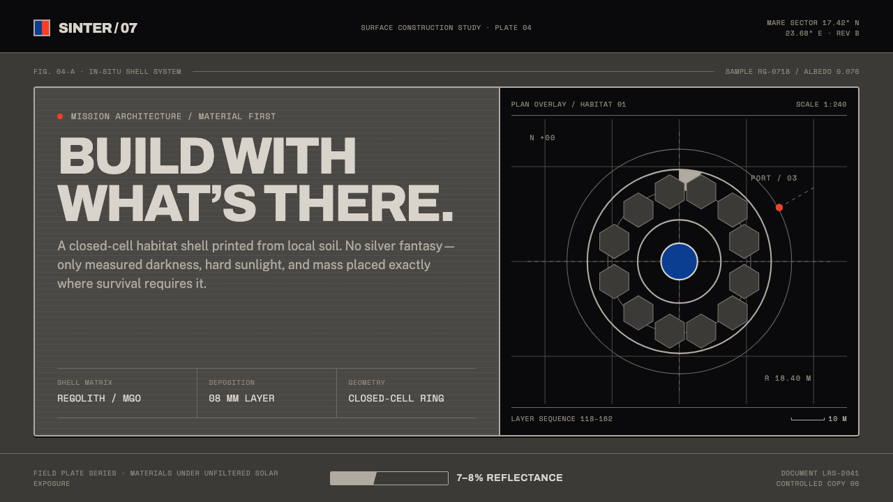 Lunar Regolith SettlementMoonlight without the myth. Regolith gray, hard terminators, and a strict tec…
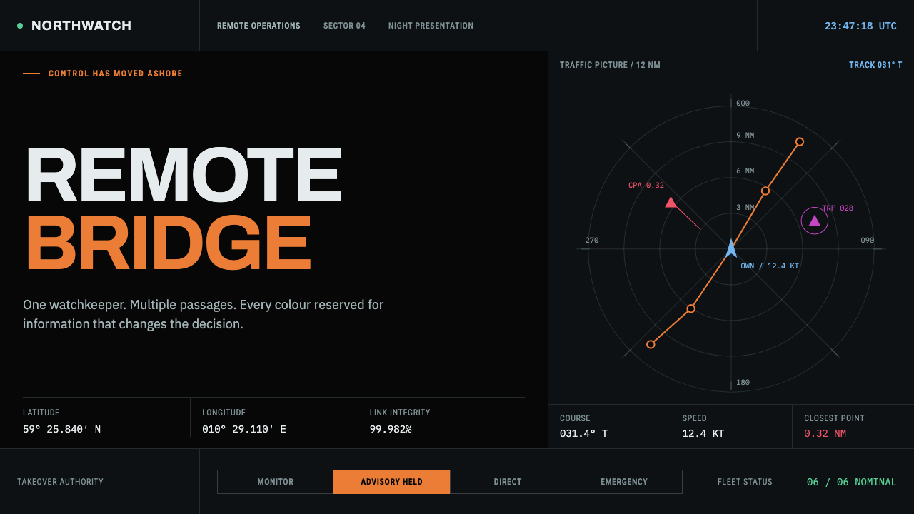 Autonomous Cargo Ship BridgeColour is protocol. Near-black chart grids reserve orange for decisions that…
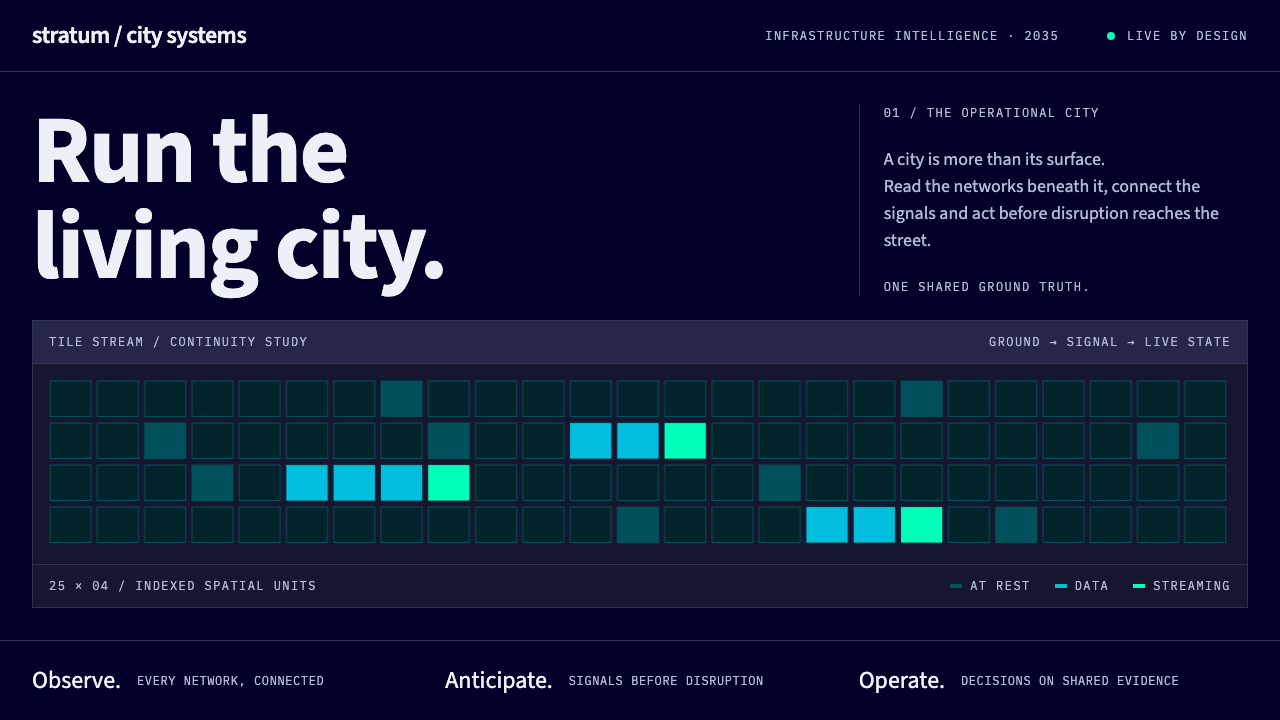 Digital Twin City OpsColour reports, never decorates. Deep blue grids reserve cyan and green for d…
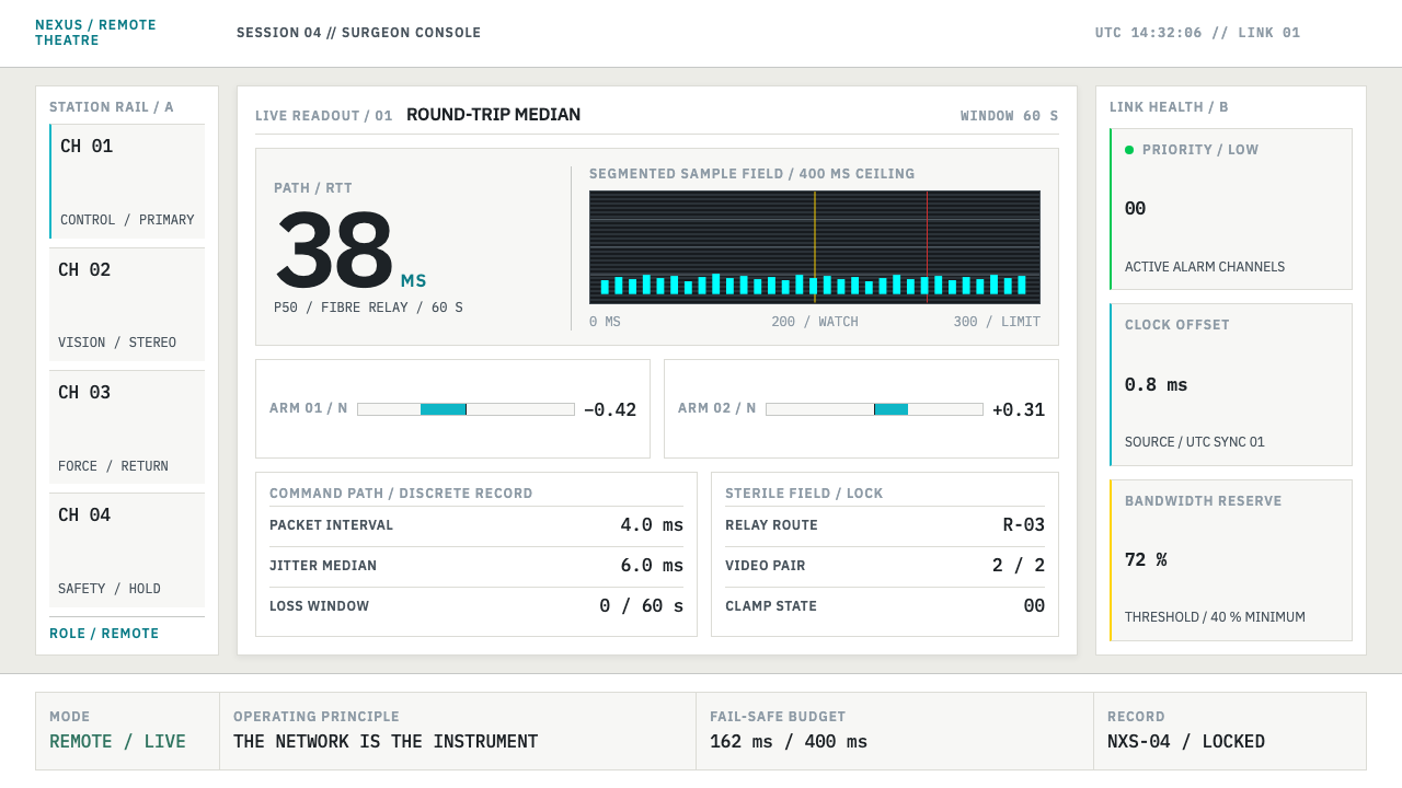 Telepresence Surgery SuiteNothing vague survives. Cyan latency bars and IBM Plex Mono make state measur…
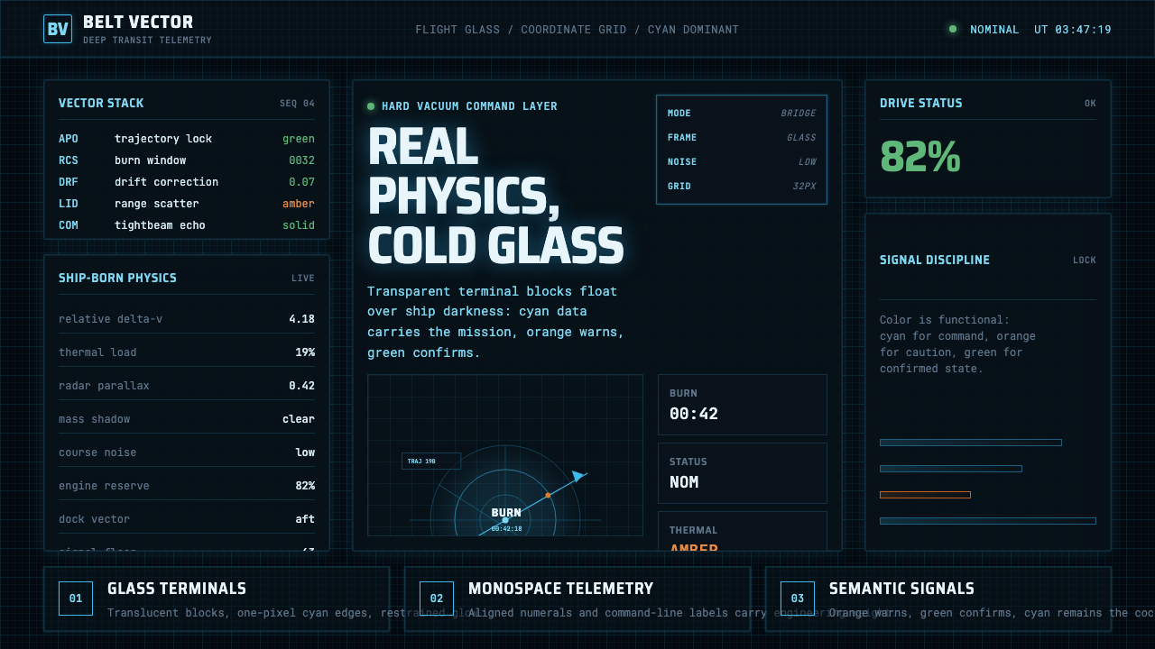 The Expanse Belter UIEngineering, not neon. Cyan glass panels, mono data, orange warnings on ship-…
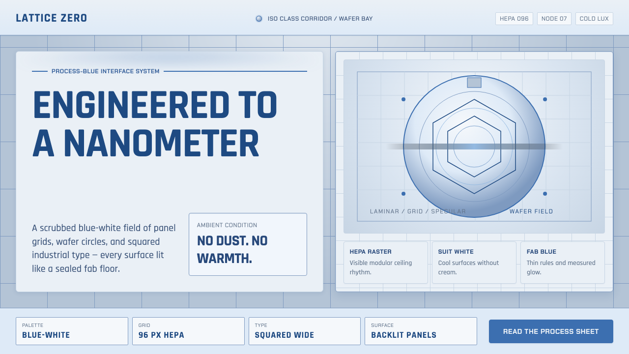 Semiconductor CleanroomCold precision, scrubbed clean. Blue-white grids, wafer circles, and squared…