What is Lunar Regolith Settlement?
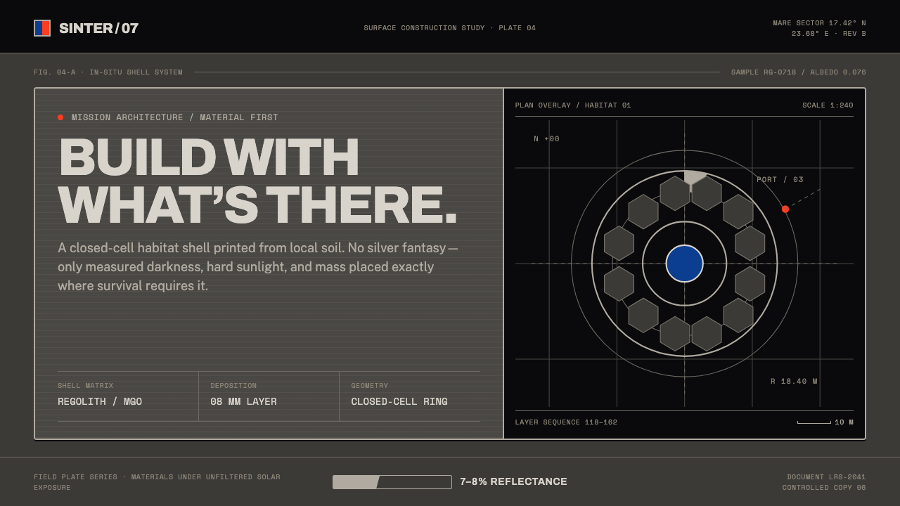
Lunar regolith is darker than worn asphalt, and a design system built around that one fact — matte printed stone under a flat black sky, lit by a single hard terminator — reads as real engineering rather than science-fiction moonlight.
Lunar Regolith Settlement in brief
Lunar regolith settlement design draws its entire visual logic from the physical properties of the material it depicts, rather than from any cinematic idea of what the Moon looks like. The single most important fact is that lunar regolith reflects only a small fraction of the light that strikes it — a surface darker than worn asphalt — and Apollo-era core sample logs describe it in plain physical terms as medium dark gray to brownish gray, not the bright silvery white common in film and illustration.
Because there is no atmosphere on the Moon to scatter light, there is no soft ambient glow and no gradual gradient between light and shadow the way there is on Earth. Anything lit by direct sunlight appears sharply bright, and anything outside that direct light drops immediately into a nearly black shadow, with almost no transitional tone between the two states. This produces a visual signature built on a single hard jump in value — a stark boundary, or terminator, between illuminated stone and unlit stone — rather than any smooth shading.
Layered onto this material and lighting reality is a second, human system: the visual conventions of aerospace technical documentation. Figures are labeled, elements carry leader lines pointing to callouts, scale references are given, and text is set in a monospaced typeface suited to specimen numbering and coordinate labels. The overall impression is not of a fantastical alien landscape but of a construction site being documented and measured by an engineering team — flat, dry, and precise.
Where does Lunar Regolith Settlement come from?
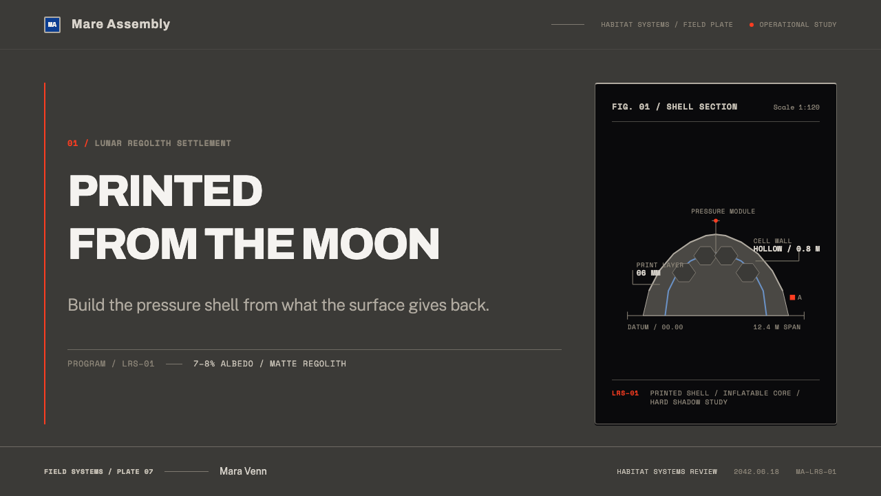
The technical foundation for this style begins in 2013, when the architecture firm Foster + Partners collaborated with the European Space Agency to 3D-print a demonstration building block weighing roughly 1.5 tonnes, made from simulated lunar soil. The structure was a catenary dome shell with a hollow, closed-cell interior wall, a design the architects themselves compared to the construction of bird bones — a form that achieves strength through internal structure rather than solid mass, an approach well suited to printing with scarce, unprocessed lunar material.
This early study was carried out at ESA's technical center in Noordwijk, Netherlands, with the materials science and additive-manufacturing expertise of Monolite UK contributing to how the simulated regolith could actually be printed into a coherent structural shell. The project established, years before any crewed return to the Moon was imminent, that lunar soil could plausibly be used as a raw building material rather than something that would need to be replaced with material shipped from Earth.
The idea was carried forward substantially by Project Olympus, a program beginning around 2020 and run by the Bjarke Ingels Group together with ICON, developed for NASA. Based at institutions including NASA's Marshall Space Flight Center and Johnson Space Center, this program moved the concept from a demonstration study into active development aimed at the construction phase of NASA's Artemis program, which plans crewed surface activity on the Moon.
Together these efforts define a design lineage rooted in in-situ resource utilization — the principle of using material already present on-site, such as lunar regolith, rather than importing it — combined with additive-manufactured architecture and the visual conventions of agency technical documentation. The style is therefore not speculative fantasy but a direct visual translation of two real, sequential engineering programs spanning from 2013 through the Artemis era.
What defines the Lunar Regolith Settlement look?
Low-Reflectance Ground
The base tone of any surface must read as genuinely dark — darker than worn asphalt — because lunar regolith reflects only a small fraction of incoming light. A composition following this principle should reject bright grays or silvery tones for its primary surfaces, favoring a deep, matte, medium-to-dark gray-brown consistent with the actual measured reflectance of lunar soil.
Hard Terminator Contrast
Because the Moon has no atmosphere to scatter light, illuminated and shadowed surfaces meet at a sharp boundary rather than a soft gradient. This means value contrast should be used deliberately and abruptly — a bright, printed-stone highlight sitting directly against a near-black shadow with almost no intermediate midtone — rather than the smooth shading conventional in Earth-lit imagery.
Flat Black Sky
With no atmosphere to scatter sunlight into a blue dome, the lunar sky is simply black, even in direct sun. Backgrounds in this style should therefore be rendered as flat, unmodulated black rather than any gradient of blue or twilight tone, reinforcing the sense of an airless, harshly lit environment.
Printed, Cellular Structure
Forms in this style are derived from the catenary dome and hollow, closed-cell wall structures demonstrated by additive-manufacturing studies, resembling bird bone in their internal logic. Shapes should favor curved, load-bearing arches and repeated cellular or lattice patterns over the flat panels typical of conventional architecture, reflecting a structure built by printing rather than assembling.
Technical-Document Typography
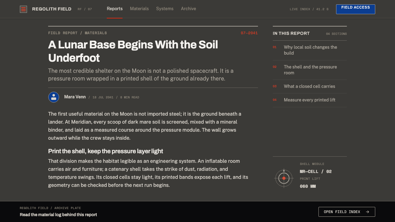
Text follows the conventions of agency technical reports: figure numbers, leader lines connecting labels to specific points, scale references, and a monospaced typeface suited to specimen or coordinate labeling. This treats every visual element as something being measured and documented rather than simply displayed, and layouts should include this kind of explicit labeling apparatus rather than clean, caption-free imagery.
Restrained Institutional Accent
Within an otherwise achromatic composition of gray, brown, and black, the only saturated color allowed is a small, deliberate touch tied to institutional identity — the kind of blue and red found on agency logos — used sparingly rather than as a general accent throughout the layout.
Who shaped Lunar Regolith Settlement?
In 2013, this architecture firm collaborated with the European Space Agency to produce a 1.5-tonne demonstration block 3D-printed from simulated lunar soil, in the form of a catenary dome shell with a hollow, closed-cell wall. This project established the foundational idea that lunar regolith could serve as a genuine structural building material printed on-site, rather than a substance requiring processing into something closer to conventional Earth building materials.
Monolite UK contributed the additive-manufacturing and materials expertise that made the 2013 ESA demonstration block possible, helping translate simulated lunar soil into an actual printed structural shell. Their involvement represents the practical, materials-science side of turning a theoretical in-situ-resource concept into a physical, testable object.
Together with ICON, the Bjarke Ingels Group runs Project Olympus, a program beginning around 2020 that develops lunar 3D-printing construction methods for NASA, carrying the 2013 demonstration concept into active development aligned with the Artemis program's plans for crewed lunar surface activity.
ICON is the construction-technology partner in Project Olympus, working alongside the Bjarke Ingels Group and NASA facilities including Marshall Space Flight Center and Johnson Space Center to develop the practical building systems needed for additive-manufactured lunar surface construction under the Artemis program.
How do you use Lunar Regolith Settlement today?
This style is well suited to any context that needs to signal serious, credible engineering rather than speculative fantasy, and the central discipline is committing to the actual physical logic of an airless, low-reflectance environment rather than a cinematic idea of moonlight. Every surface should read as genuinely dark and matte, and every light source should produce hard, immediate contrast rather than soft gradients.
For presentation slides, a cover built on a near-black background with a single dark gray-brown structural form lit sharply from one side — the illuminated portion bright, the rest dropping immediately into shadow — establishes the mood instantly. Content and data slides should adopt the technical-document convention directly: numbered figures, leader lines pointing from labels to specific chart elements, and a monospaced typeface for any specimen or coordinate-style data, which gives even ordinary business charts an engineering-report credibility.
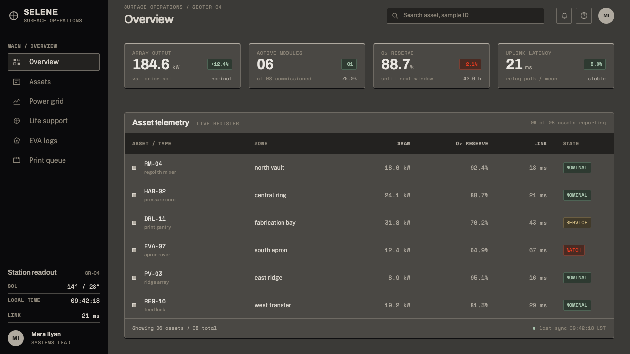
For web interfaces, this approach suits technical, scientific, or aerospace-adjacent products where the audience expects precision over warmth. Dashboards can use the dark gray-brown ground as a default background, with data visualizations rendered as flat, hard-edged shapes rather than soft gradient charts, and a single institutional accent color reserved for critical alerts or primary actions only, keeping the rest of the interface achromatic.
For editorial and marketing layouts, feature articles benefit from full-width dark, matte photography or illustration treated with the same hard terminator logic — a sharply lit foreground subject against deep shadow and flat black background — paired with technical captions and figure numbers rather than conversational pull-quotes, reinforcing an documentary, engineering tone throughout.
A common mistake when applying this style is defaulting to conventional 'space' visual tropes — a starry sky, a soft blue-gray moonscape, or gentle gradients suggesting atmospheric haze. None of these are accurate to an airless environment. The correct approach commits to a genuinely dark, low-reflectance ground, a flat black sky with no gradient, and a single hard light-to-shadow transition, because those three choices are what make the result read as physically real rather than decorative.
Lunar Regolith Settlement — FAQ
Why is the ground tone in this style so much darker than most depictions of the Moon?
Most popular depictions of the Moon exaggerate its brightness because it appears bright relative to a dark night sky when viewed from Earth. Measured directly, lunar regolith reflects only a small fraction of incoming light — Apollo core sample logs describe it as medium dark gray to brownish gray, darker than worn asphalt — so an accurate design system has to commit to a genuinely dark, matte ground rather than the bright silver-gray common in illustration.
Why does the sky appear pure black instead of showing stars?
The Moon has no atmosphere to scatter sunlight into a blue dome, which is why the sky is black even in full daylight — but in a strongly sunlit scene, the brightness of illuminated foreground surfaces overwhelms the visibility of faint stars, so the background reads as flat, featureless black rather than a starfield. This style keeps that background flat and unmodulated to stay consistent with how a brightly lit lunar scene actually appears.
What is the source of the dome and cellular structural forms used in this style?
These forms come directly from the 2013 Foster + Partners and ESA demonstration project, which 3D-printed a catenary dome shell with a hollow, closed-cell interior wall from simulated lunar soil — a structure the architects compared to bird bone because it achieves strength through internal cellular structure rather than solid mass, an approach well suited to material that is scarce and difficult to transport.
Why does the style borrow from aerospace technical documents rather than from science-fiction art?
The underlying subject matter — Project Olympus, developed by the Bjarke Ingels Group and ICON for NASA, and its predecessor ESA study — are real engineering programs tied to the Artemis program's actual surface-construction plans, not fictional concepts. Borrowing the visual conventions of technical reports, such as figure numbering and leader lines, keeps the design honest to its documentary, engineering source rather than drifting into decorative space fantasy.
Is any bright, saturated color appropriate in this style?
Only in a small, deliberate way. The composition should remain overwhelmingly achromatic — grays, browns, and black — with any saturated color, such as the blue and red typical of agency logos, reserved for a single institutional accent rather than distributed generally across the layout. Overusing bright color would undermine the restrained, technical-document character that defines the style.
Related design styles
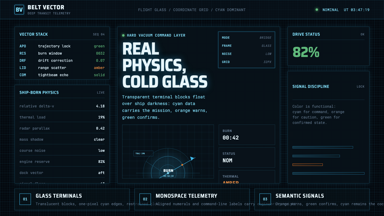 The Expanse Belter UIEngineering, not neon. Cyan glass panels, mono data, orange warnings on ship-…
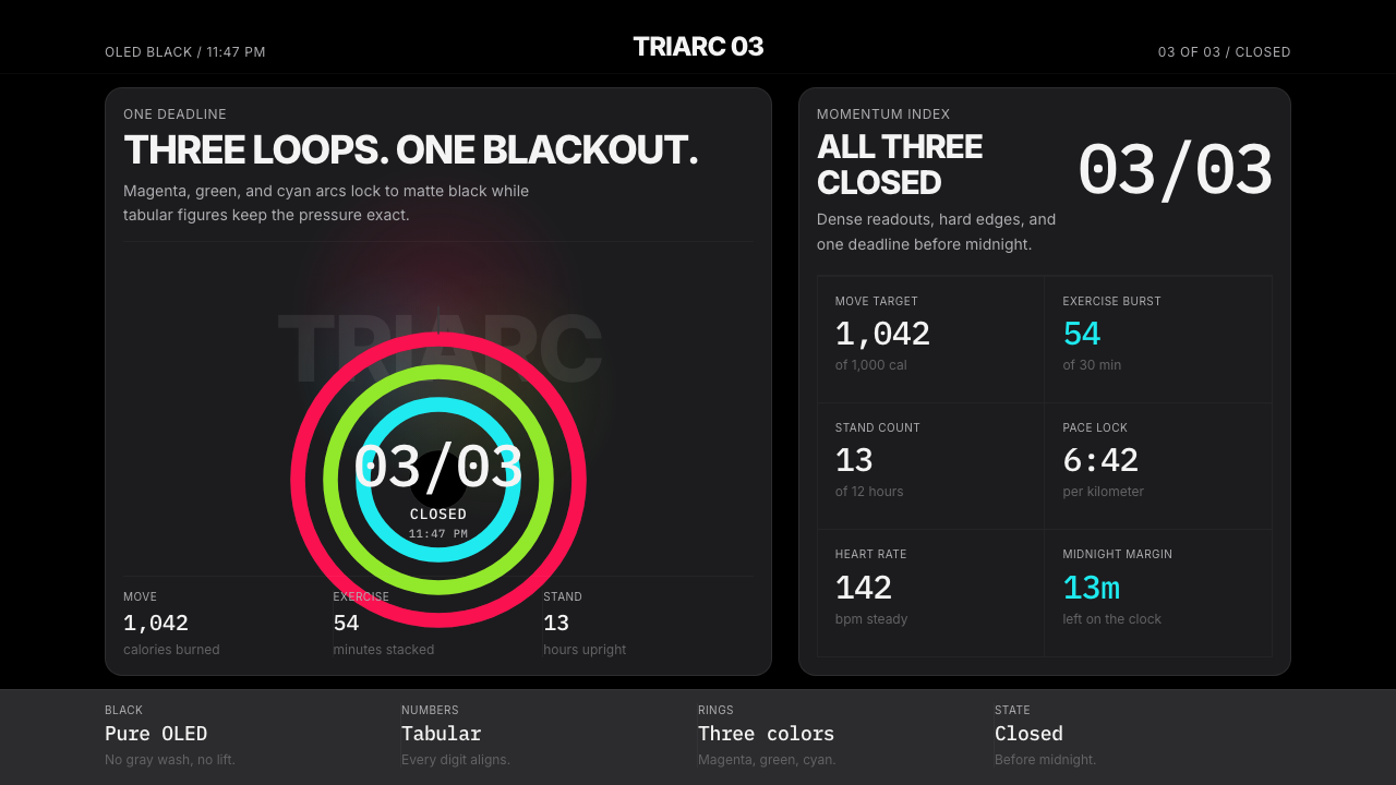 Apple Fitness Rings Closed (2024)Midnight feels exact. Magenta, green, and cyan rings lock onto OLED black.
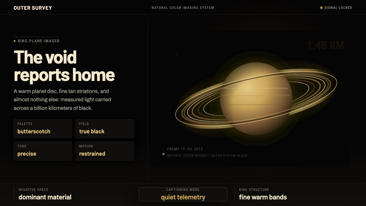 Cassini Saturn ImagingDeep space feels exact. Butterscotch Saturn floats in black with fine tan rin…
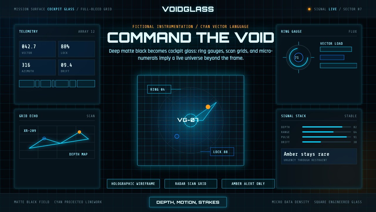 FUI Sci-Fi HUDBlack until it glows. Cyan wireframes, ring gauges, and radar grids sell live…
 GitHub DarkCode-first darkness. Cool-blue canvas, 1px borders, green/red diff lines.
 Linear 2024Precision down to the millisecond. Near-black, indigo-violet accents, Inter D…