What is Telepresence Surgery Suite?
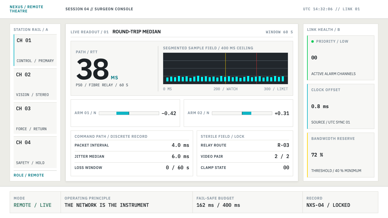
The Telepresence Surgery Suite turns a remote operating room into an interface language: wipe-clean white panels, cyan traces, a graded alarm ladder, and latency shown as a measured bar instead of a reassuring word.
Telepresence Surgery Suite in brief
The Telepresence Surgery Suite is a design language drawn from the interfaces of remote surgery, the field in which a surgeon operates on a patient who is in a different room, a different city, or a different continent. Its look is that of a regulated clinical console: flat panels with thin borders, square corners, a wipe-clean white ground, a cyan trace colour taken from the patient monitor, and a three-step alarm colour ladder that runs from calm through caution to danger. Nothing in it is there to be charming. Every element is an instrument face, built to be read quickly and correctly under pressure.
The central idea is that nothing vague survives. Status is not described, it is measured. Where a friendly product might say a connection is good, this system shows a number, a unit and a position on a scale. Labels are numbered channels rather than approachable nouns. Latency, the delay between a surgeon's hand and the instrument's response, is drawn as a segmented bar with threshold ticks, so a viewer can see at a glance how much of the allowed budget has been used and how far there is to go before the line is crossed.
The result is deliberately unlike a consumer health application. It has no soft cards, no encouraging illustration, no animated welcome. It looks like a control surface that someone is accountable for, because the situations it takes its cue from are ones in which a misread value has real consequences. For designers, it is a rare, highly disciplined reference for interfaces in which accuracy and speed of reading outrank warmth.

Where does Telepresence Surgery Suite come from?
The story starts in September 2001, when a surgeon in New York removed a gallbladder from a patient in Strasbourg. The operation, known as Operation Lindbergh, was carried out across a dedicated fibre link with a round-trip delay of roughly a sixth of a second. Its name echoes the first solo flight across the Atlantic, and the comparison was deliberate: this was a crossing too, the first time a complete operation had been performed across an ocean. Everything about the room in which such work happens, the wipe-clean white cladding, the cyan of the oxygen-saturation trace and the green, amber and red alarm ladder, had been built to be read fast and read correctly under pressure.
After that operation, long-distance surgery stopped being a demonstration and became an engineering problem. The patient and the robotic arms sit in one operating room, while the surgeon's console is in another city, and the success of the whole system depends on a delay budget measured in thousandths of a second. This is what gives the design language its character. When time is the scarce resource, every interface decision is judged by one question: does it make the state of the system faster to read, or slower? Decoration, ambiguity and friendly vagueness all fail that test.
The next chapter was written by networks. Telesurgery trials over fifth-generation mobile links took place between 2019 and 2024, including demonstrations in China and in Greece, and the International Telecommunication Union's work on the tactile internet gave the field a vocabulary for what was being attempted: a network quick and dependable enough to carry the sense of touch, not only pictures and sound. The theme's own era statement reaches forward from these trials to an extrapolated near-future in which a surgeon's console, a haptic channel and a remote patient-side system form one routine arrangement.
Two other strands shape the look. One is the standardisation of medical alarms under IEC 60601-1-8, an international standard that treats the priority of an alarm as something to be signalled consistently, so that clinicians in any room can tell an urgent condition from a routine one. The other is the tradition of high-hygiene clinical interiors, in which surfaces are chosen to be cleaned easily and to show no clutter. Add the lineage of robotic surgical platforms, with companies such as Intuitive Surgical putting surgeon consoles in front of patient-side systems, and the visual grammar is complete: measured, bordered, flat and calm.
What defines the Telepresence Surgery Suite look?
Signal White Surfaces
The ground is a hygienic, signal-style white, the colour of wipe-clean cladding in a clinical room. It is clean and bright but not warm, and it is used for large, flat fields without texture. White is the neutral stage on which data and alarms are the only things allowed to carry colour, so the page stays legible however many readings are shown.
Cyan Trace and the Alarm Ladder
Two colour systems share the page. A cyan, borrowed from the oxygen-saturation trace on a patient monitor, draws live signals and data lines. A graded ladder of green, amber and red marks alarm priority, and it follows the logic of the IEC alarm standard rather than taste. Colour is never ornamental: if something is red, it means a person must act.
Flat Bordered Panels
Panels are flat, with thin hairline borders and square corners, or corners so slightly softened that they read as square. There are no heavy shadows, no layered cards and no glass effects. A border does the job of separating one instrument from the next, which is exactly how a physical control panel works.
Readouts, Not Adjectives
Every state is written as a number and a unit, set in a monospaced, instrument-style face whose digits line up so values do not jump as they change. The system writes a measured delay where a friendly product would write good. The rule is that a viewer should never have to trust a word where they could check a value.
Numbered Channels
Labels are numbered channels, such as a short code followed by an index, instead of approachable nouns. A feed becomes a channel with an identifier, and a reading becomes a position in a list. The numbering makes the interface unambiguous when several people refer to the same value aloud, and it gives the page the cool, procedural tone of equipment.
The Segmented Latency Bar
Latency is the signature component: a bar divided into segments with ticks marking the thresholds, filled in cyan up to the current value. The viewer sees the delay, the allowed limit and the margin in a single glance. It is the clearest example of the system's view that a status should be a position on a scale, never a mood.
Alarms Without Animation
An alarm simply appears. It does not slide in, bounce, fade or pulse for effect. Entrance animation makes the viewer wait to confirm what changed, and in a clinical setting a delay in reading is a cost. A static, immediate appearance, with the ladder colour and a clear label, is the more trustworthy way to deliver bad news.

Who shaped Telepresence Surgery Suite?
Marescaux is the Strasbourg surgeon whose team is identified with Operation Lindbergh, the 2001 procedure in which a New York surgeon operated on a patient in Strasbourg over a dedicated fibre link. His name stands for the proof that a complete operation could be carried out across an ocean, and with it the realisation that the interface between surgeon and patient is a timing problem as much as a medical one.
Intuitive Surgical is the best-known maker of robotic surgical platforms, systems in which a surgeon works at a console while instruments act at the patient's side. It represents the commercial and clinical lineage that made the console a familiar object in operating rooms. For this design language, the console is the model: a single seat from which a person reads many channels and acts on them with confidence.
Harry Sherman appears among the key figures attached to this lineage in the system's own reference material. What matters for design is what the lineage stands for: the move from a one-off demonstration to equipment that other hospitals can install and rely on. Reliability of that kind is expressed visually through consistency, so the same panel, the same border and the same alarm ladder appear every time.
How do you use Telepresence Surgery Suite today?
The Telepresence Surgery Suite is most useful as a discipline for any interface where accuracy, speed of reading and trust outrank warmth. Applying it well means taking its rules seriously: measure rather than describe, separate with borders rather than shadows, reserve colour for meaning, and keep motion out of anything urgent. A white page with a cyan accent is not enough.
For presentation slides, build the cover like a console header: a flat white field, a small numbered channel label, a title in a restrained sans-serif, and a thin border around a single key figure. Content slides work as panel grids, with each panel carrying one reading, a unit and a short label. Data slides are where the style excels, because line charts in the cyan trace colour, segmented bars with threshold ticks and ladder-coloured status cells make results feel verified rather than illustrated.
For web interfaces, the natural territory is monitoring and operations: observability dashboards, incident consoles, network status pages, logistics control rooms and any product that watches a live system. Use a white ground, bordered panels on a strict grid, a monospaced face for values, cyan for live data and the ladder colours only for severity. Show latency, uptime and error rates as numbers with units, and use segmented bars rather than smooth, decorative gauges. Alarms and toasts should appear immediately, without entrance animation.
For editorial and marketing work, the style suits technical white papers, medical-technology explainers, engineering documentation and product pages for professional equipment. Long-form copy should be plain and specific, with measured claims, and figures laid out as small numbered tables. The page persuades by looking accountable. Take care with imagery: clinical photography can support the look, but stock smiles and soft-focus wellness photography contradict it.
The most common mistake is to borrow the aesthetic without the logic, for instance by using the white and cyan palette on a rounded, friendly, animated wellness app. A second is to colour things red or amber for emphasis, which dilutes the ladder until it means nothing. A third is to replace measured values with reassuring labels. Finally, resembling a clinical console does not make a product compliant with any medical or safety standard; the look is a reference for clarity, not a substitute for regulatory work.

Telepresence Surgery Suite — FAQ
What was Operation Lindbergh?
It was a procedure performed in September 2001 in which a surgeon in New York removed a gallbladder from a patient in Strasbourg, using a robotic system over a dedicated fibre link with a round-trip delay of roughly a sixth of a second. It is widely treated as the first complete transatlantic telesurgery, and it is the event from which this design language takes its name and its sense of discipline.
What is the tactile internet?
It is a concept developed in the International Telecommunication Union's work on networks fast and reliable enough to carry touch and force feedback in real time, so a remote operator can feel as well as see. For telesurgery it describes the target: a haptic channel that behaves like a direct connection. The design language borrows the discipline that goal demands, which is to treat time as a measurable resource.
Why does the system use numbers instead of words like good or fine?
Because a word hides the margin. Good tells a viewer nothing about how close a value is to its limit, while a number with a unit and a position on a scale tells them exactly that. In settings where a misread value matters, the system prefers information that can be verified at a glance. Words are used for labels, never for states.
Can the style be used outside healthcare?
Yes, and it often works best there. Any product that monitors a live system, such as infrastructure, logistics, energy, finance operations or network status, benefits from measured readouts, bordered panels and a disciplined alarm ladder. What it does not suit is a context built on warmth and play. Its coolness is a feature in operations and a drawback in entertainment or lifestyle products.
Why do alarms in this style never animate?
Because animation delays comprehension. An alarm that slides, fades or pulses forces the viewer to wait to see its final state, and in a clinical setting every extra moment of reading time counts. The convention is to show the alarm at once, in its ladder colour, with a clear label, so the message is read the instant it appears.
Related design styles
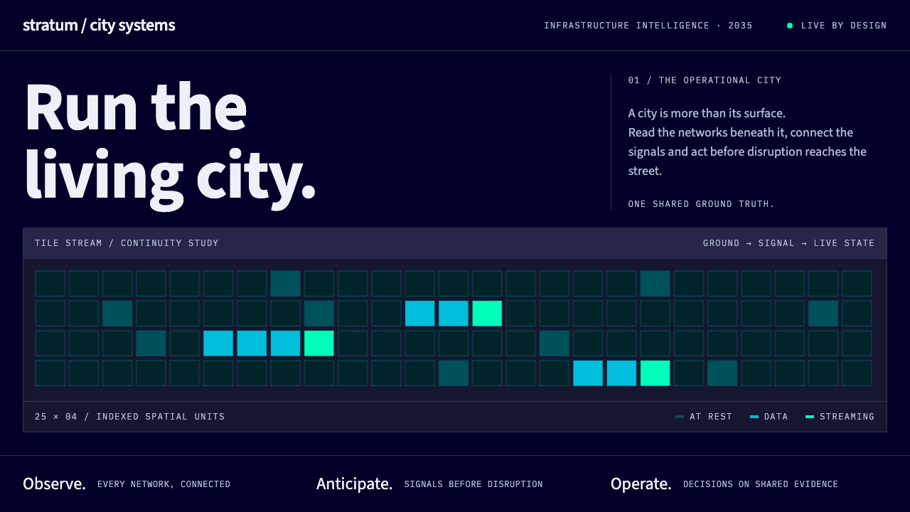 Digital Twin City OpsColour reports, never decorates. Deep blue grids reserve cyan and green for d…
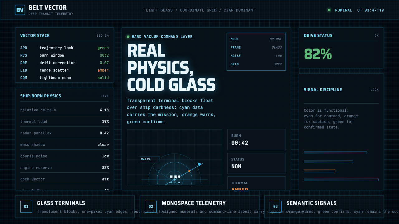 The Expanse Belter UIEngineering, not neon. Cyan glass panels, mono data, orange warnings on ship-…
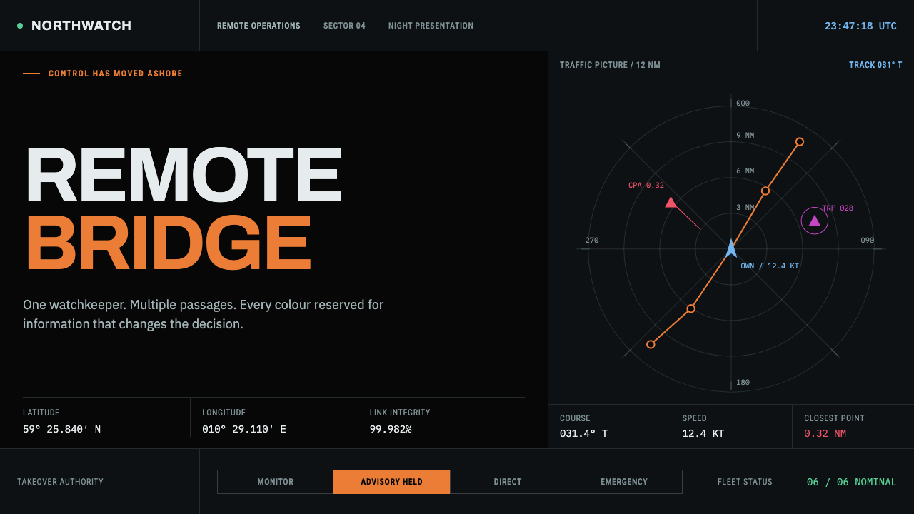 Autonomous Cargo Ship BridgeColour is protocol. Near-black chart grids reserve orange for decisions that…
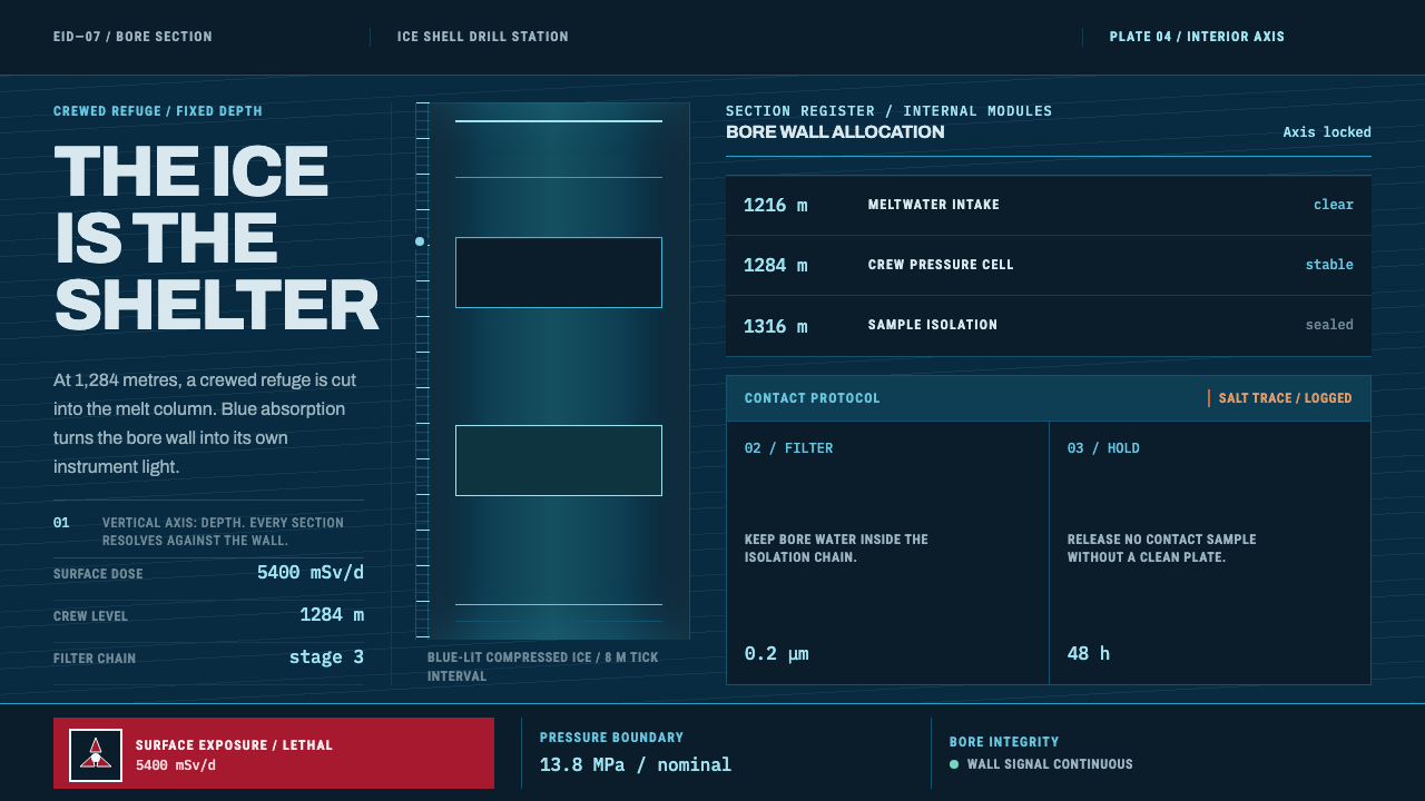 Europa Ice Drill StationShelter is a depth, not a room. Blue bore axis, hard tables, and earned radia…
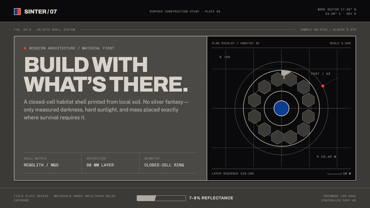 Lunar Regolith SettlementMoonlight without the myth. Regolith gray, hard terminators, and a strict tec…
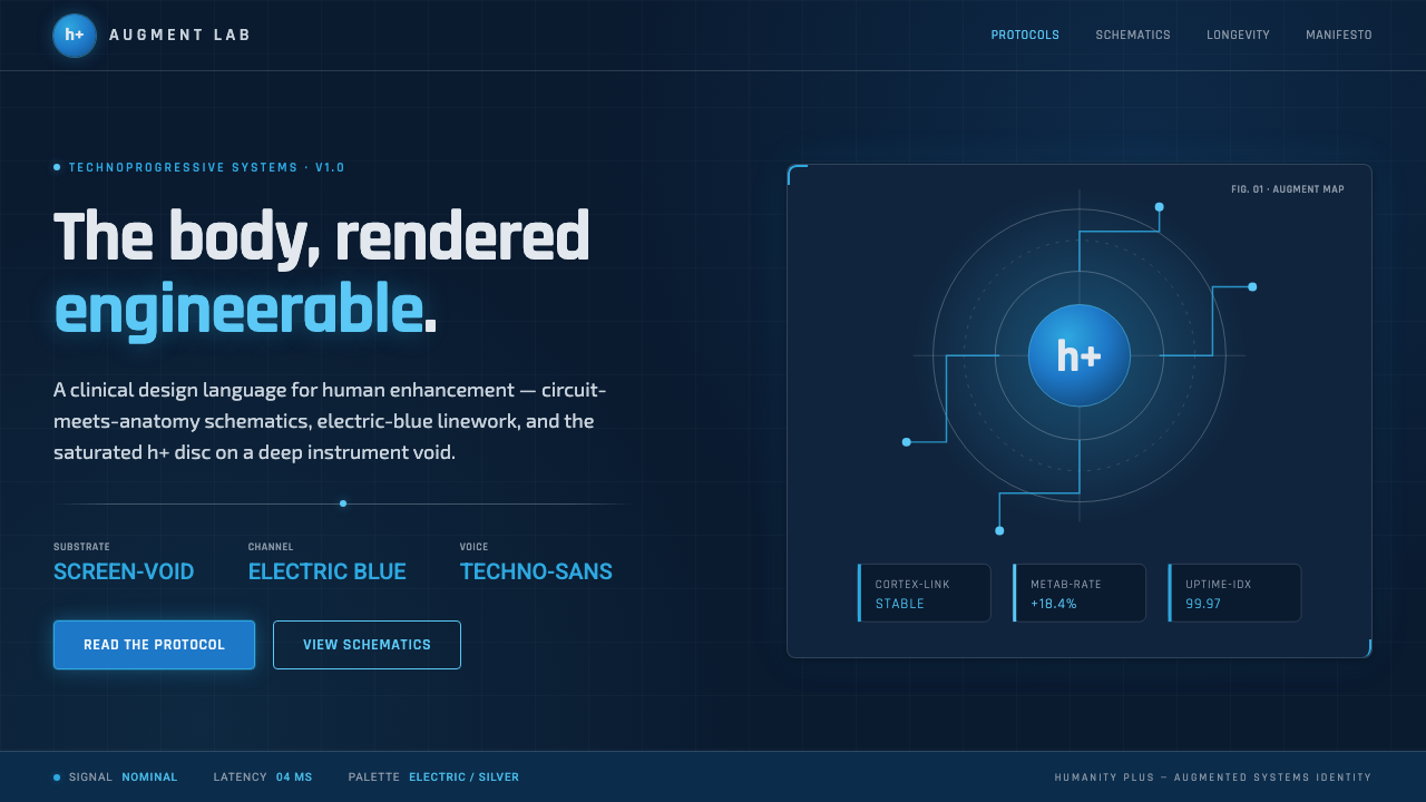 Transhumanism (H+)The body, rendered engineerable. Electric-blue circuit-anatomy schematics and…