What is Transhumanism (H+)?
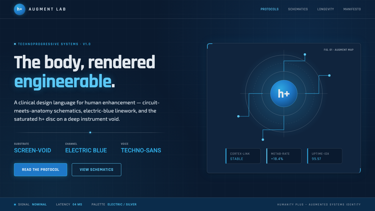
Transhumanism renders the body as an engineerable system: electric circuitry, clinical anatomy, and the h+ disc suspended in a technological void.
Transhumanism (H+) in brief
The Transhumanism, or H+, aesthetic is the visual language associated with Humanity+ and the broader transhumanist movement. It imagines human capability as something open to deliberate extension, and gives that idea a clinical visual form: cool electric blue, silver-white notation, circuitry, and anatomical diagrams arranged against a dark screen-void.
Its central image is not the heroic machine or the glossy science-fiction city. It is the body under examination. Limbs, neural pathways, organs, and interfaces are treated as if they belong to a technical manual: outlined, labeled, cross-sectioned, and connected by precise traces. The result is forward-leaning but restrained, more diagnostic than theatrical.
The saturated blue h+ disc acts as the system’s emblem and focal point. Around it, thin techno-sans type, circuit-like dividers, and schematic callouts establish a language of analysis. The aesthetic suggests that biology, computation, medicine, and personal agency are being brought into one shared diagram.
Where does Transhumanism (H+) come from?
The aesthetic belongs to a global, internet-native context rather than a single city, school, or material tradition. Its visual vocabulary reflects ideas that circulate through screens: technical documentation, interface diagrams, medical imaging, systems thinking, and the compressed symbolic language of digital identity.
Its named institutional anchor is Humanity+, formerly the World Transhumanist Association. In the organization’s 2008 rebrand, the h+ mark was adopted as a compact visual sign. The mark’s brevity matters: a single letter and operator can imply a proposition about augmentation, continuation, and human possibility without requiring an illustrated narrative.
The movement’s imagery makes a deliberate connection between anatomy and circuitry. This is not decorative cyberpunk density. Circuit traces function like routes in a system diagram, while anatomical outlines make the human body legible as a site of observation, intervention, and redesign.
Nick Bostrom and David Pearce are named among the movement’s key figures, alongside Humanity+ itself. Within this visual world, individual names, organizational identity, and the h+ symbol are best treated as parts of a shared public language: global in reach, technologically oriented, and concerned with the future condition of the human body.
What defines the Transhumanism (H+) look?
Dark Screen-Void
The background is deep and cool, creating the sensation of an active display rather than a physical surface. Darkness is not used for drama alone; it gives silver-white labels, electric-blue traces, and anatomical linework the isolated clarity of a diagnostic interface.
Electric Blue and Silver
Electric blue carries the system’s energy and identity, while cool silver-white supplies information and structure. Blue should feel activated and intentional, not casually decorative. Silver-white is best reserved for anatomy, labels, dividers, and the quiet machinery of explanation.
Circuit-Anatomy Linework
The signature motif joins circuit traces to anatomical drawing. Lines may map a body, an internal cross-section, or an abstract interface, but they remain precise and clinical. The body is not ornamented with technology; it is diagrammed through technology.
Schematic Callouts
Labels, leader lines, small captions, and sectional frames make the layout read as a technical artifact. They should clarify relationships rather than simulate complexity. A callout earns its place when it identifies a function, route, boundary, or point of attention.
Techno-Sans Typography
Typography is thin, engineered, and informational. It should feel capable of carrying a measurement, an annotation, or a system state. Strong hierarchy comes from grouping, contrast, and alignment, while the type remains disciplined enough to coexist with dense linework.
Blue Disc Identity
The saturated blue disc containing h+ is the visual anchor. Its circular form introduces a decisive, human-recognizable signal into a field of traces and panels. Used sparingly, it gives the composition a center of conviction rather than another interface control.

Who shaped Transhumanism (H+)?
Humanity+, formerly the World Transhumanist Association, is the movement’s named organizational reference. Its 2008 rebrand adopted the h+ mark, making the compact blue-disc identity central to the aesthetic’s public recognition.
Nick Bostrom is listed as a key figure in the transhumanist context. In an H+ visual treatment, his name belongs to the intellectual and organizational layer of the system: concise, highly legible, and positioned as part of a network rather than a celebrity portrait.
David Pearce is also named as a key figure. His presence supports the aesthetic’s global and idea-driven character: figures are presented through labels, references, and structured information, consistent with a movement that frames human futures as subjects for deliberate inquiry.
How do you use Transhumanism (H+) today?
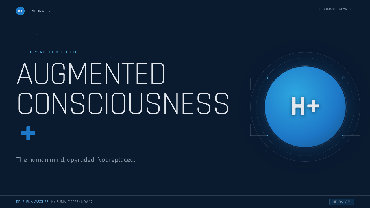
For presentation covers, use the dark field as a deliberate void and let one h+ disc or anatomical schematic establish the subject immediately. The title should read like a system heading, with a small amount of silver-white supporting information. Keep the image sparse enough that the blue identity remains a signal, not a background pattern.
Content slides work best as controlled diagnostic panels. Give each slide one body system, question, process, or proposition; use callouts to connect ideas and thin dividers to separate evidence from interpretation. For data slides, turn charts into schematic instruments: retain clear axes and labels, use electric blue to indicate the active comparison, and avoid turning every series into a glowing trace.
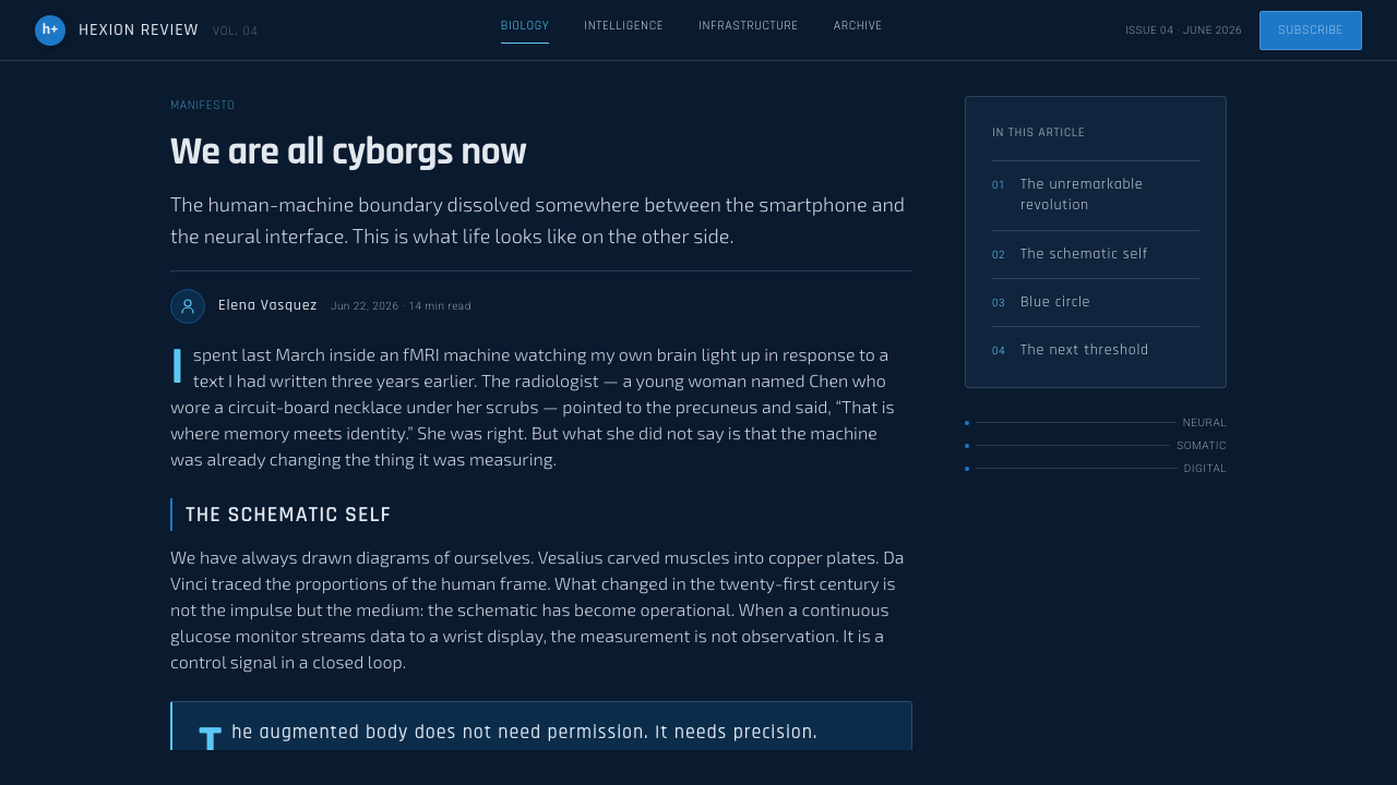
For web interfaces, the style suits dashboards, research portals, health-adjacent concepts, and future-facing product pages where systems literacy is part of the experience. Navigation can behave like an instrument panel, with clear labels and controlled state indicators. Panels should feel like cross-sections or inspection windows, not like floating lifestyle cards.
Editorial and marketing work can use the aesthetic to frame a report, manifesto, long-form essay, or event page. Pair a broad dark field with a diagrammatic body image, then use silver-white copy for the analytical layer. Marketing claims should be treated as annotated propositions: the visual language gains credibility when it explains a relationship rather than merely decorating a promise.
The common mistake is confusing H+ with generic neon cyberpunk. Dense glow, random code, overloaded holograms, and aggressive futuristic ornament obscure the style’s real discipline. The transhumanist look is strongest when circuitry is legible, anatomy is purposeful, typography is clinical, and the blue disc appears as an intentional emblem rather than an interchangeable sci-fi badge.
Transhumanism (H+) — FAQ
Is H+ simply a cyberpunk style?
No. Both may use dark grounds and technological imagery, but H+ is organized around analysis rather than urban spectacle. Its circuitry is schematic, its anatomy is clinical, and its blue identity mark is institutional and symbolic. Cyberpunk often emphasizes density, decay, rebellion, or sensory overload; H+ emphasizes legibility, augmentation, and systems thinking.
Why is the h+ mark placed in a blue disc?
The h+ mark was adopted in the 2008 rebrand of the World Transhumanist Association, later known as Humanity+. Within the aesthetic, the disc concentrates the identity into a compact, high-recognition sign. Its simple circular field gives an otherwise technical composition a stable conceptual center.
Can this aesthetic use photography?
It can, but photography should support the schematic logic. Treat a body image as evidence, a scan, or a source for annotation rather than as a glossy lifestyle image. Strong crops, restrained contrast, and clear callouts help photography join the system instead of interrupting it.
Does a dark background make every interface feel transhumanist?
No. The dark screen-void is only the setting. The style emerges from the relationship between dark space, cool information lines, anatomical framing, circuit logic, and the h+ identity. Without that disciplined relationship, a dark interface may read as gaming, security software, or generic futurism instead.
Where does H+ work poorly?
It can feel too clinical or abstract when a product needs intimacy, softness, craft, or immediate emotional warmth. Child-focused experiences, sensory brands, and communications that depend on organic trust may resist its diagnostic tone. The question is not whether the style looks futuristic, but whether framing the body or user as a system supports the message.
Related design styles
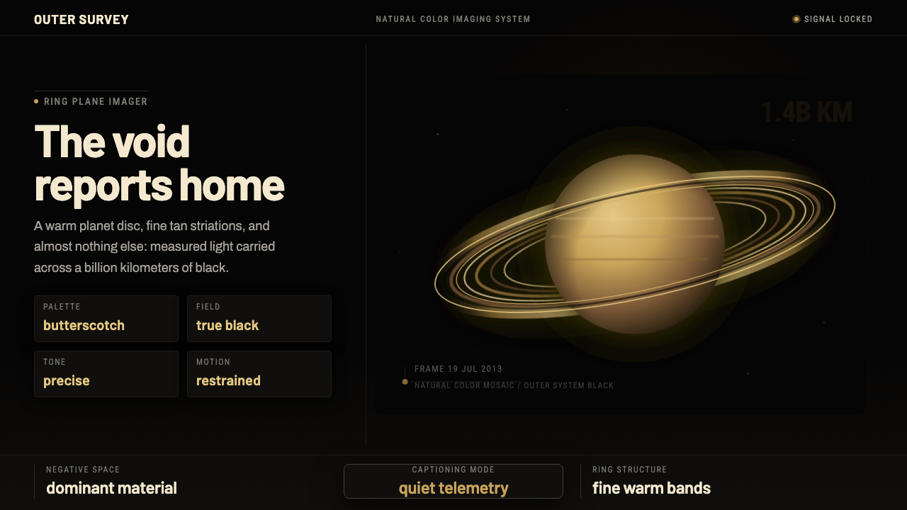 Cassini Saturn ImagingDeep space feels exact. Butterscotch Saturn floats in black with fine tan rin…
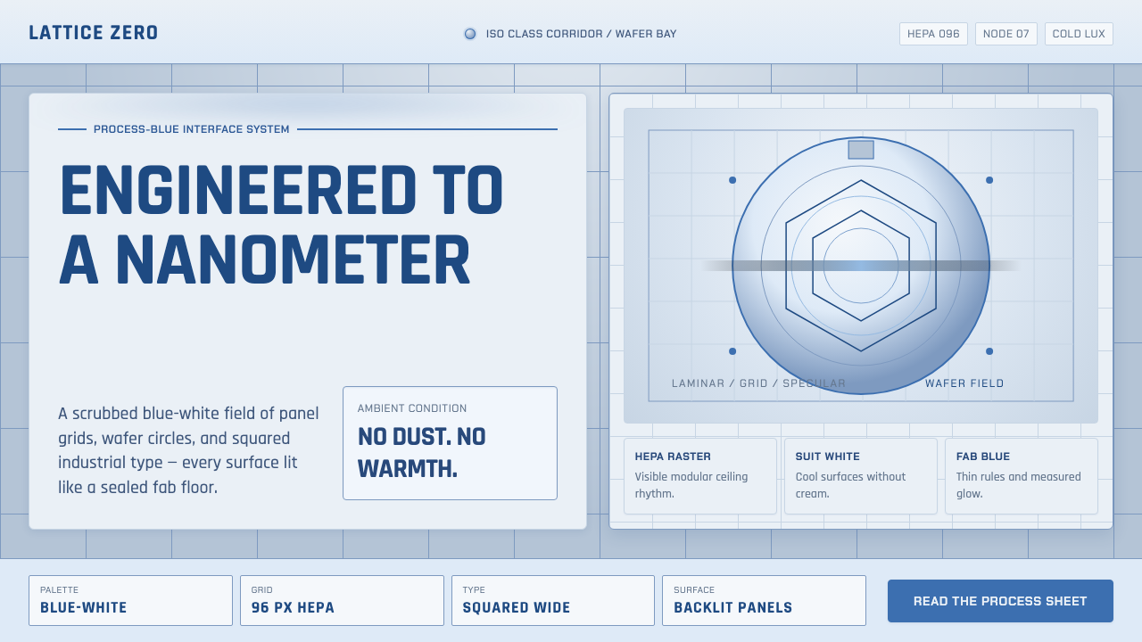 Semiconductor CleanroomCold precision, scrubbed clean. Blue-white grids, wafer circles, and squared…
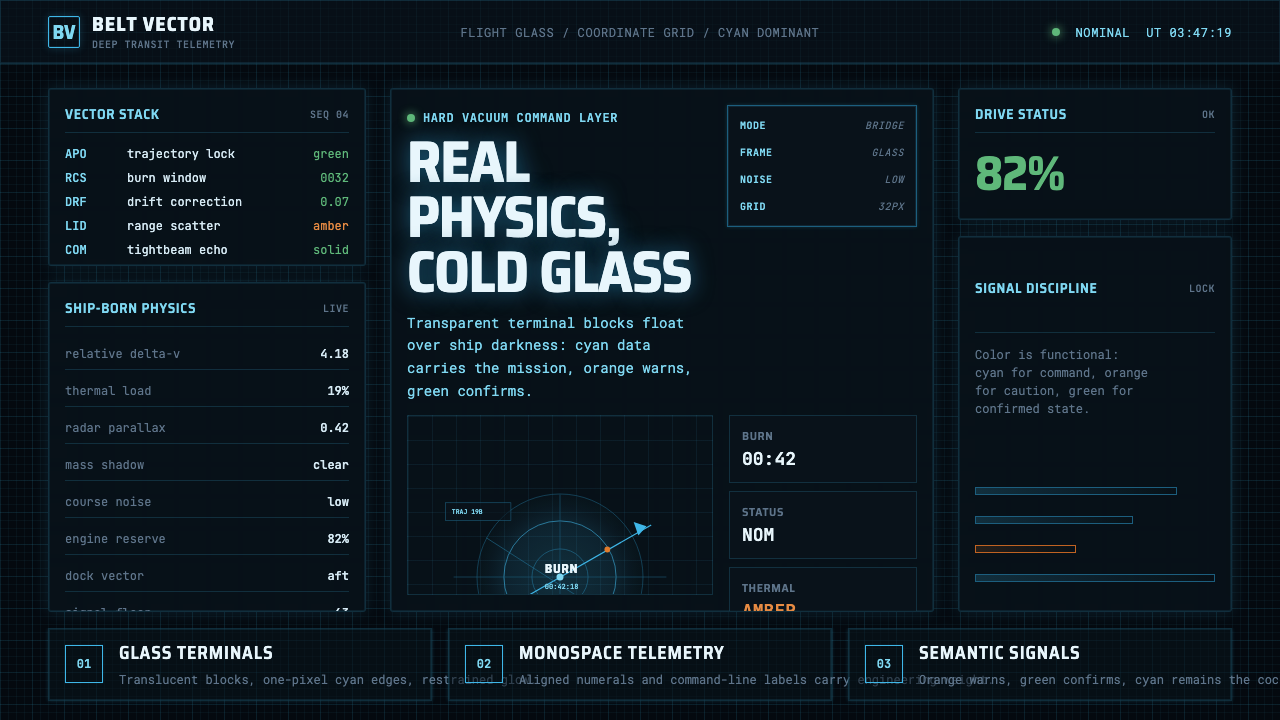 The Expanse Belter UIEngineering, not neon. Cyan glass panels, mono data, orange warnings on ship-…
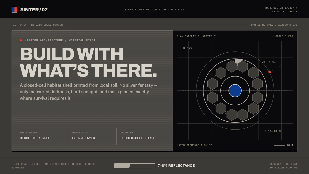 Lunar Regolith SettlementMoonlight without the myth. Regolith gray, hard terminators, and a strict tec…
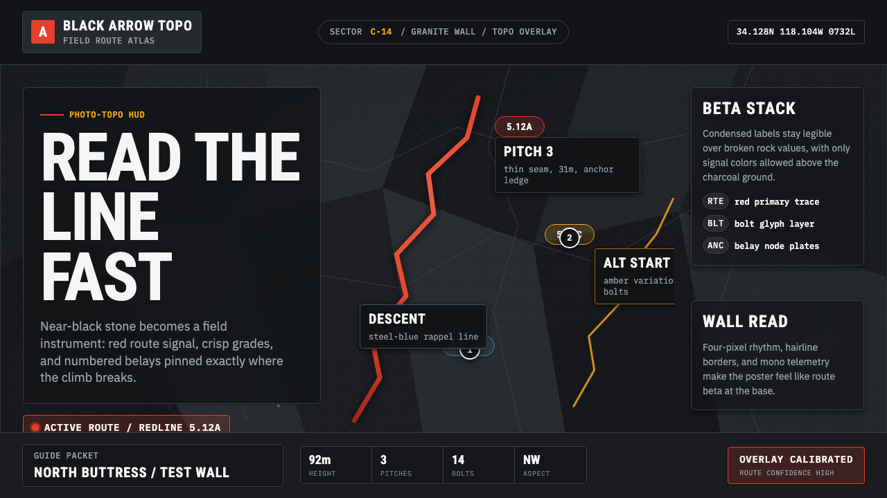 Climbing Topo GuideBeta at a glance. Red route telemetry cuts across near-black stone and conden…
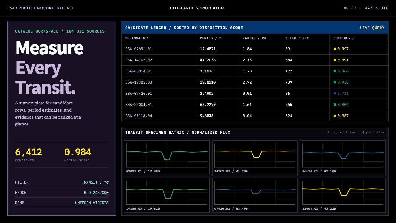 Exoplanet Survey AtlasNumbers stay legible at survey scale. Viridis ranks dense mono tables and tra…