What is Cassini Saturn Imaging?
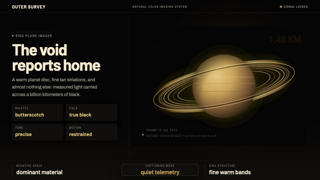
Deep space feels exact: a butterscotch Saturn hangs in black, its fine tan rings and restrained technical captions turning distance into a visual language.
Cassini Saturn Imaging in brief
Cassini Saturn Imaging is not a generic galaxy aesthetic or a decorative space theme. It distills the documented natural-color image of Saturn assembled by the Cassini spacecraft: a warm cloud-lit disc, brown and tan ring bands, and the pitch-black void of the outer solar system. The result feels observational rather than cinematic, as though the interface itself has received a transmission from far away.
Its visual system is built on a severe contrast between the planet and the space around it. Black is not merely a background color; it is the dominant field of distance and silence. Against it, Saturn appears in butterscotch, gold, brown, and tan, with the rings providing fine horizontal and concentric structure. Warm color carries the eye, while the surrounding darkness gives the planet scale.
The mood is quiet, technical, and emotionally restrained. Captions should feel like evidence accompanying an image, not like poetic decoration. Every visible element should support the impression of a probe reporting home from deep space: exact, calm, isolated, and faithful to the physical subject. The style belongs to planetary science visualization and aerospace spacecraft imaging, but its design logic can travel into interfaces, presentations, editorial pages, and campaigns that value clarity over spectacle.

Where does Cassini Saturn Imaging come from?
The source image belongs to 19 July 2013, when the Cassini spacecraft turned its cameras back toward the Sun and assembled the mosaic known as the Day the Earth Smiled. Saturn appears in true, documented color: a golden butterscotch world suspended in darkness, surrounded by brown and tan rings. That date and image provide the style with its central tension. The subject is extraordinary, but the visual treatment remains observational and controlled.
The approved source places this lineage in the United States, within the NASA and JPL context associated with Pasadena. It also names Carolyn Porco, the Space Science Institute, and the Cassini Imaging Team among the key figures and institutions connected to the theme. These names matter less as decorative credits than as anchors of provenance. They keep the design attached to a specific imaging story rather than allowing it to drift into an invented science-fiction universe.
The image itself determines the design vocabulary. The pitch-black field becomes dominant negative space. The illuminated planetary disc becomes the warm focal mass. The rings become a system of fine striations that can be echoed through rules, dividers, data bands, or quiet horizontal structures. The technical captioning becomes a model for labels: concise, factual, and visually subordinate to the subject without disappearing.
As a design movement, Cassini Saturn Imaging sits between planetary science visualization and aerospace spacecraft imaging. Its authority comes from restraint. It does not romanticize the void with decorative stars, colored nebulae, or theatrical light effects. Instead, it presents deep space as real and lonely, with beauty emerging from accuracy, scale, and the disciplined relationship between a singular object and the darkness around it.
What defines the Cassini Saturn Imaging look?
Black Negative Space
Black is the structural condition of the style, not a neutral container. It should occupy enough visual territory for Saturn to feel suspended rather than placed inside a card. Empty space creates distance, silence, and scale. Crowding the frame with decorative stars or secondary imagery weakens the central idea. The darkness should feel deep and continuous, giving every warm surface a clear edge and making the subject appear received from somewhere beyond the interface.
Butterscotch Planet
Saturn is represented as a warm, cloud-lit disc rather than a cold metallic sphere. Butterscotch, muted gold, brown, and tan create a restrained range of related warmth. The color should feel atmospheric and physical, not neon or candy-bright. The disc is the visual authority of the composition: it carries the emotional charge while remaining faithful to the documented image. Supporting elements should never compete with its quiet luminosity.
Fine Ring Striations
The rings introduce precision into an otherwise spacious composition. Their brown and tan bands should read as delicate, ordered structures, with variation kept controlled and legible. In interface work, this quality can inform separators, horizontal rules, stacked information, or restrained data traces. Ring-like repetition should suggest measurement and orbital order, not ornamental pattern. The finer the visual structure becomes, the more important it is to protect the surrounding darkness.
Measured Contrast
The strongest contrast belongs to the relationship between the warm planet and the black void. Text and controls should remain visible without becoming louder than the image. Tan can support secondary information, while brighter warmth should be reserved for focal points, active states, or essential signals. Contrast is not used for constant excitement. It is used to establish a clear hierarchy between subject, evidence, and interface operation.
Technical Captioning
Labels should evoke a spacecraft report: quiet, concise, and exact. Short captions, restrained metadata, and factual descriptors can sit near the image without turning it into a poster of slogans. The lettering should feel engineered and dependable, with spacing that allows each fragment of information to breathe. Captions are part of the atmosphere because they explain how the image reached the viewer and remind us that observation, not fantasy, is the source of the beauty.
Singular Focus
The composition is organized around one unmistakable subject: Saturn and its rings. Supporting marks may clarify scale, context, or data, but they should not create a competing scene. This singular focus gives the style its contemplative force. The viewer is allowed to look, measure, and absorb the relationship between the disc and the void without being pushed through a sequence of decorative events.
Scientific Restraint
The style gains credibility by refusing effects that announce themselves. Avoid theatrical flares, colorful nebulae, excessive glow, and invented futuristic markings. Even when the subject is emotionally powerful, the treatment should remain grounded in the idea of true, documented color. The most convincing result feels less like a fantasy of space and more like a careful visual record that happens to be beautiful.

Who shaped Cassini Saturn Imaging?
Carolyn Porco is named in the approved source as a key figure associated with the Cassini Saturn Imaging lineage. Her inclusion anchors the style to the specific story behind the Day the Earth Smiled mosaic. In practical design terms, that means preserving the authority of a documented image and the emotional quiet of a spacecraft looking back toward home, rather than treating Saturn as a generic emblem of adventure.
NASA/JPL, Pasadena is identified as the institutional context for the source material. The name contributes a sense of engineering discipline and public scientific record. A design inspired by this theme should therefore favor clear provenance, restrained labeling, and observable structure. Its visual confidence should come from precision and clarity, not from exaggerated technological ornament.
The Space Science Institute appears in the approved key-figure list, reinforcing the theme's connection to scientific imaging rather than fictional world-building. Its presence supports a visual language in which imagery, captions, and contextual information work together. The design should make room for evidence and explanation without allowing text to overpower the singular planetary subject.
The Cassini Imaging Team is named as a key collective associated with the source. The team perspective is reflected in the style's balance between wonder and documentation: Saturn may be visually astonishing, but the frame remains an image returned by an instrument. This balance should guide every adaptation, from a presentation cover to a dashboard or editorial feature.
How do you use Cassini Saturn Imaging today?
Cassini Saturn Imaging transfers best to work that needs atmosphere without sacrificing exactness. Use the black field to establish depth, the warm planetary range to create focus, and ring-inspired lines to organize information. The theme becomes convincing when the visual hierarchy follows the source image: one dominant subject, a quiet surrounding field, and supporting captions that explain rather than decorate.
For presentation slides, the cover should give Saturn room to float in the black field, with the title and source caption arranged as calm technical information. Content slides can use warm bands, restrained rules, and short labels to separate concepts without turning every page into an illustration. Data slides should let charts, readings, or comparisons inherit the ring logic: orderly layers, fine traces, and a warm accent that marks the important observation. The image remains a reference point, not a background pasted behind unrelated content.
For web interfaces, the style suits dashboards and pricing pages where users need to scan a dark, information-rich environment. Use black as the field, warm gold or tan for emphasis, and brown as a quieter supporting tone. Cards and panels should feel like instruments or observation windows, with clear boundaries and controlled contrast. In pricing layouts, reserve the brightest warmth for the selected plan or primary action, while keeping explanatory text subdued and factual. Avoid glowing controls that make the interface feel like entertainment software.
For editorial and marketing work, the theme supports a strong visual story built around distance, evidence, and singular focus. A feature page can open with the Saturn disc, then move into compact captions, contextual writing, and ring-like horizontal structures that guide the reader through the material. Marketing campaigns can use the contrast of warm subject and black field to make a product or message feel precise and memorable. Claims should remain direct and documented; the visual drama should come from scale and silence.
The common mistake is turning the theme into generic space fantasy. Adding neon color, dense star fields, purple or blue cosmic effects, dramatic flares, or invented futuristic symbols breaks the relationship to the Cassini image. The opposite mistake is using black everywhere without preserving the warm planetary focus. The system needs both halves: deep negative space and a carefully controlled object that gives that space meaning. Ring lines should clarify structure, not become wallpaper.

Cassini Saturn Imaging — FAQ
Is Cassini Saturn Imaging just a generic space theme?
No. Its identity comes from a specific documented natural-color image assembled by Cassini on 19 July 2013. The black field, warm Saturn, fine ring bands, and technical captions work together as a visual record. Removing that restraint and adding generic cosmic effects changes the style into something else.
Can the style work on a light background?
It can be adapted, but the dark field is central to the theme. A light version may preserve the butterscotch planet, tan ring structure, and factual captioning, yet it will lose some of the sense of distance and suspension. If the void no longer feels present, the design is no longer expressing the core Cassini relationship between subject and space.
How should color be used in a Cassini-inspired interface?
Let black carry the environment, then build emphasis through related warm tones: butterscotch, muted gold, brown, and tan. The brightest warmth should identify the most important subject or action. Additional saturated colors are usually unnecessary because they compete with Saturn and weaken the documented, observational mood.
What makes the captions important?
The captions connect the image to the act of observation. They should feel like quiet technical reporting: concise, factual, and subordinate to the planet without becoming invisible. This keeps the design grounded in spacecraft imaging and prevents the subject from becoming an unexamined fantasy image.
Which products suit this style best?
It is strongest where precision, distance, evidence, and quiet authority matter: scientific or aerospace presentations, analytical dashboards, pricing systems, editorial features, and campaigns built around documented imagery. It is less natural for products that depend on playful warmth, organic texture, or exuberant color. The style works when the product can let restraint carry meaning.
Related design styles
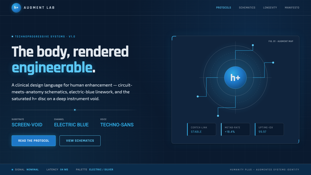 Transhumanism (H+)The body, rendered engineerable. Electric-blue circuit-anatomy schematics and…
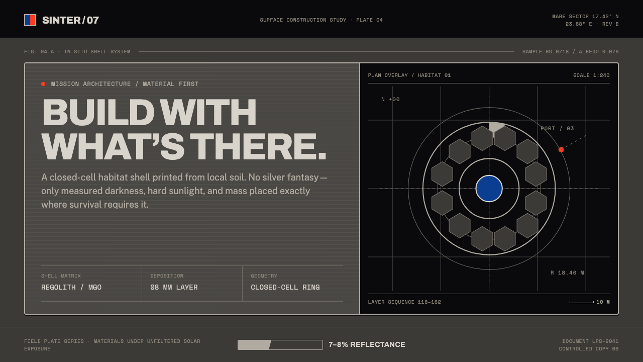 Lunar Regolith SettlementMoonlight without the myth. Regolith gray, hard terminators, and a strict tec…
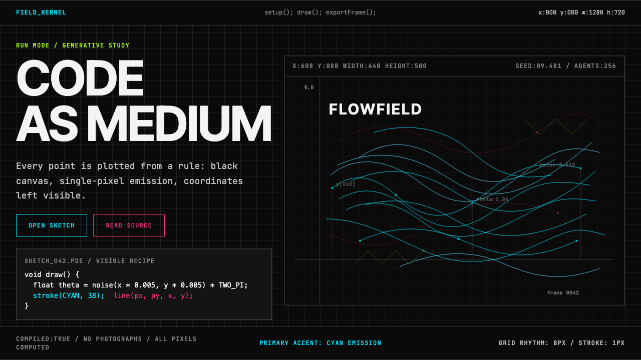 Processing / GenerativeCode becomes image. Cyan hairlines trace black-grid flowfields with mono coor…
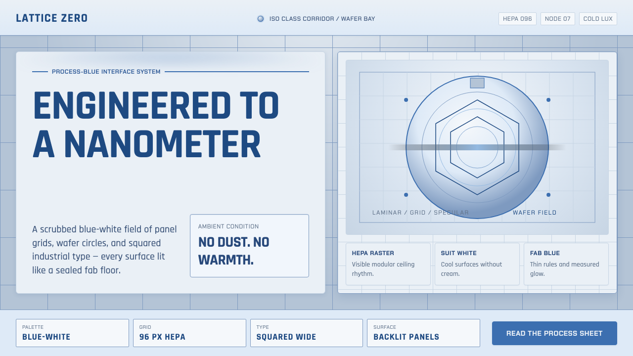 Semiconductor CleanroomCold precision, scrubbed clean. Blue-white grids, wafer circles, and squared…
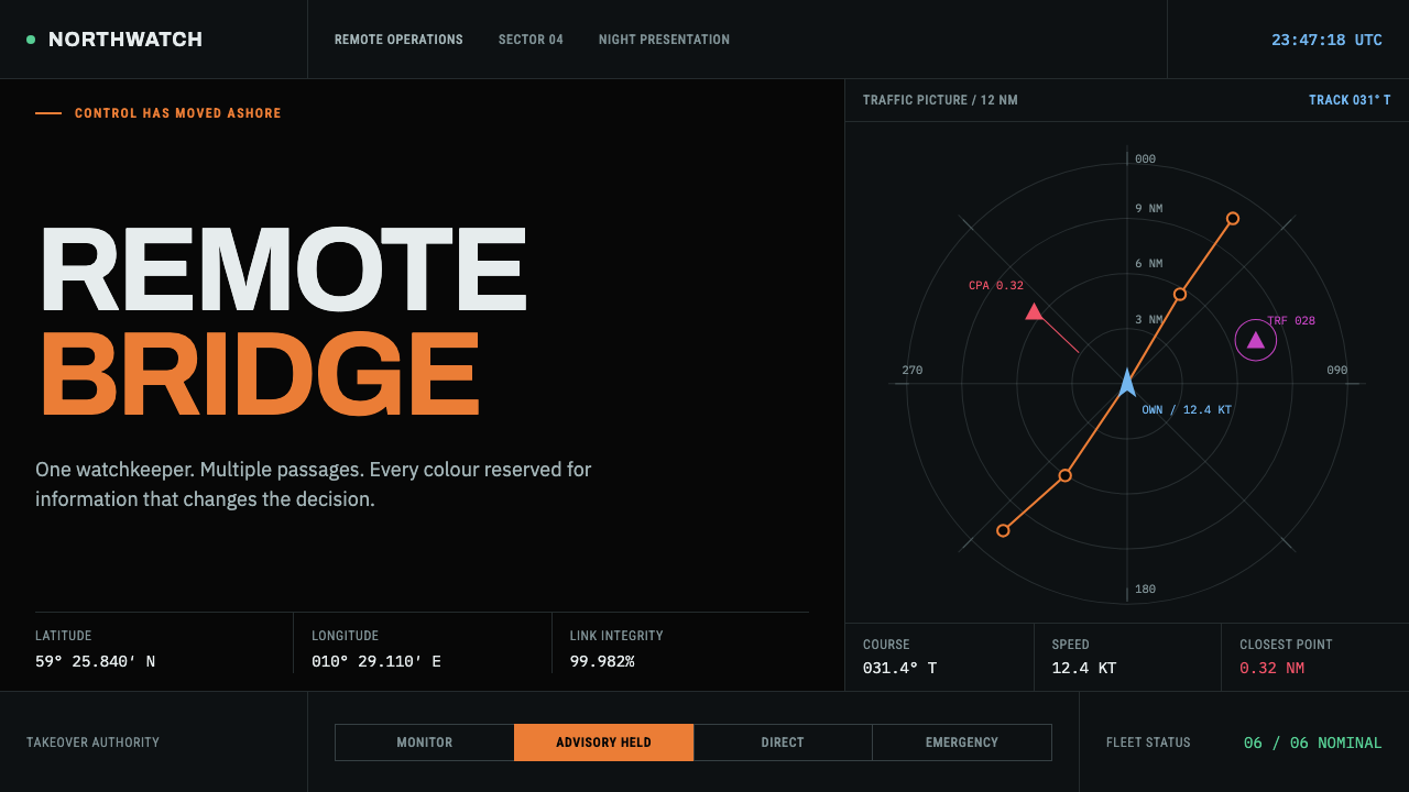 Autonomous Cargo Ship BridgeColour is protocol. Near-black chart grids reserve orange for decisions that…
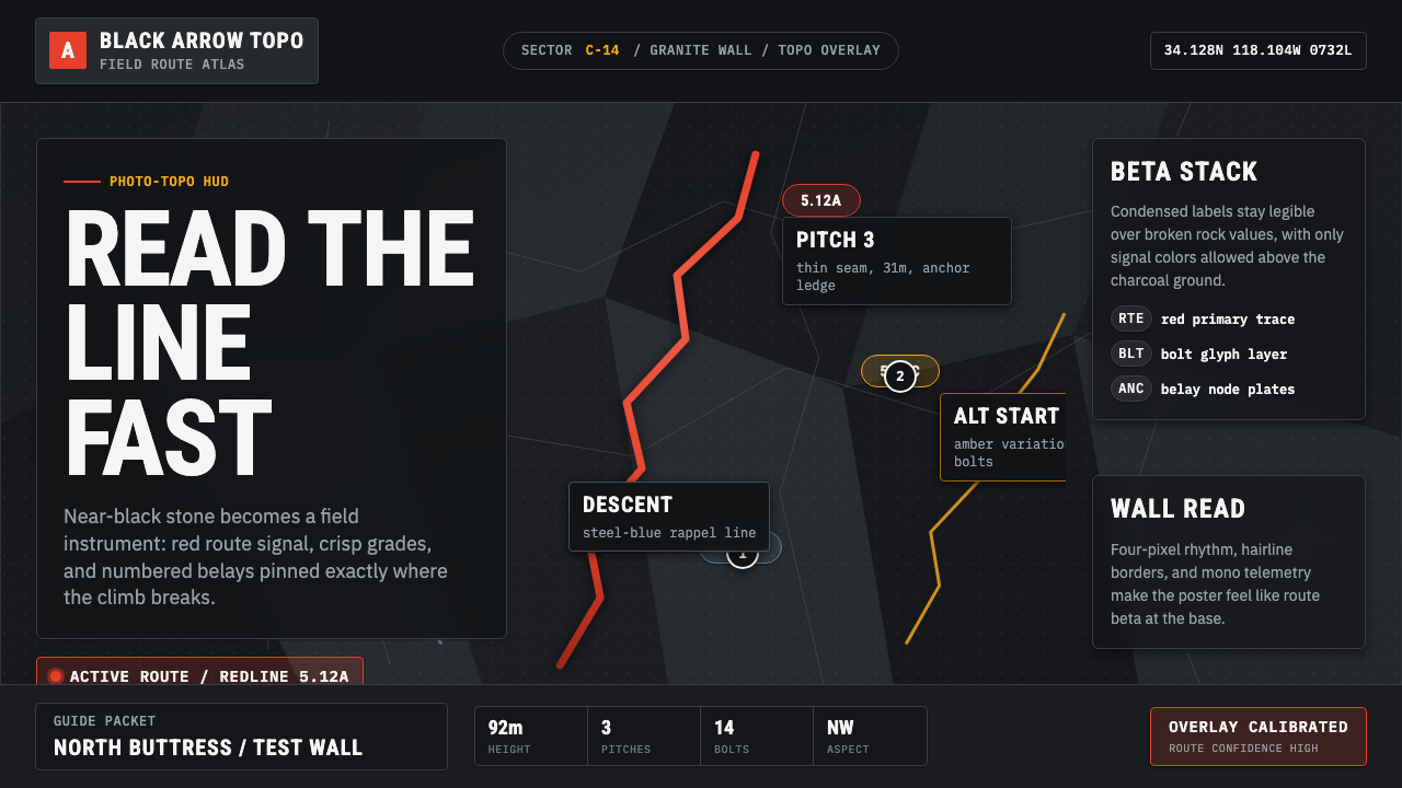 Climbing Topo GuideBeta at a glance. Red route telemetry cuts across near-black stone and conden…