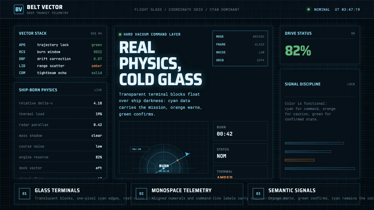
About The Expanse Belter UI
The Expanse renders its starships' interfaces as cool cyan data glowing on near-black — the Rocinante, MCRN, and UNN bridges read like NASA met a WWII battleship. Transparent glass terminal blocks float against the void, all command-line readouts, orbit-line plots, and faint hairline grids.
The system is functional and real-physics: cyan dominant, with disciplined orange for warnings and green for status. Monospace data fonts carry the "real engineering" voice — high signal, low noise, no decoration.
- Origin
- Global / Internet (international production)
- Era
- 2015–2022 series, set ~200 years in the future
- Key figures
- Timothy Peel · Junction Box
- Movements
- Hard sci-fi FUI · NASA-inspired functional interface · Monospaced terminal aesthetic
The Expanse Belter UI design spec
Colors
Background
Surface
Primary
Secondary
Accent
Text
Typography
Saira Semi CondensedHeadings
Roboto MonoBody
JetBrains MonoMono
Unlock for 1 credit
The other 11 sections — buttons, cards, spacing, motion, techniques and more — open once you unlock. Download the DESIGN.md or send it to your AI in one click. Unlock once, yours forever.
Sign up nowHave an account? Sign in
Styles similar to The Expanse Belter UI
Also inspired by film, games & music, with a close feel.
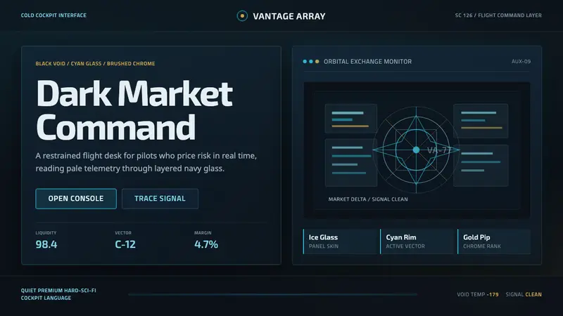 EVE Online (New Eden neocom)Cold cockpit luxury. Cyan glass panels float over a black nebula void.
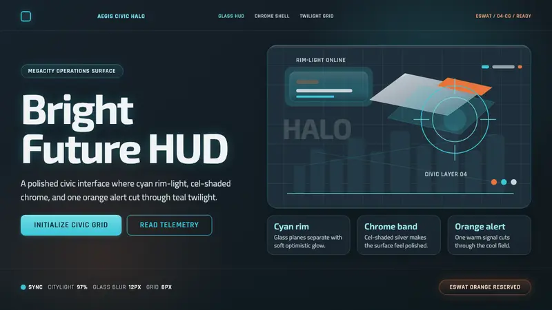 Appleseed (Olympus)Polished future, not noir. Cyan HUD glow and chrome panels float over teal twilight.
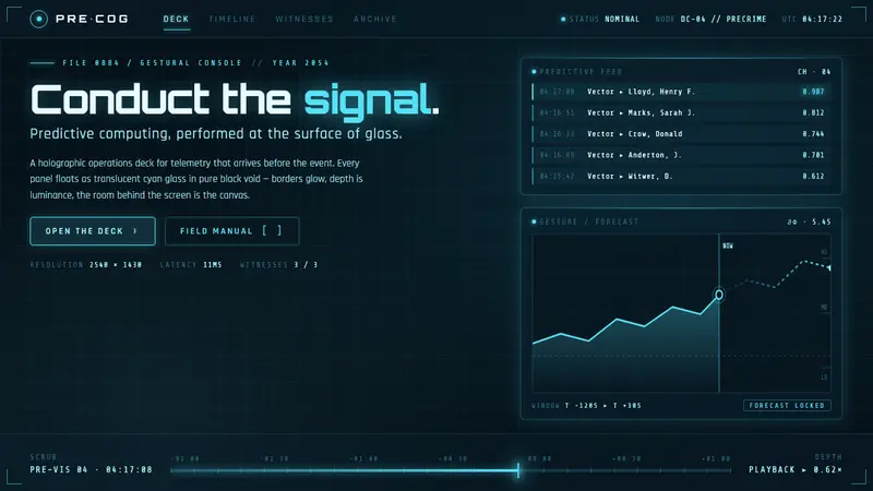 Minority Report Gestural UIPredictive computing, conducted on glass. Luminous cyan panels floating in pure black void.
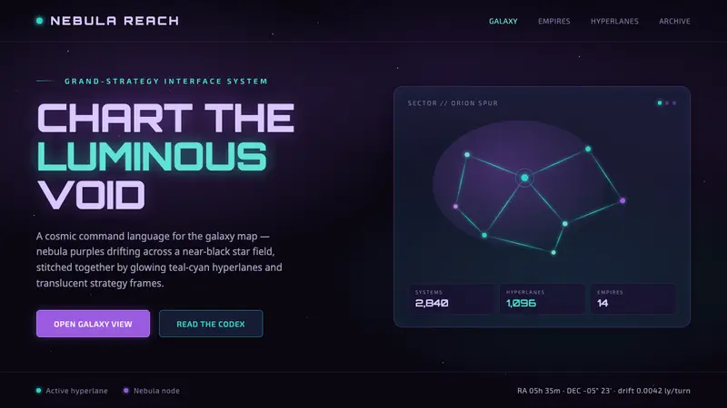 Stellaris (Galaxy Map)Quietly grand cosmic command UI. Nebula purples on near-black void, teal-cyan hyperlanes glowing.