What is Neural Interface Clinical?
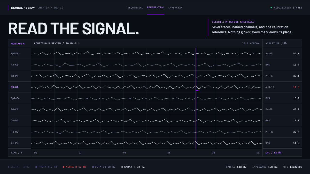
Neural Interface Clinical looks the way a seizure has to be read: silver waveforms on an unlit panel, with violet held back for the one signal that must never be mistaken for a symptom — calibration.
Neural Interface Clinical in brief
This system is modeled on the review station of a neuro monitoring unit — the kind of workstation used in epilepsy monitoring or a neuro intensive care setting — projected one step forward from its own history. The equipment it replaces was an ink pen tracing EEG activity onto paper moving at a steady, fixed speed; what sits in its place today is a near-black digital panel showing the same kind of information in the same basic layout. Stacked horizontal channels, each one labeled by its electrode pair, run in silver-grey across an unlit ground. Nothing on the panel glows — the contrast comes entirely from silver against near-black, not from any light source within the display.
Violet is present in the system, but only as a calibration reference, never as decoration. It shows up as a small marker, as the selected state of a channel in a list, or as a thin rule along one edge — never as a large color field or a background wash. That restraint mirrors how a calibration signal actually behaves in a real monitoring device: it exists to confirm the equipment is reading correctly, not to draw the eye.
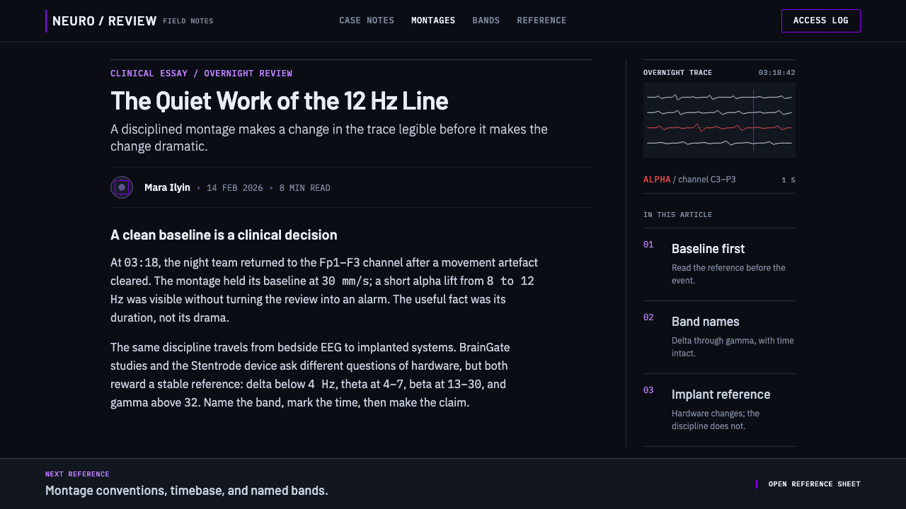
The vocabulary this system uses is documented clinical convention rather than invented technological flourish: sequential and referential montages (the standard ways of arranging which electrode pairs are compared against which), the named frequency bands used in real EEG interpretation, and real implant hardware referenced by name. Legibility is the entire design brief — every choice in the system exists to make a clinician's read of the signal faster and more certain, not to look impressive.
Where does Neural Interface Clinical come from?
This system draws on two overlapping timelines. Clinical electroencephalography, the practice of recording electrical activity from the scalp for diagnostic review, has been in continuous clinical use since the 1920s. Implanted brain-computer interface hardware is much newer, with real devices in human trials from 2004 onward. The panel this system describes sits at the meeting point of both histories, projected one step forward from current review stations rather than depicting any single existing product exactly — the work of research hospitals and neurotechnology laboratories worldwide.
What has not changed across a century of EEG practice is the basic convention for laying out the signal. The equipment moved from an ink pen physically tracing lines onto paper fed past it at a fixed, steady speed, to a digital screen doing the equivalent job — but the layout convention of stacked horizontal channels, each one tied to a specific electrode pair, carried straight across that transition. A clinician trained to read the older paper output can read the newer digital panel using the same basic mental model.
The more recent, implant side of this field is represented by real, named efforts rather than invented technology: BrainGate, a long-running research consortium behind some of the earliest human trials of implanted brain-computer interfaces; Blackrock Neurotech, a supplier of the hardware used in clinical and research-grade neural implants; Neuralink, a more recent entrant developing its own implanted interface; and Synchron, whose Stentrode approach places its interface inside a blood vessel rather than requiring open surgery on the brain itself. Together they represent the range of active approaches within contemporary brain-computer interface research, and this system's implant-related vocabulary draws directly on their real, documented terminology.
The system's restraint is a deliberate choice rather than an aesthetic default. In a genuinely clinical or high-stakes monitoring context, credibility depends on looking exactly as disciplined as the real instruments it is modeled on — a monitoring display that glows, animates freely, or uses color decoratively would read as less trustworthy to the people who actually have to act on what it shows, not more advanced. Borrowing only documented medical convention, rather than speculative science-fiction imagery, is what makes the system's authority believable.
What defines the Neural Interface Clinical look?
Color
The working palette is silver-grey against an unlit, near-black ground, with violet held in reserve for a single purpose: calibration reference. Violet never appears as a large field or background wash — only as a small marker, a selected state, or a thin rule.
Non-Luminous Contrast
Contrast comes entirely from the material relationship between silver and near-black, not from any glow or luminance effect. Nothing in the system emits light in the way a neon or cyberpunk-inspired interface would; the display reads as a disciplined instrument, not a light source.
Stacked Channel Layout
Content is organized into stacked horizontal channels, each one clearly labeled by its source — the direct descendant of how EEG output has been laid out for a century, from paper trace to digital display. This layout convention should be preserved even where the underlying content has nothing to do with medical data.
Documented Vocabulary
Every technical term and label the system uses is drawn from real, verifiable convention — montage types, named frequency bands, actual hardware names — rather than invented terminology designed to sound futuristic. This grounding in documented fact is part of what makes the system credible.
Restraint as Credibility
Visual restraint functions here as a signal of trustworthiness rather than a limitation. In a context where someone has to act on what the display shows, a calm, disciplined surface reads as more credible than an animated or decorative one — the opposite of how restraint is often treated in consumer-facing design.
Precise Calibration Marker
Where a calibration reference does appear, it is small and exact — a fine tick, a highlighted selector state, a thin rule along one edge — never a large or ambiguous shape. Precision of placement matters more than visual prominence.
Continuity Across Media
The layout convention this system uses has survived a full transition in medium, from a mechanical pen tracing paper to a digital display, without fundamentally changing. That continuity is itself a design value: a genuinely useful clinical layout does not need to be reinvented just because the underlying technology changed.
Who shaped Neural Interface Clinical?
BrainGate is a long-running research consortium behind some of the earliest human trials of implanted brain-computer interfaces, and its work forms part of the documented real-world foundation this system's implant-related vocabulary draws on. Its history reflects how this technology moved from laboratory research toward genuine, if still limited, clinical application.
Blackrock Neurotech supplies hardware used in clinical and research-grade neural implants, representing the equipment side of brain-computer interface research rather than a single trial or study. Its role reflects how a research field this technical depends on specialized hardware providers as much as on individual research teams.
Neuralink is a more recent entrant developing its own implanted brain-computer interface, part of a wider surge of activity in the field alongside longer-running efforts. Its inclusion here reflects the system's commitment to naming real, currently active organizations rather than generic or invented technology.
Synchron takes a distinctive approach with its Stentrode device, placing the interface inside a blood vessel rather than requiring open brain surgery. Its inclusion broadens the system's real-world vocabulary beyond a single implant method, reflecting that brain-computer interface research currently spans more than one surgical approach.
How do you use Neural Interface Clinical today?
This system transfers well to any interface that needs to project extreme precision and trustworthiness rather than warmth or playfulness — monitoring dashboards, technical or scientific tools, operations consoles, or any product where the person using it needs to act quickly and correctly on what they see.
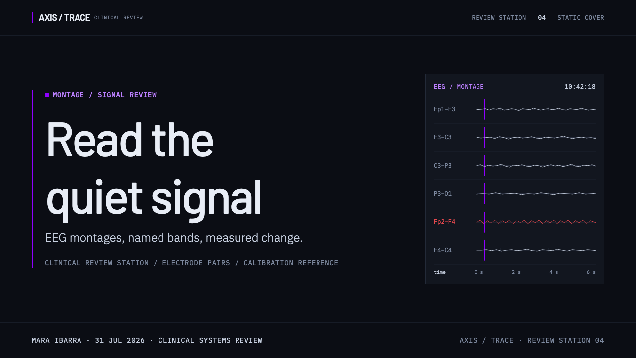
On presentation slides, a cover works well built around the stacked-channel motif itself, rendered in silver on a near-black ground, with a single violet mark functioning as a deliberate visual anchor rather than decoration. Content slides should organize information as labeled horizontal rows, echoing the channel layout directly, rather than a looser freeform arrangement. Data is best shown as continuous, waveform-like line traces in silver-grey rather than colorful bars or pie charts, since the whole system's credibility rests on looking like an instrument rather than an infographic.
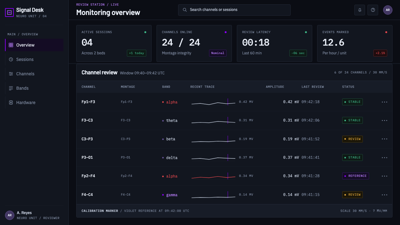
For web interfaces, the style suits monitoring dashboards, system-health displays, and other technical products where trust in the data matters more than visual warmth. Backgrounds should stay a genuine unlit near-black, primary text and data should run in silver-grey rather than pure white, and violet should be reserved strictly for a single calibration or reference indicator, or a selected state — never spread across the interface as a general accent color.
In editorial and marketing contexts, the style supports technical and scientific credibility — research organizations, medical technology, or deep-tech companies that want to signal rigor rather than approachability. Documented, real terminology used correctly does more to build trust with a technically literate audience than any amount of glowing visual flourish would.
The most common mistake is adding glow, neon accents, or animated flourishes in an attempt to make the system feel more futuristic — this undermines the exact quality that makes it credible, since real clinical and technical instruments are disciplined rather than luminous. A second common mistake is using violet as a general decorative accent instead of reserving it strictly for a calibration or reference marker; spreading it around the interface erases the specific meaning it is supposed to carry.
Neural Interface Clinical — FAQ
Why doesn't anything in this style glow, given that it's meant to feel technological?
Because real clinical and monitoring instruments do not rely on glow to signal sophistication — they rely on legibility. A display that a clinician has to read quickly and correctly benefits from calm, non-luminous contrast rather than an animated or glowing surface that could distract from the actual signal. Restraint, in this context, is what reads as advanced and trustworthy, not brightness.
Why is violet used so sparingly instead of as a general accent color?
Because in the real equipment this system is modeled on, a calibration reference has one specific job: confirming that the instrument is reading correctly, not drawing attention to itself. If violet were spread across the interface as a general accent, it would lose that specific meaning and a viewer would no longer be able to tell, at a glance, which mark was the calibration reference and which was ordinary decoration.
Is the terminology used in this style invented, or is it real clinical and technical vocabulary?
It is real. Montage types, the named EEG frequency bands, and the specific implant hardware referenced are all documented, verifiable terms drawn from actual clinical and neurotechnology practice, not invented for visual effect. That grounding in real terminology is part of what gives the style its particular sense of authority.
Can this style work for a consumer-facing product rather than a clinical one?
It can, wherever the product genuinely benefits from projecting precision and trustworthiness over warmth — a security dashboard, a performance-monitoring tool, or any technical product aimed at an audience that values rigor. It works less well for anything meant to feel friendly, playful, or emotionally warm, since the entire visual language is built around clinical restraint rather than approachability.
Where does this style struggle?
It struggles wherever warmth, approachability, or emotional reassurance is the actual design goal — consumer wellness apps, children's products, or anything meant to feel comforting rather than clinical. The style's entire value comes from projecting disciplined, instrument-grade precision, which can feel cold or intimidating in a context where the audience needs to feel cared for rather than monitored.
Related design styles
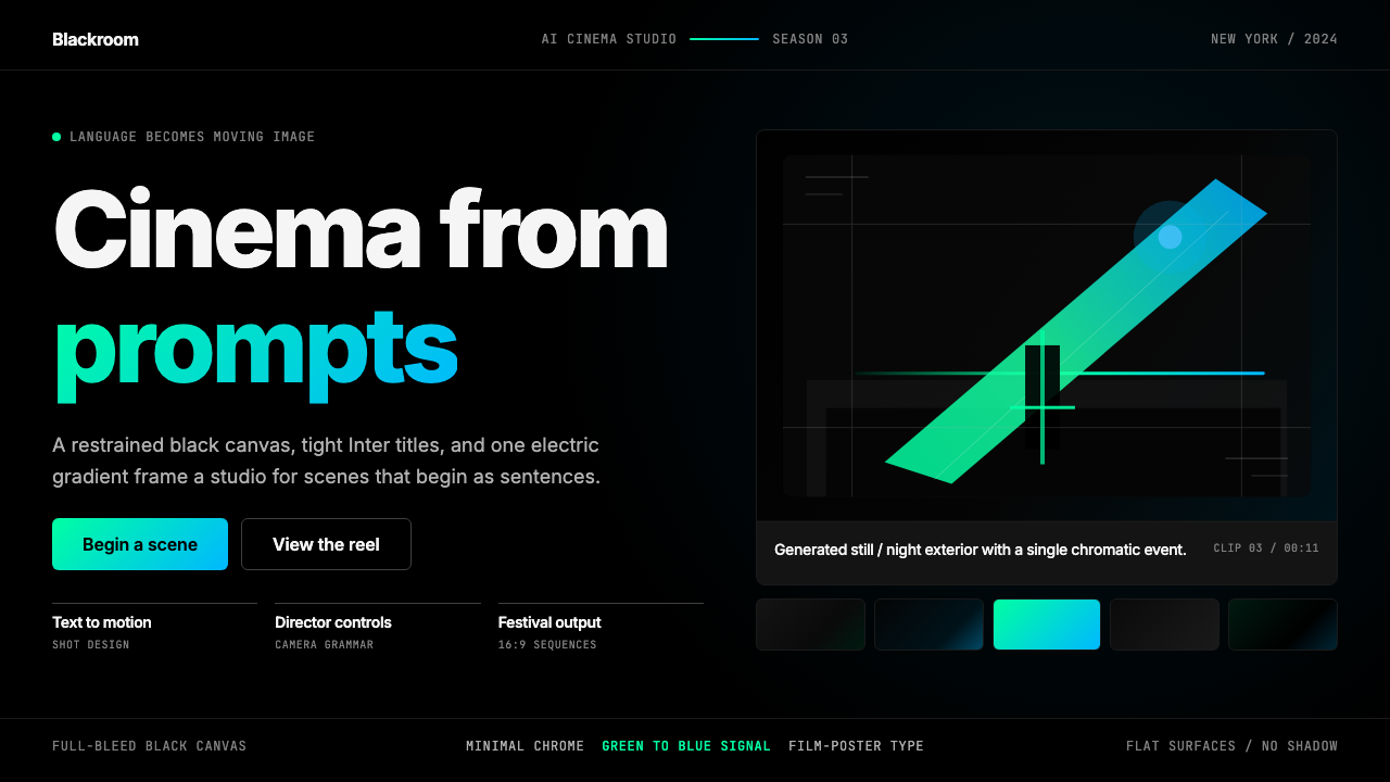 Runway MLCinema, not dashboard. Deep black frames tight Inter type and one green-blue…
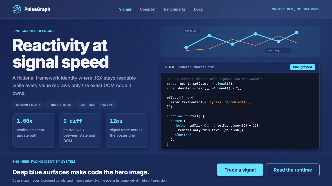 SolidJS Reactive FrameworkCode is the hero. Deep indigo panels, cyan signal arcs, and mono JSX carry th…
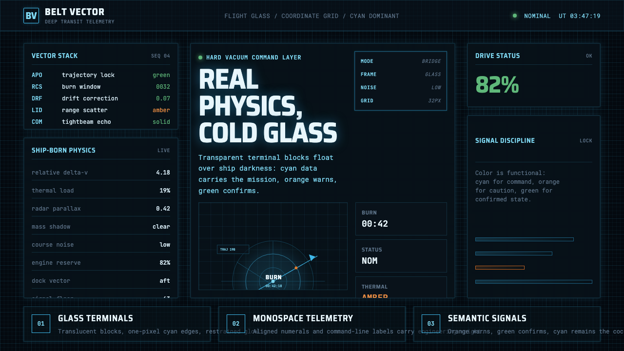 The Expanse Belter UIEngineering, not neon. Cyan glass panels, mono data, orange warnings on ship-…
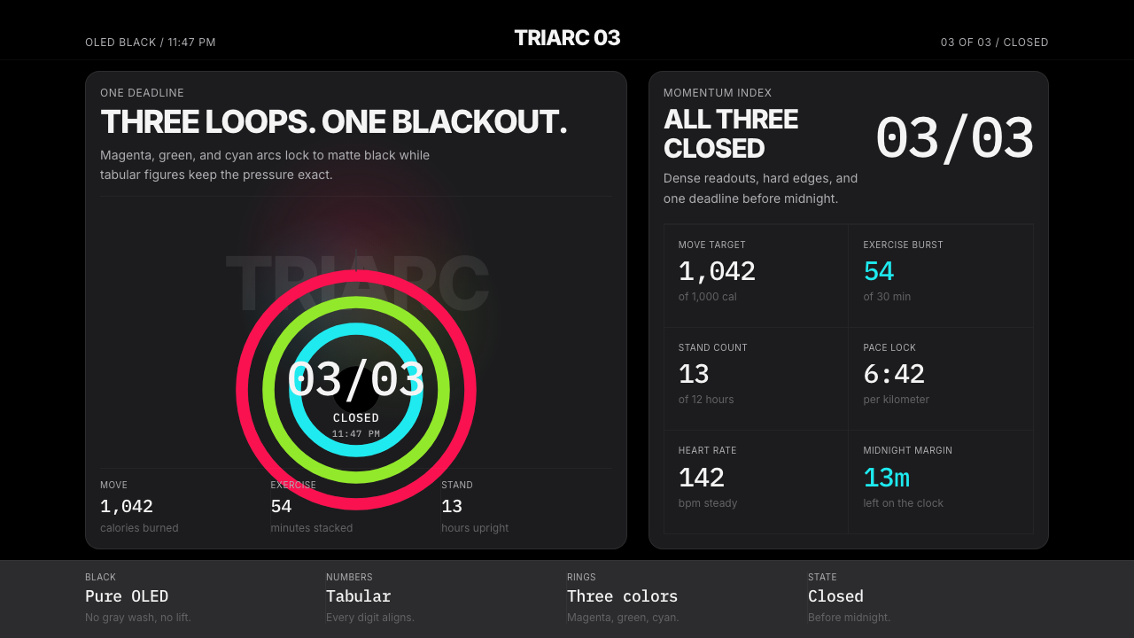 Apple Fitness Rings Closed (2024)Midnight feels exact. Magenta, green, and cyan rings lock onto OLED black.
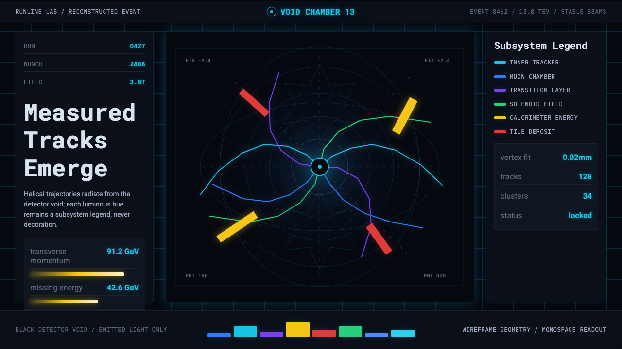 CERN CollisionData, not spectacle. Cyan tracks on black wireframes make every subsystem col…
 Ex MachinaClinical control, made visible. Concrete gray, cyan glass, LED seams, one woo…