What is Benthic Research Outpost?
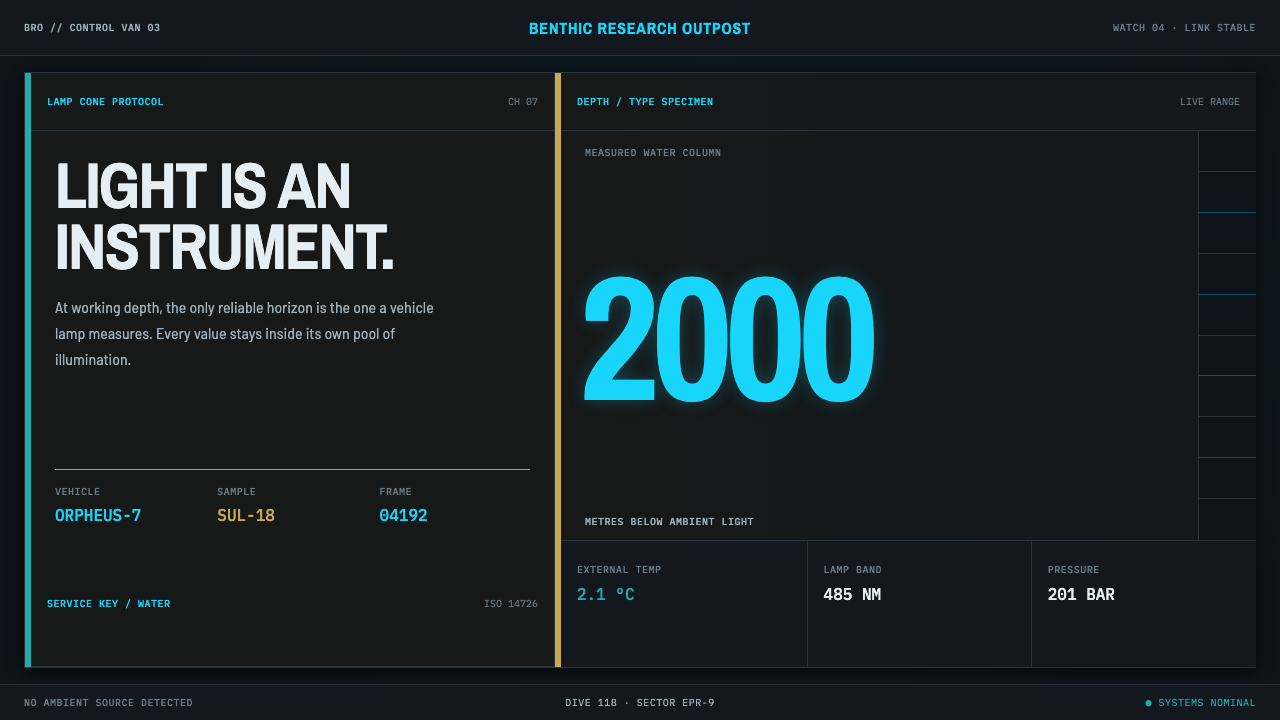
Benthic Research Outpost designs for a room lit only by its own instruments: a darkened deep-sea control van where cyan readouts, hairline frames and edge-to-edge panels do all the work.
Benthic Research Outpost in brief
Benthic Research Outpost is a design style built for the seabed and for the room that watches it. Two kilometres down there is no ambient light; the world exists only inside the cone of a lamp, and outside it the water is a flat blue-black void. The system is made for the space on the other end of the cable, a darkened control van in which the displays are the only source of light.
Its logic is that light is an instrument. Cyan carries the interface because cyan is the part of the spectrum that survives seawater best. Panels butt edge to edge like a rack of instruments, colour keys follow a real ship-board standard instead of an invented scheme, and every readout is framed by hairlines inside its own pool of light. Illumination falls away from the centre toward the edges, where it dissolves into nothing.
The effect is cool, technical and quiet. It is a dark style that is dark for a reason, with no decorative glow, no rounded glass cards and no reflections. It suits telemetry, monitoring, scientific and engineering subjects, or anything that wants to feel like a calm room full of well-labelled instruments.
Where does Benthic Research Outpost come from?
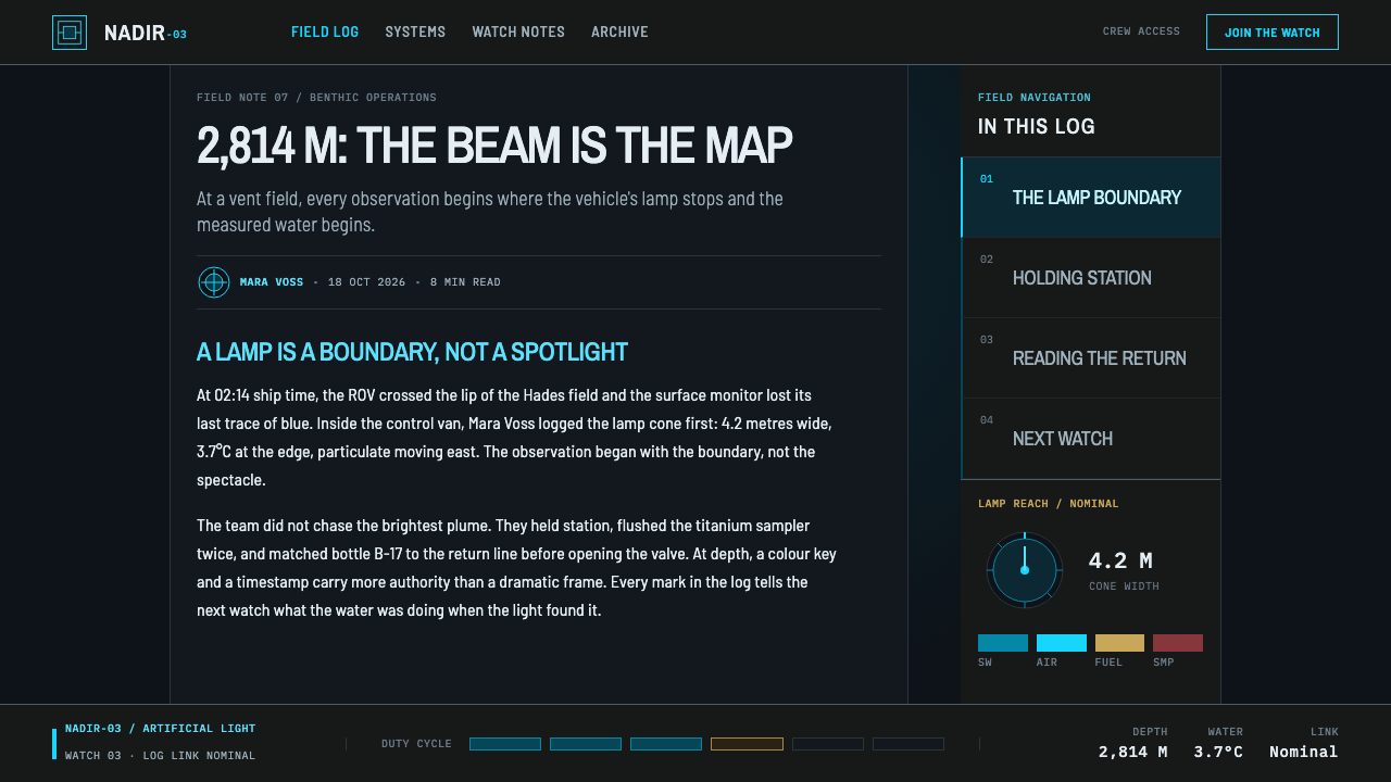
The setting is the deep ocean. Below about a kilometre, sunlight is effectively absent, so everything visible at depth is lit by human-made lamps carried on submersibles and remotely operated vehicles. At two kilometres, an observer sees a bright patch of seabed within a lamp cone and nothing beyond it. The control rooms that run these dives are designed around the same condition, darkened on purpose so that operators can read screens and keep their eyes adapted to the dim video feeds.
The history that anchors the style is the discovery of hydrothermal vents in 1977 on the Galápagos Rift, made from the crewed submersible Alvin. Researchers found chimneys of hot, mineral-rich water on the seafloor, and around them dense communities of animals living without sunlight, including giant tube worms with red plumes. Vents occur at spreading centres, the places where tectonic plates move apart, among them the Mid-Atlantic Ridge, the East Pacific Rise and the Juan de Fuca Ridge. Ever since, ROV and crewed-submersible work has been continuous, and so has the habit of looking at the abyss through screens.
A second tradition adds the human dimension. Saturation-habitat living, in which divers or researchers live under pressure for days or weeks in an underwater or seabed habitat, produced compact, instrument-filled interiors where every system had to be identified at a glance. The design borrows that spirit: a room where nothing is decorative, because everything is life support, communication or measurement.
The colour logic follows two physical and regulatory facts. First, seawater absorbs long wavelengths quickly, so red disappears within a short distance while blue-green light travels furthest; that is why vehicle lamps and heads-up displays lean cyan, and why a red specimen returns to the eye only as a dark maroon. Second, ISO 14726 is the international standard that assigns identification colours to the contents of piping systems aboard ships. The style adopts those colours for its thin side markers rather than inventing a symbol language of its own.
What defines the Benthic Research Outpost look?
The Blue-Black Void
The ground is a deep, flat blue-black with no ambient variation, representing water beyond the reach of any lamp. It is not a decorative dark mode but the actual condition of the abyss: nothing exists here unless an instrument is lighting it. Because the ground carries no texture or glow of its own, every lit element appears to be the only thing in the world.
Cyan as Instrument Light
Cyan carries the interface, including type, lines, readouts and active states, because it is the wavelength that physically survives seawater and the colour real vehicle lamps and heads-up displays lean toward. It reads as bright, cold and exact. Other hues are rare and functional, and the dominance of a single cool colour is what lets a small change of tone register as a meaningful signal.
Lamp-Cone Falloff
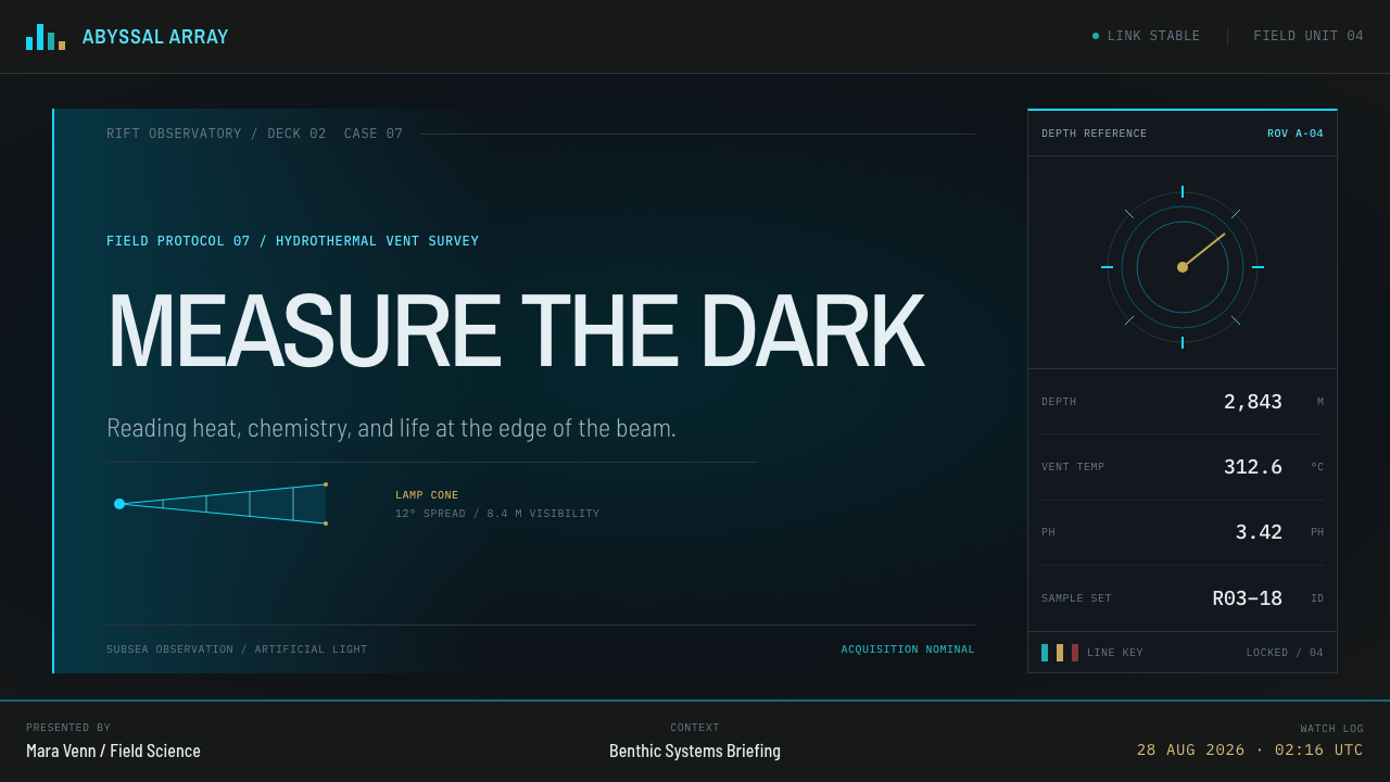
Illumination behaves like a lamp: brightest at the centre of a panel or region, falling off toward the edges and dissolving into the void. This falloff is the system's breathing, and it is the only soft transition the style allows. It tells the viewer where the instrument is pointing and gives each readout its own pool of light without any need for a drop shadow.
Rack-Butted Panels
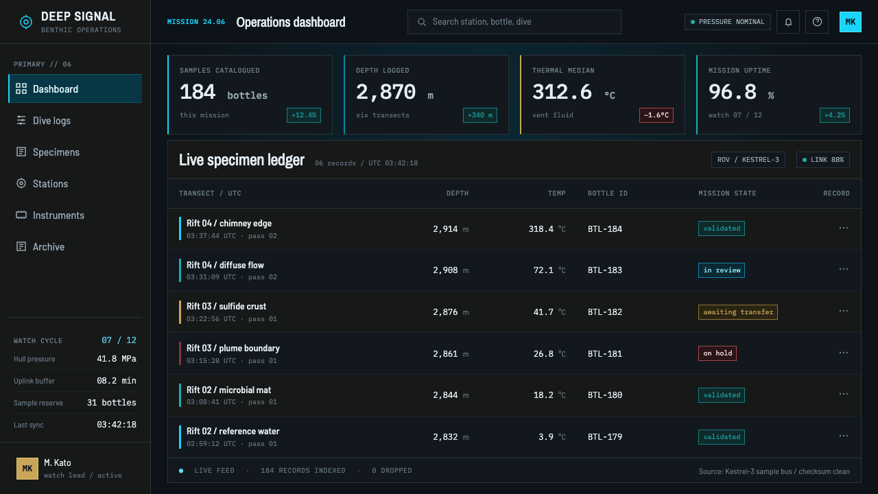
Panels meet edge to edge like modules in an instrument rack, with no gaps, no rounded corners and no floating cards. There are no glass reflections and no glossy bevels. The layout is a grid of functional units, each one clearly a piece of equipment, which gives the page the density and order of a control wall rather than the airiness of a consumer interface.
Hairline Frames
Every readout is framed by fine lines, hard-racked rather than soft-edged, marking its boundary inside its own pool of light. The lines are thin and crisp and do the work that shadows and fills do elsewhere. They give the page its precise, measured character and make dense information scannable without adding visual weight.
ISO Colour Keys
Along the left side of panels run thin colour strips that follow ISO 14726, the standard for identifying the contents of piping aboard ships, instead of an invented code. This borrows an existing visual language that engineers already understand and anchors the interface in real practice. The keys are small and functional, never decorative, and they tell the reader what a system carries at a glance.
Dark Maroon, the Only Red
Red is nearly absent, because water absorbs it before it can return to the eye. Where a red subject must appear, such as the plume of a vent tube worm, it shows only as a dark maroon. This is a rare, physically motivated use of warmth, and it keeps the cool palette honest: the style does not pretend colours survive the depth when they do not.
Who shaped Benthic Research Outpost?
Corliss is the geochemist from Oregon State University associated with the 1977 Galápagos Rift expedition on which hydrothermal vents were found. His name stands for the moment when the deep sea turned from an assumed desert into an active, chemically driven habitat. That shift is the reason there is now an entire visual practice of watching vents on screens in darkened rooms.
Ballard is an oceanographer who took part in the 1977 Galápagos dives and later became widely known for deep-sea exploration, including remotely operated and towed camera systems. He is associated with the idea that the seabed can be explored by sending light and cameras down on a cable while people watch from above, which is the basic scenario of this style.
Jones is a biologist at the Smithsonian who formally described the giant tube worm of the vents, the red-plumed animal that became the symbol of life without sunlight. The worm explains the style's single, exceptional red: a living thing whose colour the water has stolen. Jones represents the biological side of the story, where design meets specimen.
Van Dover is a biologist who studies vent ecology and became the first woman to pilot the submersible Alvin. Her career joins the two halves of this style, the scientific subject and the human operator in a small, instrument-filled space. She stands for the people who spend hours reading lit panels in the dark so that the seabed can be understood.
How do you use Benthic Research Outpost today?
Benthic Research Outpost is the right choice when the content is data in motion and the audience is watching it: telemetry, monitoring, research, engineering and operations. It also suits storytelling about the ocean, exploration and anything that benefits from a calm, rigorous, low-light interface. It is not a style for warm, sociable or highly decorative subjects.
For presentation slides, a cover can be a single lit region on a blue-black field, a title in cyan, a thin hairline frame and a faint falloff of light from the centre. Content slides work as instrument walls: a few edge-to-edge panels, each with a clear label, a hairline border and one reading or message. Data slides are a natural fit: charts drawn as thin cyan lines on black, small readouts in framed cells, and a colour key strip along the left of each panel.
For web interfaces, the style is ideal for monitoring dashboards, scientific tools, developer consoles and status boards. Build the layout as butted panels without gaps or rounded corners, keep type and charts in cyan on a dark ground, and separate regions with hairline frames rather than shadows. Use the left-edge colour keys to classify systems or data sources. Pricing or plan pages can be treated as spec panels, one per tier, each a framed readout.
For editorial and marketing work, the style supports atmospheric but disciplined pages: a long-form article about the deep sea, a research programme landing page, a product for scientific instruments. Photography should be treated as if lit by a lamp, with a bright centre falling into darkness, and captions set like instrument labels. Marketing copy works best when it is calm and exact, since the visual language already implies seriousness.
The most common mistake is to add decoration to the darkness: neon bloom, rounded glass cards, gradients across panels, reflections or particles in the background. These are exactly the effects the style refuses. A second mistake is bringing in a full rainbow of status colours, which breaks the cool, single-hue logic and ignores the physics behind it. A third is letting the glow become so strong that small text blurs; keep the light confined and the type crisp.
Benthic Research Outpost — FAQ
Why cyan, and not the green of a classic terminal?
Because the style is anchored in physics, not in computing nostalgia. Cyan is the part of the spectrum that survives seawater best, and it is what real vehicle lamps and heads-up displays lean toward in the deep. Terminal green belongs to a different story, one of phosphor screens and command lines, so using it here would undermine the premise that the interface is lit by instruments built for the sea.
How is this different from an ordinary dark mode?
A generic dark mode inverts a light interface and keeps its cards, rounded corners and soft shadows. This style starts from a darkened room in which displays are the only light, so it has panels butted edge to edge, hairline frames, light falling off from the centre of each readout and a restricted cool palette. The darkness has a cause and a structure, rather than being a toggle applied after the fact.
Why are there no rounded corners or glass effects?
Instrument racks are made of rectangular modules that sit flush against one another, so the interface does the same. Rounded, glassy cards suggest a consumer product and introduce reflections that do not exist in a darkened control room. The hard, square panel edge also makes the hairline frames work, and keeps a dense page scannable.
Are the colour keys on the left meaningful?
Yes. They follow ISO 14726, the international standard that assigns identification colours to the contents of piping systems aboard ships, so they borrow a code that marine engineers already know instead of inventing one. In a design you can use them to classify systems, data sources or channels, but keep them thin and consistent, and explain any use that goes beyond the standard.
Is cyan text on a very dark ground accessible?
Generally yes, since bright cyan on blue-black gives strong contrast, but there are cautions. Avoid heavy bloom or glow around small type because it blurs the letterforms, avoid dim secondary text that sinks into the void, and do not rely on colour alone to convey status. Pair the colour keys with labels, and keep the light concentrated where information is, not spread across the whole page.
Related design styles
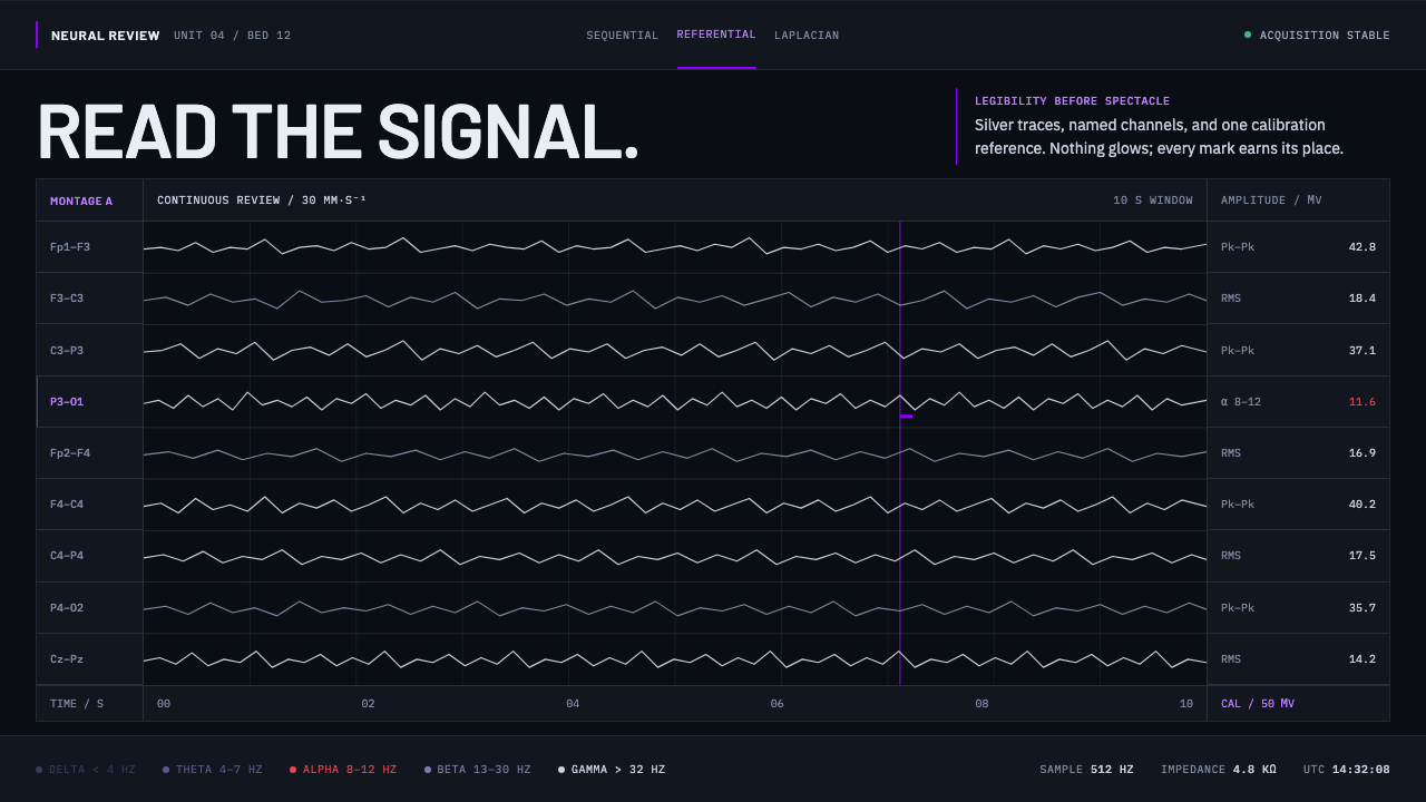 Neural Interface ClinicalClinical restraint makes signals legible. Silver traces cross near-black; vio…
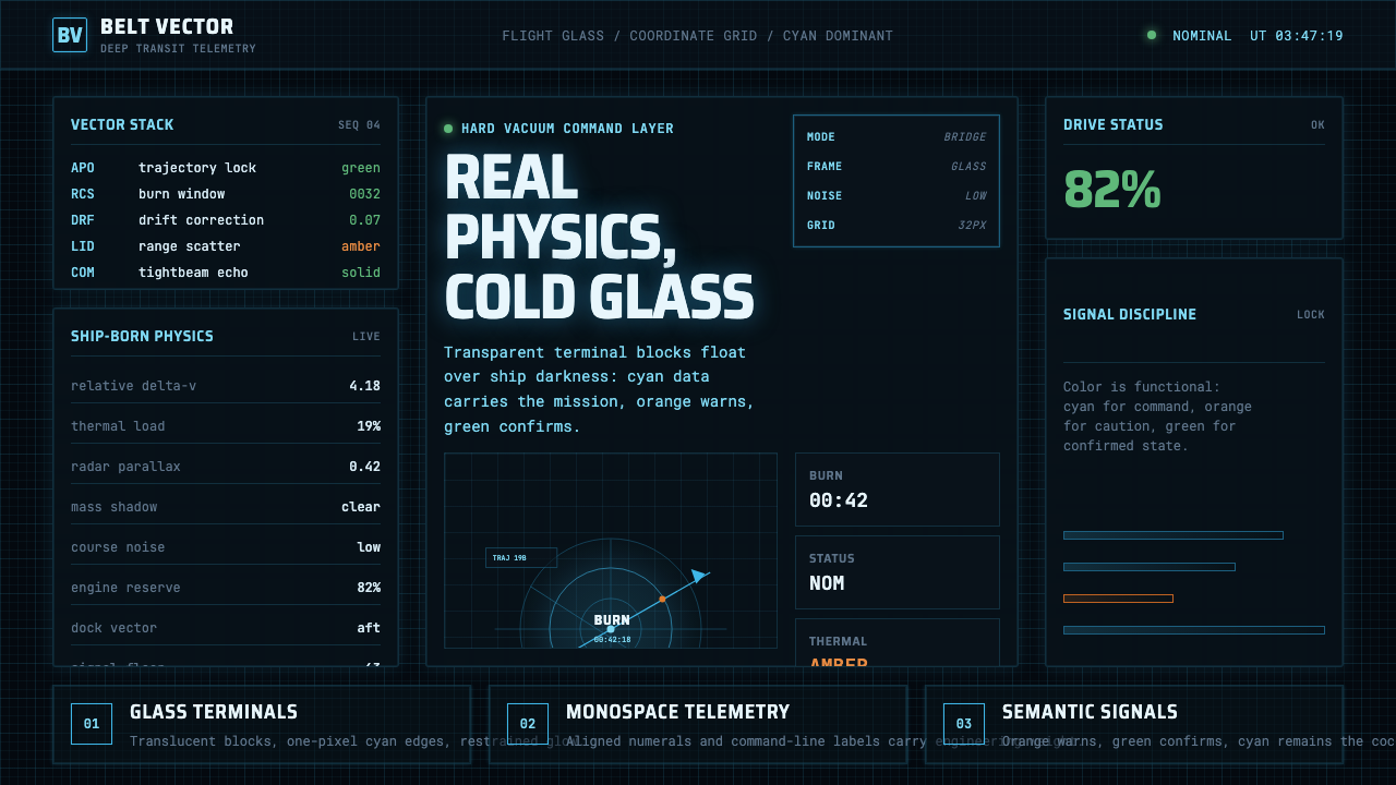 The Expanse Belter UIEngineering, not neon. Cyan glass panels, mono data, orange warnings on ship-…
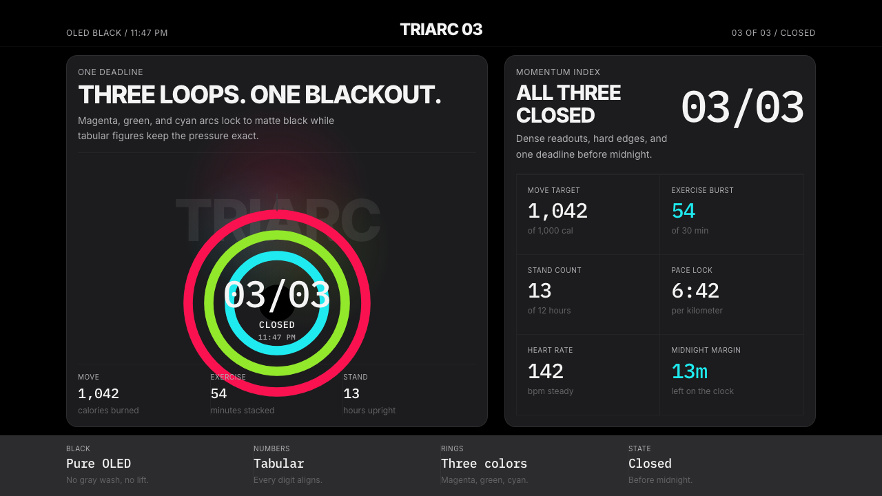 Apple Fitness Rings Closed (2024)Midnight feels exact. Magenta, green, and cyan rings lock onto OLED black.
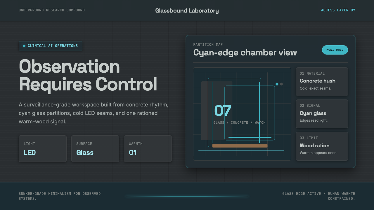 Ex MachinaClinical control, made visible. Concrete gray, cyan glass, LED seams, one woo…
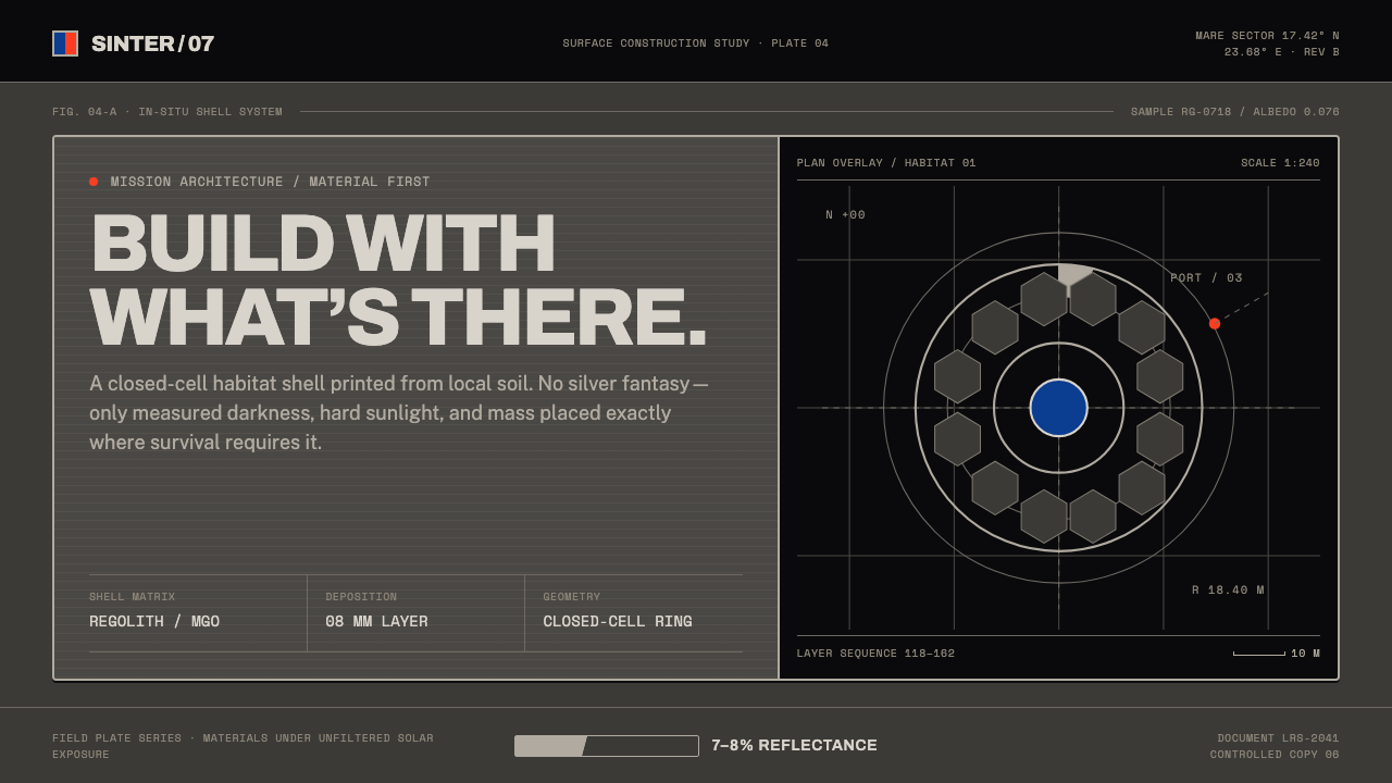 Lunar Regolith SettlementMoonlight without the myth. Regolith gray, hard terminators, and a strict tec…
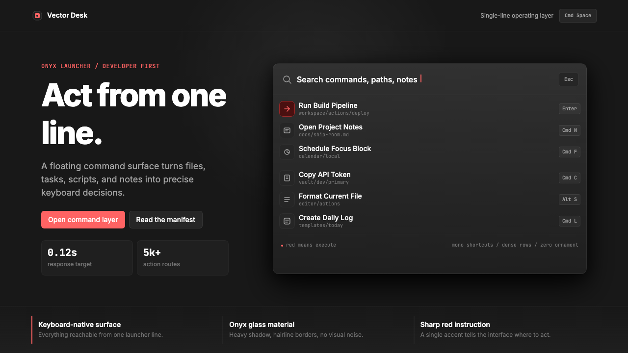 Raycast Spotlight Launcher (2023)Obsidian confidence. Sharp red cuts through Inter rows and mono shortcut chip…