What is Dream Recording Lab?
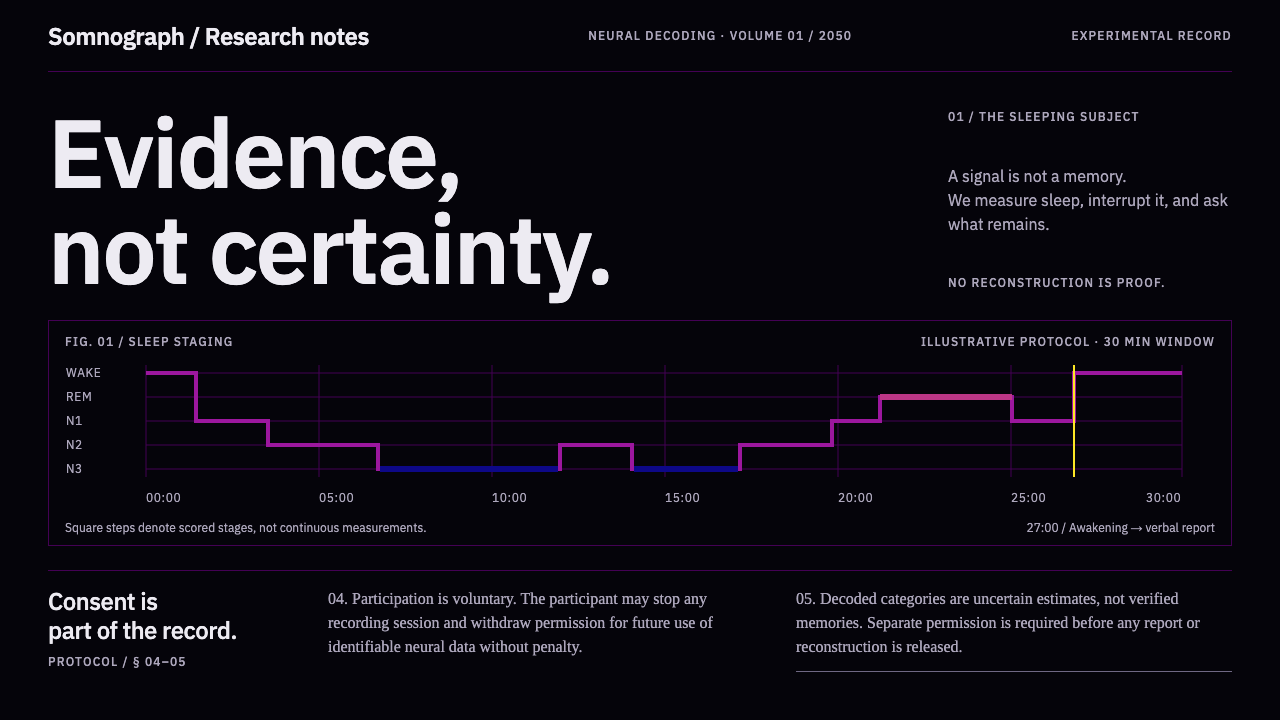
Dream Recording Lab imagines a sleep laboratory in which the interface is the brain viewer itself: pure black slices, honest colour ramps, and consent paperwork that never shrinks.
Dream Recording Lab in brief
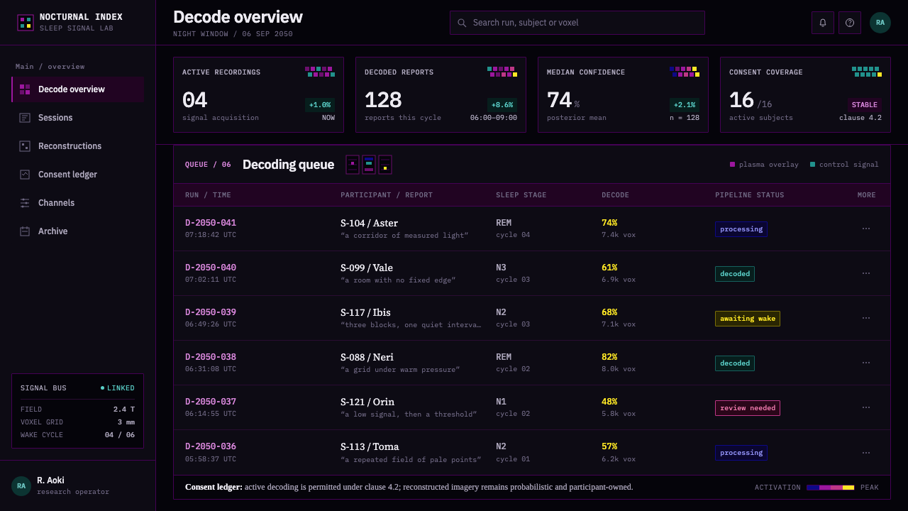
Dream Recording Lab is a dark, speculative design style modelled on a sleep laboratory of the mid-twenty-first century, where functional MRI signal is decoded into reconstructions of what a sleeper was dreaming. It is a projection, but a disciplined one. It extrapolates from published neural-decoding research and from the everyday routines of sleep medicine rather than from science-fiction imagery, so there are no glowing holograms and no floating control panels. The interface is not a metaphor for laboratory software. It is the viewer the researchers would actually sit in front of.
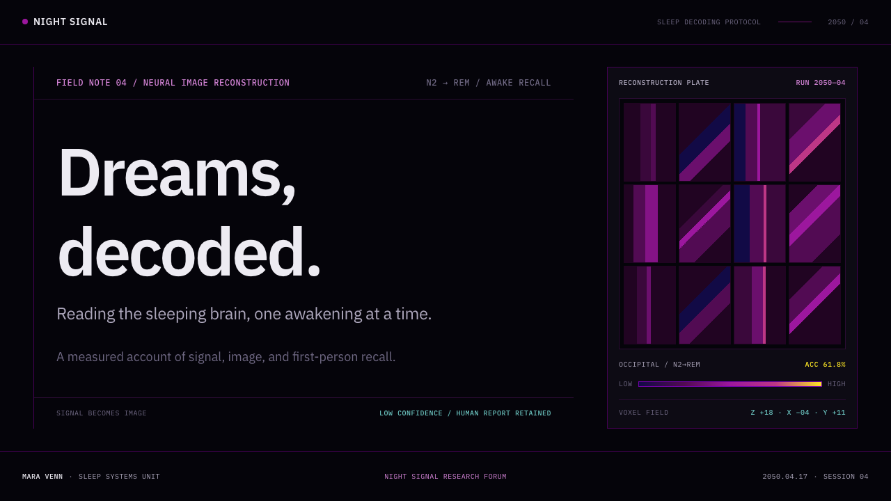
Four ingredients define its look: axial brain slices floating on pure black; statistical overlays ramped through the scientific colour scales known as plasma and viridis; a hypnogram that steps down and up through Wake, REM, N1, N2 and N3; and blurred, low-resolution reconstructions of dream imagery, each tagged with a decoding-accuracy percentage. Beside all of it, at full reading size and set in a Times-style serif, sit the informed-consent and ethics-review clauses.
What separates the style from an ordinary dark-mode dashboard is its position on certainty. Nothing in it is certain, and the design says so. Reconstructions are blurred on purpose, every claim carries its accuracy, and the paperwork about consent is never folded into a footnote. The tone is evidence rather than spectacle: a place where a large claim about the mind is made modestly, and the reader is trusted to weigh it.
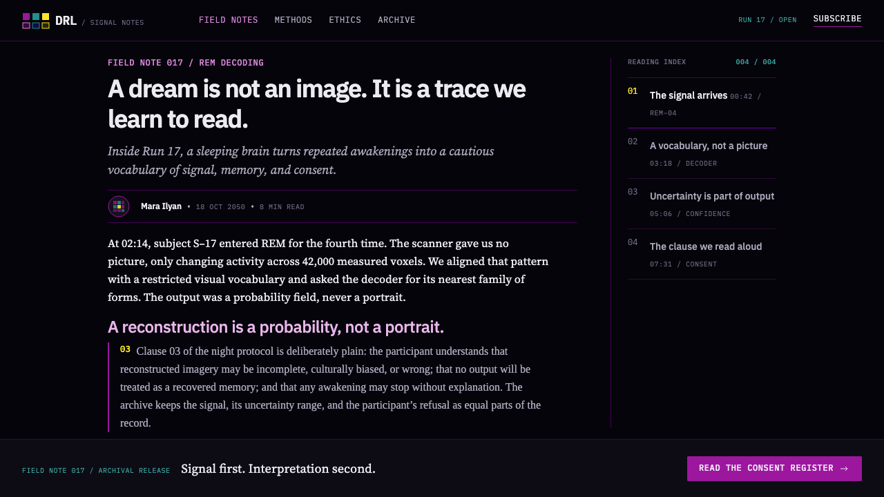
Where does Dream Recording Lab come from?
The style takes its scientific premise from a paper published in Science in 2013 by Tomoyasu Horikawa and Yukiyasu Kamitani, with Masako Tamaki and Yoichi Miyawaki among the authors, carried out at the ATR Computational Neuroscience Laboratories and Kyoto University. Volunteers slept inside a scanner and were woken repeatedly shortly after falling asleep, each time asked to describe what they had just seen. Decoders trained on brain activity recorded while the same people looked at pictures were then applied to the sleeping recordings, and they could predict the kinds of objects in the reports at a rate better than chance. That is decoding of content categories, not film playback, and the design inherits that modesty.
The second root is sleep medicine itself. Clinical sleep scoring, as standardised by the American Academy of Sleep Medicine, divides a night into Wake, REM and three stages of non-REM sleep, labelled N1, N2 and N3, and plots them as a hypnogram: a stepped line that descends into deep sleep and surfaces periodically into REM. Sleep laboratories around the world have used some version of this chart for decades. The style lifts it whole, which is why the stair-step trace appears in the interface as a working instrument rather than as a decorative motif.
The third root is scientific visualisation. Neuroimaging papers display statistical maps as coloured overlays on greyscale anatomy, and in recent years the field has moved toward perceptually uniform colour scales such as viridis and plasma, designed so that equal steps in the data look like equal steps in colour and so that the picture survives greyscale printing and common forms of colour-vision deficiency. The background of such images is black for a practical reason: voxels outside the brain carry no signal, so there is nothing to draw there. The style turns that convention into a rule. Black is the absence of signal, not a mood.
Together these three streams — neural decoding or brain reading, AASM sleep staging and perceptually uniform colormaps — give the style its projected timeline. Its practice is set across the 2010s to the 2050s, a span in which the science is real, the sleep-lab routine is real, and only the reach of the decoding is imagined. That is why the style reads as plausible rather than fantastical. The laboratory it describes could exist in Kyoto or in any sleep centre in the world. And because the imagined technology touches the most private content a person has, the designers added the ingredient that science fiction usually leaves out: the consent paperwork, kept at full size, on the same screen as the result.
What defines the Dream Recording Lab look?
Black as absence of signal
The ground is pure black, and the reason is functional. In brain imaging the area outside the head holds no signal, so a faithful viewer leaves it empty. Slices, hypnogram and charts float on that emptiness without panels, borders or glows around them. Because black is meaningful, anything lit stands for something measured. Containers are kept minimal and quiet, so the only brightness on screen is data.
Scientific colour ramps
Statistical overlays move through perceptually uniform ramps: from deep indigo through magenta and orange to pale yellow in one, from dark violet through blue-green to bright yellow in the other. Colour encodes magnitude and nothing else. Because the ramps rise steadily in lightness, a reader can still order values correctly in greyscale, and the style never uses them as atmospheric gradients.
The hypnogram staircase
Sleep stages are drawn as a stepped line in the order Wake, REM, N1, N2, N3, with light stages near the top and deep sleep at the bottom. The line moves in discrete horizontal runs and vertical drops, never as a smooth curve, because stages are scored in discrete epochs rather than as continuous values. Awakenings, when the subject is questioned, appear as returns to the top rail. The trace is the timeline of the whole interface.
Blur with an accuracy tag
Reconstructed dream imagery is intentionally soft, low in resolution and slightly out of focus, and it is never shown without a decoding-accuracy figure beside it. The blur is a grammar of honesty: the image announces that it is an estimate. A sharp reconstruction would claim a certainty the data cannot support. Designers adopting the style should resist the urge to crisp these images up.
Consent in plain sight
Informed-consent and ethics-review clauses are typeset in a Times-style serif at ordinary body size, on the same screen as the results. They are not collapsed, greyed out or tucked behind a disclosure link. The serif marks a change of register, from instrument to institution, and the full size says that obligation weighs as much as findings. It is the style's most unusual rule and its most memorable.
Instrument restraint
Everything else follows clinical equipment rather than cinema: neutral labelling, thin rules, a handful of readouts, and no scan-line effects, neon outlines or particle fields. The style takes its drama from the subject and never borrows it from surface effects. When a layout feels empty, the style's answer is to add a caveat or a scale, not decoration.
Who shaped Dream Recording Lab?
Kamitani, working at Kyoto University and the ATR Computational Neuroscience Laboratories, is a leading name in the line of research known as neural decoding or brain reading, which asks what can be inferred about a person's perception or imagery from patterns of brain activity. He is among the authors of the 2013 study of dream content that this style projects forward. His work supplies the style's central posture: reading the brain is probabilistic, so every output must be shown with its uncertainty.
Horikawa is the first-named author of the 2013 sleep study and is associated with decoding the content of sleep-onset dreams from fMRI. His name anchors the style's central scene: a sleeper woken shortly after falling asleep, asked what was just seen, and a decoder compared against that report. The method of wake, ask and compare is why the interface pairs a timeline of sleep stages with a record of what the subject said.
Tamaki is a sleep researcher and one of the authors of the 2013 study. Her presence ties the project to sleep science proper, with its scored stages, laboratory discipline and awakening protocols, rather than to imaging alone. In the style she stands for the half of the interface that is borrowed from sleep medicine: the hypnogram, the stage labels and the clinical register of the paperwork.
Miyawaki is a co-author of the 2013 study and is associated with earlier work reconstructing seen images from brain activity, the immediate predecessor of dream decoding. That lineage explains the style's fascination with reconstruction as a visual object: an image estimated from signal, always an approximation of the original, which is exactly why the style renders it blurred and labelled with an accuracy.
How do you use Dream Recording Lab today?
The style suits any subject in which a bold claim rests on thin evidence and the honest response is to show the evidence: neuroscience, medical research, AI evaluation, biometrics, sleep and wellness tools with a scientific posture, and speculative-technology storytelling. It asks designers to treat uncertainty as content. If a design cannot say how sure it is, this is the wrong style.
On slides, covers work best as a single large brain slice or hypnogram trace floating on black, with a short title in plain instrument lettering and nothing else. Content slides should carry one finding each: a visual, the number that qualifies it, and a one-line caveat. Data slides are the style's strongest ground: heat maps in the plasma or viridis family, stage timelines with the stair-step line, confidence values printed directly beside the figures they qualify, and legends that show the full colour ramp.
In web interfaces, the style fits research dashboards, clinical-trial portals, model-evaluation consoles and data-ethics pages. Keep the page black, set charts directly on it, and put the accuracy or confidence next to every headline number. Pricing or sign-up flows for products in this space should treat consent as part of the interface: the terms appear at body size, in the serif, before the commit button rather than behind a link. Navigation stays quiet and typographic.
For editorial and marketing work, think of long-form science journalism, a launch for a speculative technology, or a report on neurotechnology policy. Pair a dark hero visual with generous prose and let the serif clauses double as pull quotes in the language of institutions. Campaigns do well when they lead with the question the technology raises rather than the capability it claims.
The most common mistake is to use the colour ramps as mood gradients, filling backgrounds or buttons with plasma for atmosphere. In this style the ramps always encode a quantity and always come with a legend. The second mistake is polishing the reconstructions until they look like photographs, which removes the honesty the style depends on. The third is shrinking the consent text; once it is small, the style has become ordinary dark mode in a cinematic coat.
Dream Recording Lab — FAQ
Is dream recording a real technology?
Not in the form the style depicts. The research it extrapolates from is real: a 2013 study in Science showed that patterns of brain activity recorded while volunteers fell asleep could be used to predict the kinds of objects they reported seeing when woken. That is category-level decoding of short, sleep-onset imagery. Producing a replay of an entire dream is an imagined next step, and the style's timeline, running to the 2050s, flags it as such.
How is it different from cyberpunk or a generic dark mode?
Cyberpunk uses darkness for atmosphere: neon, haze, glitch. Generic dark mode inverts a light interface for comfort. Dream Recording Lab uses black because the measuring instrument does: the background carries no signal. It rejects glow, grain and scan lines, keeps its colour for data, and gives one of its most prominent typographic positions to legal text. It looks sombre because it is accountable, not because it is moody.
Why do the colour ramps matter so much?
Perceptually uniform ramps keep the visual size of a difference proportional to the size of the difference in the data. Older rainbow-style scales create false bands and bright spots that are artefacts of the colour scale rather than the data. By using viridis- and plasma-like ramps, the style keeps its charts honest, readable in greyscale and friendlier to readers with colour-vision deficiency.
Can the style work on a light background?
It is built on the black ground, since the absence of signal is part of its logic, so a light version would need a different argument behind it. If the audience needs paper, borrow selectively: the stair-step hypnogram, the honest colour ramps, the accuracy labels and the full-size consent text all travel to a light page. The black ground itself does not, and without it the result is a related but different style.
Which projects should avoid it?
Anything whose business is reassurance or spectacle first. Wellness brands promising effortless transformation, or apps that want dreams to look magical, will find the style's modesty works against them. It also becomes awkward where there is no real uncertainty to display: its visual argument depends on the data being tentative, and if the product is certain, the interface looks anxious for no reason.
Related design styles
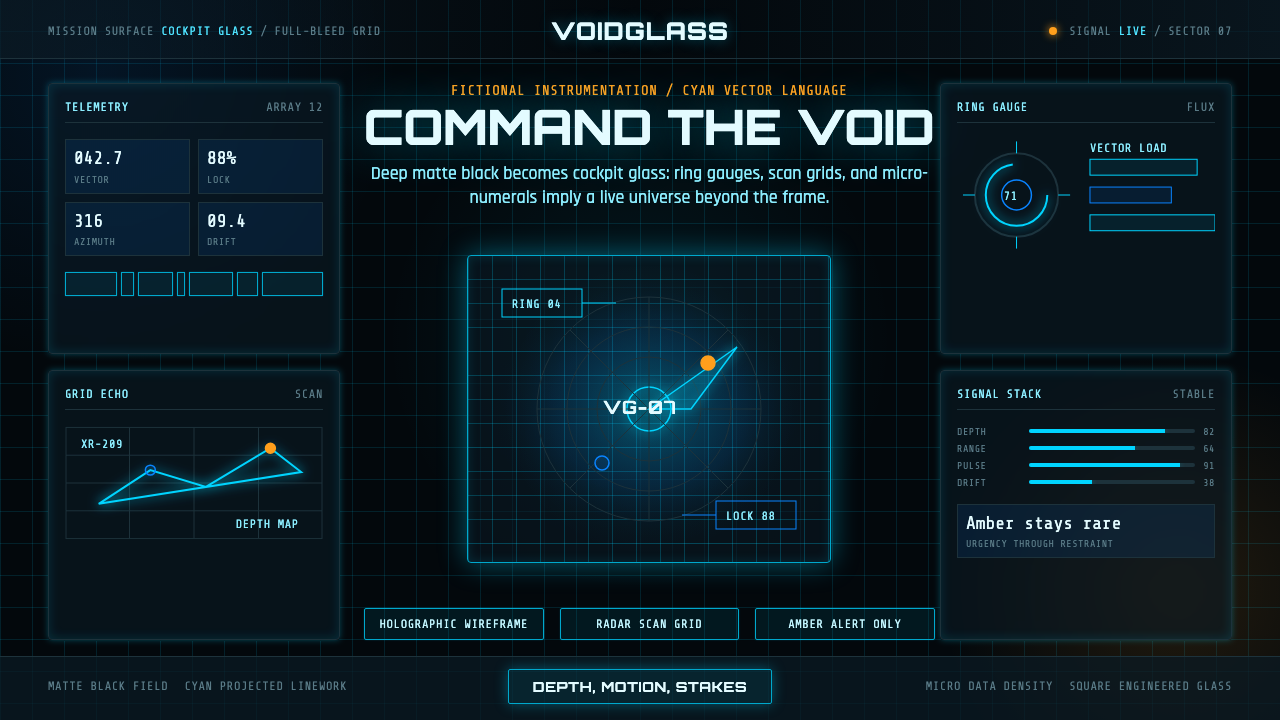 FUI Sci-Fi HUDBlack until it glows. Cyan wireframes, ring gauges, and radar grids sell live…
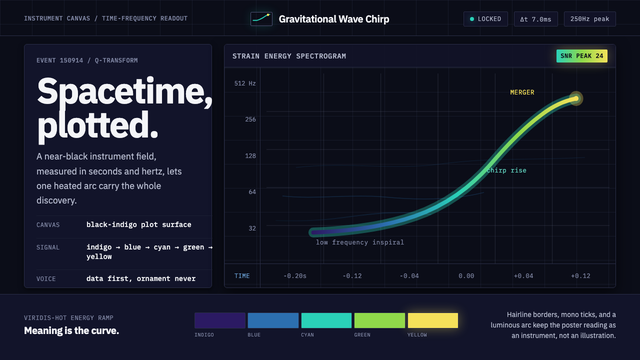 Gravitational Wave ChirpData makes the drama. Near-black grid, mono Hz ticks, and a viridis-hot chirp…
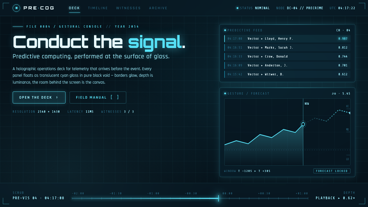 Minority Report Gestural UIPredictive computing, conducted on glass. Luminous cyan panels floating in pu…
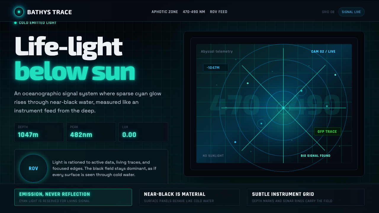 Abyssal BioluminescenceDark carries the signal. Electric cyan pins and Exo 2 readouts surface from a…
 Autonomous Cargo Ship BridgeColour is protocol. Near-black chart grids reserve orange for decisions that…
 CERN CollisionData, not spectacle. Cyan tracks on black wireframes make every subsystem col…